Step inside this Victorian home in Hertfordshire
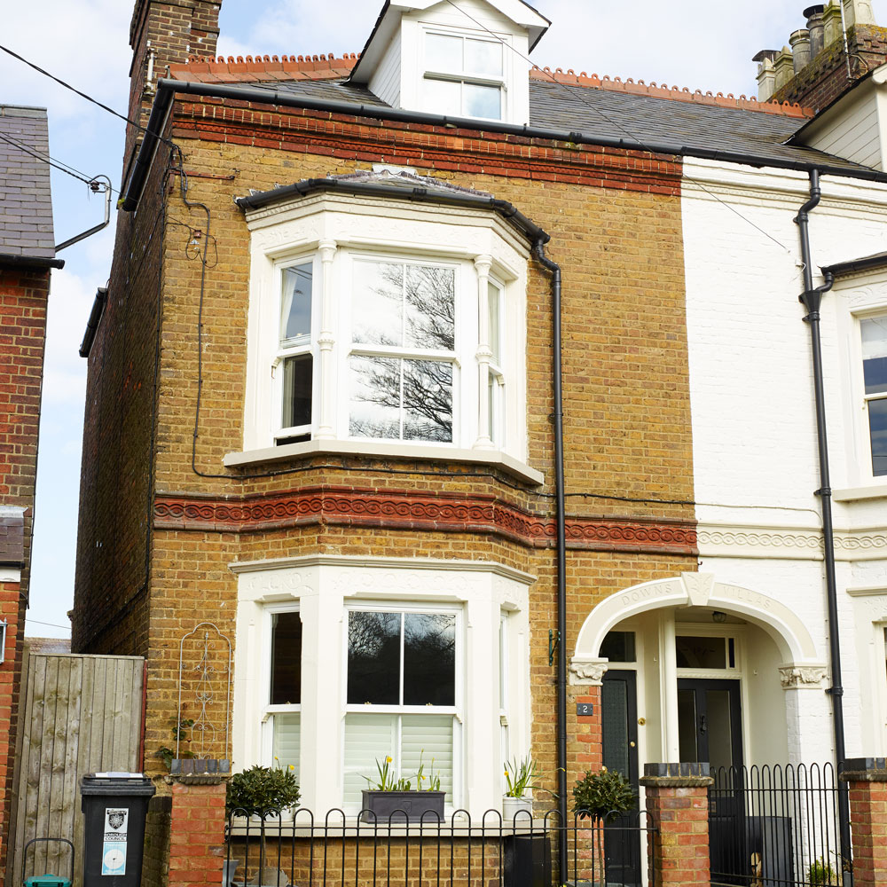
Looking for a house in an area with a villagey feel, but still within easy reach of London for work, this property caught the attention of the couple who now own it.

Looking for a house in an area with a villagey feel, but still within easy reach of London for work, this property caught the attention of the couple who now own it. The first-time buyers jumped at the opportunity to buy the four-bedroom semi in Hertfordshire. 'We adored its homely feel, despite it looking a bit unloved and sad inside.'
The house had previously been owned by a family with three kids but the new owners, who were starting to plan for a family themselves, thought the space looked dated, cold and dark despite it clearly being well-loved. Their plan was to accentuate the period features while also bringing the property up to date. However, although they knew what they liked and disliked, the owners still lacked the confidence to put their ideas into practice. 'We felt that in our new home we needed some expert advice,' they say, so they contacted a local interior designer for help.
1/10 Exterior
'I told her I wanted to add new twists but highlight the original features. She really helped me to work out the best use of space, plan the layout, develop the colour palette for each area and source the furniture and accessories too.' The couple decided that they wanted an elegant, feminine style but with an industrial edge. Their interior designer suggested a palette of wood, copper tones and blue hues running as a theme throughout the house, creating a sense of a coherence but which could be varied from room to room.
2/10 Open-plan living room
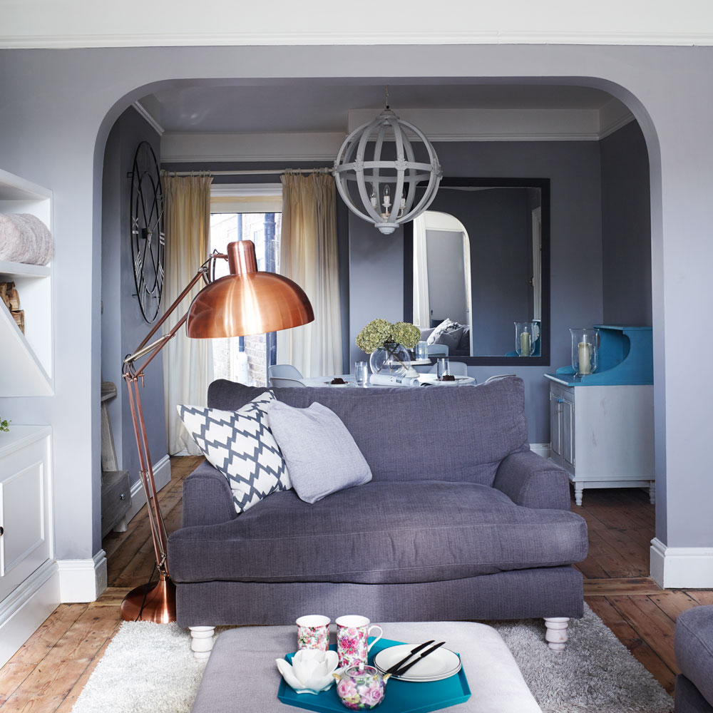
'Our living room was the first space we wanted to change,' say the owners. 'We were desperate for a place to unwind in the evening, and this long narrow room felt dark and uninviting.' Originally two separate rooms, this space had previously been knocked through but the old fireplaces and floorboards remained intact, something that helped to connect the two areas more.The blue-hued colour palette also came into play here; while the walls are all painted the same soft shade, deeper tones - such as the seating in the living area - helped punctuate the space to act as a visual (as well as physical) room divider. Metallic accents were used to brighten the scheme and hits of warmth.
Similar sofa
Habitat
Similar lamp
Atkin & Thyme
3/10 Living Room
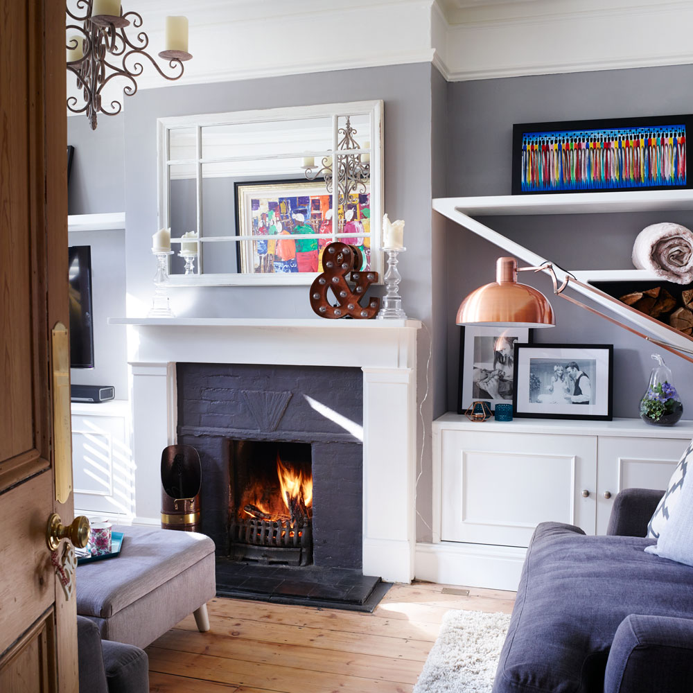
The owners wanted to make the most of the alcoves, so they suggested building in storage. Their bespoke cabinetry includes this unusual diagonal shelf, which has a contemporary feel. 'We love storing our firewood here, as it feels fun and unexpected,' they say.
Similar mirror
Get the Ideal Home Newsletter
Sign up to our newsletter for style and decor inspiration, house makeovers, project advice and more.
Similar Ampersand
4/10 Dining area
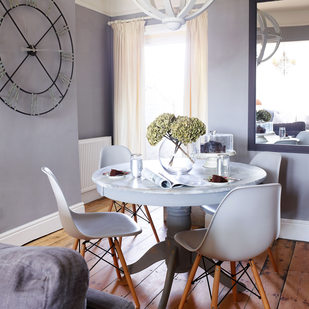
The dining space at the opposite end of the open-plan living space features furniture and accessories that have been cleverly upcycled. 'I found the table at a pre-loved furniture shop, and updated it with chalk paint,' says the owner. This is set off by mid-century modern inspired chairs, and a French-style clock on the wall, all of which creates an eclectic finish. An oversized light can also work really well in small spaces, helping to emphasise the dining area as a focal point. 'I also painted the pendant light above it to tie in with the table and chairs. I've learnt not to assume that buying an expensive item is the best solution, as there are lots of clever things you can do by upcycling furniture and other pieces.'
Similar chairs
Heal's
Similar table
Rose & Grey
5/10 Kitchen
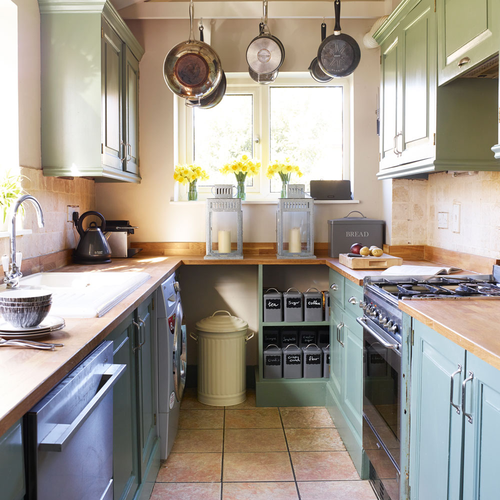
When the owners moved in, the kitchen was not their priority for renovation but it's next on their list. 'We've been dying to do this since we moved in. Because the kitchen and breakfast area is poky, we plan to extend it into the side return and create a spacious kitchen-diner that links through to the living room.' For now, they have styled the space to fit their needs. Tin accessories with a country feel complement the farmhouse-style sink and wooden worktops, while fitted ceiling hooks for pots and pans help to resolve a shortage of storage space.
Similar lantern
Debenhams
Similar storage containers
6/10 Staircase/ Hallway details
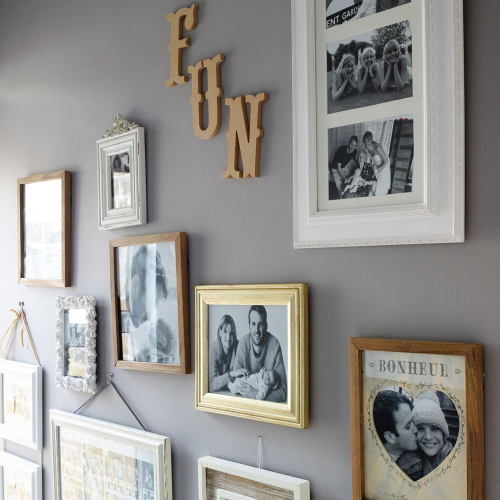
Typically for a period property, the hall was another challenging narrow space. It was long, badly lit and felt very unwelcoming. It desperately needed an injection of personality but it wasn't wide enough for conventional furniture. The couple got inventive with their furniture, but also with their wall display, a series of family photos in a variety of frames which add character and a truly personal touch to the stairwell.
Similar photo frames
7/10 Master bedroom
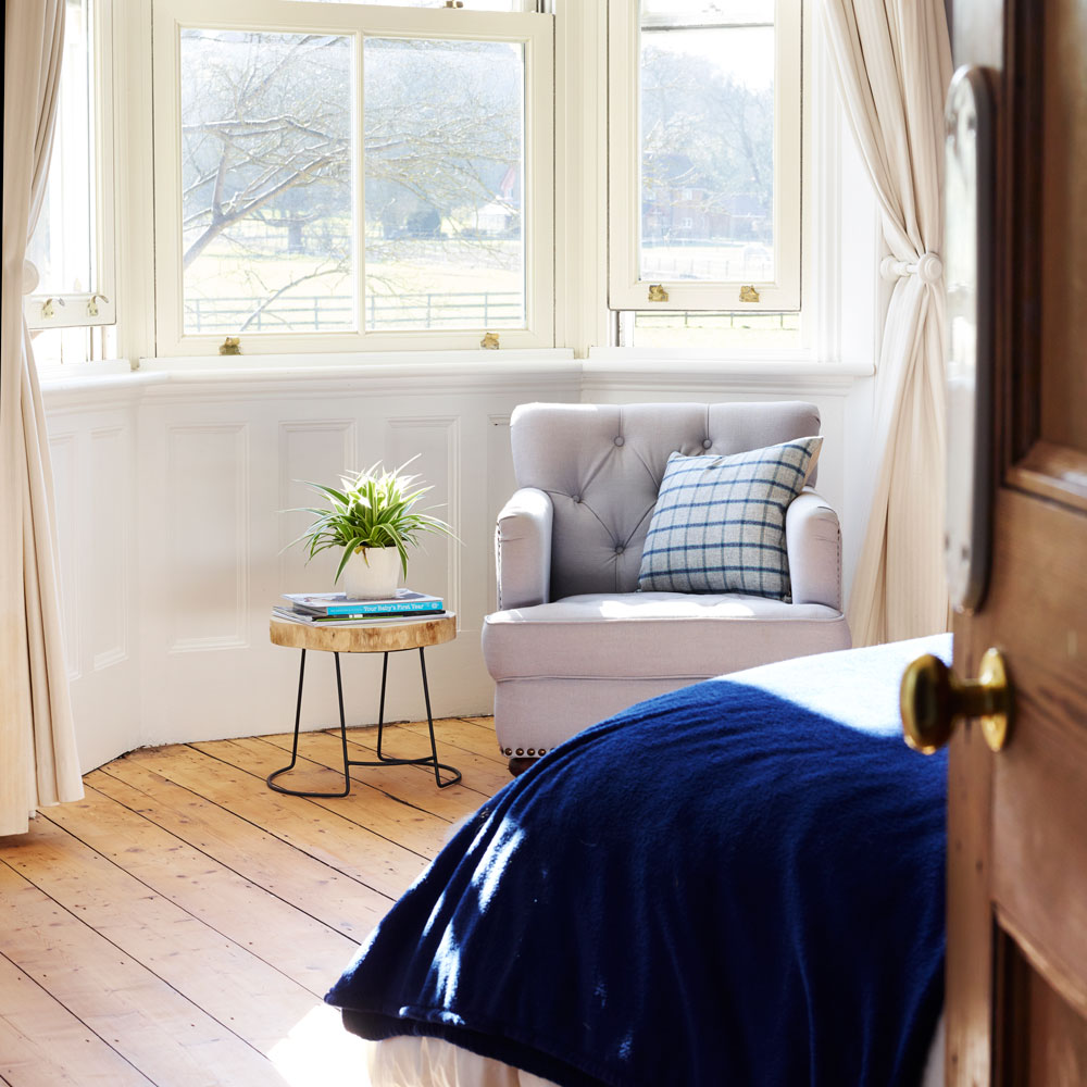
The master bedroom is a favourite space for the owners. 'It's so serene. We can lie in bed and watch the horses grazing in the fields opposite,' they say. In this light-filled space with its original wooden floors, the blue decorating theme seen throughout the rest of the house continues, this time via luxurious midnight blue velvet bed linen and a powder blue armchair, both of which lend a grown-up glamour to the room.
Similar armchair
Similar bed throw
8/10 Master bedroom fireplace
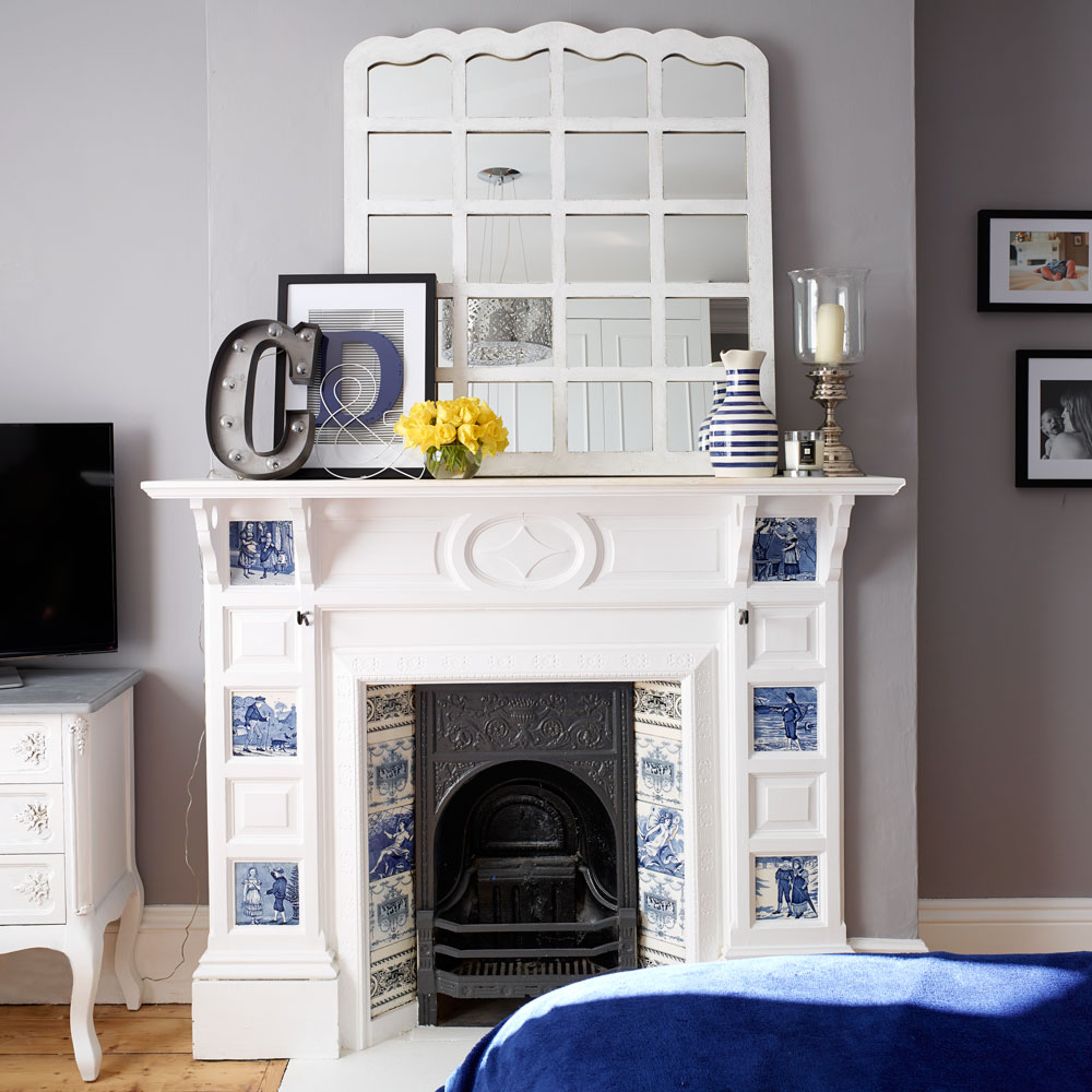
Classic white accents, such as the window mirror, and original architectural furniture like the fireplace give this space a serene style. The rich blue throw on the bed picks out the detailing of the original blue tiles in the fire surround, adding warmth in this otherwise cool scheme.
Similar original tiles
Similar mirror
9/10 Nursery
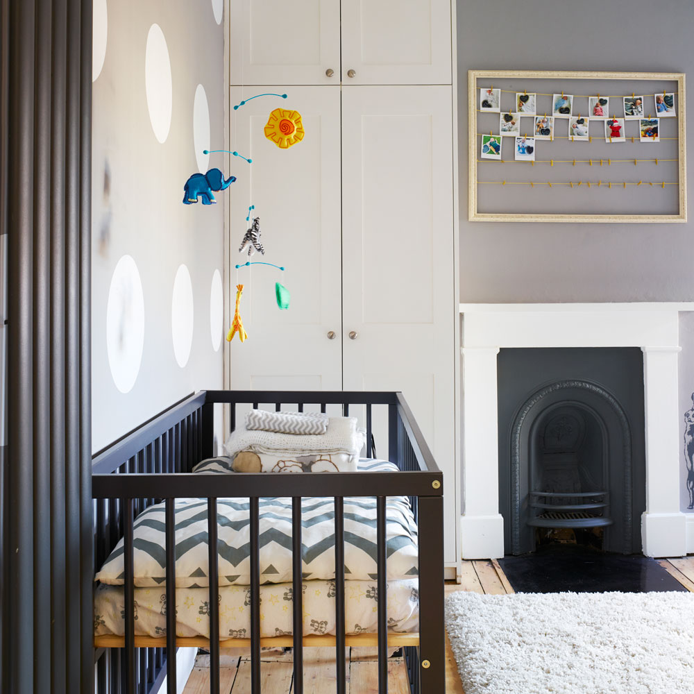
As well as having challenging narrow spaces to design, the owners had a nursery to plan too. 'We had to design the space to incorporate part of the staircase, which was built into the room. The previous owners had built a double bed base, but that didn't work for us,' they say. 'We had to carefully remove the bed without disturbing the staircase and then think about how to convert it into something useful.' In the end they boxed it in and made a changing table for their baby that could be converted into cupboards at a later date. Alcoves have been used once again to streamline the storage in this space.
Similar cot
Similar rug
10/10 Attic bedroom
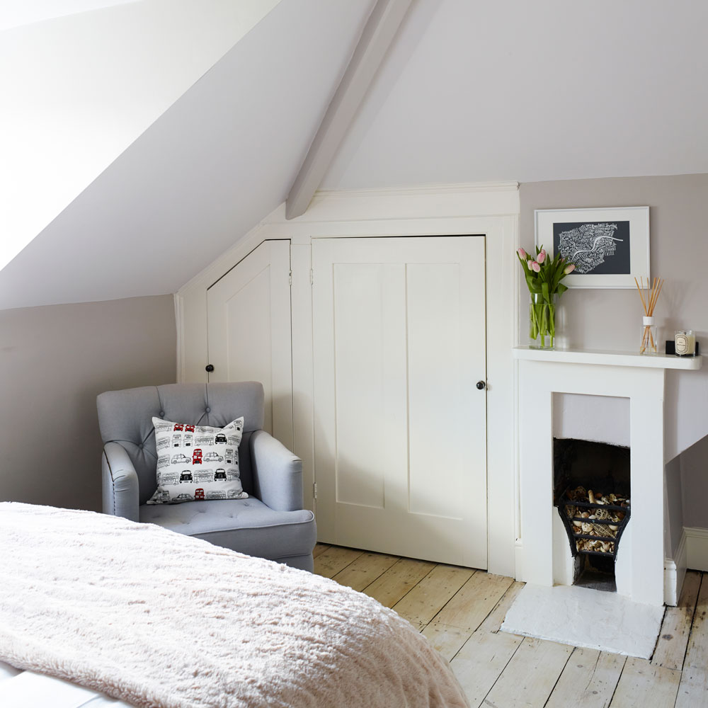
Thoughtful design has been applied throughout the house, extending right up into to the guest bedroom in the converted attic which features earthy tones and rustic touches, to make it extra homely.
Using a fixed colour palette throughout this house has worked extremely well for the owners. 'The great thing about is is, if I ever get bored with the look it's simple and inexpensive to reinvent it or update it with some brand-new accessories. Hiring a designer made the whole process fun and stress-free.'

Heather Young has been Ideal Home’s Editor since late 2020, and Editor-In-Chief since 2023. She is an interiors journalist and editor who’s been working for some of the UK’s leading interiors magazines for over 20 years, both in-house and as a freelancer.
-
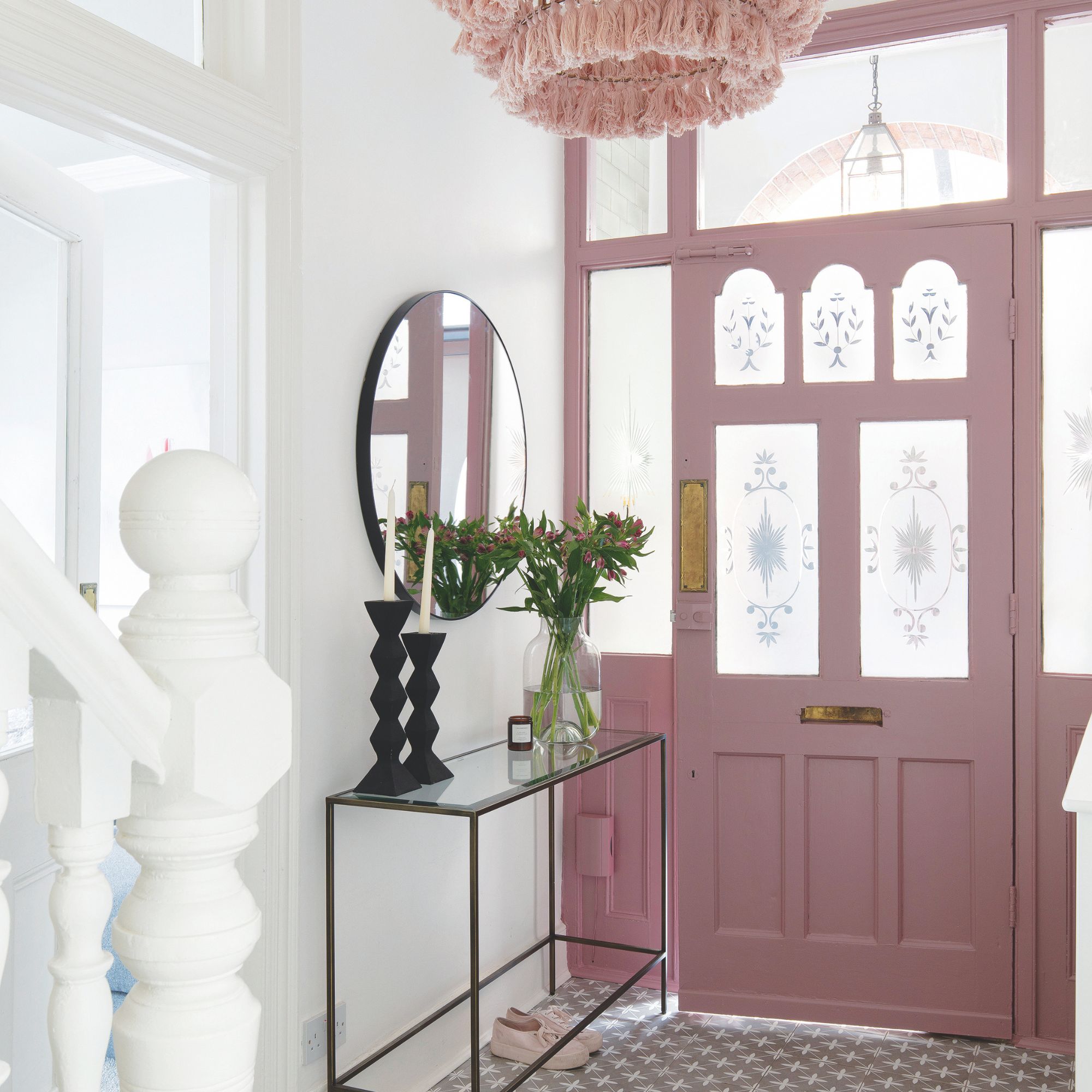 Should your front door colour match your hallway? Interior experts reveal 3 reasons why it should (and 3 reasons it shouldn't)
Are you team matching or contrasting?
By Ellis Cochrane
-
 This £200 limited-time discount makes this Dyson vacuum cheaper than I’ve ever seen it - run don’t walk to Argos for this bargain
It's the most affordable Dyson on the market right now
By Lauren Bradbury
-
 Martin and Shirlie Kemp’s pastel flower beds has given their Victorian renovation a romantic look - how you can get the look
Their pastel garden is the cottage garden inspo you've been looking for
By Kezia Reynolds