Take a look at this modernised Victorian terraced house in London
Gutting and renovating a house was more that worth it in this London home. It's gone from dark and dingy to bright and beautiful in just five months.
The owners of this Victorian terrace were eager to take on a project as an affordable solution for living in their preferred area of London. The house they chose was very dated and dark with lots of garish wallpaper, mismatched carpets and black painted wood, not to mention a wood panelled ceiling in the kitchen. It urgently needed to be brought into the 21st century.
However, they definitely weren't prepared for how challenging the renovation would actually be! From ripping out walls and bringing down the ceilings to adding a new extension at the back and creating a utility area, all they actually kept of the original house is the exterior shell.
1/9 Victorian Terrace with black front door
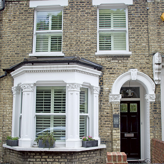
But now, after just five months of hard graft and a super builder, the family reside in their idea of a perfect family home. It's now light, bright, contemporary and comfortable - a very happy space to be in.
2/9 Hallway
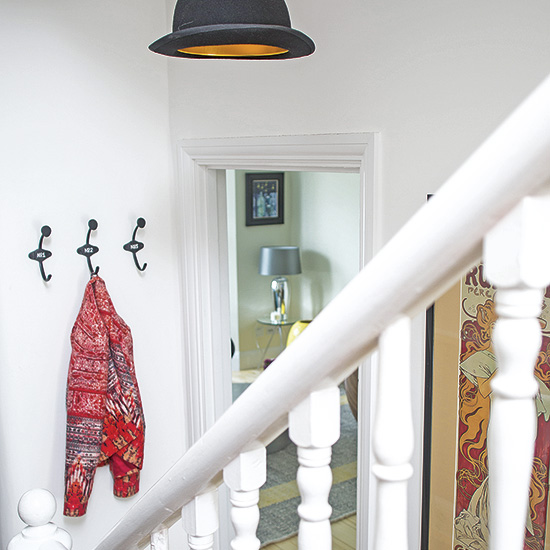
By living on friends sofas and spending a small fortune on storage, the couple were able to renovate the whole house all at once. Once the renovations were complete they got to work on decor and choose a neutral colour scheme for all walls and woodwork. Fresh white keeps the entrance hall light and airy and the rooms are then made interesting and unique with accessories and beloved artwork. "Quirky touches add personality to the hall and landing areas" explains the owner.
Pendant light
Nuastyle
Similar Art Nouveau poster
Art.co.uk
3/9 Living room
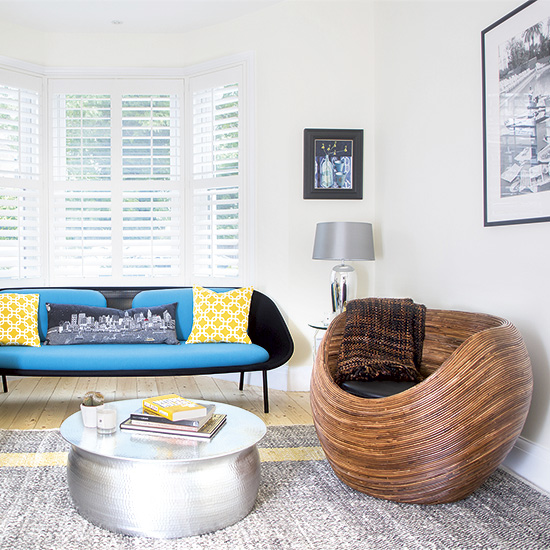
Walls and ceilings were pulled up and the whole property was re-plastered and re-plumbed. All the windows were replaced, including this beautiful bay in the the living room. Jaunty colours on the modern and stylish furniture transforms and the brightens the studio style space.
Similar sofa
Made.com
Similar coffee table
Graham and Green
Get the Ideal Home Newsletter
Sign up to our newsletter for style and decor inspiration, house makeovers, project advice and more.
4/9 Kitchen diner
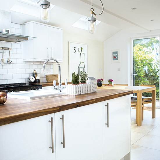
The owners immediately extended into the side return to open up the kitchen and create a utility room and downstairs loo in the back part of the double reception room. "It's a space I can't imagine living without now," says the owner. Skylights and bi-fold doors flood this space with natural light while a large and practical kitchen island separates the zones makes this a multifunctional room perfect for modern living.
Similar tiles
Topps Tiles
Similar Units
Ikea
Similar Pendant lights
Clippings
5/9 Kitchen
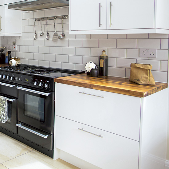
White units, metro style tiles and industrial lighting ensures the kitchen diner is modern, fresh and stylish. Warm wooden worktops are rich in colour and keep the room from becoming stark. A super sized black range cooker adds a professional chef style finish.
Similar tiles
Topps Tiles
Similar range cooker
ao.com
6/9 Dining room
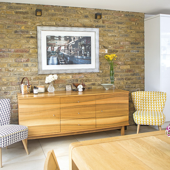
The family love spending time together in their new open plan kitchen diner. "It's a great, multipurpose room that looks out onto our garden- our own oasis in a busy, noisy city." Most of the accessories are from Habitat as well as online shops such as Graham and Green and Cox and Cox. The exposed brick wall teamed with the mid-century style furniture adds an industrial touch.
Table and chairs
Habitat
Similar upholstered chairs
Made.com
7/9 Master bedroom
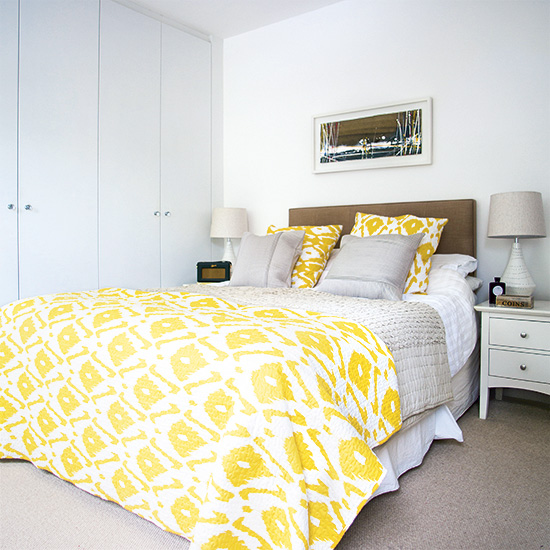
The white backdrop theme is continued upstairs in the owners bedroom. Integrated wardrobes streamline the room while pops of yellow perk up additional yellow tones. A neutral carpet keeps the room warm and homely.
Bedside tables
Ikea
Similar Ikat bedding
Amazon
8/9 Guest bedroom
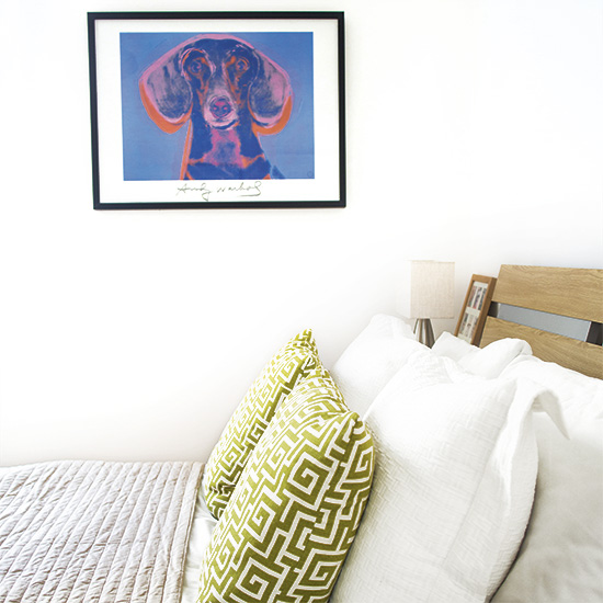
Simple wooden furniture works beautifully against the pale walls in the guest bedroom and vibrant art work pops out. "I love art and adding colour and pattern via prints" explains the owner. "The artwork and photographs all have meaning for us and we've spent a lot of time choosing pieces that hold significance - I like to think it's what makes our house different."
Similar bed
Habitat
Black frame
Ikea
Similar grey quilt
The White Company
9/9 Bathroom
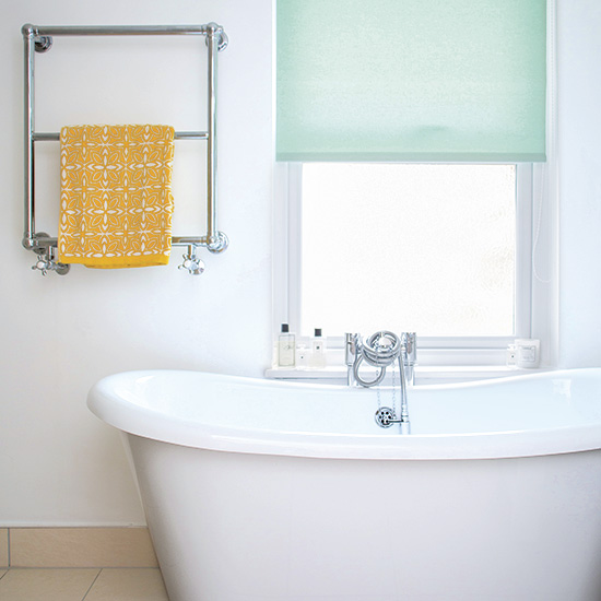
A soothing combination of white and neutral tones turns the bathroom into a stylish sanctuary complete with luxurious roll-top bath. A simple aqua roller blind keeps the look smart while a pop of yellow continues the decorating theme coherent to the rest of the house.
Rachel Homer has been in the interiors publishing industry for over 15 years. Starting as a Style Assistant on Inspirations Magazine, she has since worked for some of the UK’s leading interiors magazines and websites. After starting a family, she moved from being a content editor at Idealhome.co.uk to be a digital freelancer and hasn’t looked back.
-
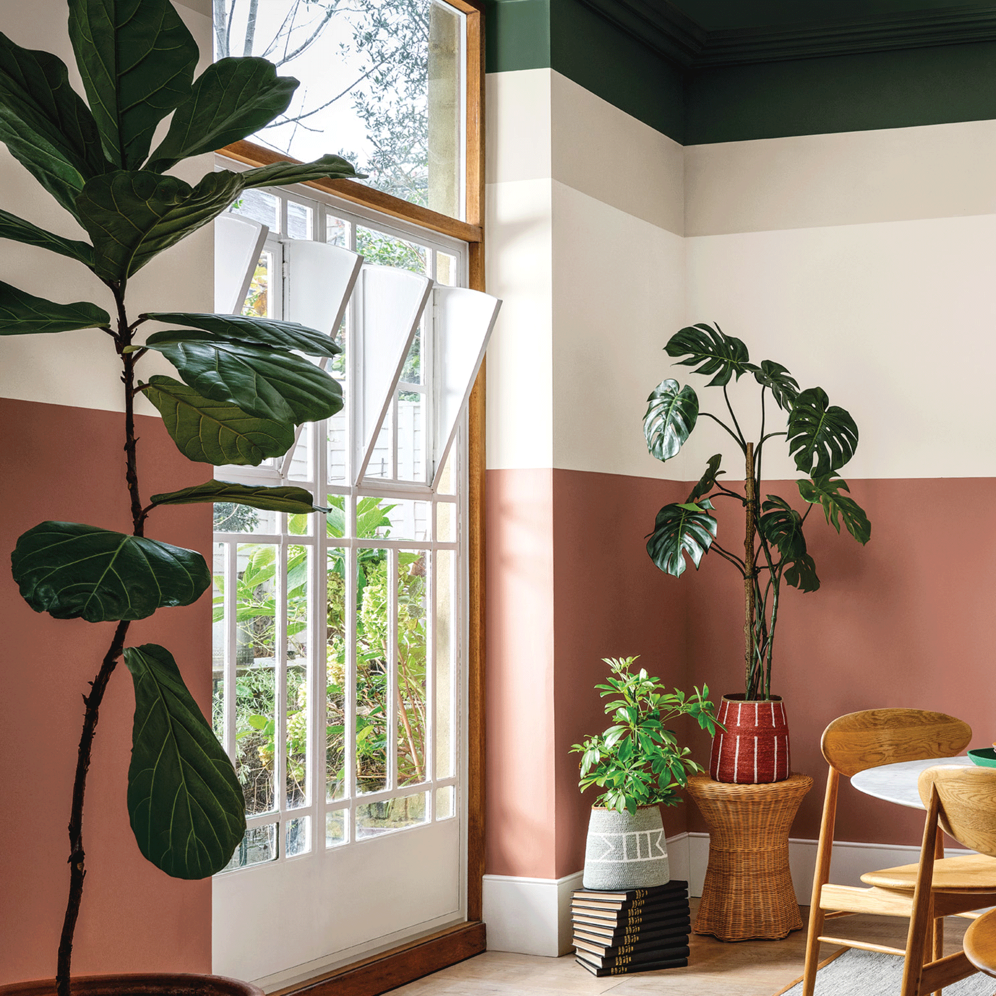 Crown Paint has launched new wall colours for the first time in three years, and changed how I think about neutral shades
Is terracotta the ultimate neutral?
By Rebecca Knight
-
 How to protect seedlings from birds – experts say there's a kind and clever way to stop them pecking
Yes, you can protect seedlings from birds without harming your feathered friends...
By Kayleigh Dray
-
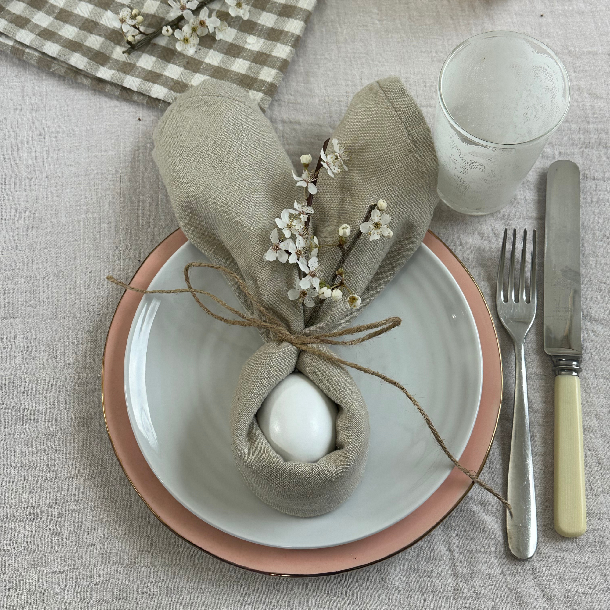 We tried the viral napkin bunny ears hack – it only takes five minutes and will take your Easter table to the next level
This Easter craft is not only beautiful, but really easy to do
By Kezia Reynolds