Take a tour of this West London new-build
The owner, who runs a care-home business, bought his five-bedroom, new-build property in 2007. His busy job meant he didn't have lots of time to decorate so he enlisted the help of an interior design company to furnish and style the house. They included lots of abstract artwork and magnolia for a sleek and minimal look.
The owner, who runs a care-home business, bought his five-bedroom, new-build property in 2007. His busy job meant he didn't have lots of time to decorate so he enlisted the help of an interior design company to furnish and style the house. They included lots of abstract artwork and magnolia for a sleek and minimal look.
A year later the owner met his wife, a bank manager, and they lived with the existing decor for four years until it started to look a little tired. 'As we had also started a family, it felt like the right time for a change,' say the owners. 'We couldn't wait to redecorate and put our own stamp on the place to suit us and our new family.' They now share their home with their three children.
The priority was to create smart spaces where the owners could relax and unwind, but these also needed to be child-friendly and practical. The most successful room transformations were the kitchen-diner and the living room, which is now used on a daily basis (previously the owners had to watch TV in the children's play room).
Exterior
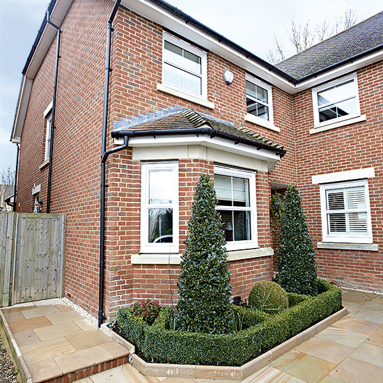
Each room is now warm and welcoming with a mixture of sophisticated tones in the grown-up spaces and bursts of colour in the children's rooms.
Hallway
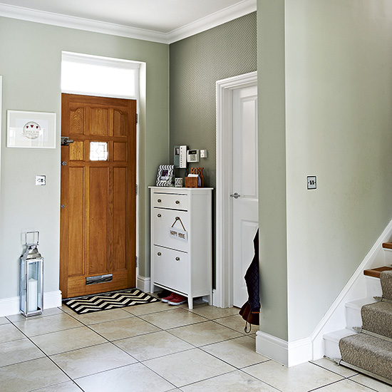
A slim storage unit keeps shoes hidden away and fits neatly behind the door in the smart hallway, while coat hooks are tucked away behind the staircase. The owners have used this space as a handy perch for post and added a decorative touch with picture frames. Country green paint and wallpaper create a welcoming feel in the open-plan space.
Storage unit
Ikea
Living room
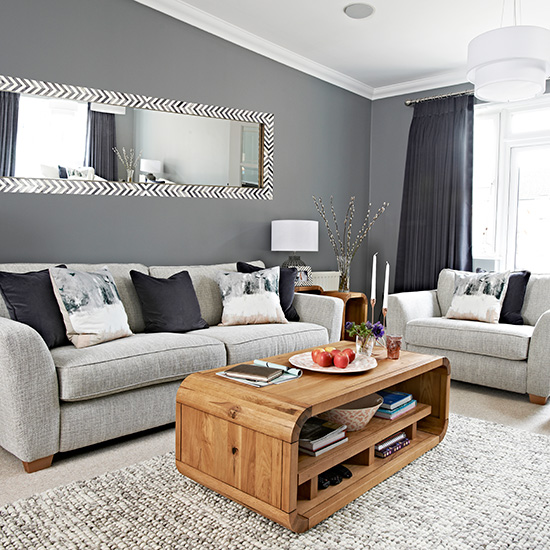
Dark grey walls and luxurious curtains create a cosy cocoon of a living room. The owners replaced an uncomfortable low sofa with a sumptuous grey design and chose warm wood funriture with rounded edges - the best option with young children around. 'We were eager to create a glam, sophisticated feel in the living room so we could start enjoying it as a family and also have it as a space that we could relax in after the children had gone to bed.'
Get the Ideal Home Newsletter
Sign up to our newsletter for style and decor inspiration, house makeovers, project advice and more.
Sofa and armchair
DFS
Plummett grey paint
Farrow & Ball
Kitchen dining area
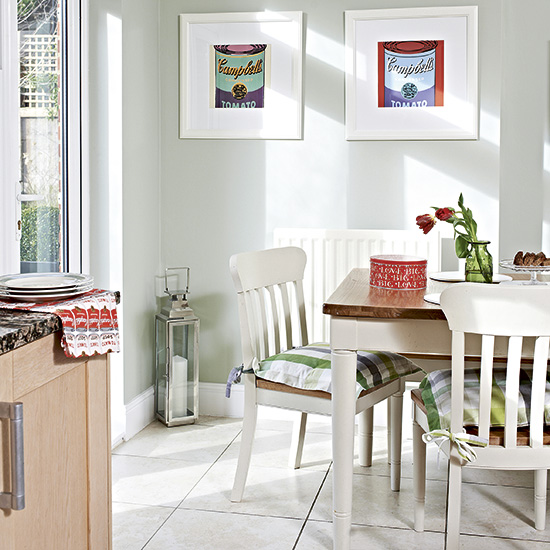
In the kitchen-dining area the owners replaced a black glass dining table with a more practical child-friendly wooden one and added comfy check seat pads to the chairs to soften the look. The white painted dining suite helps to counterbalance the plain wood kitchen cabinets, making the dining area a distinctive zone. 'The Campbell's soup prints add a splash of colour and give the kitchen a laid-back vibe.'
Table and chairs
John Lewis
Main bedroom
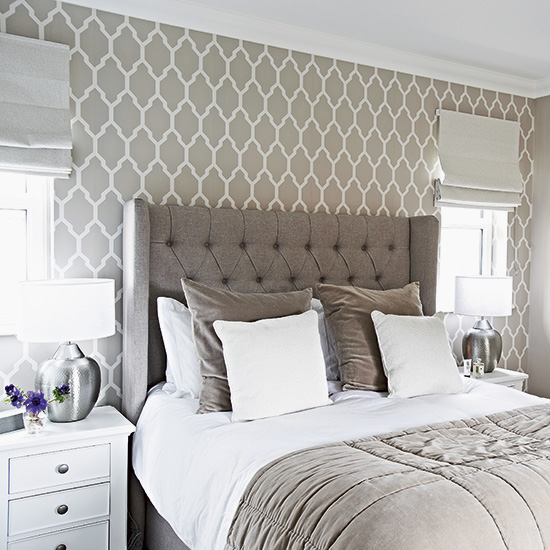
The main bedroom originally had a very low bed with very little storage and it was swapped for this luxurious version with its impressive upholstered and buttoned headboard. A trellis-design wallpaper lines the wall behind the bed, which has been placed centrally between the two windows. Pewter-finish lamp bases add an understated feel. The warm grey and white colour palette is naturally restful.
Wallpaper
Farrow & Ball
Bed
Feather & Black
Main bedroom storage
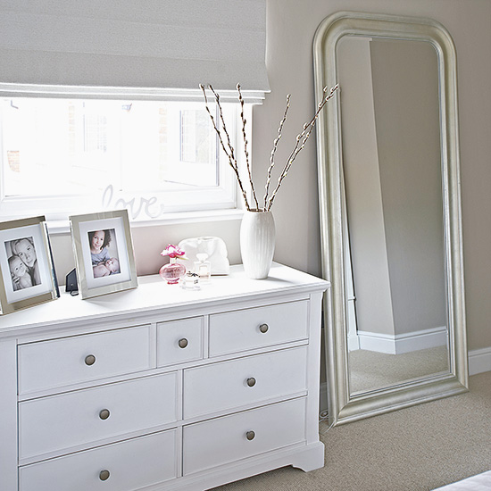
The bedroom colour scheme is instrumental in creating a calm and restful feel. Gentle neutrals on walls, flooring and soft furnishings are broken up with lighter storage. A chest of drawers placed under the window gives the impression of an extended sill, perfect for displaying family photographs. 'White furniture and minimal clutter keep our bedroom feeling light and airy,' say the owners. 'We love to retreat here at the end of the day.'
Similar chest of drawers
New England Lifestyle
Similar mirror
The French Bedroom Company
Child's bedroom
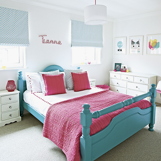
While the family spaces tend to be neutral in this home, the children's rooms are more colourful. 'I wasn't sure about mixing blue with pink in this room at first,' says the owner, 'but I love it now.' The two colours bring fun and gusto to the white backdrop and appear in all sorts of unexpected places, such as on a lantern, wastepaper basket and photo frame. Think about painting a pine bed an unusual colour for a fun, bright and personal solution.
Blind fabric
Clarke & Clarke
Similar bed (unpainted)
The Cotswold Co
Child's bedroom storage
Bathroom
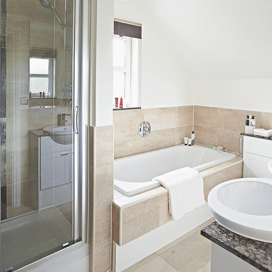
The bathroom is the perfect compact space and includes a shower that has been built into a false wall behind the bath. Large-format tiles in muted neutral shades line the shower, floor and splashback, while double basins have been housed in smart built-in, granite-topped vanity units that supply ample storage for the whole family. Keeping walls above dado height plain and white has helped to lighten up the space.
-
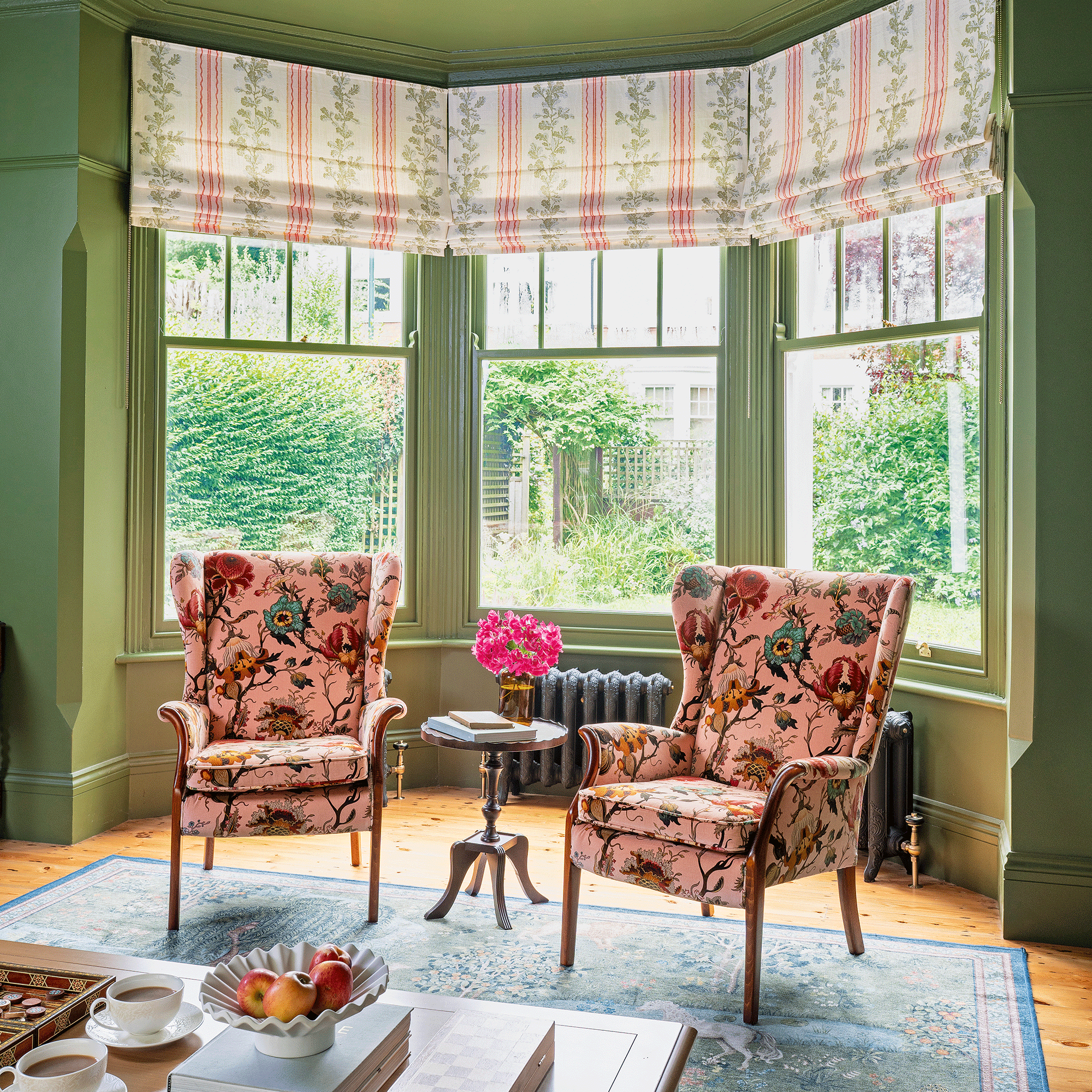 A strict colour palette and vintage finds have turned this semi-detached Edwardian house into an elegant family home
Sticking to a three-colour palette of green, pink and yellow and mixing in plenty of vintage furniture and art has created an authentic period feel
By Stephanie Smith
-
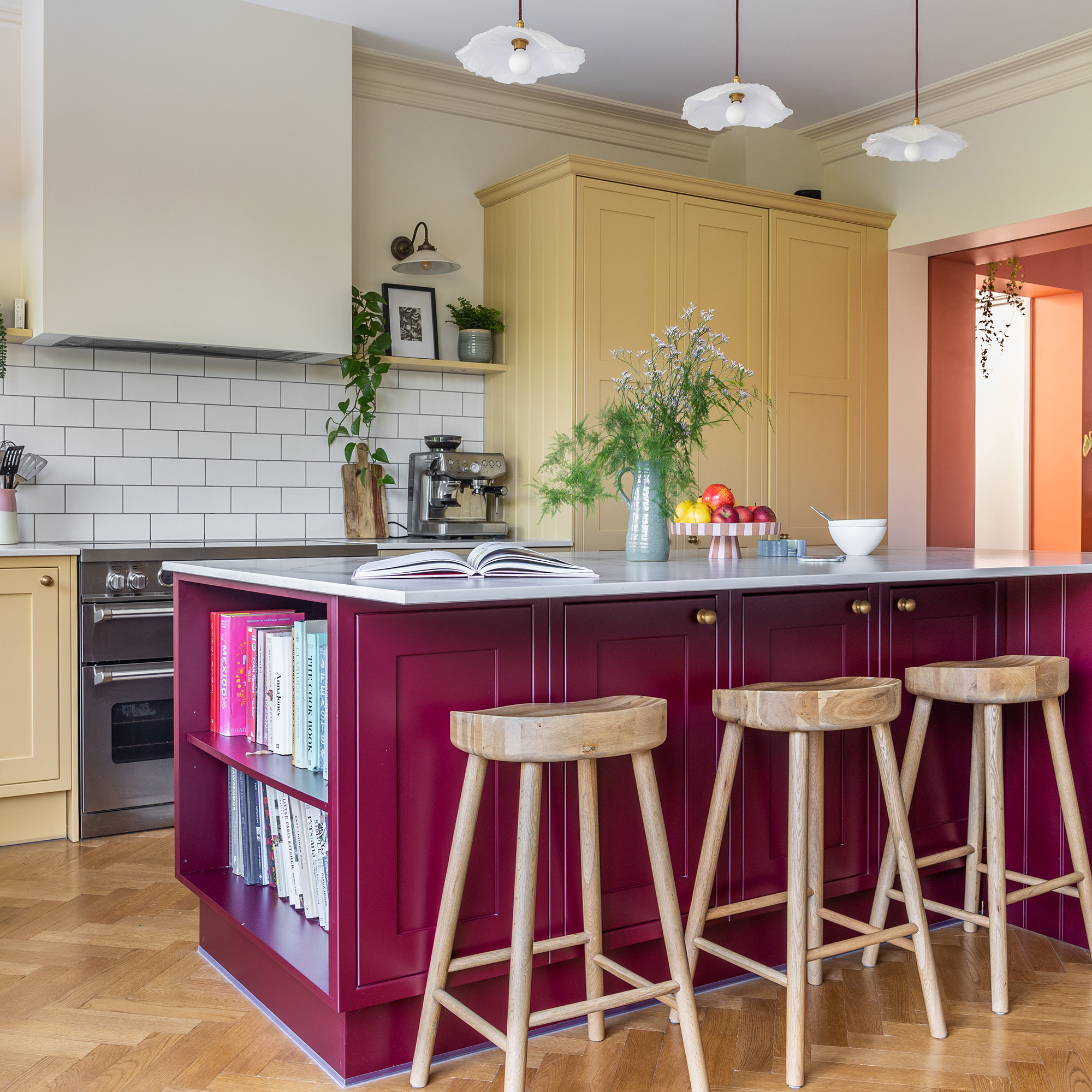 A top-to-bottom renovation has turned this Edwardian house into a lovely family home
With a few considered structural changes, this period house has been turned into a family home and has created a sanctuary for years to come
By Maxine Brady
-
 How to heat a conservatory
7 practical options to consider for year-round comfort
By Amy Reeves