Take a tour around an impressive riverside apartment in London
Stylish furnishings, statement art and views of the Thames give this spectacular series of rooms the feel of a luxury hotel
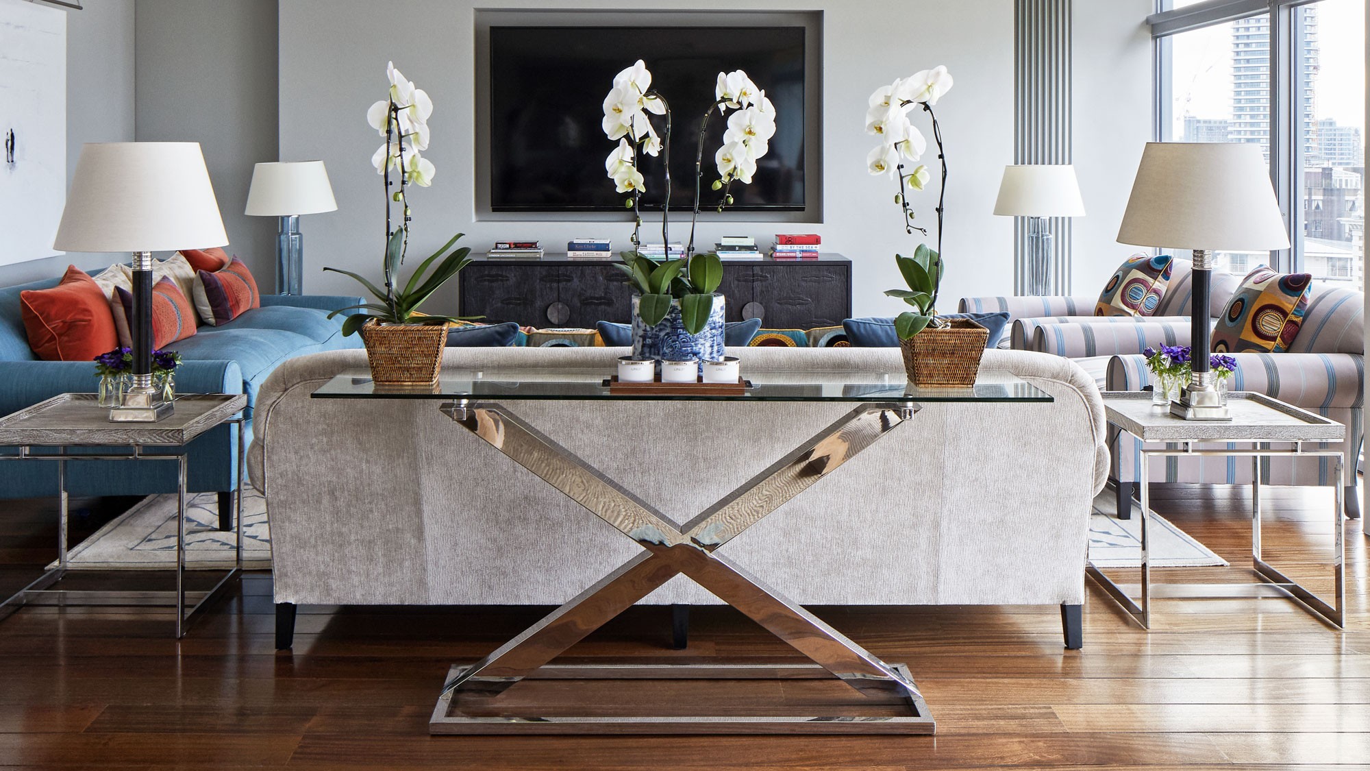

The ideal Thameside apartment should have unobstructed views, an excellent concierge service and a decent-sized terrace. The owner, when searching for a new home, found all of this in London's Battersea. The situation is made better by the fact the building, designed by architect Richard Rogers, is not densely packed with apartments, meaning the rooms offer plenty of space to breathe and allow for a free hand when decorating, which was done by interior designers Jane Churchill.
I have often joked that many of the London homes I viewed fell within my price range, in the areas I prefer, were like ladders with rooms coming off at each rung. I felt as if I would be missing out on a lot of house, while with an apartment on one floor, you really do feel as if you're using all of the space, all of the time. This place offers the whole package - the concierge staff are wonderful - so that for me, it's like having a taste of America in London.
Entrance hall
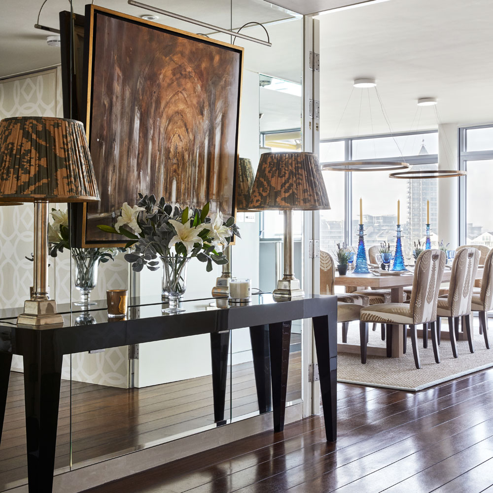
The mirrored wall adds a note of glamour and enhances this light-filled space, while an earthy-hued artwork helps to anchor the scheme and provides a warmer detail.
Get the look
Buy now: Table lamp, Nosuch table lamps, Oka
Living area
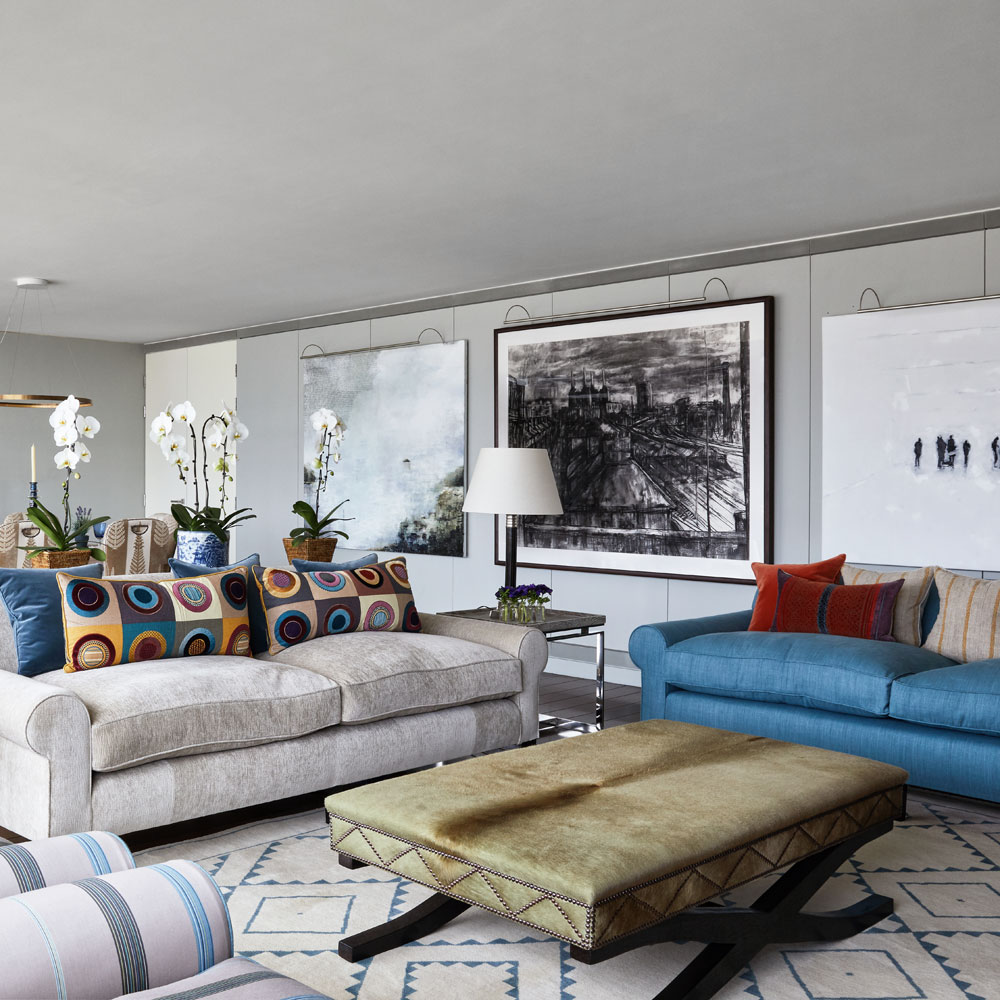
The designer was asked to make the apartment feel like the most comfortable hotel suite. While the owner had no requests for a particular colour palette or furnishings, she did give great consideration to the fact that he is six foot eight inches tall and made adjustments to furnishings to suit this: the breakfast bar is set six inches higher than standard, and the bespoke sofas have been made deeper to accommodate longer legs. Here a simple palette of pale greys and soft blues, inspired by the changing colours of the river, blends the seating area with the rest of the room.
Get the look
Buy now: Interior design, Jane Churchill Interiors
Dining area
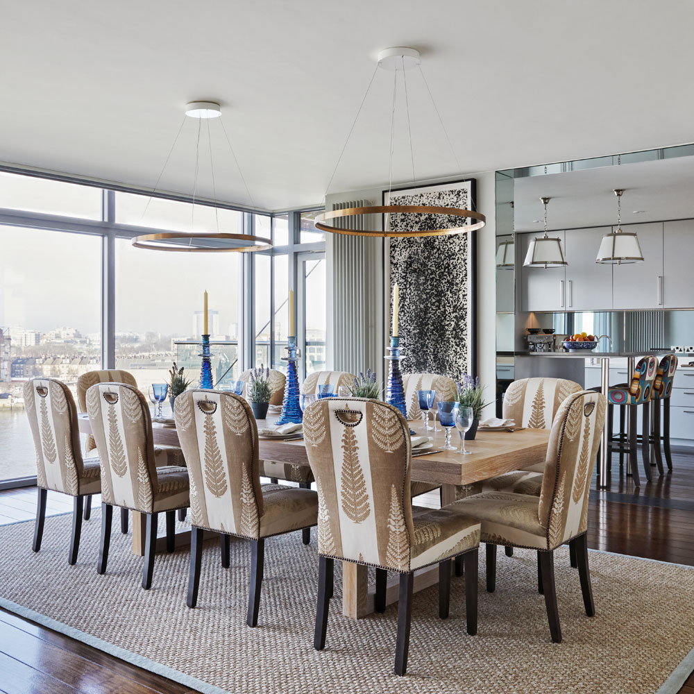
An oversized table, which overlooks the River Thames, is able to accommodate large parties, guests and family members. 'I thought that these tall candlesticks were masculine enough for the apartment', says the designer.
Get the Ideal Home Newsletter
Sign up to our newsletter for style and decor inspiration, house makeovers, project advice and more.
Get the look
Buy now: Candlesticks, Strata candlesticks in Midnight, William Yeoward
Kitchen
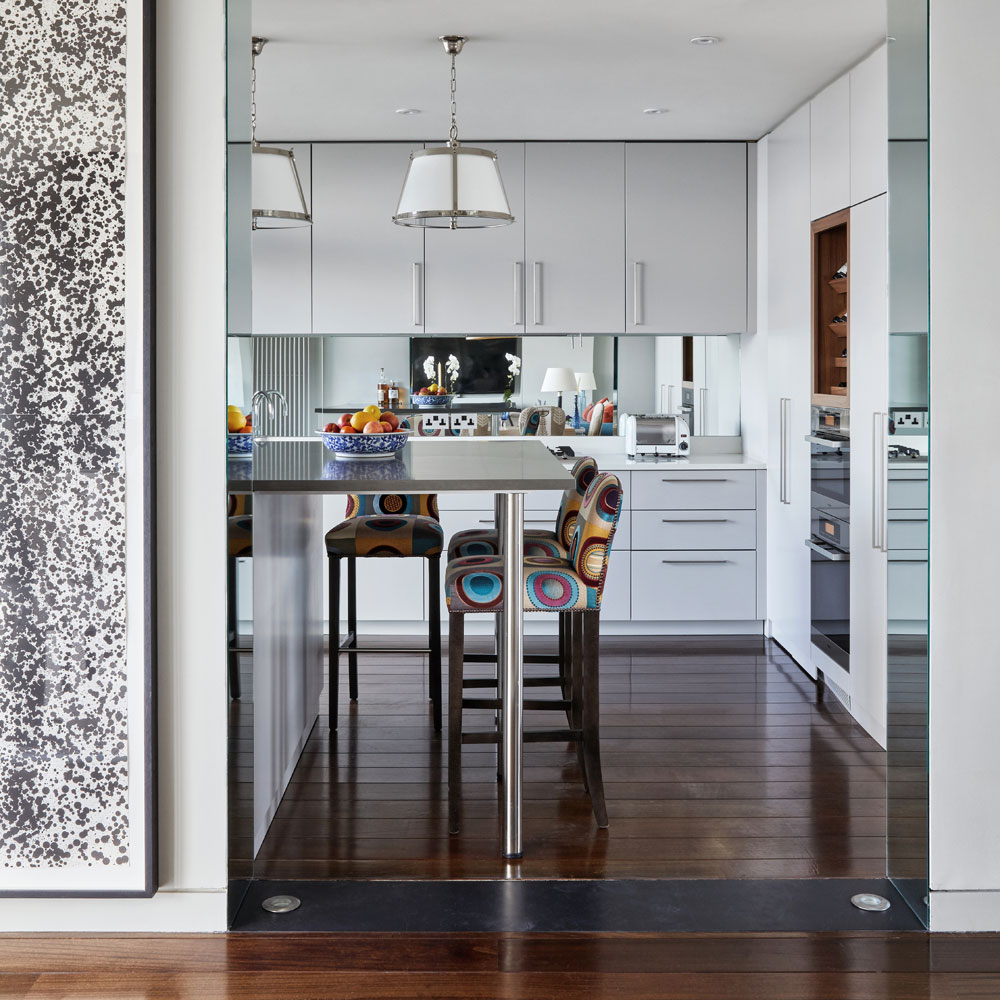
The designer lined the vertical edge of the newly opened up wall with mirror glass to help blur the boundary between the kitchen and dining area. 'It also emphasises the lovely effect made by the uplights in the floor in the evenings.'
Get the look
Buy now: Pendant lights, Bespoke Belluno pendant lights, Vaughan
Dressing room
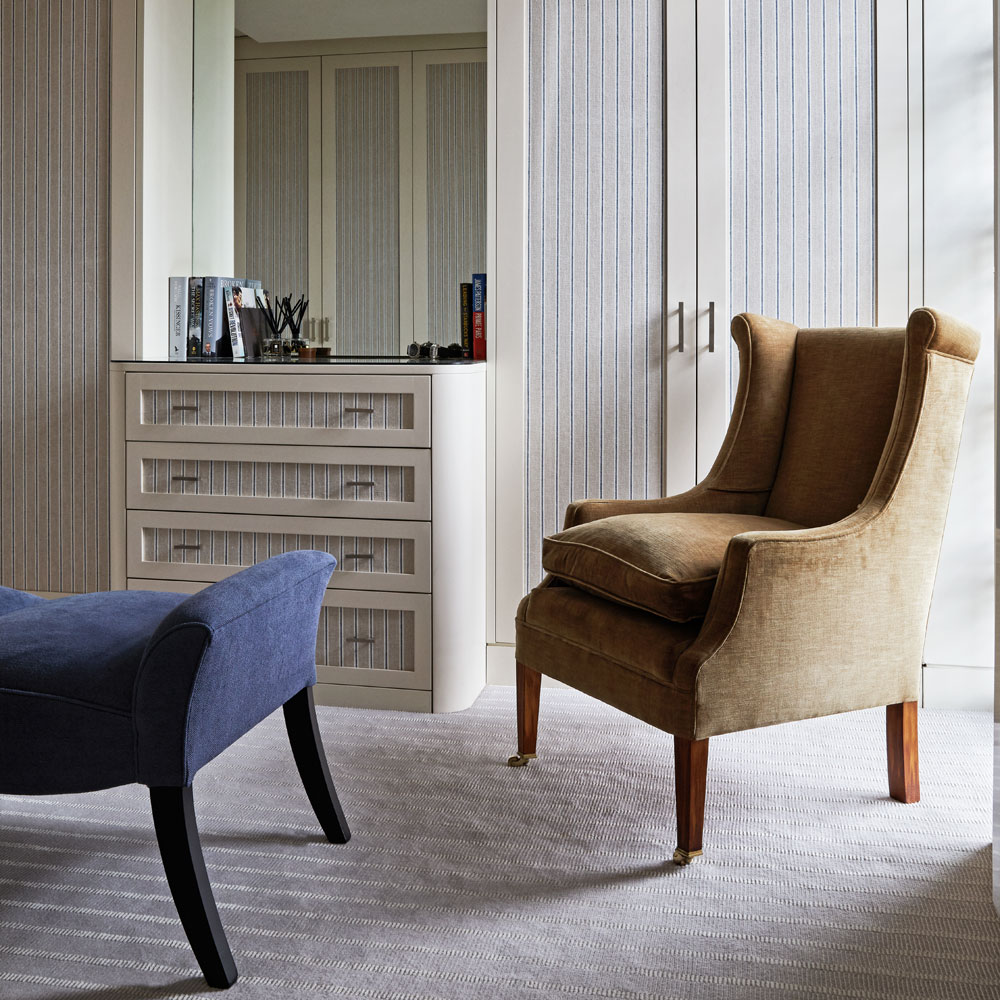
The elegant, tailored look of the bedroom is continued in this space, with built-in cupboards on all three walls, the door panels of which are lined with striped fabric.
Get the look
Buy now: Cupboard panels, Finlandia in Denim, Altfield
Guest bedroom
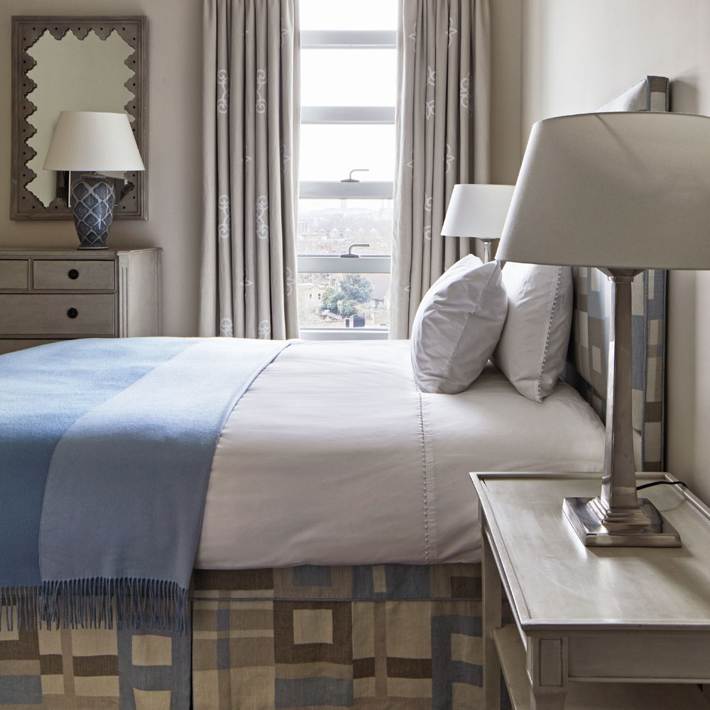
In this comfortable and inviting scheme, ornamentation has been kept to a minimum so guests feel that it is their space during their stay. Plenty of storage options have been carefully and rather cleverly incorporated into the bedroom and beyond. 'I regard myself as allergic to bric-a-brac; I make an effort to keep clutter down to the degree where anyone could come to stay and not feel as if they were intruding on my private life.' The owner's wish was to have a wonderful suite of rooms worthy of a smart London hotel.
Get the look
Buy now: Headboard and valance, Blocking in Stone, GP&J Baker
Bathroom
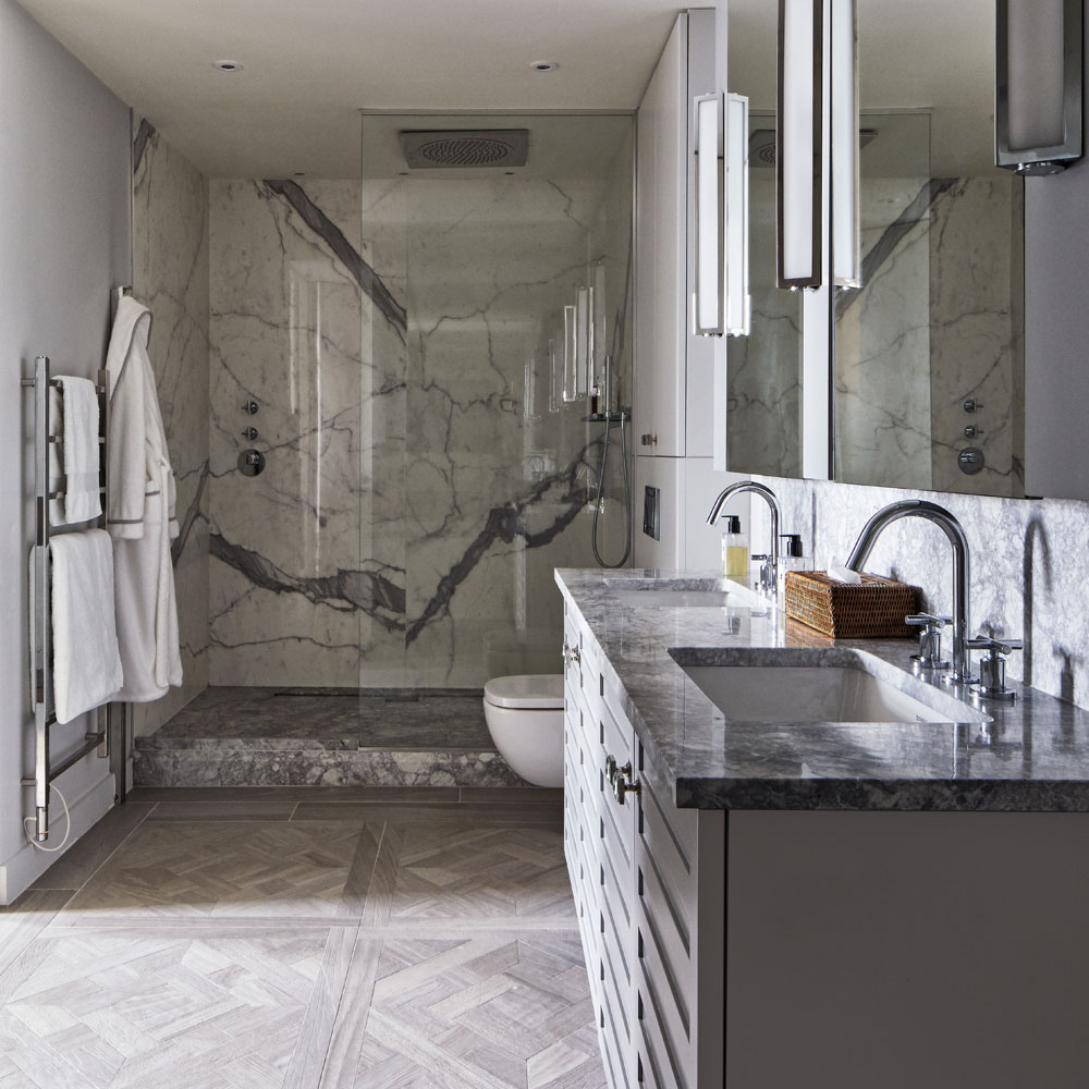
The combination of strikingly veined marble, wood-effect parquet pattern floor tiles and a vanity unit made to suit the owner's height fulfil the brief for hotel-style luxury. The original layout included three bedrooms and three bathrooms, but the designer decided to join two of the bathrooms together to make a room large enough to fit the expansive bath and shower. 'We also made one of the three bedrooms into a dressing room. This was a point of debate for the owner as he was reluctant to lose the third bedroom, but I convinced him that to be really comfortable, he had to have a dressing room.'
Get the look
Buy now: Wall lights, Wilton bathroom lights, John Cullen
Buy now: Tiles, Cavendish parquet porcelain tiles, Capital Designer Studio
Main bedroom
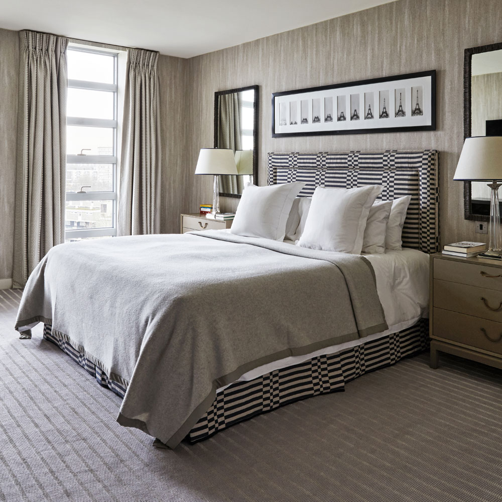
The set of photographs above the bed record the construction of the Eiffel Tower over a period of two years, two months and five days. There was a debate about which carpet to have in this room, with the designer persuaded the owner to opt for a gentle stripe for added interest, despite his preference for plain.
Get the look
Buy now: Headboard fabric, Check Stripe in Navy, George Spencer
Buy now: Wallpaper, Les Mineraux Opale wallpaper, Arte
'A key part of London's personality is the River Thames and, although I'd lived in the city for 20 years, I'd never lived within sight of it. The building sits rather majestically at an angle to the water and the apartment and the terrace have a sweeping view down a busy stretch towards Fulham and Chelsea. In summer, while the rest of London swelters, the terrace catches the river's cooling breezes, so it gets a lot of use all year round.'

Heather Young has been Ideal Home’s Editor since late 2020, and Editor-In-Chief since 2023. She is an interiors journalist and editor who’s been working for some of the UK’s leading interiors magazines for over 20 years, both in-house and as a freelancer.
-
 I tried out this neat little dehumidifier for a month – it dried my laundry in half the time
The 20L SmartAir Dry Zone dehumidifier tackled my laundry drying woes head on
By Jenny McFarlane
-
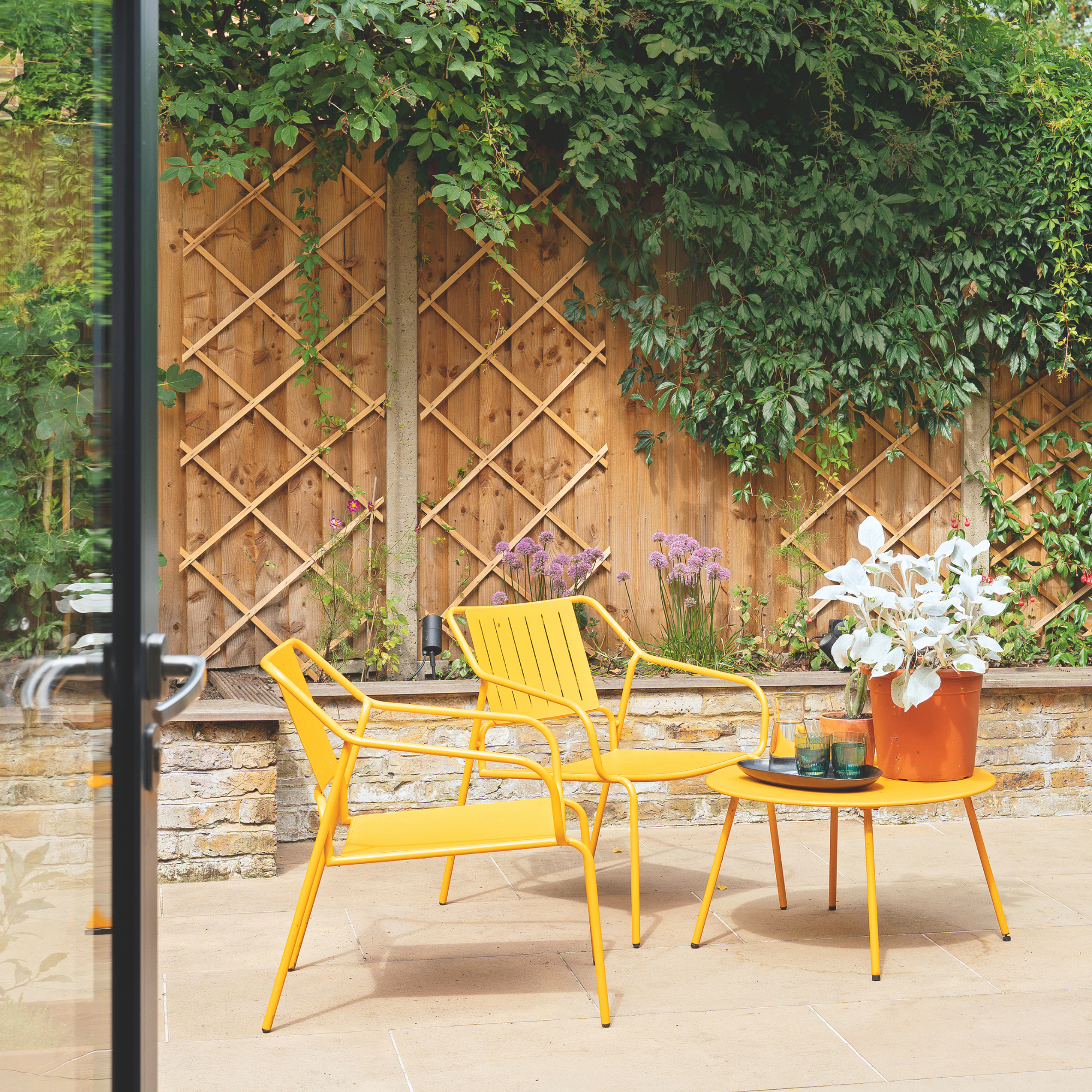 I’m seeing pastel garden furniture at all my favourite brands this spring, but QVC’s sorbet collection impressed me the most
Fresh pastel shades are a great way to liven up your outdoor space
By Kezia Reynolds
-
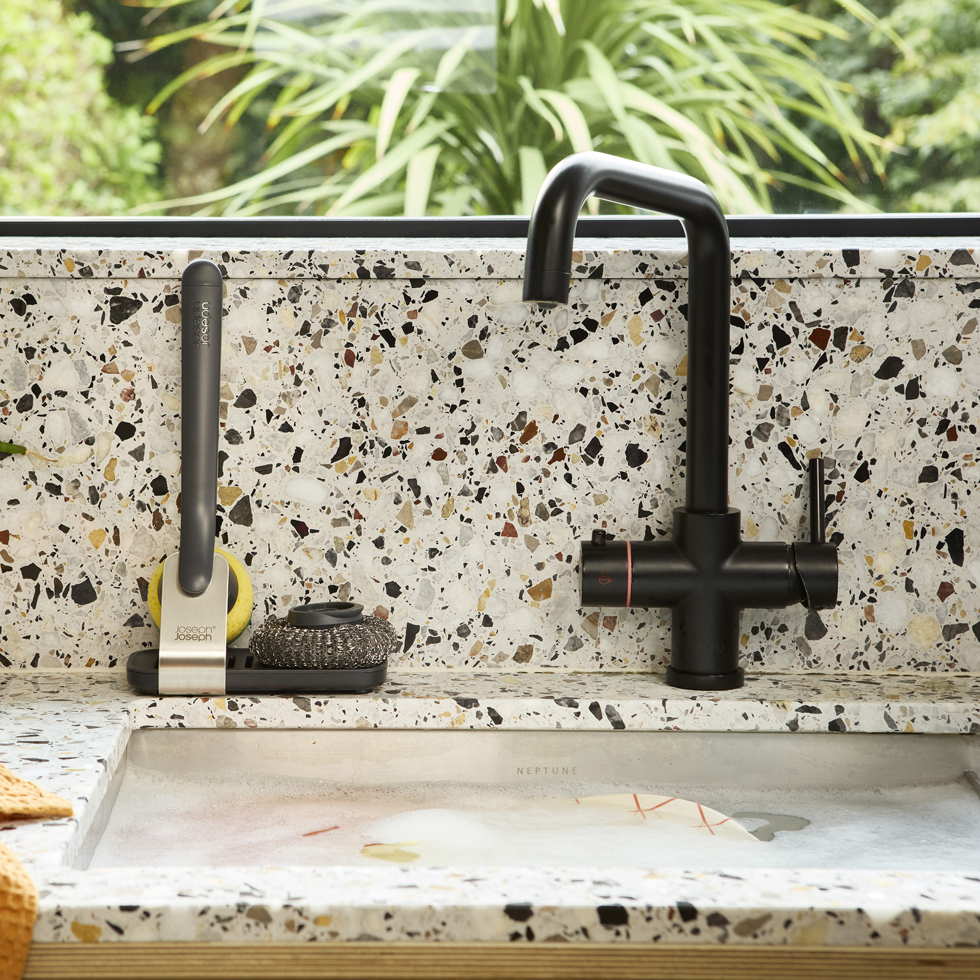 Don't tell my flatmates, but Joseph Joseph's clever new sink range finally made me enjoy washing up
I didn't know stylish washing up accessories existed until I saw this collection
By Holly Cockburn