Tour this terraced London home: transformed by a clever extension
See how this period home became the essence of modern-Victorian with thoughtful building and smart storage
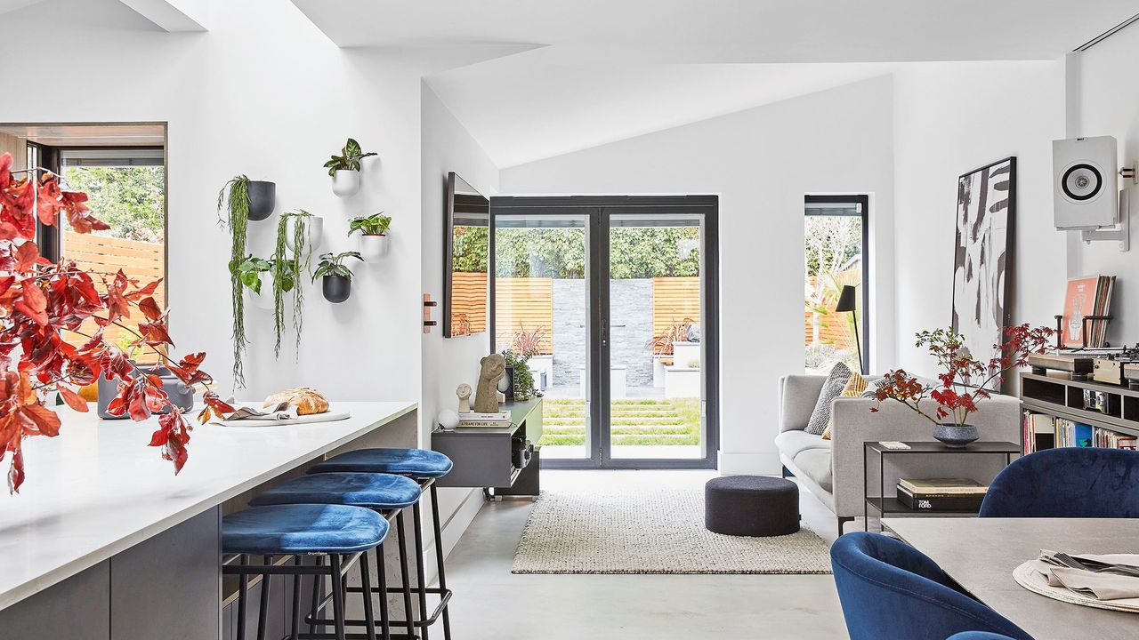

When the eventual owners found this three bed end-of-terrace house in an attractive part of east London after months of looking, not even the prospect of a significant overhaul put them off.
They were attracted by the property’s mid-Victorian proportions, generous garden and the tranquillity of the street. The owners also knew they could turn it into a contemporary haven, while still respecting its 1860s roots.
The extension
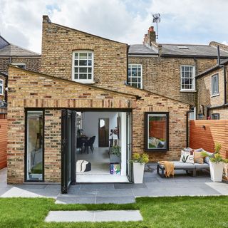
‘We looked at about 20 houses before this one, across north and east London, but none felt inspiring,' say the owners. 'This was wider than average, on a quiet street yet right in the heart of Dalston, with its urban buzz. It had plenty of potential: we liked the split levels on the first floor, and the original features in the living room.'
'But we wanted to reimagine the ground floor. Eight One Two Architects came on board early on; our brief was to create a contemporary rear space where we could entertain and connect with the garden. We wanted to retain the Victorian features of the front living room and the main bedroom, update the bathroom and find space for a utility. Ultimately, we wanted to create a ‘modern-Victorian’ home.'
The living room
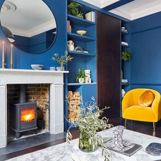
In the renovations, the dividing wall between the original living and dining rooms was removed. They reconfigured the space to enlarge the proportions of the living room.
Here, the fireplace was refurbished for cosy evenings,
The living room storage
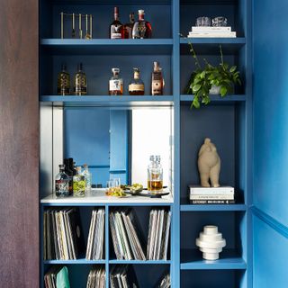
Adding a sliding door enables sleek concealed storage or full display, depending on the mood. Extra storage and a drinks bar can be concealed behind the dark wood panel.
Get the Ideal Home Newsletter
Sign up to our newsletter for style and decor inspiration, house makeovers, project advice and more.
The living room details
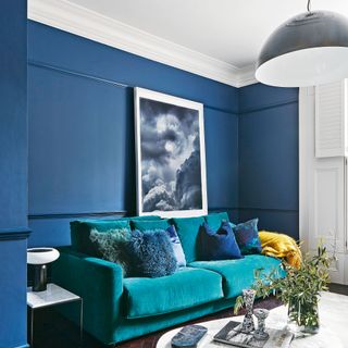
The couple added bespoke shutters, a dado and picture rail, plus an ornate ceiling rose, to elevate this space. A green sofa ideas and yellow accessories add a vital colour pop.
Adding a simple but bold silhouette like, with this pendant light, is an effective way to update a period scheme
The open-plan space
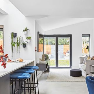
‘The space has transformed the way we live,' say the owners. 'The kitchen and snug are where we congregate with friends and cook. Then the living room, with its stove and dark-blue walls, is the place we hunker down in winter.'
The snug
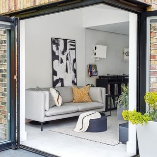
The rear was extended outwards and into the side return to accommodate an open-plan kitchen-diner and snug area, which has a bespoke DJ table and wall-mounted speakers.
This informal snug features a smart monochrome palette. ‘We wanted to retain a simple feel that didn’t compete with nature,’ say the owners.
Metal-framed bi-folds with a corner opening allow for maximum connection to the outdoors.
The kitchen-diner
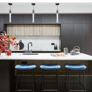
The building was extended to the side to incorporate a generous island with a sleek, contemporary finish that houses a fridge, sink, dishwasher, storage and bookshelf.
Thoughtful touches make the space sing. A quartz surface in Calacatta Gold by Planet Marble cascades over each side of the island for maximum impact. Interior design studio Kemsi also used black kitchen joinery with a light-wood finish on the inside of cupboards for a dramatic, contemporary feel.
Blue velvet bar stools add a vibrant pop, providing a visual link to the walls of the blue living room.
The cabinetry
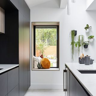
The new space incorporates a deep picture window, lined with the same wood used for the inset kitchen cabinetry. Framed in black metal, looking out to the garden, this creates a simple but strong statement.
It is complemented by the bi-fold corner door that opens fully to the outside from the snug, plus a narrow floor- length window by the sofa.
The bathroom
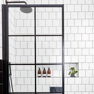
The bathroom was transformed with a black and white bathroom scheme and a new skylight. Details, such as the sleek handles from Buster and Punch, provided crucial finishing touches.
The guest bedroom
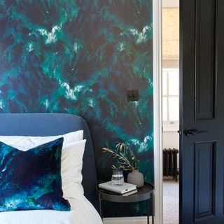
A modern marbled effect on the feature wall introduces drama to this scheme.
The master bedroom
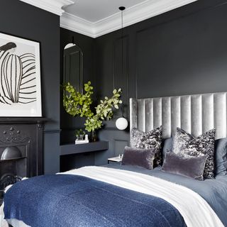
Kemsi designed simple bespoke floating dressing tables either side of the fireplace, which was sourced to complement the age of the building. Simple beading on the wall either side of the bed creates a panelled effect, adding depth to this moody space.
Additional words: Emma J Page

Thea Babington-Stitt is the Managing Editor for Ideal Home. Thea has been working across some of the UK’s leading interiors titles since 2016.
She started working on these magazines and websites after graduating from City University London with a Masters in Magazine Journalism. Before moving to Ideal Home, Thea was News and Features Editor at Homes & Gardens, LivingEtc and Country Homes & Interiors. In addition to her role at Ideal Home, Thea is studying for a diploma in interior design with The Interior Design Institute.
-
 The 5 best plants for a Japanese garden – key trees and flowers to help nail the style
We checked in with garden experts to curate a checklist
By Sophie King
-
 The Grecian bookshelf trend adds a luxury look to your reading corner, and it’s super easy to get the look at home
It couldn't be easier to get the look, too
By Kezia Reynolds
-
 Is your conservatory letting your house down? Here's how to modernise it
Get an instant upgrade
By Natasha Brinsmead