This Thirties home has been transformed with steel framed windows and stunning built in storage
Choosing steel framed windows with antique brass handles, and plenty of cool storage for this 1930s home turned out to be the starting point for a stunning interior design scheme.
When a Buckinghamshire couple spotted this property up for sale close to where they already lived, they could immediately see its potential. It had the space they wanted and was in the village they loved.
The property was in perfectly reasonable condition, but the décor was just not to their taste. They knew a new rear extension with steel-framed windows to the garden, and plenty of new built-in storage would for transform the space. 'We were very fortunate to be able to stay in our previous home for eight months while we gutted it. I’m not one to live in a house for a year and think about it, I just wanted to crack on!' says the owner.
'I am a real completer finisher and there were a few problems with the original house that I was determined to resolve. We employed a project manger to begin with who was excellent, just for the first few months, and helped us to find an architect and a builder. But once the project was under way things went pretty smoothly and we were able to take over the communication.
Exterior
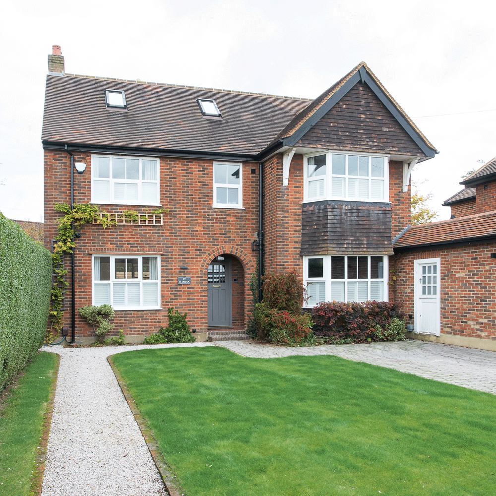
The couple fell in love with the front façade of the house and knew they could preserve that, while improving the interior and making some huge structural changes to the back of the property. 'I’m a self-confessed perfectionist and I had a vision; I knew exactly what I wanted, so why wait? My husband was very calm throughout the whole process but I have to admit I did get quite anxious at times. At one point there was no back or roof on the house. It did make me question what on earth we had done!'
See more of our real house tours to inspire your home
Kitchen
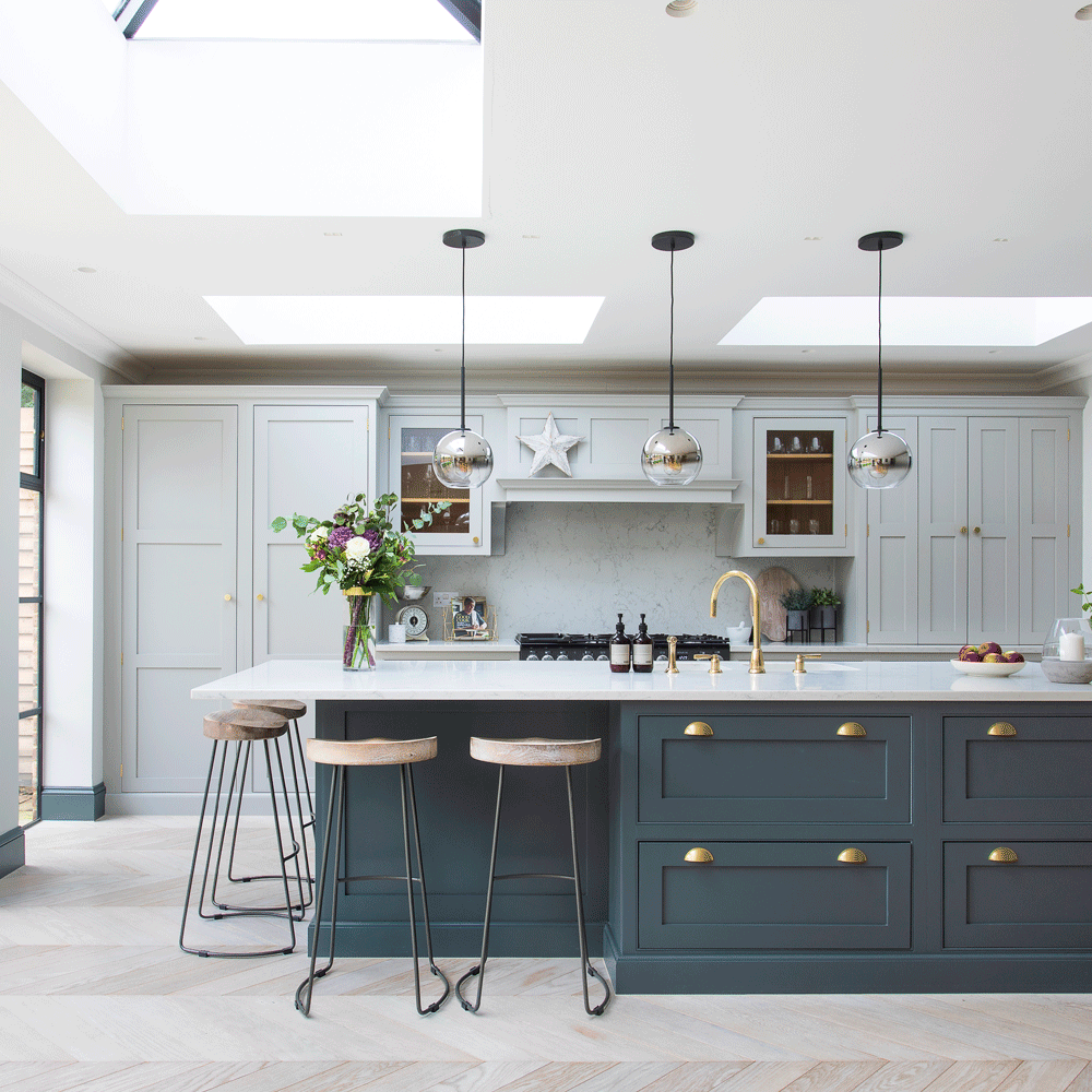
The kitchen had been four small rooms originally: the kitchen, a utility with loo, and a pantry. The couple turned the lot into one large space, open to the extension they had added, that is now the dining area. The utility was then relocated a better position.
‘The cabinetry was from a supply only company, Handmade Kitchens of Christchurch, which helped us keep costs down. We opted for a hand painted finish once our carpenter had installed it, choosing the Farrow & Ball shades Pavilion Grey on the far wall and Downpipe on the island,’ explains the owner.
Get the Ideal Home Newsletter
Sign up to our newsletter for style and decor inspiration, house makeovers, project advice and more.
‘The main roof light was there already, but we enlarged the opening to the same width as the steel-framed doors. We added two more, running the length of the kitchen, again ensuring the sight lines matched those of the floor to ceiling window. Achieving this kind of detail was really key for us.'
Related: Kitchen extension ideas – to maximise the potential of your extended space
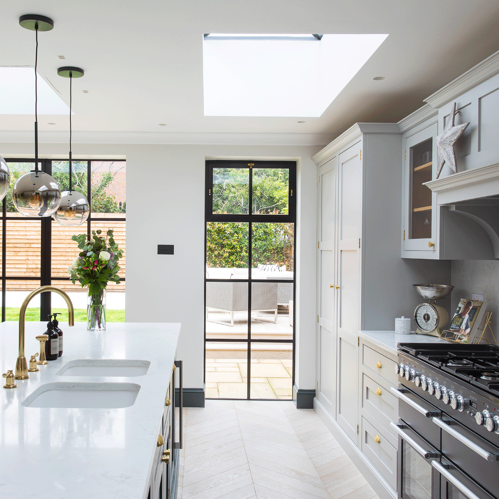
The steel-framed windows that were installed along the back wall of the kitchen and dining area are a perfect fit for this 1930s house: the ideal way to update a home from this period but still retain its character.
'With most of the works completed I launched an Instagram account, @my_midcenturymakeover. It was a fun distraction during my maternity leave with my daughter, which coincided almost entirely with Lockdown,' says the owner. 'What started as a hobby has become a great way to connect with other design lovers.'
Living room
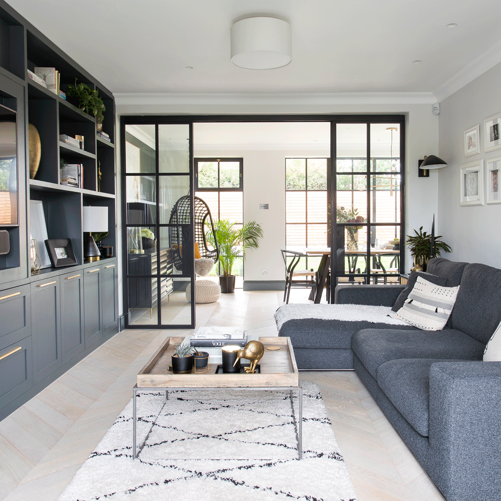
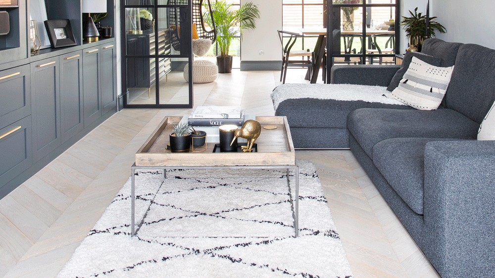
The couple created a media room with a wall of storage to house books, the TV and sound system. They painted it in Farrow & Ball's Downpipe to maintain a cohesive scheme throughout the downstairs living areas, and then added some sleek brass handles found on Etsy. If you are wondering how to fit a door handle yourself, our expert guide has all the advice you need.
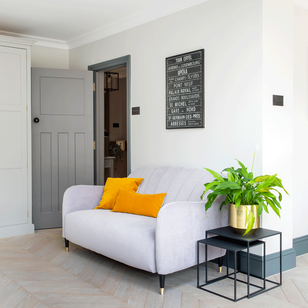
A neutral scheme of greys, black and white is given pops of colour with the bright orange velvet cushions, and a leafy green houseplant in a shiny brass pot. Engineered oak chevron flooring throughout the downstairs creates a contemporary feel.
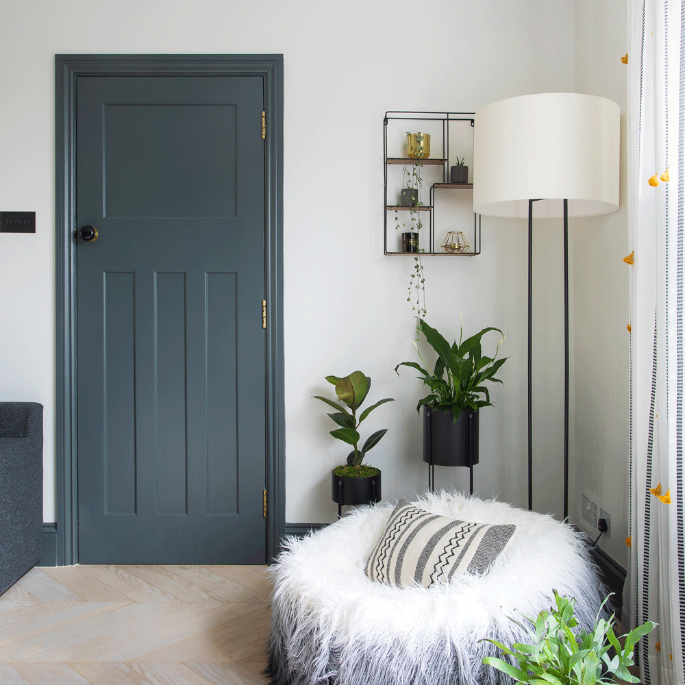
This is a fun, cosy corner for playing with toys and reading stories. The yellow pom-poms on the curtains offer a touch of fun and unpredictability in the otherwise more urban and sophisticated downstairs spaces.
Loft bedroom
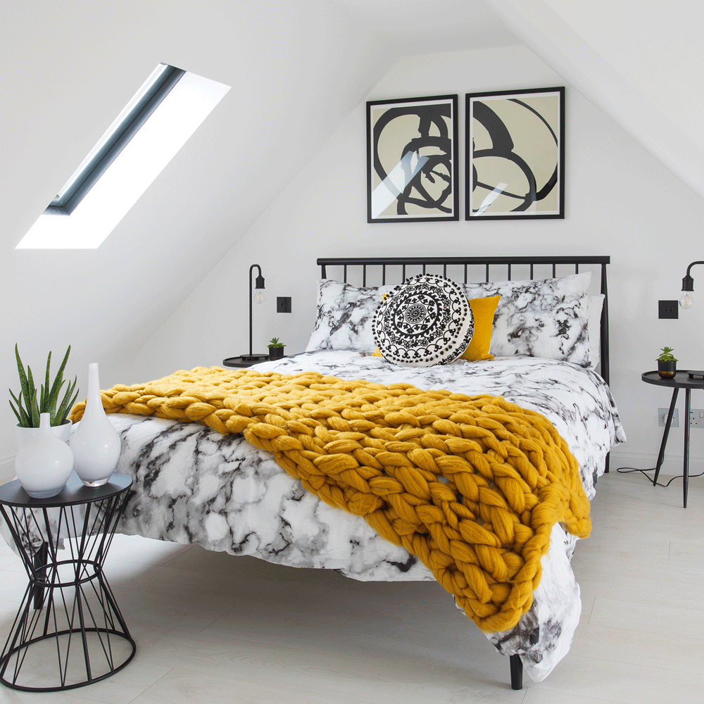
Currently a guest bedroom, the loft also serves as a quiet retreat away from busy family life. The loft had already been converted when the couple moved in, but the layout was quite awkward. As well as extending above the new dining area, the couple changed the traditional ‘hip’ style roof to a gable end then moved the staircase and dormer window to create a better space that allowed a sitting area in the bedroom, a landing and a private shower room. There is a more minimal, monochromatic look up here. The hand knitted mustard throw and cushion make a punchy colourful addition.
Loft ensuite
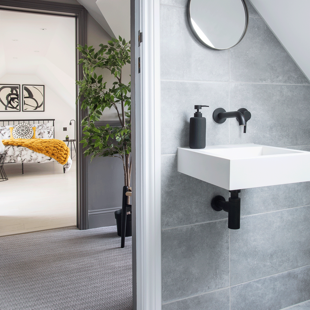
Previously the ensuite had been completely open plan to the bedroom! This new layout provided a much better solution, as well as some privacy.
Child's nursery
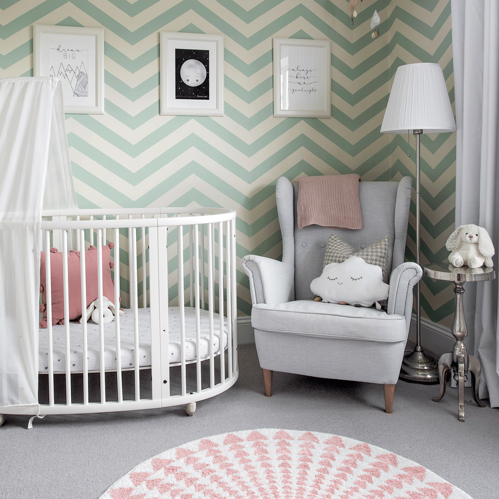
'This was my son's room previously. I chose the mint green chevron wallpaper as it was a good unisex option, and with a few soft pink touches it’s now transformed into a beautiful girly room for my daughter. The Stokke cot grows into a toddler bed and you can buy an extension to turn it into a couch.
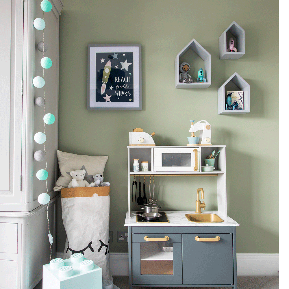
'I love wooden toys; this play kitchen is an Ikea hack using left over paint from our kitchen to create a mini copy. My kids both have great fun with it!'
Additional words by Ruth Corbett
-
 Did you know John Lewis can make your old curtains or rugs look like new? Their repair service is now available in all stores
John Lewis has added another string to its bow, and it's great news for your old homeware
By Kezia Reynolds
-
 This beautiful mixing bowl is the unexpected star of so many kitchens – including Mary Berry's and the Bake Off tent
This earthenware bowl proves that you don't have to spend a huge amount for a classic kitchen addition
By Molly Cleary
-
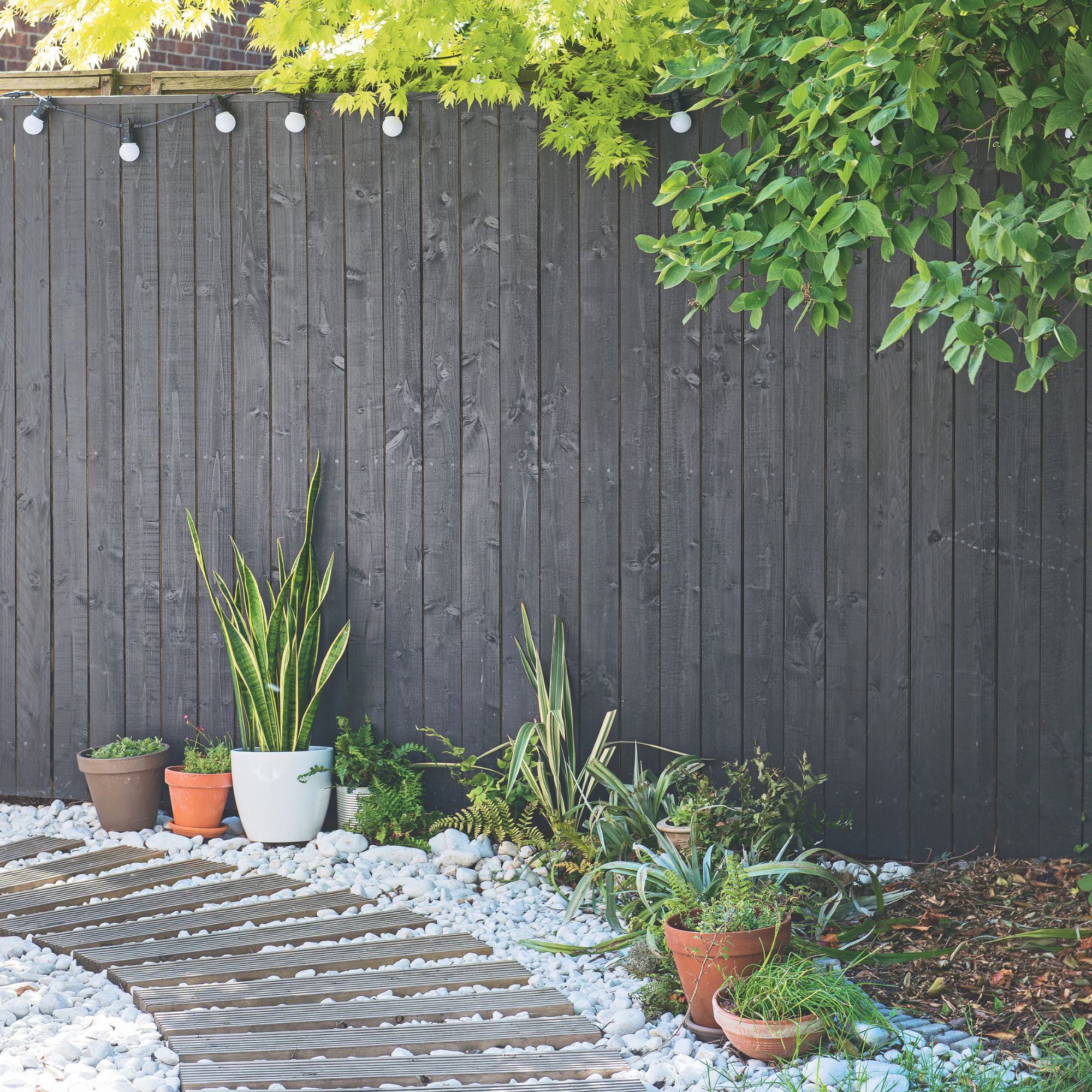 Have you been painting your fence wrong? 8 common fence painting mistakes that will lead to a streaky and patchy finish
Wondering why your fence's last paint job didn't turn out like you hoped? Here's why
By Katie Sims