Have a wander around this five-bedroom 1820s period house with a modern interior
The owners have brought a period house into the 21st-century with a contemporary glass extension and a modern interior
Looking to move out of London, the owners fell in love with a village in Berkshire, near where she grew up. ‘We came out of the station and there was the feel of autumn – the smell of woodsmoke and mist over the canal,’ she says. ‘The setting sold the village to us. We knew it would be a lovely place to live.’
The couple then began looking for a house and one soon came up that seemed promising, but it sold straight away before they even had the chance to view it. However, the deal fell through and the estate agent got in touch with them when the house went back on the market, so the couple went to see it. ‘It was a lovely house, so we put in an offer immediately,’ says the owners.
Living room
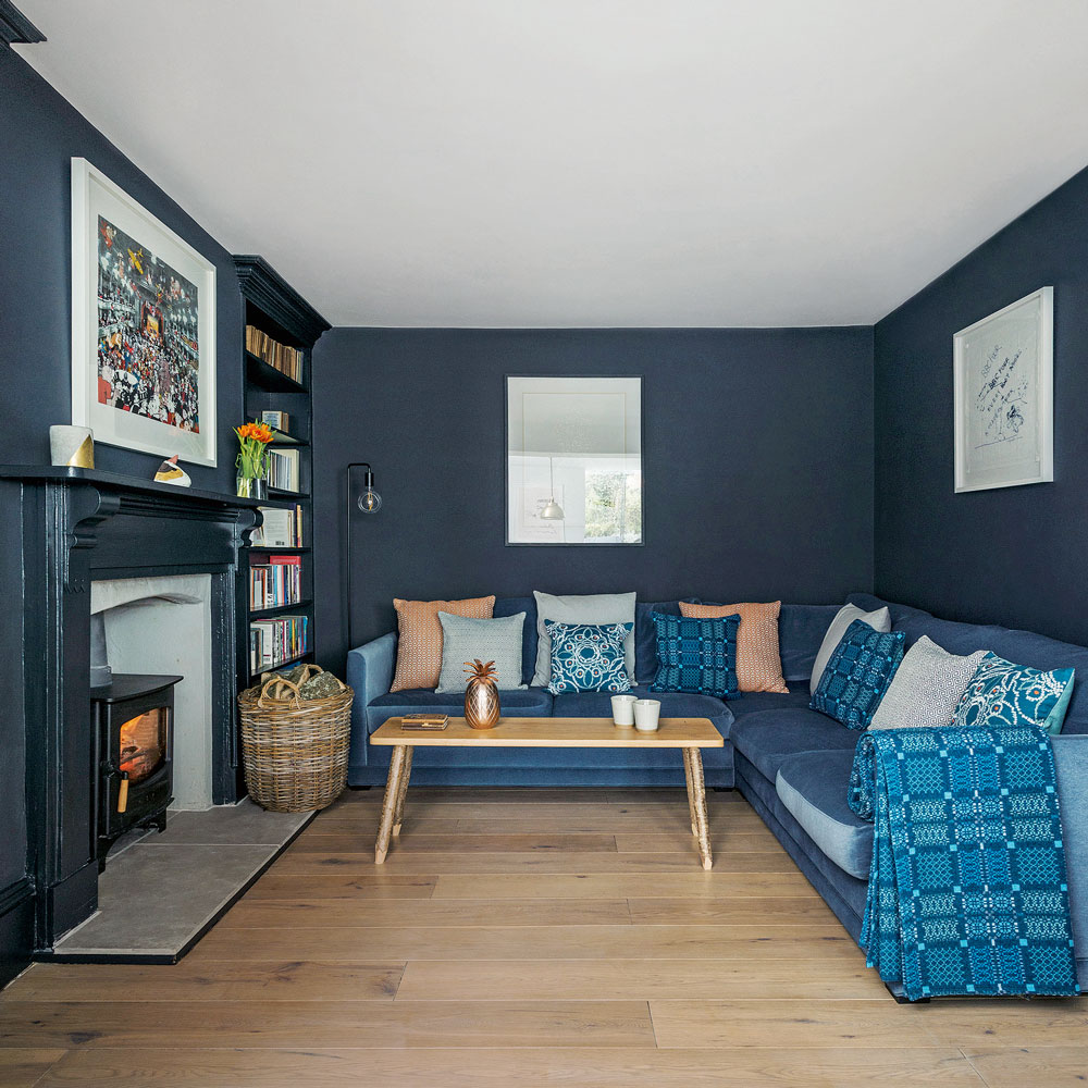
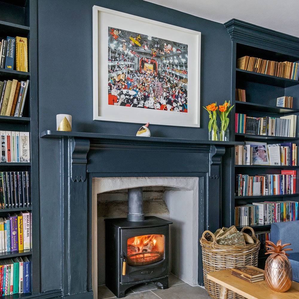
It was the period features that particularly attracted the couple. ‘The Victorian frontage was attractive, but there was also a Georgian property behind, so it had the best of both periods. Plus, it was light and spacious and it reminded me of my childhood home,’ they say.
Although quite a bit of work needed doing to the property, the couple had a vision of what it could become. ‘We did a lot of remedial work at first,’ says the owners. ‘In fact, we started renovating as soon as we moved in.’ The couple carried out the work slowly over three years, replacing floors, installing underfloor heating and adding a new boiler.
Shop the look
Buy now: Wall paint, Railings, £46.50 for 2.5L, Farrow & Ball at B&Q
Buy now: Sofa, Aissa Corner Sofa, from £2,028, Sofa.com
Kitchen extension
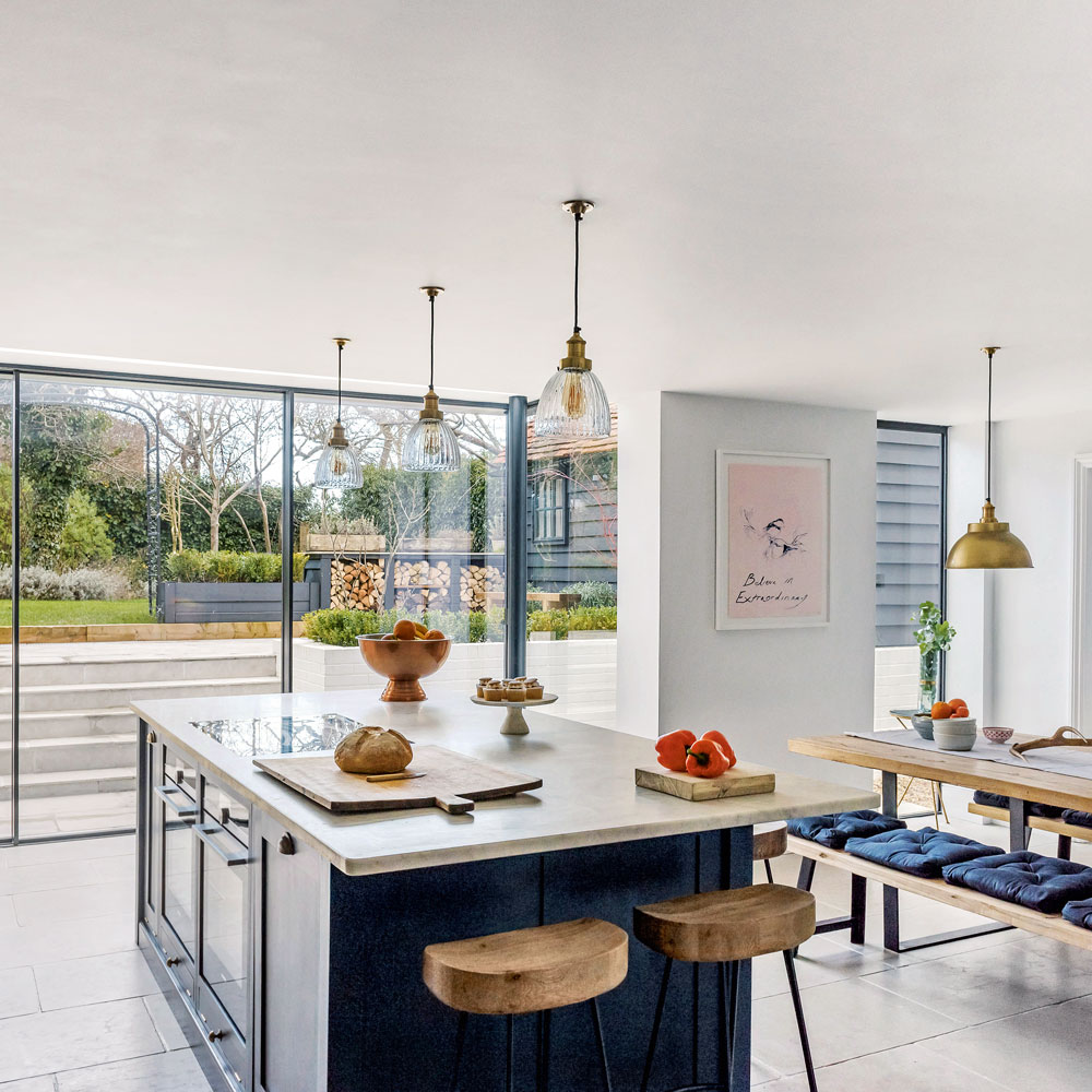
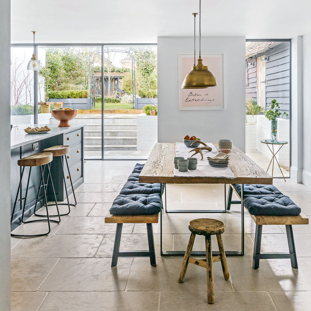
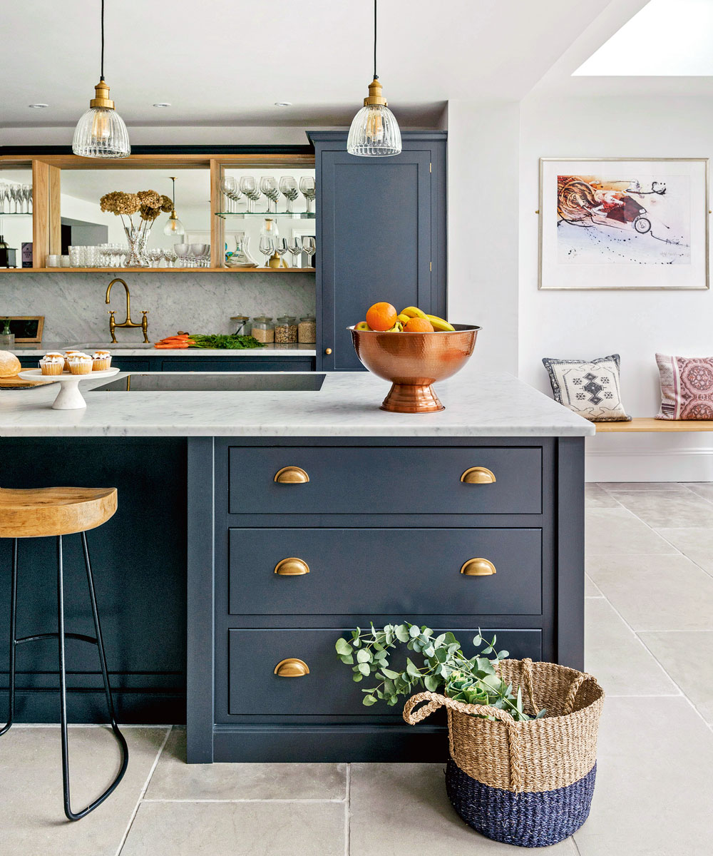
Walls were then re-rendered and replastered, ceilings were repaired and part of the roof replaced. Once that work was completed, the couple gradually started to decorate the house. But, in 2016, they realised that they were in an extend-or-move situation. ‘The house had three bedrooms and after our son was born in 2012, we had used them all up,’ says the owners. ‘Properties don’t come up for sale in the village very often, so we decided to extend.’
Shop the look
Buy now: Kitchen cabinetry, DeVol
Buy now: Dining table, Designers Guild
Get the Ideal Home Newsletter
Sign up to our newsletter for style and decor inspiration, house makeovers, project advice and more.
Hallway
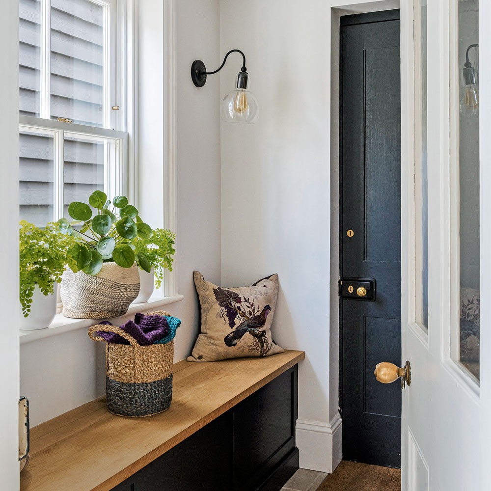
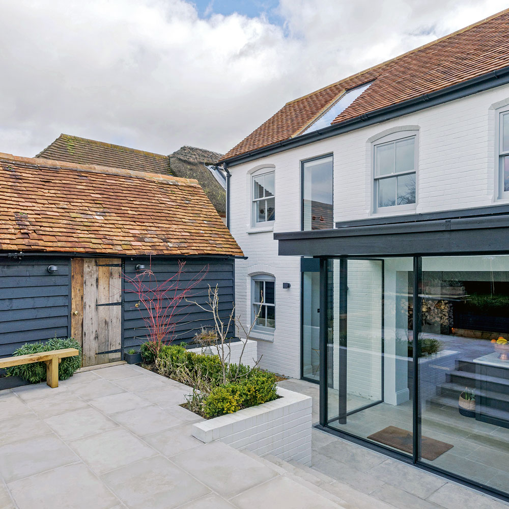
The couple visited architect and structural engineers Orange Key Design Studios to discuss their options. ‘We came back with designs that were beyond what we expected for the house and what it could be.' The design studio’s plan involved a contemporary side extension that created two more bedrooms and two extra bathrooms, plus a glass kitchen-diner extension that opened on to a Mediterranean-style courtyard.
Bathroom
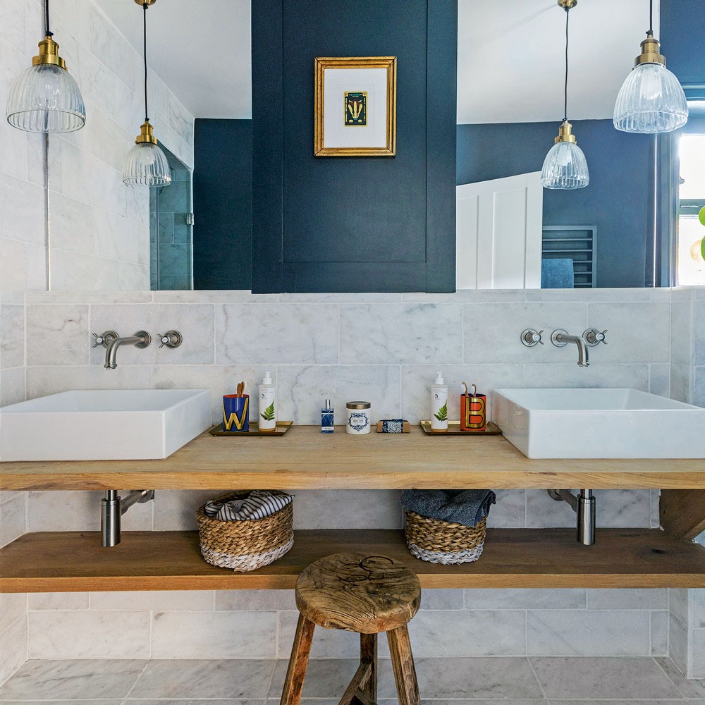
The challenge was getting the balance between bringing in more space and light, while retaining the period elements to keep as much of the property’s character as possible. ‘We went to lots of trouble to keep the original materials and find similar reclaimed ones that were sympathetic to the house.'
‘Roofing tiles were handmade to match the original ones and new windows commissioned to blend with the original sash windows. From the front it’s a quiet extension and we’ve retained the character from the road, but from the back it has a contemporary edge – we like the juxtaposition of old and new,’ he says. All in all, the project took around six months to complete. ‘We refurbished most of the house when we did the extension and repainted every room.'
Master bedroom
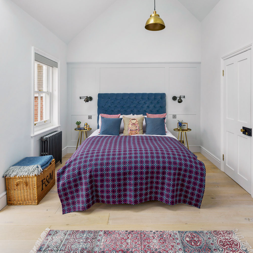
The dark blue and grey colour scheme, which provides continuity throughout the house, stems from the kitchen. ‘We wanted the kitchen to feel solid so we chose a shade of dark blue, with marble worktops for contrast,’ she says. The colour was then continued throughout the downstairs with similar shades used in the snug and library area.
Shop the look
Buy now: Bed, Sofa Workshop
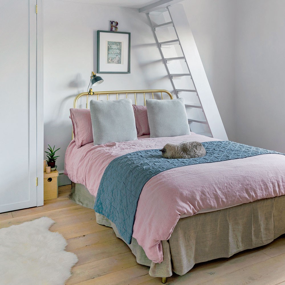
Loft bedroom
‘It became a key colour for the house,’ says the couple. ‘Our mantra was to limit the palette and materials needed.’ Using as few ingredients as possible worked really well for the couple. Limestone flooring was laid throughout most of the downstairs rooms, while unfinished oak was used for the floor in the snug, plus the furniture, shelving and the window seat in the utility to create a light, natural feel. ‘We wanted it to have a sense of calm so we limited the raw materials and layered up with fabrics and pictures.'
Garden
‘The William Morris quote, “Have nothing in your house that you do not know to be useful, or believe to be beautiful”, played a big part.’ They are thrilled with the finished result. ‘The extension delivers on both a functional and a design level,’ they explain. ‘It’s changed how we live as a family. We can talk to people when we’re cooking as they sit at the island, and we have cosy nooks where we can tuck ourselves away.’
This house tour originally featured in Country Homes & Interiors, February 2019.
-
 I swore I would never choose a flat sheet over a fitted sheet – but this advice from a bedding expert just changed my mind
Why I'm now a 'flat sheet' convert
By Amy Lockwood
-
 Small garden shed ideas – 5 ways to make the most of this garden building without compromising on space
There's a shed for every garden size – even the tiniest ones!
By Sophie King
-
 My mum introduced me to Nancy Birtwhistle’s ‘Pure Magic’ recipe - now I don’t think I’ll need to buy another cleaning product ever again
I live in a hard water area, and it's the ONLY thing that's removed the limescale in my toilet
By Lauren Bradbury