Take a look around this two-bedroom 1930s semi in Solihull
Small home? Then check out this bright and airy two-bedroom semi-detached home for decorating ideas that will maximise your space
As the owners of this 1930s semi were first-time buyers, they were mindful of the need to not overspend on a property and end up with a hefty mortgage to pay off. Their search, therefore, was for somewhere within a sensible budget that they could put their own stamp on. But the couple didn't quite agree. 'It was my husband who fell in love with this two-bedroom home dating from the 1930s and convinced me it was a great buy,' says the owner. 'But I wasn't so sure due to the lack of bedrooms, and I was worried about storage space, too.'
Drawn to the peaceful location near to family and friends, the couple also loved the wild garden at the back of the house that gazes out over beautiful rolling countryside. 'Looking back now, we realise we may have been a little naive about what work needed doing,' they say. 'We quickly realised that simply buying some new furniture and pretty cushions wouldn't be quite enough to turn it into the home we'd envisaged!'
The structure of the house was good and sturdy, but the couple wanted to rework the layout of most of the rooms. They also replastered and rewired the entire place. It was a a big project, but now - despite some initial reservations - both of the owners are thrilled with their home. 'We don't see ourselves ever getting tired of living here,' they say.
1/11 Exterior
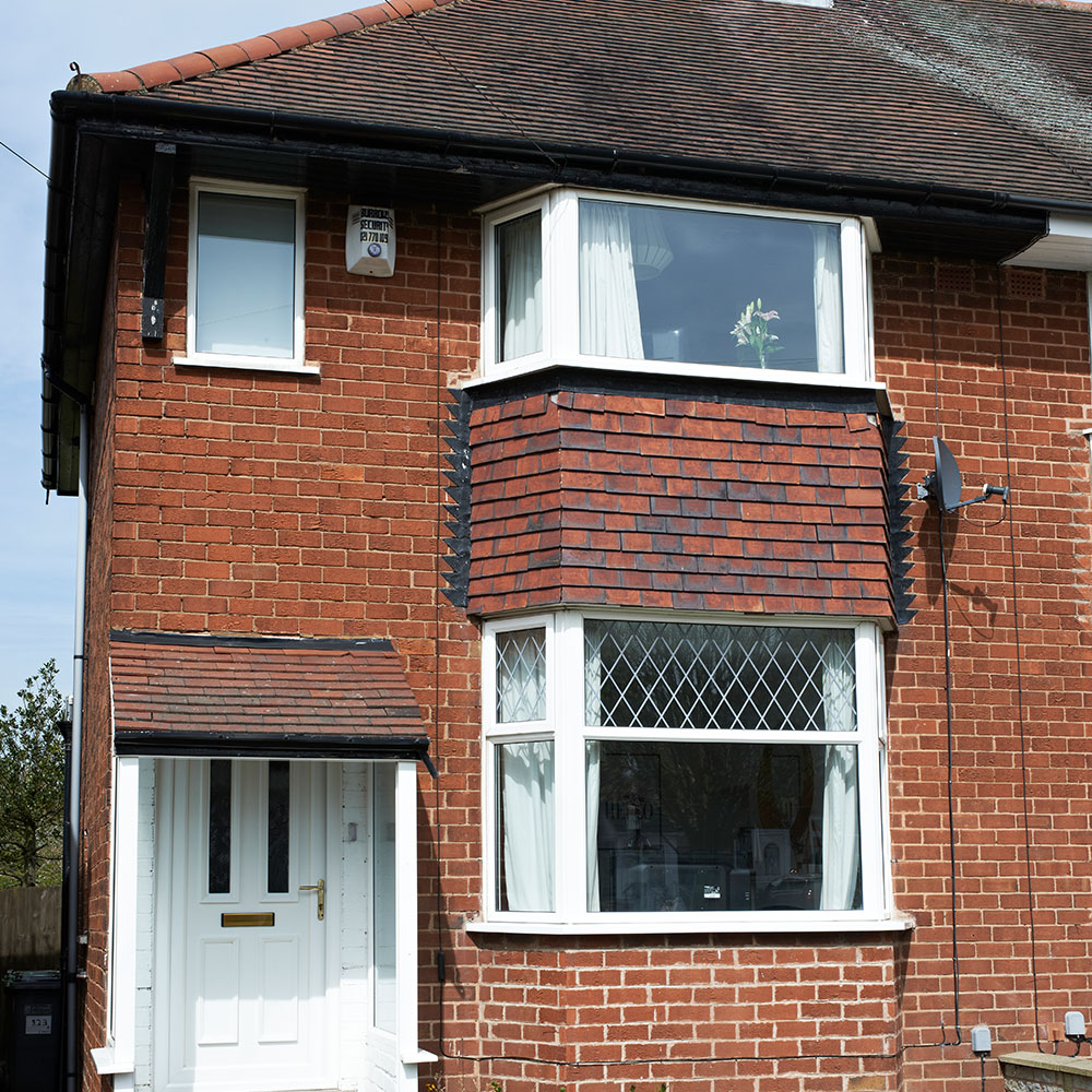
The owners bought their two-bedroom semi-detached home in 2011. Concerned about the lack of space for a family home, they set about transforming the layout and decor to make it work for them.
2/11 Living room
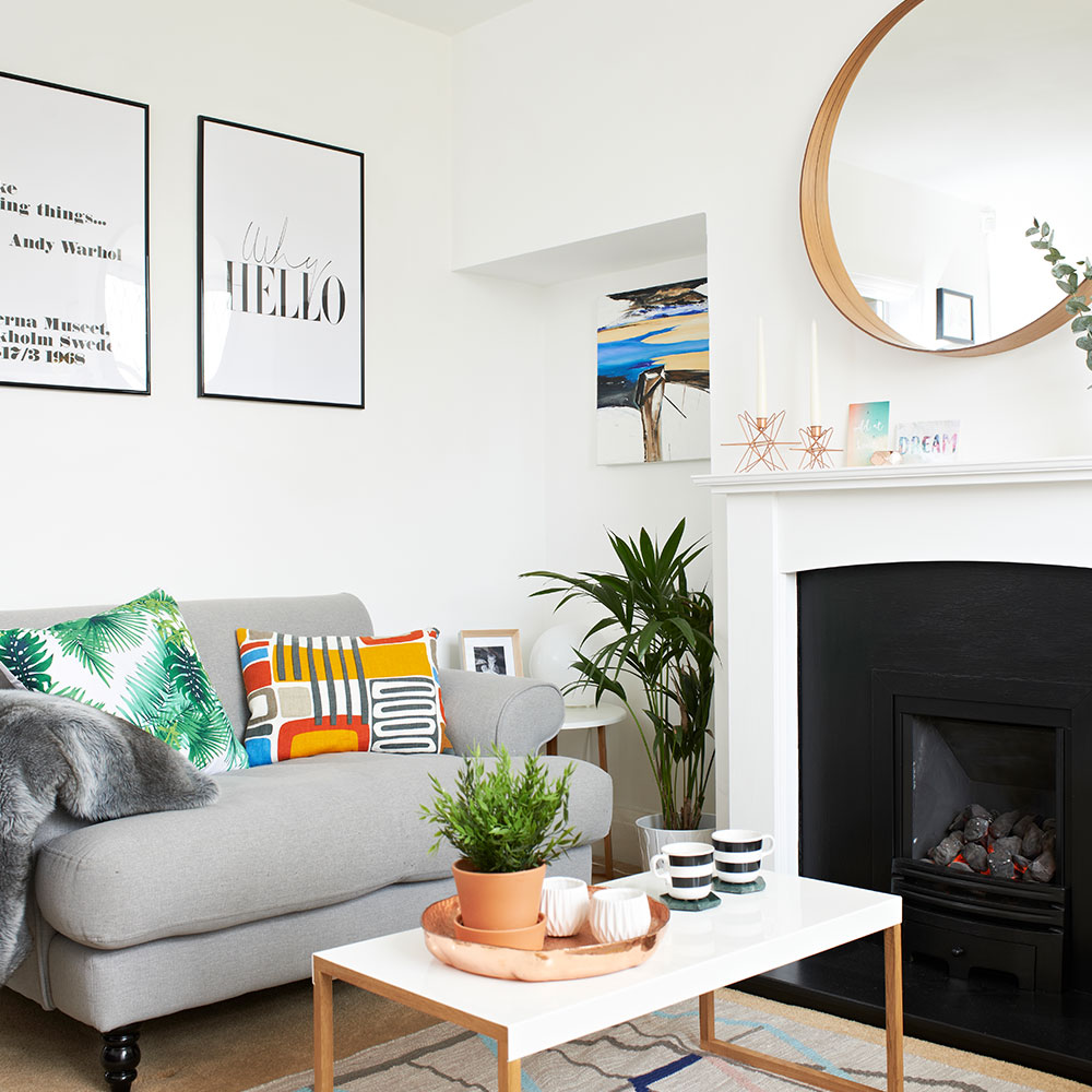
As the house can sometimes feel small, the owners have tried to keep the decor bright and airy by using lots of white wherever possible. They then added splashes of various colours through accessories such as cushions, artworks and plants. The fireplace was also carefully painted with heat-resistant paint to fit in with the scheme.
Similar sofa
Made
Similar copper tray
MiaFleur
3/11 Living room reading corner
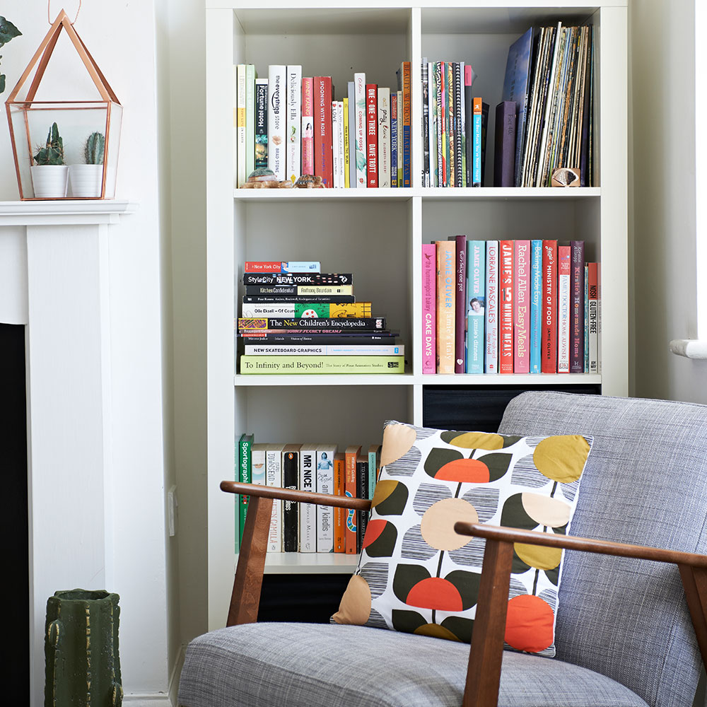
Next to the fireplace is this pretty reading corner, which is brought to life by the owners' colourful collection of books. White shelving blends into the walls, for a seamless look that lets the books and accessories command attention.
Get the Ideal Home Newsletter
Sign up to our newsletter for style and decor inspiration, house makeovers, project advice and more.
Armchair
Ikea
Similar terrarium
Maisons du Monde
4/11 View towards dining area

The living room flows into the open-plan kitchen-dining area, creating a wonderful sense of space in this compact home. To break up the all-white decor and add warmth, the owners have introduced colourful textiles, such as the sofa, cushions and dining-area rug.
Similar flamingo cushion
John Lewis
Similar dining chair
The Conran Shop
5/11 Kitchen
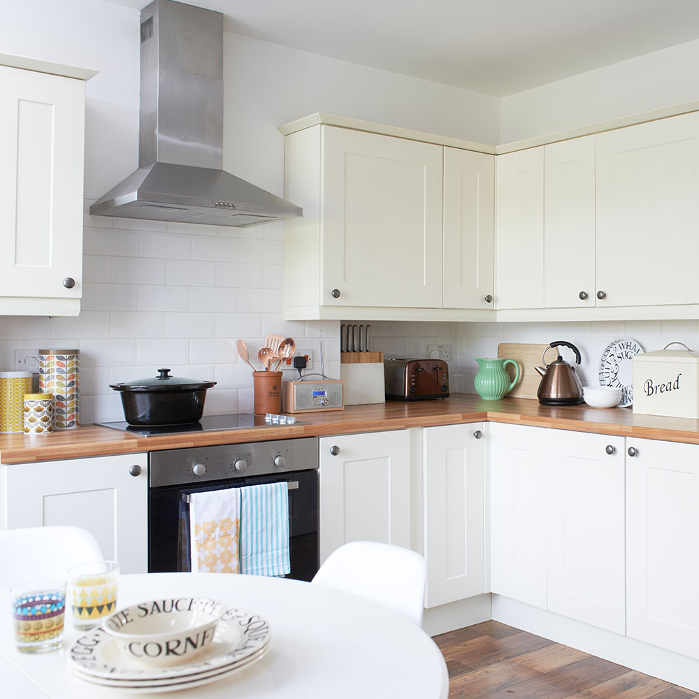
The original kitchen was a very small galley space, with a door that led through to a small dining room, but the owners wanted something that was more of an open-plan design, to suit their growing family. They knocked down the wall between the dining room and kitchen to create an airy kitchen-diner that makes much better use of the space.
Kitchen
B&Q
Storage canisters
Orla Kiely
6/11 Kitchen corner
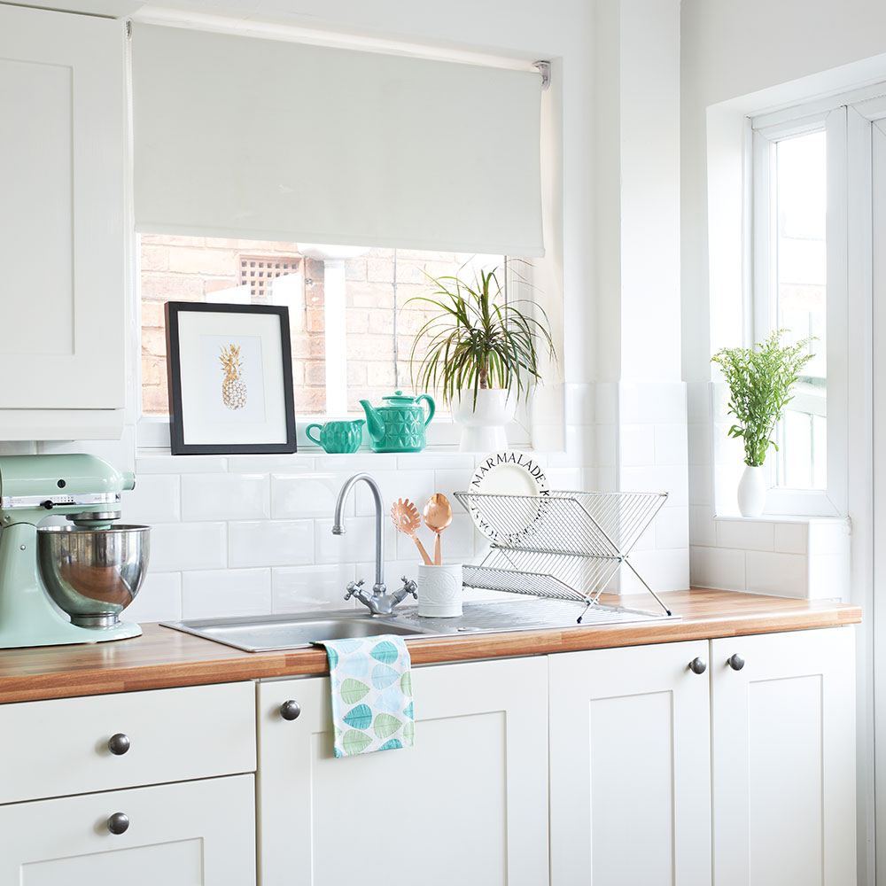
Neutral cream units have been combined with a wooden worksurface for a timeless kitchen look. Indoor plants add a natural touch to the scheme, while mint accents tone with the greenery and create a homely feel.
Similar mixer
Debenhams
Similar pineapple print
Art.co.uk
7/11 Bedroom
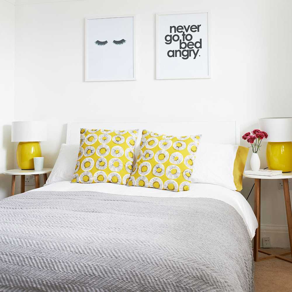
The owners have chosen bedside tables instead of cabinets to give the illusion of space in this small bedroom. Playful cushions match the bedside lamps perfectly, while black and white prints add a fun touch to the walls.
Cushions
Habitat
Similar prints
Etsy
8/11 Study area
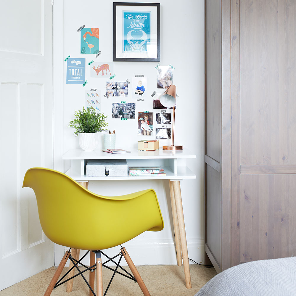
In a small corner of the bedroom is this stylish study area, which is ideal for home working. The white furniture keeps the look bright, while the chair adds a colour hit that fits in with the bedroom scheme. Favourite postcards and photos have been hung above the desk to create a cool gallery wall.
Desk
Habitat
Similar chair
The Conran Shop
9/11 Boy’s bedroom
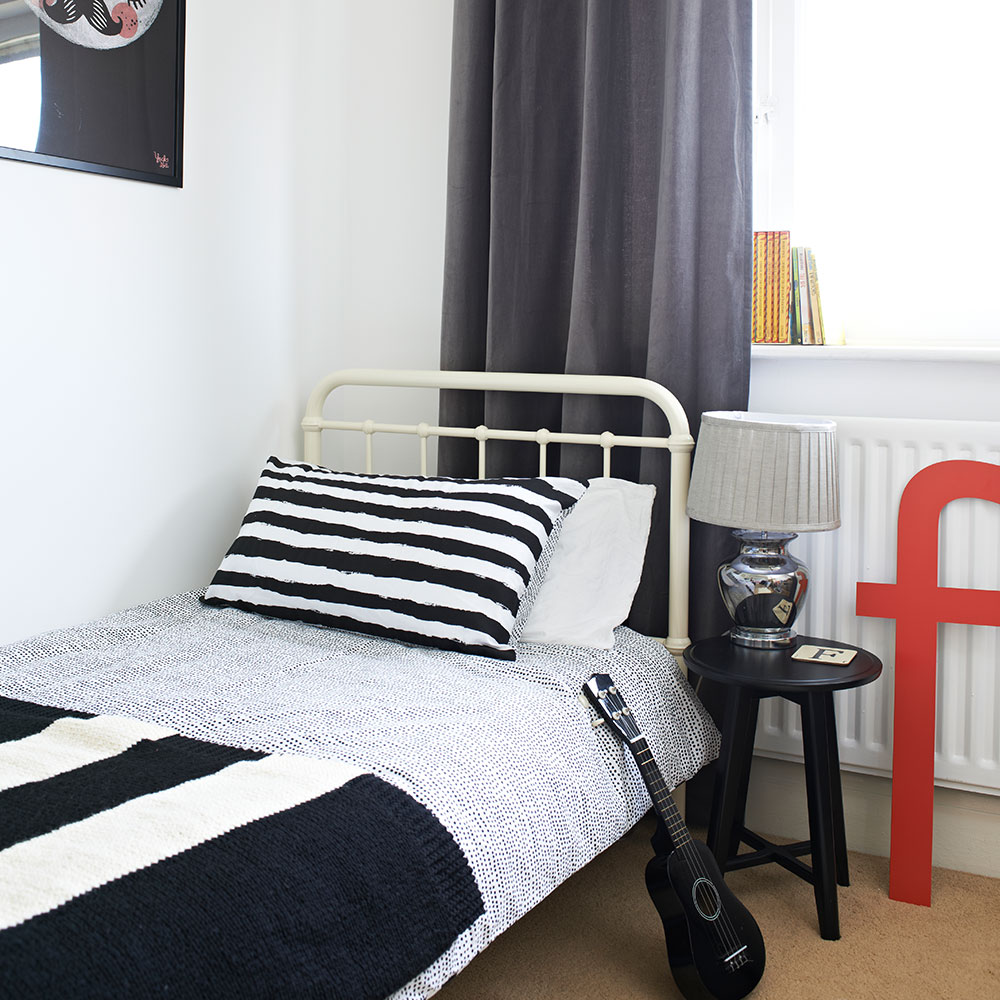
The owners' four year old has inherited his mother's passion for interiors. 'As he gets older, he now has his own opinion on where things should go,' they say. His bedroom is no exception, and he even helped to choose the bed.
Bed
Ikea
10/11 Bedroom wall stickers
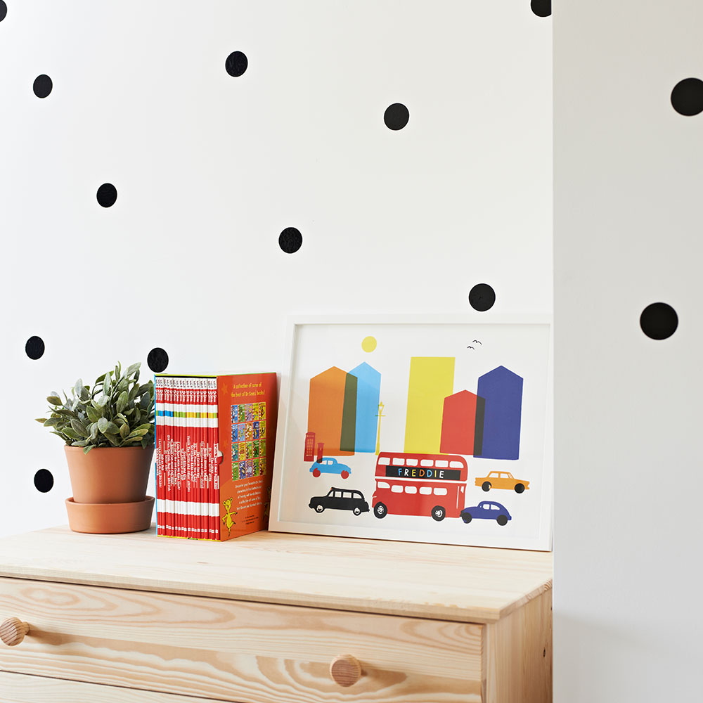
Wall stickers lend a little excitement to the corner of this bedroom and the monochrome colours go with everything from wooden finishes to bright colours.
Wall stickers
Etsy
11/11 Bathroom
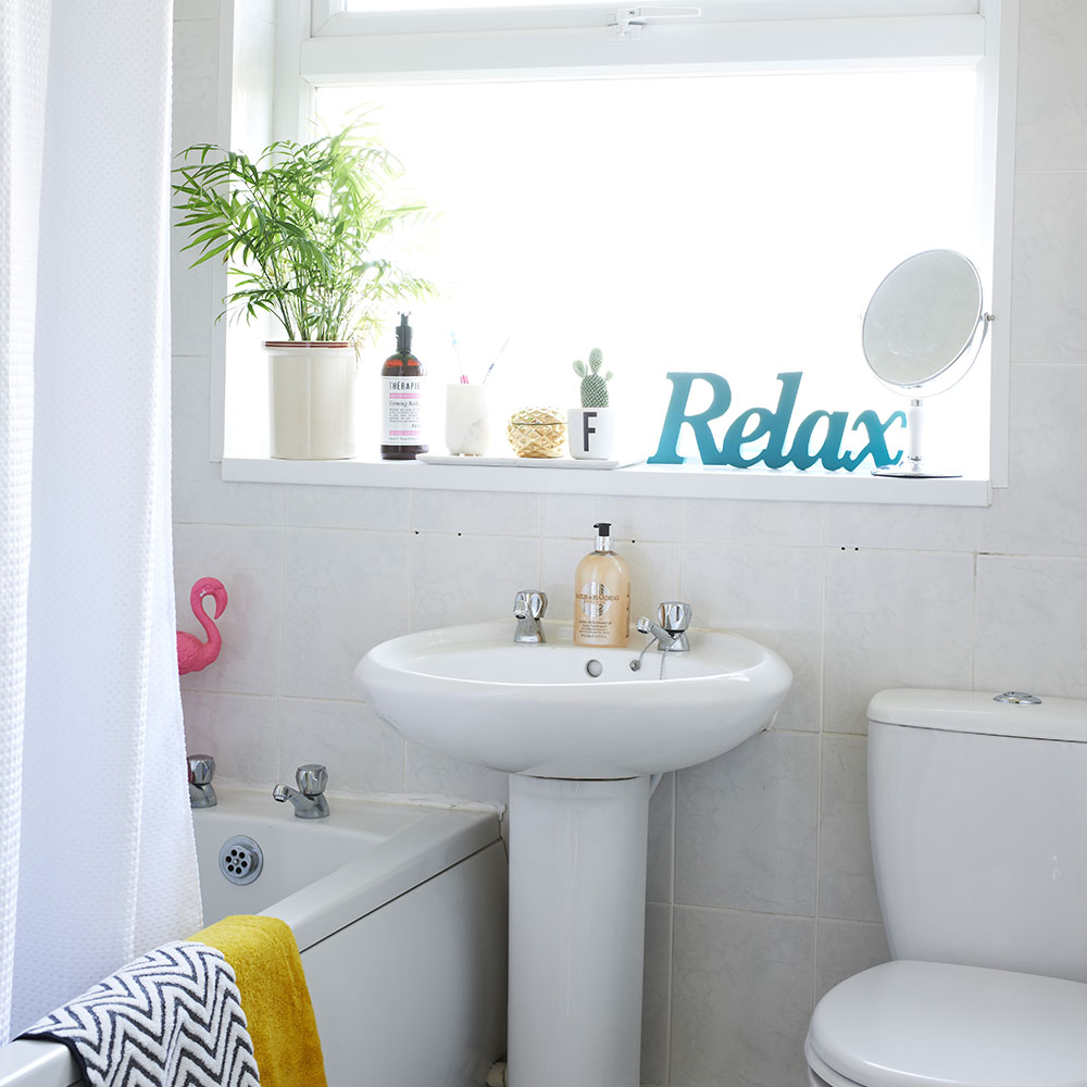
The owners still need to have the bathroom done so it better suits their needs as a family, especially now that they have another child on the way. But for now, it has been given a budget update with colourful accessories and plants, which thrive in the moist conditions.
Similar pink flamingo
Maisons du Monde
Similar 'relax' sign
Etsy
This house tour originally appeared in Style At Home, February 2017
-
 Ooni's new stand mixer is already a sell-out success
Here's why the Ooni Halo Pro Spiral mixer is a big deal for at-home breadmakers
By Molly Cleary
-
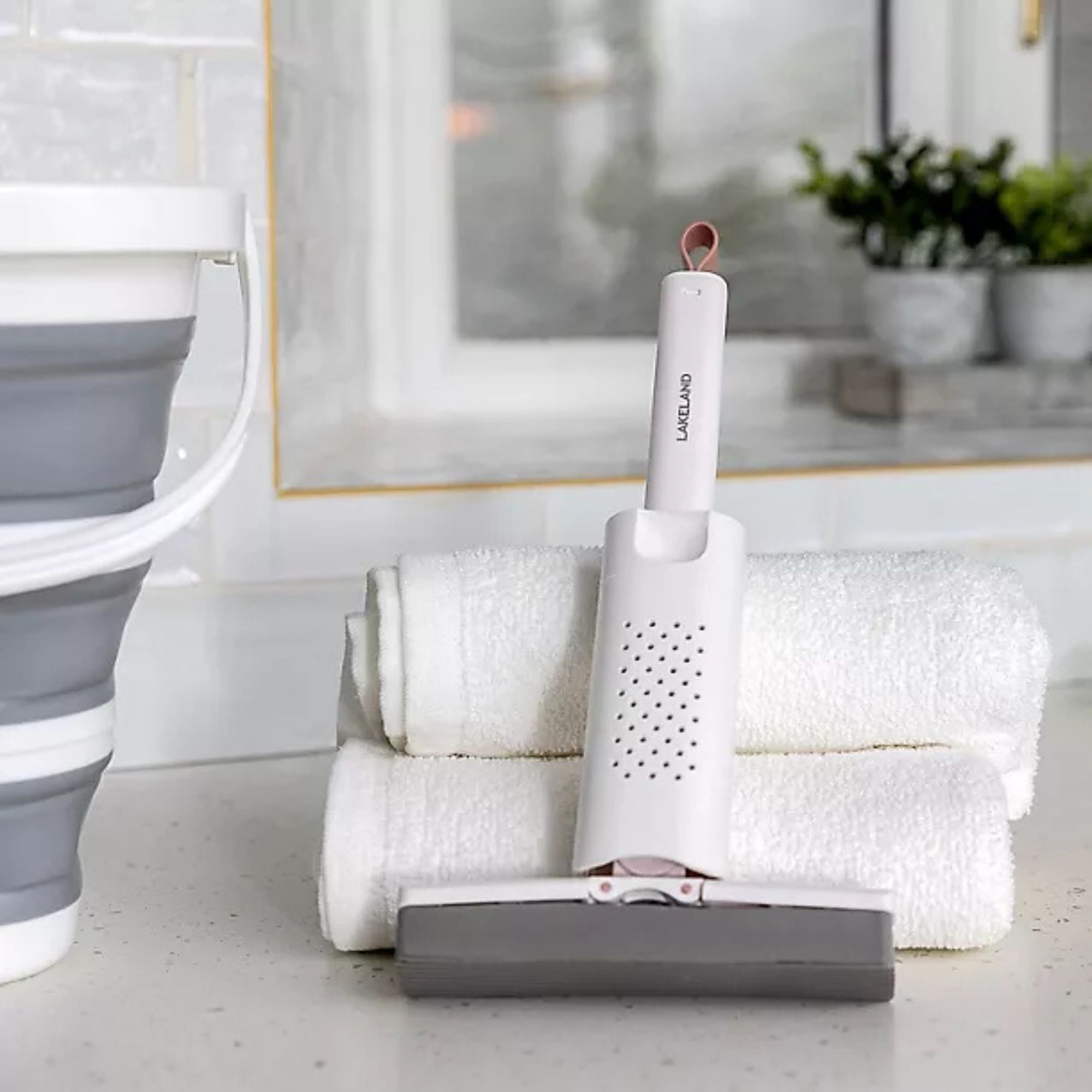 I’ve been using Lakeland’s new £5 mini mop as a shower squeegee, window cleaner and damp duster — it’s the ultimate multi-purpose cleaning tool
Yep, I've added this new mini cleaning tool to my collection
By Lauren Bradbury
-
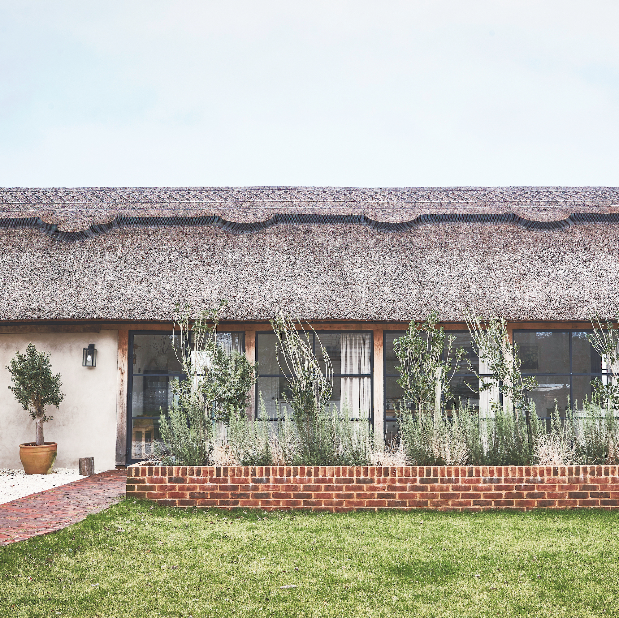 This old dairy barn was brought back to life and is now an amazing home
It's brilliant blend of old and new in West Sussex
By Sara Emslie