Discover this unique barn conversion – a masterclass in modern rustic style
The owners of this home share their style secrets
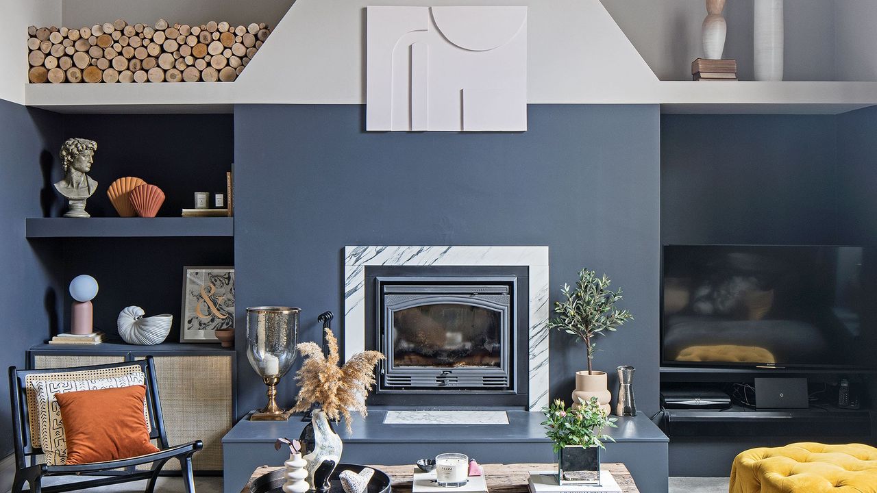

Good bones and rustic finishes have enabled the owners of this property to transformed a bland barn conversion into a unique modern home that’s bursting with style and inspiration.
They tell us how they achieved their stylish and individualistic real home.
The exterior
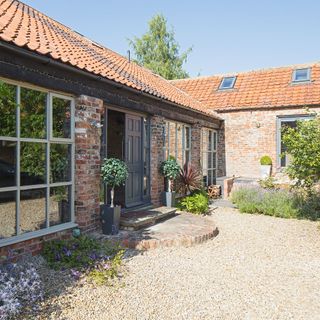
The detached barn near York was originally built in the 1800s. While it had been renovated in the 90s, it hadn’t really been maintained since, so needed quite a bit of work. A clever combination of textures and a neutral palette made the vision of the owners work.
The kitchen colour scheme
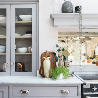
As the kitchen is a large room the owners chose a neutral scheme so it wouldn't date. The soft greys and marble worktops are timeless so they wouldn't tire of it any time soon.
'We started from scratch with the kitchen area,' say the owners. 'It needed everything doing to it; insulation, re-roofing, new windows, new doors.’
The kitchen
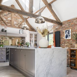
'The plan was to make the best use of the available space and I think we have done that, as now we spend most of our time here,' say the owners.
They designed the units and layouts to suit their needs, while the cabinets were hand-painted so we they can easily change the colour as and when they want. With so much neutral on display, the beautiful Carrara marble worktop becomes the focal point of the room.
Get the Ideal Home Newsletter
Sign up to our newsletter for style and decor inspiration, house makeovers, project advice and more.
If you have high ceilings like this, note that a pair of feature pendants will draw the eye, making the space feel even larger and create a real sense of purpose.
The hallway
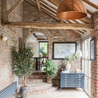
Along with any type of timber, brickwork adds a real sense of character in a home. Here, light parquet flooring adds a contemporary feel, while letting the original architectural elements shine.
'For me, houseplants are a must, too, as natural greenery softens a space that has few soft furnishings,' says the owner. 'The grey drawers are one of my favourite upcycling projects; they started life as school art drawers. I gave them a new lease of life with a coat of paint and some new handles.’
The family space
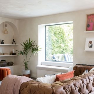
When revamping the open-plan living and dining space, the owners built in a window seat. As well as working as extra seating for guests, there is additional storage beneath.
'The paint on the walls is a limewash,' says the owner. 'I love its beautiful patinated finish – just sand and prime your walls before you apply it. We put in the arches and floating shelves ourselves.'
The open-plan area
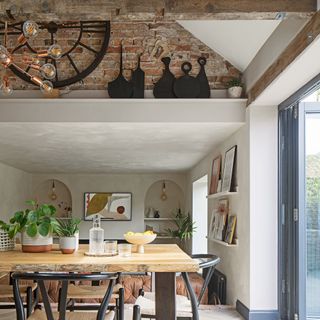
Although the owners kept much of the house as it was layout-wise, the kitchen was in an unconverted barn attached to the main building and it made sense for them to knock through to create one large open-plan living space.
Running the same flooring throughout the downstairs gives a sense of flow and cohesion. Wood flooring is warmer both practically and visually than tiles, and is easier to keep clean than carpet.
The living room
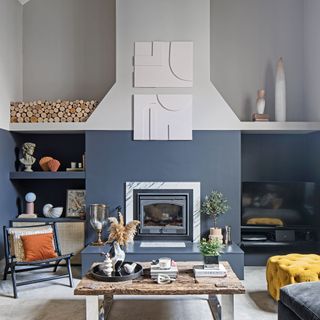
'The living room was originally painted a pale neutral with deep pink alcoves which I felt did nothing for the space,' says the owner. 'Instead we painted the lower half of the room a deep grey which feels wonderfully warm and cosy. This is the perfect room to settle down and watch a movie together, especially in the winter when the wood burner comes into its own.’
Warm accents of burnt orange and mustard mixed with the rustic/luxe finishes against the grey gives a sophisticated, but homely feel.
DIY artwork adds a personal touch. The owners made the pieces above the fireplace by pinning MDF pieces onto backing, then painting.
The staircase
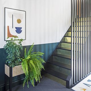
The original stairs were open tread with a carpet and traditional spindles, and at odds with the style of the room. The owners removed the spindles and newel post, filled in the risers with MDF, and made the balustrade. The carpet was replaced with brass sheets that were attached with silicone.
Speaking of the imaginative staircase idea the owner says, 'I love the hint of glamour it brings. The stairs now look spectacular when the light hits them.’
The home office
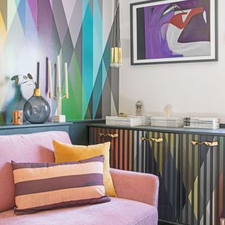
In the office, pale-pink contrasts well with the Cole & Son Circus wallpaper. It’s striking but doesn’t overwhelm the space. This room is filled with fun and quirky accessories, as well as a cheerful gallery wall.
'I’ve let my love of fun run loose in here!,' says the owner.
The master bedroom
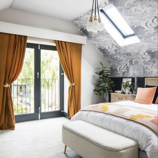
The walls in the master bedroom finish at a relatively low level. Taking the bedroom wallpaper idea up onto the ceiling counteracts this very cleverly, giving the impression of taller walls. And the fun cloud design makes perfect sense, particularly as the ceiling is vaulted.
The guest bedroom
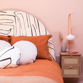
In this bedroom the ceiling isn't very high and doesn't have an obvious end point due to the vaulted part, so the owners decided to embrace it and paint it all the same colour to make the scheme more coherent.
We love the DIY headboard idea! 'We made the headboard out of plywood and foam before adding one of our favourite fabrics, Graffito by Kelly Wearstler,' say the owners.
The bathroom
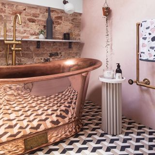
The owners had always wished for a copper bathtub and so made this the starting block for our new en-suite. Having removed the carpet and discovered a hole and rotten floorboards beneath it due to a limescale build-up, gorgeous mosaic tiles were the great flooring replacement choice.
'We exposed the original wall bricks to tie in with those in the rest of the house,' say the owners. 'They add to the cosy feel the room now has. I absolutely love it!’
Additional words by Laura Ewart

Thea Babington-Stitt is the Managing Editor for Ideal Home. Thea has been working across some of the UK’s leading interiors titles since 2016.
She started working on these magazines and websites after graduating from City University London with a Masters in Magazine Journalism. Before moving to Ideal Home, Thea was News and Features Editor at Homes & Gardens, LivingEtc and Country Homes & Interiors. In addition to her role at Ideal Home, Thea is studying for a diploma in interior design with The Interior Design Institute.
-
 6 things that feel illegal to declutter — and how professional organisers reuse them around the home instead
Experts reveal what to do with those 'just in case' items
By Lauren Bradbury
-
 The 5 best plants for a Japanese garden – key trees and flowers to help nail the style
We checked in with garden experts to curate a checklist
By Sophie King
-
 The Grecian bookshelf trend adds a luxury look to your reading corner, and it’s super easy to get the look at home
It couldn't be easier to get the look, too
By Kezia Reynolds