Before and After: smart extension turns a narrow kitchen into a cool contemporary family space
After careful planning this homeowner added a side extension to create the ideal kitchen for his new family
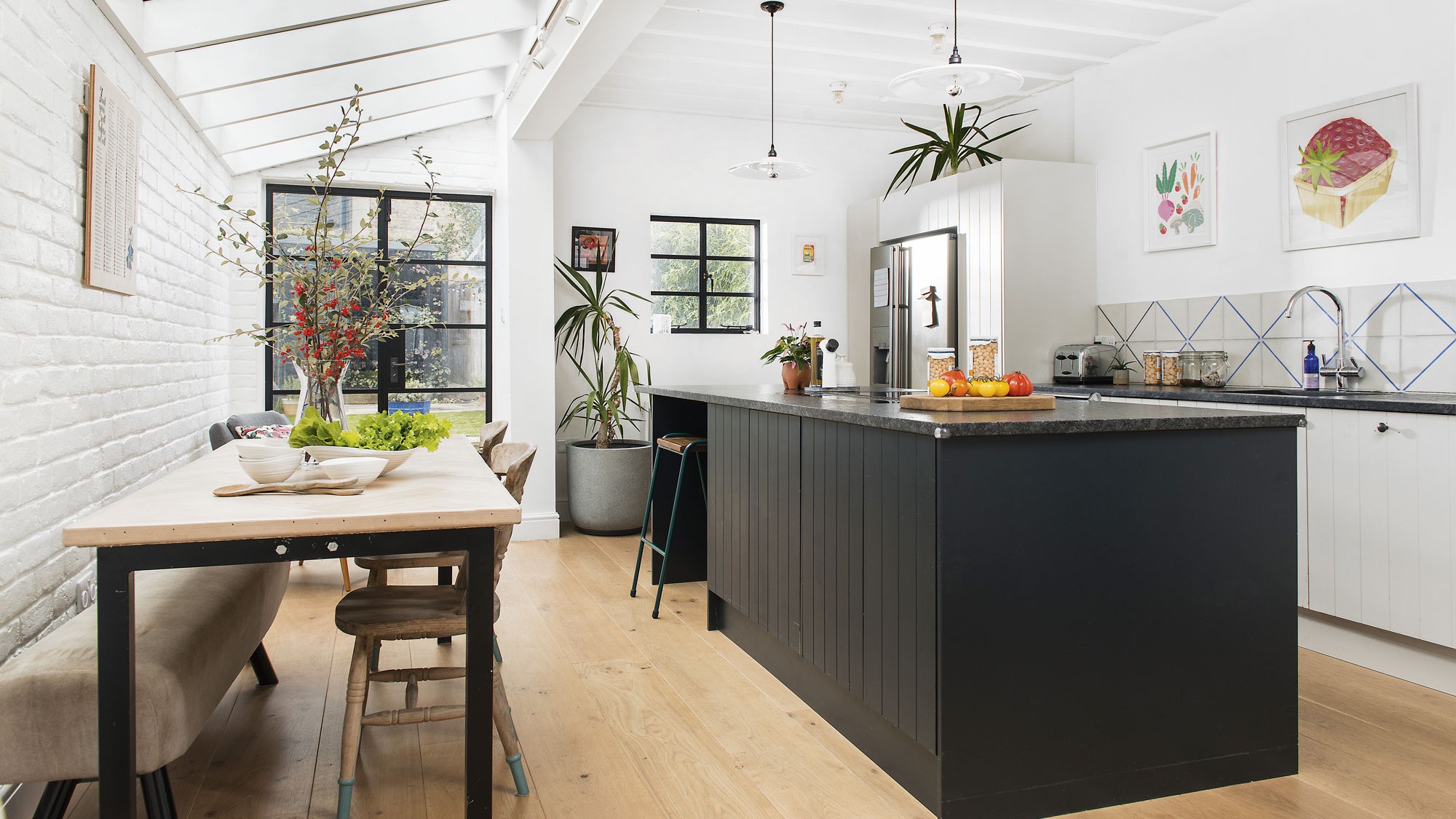
‘The old kitchen hadn’t been touched for 15 or 20 years,’ says the owner of this five-bedroom Victorian terraced house in East Dulwich, London.
'It was too small, and all the cupboards and units were falling apart. We wanted to make the space bigger, and with a baby on the way, to turn it into a useful family room.' So they added an invaluable narrow kitchen extension to create the space of their dreams.
'We planned everything ourselves, working out dimensions, what space was needed between seating areas. Even the positioning of appliances and units to ensure it would work for us. So we could have a kitchen that we can entertain in, with all of us enjoying the same space.’
Before and After: narrow kitchen makeover with extension
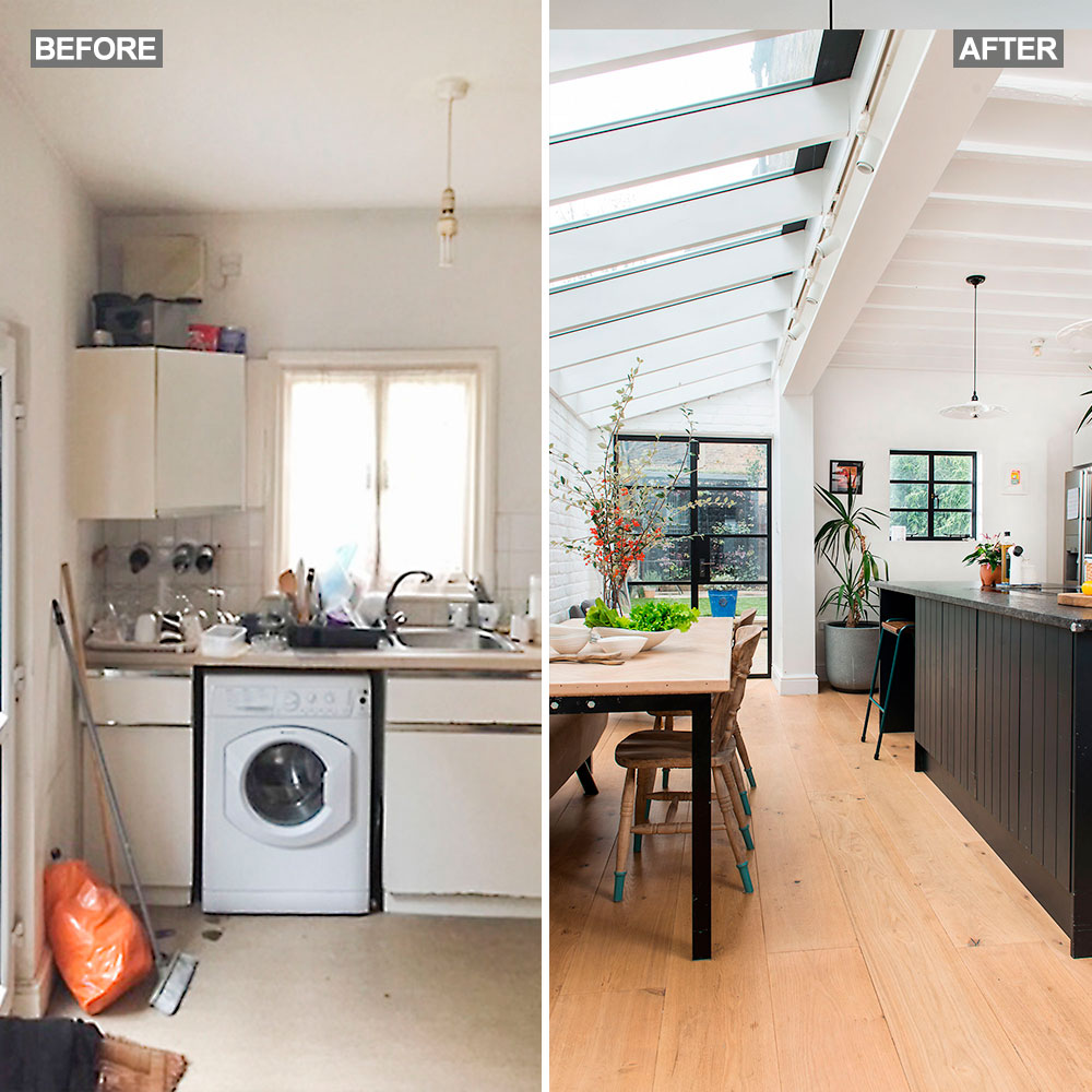
‘Our main objective was to create a spacious kitchen with the island and dining table taking centre stage. In the old kitchen, we squeezed a small, round table into a bay window but could only seat four people – now, we can accommodate eight comfortably' explain the couple.
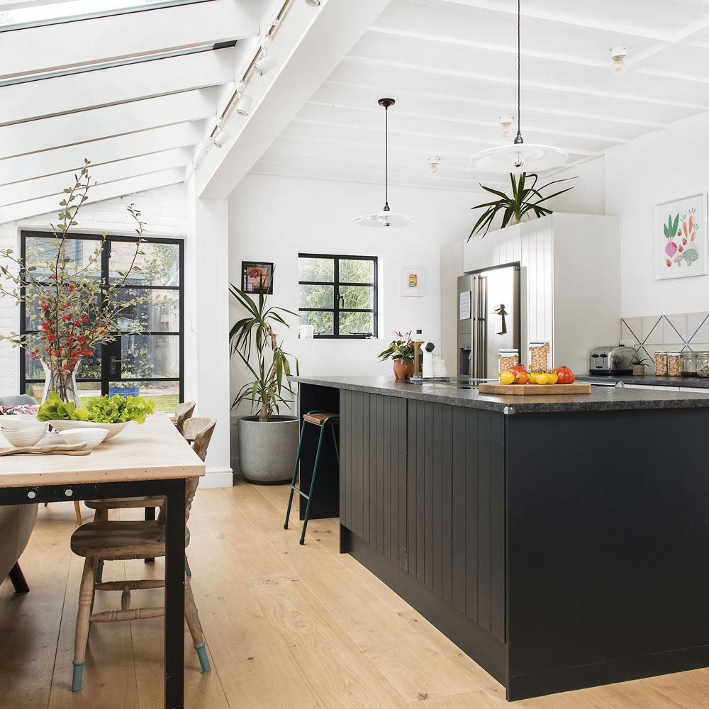
'We used Resi, an architecture practice, to secure planning permission, but I’m a builder so I built the extension myself' says the homeowner proudly. My partner and I produced several different layouts on graph paper, detailing the dimensions for the space needed – for things like walking between the island and kitchen units. And what might be required for the seating area.'
Being a builder, the owner not only built the extension but designed the pitched glass roof as well.
‘It was a fairly straightforward design using planed structural timber, double-glazed panels and power-coated aluminium capping. In fact, it was probably cheaper than a slate and Velux alternative and allows plenty of light to flood in.’ The combination of a glazed pitch roof and large steel-style windows and doors provide a bright, airy feel to the kitchen.
Get the Ideal Home Newsletter
Sign up to our newsletter for style and decor inspiration, house makeovers, project advice and more.
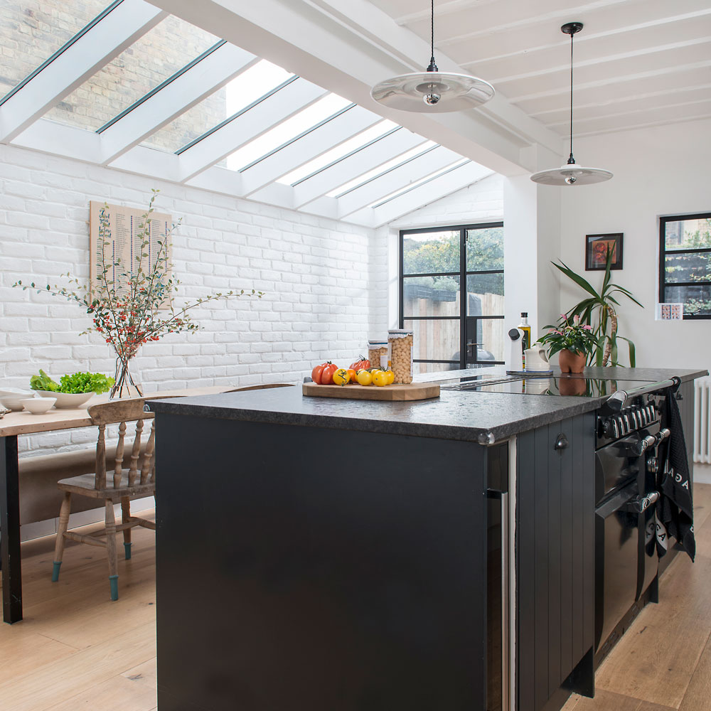
'After introducing texture in the form of an exposed brick wall and raising the ceiling to reveal the upstairs floor timbers, we opted for a white colour scheme, allowing the windows, tiles and island to become the main showpieces.'
'We fitted our Range cooker within the island, so that you are facing the dining table while cooking. Now, when we’re entertaining, we can prepare the food while chatting to our friends. Before, one of us would be stuck out in the kitchen, not involved in the conversations. We chose a leathered granite worktop because it’s not only strong but has a slightly uneven surface so you don’t see cleaning streaks or marks.'
Stylish storage solutions
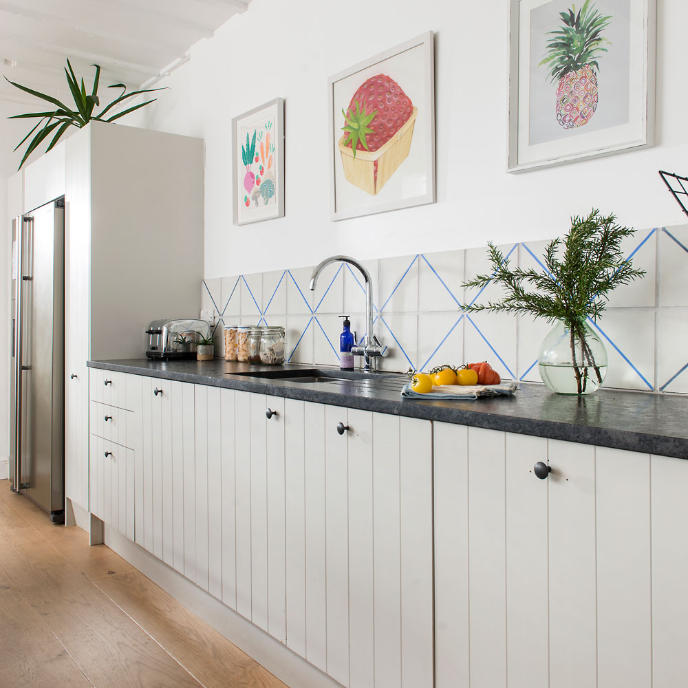
'We wanted plenty of cupboards and storage space – and in convenient locations, too. For example, to the left of the oven is a pull-out bin for food scraps when you’re chopping and peeling' they explain. 'On the other side is a cupboard for pots and pans – so everything we need is within reach.'
The owners wanted to avoid traditional shaker-style doors. Instead, they chose a simple v-groove design from Howden’s which provides depth to an otherwise flat panel. The addition of plain black handles creates a classic timeless look.
Concealed appliances
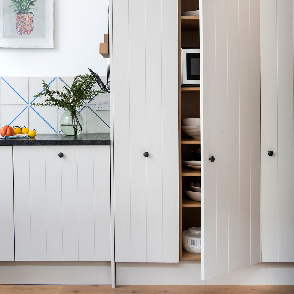
To make this kitchen seamlessly stylish, everyday design aspects were well considered. 'Microwaves are invaluable when you have young children but aren’t the prettiest of items, so we’ve hidden ours' the couple reveal. 'We just open the door when we need it, then close it off again when we’ve finished. It helps the kitchen remain clutter-free.'
'Essentially, we’ve created plenty of storage options without it appearing like the space is full of cupboards. In fact, it’s quite a clean space. We’ve achieved that effect partly by not fixing wall cupboards; they would have enclosed the space too much.'
Thoughtful layout
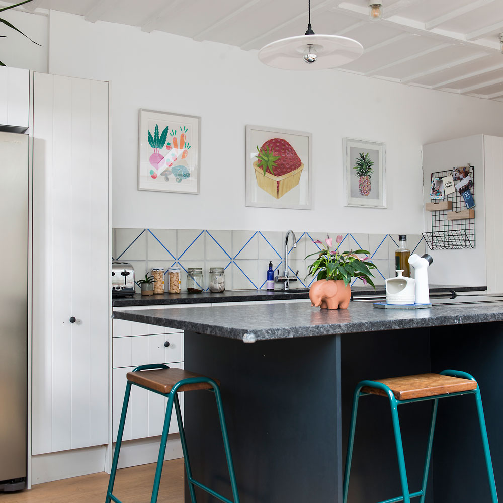
‘It's important to take time to explore different options and layouts, focusing on where items, such as ovens, tables and islands, will be placed. Or how much room you want between your table and any cupboards or islands.'
Adding, 'For us, the inclusion of an island has been a big success. Now, we can sit round it and read the paper, watch TV or chill and chat while our two-year-old plays around us. As well as the big stuff, remember that the best ideas aren’t always the most expensive ones. For example, we decided to hang free or inexpensive paintings by family and friends to our walls, adding a splash of colour in the process.
The owner explains, 'The build took around three months and went smoothly. Although was a little delayed thanks to a massive storm striking halfway through the project. We’re very happy with our new kitchen.'
'Although, in hindsight, installing underfloor heating might have been a good idea. We can definitely say that our bigger, smarter, more contemporary kitchen has improved our lives.’
Further finishing touches: Kitchen wall decor ideas – easy and affordable ways to style your space
This impressive kitchen makeover was featured in the July 2020 issue of Ideal Home. Words by Richard Webber.
Tamara was Ideal Home's Digital Editor before joining the Woman & Home team in 2022. She has spent the last 15 years working with the style teams at Country Homes & Interiors and Ideal Home, both now at Future PLC. It’s with these award wining interiors teams that she's honed her skills and passion for shopping, styling and writing. Tamara is always ahead of the curve when it comes to interiors trends – and is great at seeking out designer dupes on the high street.
-
 The 6 outdoor lights from Habitat that I'm choosing between to make my outdoor space look more expensive this summer
I couldn’t believe some of the prices
By Ellis Cochrane
-
 Joseph Joseph 3-piece Saucepan review – seriously space-saving
Small kitchen? I tested this innovative Joseph Joseph space-savvy set which has foldable handles — and I loved it
By Annie Collyer
-
 Forget seating, this is how you should be making the most out of your kitchen island in 2025
Seating doesn't always have to be a necessity on an island when you can choose these ideas instead
By Holly Cockburn
-
 Two brothers save £2,000 on parquet flooring for their mum's living room by using wooden pallets
What a transformation!
By Millie Hurst
-
 Before and after: See how a narrow kitchen was transformed without an extension
Reversing the layout transformed the use of this skinny kitchen, without the need to extend
By Amy Cutmore
-
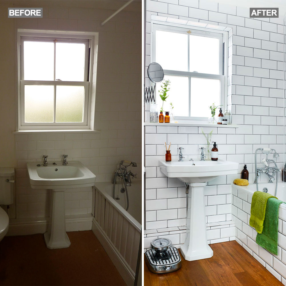 Before and after: homeowners transform bland bathroom to chic retreat
When the time came to redecorate their bathroom, the owners used what they already had – making small changes to create a fabulous new scheme
By Andreia Shelley
-
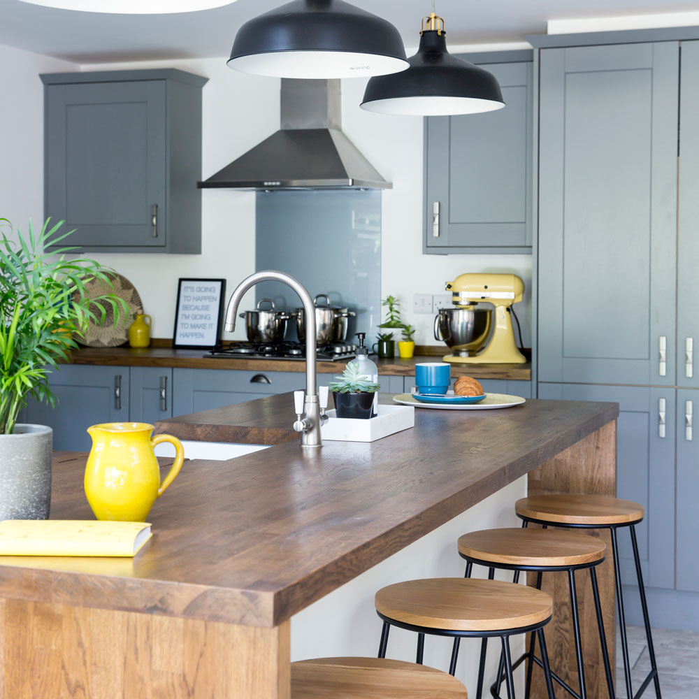 Before and after: space and style was the order of the day this gorgeous kitchen makeover in grey and white
This epic project delivered equally epic results
By Miriam Habtesellasie
-
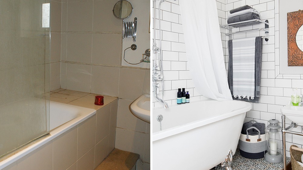 Before and after – using a room's varying floor levels puts the bath centre stage
This owner has created a dramatic heritage-style suite
By Amy Cutmore
-
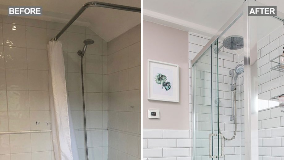 Before and after – a new layout has taken this bathroom from dreary to delightful
Moving the loo has opened up the space
By Holly Walsh
-
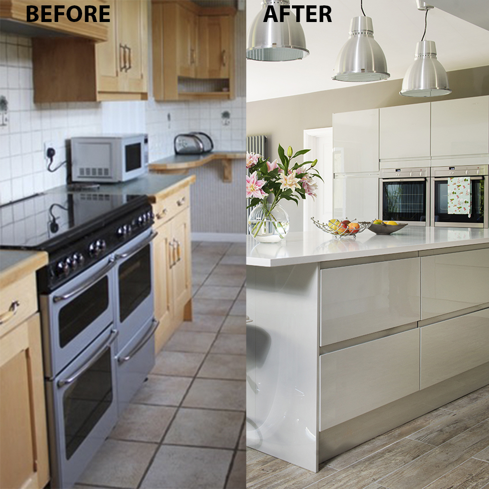 Before and after: from poky kitchen to extraordinary extension
Fed up with their cramped kitchen but unwilling to leave an area they love, the owners decided to knock through and extend their kitchen
By Katie Garrett
-
 Before and after: raising a window made room for more kitchen units
A tricky layout was no match for the owners' planning skills when they tackled their new home's kitchen
By Andreia Shelley