Savvy planning saw homeowners extend tiny kitchen into a contemporary open plan space
One that blends texture, colour and creativity - all for a snip of their original budget
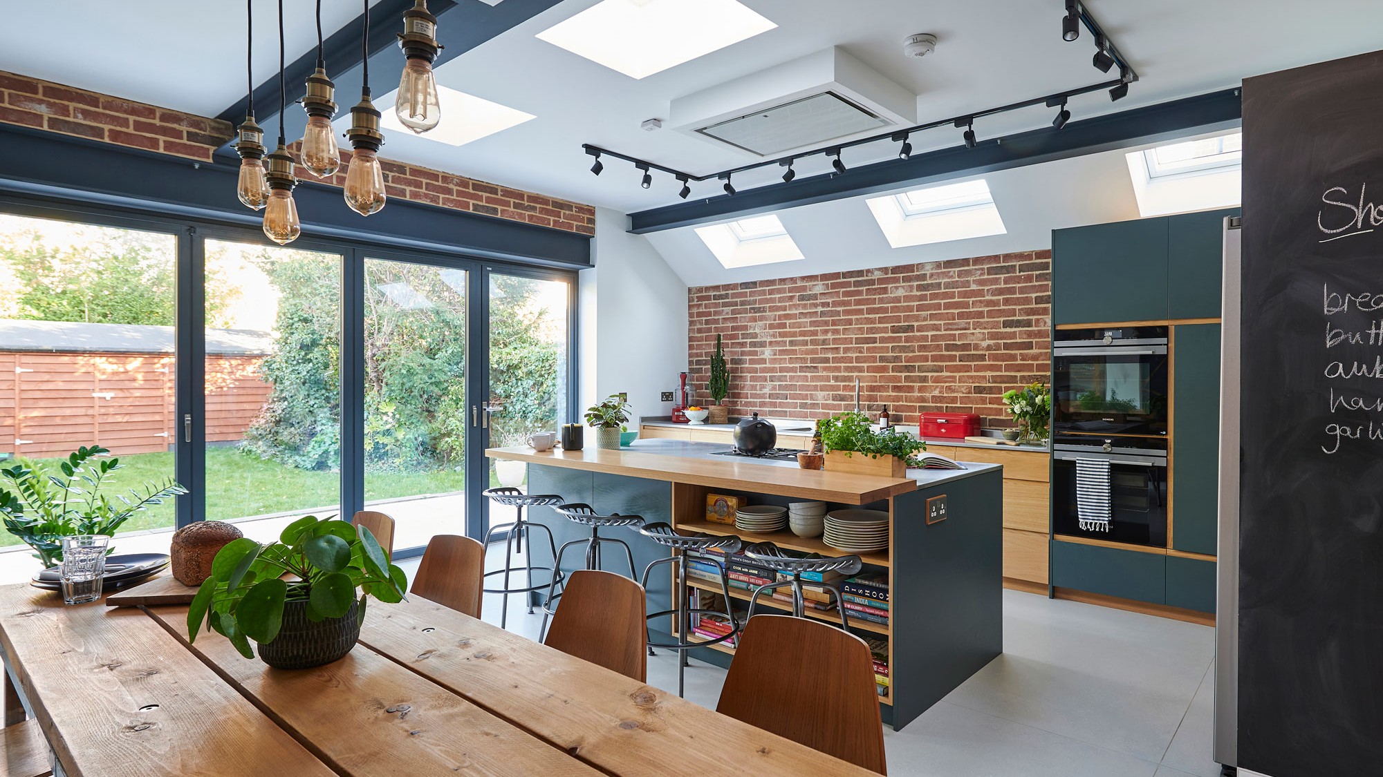
The owners of this kitchen wanted to create a spacious family living area where they can all be together, while all doing their own thing. 'We bought the house in 2010 and thought we’d only be here for a few years, but we love the area and have great neighbours, so we decided to stay and extend the downstairs living space to create a sociable area.'
'Fortunately for us, my brother-in-law is an architect. He drew up the plans from my sketches, creating an industrial style kitchen/diner that extends through to the old dining room.'
The impressive new kitchen extension features Bi-fold doors and sleek roof windows flood the new space with natural light, which reflects off white painted walls. A high ceiling, steel beams painted in grey anthracite to blend with the cabinetry and exposed brickwork, inject a contemporary feel that is emphasised with strong flush lines and stainless-steel worktops and appliances.
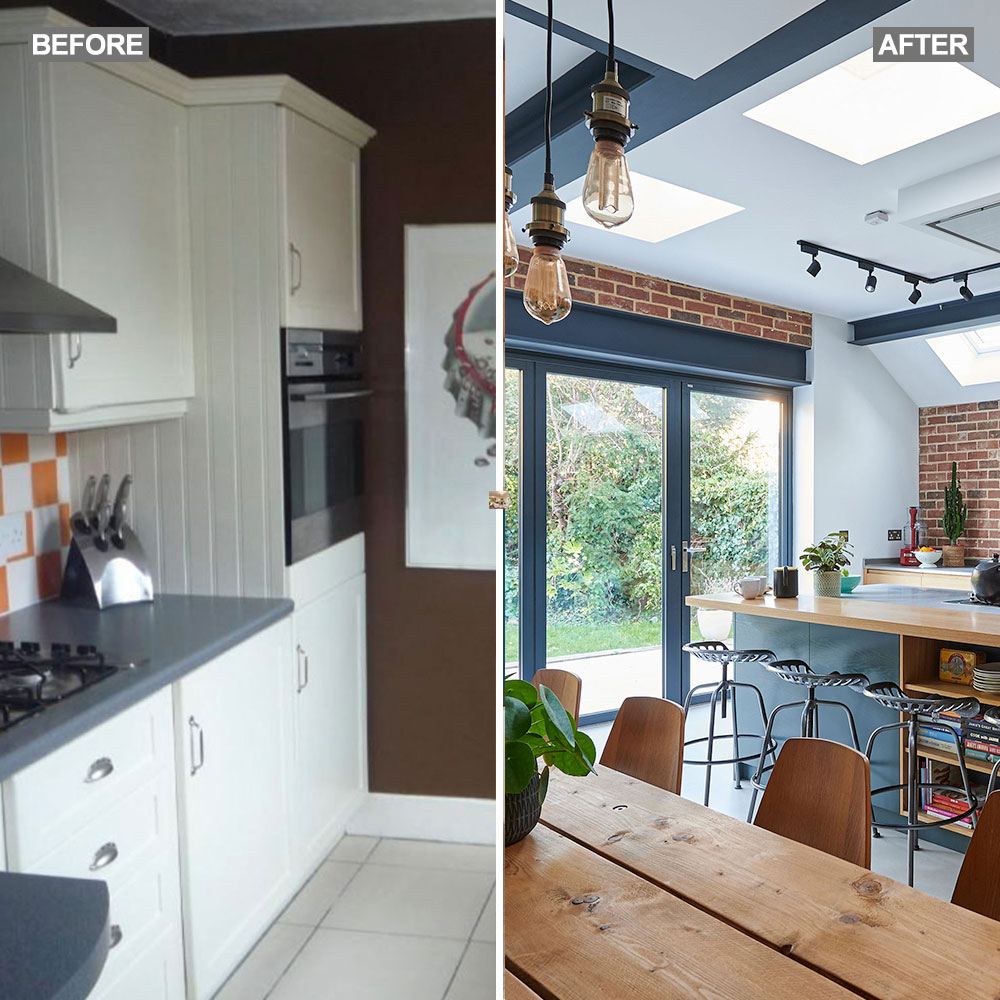
Contemporary open plan kitchen makeover
'I love the symmetry of the kitchen with its strong lines and flush finishes that give it a contemporary look' exclaims the homeowner. 'Exposed brickwork, warm oak and stainless steel add texture and colour.'
'I found the kitchen company, Naked Kitchen on Pinterest while looking for inspiration. The solid oak cabinets are a mix of painted and unpainted units, with the colour mixed to match a sample. We didn’t want a kitchen that we had to be precious about, so everything has been designed to be practical. It functions well as a working kitchen, a family space and a place to entertain. We love the simplicity of the space and how it works for us as a family.'
To maintain clean lines, the American style fridge freezer was inset into a wall, which meant building a false wall, that also houses a larder cupboard. To tie everything in we’ve painted the surround the same colour as the cabinetry' – a brilliant grey kitchen idea for inspiration.
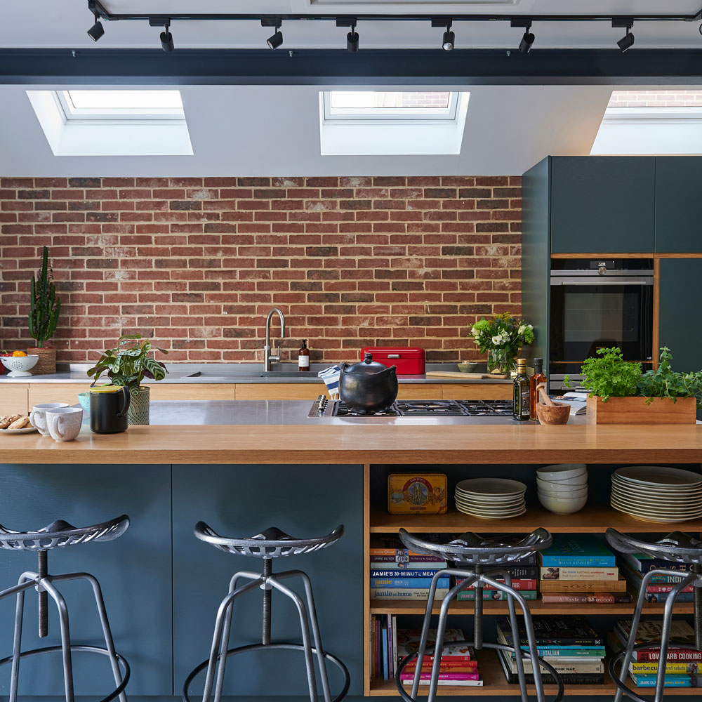
'Thanks to a local engineering company who made the stainless steel worktops, we saved over £6K' explains the homeowner. 'I used to work in catering and enjoy the practicality of working on stainless steel. It’s hygienic and easy to keep clean and I don’t have to worry about pot marks.'
Get the Ideal Home Newsletter
Sign up to our newsletter for style and decor inspiration, house makeovers, project advice and more.
'I had wanted a concrete floor, but it was too expensive. By chance I came across these amazing tiles which help to soften the industrial look and I think they are a better choice. They were the largest tiles in the showroom and measure 1.2m x1.2m but really complement the space.'
Adding ' The underfloor heating is amazing, we have a constant warmth, and without the need for radiators, it’s given us more flexibility with the overall design.'
The steel beams and open high ceiling add to the contemporary industrial look. The beams have been painted in grey anthracite to blend with the cabinetry.
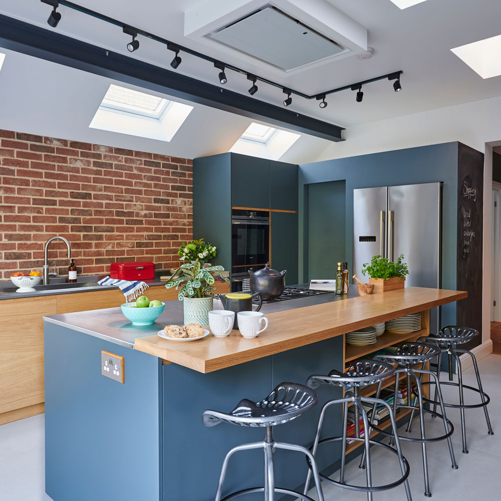
'The extractor fan was a must-have and I wasn’t going to compromise' says the owner of her Luxair extractor hood. 'It’s perfectly flush and creates a clean discrete line. We designed the roof lights to be positioned above the central island to provide plenty of light within the working area. We’ve also got directional track lighting when the natural light fades.'
Breakfast bar
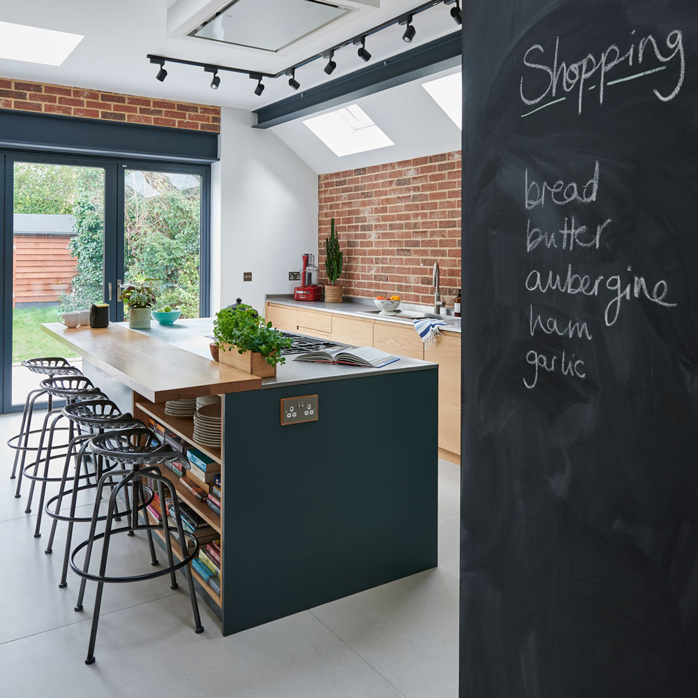
'The children often sit at the breakfast bar and do their homework. It’s given us a flexible seating area. There’s clever storage for my recipe books and crockery below. The tractor-style bars stools were an eBay find.'
'We all make use of the chalk board; it’s great for shopping lists and for the children to draw on. It’s been given three coats of a magnetic chalk paint.'
A length of solid oak extends from the central island unit with stools below to provide an extra seating area. I can enjoy a quick coffee or the children can sit and chat to me while I cook.
Family dining area
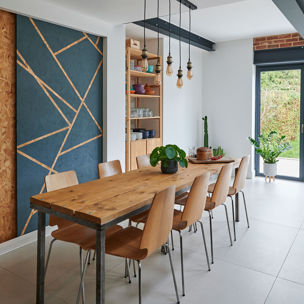
'The dining table is a one-off, made by my husband and his father after we ran out of money. It’s made to my exact measurements and is constructed using a metal frame and scaffolding. It’s given us plenty of space for entertaining, while it’s narrowness makes it intimate.'
Large sliding doors made using inexpensive shuttering plywood, hide the children’s art and craft materials. Christine and her daughter, Sophie, created the geometric design on one of the doors using masking tape and paint.
Handy hot water tap
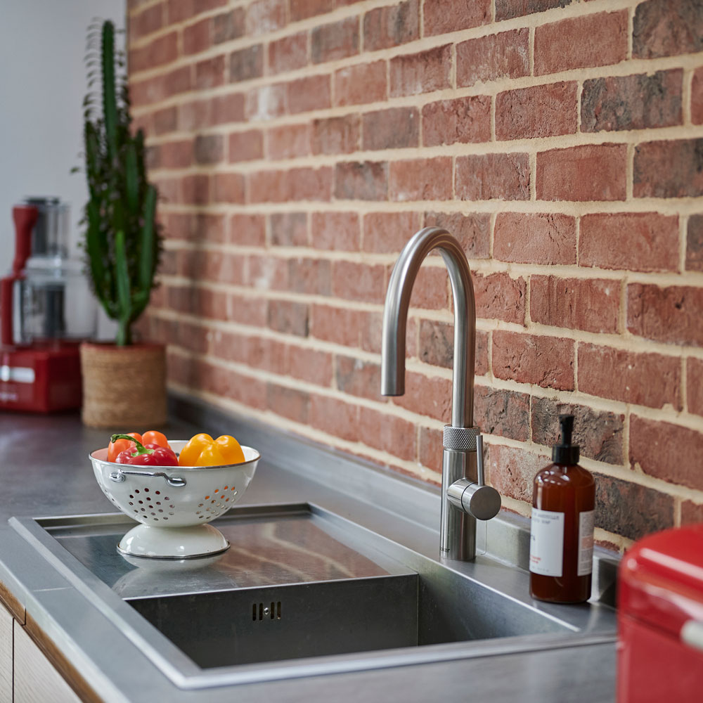
The boiling tap is brilliant. You can have a cup of tea or filtered water in an instant. There’s also one less item to clutter the worktop as I don’t need a kettle.
Inset hob
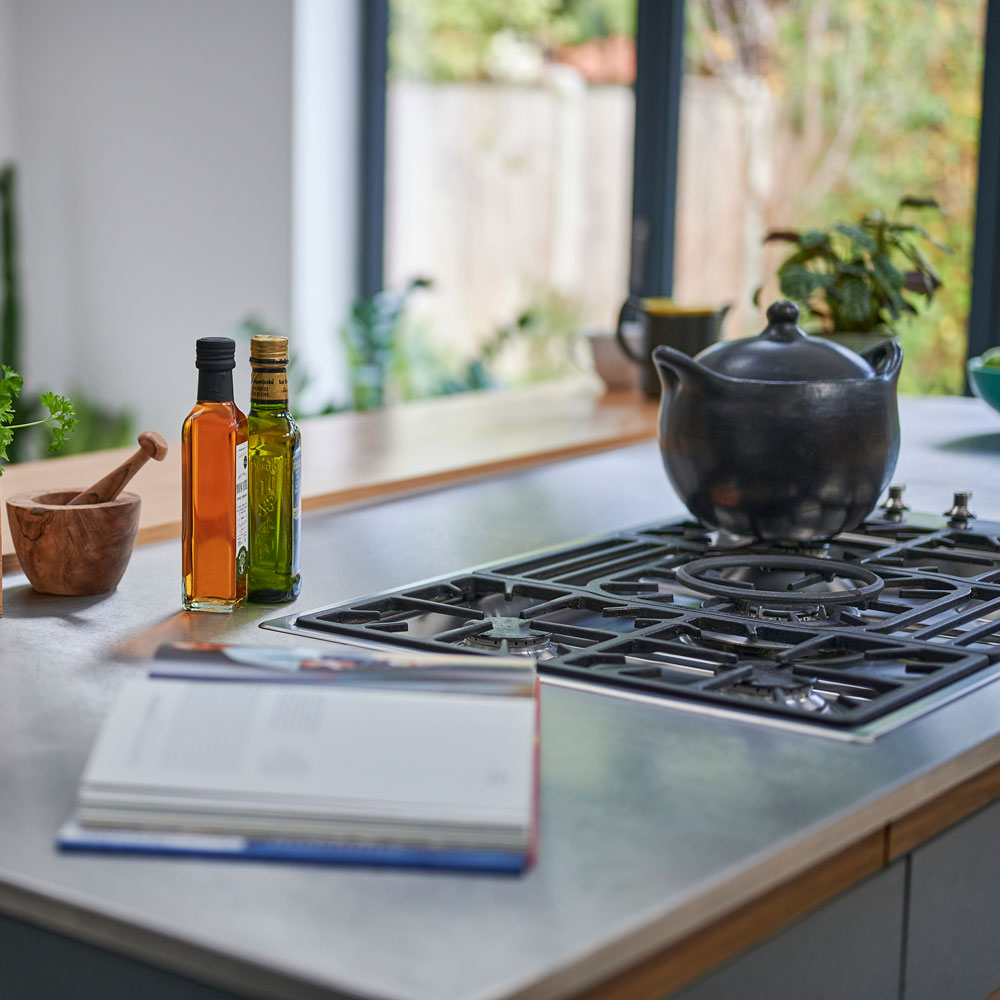
'The Smeg inset hob is amazing to work with, I’ve lost some storage space below, but I love that even the pan supports are flush to the work surface.'
'A double oven gives me the flexibility to cook a roast dinner and a pudding at the same time.' Positioning the oven, hob and sink within an ergonomic triangle makes movement around the kitchen easier.
Kitchen lighting
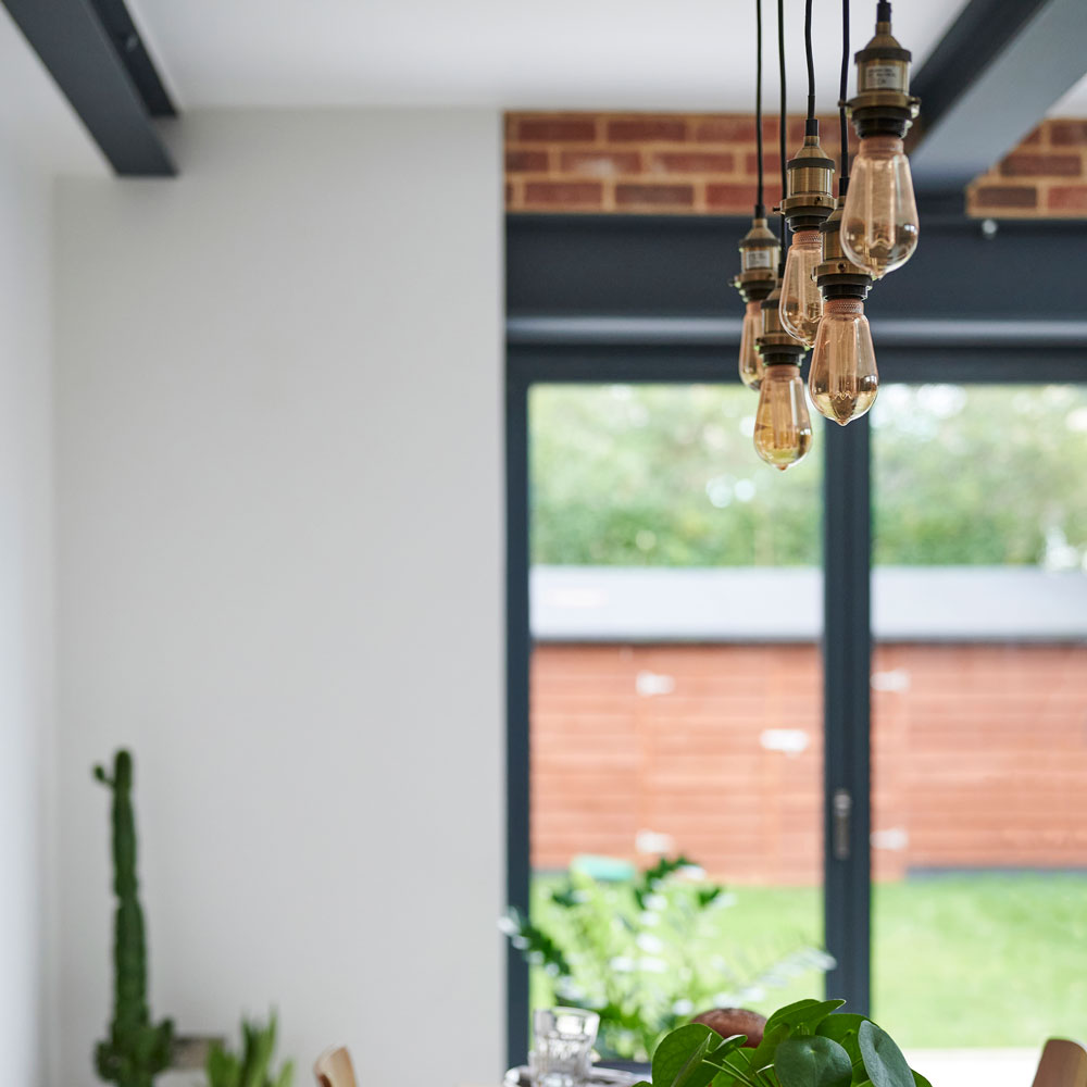
'The pendant lights add a warm ambience when we’re entertaining and the linear design complements the length of the table.'
'The garden is quite small, so to give continuity we extended the tiles onto the patio to bring the inside out. The flush threshold on the bi-fold helps the natural flow.'
Ideal Home asks the homeowner; what have you learned? 'Have faith in your ideas and how you want to use your kitchen. Don’t let your builders or installers set you off your path' says the owner.
Feature by Camilla Sharman
-
 5 brilliant budget alternatives to paving slabs that won't cost the earth
Looking to pave your garden on a budget? Try these stand-ins...
By Sophie King
-
 Want to cook like Jamie Oliver? Here's the top-rated pan from his collection
Jamie's collaboration with Tefal has led to this casserole dish getting the best user reviews I've ever seen
By Molly Cleary
-
 7 best colours to paint a windowless bathroom that will transform the mood of a dark wash space
A bathroom without a view needn’t sink your plans for a warm and welcoming retreat
By Linda Clayton
-
 A £3 IKEA hack helped transform this bedroom into a scandi-inspired retreat
It's the ultimate thrifty makeover
By Laurie Davidson
-
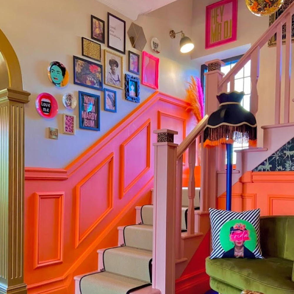 This colourful hallway makeover makes a bold first impression – it’s stunning!
It's a little bit extra and a whole lot of fun
By Laurie Davidson
-
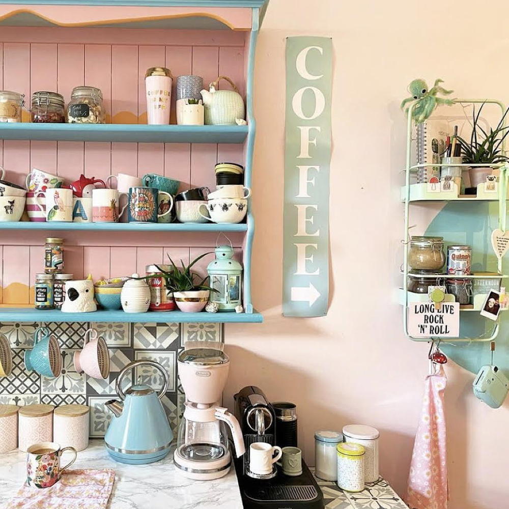 A dull kitchen was given an injection of colour and pattern for less than £250
Eye-popping pastels and gallery walls galore make this scheme pretty unique
By Laurie Davidson
-
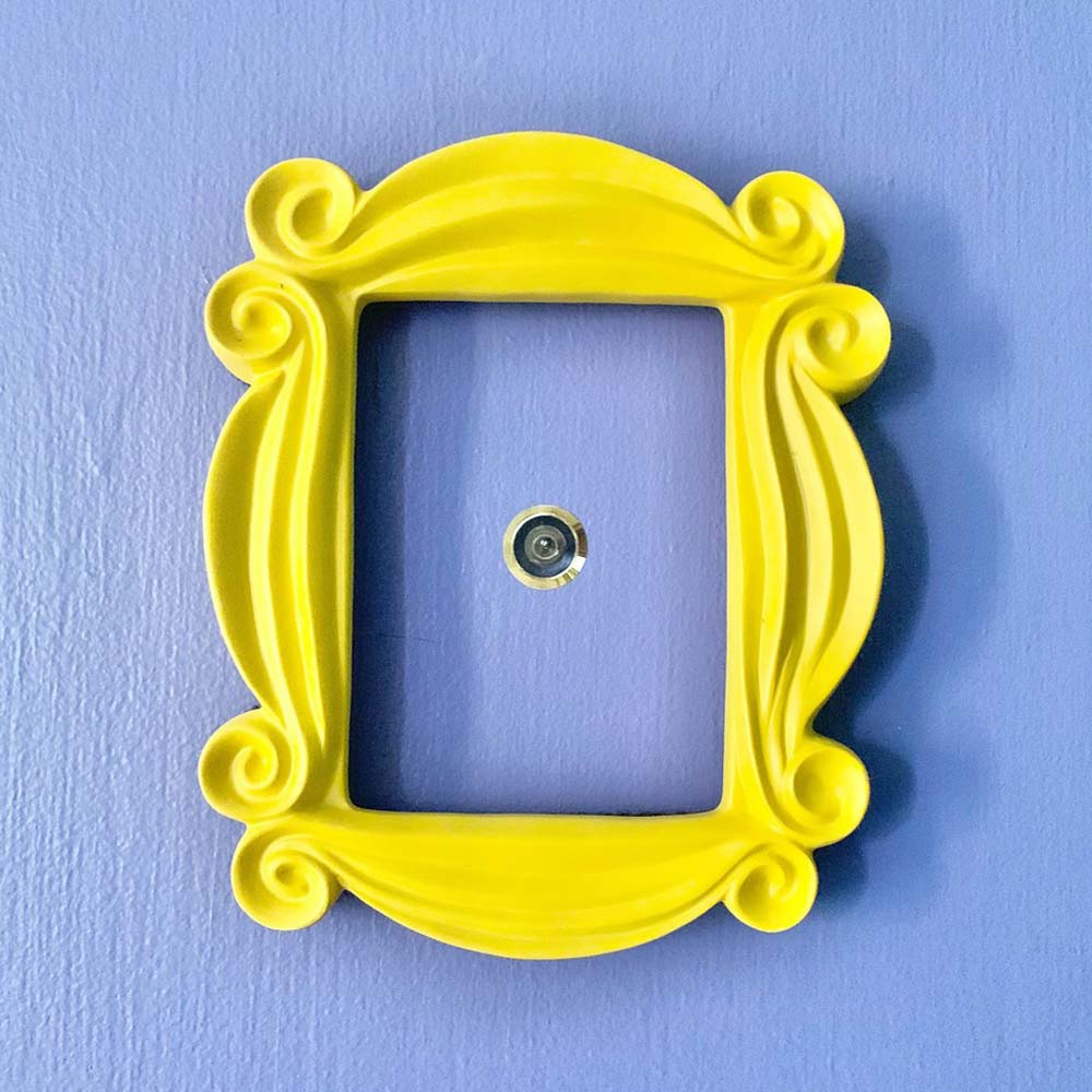 A DIY fan has recreated the Friends kitchen for less than £750
So no one told you renovating was gonna be this way...
By Millie Hurst
-
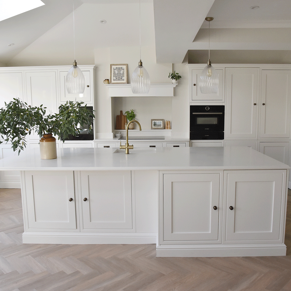 An interiors lover shares her stunning white kitchen makeover
It's now the kind of room you walk into and exhale
By Millie Hurst
-
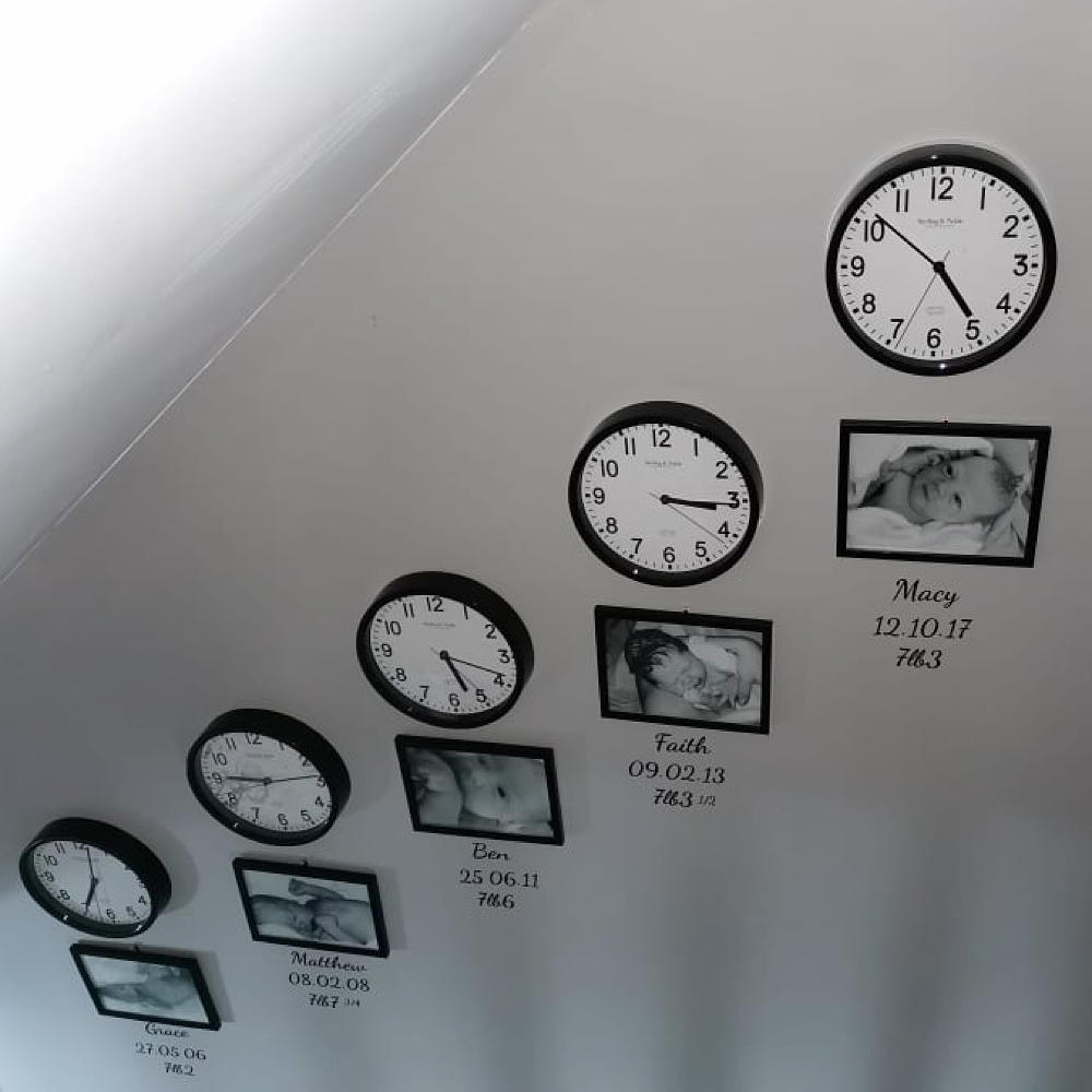 Mum created an adorable hallway tribute to her children for under £80
All it took was some wall clocks, frames and a bit of self-adhesive vinyl…
By Laurie Davidson
-
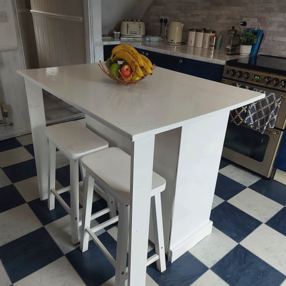 A thrifty DIY fan made a kitchen island for free out of an old set of drawers
'It took two days to complete and cost me nothing!'
By Millie Hurst
-
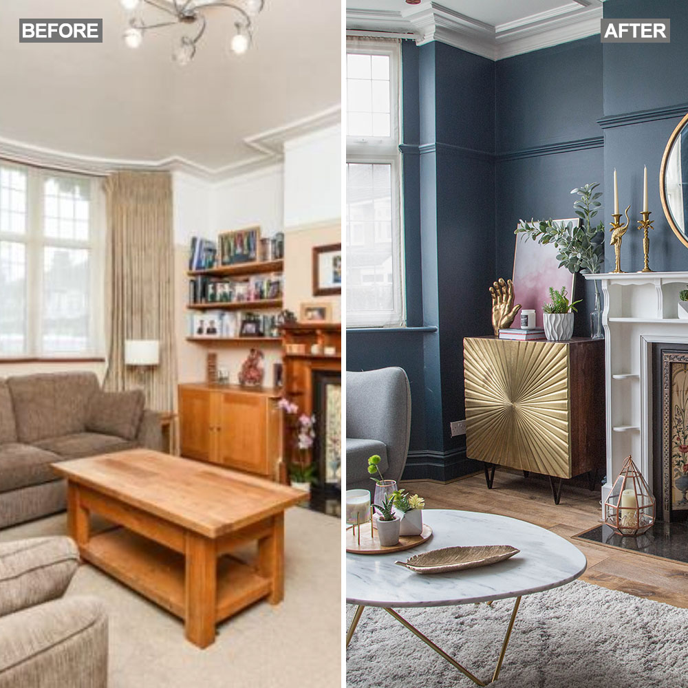 Before and after: A 'boring' neutral living room gets a glam and dramatic makeover
The owners took a risk and banished the beige...
By Amy Cutmore