Before and after: from dated 1930s kitchen to quirky family space
The owner faced months of living in a building site, delayed fittings and even a split lip, but says her kitchen was worth all the drama
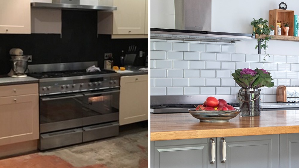

'There’s nothing like having children to show up your house’s shortcomings,’ says the owner of this detached five-bed Thirties house in Cheshire. ‘So when our son and daughter came along, it became clear our existing kitchen just wasn’t going to work.'
'It was small, boring and beige but because it was usable, we ended up living with it for years. My husband and I could clearly see that no thought was given to how a family would use it and this was, after all, a family home, so it really needed sorting once and for all.'
The kitchen was just one element of the three-storey extension the couple were planning. 'We started the kitchen ideas of the project first, but we had to complete the various stages as funds allowed. My husband project managed and did as much of the work himself as he could – no mean feat for a man who barely knew how to build flatpack furniture!'
The extension starts where the old kitchen ended and a conservatory, outside toilet and laundry shed were demolished to make room for it all. Taking out the back of the house meant a huge RSJ was needed, giving the family 500 sq ft of new, open-plan space.
Kitchen makeover
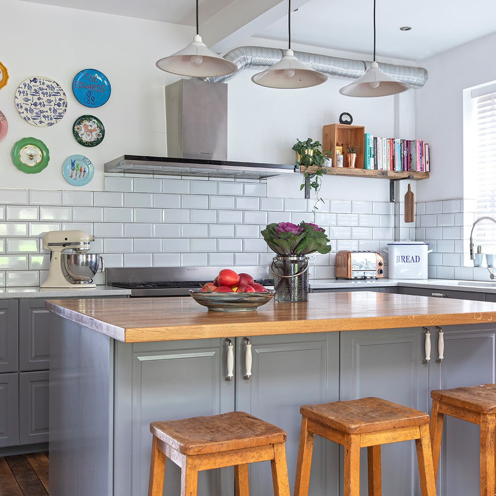
The work wasn't without its problems. 'We couldn’t afford to move out during the work, so we ended up living on a building site for a long time, says the owner. Dust aside they managed to make it work.
'In all, the work on the kitchen took six months, and with the builders finally out of the house, I was able to start focusing on the finishing details' the owner explains.
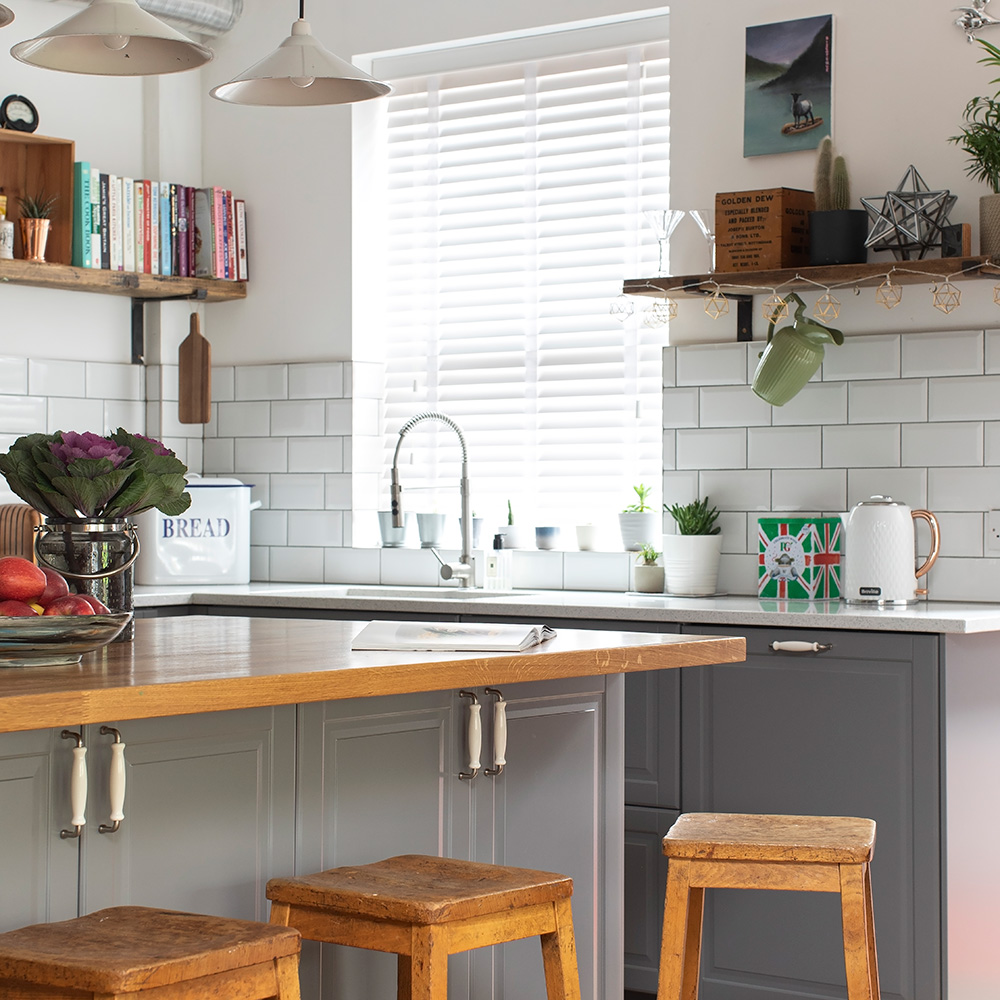
‘The directional tap is a game changer because you can rinse every corner of the sink! You can get them in a range of prices, too.’
Get the Ideal Home Newsletter
Sign up to our newsletter for style and decor inspiration, house makeovers, project advice and more.
'We did have the foresight to plan the kitchen lighting ideas early so the power points are in the right place. We wanted downlighters for task lighting and mood lighting over the island and table.’
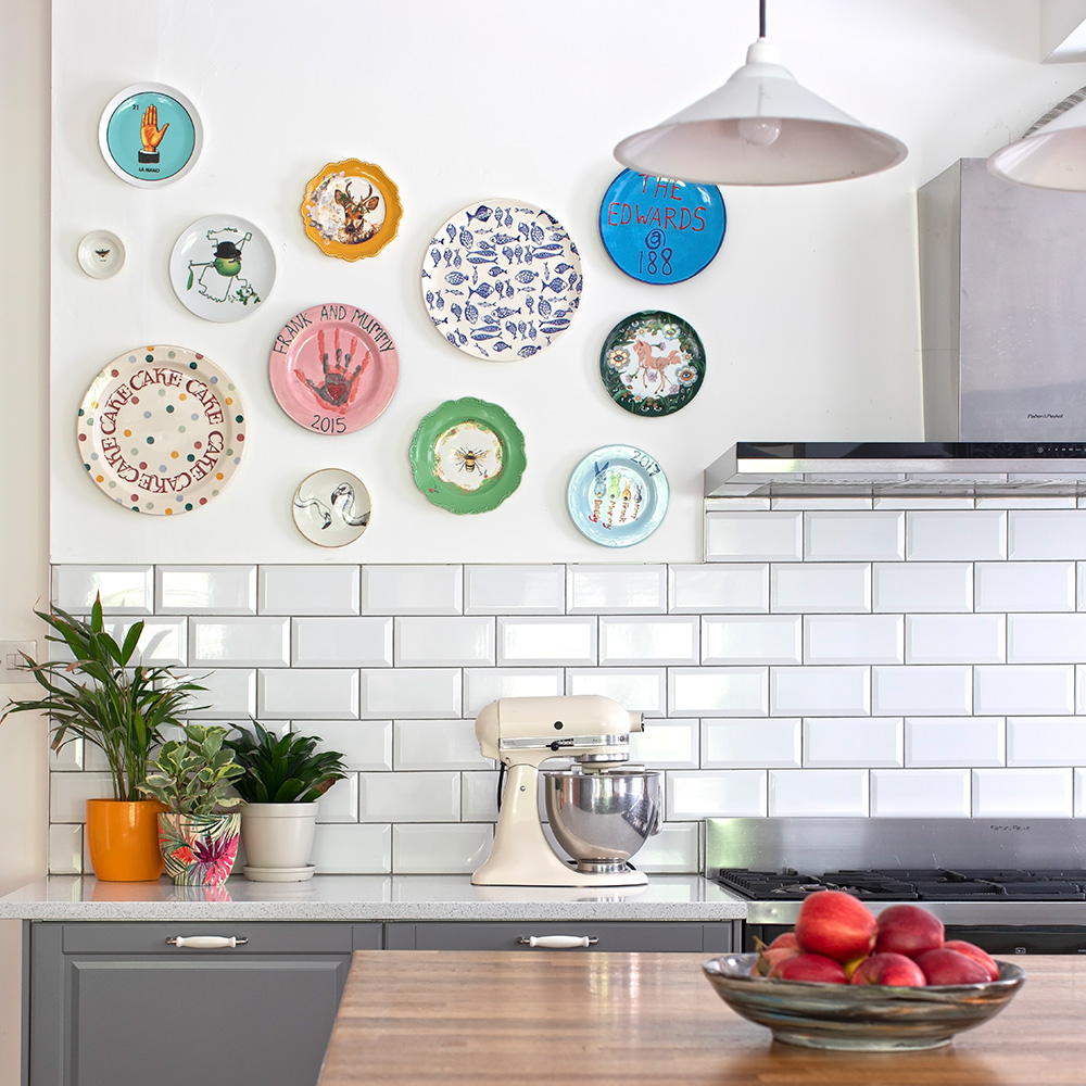
‘I wanted to have fun styling the kitchen and knew it was the perfect excuse to display the plates and pictures I’ve collected over the years’
Open-plan dining area
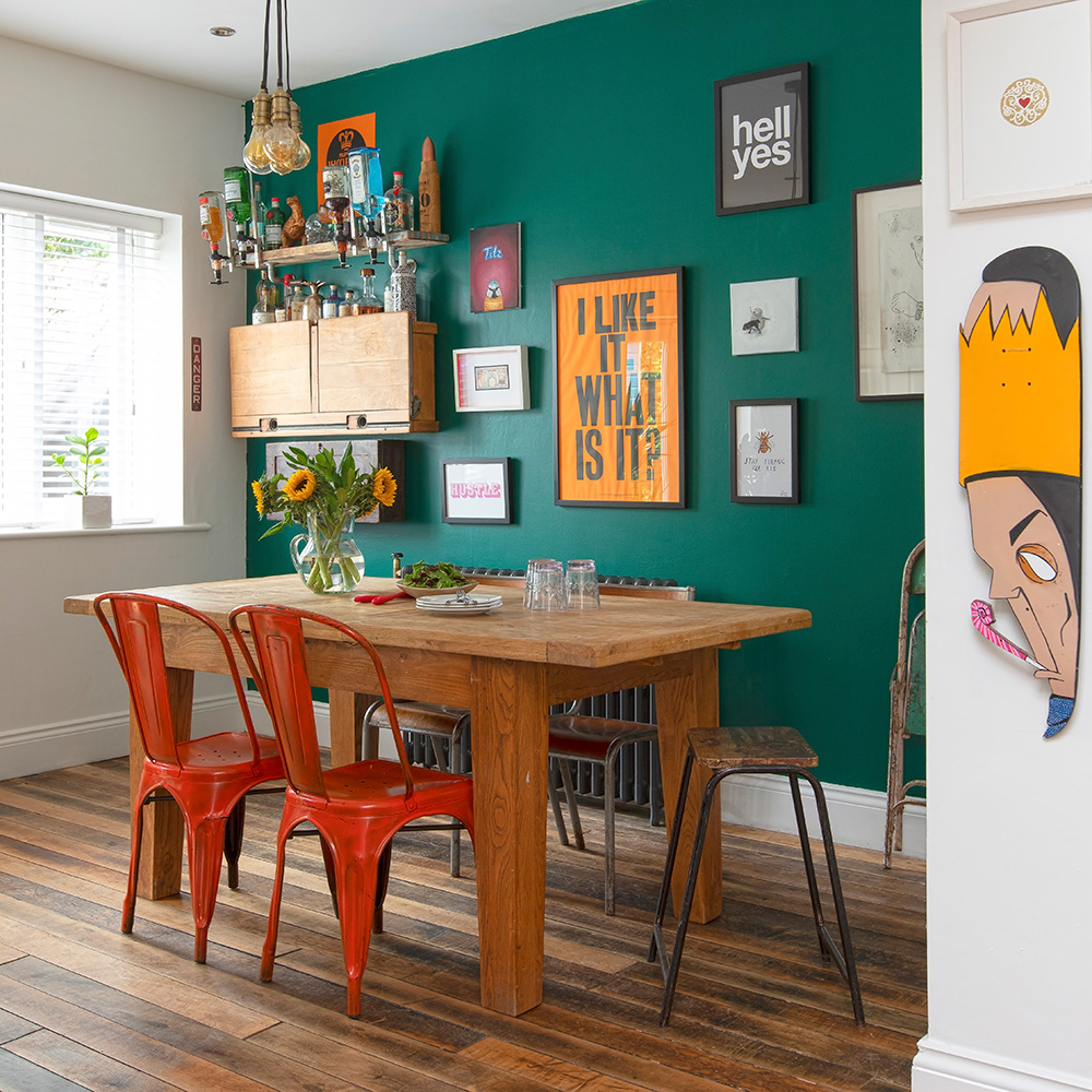
A vivid emerald green on the wall behind the table really helps to define the dining area in this open-plan space, and provides a vibrant backdrop for a striking gallery wall and quirky, wall-hung bar.
'Before, when it came to decorating, I’d just go with whatever colours and furnishings were in fashion, but by this stage, I had the confidence to follow my own tastes,' says the owner. 'I love colour and I wanted the kitchen to be a fun space.'
The new space is bursting with character, 'The flooring is maple from an old tobacco factory. It had 130 years worth of dirt ingrained and took ages to clean.'
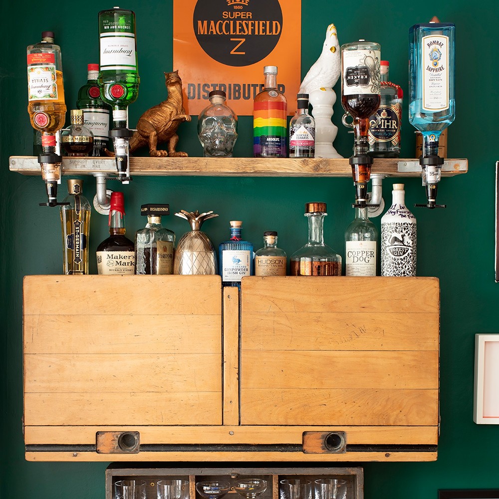
'The old school desk makes the perfect wall-mounted drinks cabinet – it’s a real talking point!’
Speaking of the bold dining room colour scheme the owner remarks, 'If something doesn’t work, I can always repaint it. Sometimes I see a shade and obsess about how to make it work somewhere. I’d already used a deep green paint to upcycle a sideboard and loved it so much, I used it on the dining area walls, too.'
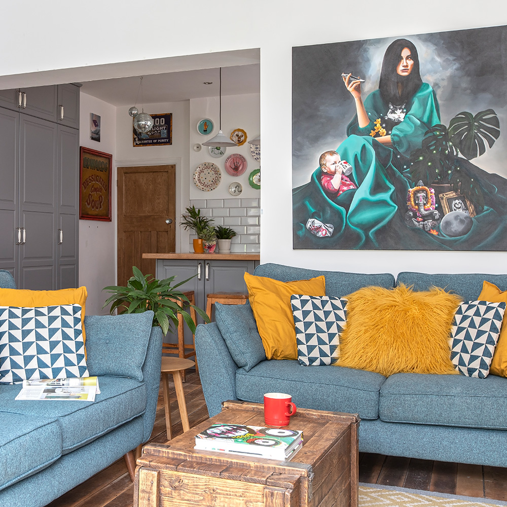
Pick an accent colour and echo it around an open plan room using accessories to help tie the scheme together. The owner of this space chose a buttercup yellow shade.
Now the family has had a chance to use the space, they've found it works really well. 'No-one’s stuck cooking on their own in the kitchen when we’ve got friends over,'says the owner. 'And we can keep an eye on the kids doing their homework when we’re making dinner.'
'Yes, there were bumps along the way but it was all resolved in the end. Now we have the social space we wanted. In fact, it’s the new heart of our home.’

Amy Cutmore is an experienced interiors editor and writer, who has worked on titles including Ideal Home, Homes & Gardens, LivingEtc, Real Homes, GardeningEtc, Top Ten Reviews and Country Life. And she's a winner of the PPA's Digital Content Leader of the Year. A homes journalist for two decades, she has a strong background in technology and appliances, and has a small portfolio of rental properties, so can offer advice to renters and rentees, alike.
-
 Wood drenching is the calming new twist on the colour drenching trend – here’s how to make the look work in your home
It’s easier than ever to embrace natural materials
By Maddie Balcombe
-
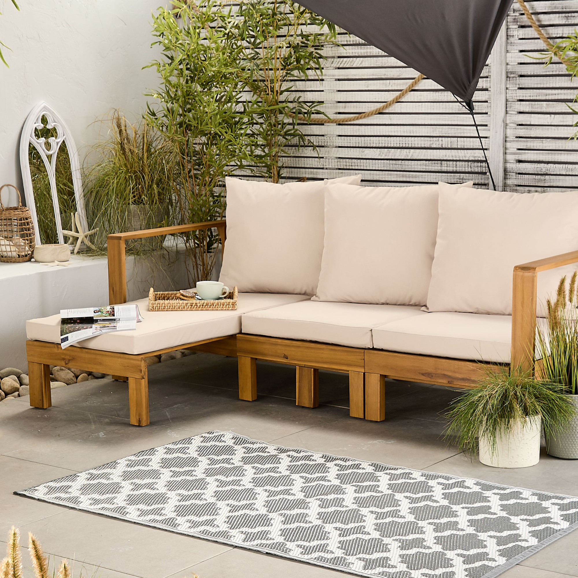 Aldi is launching a £200 day bed with four different features - its sleek design is suited to the whole family
You don't want to miss out on this Specialbuy
By Kezia Reynolds
-
 How to set up a drip watering system that saves water and a lot of effort
Keep your plants hydrated (and your water bill down) with this clever garden watering solution
By Natalie Osborn
-
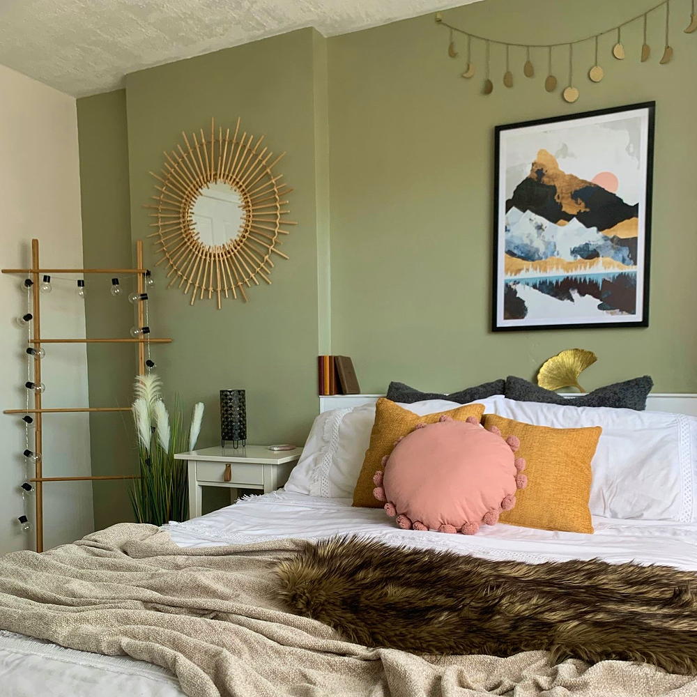 A £3 IKEA hack helped transform this bedroom into a scandi-inspired retreat
It's the ultimate thrifty makeover
By Laurie Davidson
-
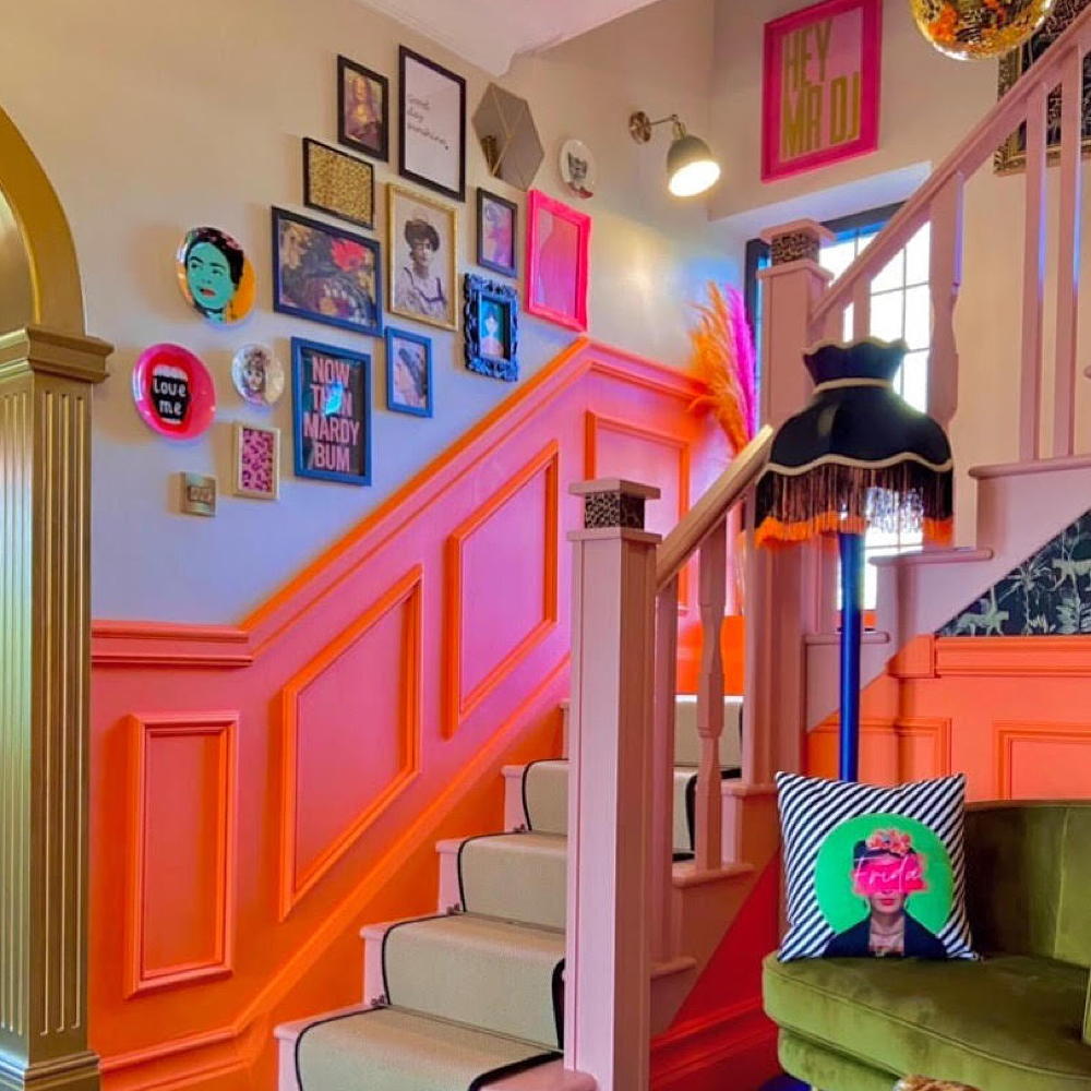 This colourful hallway makeover makes a bold first impression – it’s stunning!
It's a little bit extra and a whole lot of fun
By Laurie Davidson
-
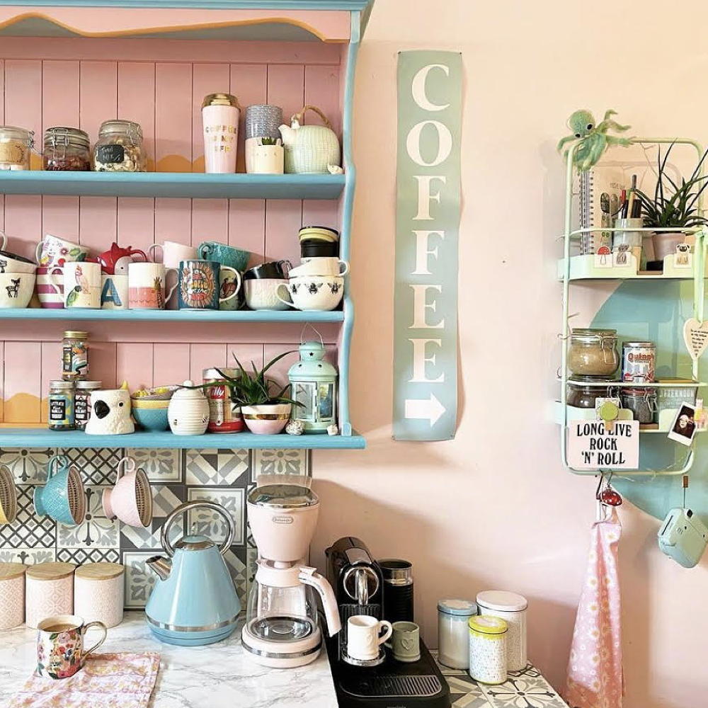 A dull kitchen was given an injection of colour and pattern for less than £250
Eye-popping pastels and gallery walls galore make this scheme pretty unique
By Laurie Davidson
-
 A DIY fan has recreated the Friends kitchen for less than £750
So no one told you renovating was gonna be this way...
By Millie Hurst
-
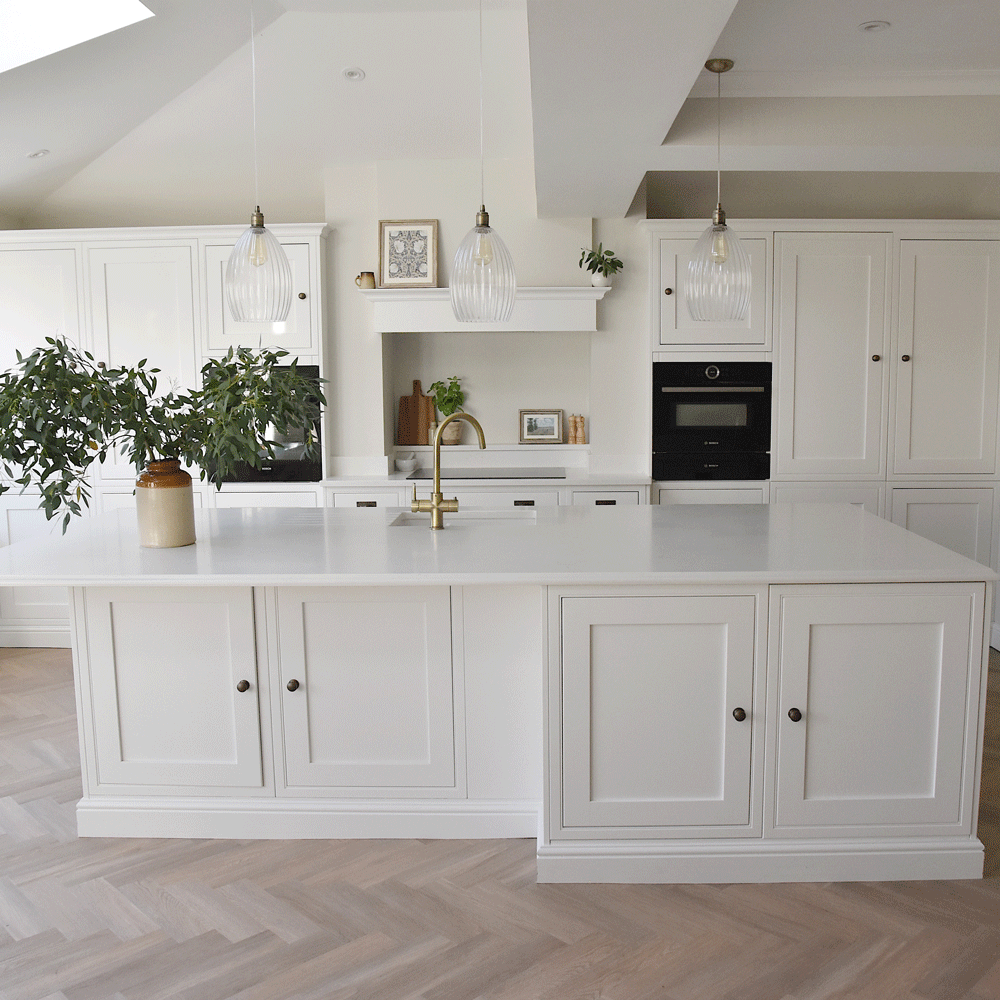 An interiors lover shares her stunning white kitchen makeover
It's now the kind of room you walk into and exhale
By Millie Hurst
-
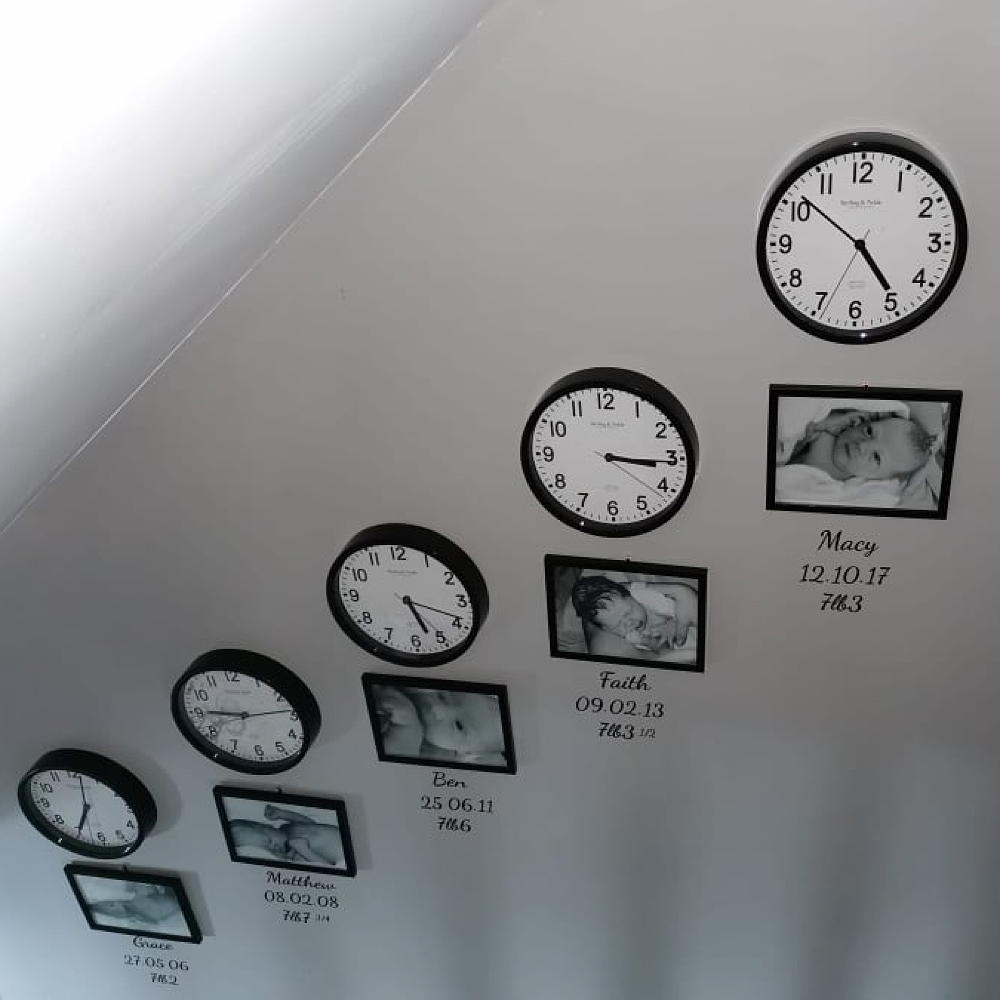 Mum created an adorable hallway tribute to her children for under £80
All it took was some wall clocks, frames and a bit of self-adhesive vinyl…
By Laurie Davidson
-
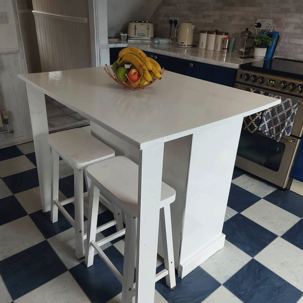 A thrifty DIY fan made a kitchen island for free out of an old set of drawers
'It took two days to complete and cost me nothing!'
By Millie Hurst
-
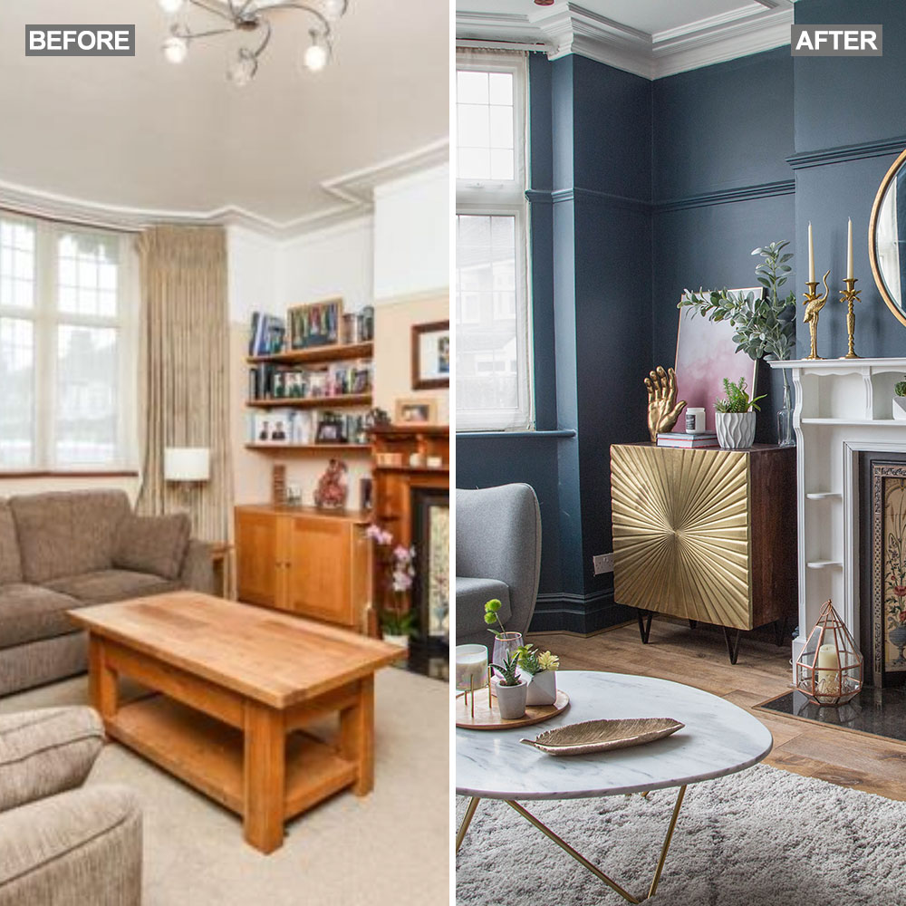 Before and after: A 'boring' neutral living room gets a glam and dramatic makeover
The owners took a risk and banished the beige...
By Amy Cutmore