Galley kitchen ideas – 26 layouts to suit any space
A Victorian staple, galley kitchen ideas are renowned for their petite footprint. Discover how best to design and dress the space with these expert ideas
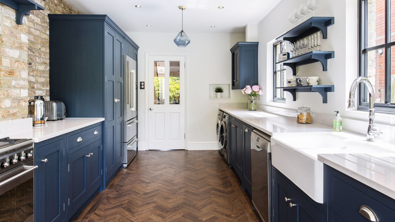

Holly Reaney
Galley kitchen ideas are defined by their floor plan – a long and thin room with cabinetry occupying one or both walls to create a small walkway down the centre.
Taking its name and design from the kitchens of planes and ships, galley kitchens are one of the most practical kitchen ideas. While other styles of kitchen prioritise lifestyle elements and practicality, galley kitchen ideas prioritise efficiency and compactness.
After all, there is a reason that professional kitchens follow a similar kitchen layout with rows of cookers or hobs divided into specific stations for prepping different types of dishes.
Despite the priority being on functionality, galley kitchens can also be beautiful spaces brimming with character.
Galley kitchen ideas
Most commonly found in Victorian terraced houses, galley kitchens are seen in homes up and down the country.
‘A single galley kitchen is perfect for smaller spaces,’ says Lizzie Beesley, head of Design at Magnet. ‘This layout features a row of cabinets on one wall with free space on the other. Larger kitchen areas benefit from a double galley layout, which features cabinets on both sides of the room with free space on either end,’ adds Lizzie.
A double galley is not only a successful layout in narrow rooms that would struggle to accommodate U-shaped kitchen ideas, but have enough width to take two rows of units. It’s a winning format that’s popular in open-plan spaces too, with a long island providing a second leg and creating a sociable seating area and a natural boundary for the kitchen zone at the same time.
Get the Ideal Home Newsletter
Sign up to our newsletter for style and decor inspiration, house makeovers, project advice and more.
1. Start with the measurement for your galley kitchen
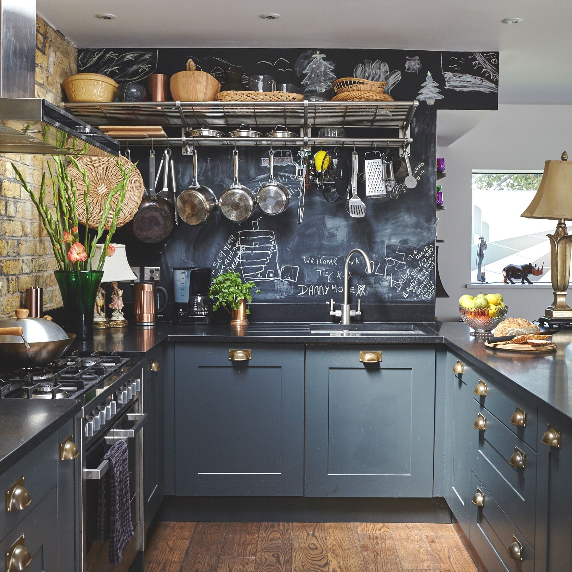
When it comes to figuring out how to plan a kitchen layout, measurements are key. For small galley-style kitchens, however, every centimetre counts.
‘When designing your layout, always leave 40 inches of walkway space on either one or both sides of your countertop, island, or peninsula counter. This is a functionally and aesthetically effective dimension to keep in mind,’ agrees Tom Howley, founder of the eponymous kitchen brand.
’If you have set aside the space for a walkway of around 40 inches, standard oven or fridge doors will compromise a considerable portion of that space when opened,' explains Tom Howley.
There are two solutions. One is to increase the walkway space to incorporate open doors and cabinets to allow a person to pass while the doors are open. The other is to embrace modern designs.
'Built-under draw fridges and dishwashers work brilliantly, as well as ovens with doors that slip back underneath the oven itself,' recommends Tom Howley.
2. Go all white to open up a narrow space
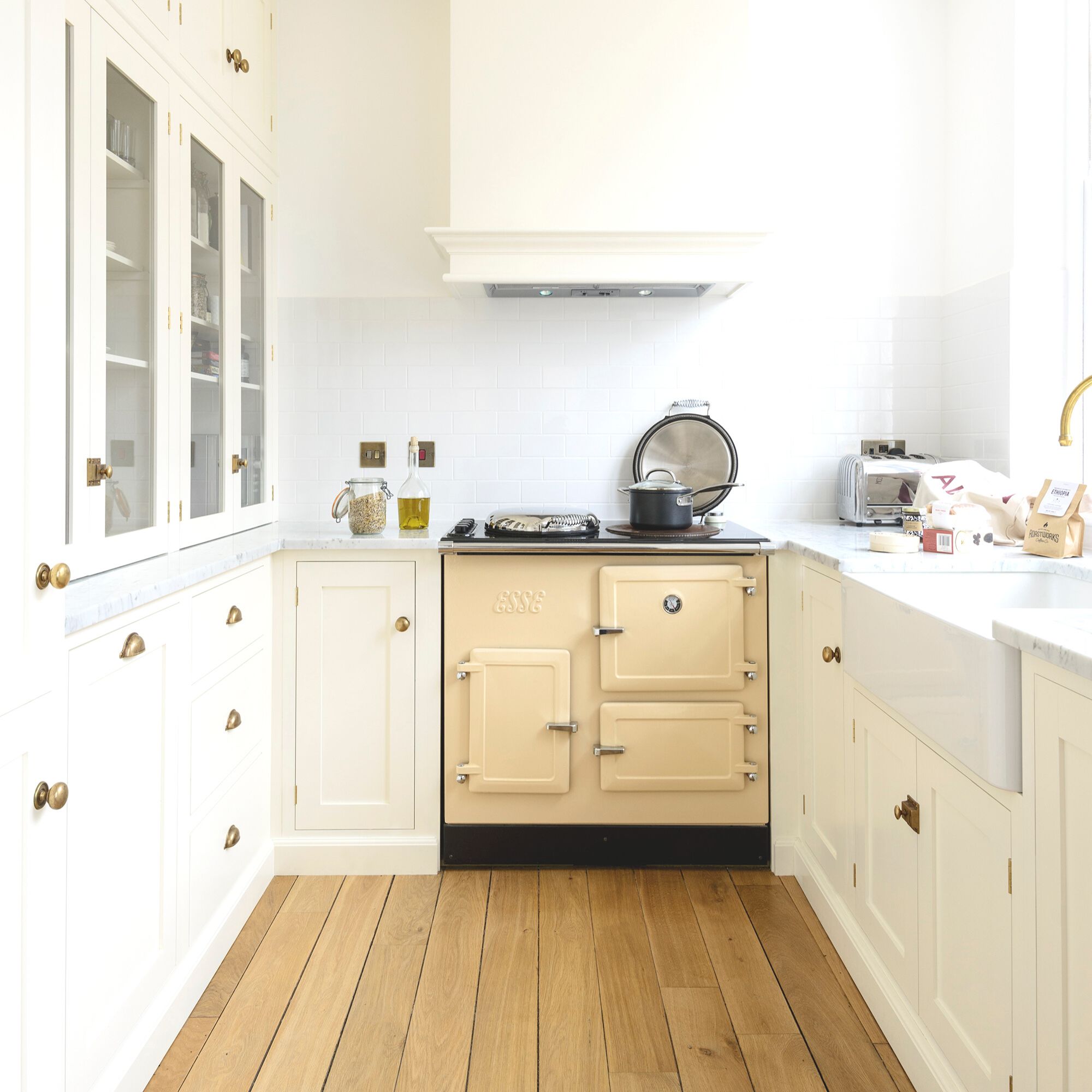
Bright and airy are often the buzzwords for kitchen designs, however, this can be challenging to achieve as part of galley kitchen ideas. Thankfully, colours, glazing and deft design can help to make even the smallest kitchen feel light. 'A small indent in a wall is a perfect place to fit some slim shelves and when painted the same colour as the walls almost disappear,’ says Helen Parker, creative director at Devol.
‘When it comes to paint ideas for kitchen cabinets, keep colours to a minimum and try to stick to a calm and soft colour palette to avoid things feeling busy, it's surprising how a limited selection of colours creates a more serene and tidy feel to a room.’ White kitchen ideas are the classic choice while cream kitchen ideas are great for a warmer scheme. Opting for a mix of glazed and solid doors will help to reflect light and ensure that the cabinetry doesn’t feel as heavy.
3. Create flow with curved edged cabinetry
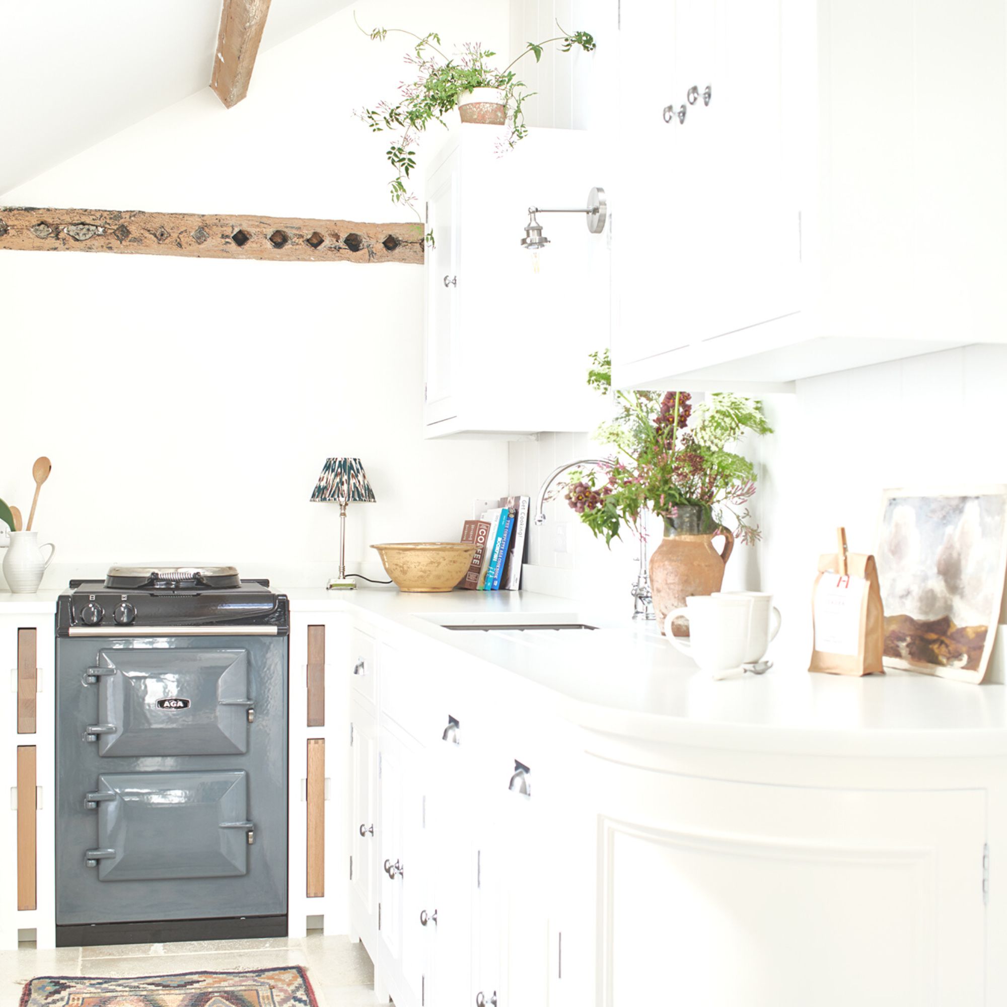
When space is limited, small changes make create a world of difference. ‘Curved-edge kitchen cabinetry is useful when faced with a tight corner, or the entrance to a small kitchen where you might feel that a straight edge would block your path. Curves, in any form, tend to lead the eye through space, rather than stopping you in your tracks,’ says Simon Temprell, interior design manager at Neptune.
‘Curved-edge cabinetry can also help to soften a rigid layout, just as a circular dining table can bring movement to a square room. There is something ‘premium’ about curved cabinets, probably because they do cost a bit more, so they imbue a sense of luxury and personality.’
4. Maximise space in galley kitchen by removing doors
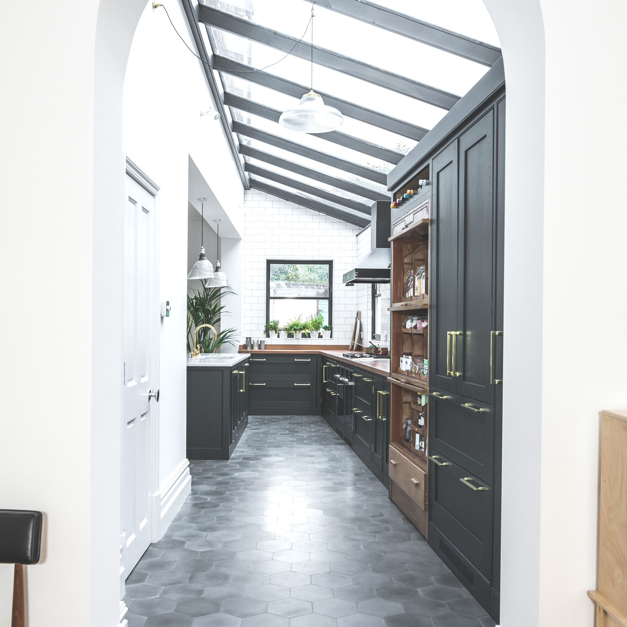
If you’re looking to make your galley kitchen feel more like an integrated part of your home, then one of the best things you can do is remove the doors – as seen in this kitchen by Sustainable Kitchens.
Replacing the door with an open archway will help to flood the space with light and feel less claustrophobic. Doors are very space-hungry additions – requiring a large uninterrupted space to swing – however, by removing them you can start the run of cabinetry earlier and, space permitting, have a door to access a separate pantry space.
5. Add colour and texture will kitchen wallpaper
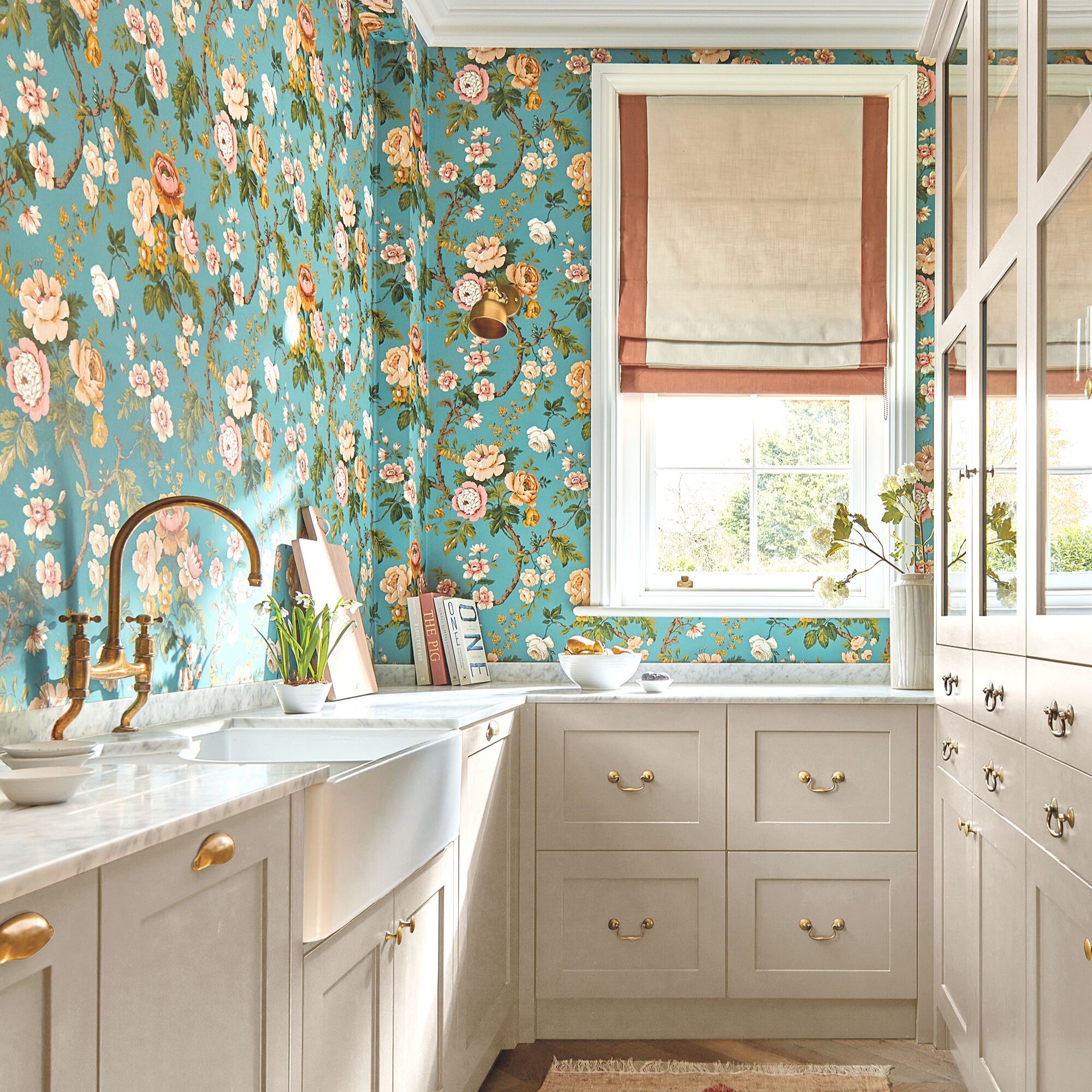
Wallpaper is a beautiful addition to the kitchen, however, in small spaces such as galley kitchen ideas, the design is key.
‘Keeping to a limited colour palette will allow the walls in your space to appear taller and in turn, the room will feel bigger. Plus, it’s best to stick to ditsy prints or small-scale patterns for this same reason,’ says Jessica Clayworth, lead designer at Morris & Co. 'Choosing nature-inspired motifs will ensure a clean aesthetic, patterns such as florals, leaves or berries can freshen up your kitchen while keeping an elegant appearance throughout.'
There are plenty of kitchen wallpaper ideas that will add character and personality to your space and are particularly well suited to vintage kitchen ideas.
6. Focus lighting on key prep spaces
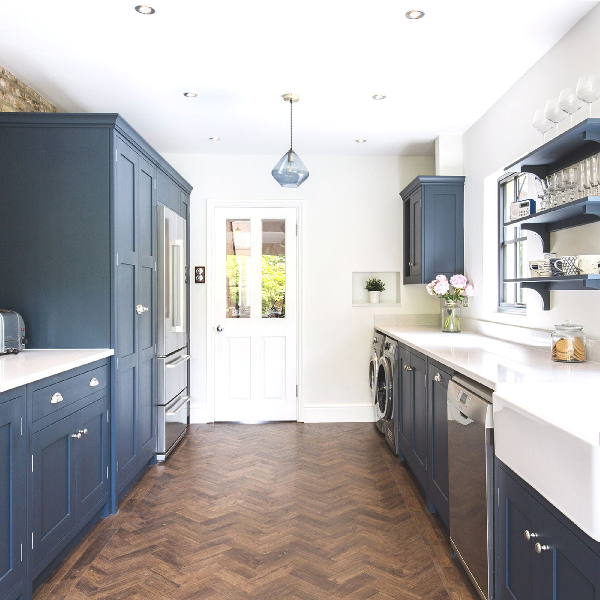
Good lighting is an essential part of galley kitchen ideas – often these spaces lack windows which, without the right lighting can make the space feel dark and unappealing.
Kitchen lighting ideas come in three parts – ambient lighting and task lighting. The balance of these elements will ensure a harmonious scheme and optimum illumination. Inset ceiling lights offer focused illumination without compromising ceiling space and preventing the ceiling from feeling lower than it actually is. If you have the height, a single pendant light can create a softer backdrop to the space.
Opt for a glass shade, rather than a solid or fabric design, to make it appear less obtrusive when off. For added task lighting, try automatic rechargeable under-cabinet lighting – such as these motion sensor under-cabinet lights on Amazon – or add clip-on lights to open shelving.
7. Embrace glazing to increase natural light
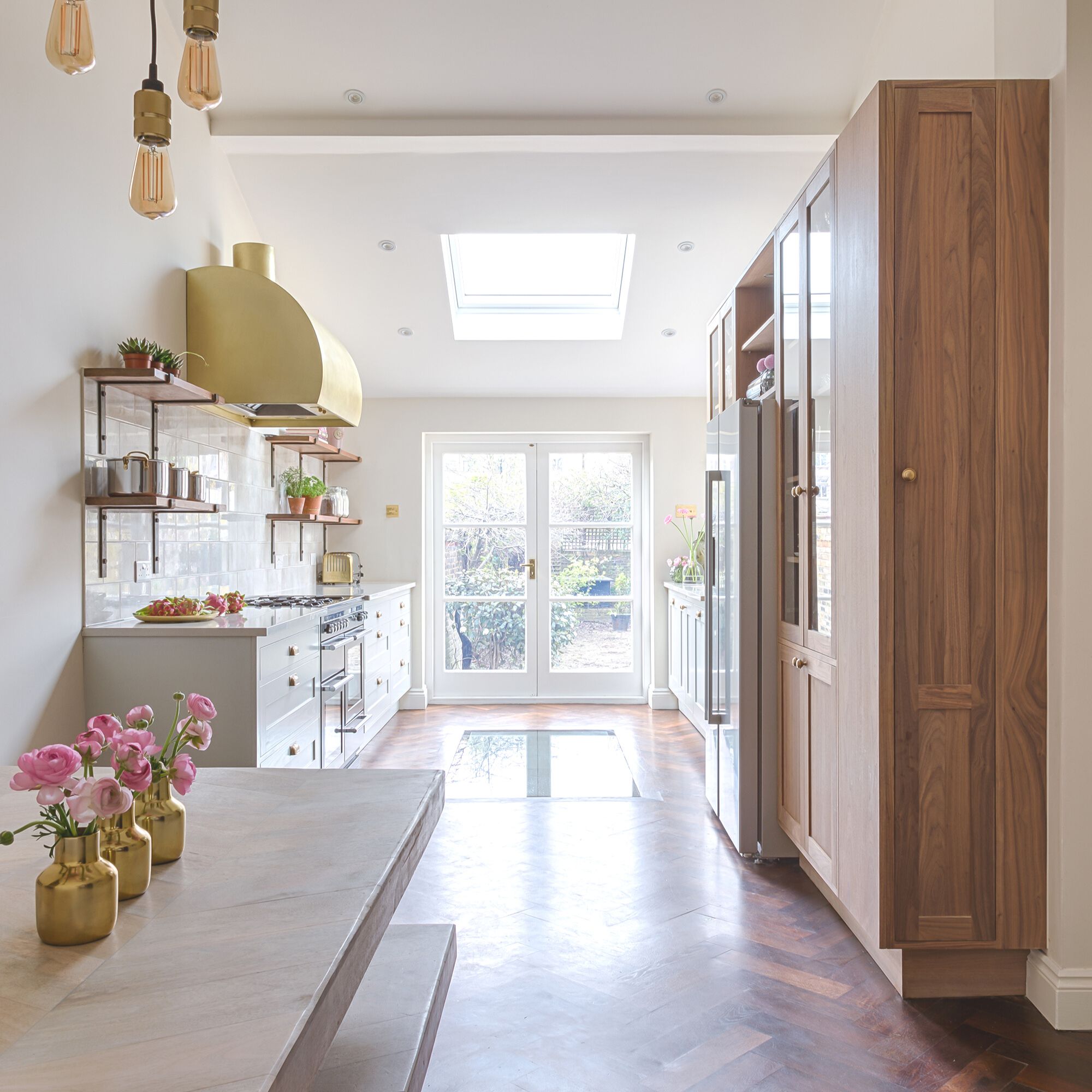
Glazing plays a powerful role in a small room. Adding glazing in place of solid walls or ceilings helps to visually expand the space – rather than the eye stopping at the wall or ceiling, it can continue beyond. It also provides a link to the outside, bringing new colours and tones into the scheme. When used internally, glass has a reflective quality, which increases the natural light in the room, brightening and lighting the space.
‘In this kitchen, cabinetry was designed in a wide galley layout around the glazed section of floor, which allows daylight to filter down into a new basement living room,’ explains Pia Rosling, design director at Sola Kitchens who designed this space.
8. Create the illusion of space with directional flooring
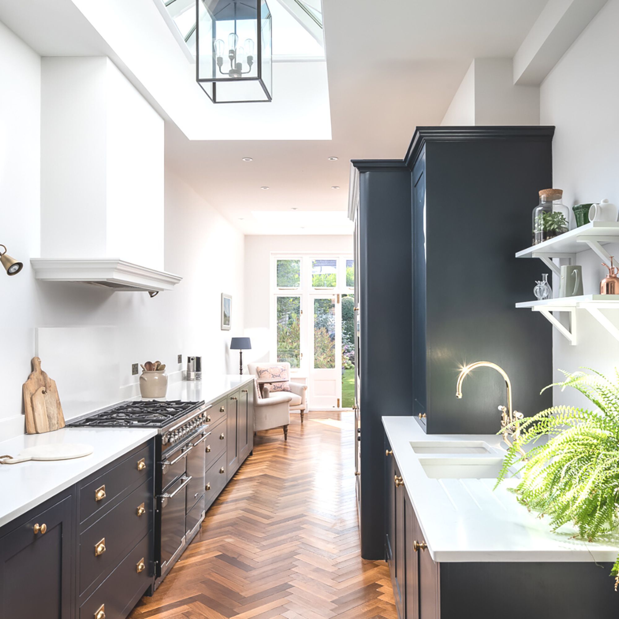
Use your directional kitchen flooring ideas to create the illusion of more space in your petite kitchen. Vertically laid rectangular tiles or wooden kitchen flooring will help a galley kitchen seem longer, while horizontally laid tile or wood will help to emphasise the width of the space. While pretty, busy floor tiles can overwhelm a small kitchen and draw an eye away from the height of the room, making it feel smaller.
In this kitchen by SGS Designs, herringbone wooden flooring directs the eye down the length of the kitchen, visually elongating the space and drawing the eye to the patio doors and garden beyond.
9. Keep a single galley sleek and streamlined
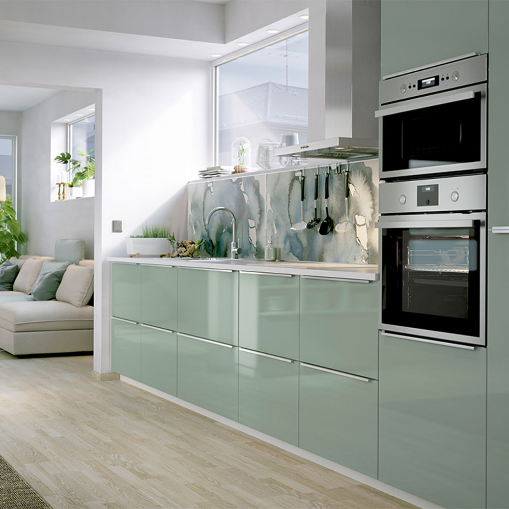
Glossy, modern units work well in a single galley kitchen layout, as the run of sleek, streamlined cabinets creates the optical illusion of more space. Light-reflective surfaces help to bounce light around the room, great for small kitchen ideas. This effect instantly makes tight and narrow spaces feel bigger and brighter.
Neat handleless cupboards keep the area minimal and smart – with no protruding door pulls or drawer knobs to catch on when you’re working or passing through. Continue the minimalist style by keeping worktops as free of clutter as possible, with neat wall-hung utensil rails to keep tools out of the way.
10. Enjoy extra prep space with a double galley
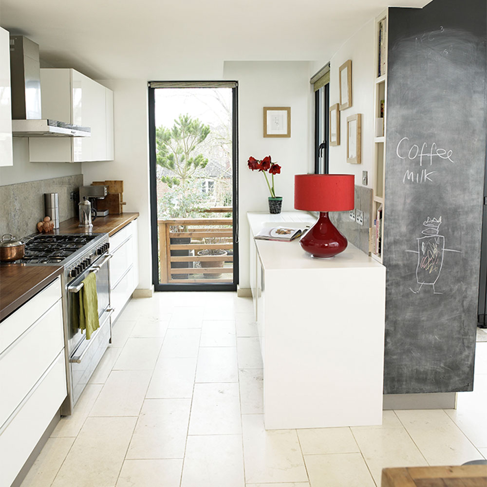
Where there’s room for a parallel run of units – a double galley – you can introduce the classic kitchen triangle rule. This involves arranging the key task zones of fridge, cooker and sink at three separate points so that it’s easy to flit from one to the other.
‘Galley kitchens definitely aren’t a disadvantage in your home,’ says Lizzie Beesley, Head of Design at Magnet. ‘They give you the perfect space to create a working triangle, which keeps all of your essentials at an easy-to-reach distance. Plenty of professional kitchens use a galley design to optimise efficiency.'
11. Work a galley kitchen into an open-plan living space
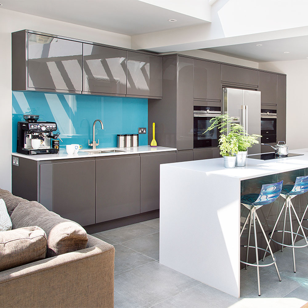
The trusty linear layout of galley kitchen ideas has been adapted to suit today’s large, open-plan living spaces. The basic design principle is the same (with two parallel runs of units) but when it comes to open-plan kitchen design ideas, your layout features a wall-hugging galley run, plus a long island unit running parallel. The island acts as a divider between the dining or living area beyond and is a clever way of zoning an open-plan space.
This stylish space has everything - streamlined surfaces for food prep, integrated appliances at practical levels, plus a breakfast bar for quick and easy meals. Beyond it, there’s plenty more space for a seating area or a formal dining table set up.
12. Make the space more sociable
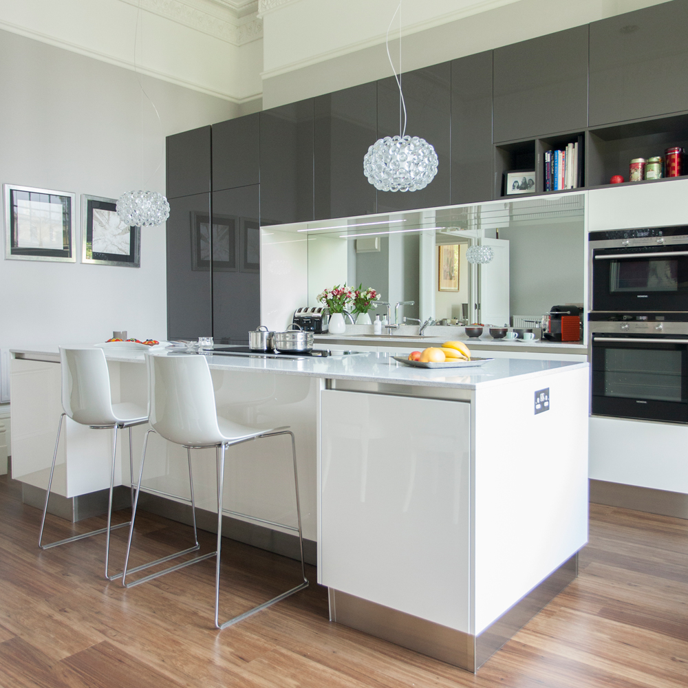
While not a classic galley kitchen, the galley style is finding itself becoming more prevalent as part of open-plan kitchens.
Opting for a galley kitchen that incorporates kitchen island ideas is great if you like to be sociable, as you can cook and entertain at the same time. You’ll find that people will naturally gravitate to the central unit, especially when it’s illuminated with statement lighting.
A large, mirrored splashback is a clever design feature, as not only will it bounce light around the room, but will allow the chef to remain part of the conversation, even when they have to turn their back to their guests!
13. Choose vertical storage to make more of space
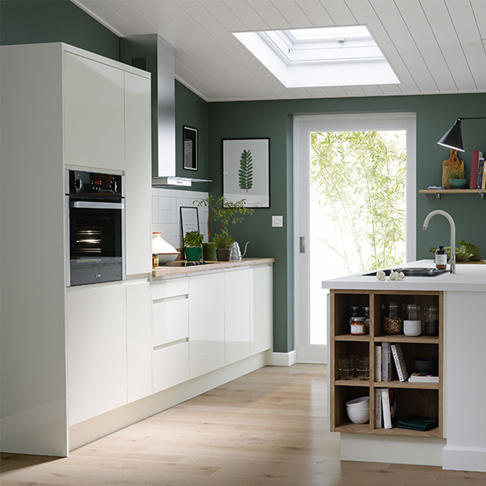
'If you need to incorporate extra storage for your kitchen consider placing long, tall cabinets on one wall and leaving the workspace on the other side open, which should mean you don't feel like the units are towering over you,’ says Darren Watts, Wren Kitchens design director.
‘Alternatively, extending overhead wall cabinets high up, close to the ceiling, can add extra storage space without infringing on the rest of the kitchen.'
14. Squeeze in a seating area
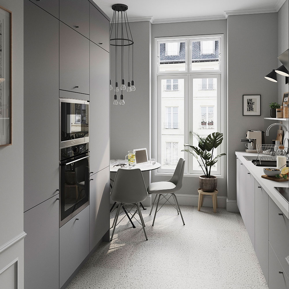
Don’t rule out having a seating area in a narrow galley kitchen. Often there’s space for a small dining table or a mini breakfast bar at the end of a run of units.
Choose compact, space-saving furniture that won’t take up too much floor space. A small, circular bistro-style table takes up less space than a square or rectangular design. Or consider a gateleg table that can be folded up when not in use, or a wall-mounted drop-leaf table that tucks neatly against a wall.
15. Lose cupboards for open shelving
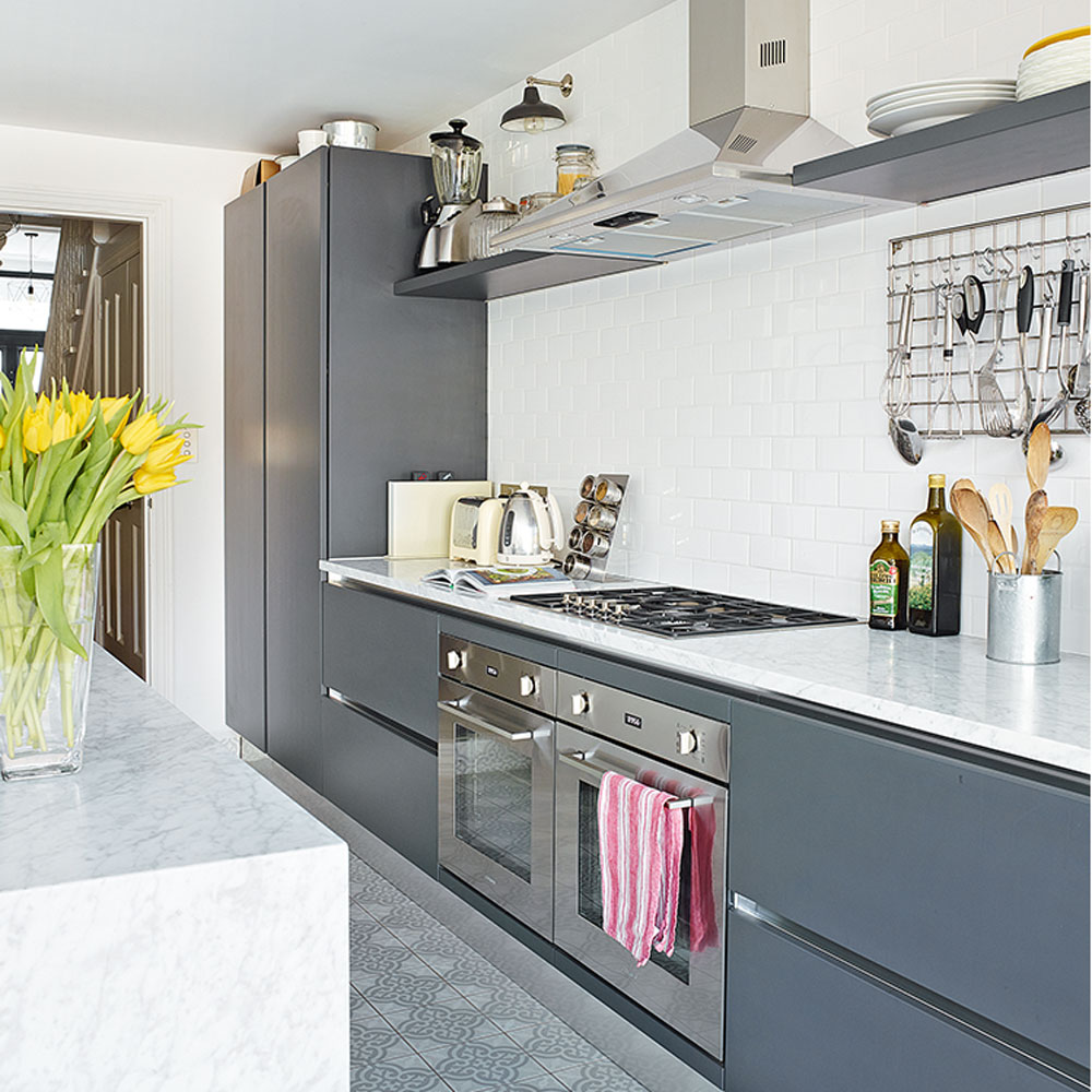
Swap bulky wall units for a long run of open shelving on one side of a galley kitchen. Wall-to-wall units on both sides of a galley can create a ‘corridor’ effect that crowds the space and makes the kitchen feel dark and enclosed.
Position shelving just above the kitchen splash back to give a neat finish and provide a display area for decorative kitchen items. Matching splash back colour to worktops will give a sleek, uninterrupted finish that will make walls recede visually. Choose a pale light-reflective colour to enhance the sense of spaciousness.
16. Stretch space with a tiled splash back
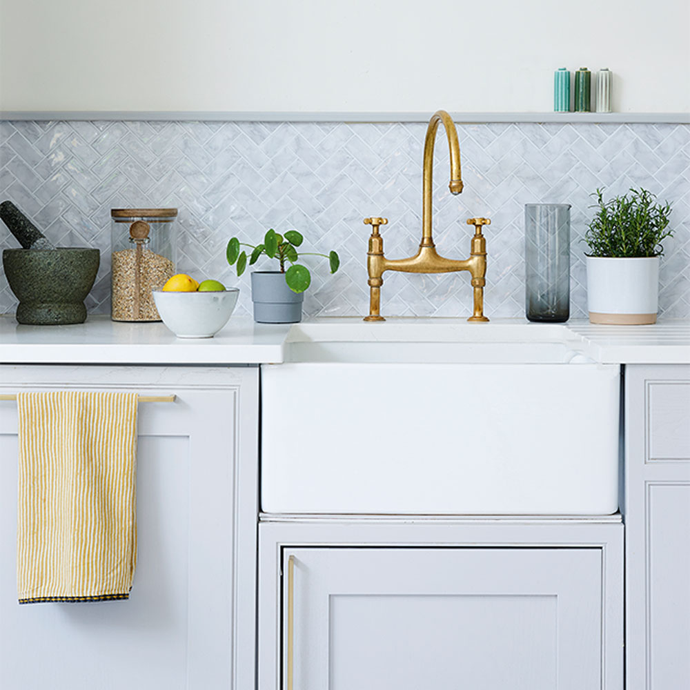
Add width to galley kitchen ideas by choosing longline kitchen splashback ideas that help to stretch the space visually. Herringbone format wall tiles create lines that draw the eye outwards and along, making the splash back feel longer and wider. Choose pale tiles in a glossy finish that will reflect light and further extend the feeling of spaciousness.
17. Incorporate a plate rack
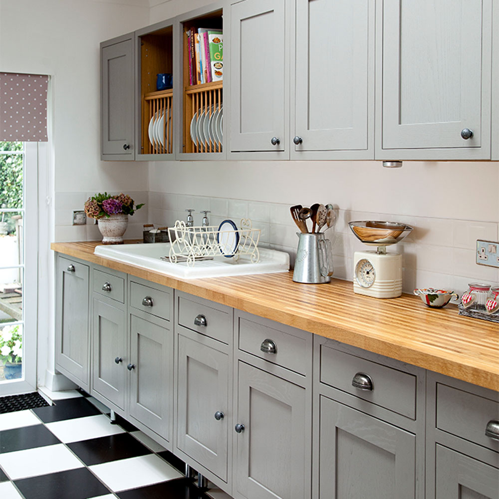
Wall-to-wall cabinets on both sides of a galley kitchen can make it feel dark and crowded if you're not careful. Break up a long expanse of wall units by adding a run of feature shelving. Wooden plate racks above a sink area add contrast against grey units and give a handy spot to dry crockery.
18. Look up to create height
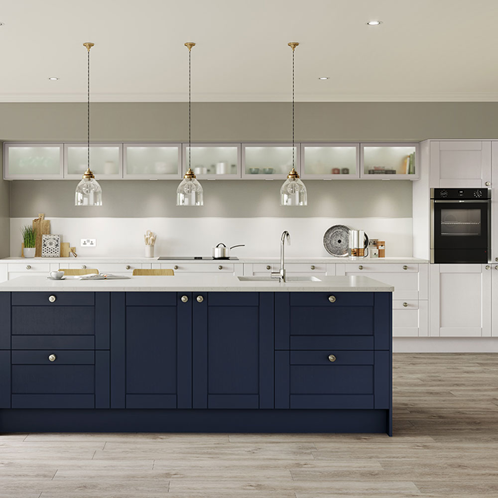
Pale colours and light-reflecting finishes will make a narrow, galley kitchen feel bigger, by bouncing light around the space. But this doesn’t mean that darker colours have to be ruled out completely. Using a darker colour on base units gives the layout definition, and adding a lighter colour on top units draws the eye upwards and makes the kitchen feel naturally brighter and more open.
‘Be a rule breaker and go for darker tones, such as navy or charcoal, in your layout,’ says Tori Summers Director of Design, Product & Innovation at Howdens. ‘These hues deliver maximum impact, no matter what square footage you have, making them great for creating a striking design. Balance dark tones by opting for lighter colours on other features, like counters and floors.’
19. Add wow with a statement splash back
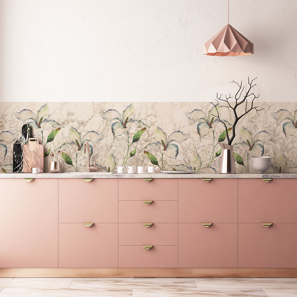
'While too much detail can be overpowering, incorporating a feature wall or a patterned backsplash is a great way to add depth to a galley kitchen,' says Darren Watts, Wren Kitchens Design Director. 'Consider placing coloured tiles along the space between your worktop and your cupboards.'
'Alternatively, hanging a mirror or bold piece of artwork on the end wall is a great way to show off your personality in your kitchen, and tie your theme from one side to the other.'
20. Keep appliances out of sight
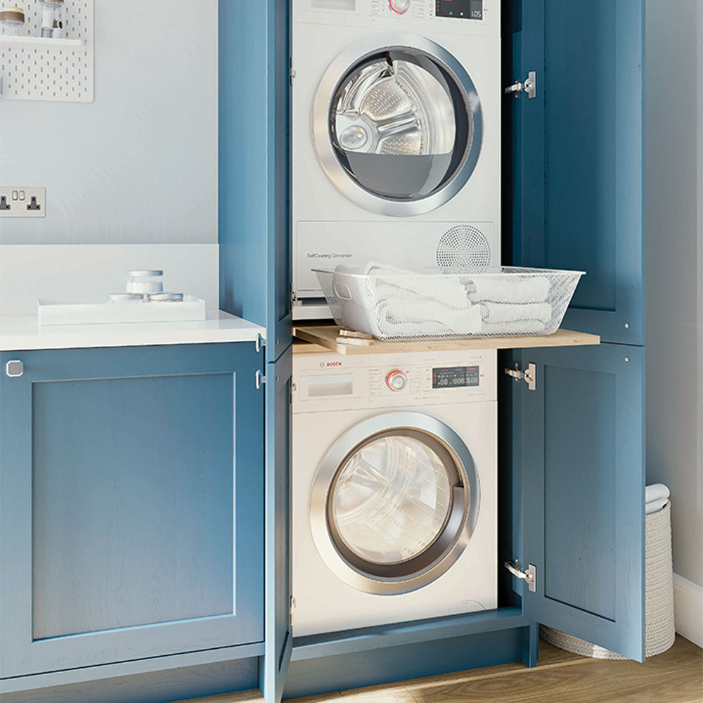
A thoughtful kitchen appliance layout is key to any good design, especially a narrow galley kitchen. Keeping appliances hidden away out of sight will help make your galley kitchen ideas feel more sleek and streamlined. A mix of different doors, finishes and control panels can feel chaotic in a very tight space, so integrating them in kitchen cabinets or concealing in a cupboard will give a flush finish and uninterrupted look.
Save space at the end of a run of units in a galley kitchen by stacking a tumble drier on top of a washing machine. Stacking kits let you stack one appliance on top of the other and include a central pull-out shelf to make sorting clothes easier.
21. Stretch your space with a side extension
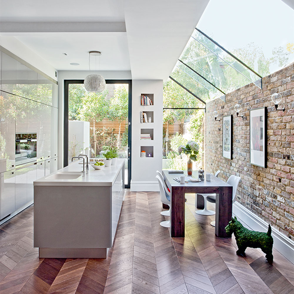
Side return extensions and galley kitchen ideas are a perfect recipe for success. The extra footage gained by extending out to the side gives ample space for a single or double galley kitchen layout, plus extra living space that can be utilised for a dining table or seating area.
A long bank of floor-to-ceiling units running along one wall gives maximum space for storage and integrated appliances and helps maintain a sense of flow between indoors and out. Centrally, a longline island gives plenty of worktop prep space and creates a divide between the dining/living area, without blocking any valuable light.
22. Keep it simple
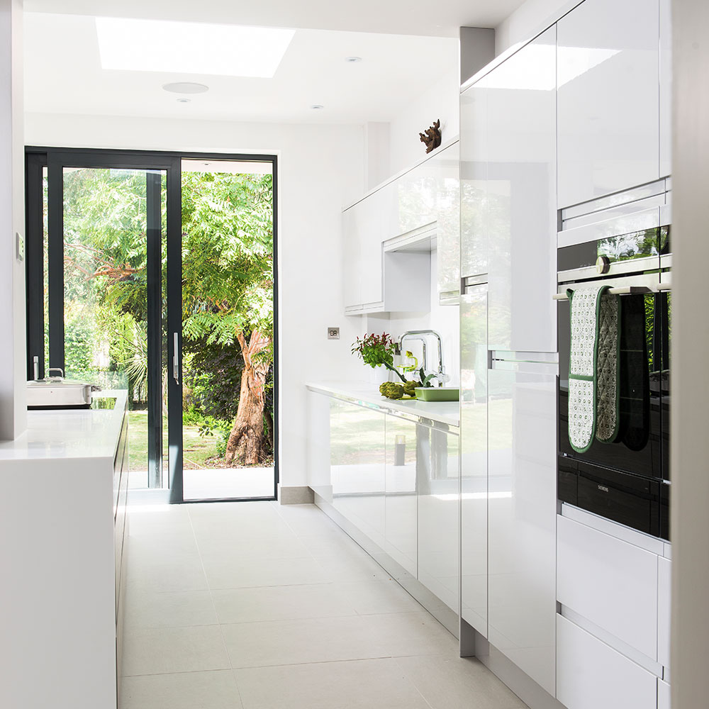
Galley kitchen ideas work excellently as part of a modern kitchen. Sleek modern units work well in a galley kitchen layout, as the run of glossy cabinets create the optical illusion of more space. Then neat handleless cupboards keep the area minimal and smart – with no knobs or bars to catch on when you're working. Continue the minimalist style by keeping worktops as free of clutter as possible, and integrating appliances – ideally behind closed doors.
23. Go for a generous galley in open spaces
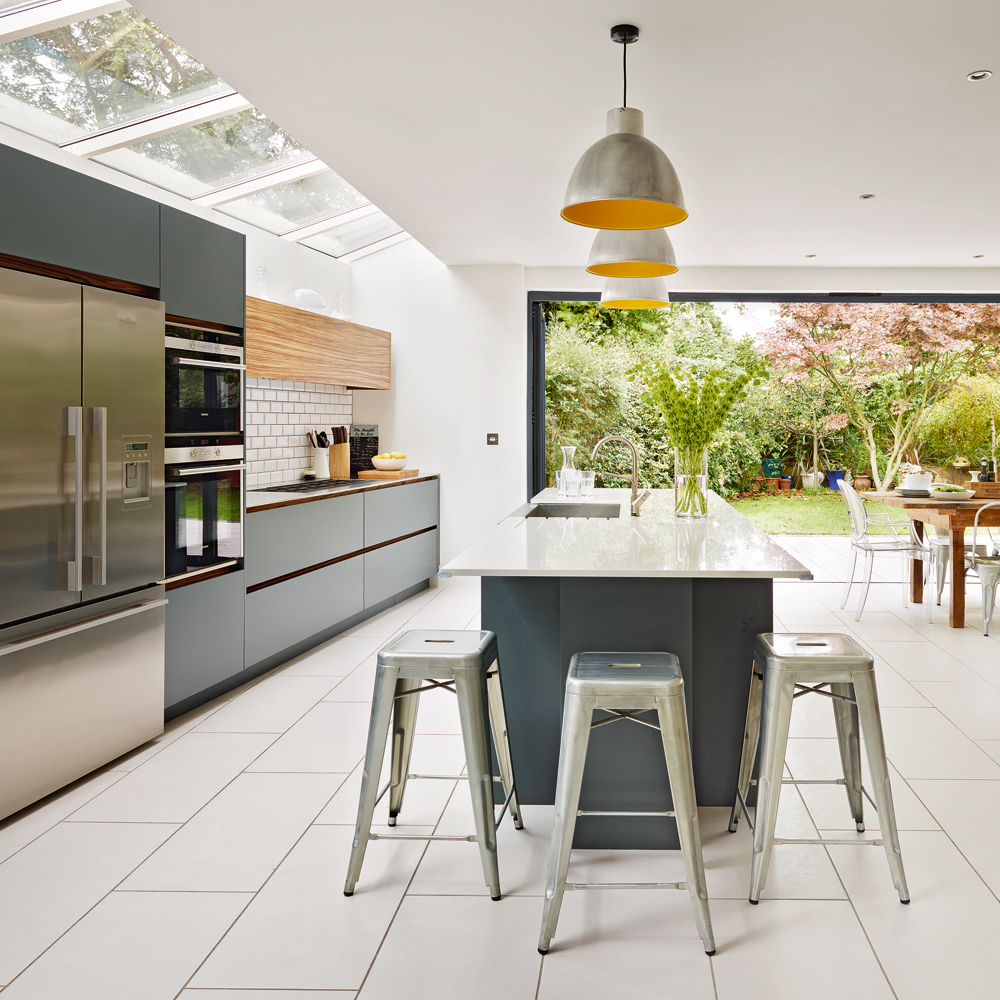
Galley kitchen ideas needn't mean you're limited in space. Widen the gap of this linear layout to suit today's large, open-plan kitchen plot. If you have the space use it to widen the gap between the base units. The space is still benefitting from the practical layout of two parallel runs of units but with the extra width, the design won't feel restrictive.
24. Create a practical flow

Here, wide, handleless units and wood flooring work in unison to lead the eye down towards a glass door, which in turn leads out to the garden path. This makes the space feel less restricted despite it being relatively compact, and strengthens the link between indoor and outdoor living. Even thought has been put into the exterior door – a sliding version that can be pushed back out of sight won't interfere with the flow.
25. Mirror your design
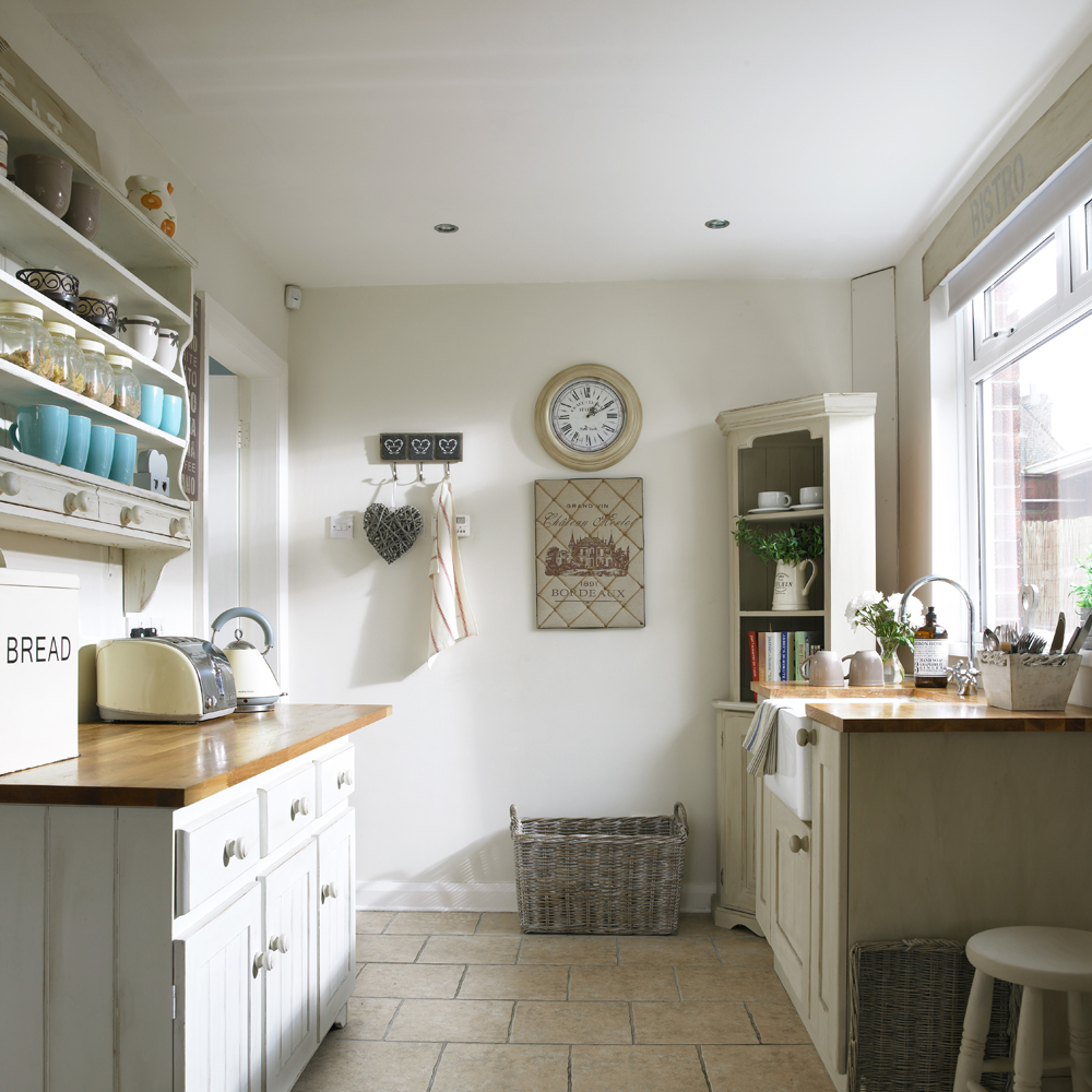
Galley kitchen ideas work just as well in country schemes as modern ones. This quaint kitchen space is bright and fresh with neutral walls and cabinetry, but rustic additions inspired by shabby chic decorating ideas, like a butler sink and open dresser-style shelving, give the space typical farmhouse charm.
Vintage kitchen ideas like wooden hooks and wicker storage are pretty yet practical storage solutions that will keep clutter down and make it easier to cook.
26. Stick to a single design to optimise space
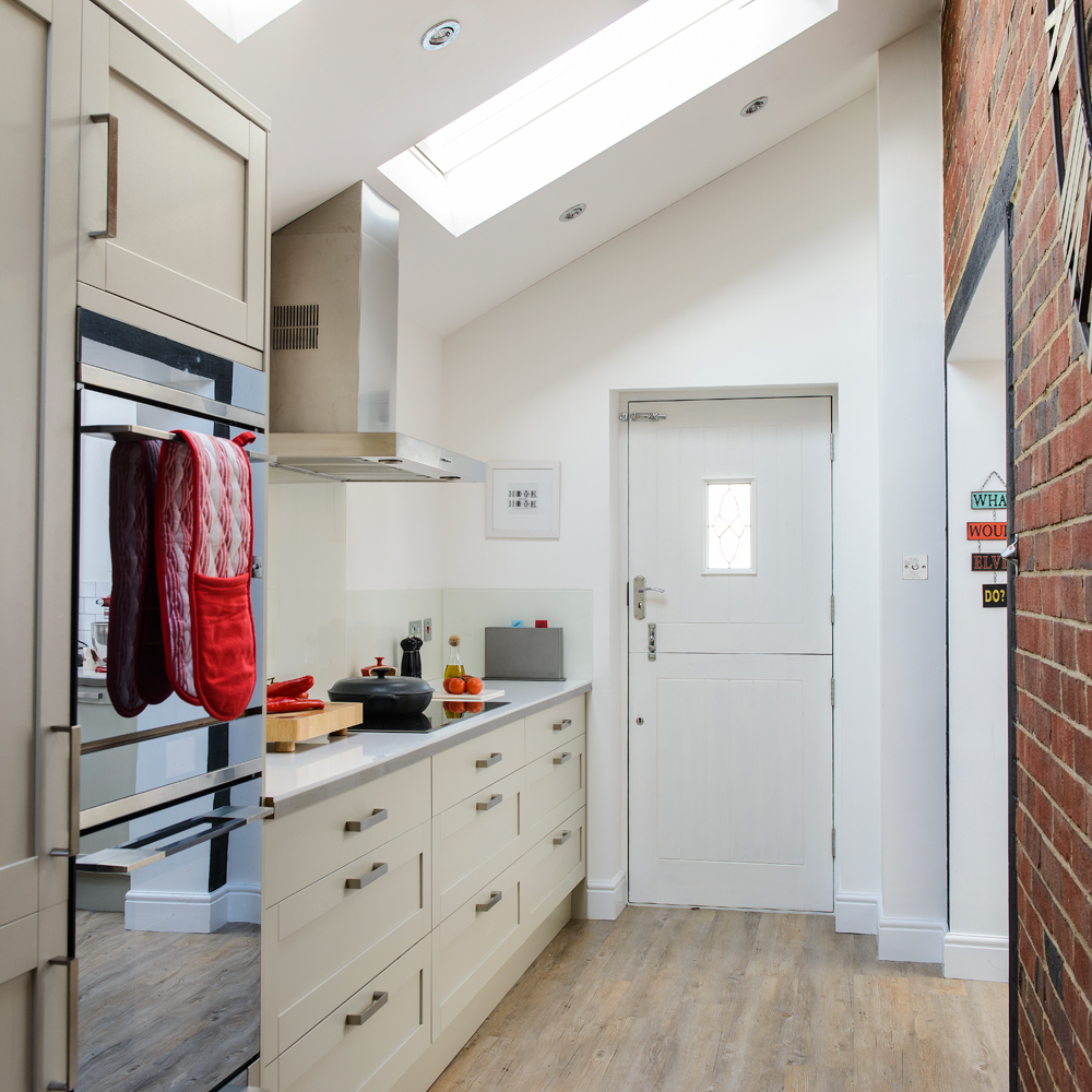
Side return kitchen extensions and single galley designs are a perfect recipe as the small space can be optimised for storage and light. Here, a pale colour palette and reflective surfaces exploit the sky lights to the max, while the exposed brick wall adds an interesting urban edge to the look.
How do I make my galley kitchen more functional?
Long, skinny and with limited space on both sides, get the best out of a galley kitchen by arranging the ‘work triangle’ of hob, sink and fridge with two working areas on one side of the kitchen and the third on the other, roughly centred between the two.
Avoid too many tall cabinets in a galley kitchen as they can overpower the space and make the kitchen feel dark and crowded. Instead of placing them haphazardly, position any tall cabinets at one end of a galley run with tall items like the fridge and freezer close by for a cohesive look.
What colours look best in a galley kitchen?
Pale, light-reflecting colours such as white and cream, look best in a galley kitchen. However, this doesn’t necessarily mean an all-white kitchen is the only option. Soft shades, like sage green, duck egg or soft neutrals work well in a small kitchen. Try using a single colour across the kitchen on both walls and units so that the eye sees it as one continuous space.
Are galley kitchens making a comeback?
Yes, galley kitchens are making a comeback.
Galley kitchens were at their most popular in the early 20th century when the kitchen was the woman’s domain, with the style slowly going out of style as kitchens become the heart of the home with families cooking together and hosting guests from the engine room. However, in recent years, the galley kitchen has been returning under a new guise – as part of an open-plan kitchen space. Rather than cabinetry being against two walls, here, one line of cabinetry will be half-height providing a view into the open plan space beyond, while keeping the kitchen area distinct.

Thea Babington-Stitt is the Managing Editor for Ideal Home. Thea has been working across some of the UK’s leading interiors titles since 2016.
She started working on these magazines and websites after graduating from City University London with a Masters in Magazine Journalism. Before moving to Ideal Home, Thea was News and Features Editor at Homes & Gardens, LivingEtc and Country Homes & Interiors. In addition to her role at Ideal Home, Thea is studying for a diploma in interior design with The Interior Design Institute.
- Holly ReaneyContent Editor
-
 I spent the afternoon looking through Wayfair's garden sale – these are the 6 pieces I'm buying immediately for summer
These are my must-have garden buys from the sale
By Holly Reaney
-
 Stripes have got a bold new look – here’s how to make the trend work in your home, according to interior experts
Add a pop of personality to the classic pattern
By Maddie Balcombe
-
 What to do if you've sown the wrong grass seed – experts reveal exactly how to fix it and get your dream lawn back on track
Don't panic! Follow this easy guide to putting it right
By Natalie Osborn