The secret to making your kitchen island look more expensive, according to design experts
The materials, colours and accessories you need to know about...

Sign up to our newsletter for style inspiration, real homes, project and garden advice and shopping know-how
You are now subscribed
Your newsletter sign-up was successful
If you're curious as to how to make your kitchen island look more expensive, you likely want to create a luxury-looking design without breaking the bank. As the focal point of a kitchen where family and friends naturally gather, you want it to feel high-end, but how do you turn it into a premium spot rather than a dumping ground for mess?
The best kitchen island ideas combine functionality (such as storage, practical surfaces and appliances) with show-stopping features that are bound to wow guests. A combination of both is key, especially when aiming for an expensive-looking design. We asked kitchen designers for their top tips on how to make a kitchen island look more expensive, so you can take inspiration big or small and incorporate into your own home.
How to make your kitchen island look more expensive
A kitchen is so much more than a place to cook, with open-plan layout kitchen ideas gaining popularity, it's also where we dine, host and catch up with family. Kitchen islands are a great way to facilitate all of these activities, creating a central zone for everyone to gather around.
Article continues belowWhen the kitchen layout focuses around one particular zone, making sure it's stylish and not cluttered is key. So with these simple design features, you can ensure your island looks luxurious.
1. Opt for an unusual shape
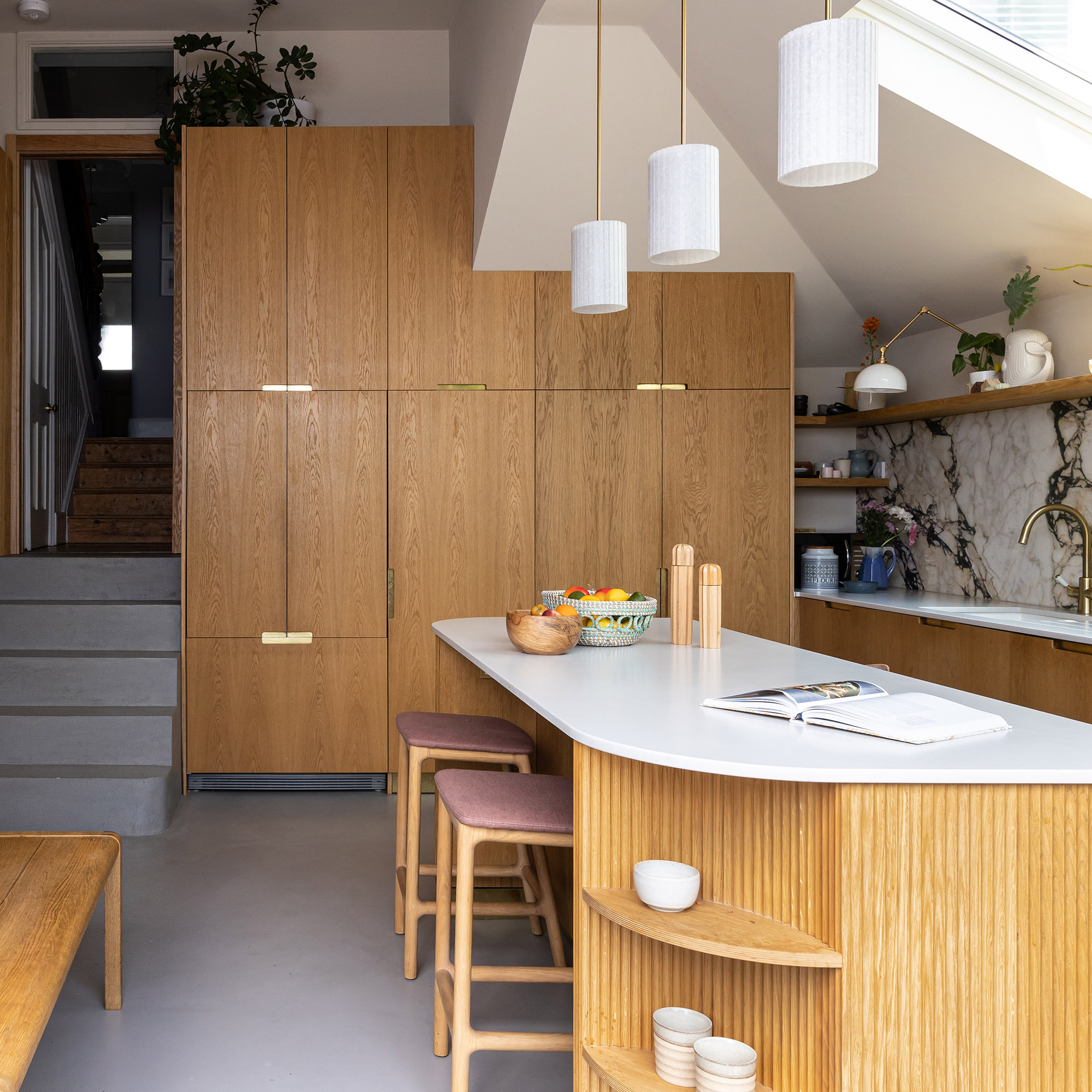
A kitchen island with an unusual design that looks bespoke is a fast way to make an entire scheme look more expensive.
'There has been a strong demand lately for rounded kitchen islands, especially from those that love to entertain,' explains Richard Davonport, managing director at Davonport.
'The ergonomic benefits of curves can infuse your kitchen with a softer, more relaxed feel, providing a more conducive way to entertain friends and family. There is also the added benefit that it's a shape we’re not often used to seeing in a kitchen. It makes it visually more interesting and appealing and can be more of a statement piece than a traditional island.'
Sign up to our newsletter for style inspiration, real homes, project and garden advice and shopping know-how
To take it one step further, Dave Young, founder of HUSK kitchens recommends amping up an island with plenty of texture.
'Utilising V-Groove panels is a brilliant way to add texture and interest to your kitchen island, making it the focal point of the room,' comments Dave.
'A tighter groove spacing gives a sleek slatted effect, while wider spacing can serve as a modern take on timber cladding. Used in the right places, V-groove panelling can alter the feel of a room significantly without taking over the space, allowing for other design elements to shine through.'
2. Choose a luxurious material
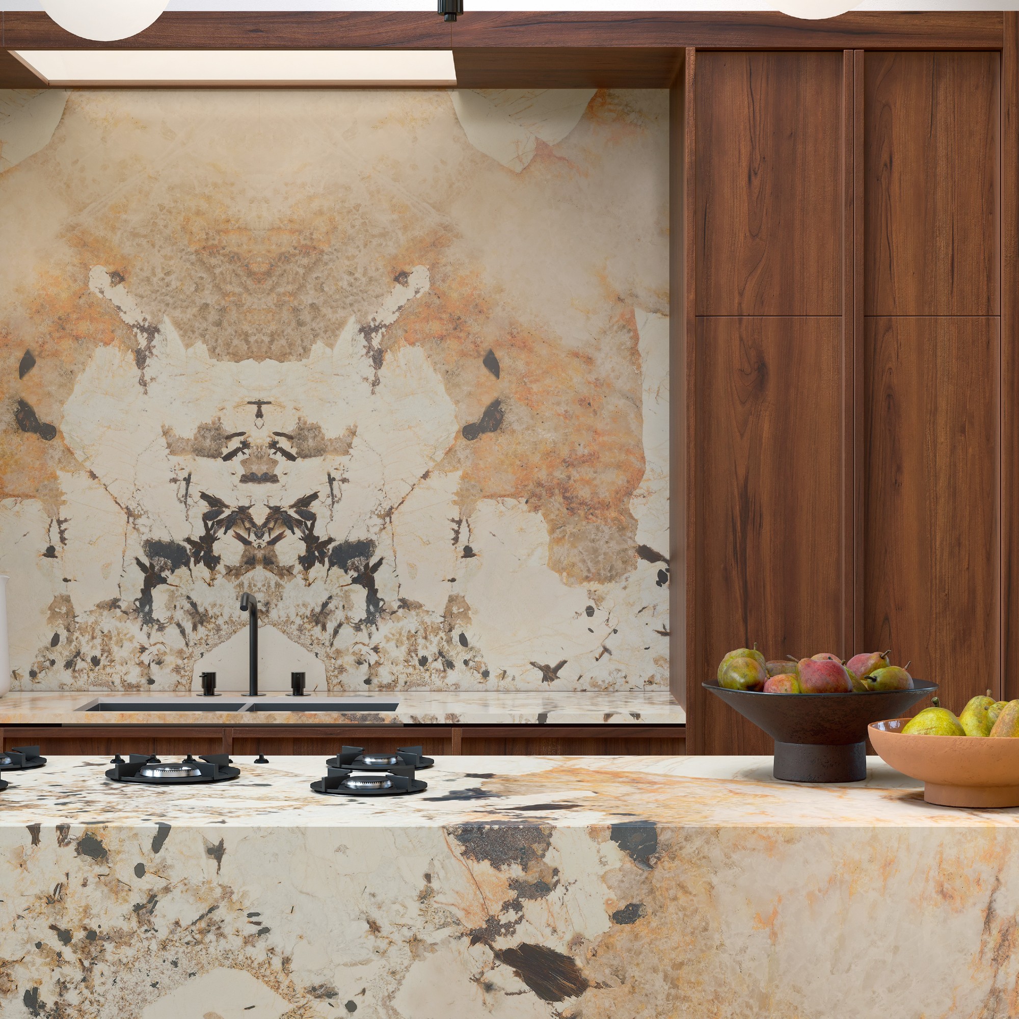
When we think of luxury kitchens, our mind automatically goes to decadent marble worktops. An island is the ultimate place to place a statement veined stone as you can make it a stand-out feature without needing to purchase it for the entire design.
'Choosing a marble or marble-look worktop with rich veining exudes an on-trend, luxurious feel,' explains Melissa Klink, creative director at Harvey Jones.
However, 'If you’re after a more affordable alternative, composite stone worktops are often cheaper than those made from natural stone and come in a great variety of colours and textures,' says Dave.
'Or, if you’re after an even more striking pattern, you could consider a terrazzo worktop. By experimenting with the colour and shape of the embedded aggregate you can create something truly eye-catching and playful.'
3. Create a colour variation
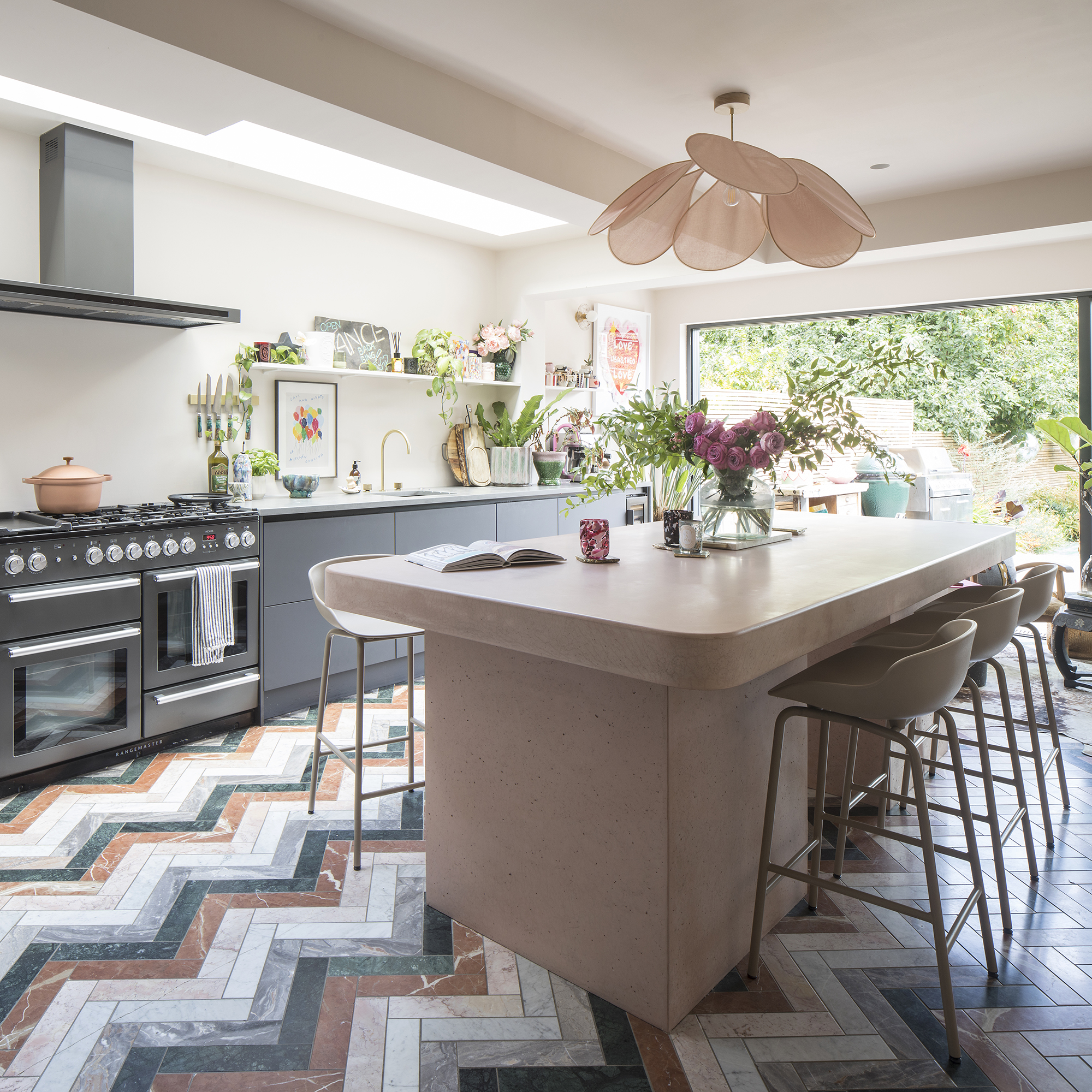
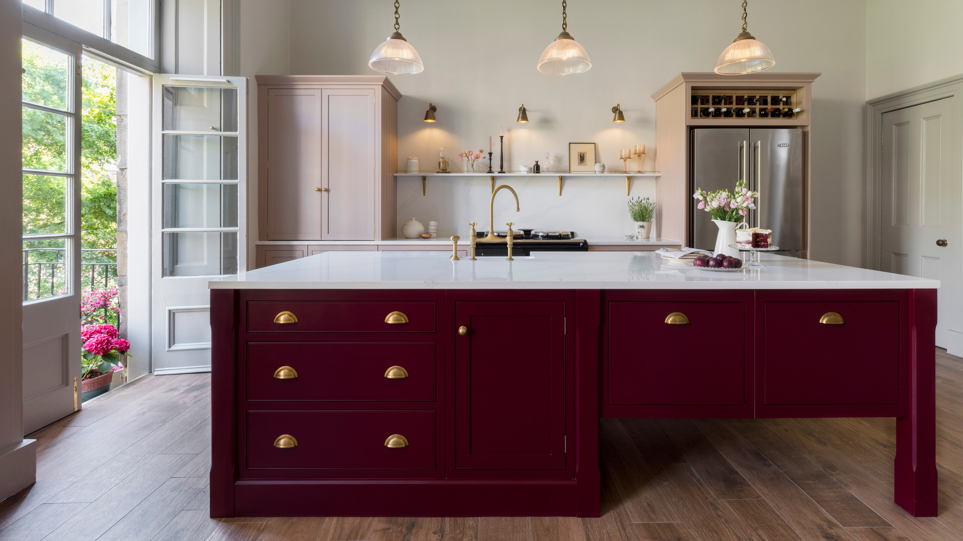
The simplest way to make a kitchen island look more expensive is to make it stand out. Differentiating it using an alternative kitchen colour scheme will create an eye-catching focal point to gather around.
'When picking out colours and textures for your kitchen scheme, try contrasting the island from the wall cabinets,' Dave recommends. 'This will help to make the island stand out from the rest of the kitchen, drawing the eye to it as a centrepiece of the space.'
4. Choose antique inspired hardware
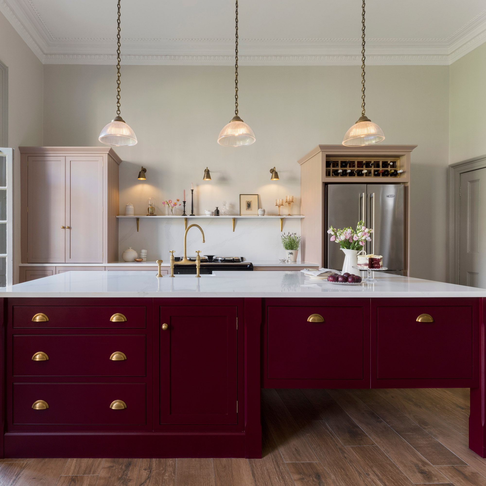
One way to make a kitchen island look grand is to take inspiration from period features, in particular aged brass cabinet hardware. Although a small touch, the tone of metal you accessorise cabinets with will have a huge impact on how contemporary and expensive it looks.
Aged brass, even when sourced affordably, has a premium appearance that is on-trend while also being timeless. It will also wear well, so you don't need to worry about handles looking tired quickly.
5. Fit appliances flush
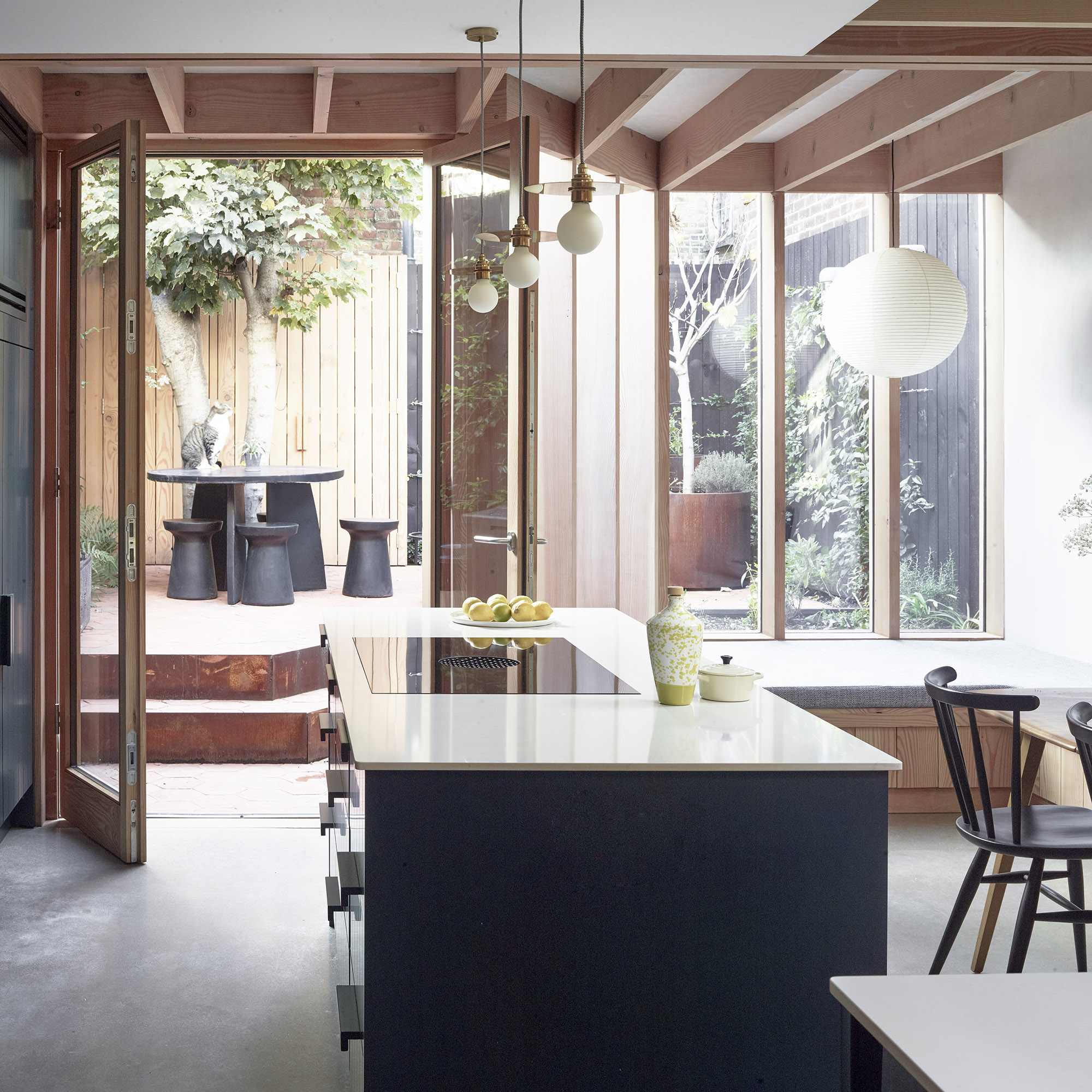
Flush-fitting kitchen appliances are the ultimate way to make your cooking space look well invested in. If you're an avid chef then opting for a top-of-the-range oven and hob will amp up functionality, but if you're not looking for the best features then there are many simple but stylish options.
Sleek stainless steel appliances with limited fuss will improve the flow of a cooking space meanwhile barely-there induction hobs are ideal for an island where a pared-back look is the goal.
6. Customise storage
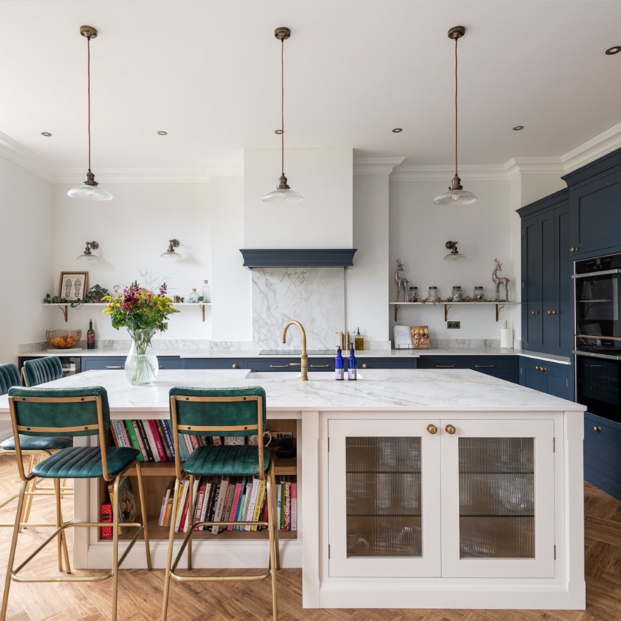
Kitchen storage is paramount for a functional space. A kitchen island is the hub of the kitchen and is used by all of the family, for a multitude of different purposes, so including practical storage to keep the mess contained will automatically make the area look chic.
'If you’re looking for a personal touch, integrated shelving can be a really great way to personalise your kitchen island – offering a space for a carefully curated selection of favourite finds to take pride of place on the side of the island that faces the room,' advises Dave.
Glass cabinets will also add a touch of glamour while still providing a useful space for storing glassware or your best seasonal crockery.
Aside from these core design elements, making a kitchen island look expensive often comes down to the smaller accessories. An oversized decorative bowl, a luxury candle and beautiful cookbooks will go a long way.

After starting out her journey at Future as a Features Editor on Top Ten Reviews, Holly is now a Content Editor at Ideal Home, writing about the very best kitchen and bathroom designs and buys. At Top Ten Reviews, she focussed on TikTok viral cleaning hacks as well as how to take care of investment purchases such as lawn mowers, washing machines and vacuum cleaners. Prior to this, Holly was apart of the editorial team at Howdens which sparked her interest in interior design, and more specifically, kitchens (Shaker is her favourite!).