I'm an interiors editor - here's why I ditched wall cabinets in my new kitchen
...and you should too

Sign up to our newsletter for style inspiration, real homes, project and garden advice and shopping know-how
You are now subscribed
Your newsletter sign-up was successful
Over the course of my 20-year career as an interiors editor, I must have looked at hundreds, if not thousands, of kitchens! So when I finally got the chance to design a brand new kitchen for the home I moved into with my family a couple of years ago (a converted Victorian porter's lodge), I had plenty of kitchen ideas for the space.
Our kitchen is not huge – we made it a little longer by stealing space from the adjacent garage as part of the renovation project and it measures 2.7m wide. The ceiling height is lower in the working area of the kitchen, and my main concern was ensuring the space didn't feel like a dark tunnel.
So I decided what we needed was a kitchen without any wall cabinets at all. My husband took some convincing ('where will we store everything?' was his constant argument). But I stuck to my guns, and our kitchen feels open and airy. And we did manage to find a home for all our stuff!

Heather has worked as an interiors editor for over 20 years, and has had the chance to look round some of the UK's most stylish homes. She has sourced hundreds of reader homes and makeovers to feature in magazines, joining Ideal Home's houses team in 2007. Heather also loves renovating her own home - and two of her previous houses (and a kitchen and garden makeover!) have been featured in the pages of magazines.
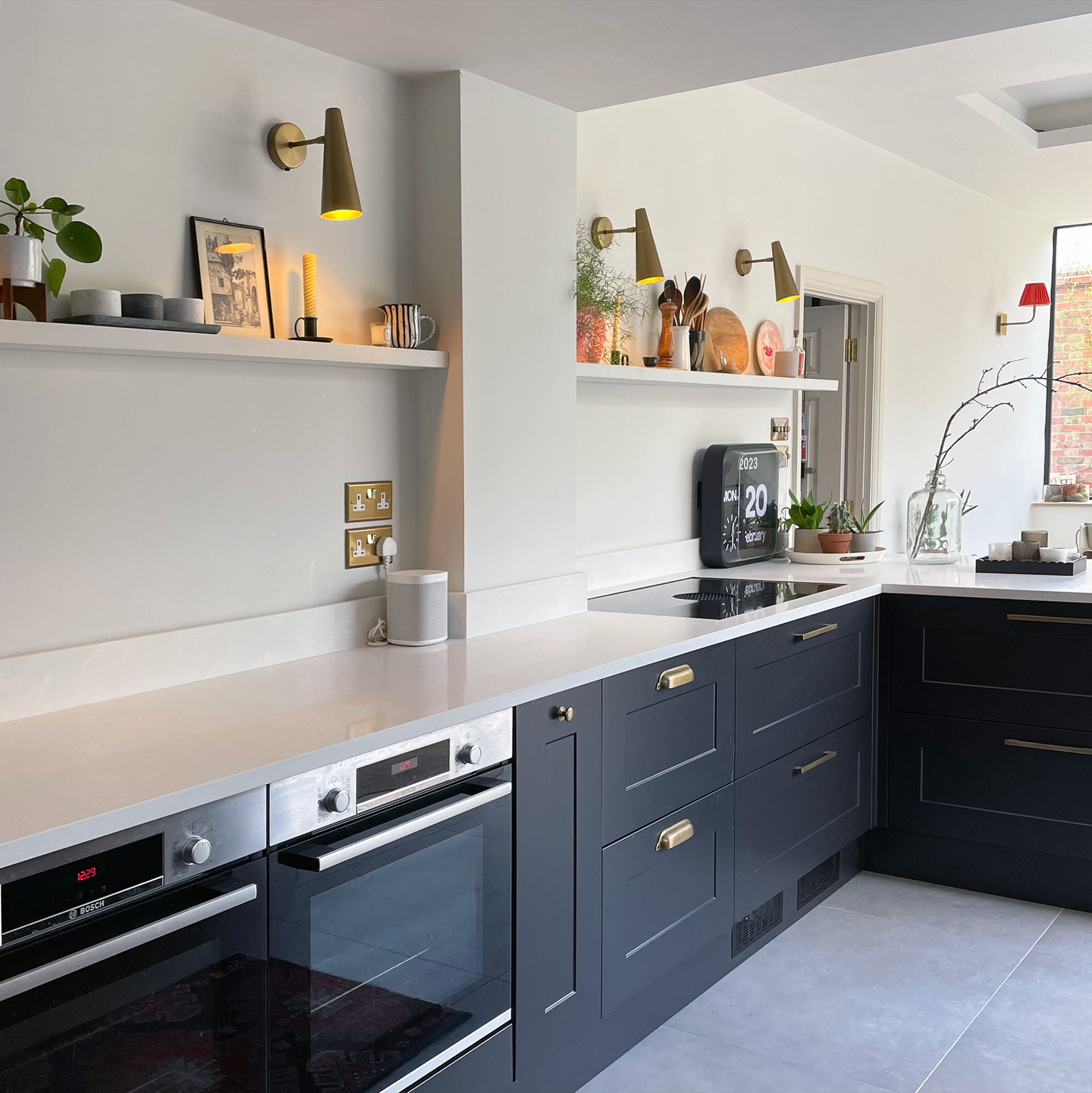
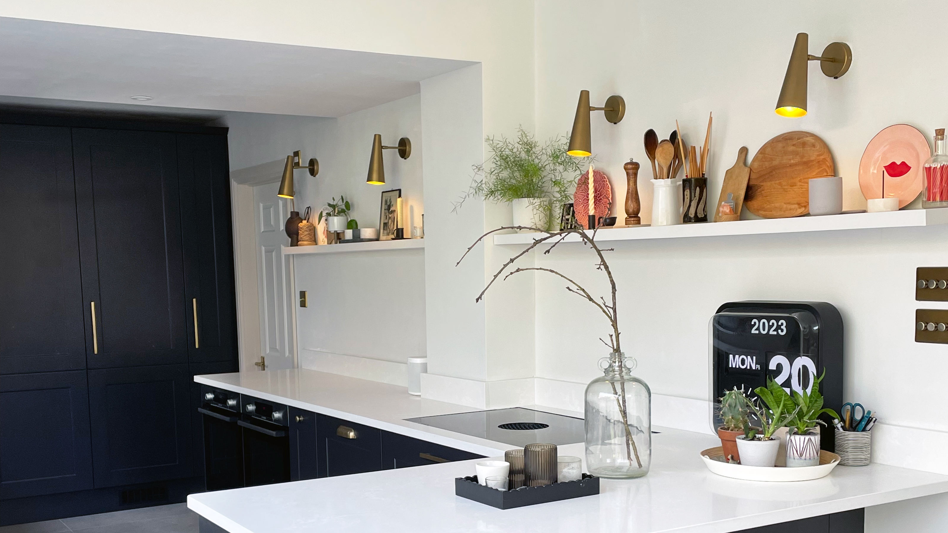
In a narrow room, wall cabinets on both sides can bring the walls in, and make the space feel more claustrophobic. Instead, I opted for a single floating shelf that runs along the full length of the kitchen. I use it as a display space for decorative bits and bobs, and then above the hob we keep salt and pepper, kitchen utensils and chopping boards.
An induction hob with built-in extractor from Bora meant that we didn't need to worry about housing an extractor and we were free to position the hob wherever we wanted it in the kitchen layout.
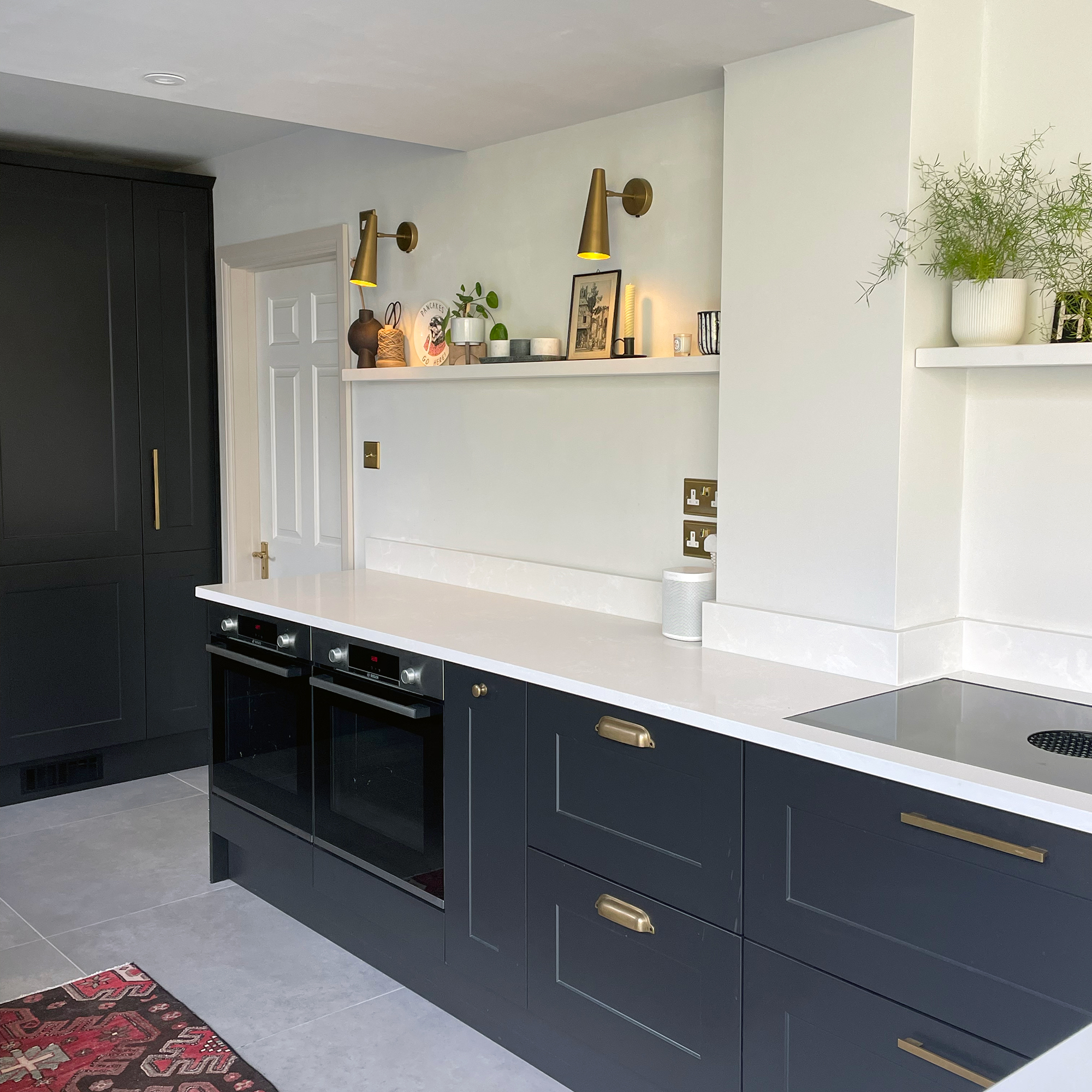
Two single ovens are housed in the main run of base units. It's really handy having all that worktop area above for prepping food, and also putting down hot trays when we take them out of the oven. There's also a narrow drawer underneath each oven for storing baking trays, which is a kitchen design feature that makes life easier. We really did make use of every inch for kitchen storage ideas, incorporating plenty of fitted kitchen storage hacks along the way.
Without wall cupboards in the way, I was able to incorporate wall lights into the kitchen design. I love how they look (I chose these brass wall lights from Nordic Nest), and they're on a dimmer switch so we can easily change the mood in the space. The other smart kitchen lighting idea is the shelf has LED strip lighting running along it, which is great for task lighting when preparing food in the kitchen.
Sign up to our newsletter for style inspiration, real homes, project and garden advice and shopping know-how
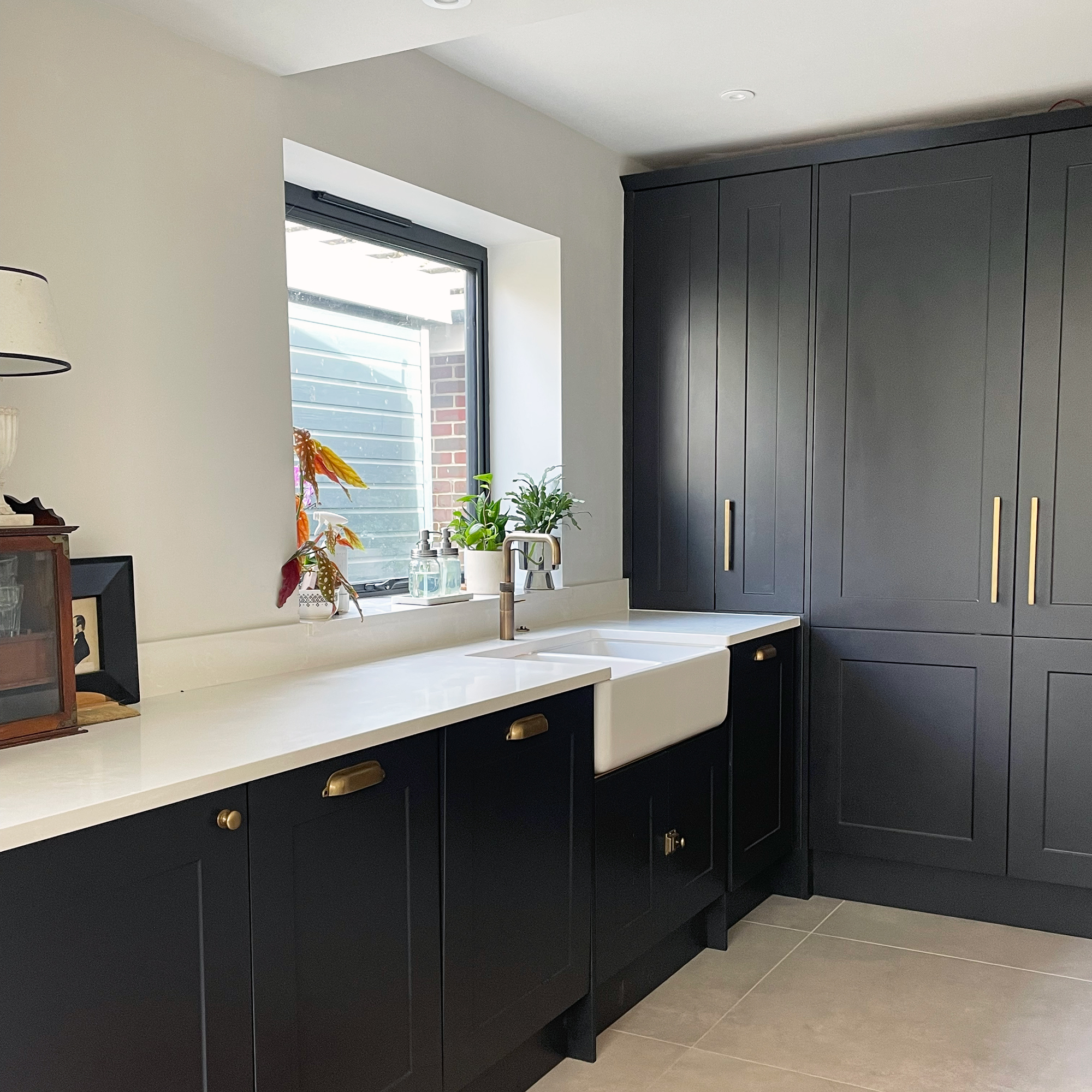
Another benefit of getting rid of a kitchen without wall cabinets is that we had space to add a kitchen window above the sink, which brings much-needed light to the far end of the room.
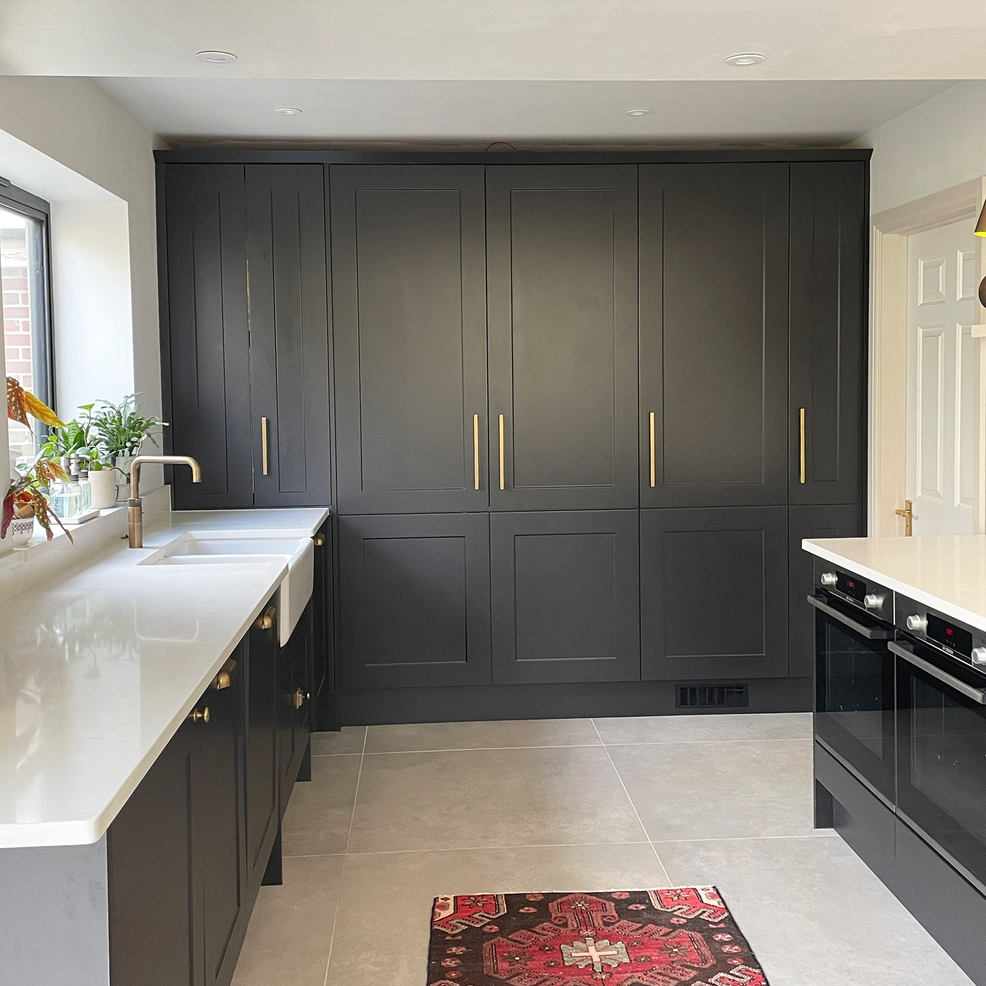
Getting rid of wall cupboards meant I had to be smart and find other ways to maximise storage. We dedicated the whole back wall to a bank of floor-to-ceiling cabinets to house as much as possible. This bank includes shelving, base corner unit, a larder unit, built-in fridge and a tall slim cupboard I use to store cleaning equipment.
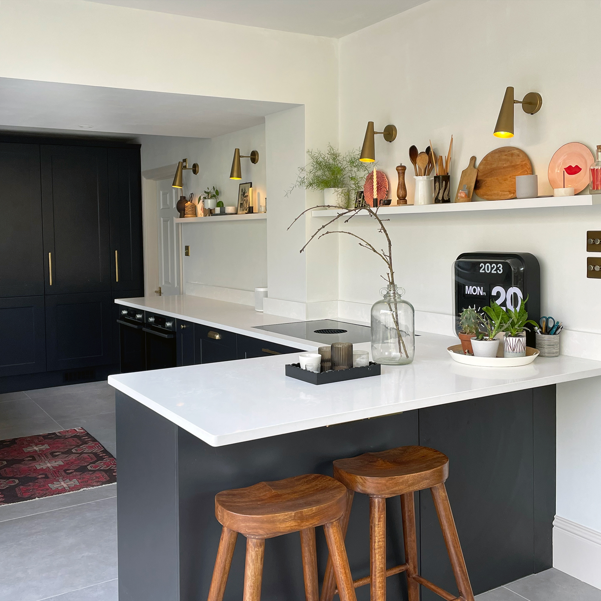
On a mission to maximise every available space for storage, we added a base cupboard under the breakfast bar that's accessed from the dining end of the room. We use it to store extra tableware and serve ware, and it's operated by a hidden push latch so it's like a secret cupboard!
I was worried that the kitchen would still feel narrow, but actually, it's really spacious, and all four family members can be prepping food in the space together without getting in each other's way.
There were concerns about storage in the planning stages, so adding units on the sink wall was always something we were open to doing if we felt we needed to, but we absolutely don't! Being smart with the storage space we have (we've added built-in bench seating with storage underneath in the dining area for stuff that isn't frequently used) has paid off, and I'd never want to sacrifice the feeling of space getting rid of the wall cabinets has created.

Heather Young has been Ideal Home’s Editor since late 2020, and Editor-In-Chief since 2023. She is an interiors journalist and editor who’s been working for some of the UK’s leading interiors magazines for over 20 years, both in-house and as a freelancer.