I’ve renovated four kitchens - these are the 7 trends I regret falling for, and what I'd now do instead
Don’t do as I do, do as I say…
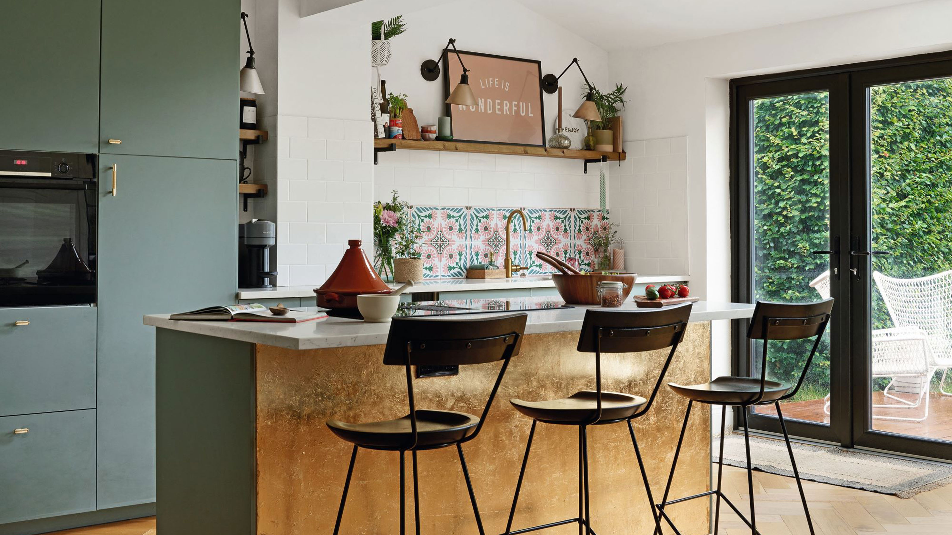

After years of writing about kitchens and watching trends come and go (and come back again), you’d think I’d be immune to their allure when it comes to renovating my own homes. Sadly, I’m just as susceptible to a hot new kitchen trend now as I was back then. Fresh out of journalism school, I barely knew how to cook but spent hours swooning around drool-worthy kitchen shoots lusting after everything in sight.
Fast forward 20-odd years and four kitchen renos, and I’ve learned a few tough lessons when it comes to kitchen design trends. There are some I will never regret; like embracing the joys of induction hobs and open-shelving over wall cabinets – the extra dusting is so worth it! But there are also a fair few trends that seemed amazing at first but have turned out to have unexpected downsides in time.
Most of the kitchen trends that have tripped me up over the years have failed on the functional front rather than purely on style. I am pretty clued-up on which kitchen trends to avoid, i.e. major fashion fads, and have written about the importance of making timeless choices enough times for it to have stuck firmly in my mind, body and soul.
Here’s a look at my top seven kitchen trend regrets and what I’ll do differently next time, because there’s always a next time when you are kitchen obsessed! Take notes and learn from my fashion failures.
1. Fancy chef-style taps
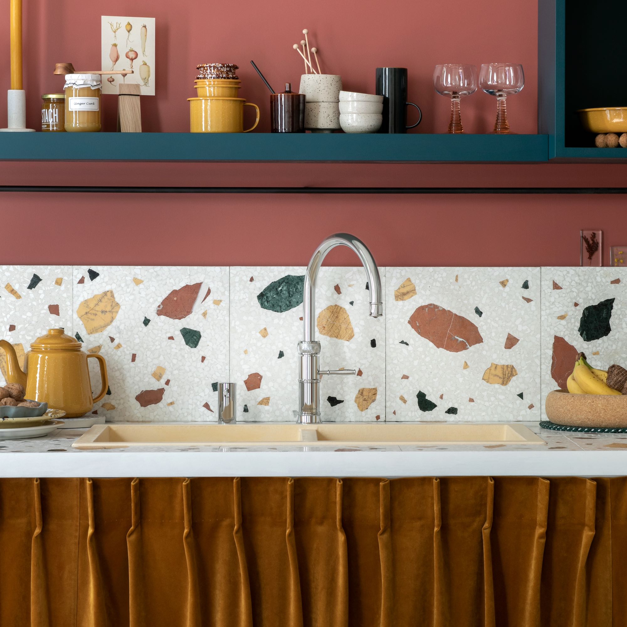
What I fell for: Back when I was renovating my first ever kitchen professional-looking chef taps were all the rage. You know the ones, with the massive spring around the spout and huge super-soaker spray head? It promised fearsome functionality and a sleek, pro look.
Why I regret it: There were so many reasons it was not a match made in heaven. For a start, it was very tall and gangly and got in the way of the window latches behind, plus it was far too powerful. I got drenched by the backsplash every single day. Sure, it had good reach and was excellent at rinsing off the draining board, but the spring was quite tight so flexing the spray head to its full length was quite the work-out. It also looked a bit silly in the small Shaker kitchen in our two-bed cottage.
What I’d do instead: Now I am all about the boiling water tap, which is one kitchen trend I’ll never ever regret. You can get ones that deliver hot, cold and boiling water from the same spout (as well as sparkling water etc if you’re really fancy) and I honestly don’t think I’ll go back to a kettle again. Mine also has a pull-out spray hose, which is perfect for rinsing vegetables and dishes but doesn’t give me an impromptu face wash in the process.
Get the Ideal Home Newsletter
Sign up to our newsletter for style and decor inspiration, house makeovers, project advice and more.
2. Real marble worktops
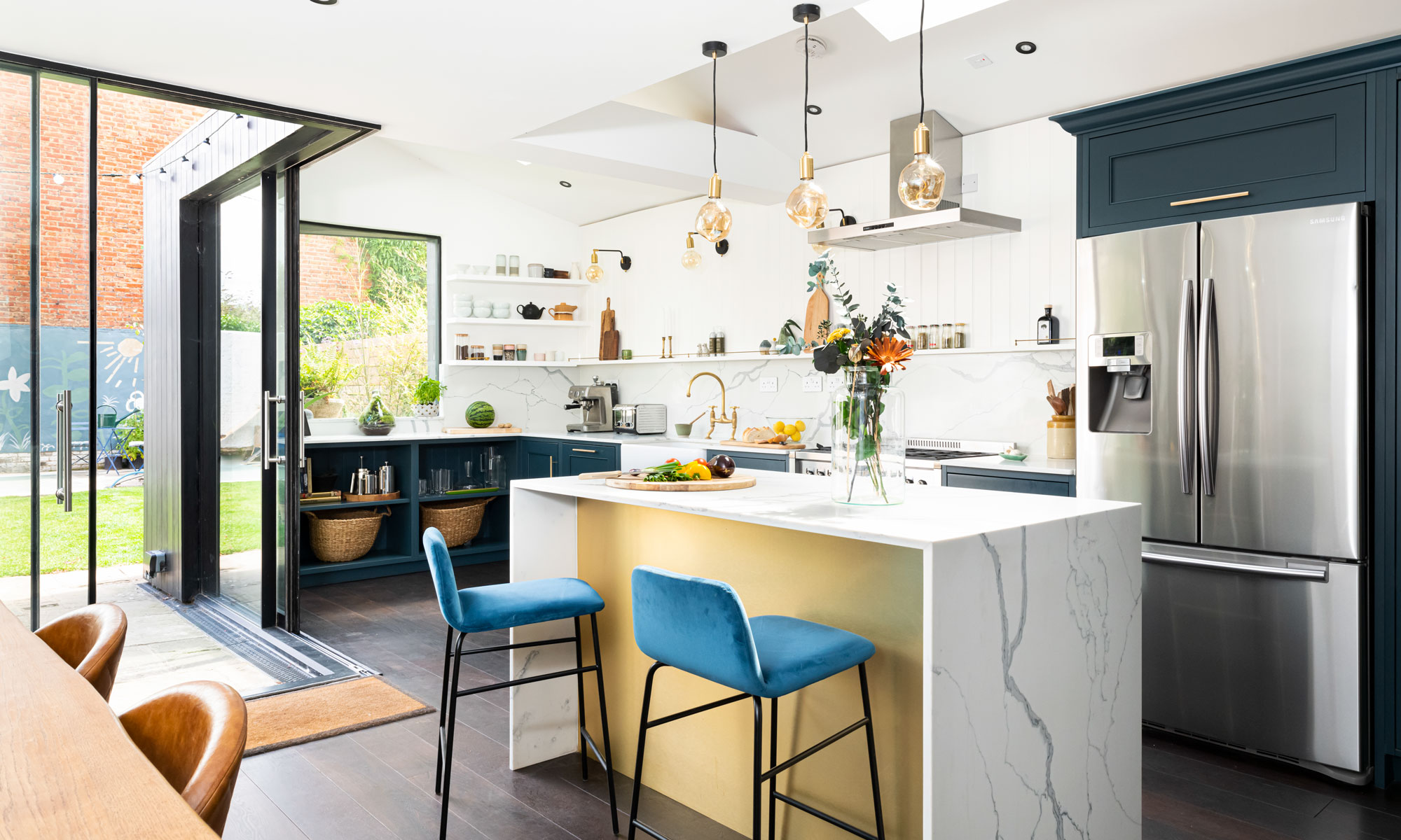
What I fell for: Oh, how I lusted after marble worktops – the unique veining and luxurious look was simply to die for, and I just couldn’t get enthusiastic about all the (actually very credible) faux marble alternatives out there. I was warned about the downsides of going au natural by approximately a bazillion kitchen experts, but did I listen? Sadly not.
Why I regret it: Marble is porous and prone to scratches and staining, all common facts I knew and thought I could handle. It’ll just add character, I reasoned. And, in fairness, if it was just regular food stains and scratches, I probably could be OK with it – but the water/acid marks that dull the surface do my actual head in. Cleaning marble worktops is virtually impossible.
My marble worktops never look clean, even when they really are, and because our kitchen is south-facing, every single mark shows up the minute the sun rises. It wasn’t a slow build-up either, our marble started to look shabby within a month of installation. I suspect the stonemason scrimped on the sealant. Three years on and it desperately needs refinishing and resealing, but somehow that always falls to the bottom of our to-do list. Just the thought of all the dust involved makes me shudder.
What I’d do instead: In hindsight, I would have sucked it up and chosen a marble-look quartz or perhaps one of the new porcelain options that mimic marble without always looking like they’ve been dragged through a hedge backwards or being so endlessly needy on the maintenance front. If you do go for the real deal, make sure it is properly sealed (and sealed again and again) before install, and for the sake of your sanity, put a proper maintenance schedule in place and stick to it. I’m too lazy for marble, and am paying the price.
3. Engineered wood floors
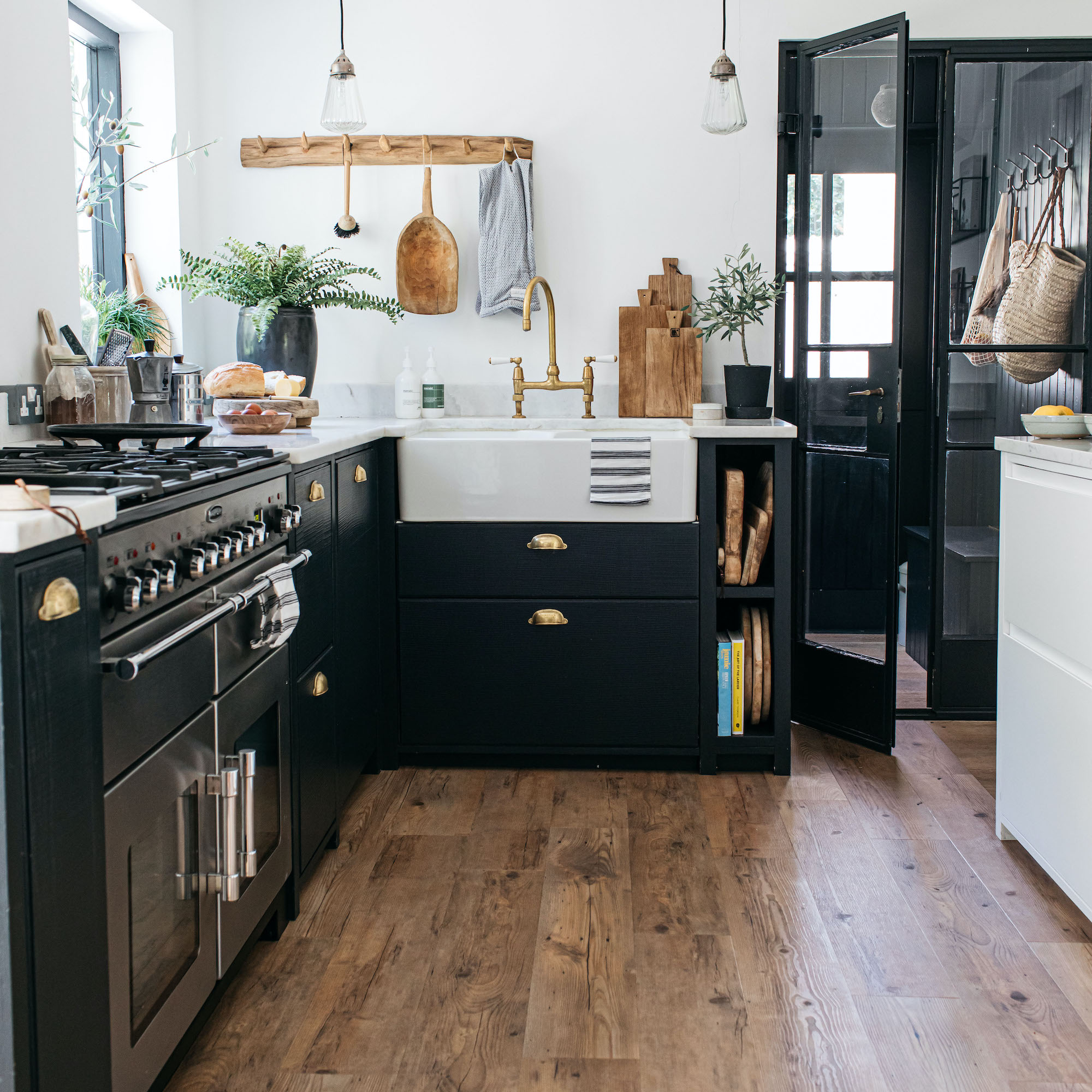
What I fell for: This is a similar tale to the marble trend to be fair. There’s just something so uniquely charming about real timber kitchen flooring – and I fell hard for some beautiful whitened oak-engineered timber flooring in the perfect Scandi-esque pale tones (double trend for the win!). Wood-look laminate and porcelain tiled flooring leaves me cold, literally.
In previous kitchens we’ve always had some kind of stone or tile flooring but, as we’re often wandering about in our socks or bare feet at home, it just wasn’t very cosy. Plus, hard floors are so unforgiving if you drop a mug or jam jar – there’s zero chance it won’t smash into a thousand pieces.
Why I regret it: I don’t entirely regret jumping on the engineered flooring bandwagon – it does look beautiful and it’s also warm underfoot and forgiving on my clumsiness. However, it does require a lot of maintenance to keep it looking good and that costs time and money. It’s also prone to staining, there are several bad watermarks where planters have not been as leak-proof as I’d like, and we’ve had to put a rug over the worst damage caused by puppy-training. You also can’t scrub and mop it as much as I’d like (or rather need to) because water just isn’t good for wood. Once a week is the recommended mopping schedule, but in our busy home, it would really benefit from more often.
What I’d do instead: I’m tempted by luxury vinyl flooring, which offers similar looks and warmth but with a lot more resilience. Or perhaps I’d try porcelain tiles again, but next time go for underfloor heating to remove the chill-factor – and try to be less butter-fingered when unloading the dishwasher!
4. Fully integrated fridges
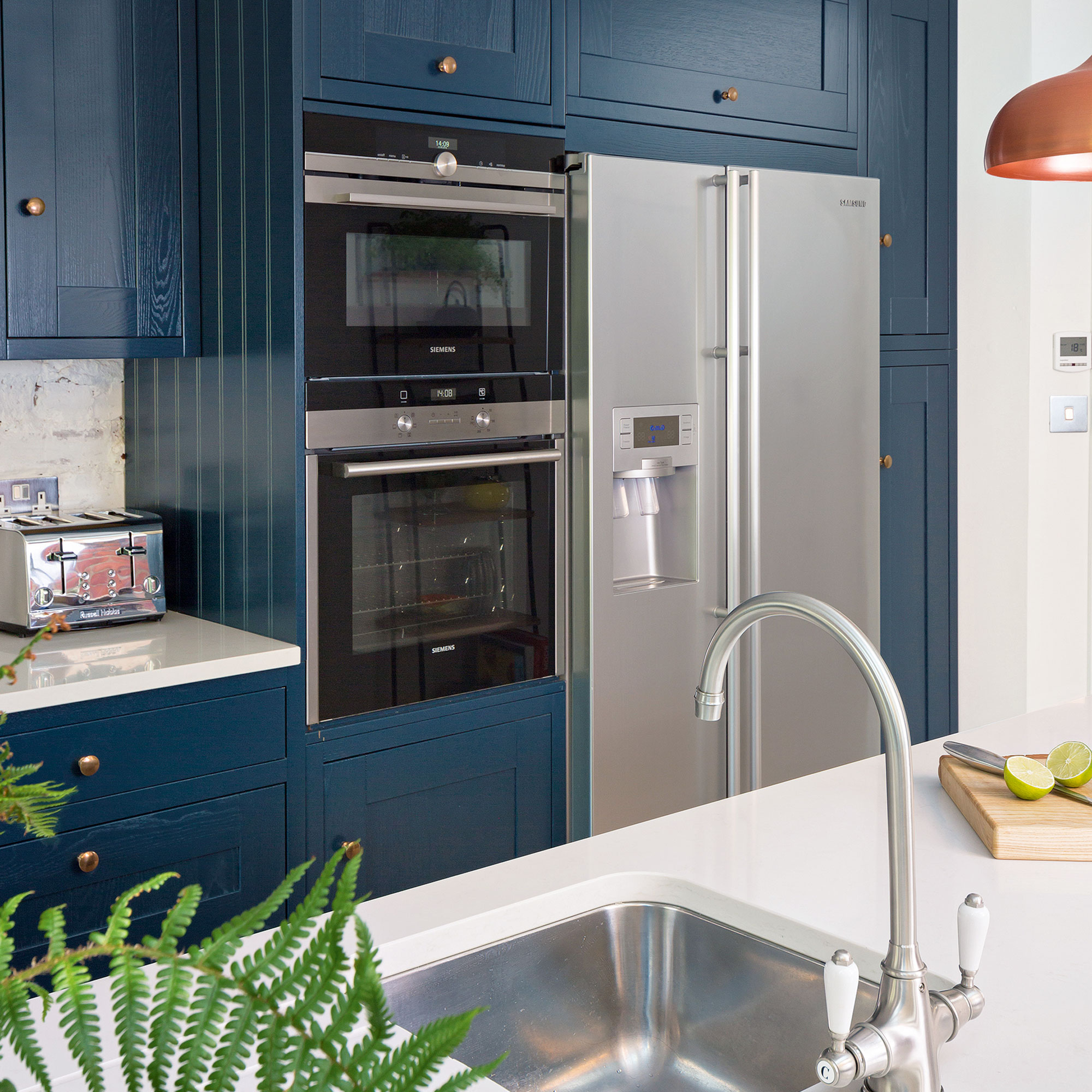
What I fell for: The minimalist trend whereby as much of the practical side of cooking is hidden away was hot news when we were renovating our last house (about 15 years ago now), and I was fully committed. I absolutely loved my fully integrated Miele ovens and have an integrated oven in our current kitchen but hiding the fridge away behind cabinet doors, although undoubtedly sleek and streamlined, just did not work out.
Why I regret it: For a start, the fridge lacked the internal capacity of a traditional standalone fridge, because the cabinet carcase it goes inside takes up precious inches of fridge space. This makes it harder to store large quantities and big dishes, especially when entertaining. Admittedly, you can get massive integrated fridges, but we didn’t have the space for anything wider than 60cm. It wasn’t just the restricted cavity that upset me, it was also the fact that the door was really heavy to open, and frequently needed adjusting on the hinges so it would sit flush. Plus, when the fridge broke down and needed the repairman, getting the thing out to access the back was a massive palaver. The swear jar did well that day!
What I’d do instead: This is one trend I’ve happily abandoned, as function ultimately outweighs aesthetic when it comes to the important job of keeping food cold. Now we have a lovely freestanding Fisher & Paykel fridge-freezer that slots into the cabinetry and has a very handy water/ice dispenser on the front. It’s spacious inside and, should it ever need to be repaired or replaced, we won’t have to remove cupboard doors to do so. The steel surface does show up finger-marks, but window cleaner and a lint-free cloth removes them again.
5. Butler sinks
What I fell for: Ah, the charms of a classic Butler sink are totally irresistible, especially if you live in a chocolate-box thatched cottage, which I did when I first bought one. With its deep, generous bowl and farmhouse appeal, it’s a trend that swept the kitchen design world a few years (decades) back, not least because a Butler sink pairs so well with Shaker kitchens, which was also, and still is, hugely popular.
Why I regret it: Here’s the catch, the deep bowl is an absolute killer on your back. Especially if, like me, you’re 5’ 10” tall (or more). We only had a slimline dishwasher in that kitchen so washing up was a literal pain and I soon abandoned any attempts to peel spuds or clean veg in that sink. Everything had to be done on the worktop, which was messy. The model we had was enamelled steel, which I also do not recommend because it etched and stained and needed a lot of scrubbing with a very expensive abrasive cleaner to keep the bowl white.
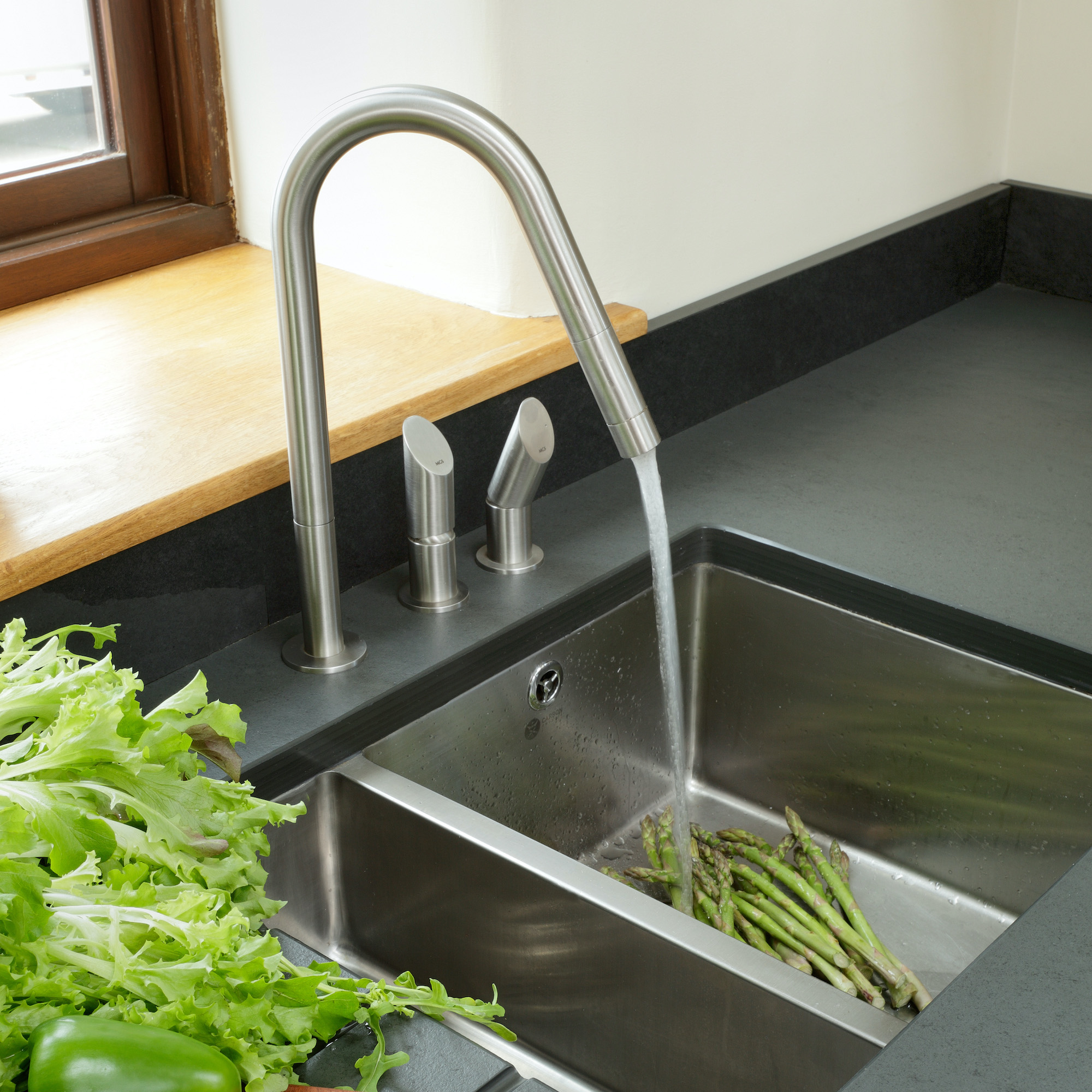
What I’d do instead: In my current home I do have a butler sink but it’s in the utility room and is low-level, which is a great height for emptying the mop bucket and washing the dogs (while sat on a stool). It’s also ceramic, which is much easier to keep clean than enamel. For a main kitchen sink that you’re likely to be standing at for a long time, I’d now recommend an undermounted model where the bowl isn’t so deep it puts strain on your lower spine. Stainless steel is by far the most durable, hygienic and easy to clean material, too.
6. Dark painted cabinets
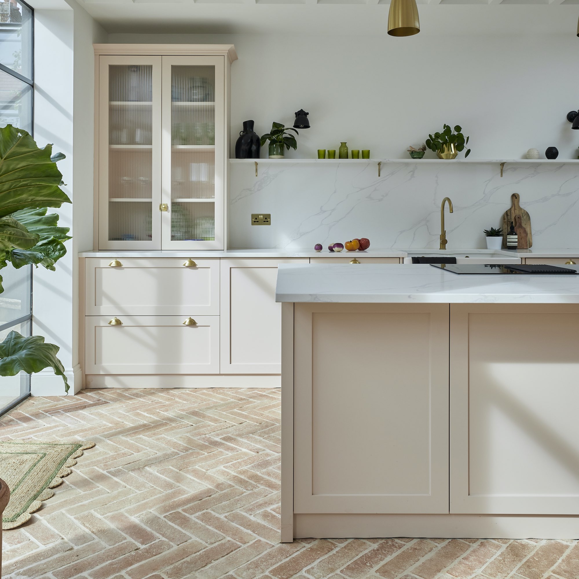
What I fell for: The dramatic allure of deep, dark kitchen cabinets – in charcoal black, regal blue or, in my case, deepest green – has undeniable style appeal. They look impressive and sophisticated and just so darn grown up!
Why I regret it: I’ve been writing about kitchen trends for more than 20 years and nobody, not one person, warned me about how hard it is to keep dark cabinets clean. They’re an absolute magnet for fingerprints, dust and all the many spills and smudges that seem to appear from nowhere to offend my eyeballs. If you have kids, pets, or both, dark cabinets can be a full-time job to keep looking pristine.
What I’d do instead: This is a tough one because I do love the look of my dark cabinets but there’s no disputing the one wall of pale painted cabinets we also have are 100% easier to clean. I don’t recall the last time I needed to wipe them down to be honest, but the dark cabinets are basically an on-going mission. So yes, if we ever repaint, or renovate again, I’ll be going lighter and brighter and look forward to enjoying all that extra free time!
7. Massive island units
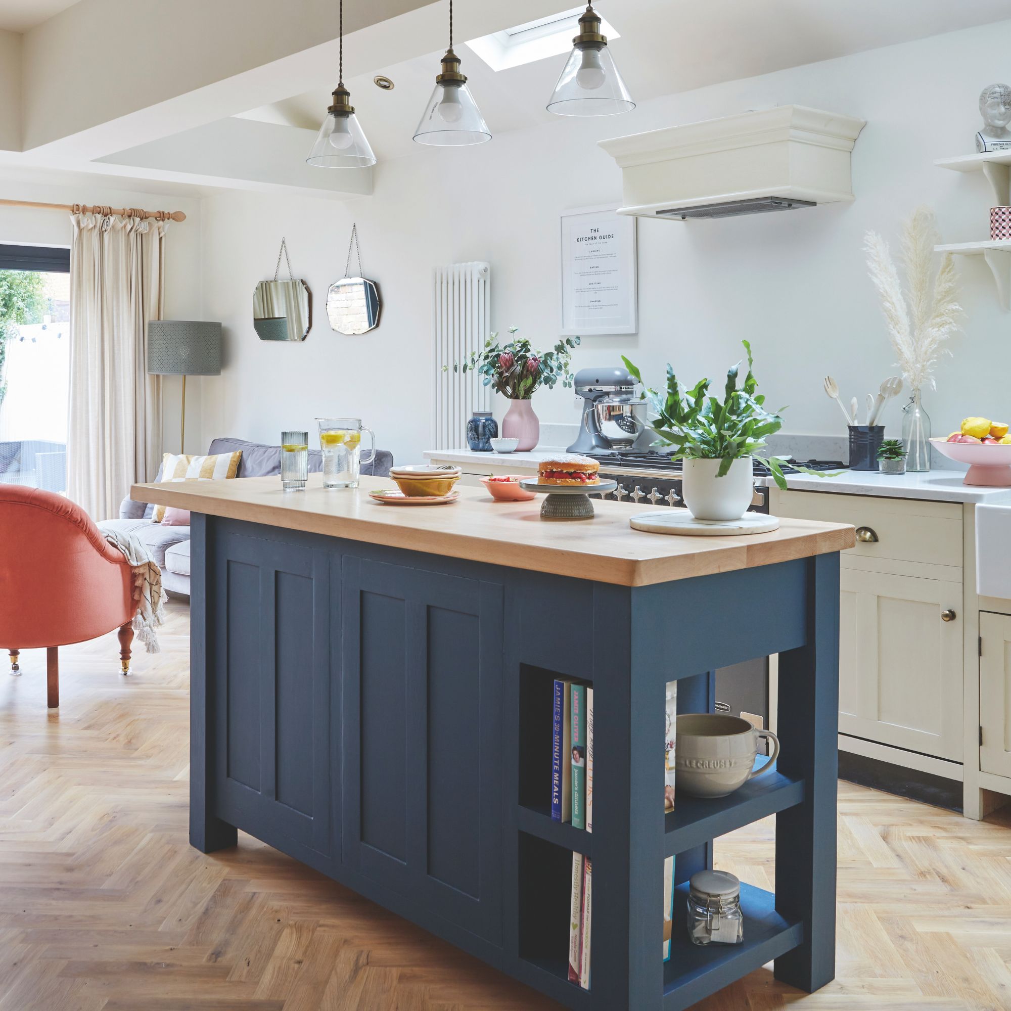
What I fell for: It took three kitchen renovations before I had the floor space to get onboard the kitchen island trend (which is still HUGE). So, when I finally got the opportunity, thanks to a fairly vast kitchen extension, I went for it, in a big way. Measuring 365cm by 165cm, our island unit is probably big enough to house an extra family or two…
Why I regret it: Island units are absolutely wonderful, and I am not surprised an island unit remains top of most-wanted lists year-after-year. But there’s such a thing as too much island. Oversized islands can become something of an obstacle in the kitchen, making you walk far further than necessary to complete the most basic of chores.
What I’d do instead: I’d probably reduce the length by at least 80cm, creating a quicker route into the heart of the kitchen and providing more floorspace for soft seating. A smaller island would be just as effective – I only really prep in one area – and could prove more ergonomic layout wise. In retrospect, a more compact design, or perhaps two islands with access through the middle, might have served us better in the long run. First World Problems, eh?!
My top tips for choosing timeless kitchen trends
So, how can you avoid being star-struck by trends and design a kitchen that won’t leave you wedded to your Marigolds or make cooking harder than it needs to be? Here’s my advice for choosing kitchen trends with functionality as well as style:
Stick to a neutral palette Go as wild and whacky with the colour and pattern on your walls, textiles and furnishings as you like, but on cabinets, keep things calm and easy to clean! Neutral colours—like warm whites and earthy tones—are timeless for a reason. They bring a sense of calm and light to the kitchen and make it easy to refresh the space with smaller accents. Dark, bold colours will make a statement, but they will not age gracefully, and they will show every last speck of dust.
Opt for low-stress surfaces Investing in high-quality, durable materials and finishes, such as porcelain, quartz and stainless steel, pays off in both durability and style. These materials look good, never go out of fashion, and require minimal upkeep. Avoid trendy finishes that may quickly feel dated. While they might be tempting at first, a timeless kitchen benefits from materials with a proven track record of both function and form. High-quality materials designed to cope with high temperatures, steam and spills don’t just look good, they’ll also stand up to the daily wear and tear of a busy kitchen.
Choose function over form It’s easy to be swayed by striking designs, but kitchen trends that prioritise function are often the ones with staying power. Consider how you use your kitchen on a daily basis. Practical choices like sufficient storage, smart layouts, and easy-to-clean surfaces will make your kitchen more enjoyable than any high-statement but excessively big island unit ever will! Elements like internal storage dividers, soft-close drawers, and well-planned lighting don’t scream trendy, but they will provide long-lasting satisfaction.
Kitchen trends are exciting and enticing, but they don’t always live up to the hype. When designing your kitchen, choose trends that are more in-tune with how you live, not just ones that look great in magazines and on your Socials. Hindsight is a beautiful thing – so take advantage of mine and create a kitchen that you’ll love for years, without regrets.

Linda Clayton is a professionally trained journalist, and has specialised in product design, interiors and fitness for more than two decades. Linda has written for a wide range of publications, from the Daily Telegraph and Guardian to Homes & Gardens and Livingetc. She has been freelancing for Ideal Home Magazine since 2008, covering design trends, home makeovers, product reviews and much more.
-
 5 brilliant budget alternatives to paving slabs that won't cost the earth
Looking to pave your garden on a budget? Try these stand-ins...
By Sophie King
-
 Want to cook like Jamie Oliver? Here's the top-rated pan from his collection
Jamie's collaboration with Tefal has led to this casserole dish getting the best user reviews I've ever seen
By Molly Cleary
-
 7 best colours to paint a windowless bathroom that will transform the mood of a dark wash space
A bathroom without a view needn’t sink your plans for a warm and welcoming retreat
By Linda Clayton
-
 Want to cook like Jamie Oliver? This is the top-rated casserole he uses from his own collection all the time on Instagram
Jamie's collaboration with Tefal has led to this casserole dish getting the best user reviews I've ever seen
By Molly Cleary
-
 I’ve found a stunning £40 buy that rivals Le Creuset at Wilko - this casserole dish is a dead ringer for one of the most summery colourways
You just can't beat finding a great Le Creuset alternative
By Kezia Reynolds
-
 This beautiful mixing bowl is the unexpected star of so many kitchens – including Mary Berry's and the Bake Off tent
This earthenware bowl proves that you don't have to spend a huge amount for a classic kitchen addition
By Molly Cleary
-
 Dunelm has given its cult snuggle chair a new look - it's swapped classic stripes for another emerging pattern trend
I'm obsessed with this fresh new style
By Kezia Reynolds
-
 I tried Joseph Joseph's pan set with foldable handles – the space-saving design is just one of the many highlights
Small kitchen? I tested this innovative Joseph Joseph space-savvy set which has foldable handles — and I loved it
By Annie Collyer
-
 As a stylist, I spend hours looking for bedding for photoshoots, and I just spotted these 6 expensive-looking sets at M&S
Get a little luxury at a high-street price
By Laurie Davidson
-
 I've been waiting to try out the Ninja Slushi for months – this is what happened the first time I tried it
The Ninja Slushi is the stuff of dreams for summer entertaining
By Molly Cleary
-
 IKEA has drenched its BILLY bookcase in this year’s ‘it’ colour - but you’ll have to act fast if you want to get your hands on one
I'm obsessed with this gorgeous limited-edition colourway
By Kezia Reynolds