14 kitchen cabinet ideas to inspire an on-trend yet practical cooking space in 2025
From on-trend colours and the latest materials to design solutions that are practical and pretty, we’ve got all the best kitchen cabinet ideas covered

Holly Cockburn
There’s a lot more to kitchen cabinet ideas than settling on your favourite door design. Although deciding whether you prefer Shaker over Georgian, beaded panel details over cathedral arch or just a plain slab front is a good starting point.
You may also want to consider whether to go for modern lay-on doors, or a classical in-frame style of cabinetry. The former is often more affordable and takes up less space than framed fronts, but the latter is hard to beat when it comes to achieving an up-market ambience.
Once you’ve got the basic look ticked, it’s time to think about more creative kitchen ideas like dynamic colour combinations, feature finishes and smart shelving. ‘When planning any kitchen cabinetry, it’s good to work in layers of interest,’ says interior designer Irene Gunter. ‘Focusing on elements like texture, shape and scale can all lead to a kitchen that gets more interesting the closer you look.’
1. Try ply
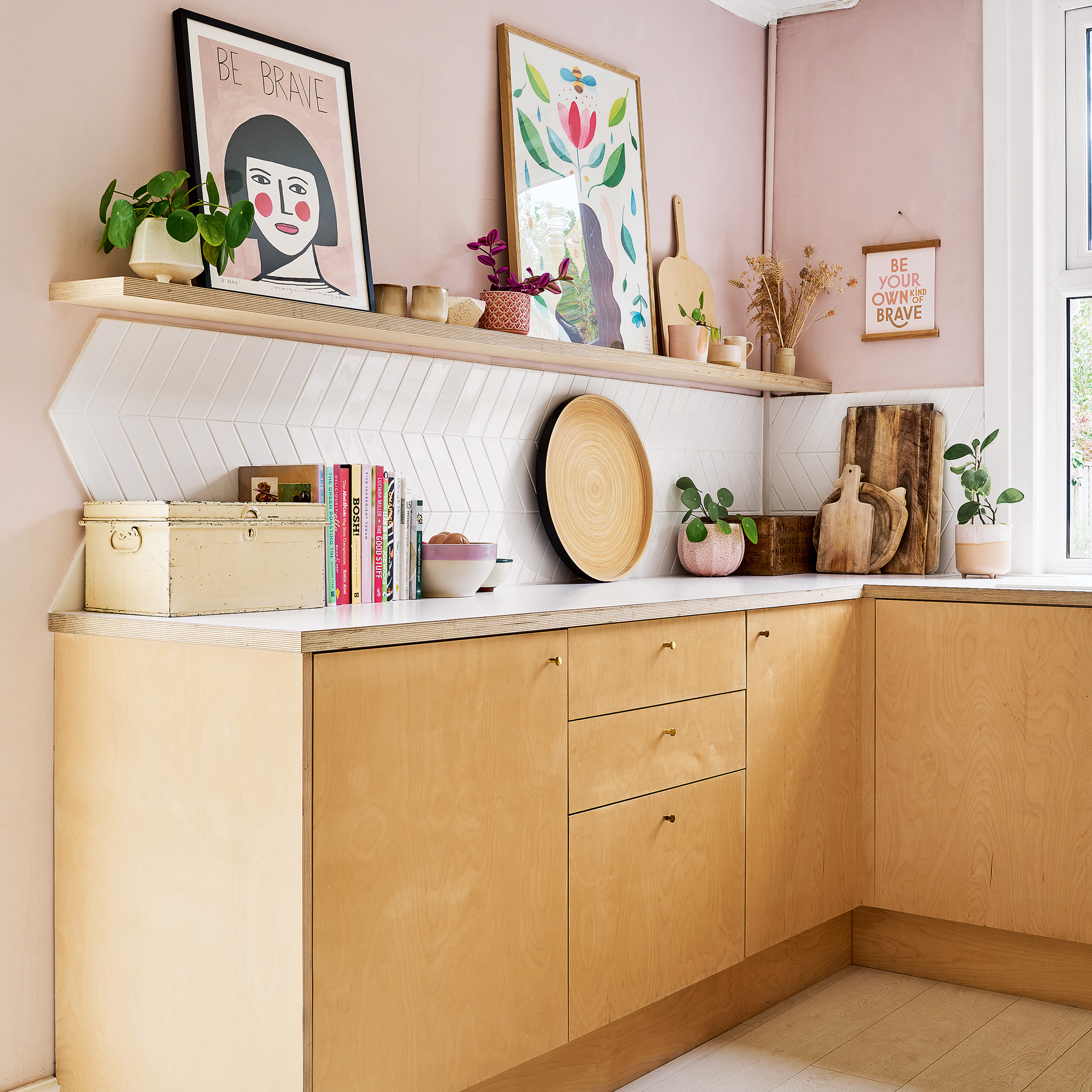
Durable, hardwearing and sustainable, plywood is becoming a top choice for kitchen cabinetry. Many of makers offer plywood kitchen doors and panelling to fit carcases from Ikea and Wickes, so it can be an affordable option, too. Plywood is manufactured with fewer chemicals compared to materials like MDF or chipboard, contributing to a toxin-free home.
Do check the material you’re buying is FSC certified, or similar, and any lacquers used are formaldehyde-free. In terms of quality and longevity, plywood should be B/BB graded, which is the standard for cabinetmaking, rather than general construction.
‘Plywood is a little more expensive than other composite sheet materials, like MDF, but the durability and environmental benefits far outweigh the cost, plus it is an attractive material that will bring natural warmth to your kitchen,’ says George Glasier, co-founder, Pluck .
2. Add a splash of colour
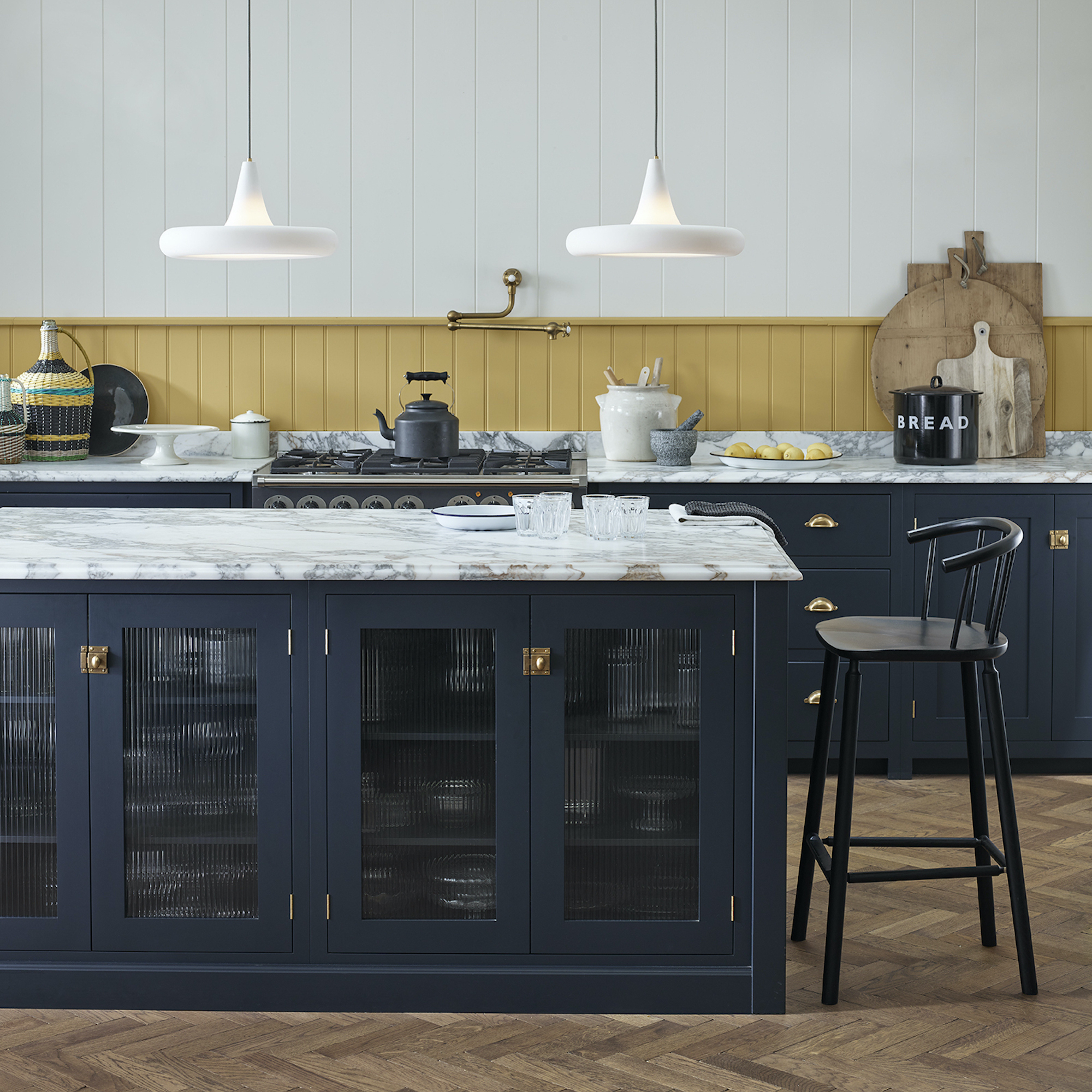
‘If you’re nervous about using bold colours, then introducing smaller doses of colour is a good place to start,’ advises interior designer Kate Guinness.
Get the Ideal Home Newsletter
Sign up to our newsletter for style and decor inspiration, house makeovers, project advice and more.
The mustard yellow splashback here really lifts the dark-painted units below and will be easy to refresh when you are ready for a change of scene. Combined with timeless marble worktops and timber flooring, the use of bold colour is reserved but gutsy – try Sanderson’s Curry Yellow for a similar shade. ‘Pops of colour are a perfect way to break up the monotony of a room and can really lift the mood,’ Kate adds.
3. Get good-looking shelves
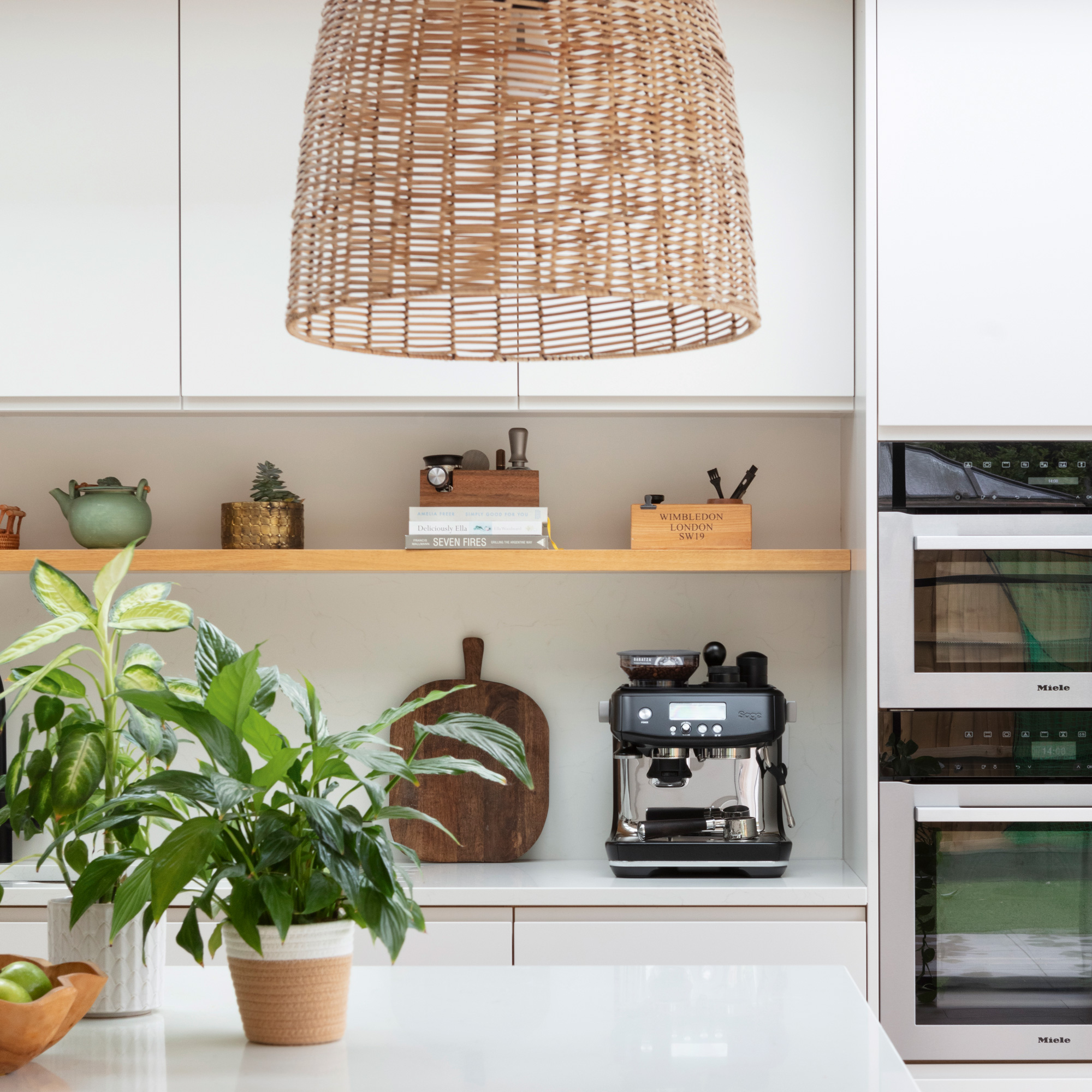
It’s no secret that open shelves are less overpowering than standard kitchen wall cabinets, with many preferring the more relaxed look and instant access. While it’s easy to get carried away with #shelfie styling and artful displays, it is important to make sure they deliver practical kitchen storage solutions, too. By making the shelving itself attractive, like this modular timber design, the contents can afford to be a little less perfect.
‘When positioning items for kitchen shelves, I tend to use the lower shelves for everyday crockery and dried foods, leaving the higher shelves for more decorative displays,’ says interior designer Enass Mahmoud. You don’t have to decant foods into stylish containers but it does help avoid the chaos of mis-matched or outsized packaging, providing a neater look.
4. Lose the handles
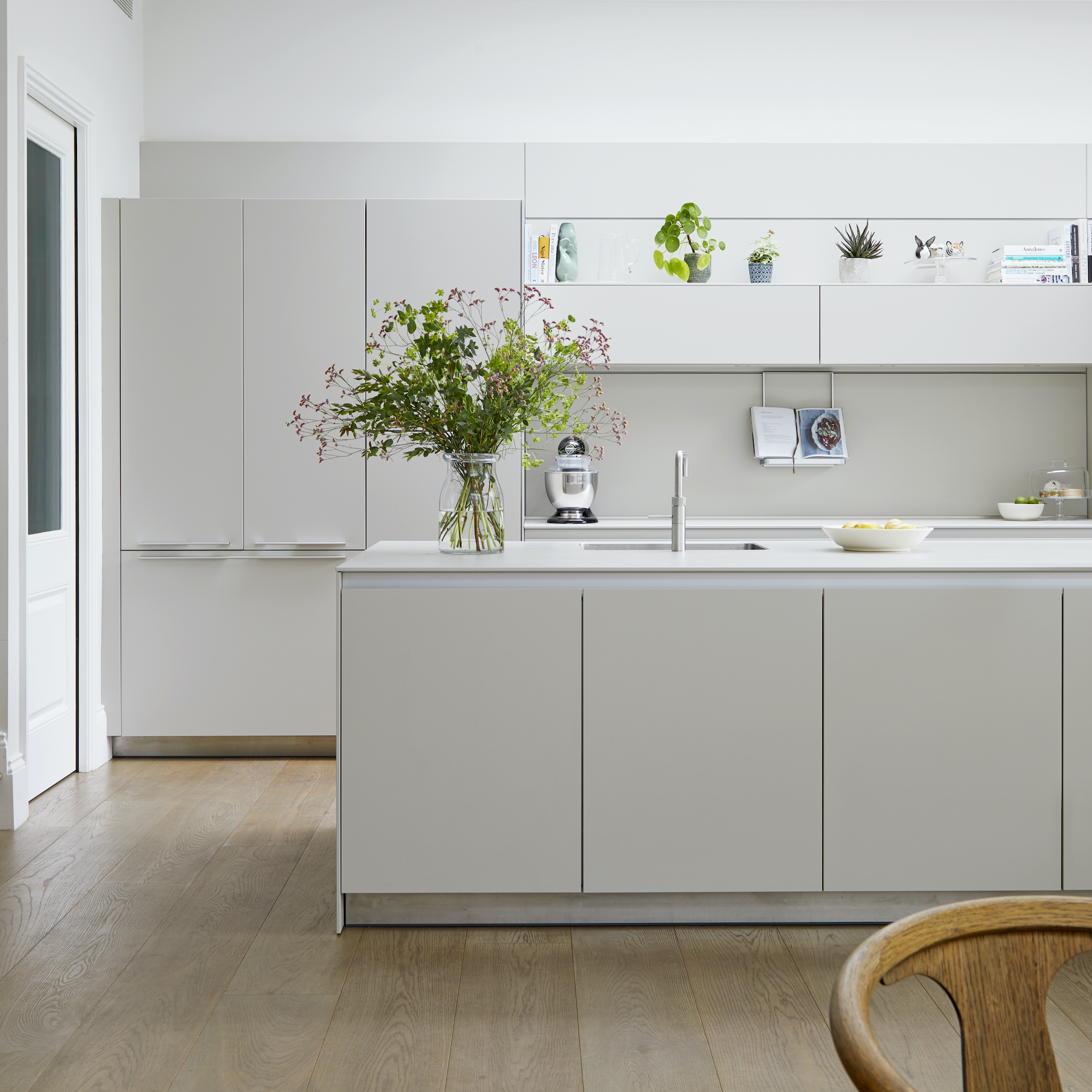
The streamlined design of handleless kitchen cabinets offers a sleek, uncluttered look that’s modern yet timeless. The benefits go beyond design. ‘Handleless kitchens are perfect for families with young children as it avoids kids from bumping into the handles on the kitchen doors – one less concern when parents are busy preparing meals in the kitchen,’ says Keith Atkins, managing director, DesignSpace London.
Recessing the handles, as seen on the kitchen island unit here, is a popular way to keep door fronts handle-free. ‘Also consider push-opening systems that allow kitchen drawers and top cupboards to be opened with just a light touch, or remote-control door opening systems, which are a nice addition to the home for gadget lovers,’ adds Keith.
If you want integrated appliances, such as a fridge-freezer or dishwasher, it’s best to fit handles to achieve decent grip when opening.
5. Break it up with baskets

Traditionally found on country kitchens, basket-based storage is brilliant for breaking up the monotony of large expanses of cabinetry. Look for baskets made from textural materials like rattan and wicker for a relaxed, rustic charm. Don’t store naturally woven baskets near direct heat, like a range cooker, or they may dry out and split.
This style of storage is naturally aerated, making it good for storing root vegetables and bread. In contemporary kitchens, a similar effect can be achieved using wirework trays and mesh boxes, which will lend an industrial edge.
6. Dial it dark
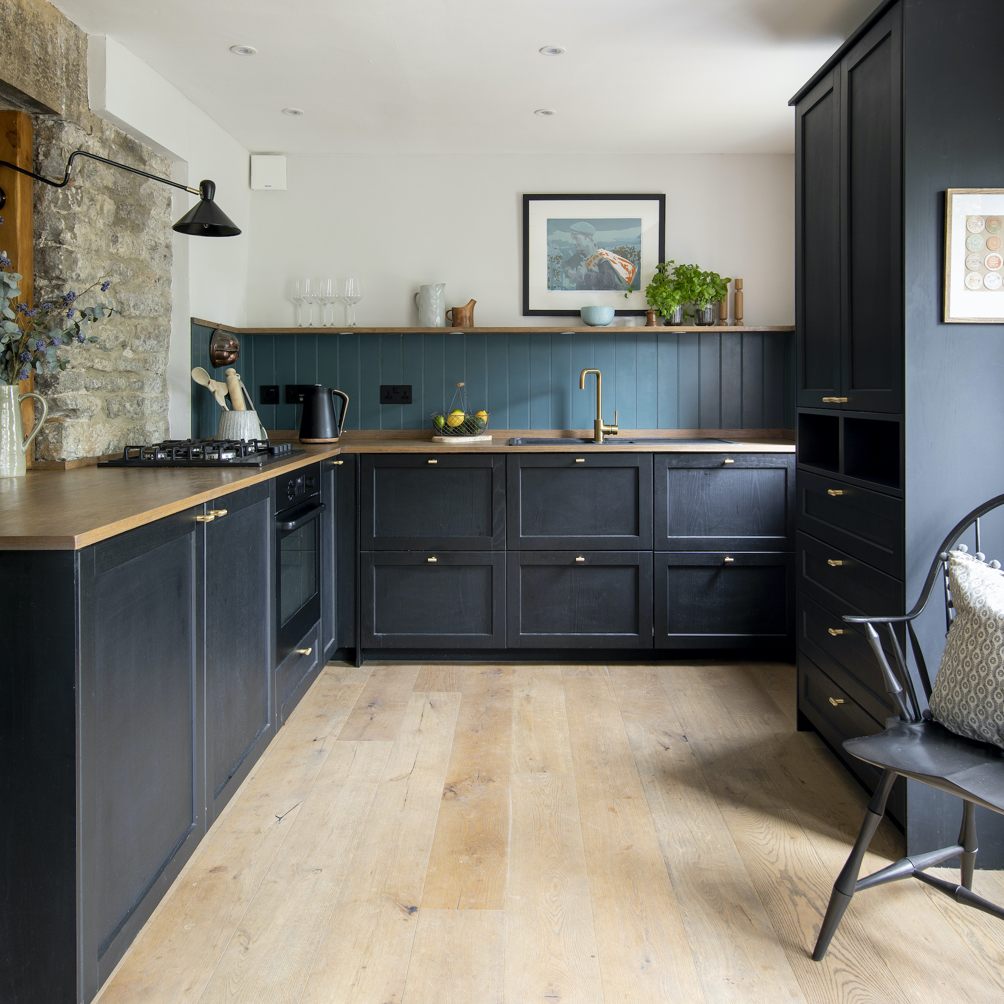
Shaker cabinetry is, arguably, THE most timeless door design ever created and we can’t imagine a day it will ever go out of style. A big part of Shaker’s success comes down to adaptability. In short, Shaker kitchen ideas can be styled to suit any home, old, new or in between.
After a classic look with a twist? Go for dramatically dark Shaker cabinets, like these. ‘Black is a bold choice for a Shaker kitchen, but it will instantly take it in a more contemporary direction,’ says Peter Humphrey, design director, Humphrey Munson. ‘Choose muted blacks over glossy shades, with undertones of grey or blue to achieve a cool, understated finish.’
7. Go with the grain
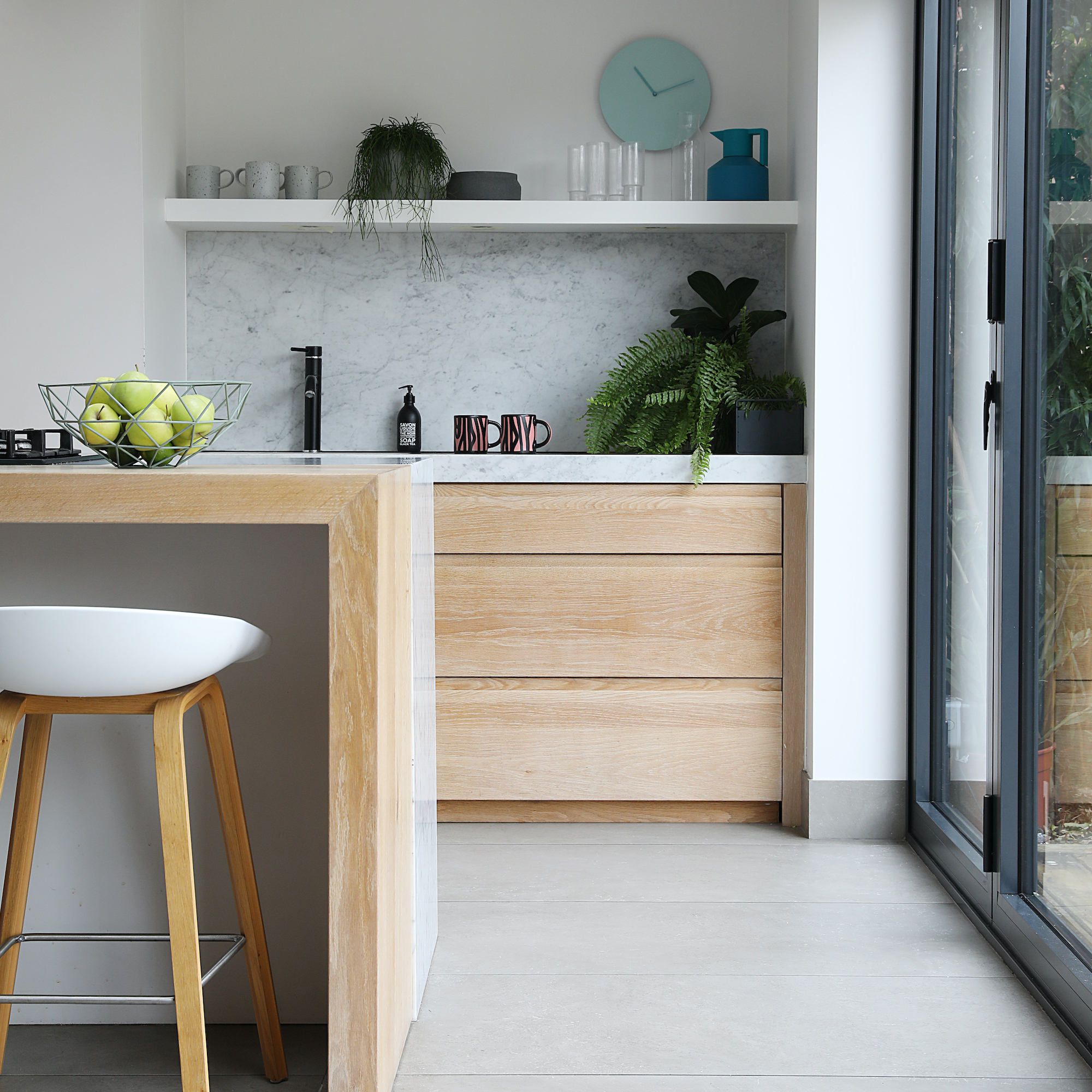
While floor-to-ceiling timber cabinetry can be a little overbearing, a touch of timber is all it takes to inject warmth into your kitchen. ‘Transitional kitchens that combine sleek and minimalist elements, with more natural, textured finishes are the modern way to work wood into your scheme,’ says Andrew Hamilton Barr, director, Espresso Design.
Opt for a twist on two-tone kitchen cabinet ideas sticking to timber below the eye-line, and going for paler surfaces above, is a good approach if you want to keep it modern. Here, a lime-wash finish highlights the grain pattern to really emphasise the uniqueness of nature’s finest material. ‘We’re also seeing a lot of interest in dark, herringbone or bi-directional wood veneers that work brilliantly at breaking up stark spaces and bring warmth and textural contrast,’ adds Andrew.
8. Wrap around the worktops
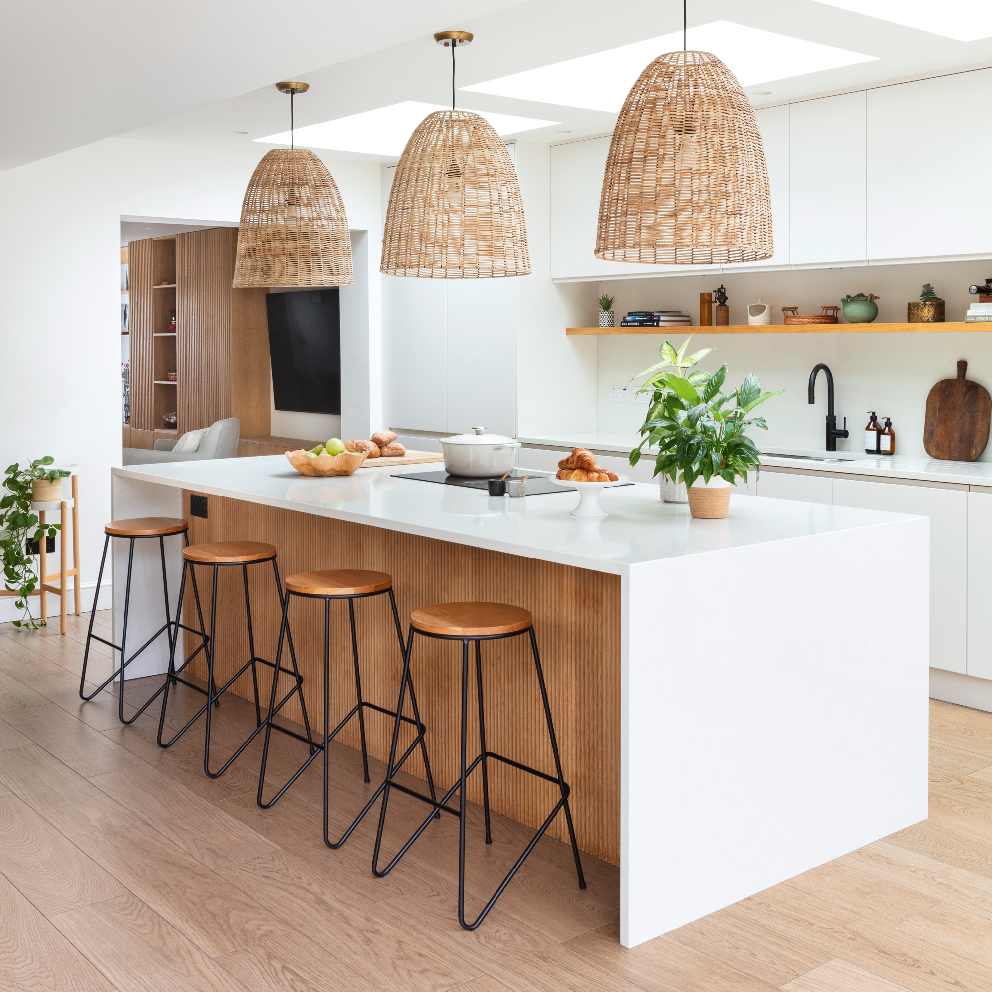
A ‘waterfall edge’ is a sophisticated way to elevate kitchen cabinets. The term essentially refers to carrying worktops seamlessly down to the floor, from horizontal to vertical, usually using a crisp mitred joint that’s barely visible. The waterfall edge is most commonly found at the end of island units, but can also be used to neatly finish a run of base units.
‘Deeply veined marbles look particularly fabulous using this technique, especially if you source a slab large enough to allow the veining to flow right down to the floor,’ enthuses Oana Sandu, lead designer, Blakes London. ‘It’s important to think about the flooring and how it will complement your choice of worktop, usually a contrast works best.’
9. Get fancy with fluting
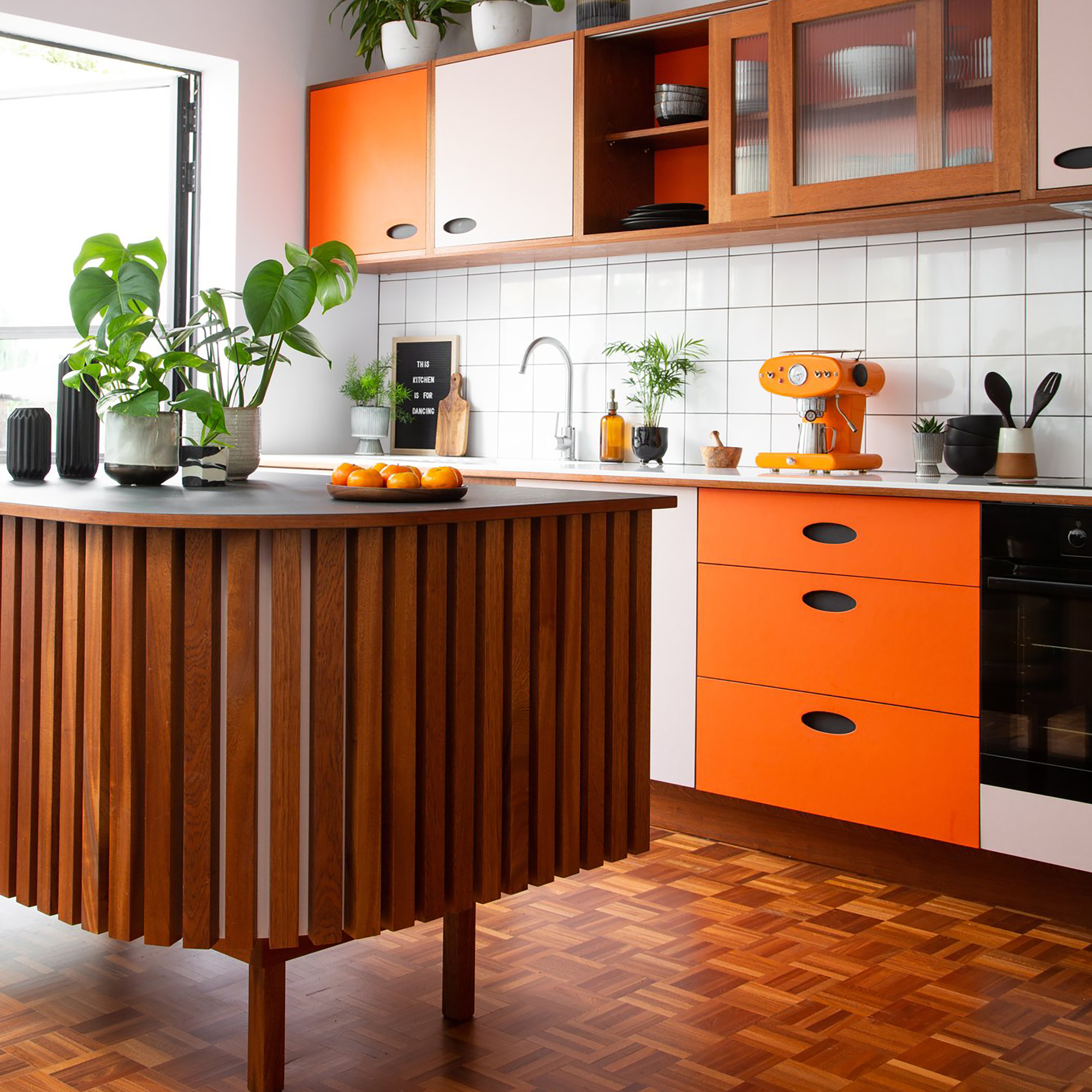
Fluted surfaces are the hottest new way to bring three-dimensional interest to kitchen cabinets. Featuring on panelling, wall cladding and even floor-to-ceiling doors, fluted designs capture the light through the day, creating movement and shadows.
The width and spacing of fluting will yield very different results. Tight fluting can look like pinstripes from a distance, while going wide emphasises has more of a scalloped, curvy look. Bear in mind that any grooved surface is going to be harder to keep clean than a flat one, and you may occasionally need to use a soft brush to work debris out of the gaps. Lighter paint colours, and timber fluting, will be more forgiving when it comes to dust.
10. Take it to the top
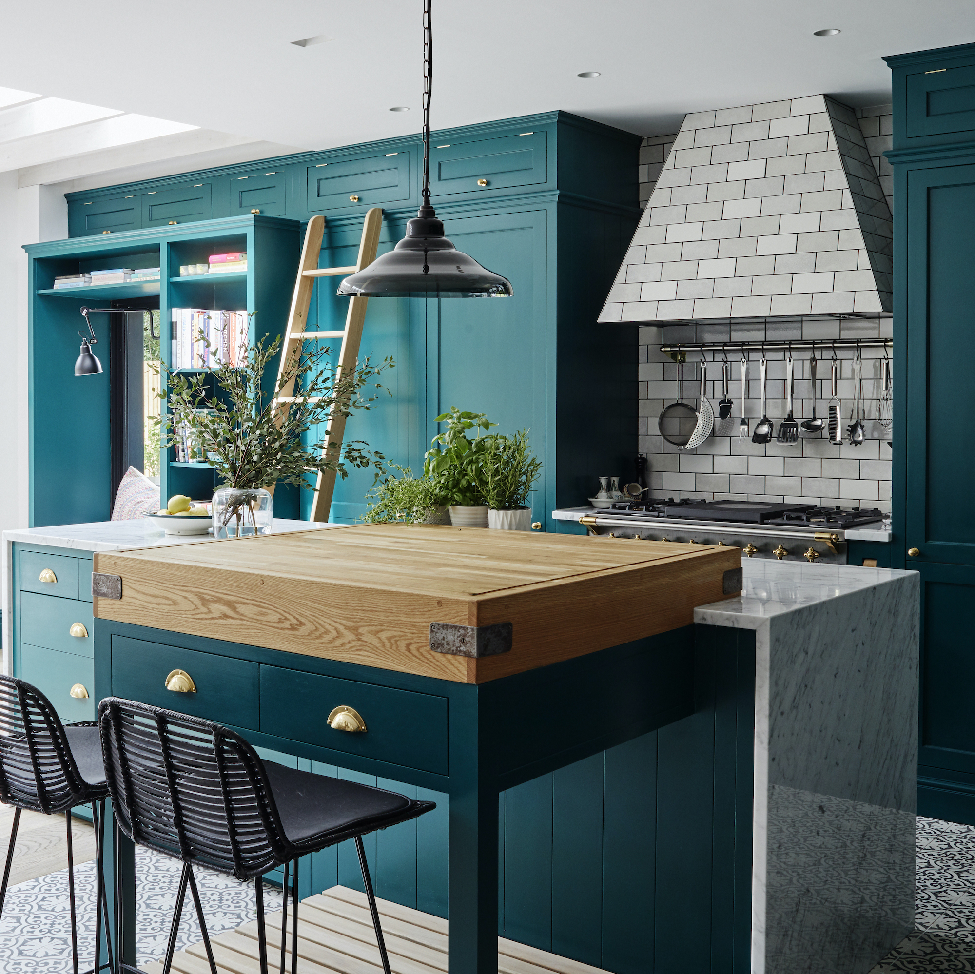
Taking kitchen cabinets right up to the ceiling can be a great way to add a sense of scale and proportion to a space. ‘This works especially well in rooms with lower ceilings where you may wish to draw the eye upwards to give the illusion of more height in a room. As an extra bonus, you also avoid the dust and grease that can settle on top of open cabinetry,’ says Jennifer Hamilton, director, The Vawdrey House.
‘On this project, we added an oak ladder, which is really practical and enables easy access to the longer-term storage cupboards at the top of the unit. The ladder also adds a characterful focal point to the room.’
11. Go two-tone

Why choose one cabinet colour, when you can have two? Painted kitchen ideas are a great option when considering multiple hues, especially if you’re concerned your current colour crush won’t last.
‘The beauty of a hand-painted kitchen is that in time, should fashions or your taste change, it’s simple to create a new look, especially if you restrict your bolder choice to one unit, like an island,’ advises Jasper Middleton, design director, Middleton Bespoke.
When choosing more than one shade, it can also help to think about the balance of colours. ‘Using lighter shades at eye-level will allow space for darker colours to breathe,’ adds Jasper.
12. Check out hinges and hardware
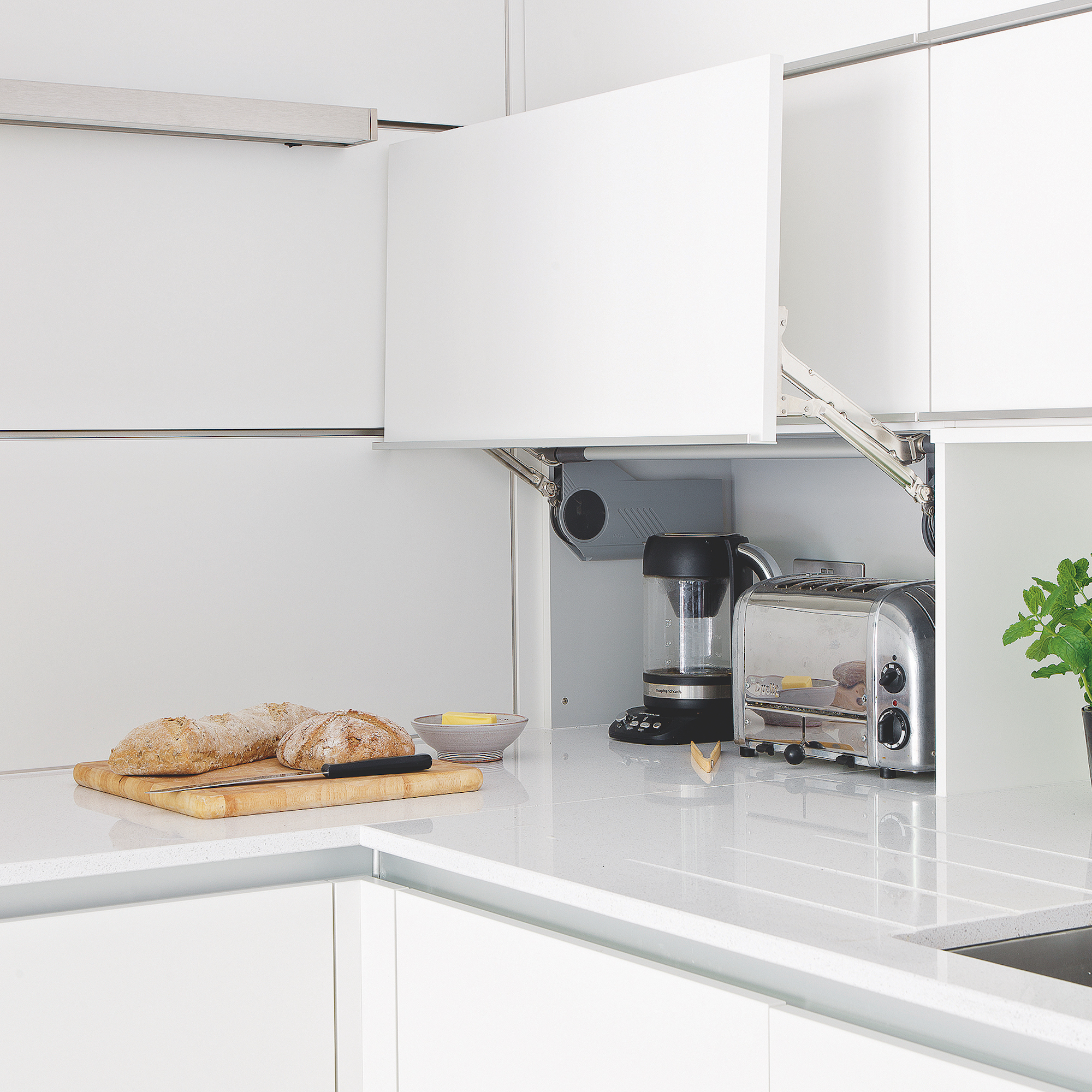
When choosing kitchen cabinets, don’t underestimate the importance of the interior hardware used. Poorly made hinges and drawer runners will soon sag and leave you with wonky cabinet doors. It is well worth going to visit a kitchen showroom before you buy, checking for smooth opening and noisiness. Don’t be afraid to bang doors and put your weight on drawers to test for robustness.
Look for reputable hardware brands like Blum, Hettich and Grass, and ask your kitchen supplier about their warranty conditions when it comes to moving parts.
Smart interior hardware can also deliver more in practical terms. For example, Le Mans units will make it easy to access the full storage potential of corner cabinets, while pull-out larder systems will allow you to store far more efficiently than simple shelves. Parallel lift-up hinges, like these, are brilliant for tucking small appliances away out of sight and keeping surfaces blissfully clear. Install sockets inside so they’re primed ready for use.
13. Go for ribbed glass
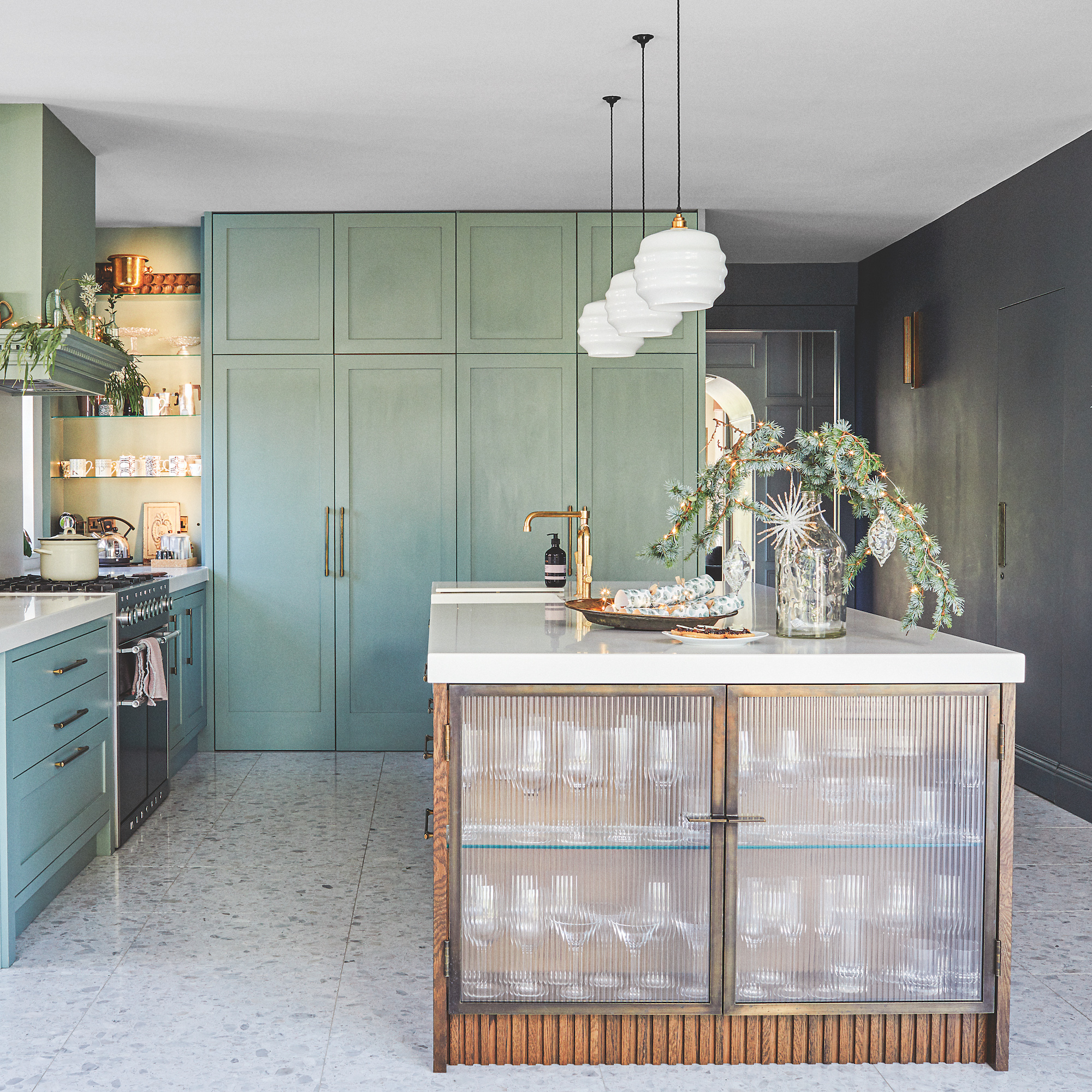
Ribbed, rippled or reeded, whatever you want to call it, this decorative glass will give kitchen cabinets a fashion-forward boost. ‘Ribbed glass is extremely popular at the moment, and for very good reason,’ says Paul Welburn, senior design consultant, Roundhouse.
‘Not only does it look more interesting than regular glass, ribbed glass also offers a degree of concealment. You don’t have to be quite so careful about keeping cupboard contents tidy.’ Use it to take the heaviness out of a large island unit, or screen off a walk-in pantry.
14. Pick pocket doors
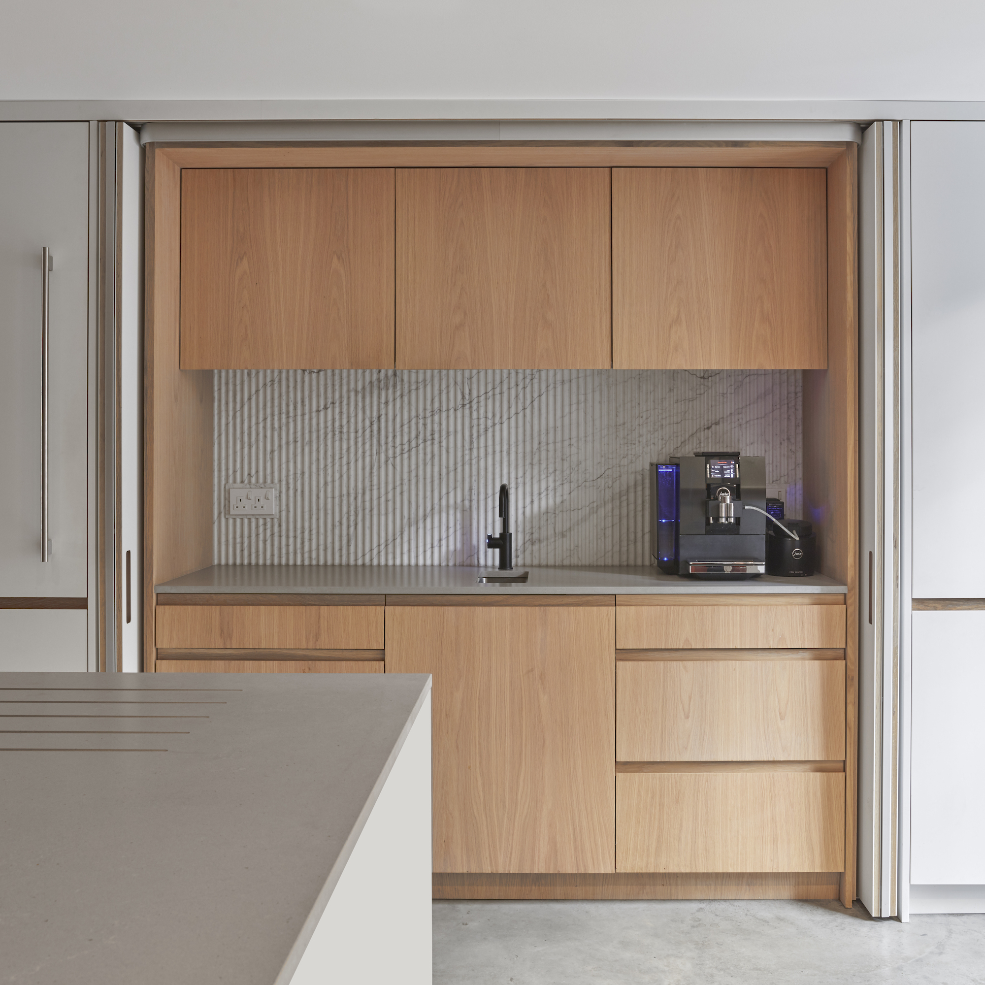
Conceal the practical side of cooking using full-height cabinets with pocket doors. So-called because they pivot back inside ‘pockets’ in the carcase when opened, pocket doors are a firm favourite in contemporary kitchens, especially those with open-plan layouts. The flexible way to enjoy a beautifully uncluttered kitchen, simply open the doors up while you’re cooking, then close everything away when it’s time to relax.
From a design point, pocket doors allow you to enjoy a switch in materials inside, perhaps with something more adventurous that could be hard to live with full time, but wonderful in quick doses. They’re also a popular feature on breakfast cupboards, which need to be kept open for far longer than larder doors, so it’s good to keep get them right out of the way.
FAQs
How can I make my kitchen more modern?
Sustainability is not a new trend, but it is quickly becoming the top consideration when it comes to shopping for new kitchen cabinets. ‘Growing consciousness for the health of our planet is playing an increasing role in our purchasing decisions,’ says Jo Jackson, product manager, Fisher & Paykel. In turn, this is leading to an increased interest in kitchen cabinets made from sustainable materials like bamboo by carbon neutral manufacturers.
UK kitchen manufacturer Symphony is leading the way with no less than four eco-focused collections now available, made from 100% recycled board, with legs made from 100% recycled plastic.
A welcome offshoot of this trend is the increased interest in buying second-hand kitchen cabinets, rather than adding to the supply chain unnecessarily, and not just as a budget-saving exercise. Diverting kitchen cabinets from landfill by sourcing cabinets that are used but still in great condition is fast becoming the most environmentally responsible way to enjoy a stylish kitchen that’s new to you.

Linda Clayton is a professionally trained journalist, and has specialised in product design, interiors and fitness for more than two decades. Linda has written for a wide range of publications, from the Daily Telegraph and Guardian to Homes & Gardens and Livingetc. She has been freelancing for Ideal Home Magazine since 2008, covering design trends, home makeovers, product reviews and much more.
- Holly CockburnContent Editor
You must confirm your public display name before commenting
Please logout and then login again, you will then be prompted to enter your display name.
-
 Typhur Dome 2 air fryer review – a glimpse into the future of air frying
The Typhur Dome 2 cooks food brilliantly and has all sorts of benefits, but is it worth the £499 price tag?
By Ellen Manning
-
 In creating their lush multi-use garden, the owners have cleverly futureproofed the space for years to come
With a zone for dining, a veg plot, a relaxing sun trap, and space for quiet contemplation
By Ginevra Benedetti
-
 5 reasons why your grass seed isn’t growing and what you can do to help, according to garden experts
For a lush, green lawn, you have to ensure the conditions are just right
By Kezia Reynolds