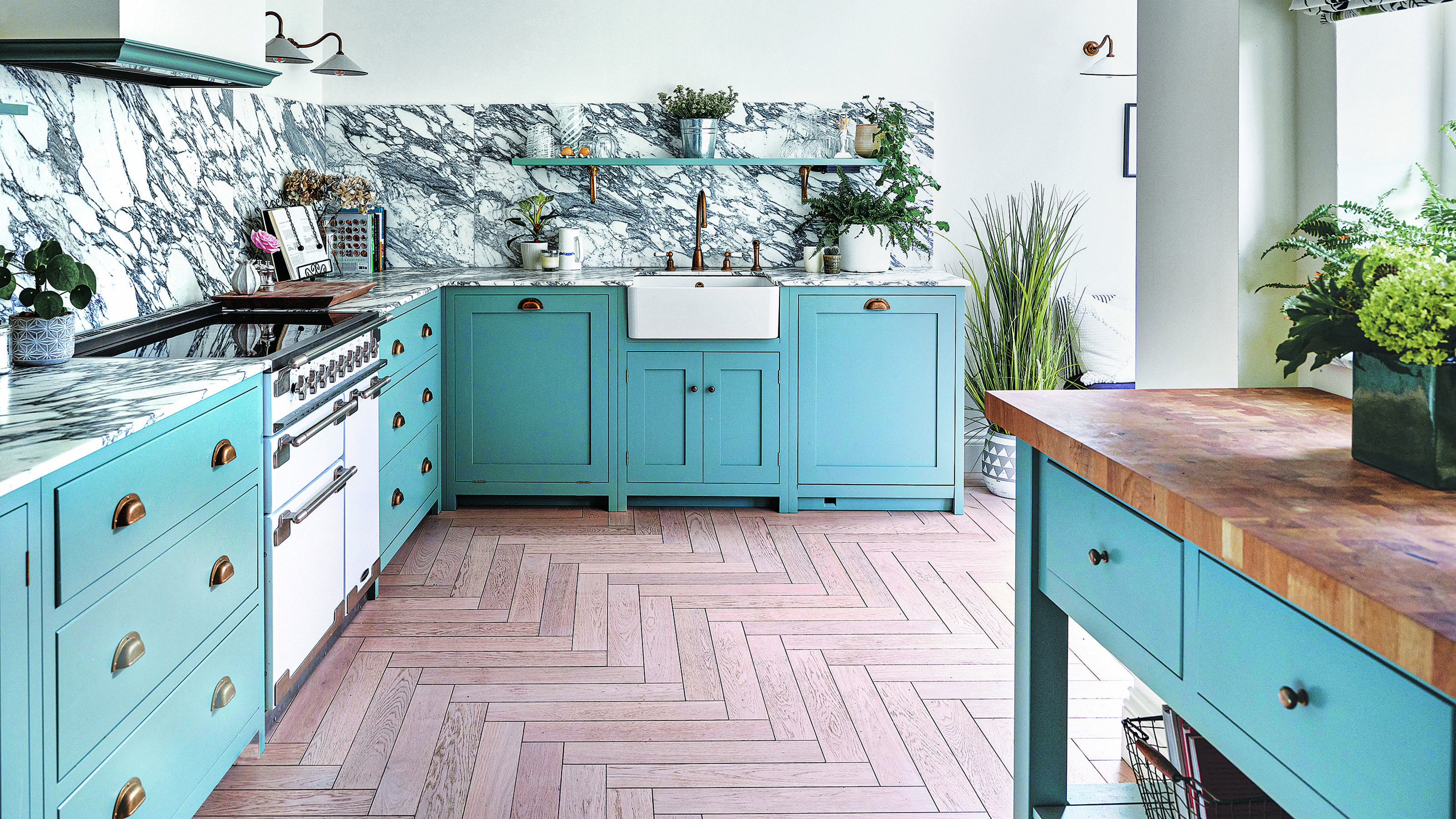
Kitchen colour trends – interior designers reveal the 7 inviting new shades to embrace in 2025
Discover the hottest new ways to get colourful in the kitchen this year…

Holly Cockburn
Colour is arguably one of the fastest ways to date a kitchen, so it pays to keep a close eye on the latest kitchen colour trends when renovating. Fortunately, colour forecasts aimed at our cooking spaces tend to be more timeless and liveable than those destined for the fashion catwalks.
Let's face it, unlike a cushion cover or lampshade, you can’t afford to fall out of love with the colour of your kitchen any time soon. If at all. However, while colour trends aimed at the kitchen do tend to be less daring than in other walks of life, that doesn’t mean there’s nothing new to report. Every year industry insiders, colour forecasters and paint brands announce their upcoming kitchen colour trend predictions – and there are always a few exciting options for those looking to shake things up on the colour front.
There’s usually also an overall ‘colour direction’ that shines through when compiling upcoming kitchen trends from a wide range of colour experts, and 2025 is no exception. Drum roll please; this year it’s pointing firmly towards warm, cosy and comforting colours that make you happy to stay home (and cook comforting foods).
Kitchen colour trends 2025
Yes, there are the expected gentle tweaks on all-time favourites (we’re looking at you green and blue) but there are also several trending colours on the horizon that haven’t been seen on kitchen cabinets for a couple of decades, if ever.
'2025 is about embracing individuality and boldness in design. Homeowners are moving away from ‘safe’ neutrals, experimenting with rich tones, statement colours, and creative techniques like colour drenching. It’s an exciting time to think outside the box and truly make your space your own,' says Michael Rolland, managing director at The Paint Shed.
'Over the past few years, British DIY enthusiasts have embraced colour as a transformative design element. People are no longer afraid to go bold or step outside of the ‘safe’ neutral zone, and that’s a trend I only see growing in 2025. Gone are the days when white, beige, or pale greys were the default choice for every wall. While these timeless shades still have their place, 2025 will be about experimenting with bolder colour schemes—think plums, wine reds, and emeralds.'
1. Burgundy
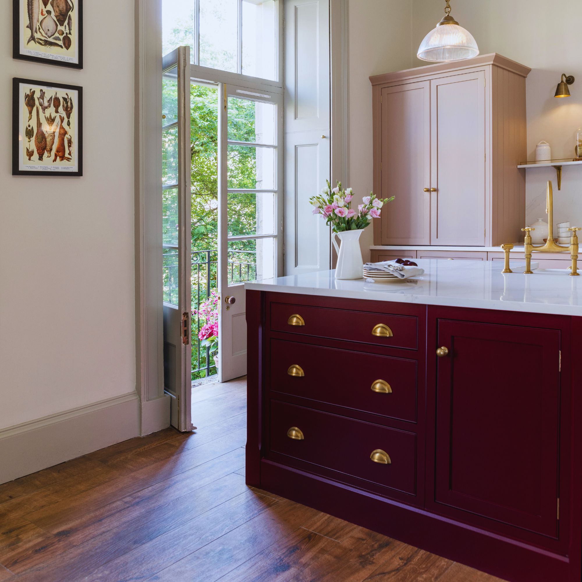
Our favourite rich, luxurious shade to invite into our kitchens in 2025 has to be burgundy. With an enveloping feel, it pairs perfectly with some other trending shades for the year ahead, such as pale pink and sky blue.
Get the Ideal Home Newsletter
Sign up to our newsletter for style and decor inspiration, house makeovers, project advice and more.
'Burgundy kitchens are going to be huge this year. Moving away from the dark blue kitchens, burgundy adds more warmth and depth than dark blue - it's a creative spin on the traditional kitchens. What’s so appealing about burgundy - like Purple 03 - is it's a really warm, cosy colour and works wonderfully when used to drench a room or even as an accent colour to add contrast,' explains Tash Bradley, head of interior design at Lick.
'A deep velvet purple with blue, red and yellow undertones, Purple 03 oozes cosiness and sophistication, creating warm spaces that feel luxurious and grown up. Because purple is made of blue and red, it means you get the calming qualities of the blue but also the energy of the red, and when they are paired together in purple they create this very inspiring, seductive environment. It also pairs well with so many colours. Neutrals, burnt oranges, buttery yellows, fresh blues and pinks look particularly stunning when paired with deep purple, making it a versatile colour for your kitchen.'
2. Pale blue
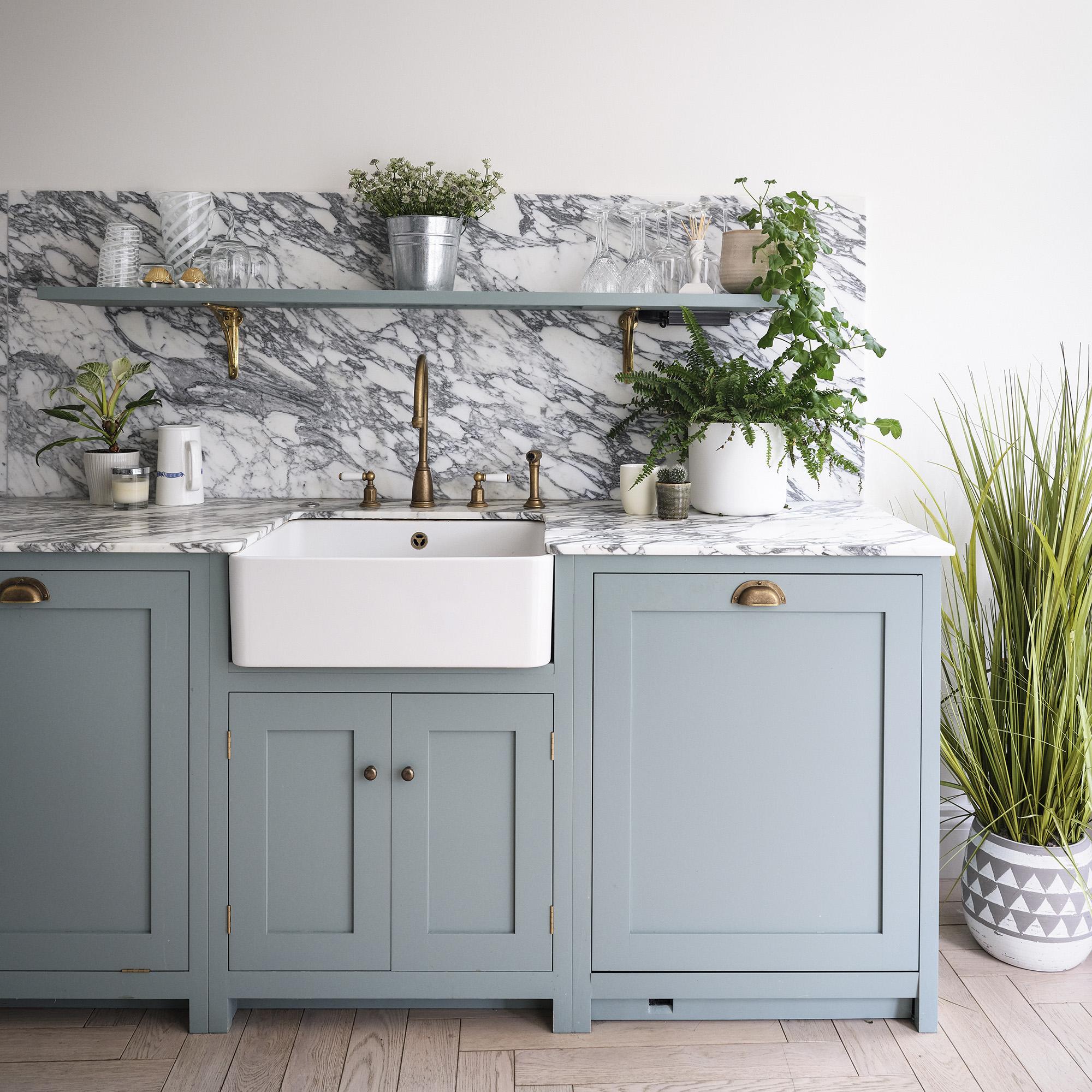
Kitchen colour trends in 2025 are all about combining fresh new takes on traditional tones. Pale blue has been a popular shade in country kitchens for years but has been brought up to date with on-trend styling, such as brass cup handles, marble worktops and open shelving.
While navy blue has dominated the kitchen landscape in previous years, we're all looking to sunnier shades to bring light into our cooking spaces. A sky-blue space will brighten up a scheme and pair easily with existing interiors.
3. 'Mocha Mousse'
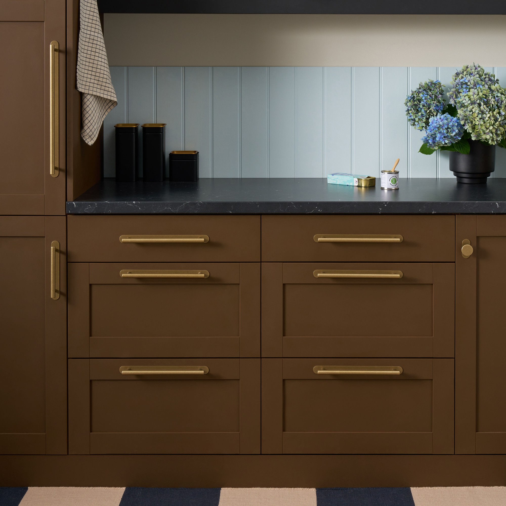
'As we move away from light grey and beige kitchens, 2025 will see earthy tones like Mocha Mousse take centre stage in cabinetry, backsplashes, and seating,' explains Darren Watts, showroom design director at Wren Kitchens.
Pantone's colour of the year for 2025, Mocha Mousse offers a new take on neutrals. Earthy tones are a huge trend for the coming year, making us feel calm in our homes.
'Pantone’s colour of the year, Mocha Mousse, offers us a soft brown with pinkish tones that effortlessly aligns with trends seen throughout interior schemes. Get the look in the kitchen with warm wood effect tiles featuring undertones of brown and taupe. Neutral pale limestone flooring will also pair perfectly with kitchen cabinetry in this colourway,' adds Isabel Fernandez from Quorn Stone.
4. Primary shades
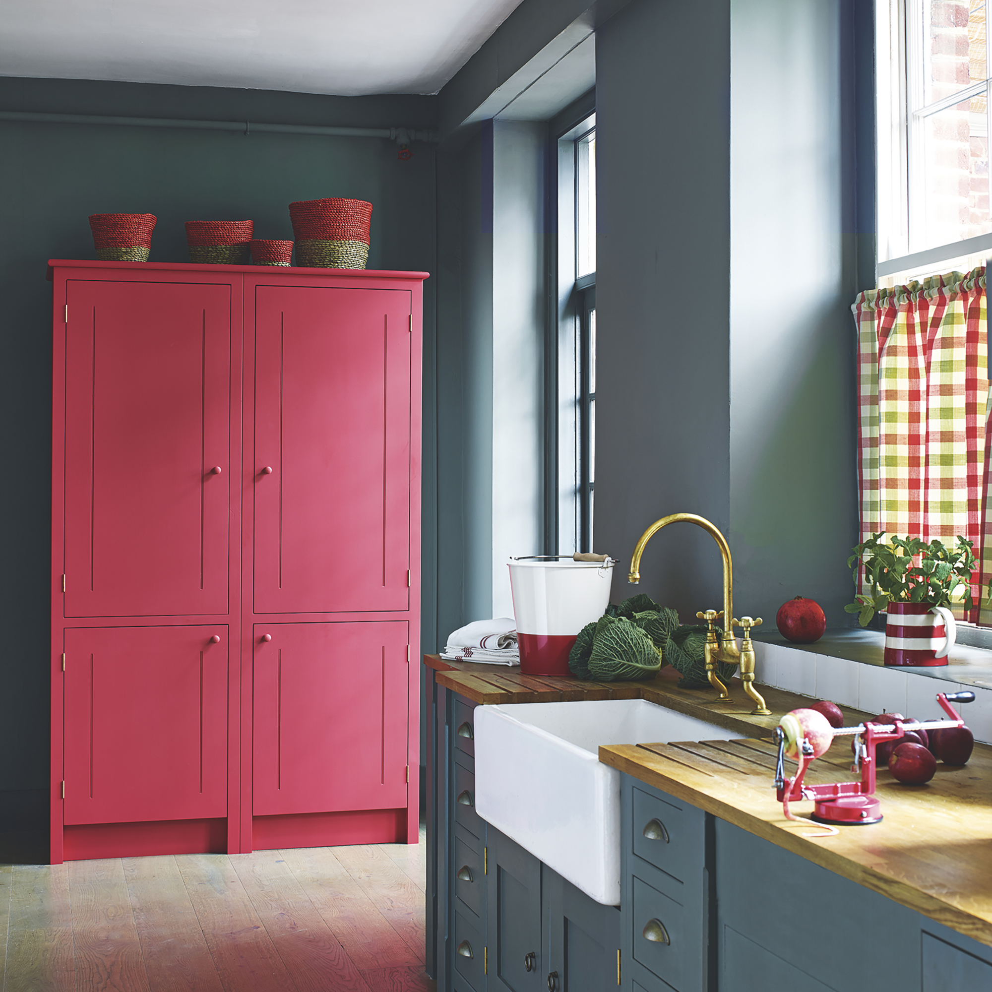
Although a lot of stylish colours for kitchens in 2025 are earthy shades, the primary play trend is one that is set to make a big impact.
We saw the unexpected red theory sweep through interiors in 2024, which has led us to become even braver with other primary shades. Red will still play a huge part in kitchens, but expect to see bright yellow and bottle green in cooking spaces too. Dulux's colour of the year 2025, True Joy, is a great example of this uplifting colour palette.
'True Joy, an uplifting yellow, brings a burst of creative energy, optimism, and pride to interior spaces. Perfect as a statement colour or an accent, True Joy complements maximalist design trends, which embrace bold patterns, eclectic prints, and vibrant textures. Tapping into the leading interiors trend of 'Primary Play', this bright and cheerful yellow shade is not as daunting as first appears,' explains Darren.
'Yellow is one of the most visible colours in daylight and has a unique ability to brighten and energise any room,' says Watts. 'It’s light-reflecting properties make it particularly effective in small or dimly lit spaces, and its appetite-stimulating qualities are ideal for kitchens.'
5. Warm terracotta
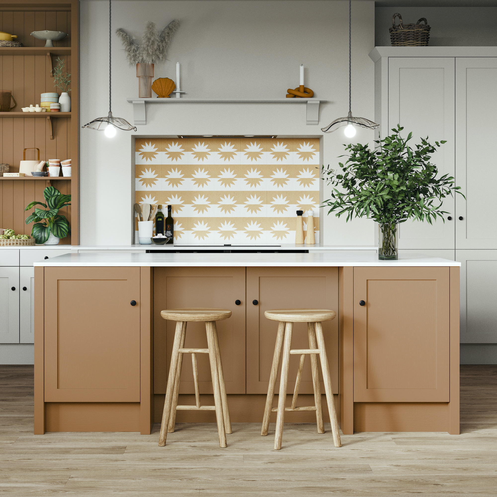
Yearning for warmer weather? Secretly wishing you could move to the Med? We can’t promise actual sunshine, but things are definitely warming up when it comes to popular kitchen cabinet colours for the year ahead.
Magnet’s head of design Jen Nash is predicting a shift towards warm, earthy colour palettes, particularly terracotta-based tones, which, she says, are set to define kitchen aesthetics in 2025. ‘The terracotta warmth of our new Nutmeg shade creates a cosy, inviting atmosphere that will suit any kitchen,’ she says.
Paint brand YesColours has also got terracotta on its radar for kitchens this year, creative director Emma Bestley explains why: ‘Shades of terracotta give a cocooning feeling and that envelops you in a big warm hug. Its burnt, bronzy richness will immediately make you feel comforted and grounded and would look incredible drenched in our most-used rooms of the home such as the kitchen and dining spaces.’
Terracotta can work well in full-drip mode, i.e. used from floor-to-ceiling, but we like the softer approach of this Magnet kitchen, which features terracotta toned with soothing Limestone neutrals.
6. Moss green
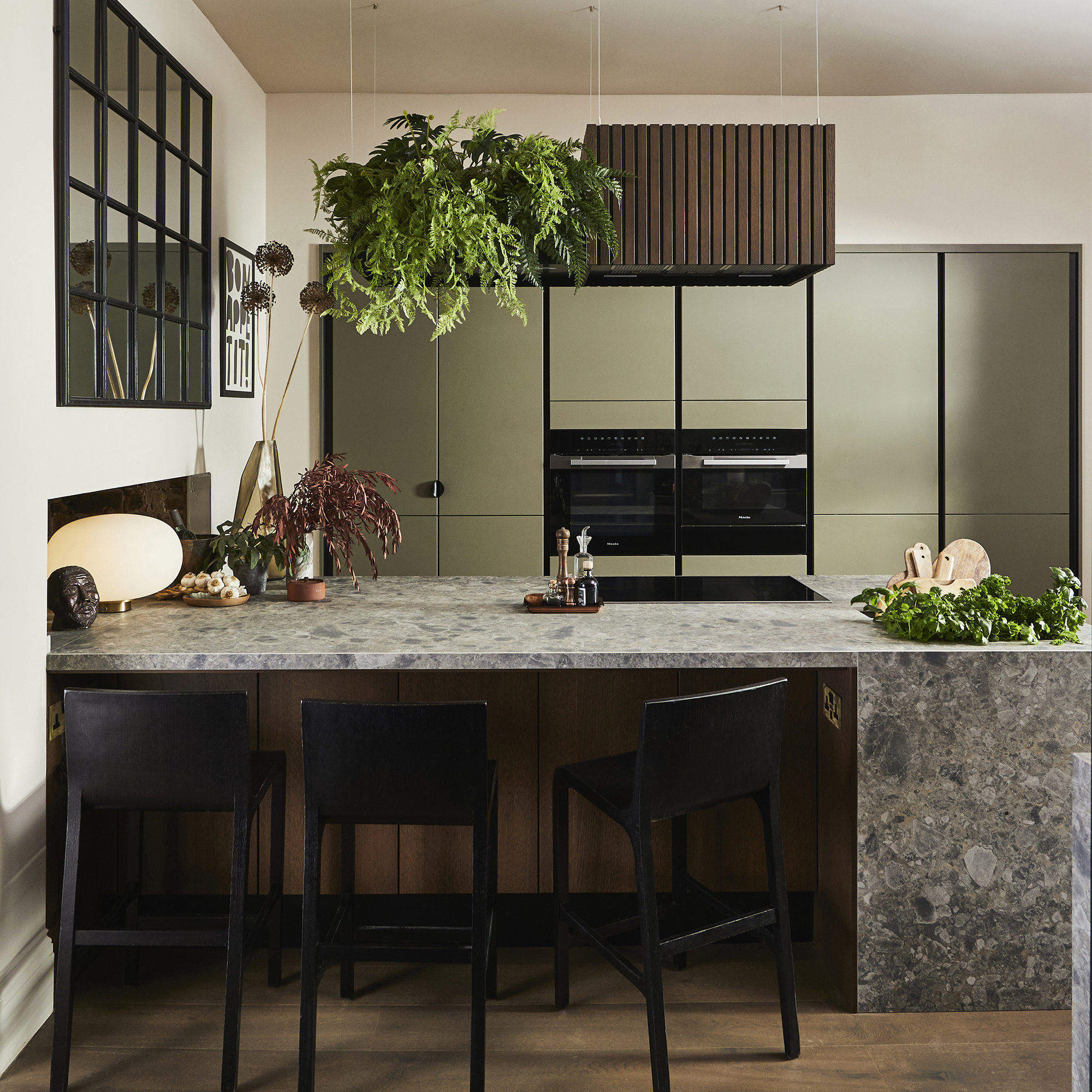
Every year we see a different shade of green take the stage in kitchen design. Moving away from deep emerald hues, we're favouring lighter shades that evoke feelings of the outside world. But which exact shade should you go for?
'Moss green!,' recommends Tash from Lick. 'A warm dark moss green with brown and yellow undertones. Green 19 is equal parts restorative and stimulating, resulting in a balanced space which makes you feel rejuvenated. It also pairs beautifully with the trending colours this year; burgundy, light blue, red and warm yellow-based neutrals.'
7. Dusky pink
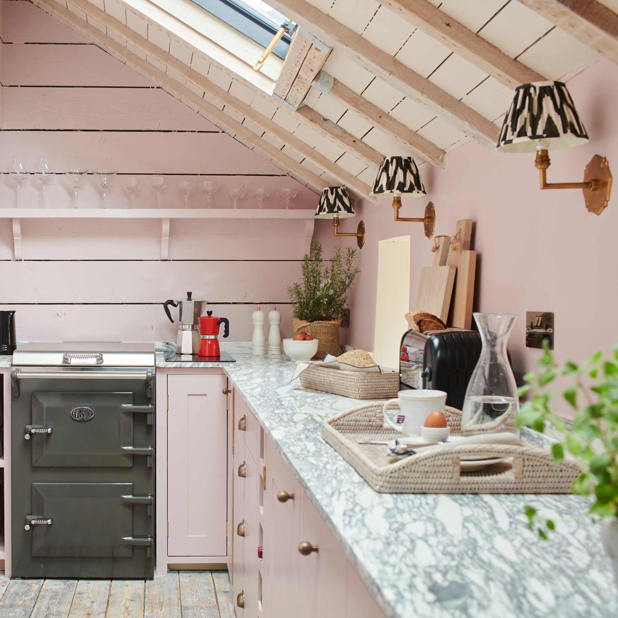
The ripple effect of Barbie fever means no colour trends line-up can escape without mentioning pink. Thankfully for pink kitchens ideas this year, we’re anticipating less bubblegum Barbie pink and more moody pink. Sophisticated, and not too sickly. Think Farrow & Ball’s ever-popular Setting Plaster, but half a Canderel sweeter.
Zoffany’s Old Rose, used on this Neptune kitchen, nails the look excellently. ‘Pale pink is a popular choice for kitchen cabinetry and Old Rose is the perfect shade as it has a slightly greyed-down appearance reminiscent of old plaster. Pink is no longer considered a gender-specific colour, it works well with pale grey and warm neutrals, but it can also sit comfortably with dark brown and black,’ says Simon Temprell, Interior Design Lead at Neptune. ‘Brass or rose gold hardware also work well with pink for a slight vintage feel.’
FAQ
What is the most popular colour for a kitchen?
While blue and white are always strong contenders, green still tops the charts as the most popular colour for a kitchen right now. It’s no secret that green’s appeal lies in its associations with nature, and all the serenity and uplifting ambience that comes with it, but green is also crushing kitchen sales because of its excellent pairing powers. By which we mean, it goes with everything. Even blue, contrary to popular belief!
Green is also celebrated for the sheer variety on offer, which provides the opportunity to achieve very different looks. From modern zesty lime green to traditional soft green and everything in-between, there’s a green kitchen to suit everyone. And, assuming you’ll never tire of looking at trees or rolling fields, it’s unlikely you’ll get sick of the colour green while cooking up a storm.
Are white kitchens still in style?
White is the ultimate neutral, which is why white kitchen ideas are always in style. White is fresh and uplifting and also feels clean and hygienic, which is important in the room where you cook and eat. As white is always on-trend, it also has the best resale appeal, so you may want to consider white if you are hoping to leap up the property ladder.
White cabinets offer a versatile backdrop for a diverse choice of colours, finishes and styles but for the ultimate space-boosting scheme, take a white-on-white approach. Add texture to prevent a one-dimensional effect or add small punches of black on hardware to step into monochrome kitchen style.
Not all whites are the same. Pay attention to the undertone when choosing white paint; cool whites have hints of blue undertone, while warm whites have more yellow. ‘Most homeowners appreciate the benefits of testing paint colours in location but, with whites, it is crucial as they can be altered beyond recognition by light and shadow,’ adds Ben Hawkswell, senior designer, Roundhouse.
Which kitchen colour trend has caught your eye?

Linda Clayton is a professionally trained journalist, and has specialised in product design, interiors and fitness for more than two decades. Linda has written for a wide range of publications, from the Daily Telegraph and Guardian to Homes & Gardens and Livingetc. She has been freelancing for Ideal Home Magazine since 2008, covering design trends, home makeovers, product reviews and much more.
- Holly CockburnContent Editor
You must confirm your public display name before commenting
Please logout and then login again, you will then be prompted to enter your display name.
-
 3 reasons why your rhododendron isn’t flowering and what you can do to ensure beautiful, vibrant blooms
Rhododendrons produce gorgeous, showstopping flowers, and this is how to ensure them year on year
-
 6 climbing plants that thrive on neglect and will add interest to your garden fence and walls with zero effort
There's nothing wrong with a little lazy gardening
-
 5 things I wish I’d left to the pros when renovating my house
Even as a seasoned renovator