10 ways to use accessories to refresh a kitchen look
Give your kitchen a fresh new look with these accessory ideas from Beautiful Kitchens. For more kitchen decorating ideas and inspiration go to housetohome.co.uk

Use pretty and practical kitchen accessories to breathe new life into your kitchen design scheme. If your budget won't stretch to a whole kitchen refit - choose accessories that can work a little magic and really lift your kitchen.
Factor in plenty of smart storage when planning your new kitchen and keep the clutter at bay and discover innovative storage solutions to fit your individual style and space. Instead of hiding everything away in cupboards and drawers, create a display area for practical items and interesting pieces. Add a carefully curated selection of vibrant accessories to lift help the mood. Look for unsual kitchen accessories that will make an instant impression, or colour co-ordinate for a smart, tailored look.
1/10 Kitchen accessory ideas
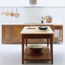
Well-chosen accessories can be used to create a strong focal point. Think oversize pendant lights, shutters, artwork and decorative tiles. Bring together pretty accessories and use them to create a display along an open shelf or work surface. After all, not all belongings should be hidden away.
Peg it
In this kitchen, a simple peg rail nails the modern Shaker look. Positioning a sleek stainless steel peg rail above the white subway tiles not only breaks up the white backdrop, but it also provides much-needed storage space for cookware, chopping boards, herbs or flowers to dry.
Kitchen
Plain English
2/10 Culinary arts
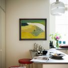
Who said you shouldn't hang art in the kitchen? It's certainly a novel decorating idea, but we definitely like it! If you have a favourite piece or art but are stuck for colour scheme ideas, then simply choose items that pick up on the colours in the artwork, letting the artist do the hard work for you.
3/10 On the tiles
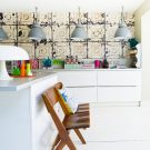
Wallpaper is making a serious comeback – so why shouldn’t it feature in a kitchen, too? Here, a wall with a run of cabinetry could have looked too stark, but has been given character by using wallpaper in an antique tin tiles pattern. If you’re worried about using wallpaper in a kitchen, position it behind a glass panel as a splashback.
Get the Ideal Home Newsletter
Sign up to our newsletter for style and decor inspiration, house makeovers, project advice and more.
Wallpaper
Rockett St George
4/10 Finishing touches
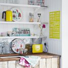
A bright, white kitchen scheme has the advantage of not only looking timelessly classic, but also of being brilliantly easy to update with accessories. Use playful, vibrant pieces to invigorate a pale scheme. Create a focal point with open shelving for display and mix bright hues with eye-catching patterns. Scandinavian designs never fail to bring colour and add a touch of modernity.
Accessories
Isak
5/10 Shelf life
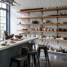
Open shelving in a kitchen maximises space and makes a strong design statement. Using chunky reclaimed boards and heritage-style metal brackets lends a reclaimed feel and adds character. Wood can also add warmth, stopping an industrial-edged scheme like this from feeling too clinical.
6/10 Blue tones
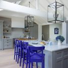
Add warmth to your kitchen decorating scheme with splashes of gem colour. Solid blocks of striking colour can emphasise the freestanding design of furniture and accessories. The bar stools here have been painted in a rich blue shade to add a vibrant punch of colour to the muted tones elsewhere. This break in the colour scheme helps to highlight the eating area as a distinct space.
Kitchen
Richard Baker Funiture
Stools
Ikea
7/10 Statement island
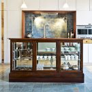
As designs become sleeker, it can be easy for a kitchen space to be efficient but a little lacking in personality. This is where reclaimed furniture steps in – pieces like this stunning ex-museum display cabinet not only add character, but also function as a statement kitchen island in its own right. Favourite pieces can be displayed inside, while you prepare food on the worksurface.
Cabinet
Retrouvius
8/10 The big picture
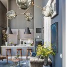
Be inspired by interior designers and create a striking space that’s as beautiful as it is practical. When it comes to lighting, there’s no need to stick to discreet spotlights or utilitarian pendants. Here, bold lighting makes an incredible style statement as well as an eye-catching focal point.
9/10 Shutter style
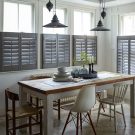
We love the clean lines of the half-shutters in this kitchen-diner. More adaptable than curtains and more versatile than voiles, the newest shutters and blinds come in a host of modern materials and super-chic colours, that not only make a feature of your windows, but provide flexible sun protection, too.
Shutters
Shutterly Fabulous
10/10 Soft focus
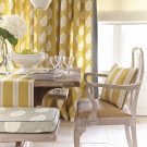
Soft furnishings add warmth and a subtle country flavour in this kitchen-diner scheme. The saffron and charcoal hues of the linens and the combination of a stripe and leaf print work beautifully together and create a harmonious, restful area to sit and enjoy a meal.
Fabrics
Vanessa Arbuthnott

Thea Babington-Stitt is the Managing Editor for Ideal Home. Thea has been working across some of the UK’s leading interiors titles since 2016.
She started working on these magazines and websites after graduating from City University London with a Masters in Magazine Journalism. Before moving to Ideal Home, Thea was News and Features Editor at Homes & Gardens, LivingEtc and Country Homes & Interiors. In addition to her role at Ideal Home, Thea is studying for a diploma in interior design with The Interior Design Institute.
-
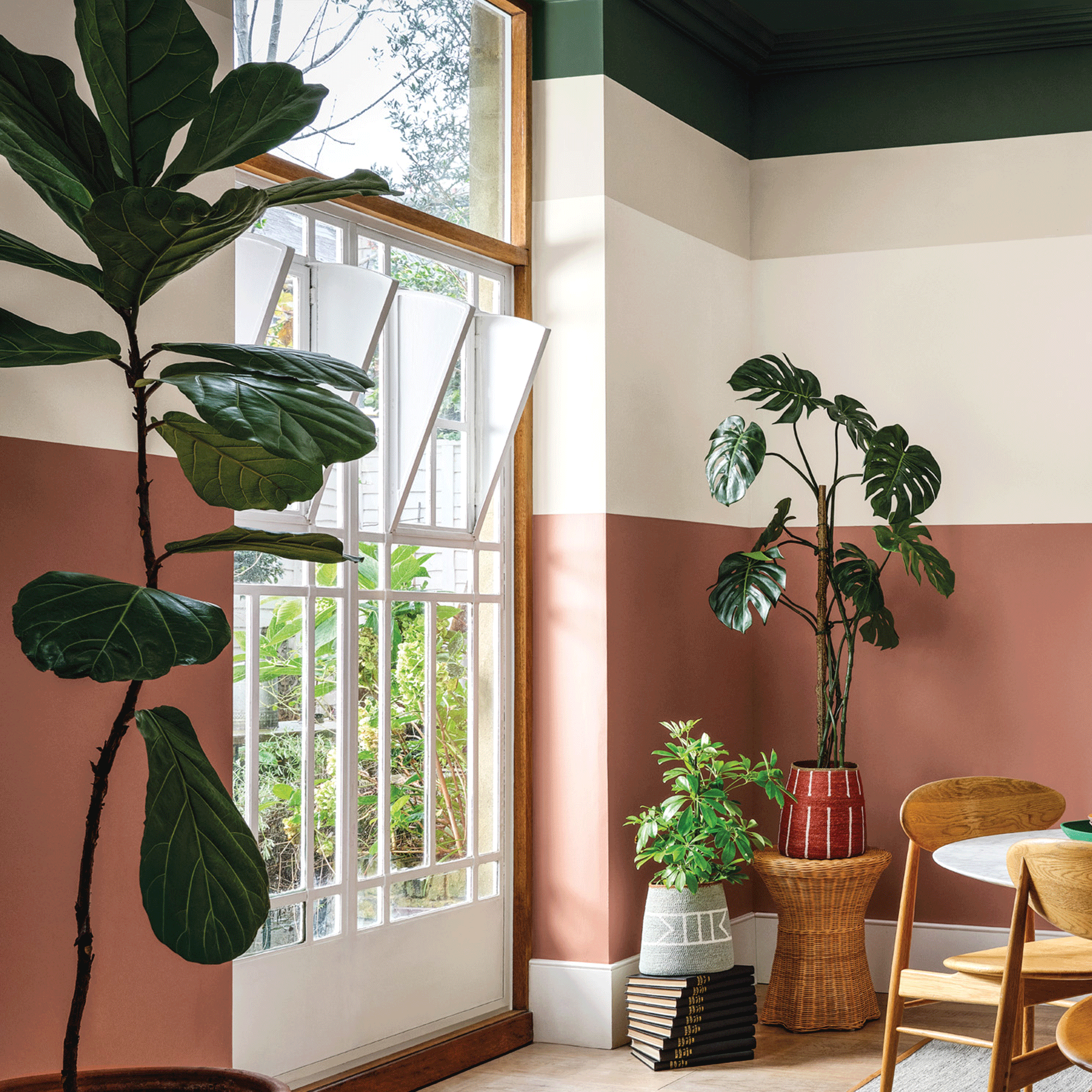 Crown Paint has launched new wall colours for the first time in three years, and changed how I think about neutral shades
Is terracotta the ultimate neutral?
By Rebecca Knight
-
 How to protect seedlings from birds – experts say there's a kind and clever way to stop them pecking
Yes, you can protect seedlings from birds without harming your feathered friends...
By Kayleigh Dray
-
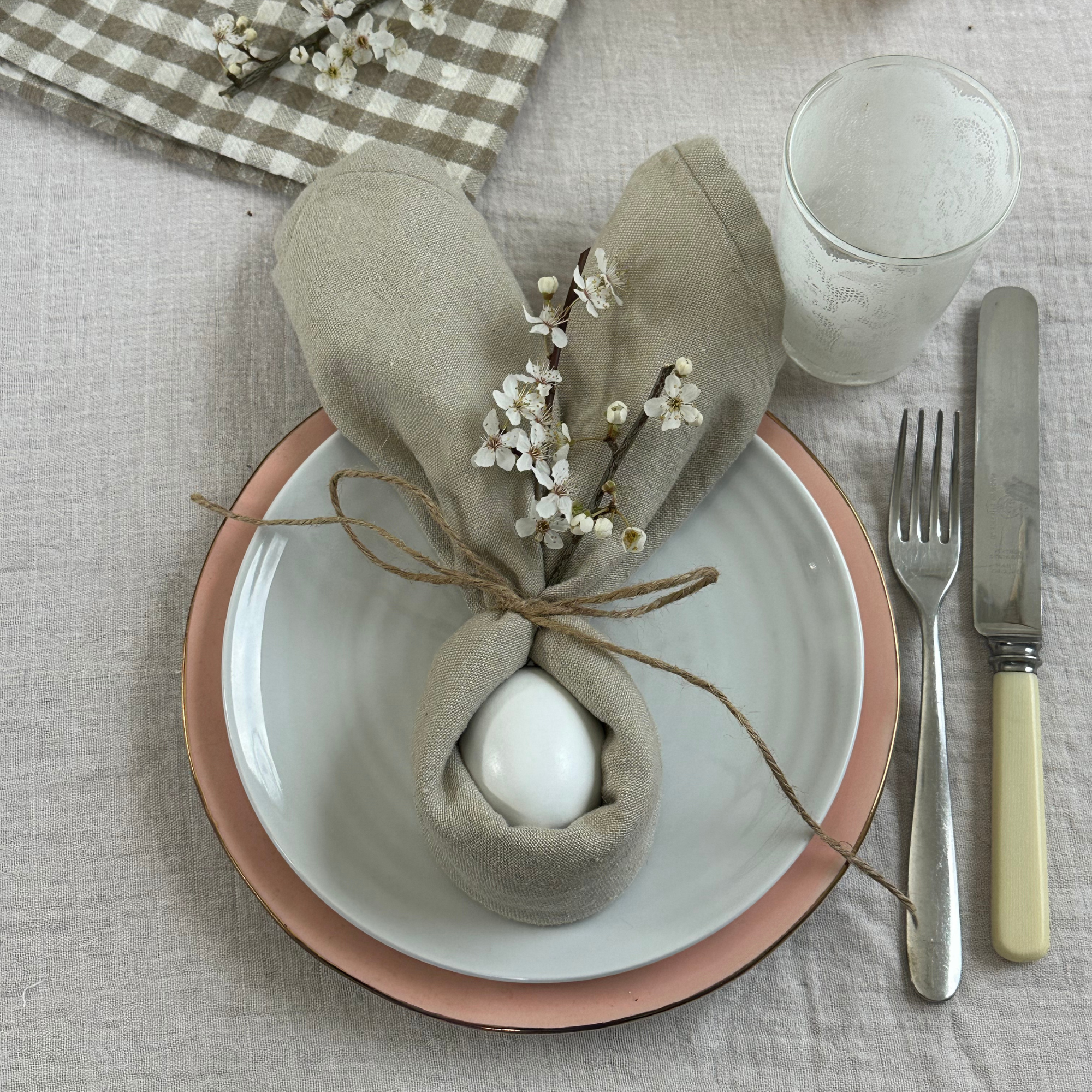 We tried the viral napkin bunny ears hack – it only takes five minutes and will take your Easter table to the next level
This Easter craft is not only beautiful, but really easy to do
By Kezia Reynolds