Kitchen island styling ideas and tips - simple ways to add standout style
Make your kitchen island look tip-top with these easy ideas that will make it shine

An island can be a valuable addition to any kitchen, whether large or small, but thinking about kitchen island styling ideas and tips can be a challenge. While practicalities like prep surfaces, appliances and storage are key, making sure that an island complements your kitchen both in terms of functionality and looks is a must.
Kitchen island ideas are often large and centrally positioned, so will have a big impact on the overall aesthetics of a kitchen. While the design of an island should complement the style of kitchen for consistency, this doesn’t mean a strictly matching look. Choosing a contrast colour or timber for cabinetry or opting for work surfaces in contrast materials is a great way of transforming a kitchen island into a stylish focal point.
Kitchen island styling ideas
With a kitchen island such a central feature, coming up with clever kitchen island styling ideas and tips will have a big effect on the overall decor. From colour choices and worktop materials, to handles, drawer pulls and fittings, thoughtful details and clever finishing touches can make all the difference.
Here's how to style a kitchen island with ease...
1. Think about the aesthetics
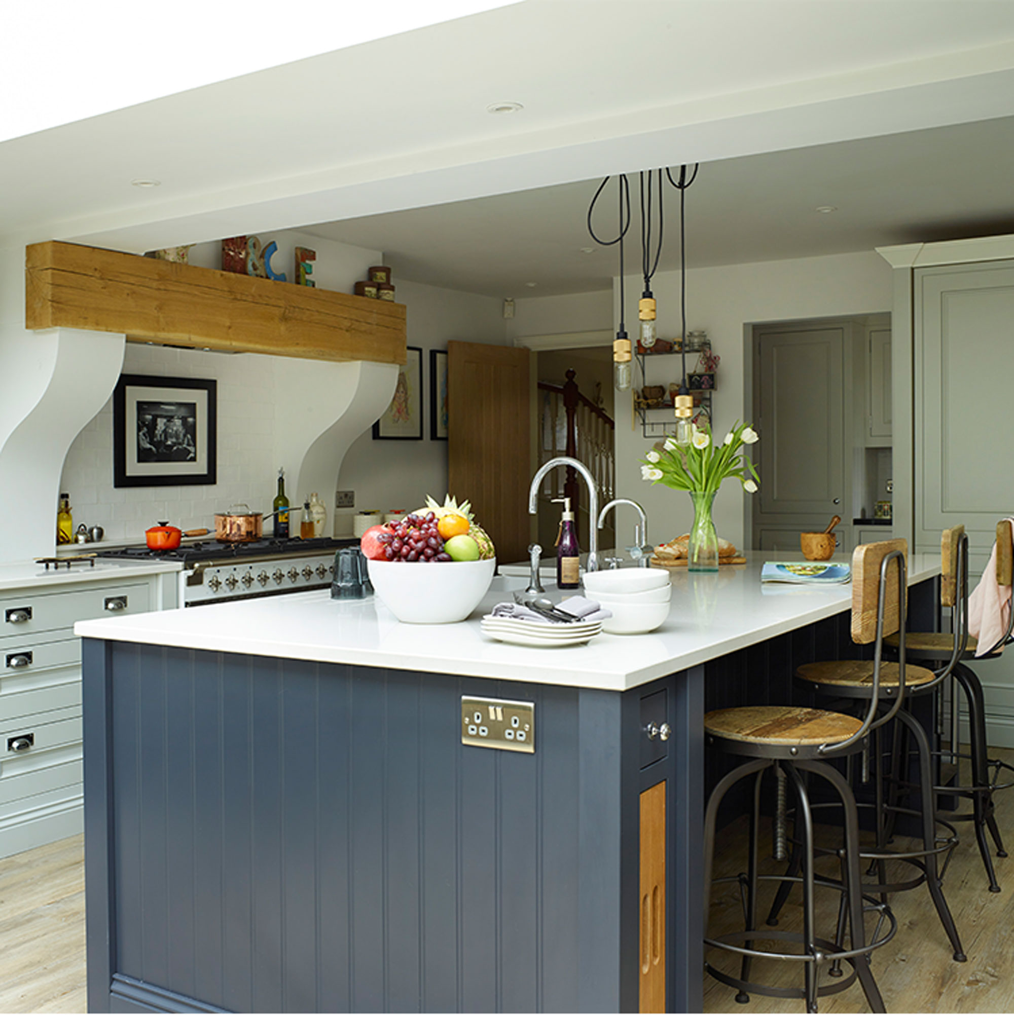
Considering the overall aesthetic of the kitchen is key according to Darren Watts, Design Director at Wren Kitchens. ‘Try to keep the materials used for the kitchen island similar to those across the rest of the room. If you have wooden units, stick to a wooden kitchen island, or if you have granite worktops, then install the same on the island. This will help to keep the room feeling consistent.’
‘But this doesn't always mean that your kitchen island should be in a uniform style to the rest of the kitchen. In fact, different yet complementing colour schemes can work particularly well together. Oak units on an island can look beautiful against cream or white, sage green kitchens can also flatter cream, while neutral stone goes perfectly with navy.’
2. Make a statement with contrast colours
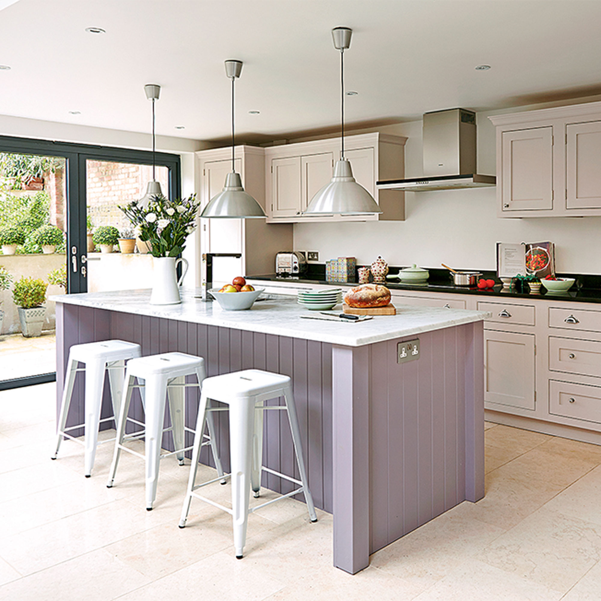
Neutral kitchens are timeless, but without any contrast colour they can sometimes lack punch. A kitchen island in a contrast colour is a great way of giving a plain kitchen extra focus, whether it’s a bold, standout shade that pops, or a muted colour that adds visual interest without overwhelming the space.
Get the Ideal Home Newsletter
Sign up to our newsletter for style and decor inspiration, house makeovers, project advice and more.
Contrast worktops are another way of adding variation in a neutral kitchen, with cool marble set against darkest black granite, or a wooden chopping block set into the end of a run of neutral composite countertops.
3. Add polish with matching hardware
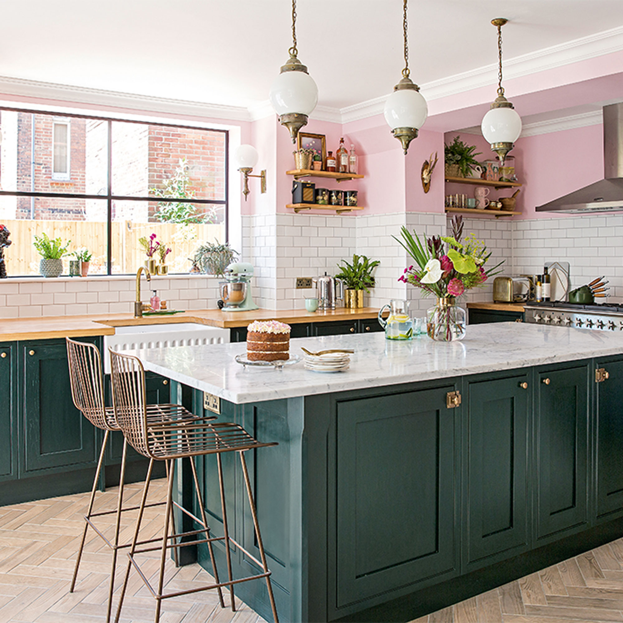
Whichever colour you decide on for kitchen cabinetry, repeating other unifying elements across the space is a good way of tying the whole scheme together and making a kitchen look more polished.
Focus on the details when it comes to a kitchen island, choosing luxe accent finishes in brushed brass, shiny chrome or matt black for drawer pulls, handles or seating. Then simply repeat these plush materials on hardware around the kitchen for a consistent look, from light fixtures and window furniture to shelf brackets and electrical switches and sockets.
4. Keep cluttered surfaces out of sight
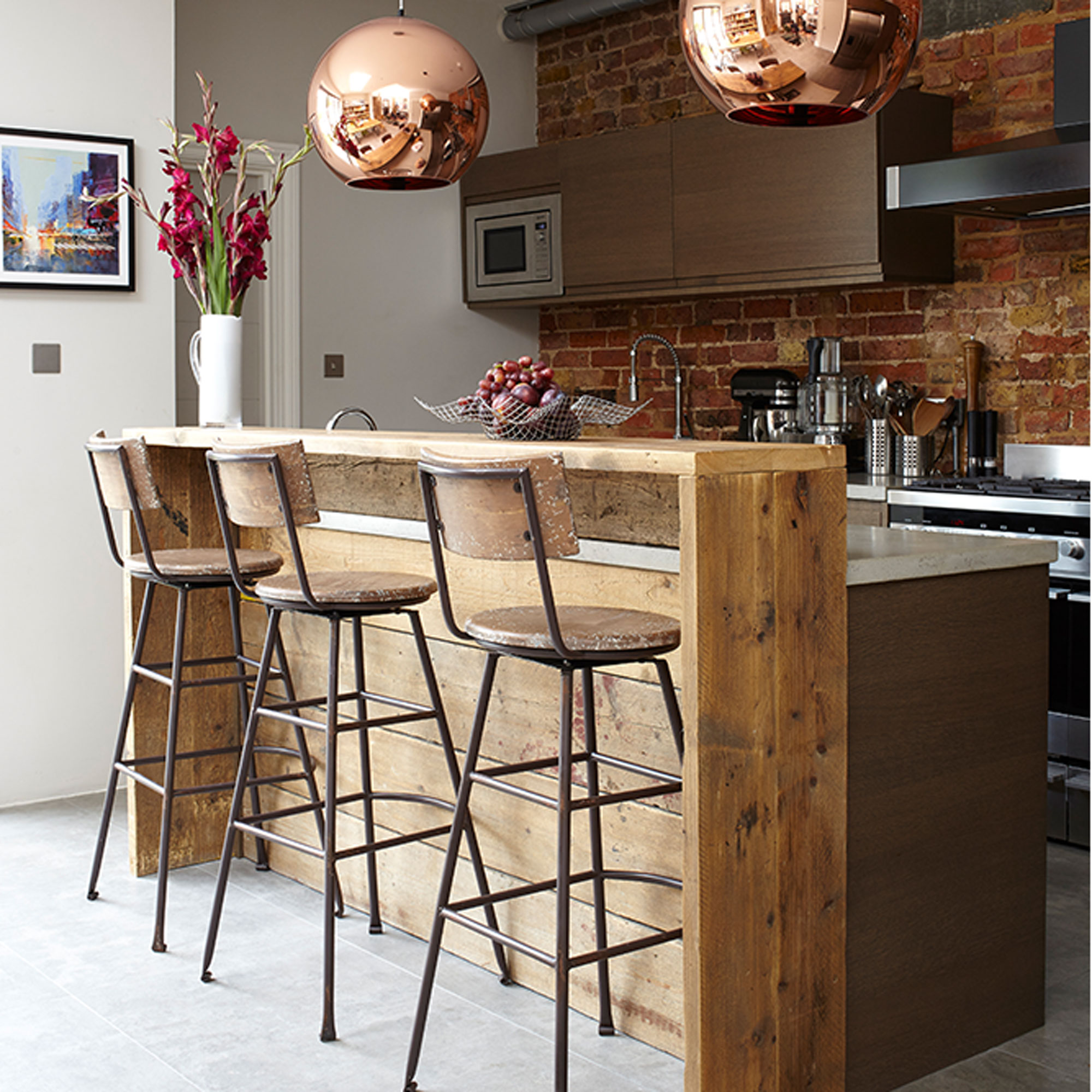
Extra prep surfaces and more space to move around are just two of the benefits of an open-plan kitchen and island, but one drawback can be that everything is on show in an open-plan space, and that includes clutter.
Incorporating a kitchen island or breakfast bar idea with stacks of storage so that cookware and utensils can be stowed away is one way around the problem. Another often-used trick is to add a raised bar or elevated section that is just high enough to conceal cookware or the washing-up, without ruining the open-plan aesthetic.
5. Show off your good side
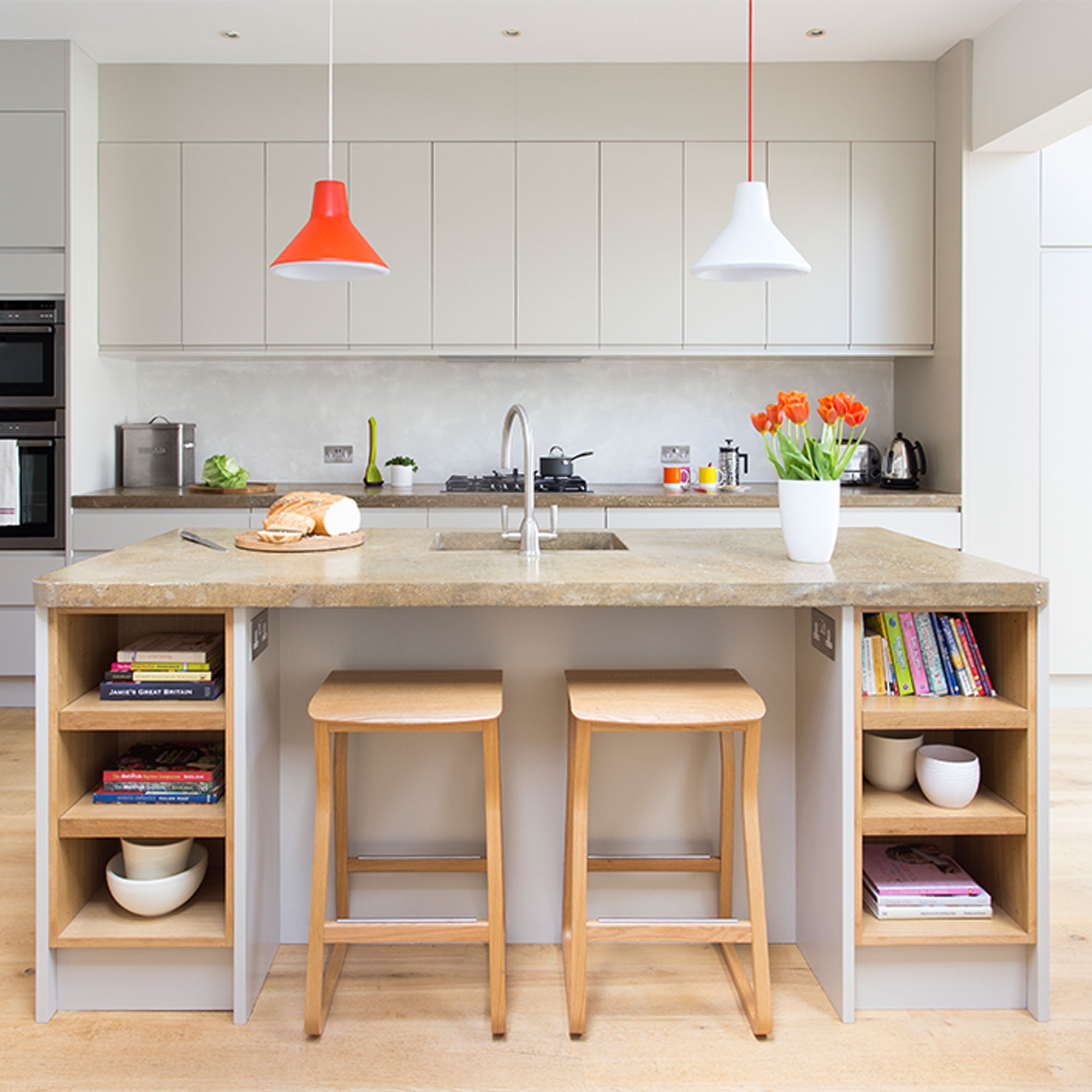
The kitchen-facing side of an island tends to be where most of the action happens, whether the space includes a hob, a sink or is kitted out with storage. The outward-facing side will be what is viewed from the dining or living area, so different considerations come into play when deciding how this area should look.
Adding a splash of colour on the back panel is one way of making this area look more visually appealing, either with paint or with a tiled splashback. Adding open shelving can also add extra interest, either on one or both ends. And if the island is to incorporate a seating area, consider how stools will look from every angle before deciding on a style.
7. Create an orderly display
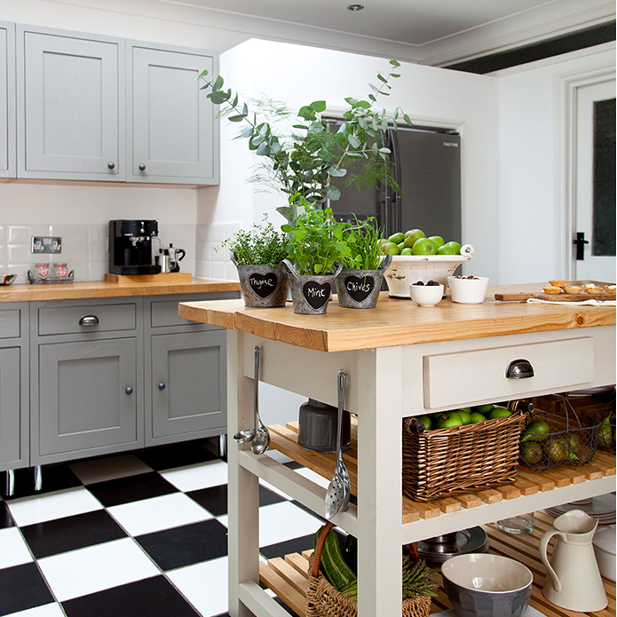
Any surface will look cluttered if too much is left to gather upon it, but more so with a kitchen island that enjoys a prominent position. Get into the habit of putting things away, rather than leaving them to clutter up the work surface and gather dust.
An arrangement of potted herbs, fresh flowers, a platter of fresh fruit or a selection of oils and vinegars will add colour and can make a pretty display on a kitchen island. But less is definitely more, so don’t overfill island work surfaces and keep any displays compact and to one end of an island so that prep space isn’t crowded.
7. Use trays to corral clutter
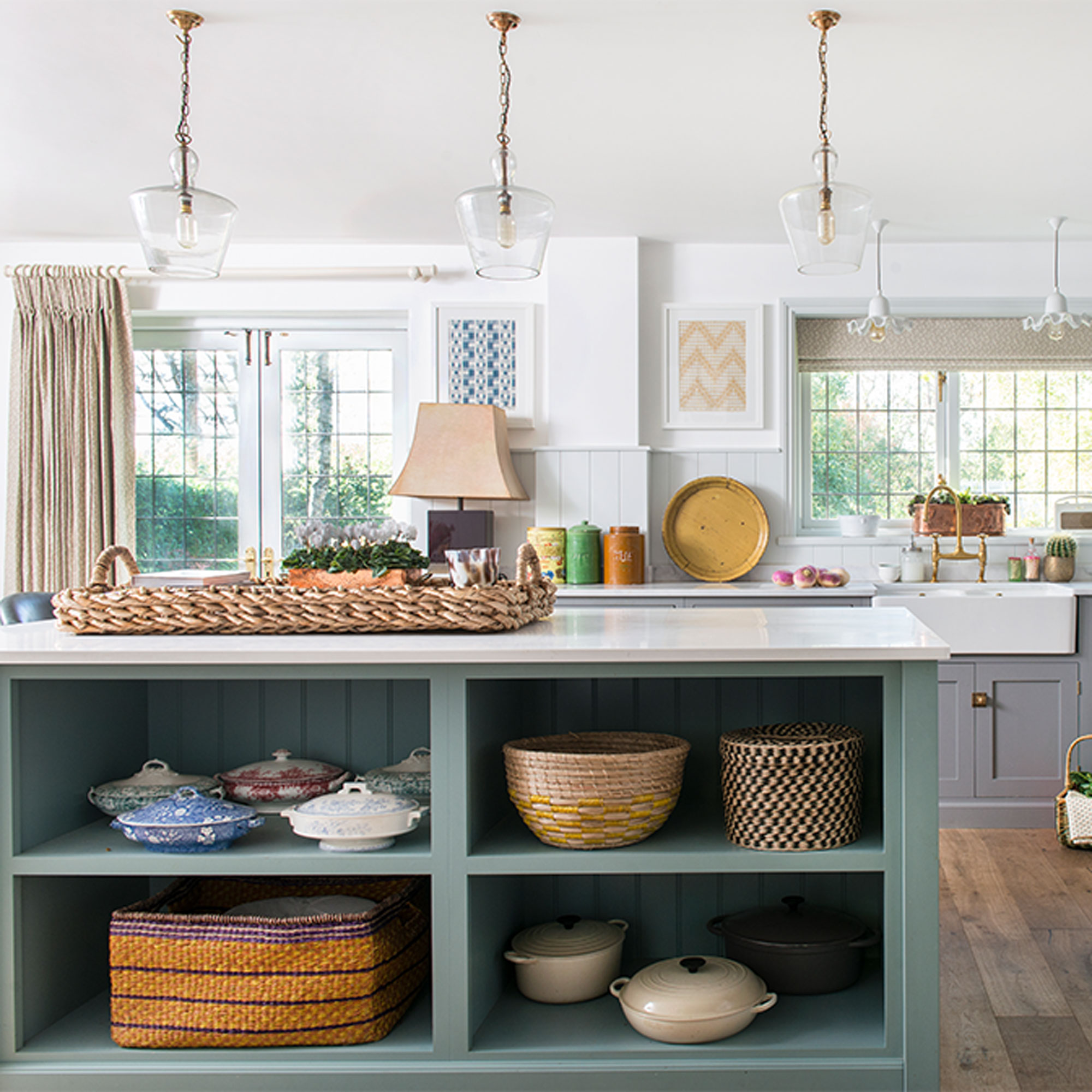
Using a tray, basket or wooden board is a technique that stylists often use when arranging displays and it works well for kitchen islands too. Placing items on a tray makes surfaces instantly look neater and items more intentionally placed, as opposed to looking like they are just there waiting to be put away.
Another benefit of storing smaller items on a tray or in a basket is that everything can be lifted up and taken away in one go when you do need to clear the surface for food prep or mealtimes.
8. Think about the end result
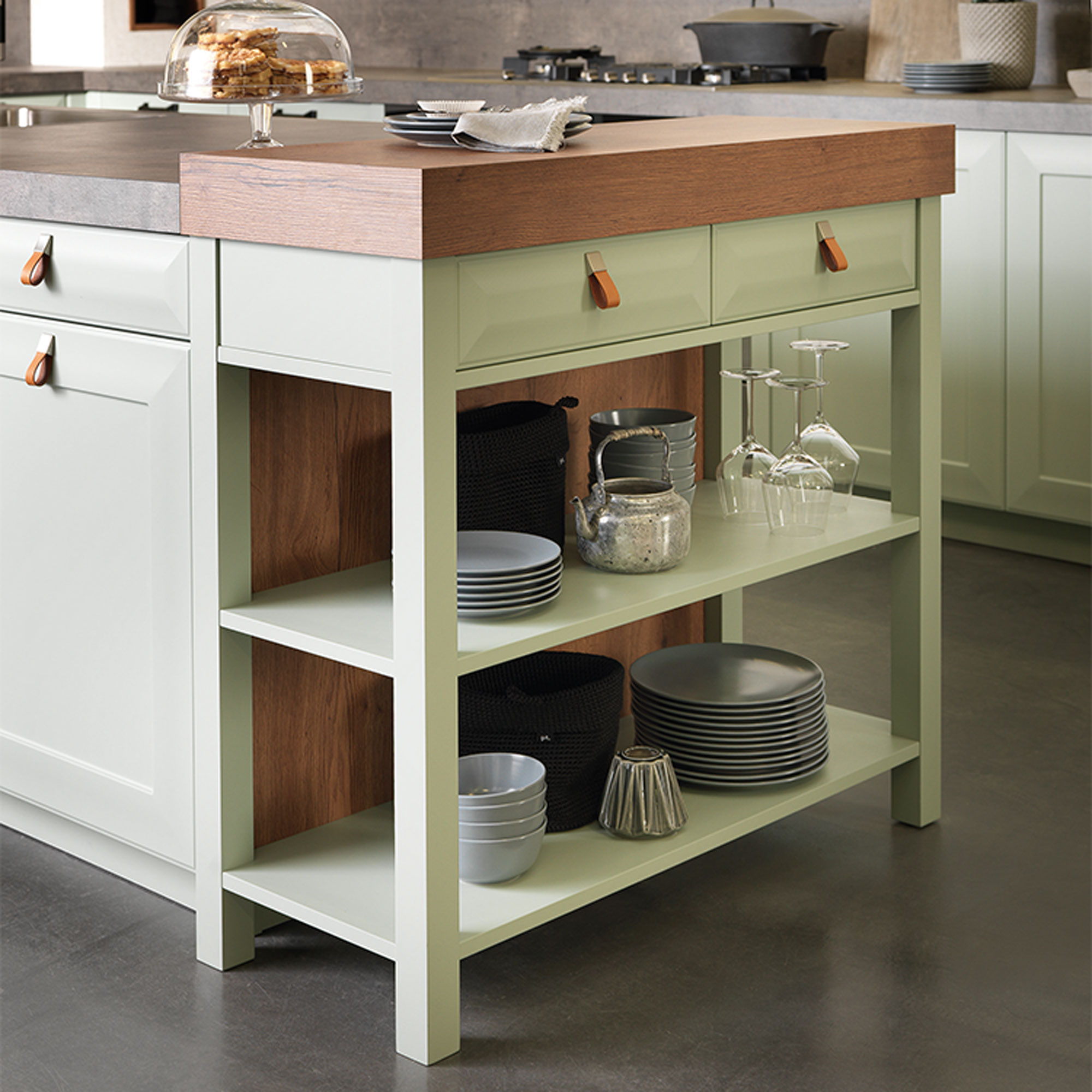
The end sections of an island unit often get overlooked, but they can be a prime location for extra storage that is handily within reach. Adding a single rail or row of hooks for hanging tea towels and oven gloves is an obvious solution that requires only the minimum of effort.
Alternatively, adding a section of open shelving at one end of an island run will give extra space for storing cookbooks or crockery. A slimline butcher’s block could also be slotted in if space allows or consider a trolley on castors that can be wheeled in and out of action as needed.
9. Pull up a stool
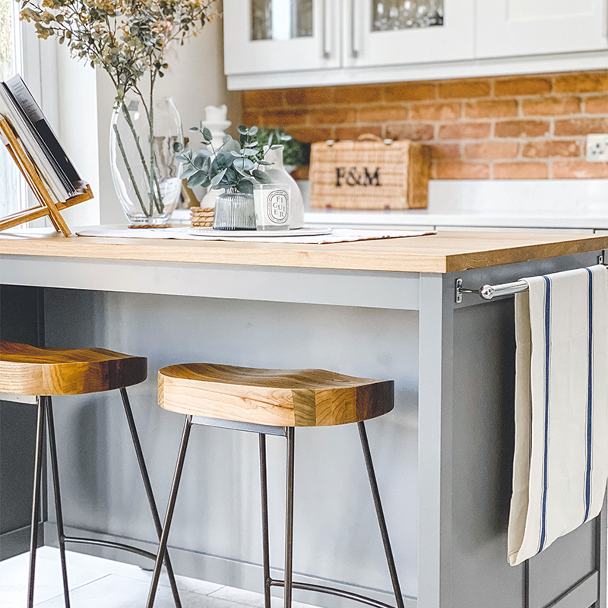
Leaving an overhang on one side of a kitchen island will enable it to double up as a breakfast bar with the addition of a set of high stools. With a compact area, keep it neat and streamlined by opting for backless stools that can be tucked underneath a small kitchen island when not in use. Match timber-topped stools to a wooden work surface to give the space a modern, rustic vibe.
10. Reserve your spot with statement seating
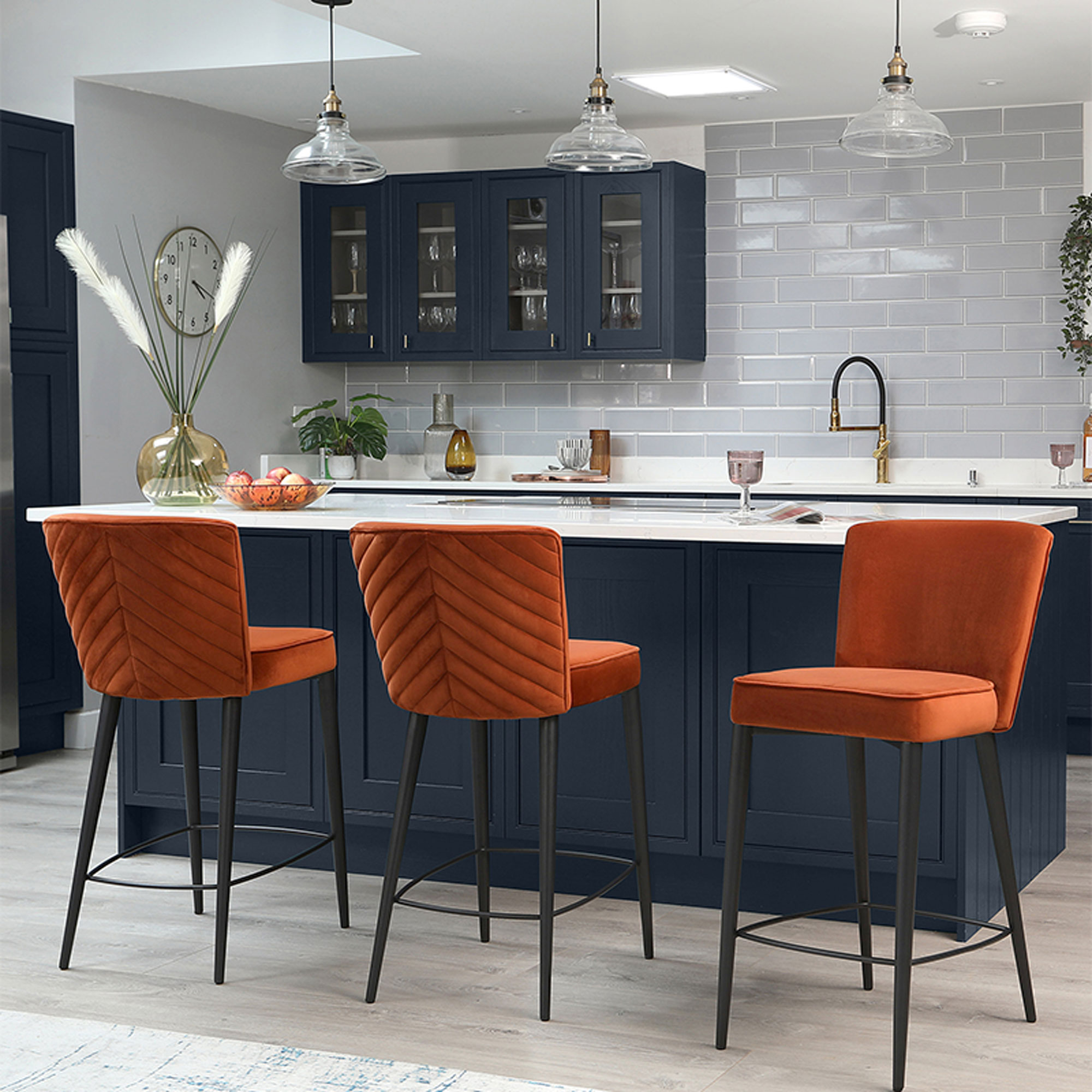
With a dedicated kitchen island seating set-up or bar area where you’re likely to spend more time sitting, comfort should be key when choosing seating. Plush upholstered stools in a bold fabric and colour that contrasts with cabinetry will add standout style.
Measure up before you buy. Start by working out how much space you have to hand, measuring the area from floor to the underside of the bar and subtracting 25-30cm from this to get your optimum bar stool height. Consider adjustable-height or swivel stools for ultimate comfort, or stools with a high back and foot rest for additional support.
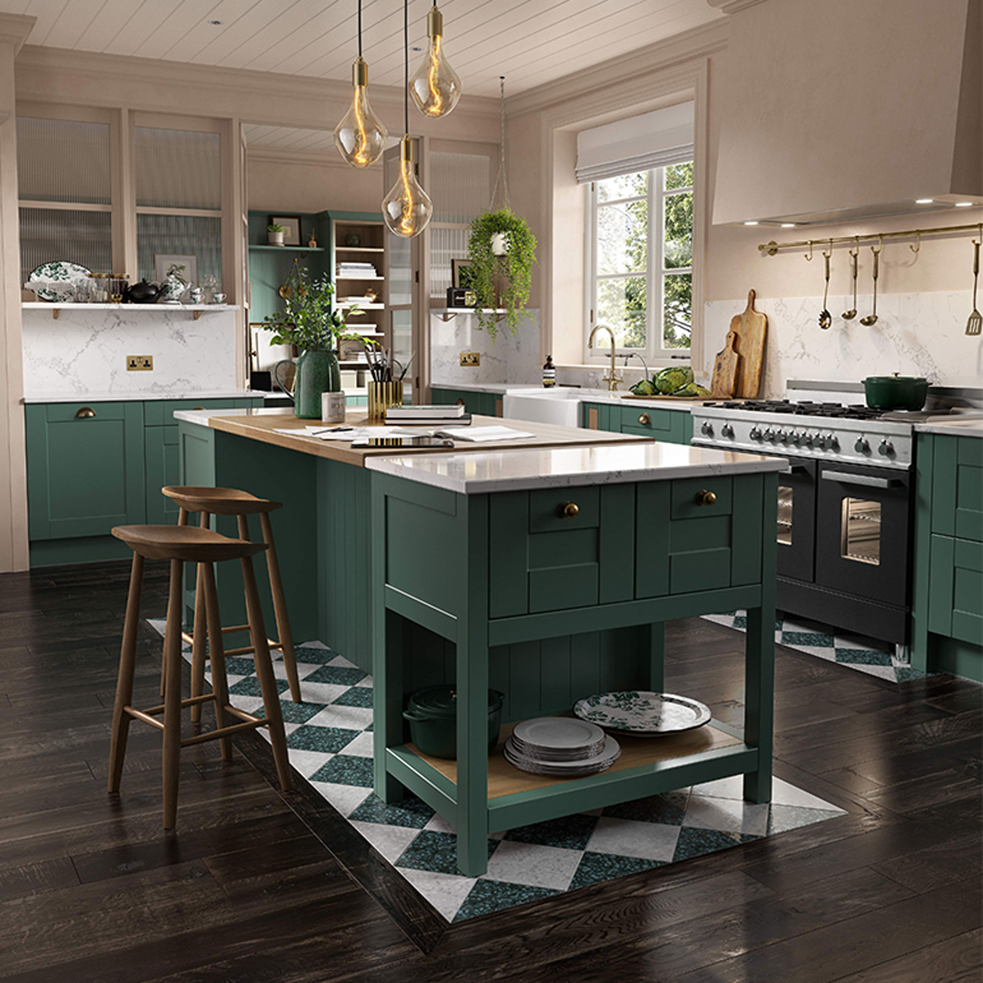
11. Go for standout flooring to show off an island
12. Choose the best layout
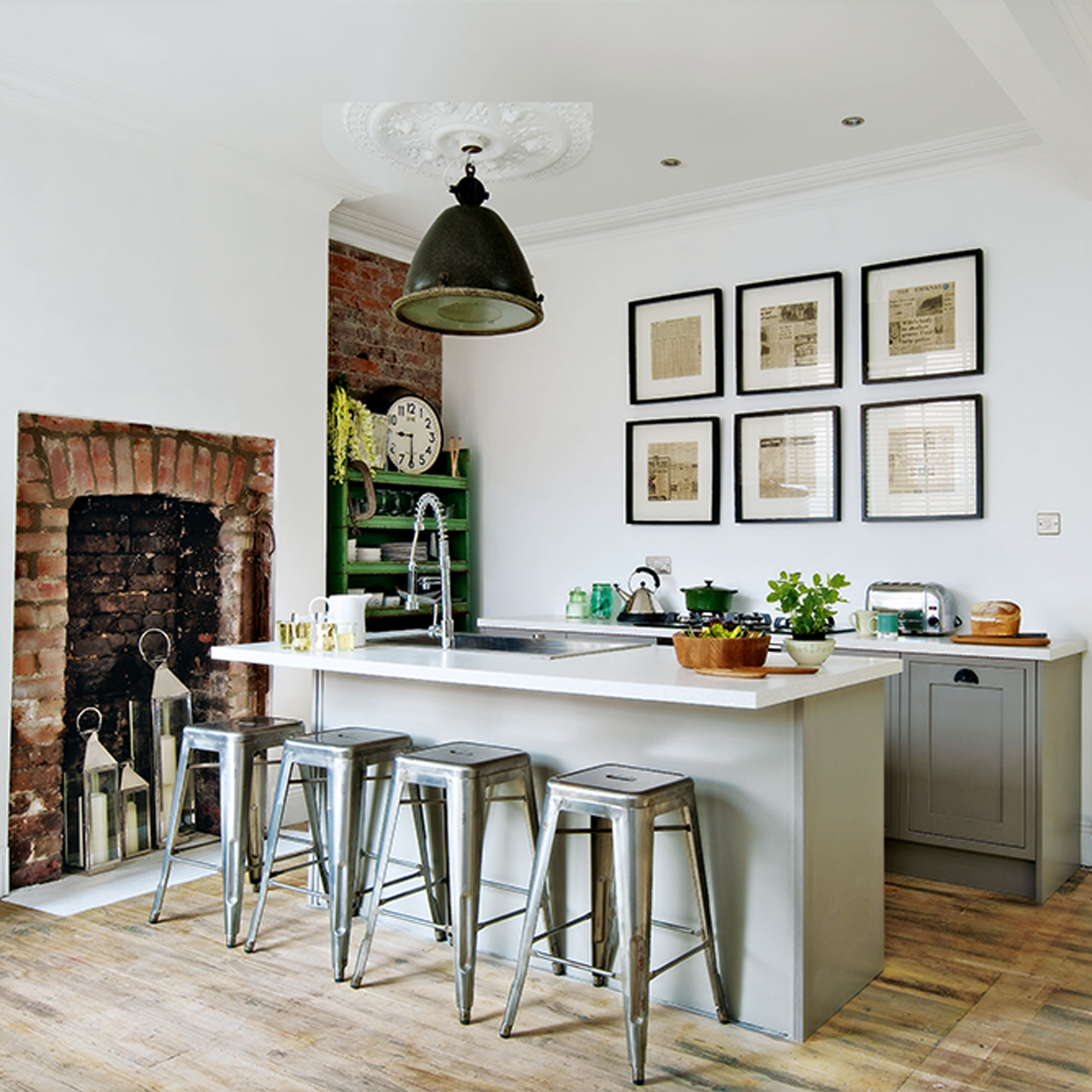
The positioning of an island will be dictated by the layout of the kitchen. Siting it centrally is often the most desired position, but there needs to be sufficient space for traffic to flow all around it. Ideally walkways should be around 100cm wide in order to be safe and practical.
Keep the ‘work triangle’ of hob, sink and fridge fairly compact to reduce too much back and forth. Arrange so that two working areas are on one side of the kitchen and the third is on the other, roughly centred between the two.
How do I style my kitchen island?
The style of your island should reflect the look of your kitchen, whether modern, traditional or rustic and country. Islands are often in a central position, which means that they’re likely to dominate the space, so keeping the surface neat and uncluttered is key.
Open-sided islands with shelving can also look untidy if there is no order to shelves, so try to keep books neatly stacked and store smaller items inside baskets and caddies so that loose odds and ends aren’t left rattling around.
Plants and greenery can make a lovely addition to a worktop, grouped together at one end. Create a small arrangement using planters of different heights, nestled together in a grouping. Three items is often enough - odd items always look more visually appealing than even - and don’t overcrowd the surface, you should always leave plenty of worktop space for prep and cooking.
How do I make my kitchen island stand out?
Colour is a great way of making a kitchen island stand out. This could be by choosing an island in a contrast colour paint finish to the kitchen cabinets or opting for a darker contrast timber to make the island stand out.
The outward-facing side of the island presents an opportunity to add a splash of colour as this will be what’s on view from the living or dining area of an open-plan space. Try painting the back panel of the island in a bold colour, wallpapering it or cladding the side in a metallic panel in burnished copper or gold. Tiling the back panel is another way of bring colour and pattern to the space, as well as being a practical choice too. Tiles are easy to keep clean and won’t be damaged by scuffs when guests are sitting up at the island on bar stools.

Lisa is Deputy Editor of Style at Home magazine and regularly contributes to sister title Ideal Home. She has written about interiors for more than 25 years and about pretty much every area of the home, from shopping and decorating, crafts and DIY to real home transformations and kitchen and bathroom makeovers. Homes and interiors have always been a passion and she never tires of nosying around gorgeous homes, whether on TV, online, in print or in person.
-
 Wood drenching is the calming new twist on the colour drenching trend – here’s how to make the look work in your home
It’s easier than ever to embrace natural materials
By Maddie Balcombe
-
 Aldi is launching a £200 day bed with four different features - its sleek design is suited to the whole family
You don't want to miss out on this Specialbuy
By Kezia Reynolds
-
 How to set up a drip watering system that saves water and a lot of effort
Keep your plants hydrated (and your water bill down) with this clever garden watering solution
By Natalie Osborn