Kitchen tile ideas to add style and personality to your walls
Pick from tiles that come in every size, shape, pattern and colour possible for a unique kitchen scheme
Holly Cockburn
Sign up to our newsletter for style inspiration, real homes, project and garden advice and shopping know-how
You are now subscribed
Your newsletter sign-up was successful
When planning out a new kitchen design, there are many intricacies to consider. From choosing the optimal layout to deciding on the perfect kitchen tiles, you'll want to combine both style and function for a space that works for you. The best kitchen tile ideas will offer the wow factor you desire, taking your cooking space from drab to professionally designed, while also protecting walls.
With many different shapes, sizes, colours and patterns to pick from, it can be a difficult choice. Regardless of the kitchen ideas you've opted for, tiles have the potential to complete a minimal scheme or a pattern-packed look. The material is also just as important, with vinyl, ceramic, porcelain or even marble to choose from, depending on how hardwearing you need your kitchen to be.
So to help your complete a cooking scheme so that it's easy to clean while also being effortlessly designed, these kitchen tile ideas will leave you feeling inspired.
Kitchen tile ideas
Whichever style of these kitchen tile ideas you take on board, do note that you may need to use a sealant. 'All tiles, aside from ceramic and porcelain, should be sealed with a recommended sealant before installation,' says Damla Turgut, founder of Otto Tiles & Design.
'This protects the tiles, which are naturally porous, from everyday dirt, grime and stains. If you don’t want to do this, then opt for a ceramic or porcelain tile which can be easily cleaned with a wet sponge or clot
1. Go with green
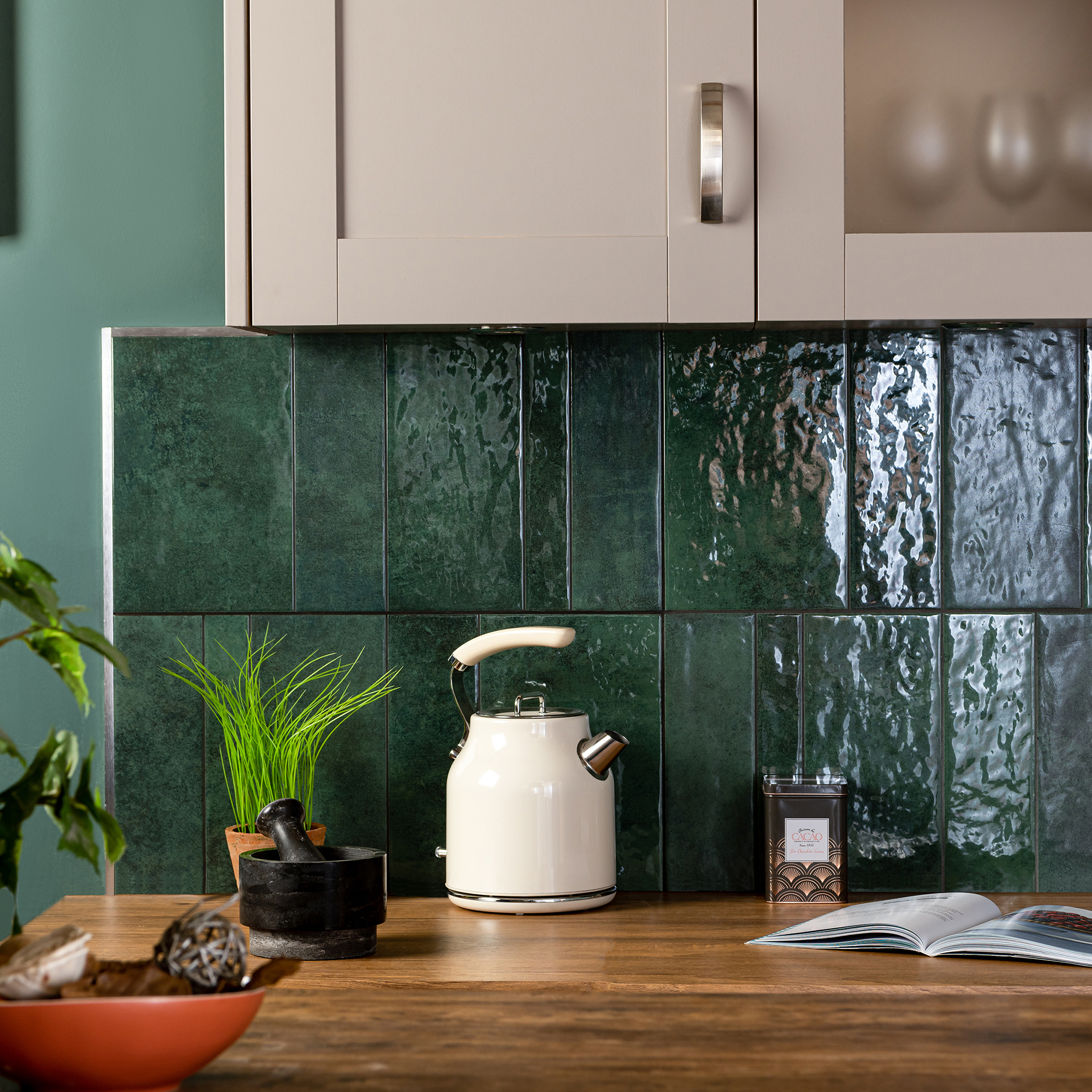
Green kitchens have firmly planted themselves in our interiors, offering a trend-led look that doesn't feel like too much of a statement. If an entire leafy green scheme isn't your thing, then go for dark green tiles to incorporate a slice of the aesthetic.
The deep shade will still reflect light, especially when paired with metallic accents from cabinet hardware. You can also style it up with wood-effect surfaces for a functional kitchen that embodies the down-to-earth design.
Sign up to our newsletter for style inspiration, real homes, project and garden advice and shopping know-how
'Darker shades are good for creating a dramatic interior ambiance so for a different feel in your kitchen try pairing darker matt shades with brighter metallics,' says Louisa Swannell Head of Creative design at Walls & Floors. 'The lavish contrast between the deep matt hues and high shine accents will create an instant impact.'
2. Stick to stacking
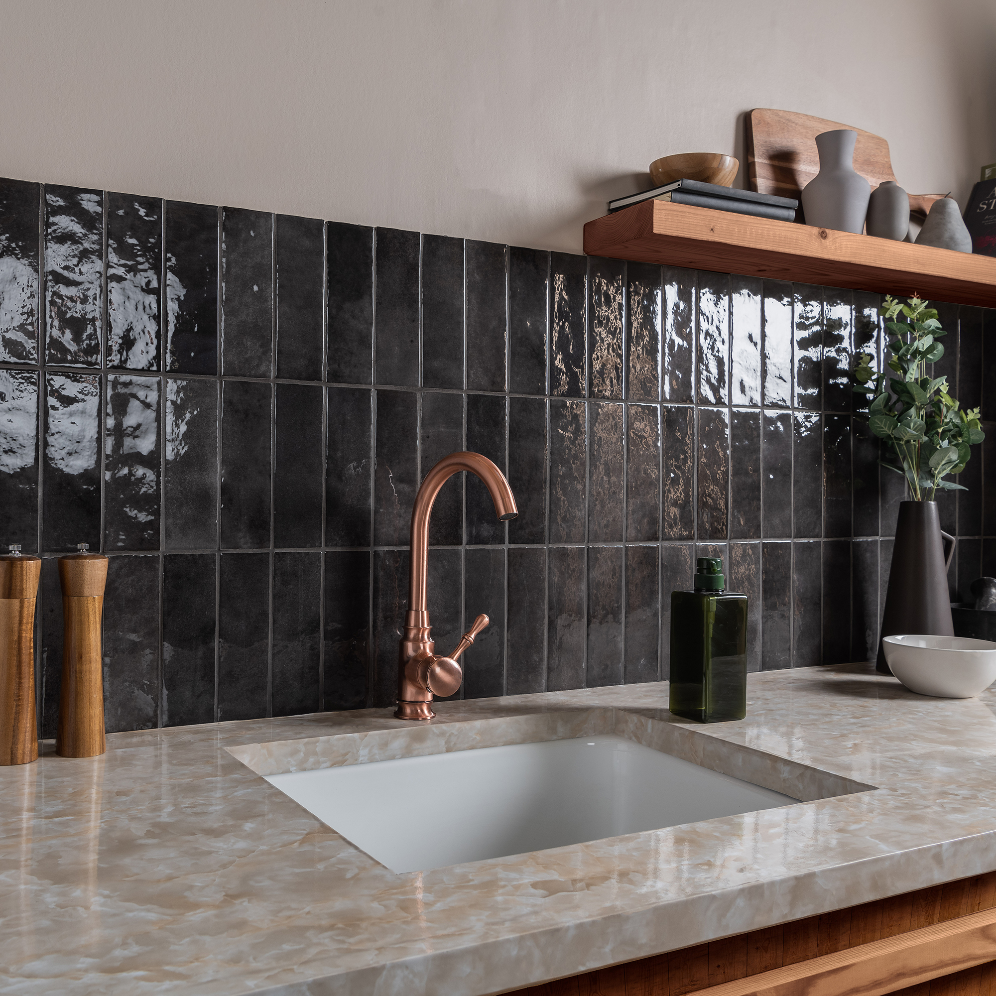
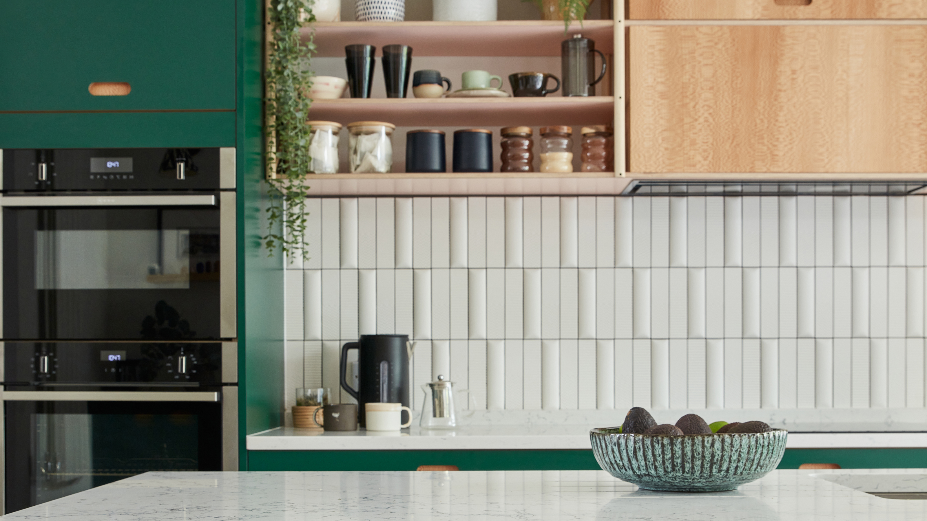
Metro tiles are an affordable tile option that are easy to match to many different kitchen schemes, so if you're looking for a quick update they can be an obvious choice. But if you're wanting more of a unique design, you should consider a different layout than the typical horizontal positioning.
'My favourite trick to make kitchen tiles look more expensive is playing around with the layout, it's a tip I learnt from US-based Interior Designer Shea McGee,' says our Deputy Editor, Rebecca Knight.
'If you are only able to afford a basic metro tile instead of a brick layout, try stacking them horizontally, or even vertically for a more considered look.'
3. Tile up the wall
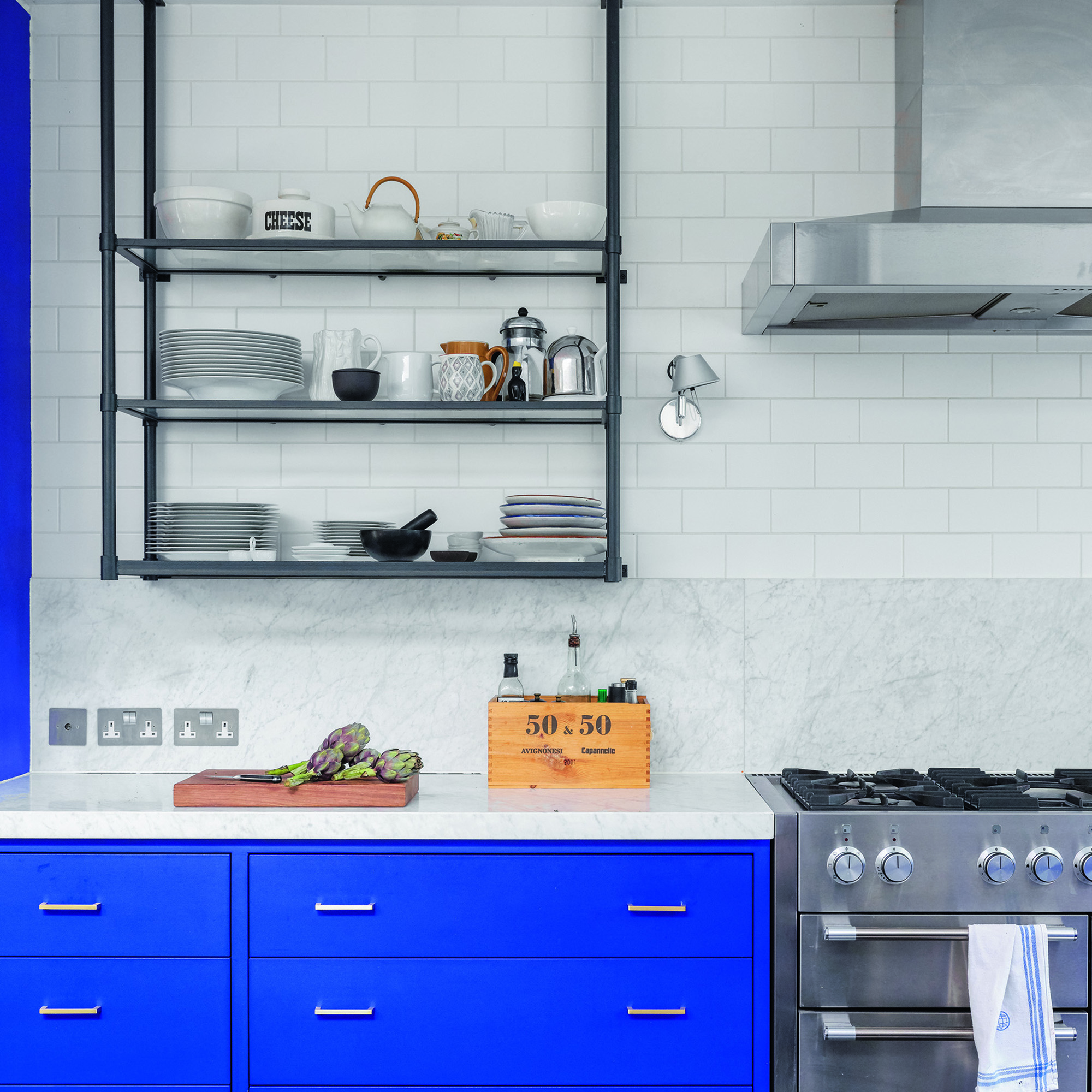
Doubling up on tiles is a great way to create a visually interesting scheme that is practical too. Consider using one type of tile for a splashback idea, and then a different one to continue up the rest of the wall.
If you're a messy cook, or want to avoid damp walls then a fully tiled wall will be a convenient way of making your kitchen work for you. You won't need to worry about grease splatters making their way up your wall or about damaging paint-work if you have open shelving or hang pans above your stovetop.
4. Give simple a twist
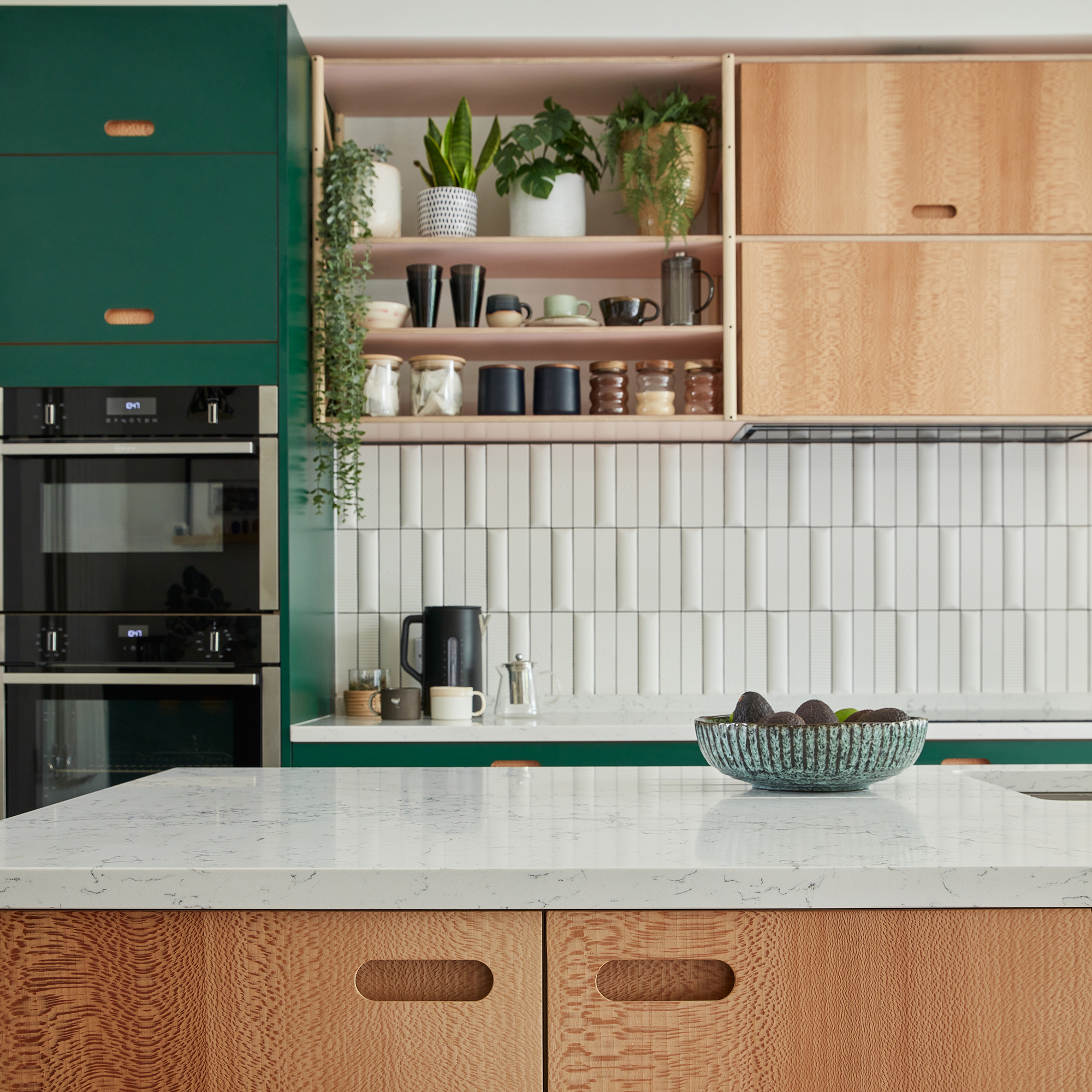
If you have a colourful kitchen scheme or just prefer a minimal look, then opting for textured tiles will be a clever way of dialling up a design. Many metro tile options also have a handmade, organic effect that will add dimension to a wall.
How you lay the tiles will also impact how they look. Adding a smaller tile shape between larger ones will create depth so that a simple area suddenly feels well-curated. This is great if maximalism is your thing, but you don't want to add more pattern to your kitchen.
'How you lay tiles has the ability to completely transform your space. As you would for wallpaper and other wall decor designs, it’s about choosing a laying pattern that works with your space, rather than trying to force an idea upon it,' says our Assistant Editor, Thea Babington-Stitt.
'For example, upturning tiles so they’re stacked vertically will lead the guide upwards, visually ‘lifting’ the ceiling and making the space feel taller. If you’re concerned about this feeling too flat or ‘plain’, choose a tile with texture, or a 3-D effect.'
5. Go large
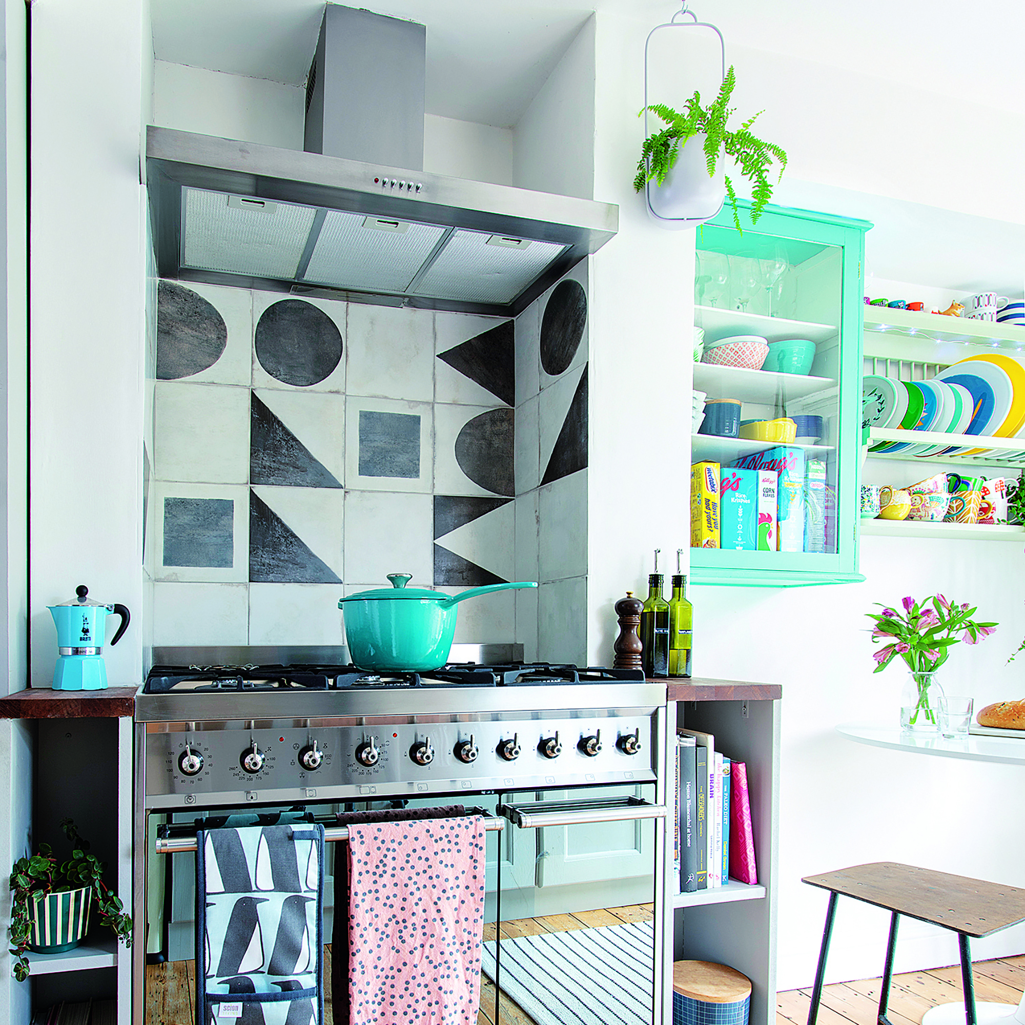
Large, statement designs are a great way to create a focal point in a kitchen, similar to the wall murals we see in other areas around the home. Geometric shapes are a common choice for kitchen tiles, but instead of using them in a formulated layout, consider opting for an irregular look. Going large is another great way to create an art-inspired scheme, with less grout causing less visual interruption.
'Over the last few years, we have seen many homeowners start to ditch intricate mosaic patterns in their kitchens, and instead opt for large format tiles when renovating,' says Leigh Price, Co-Director of Real Stone, Tile & Bathroom
'One of the reasons for this is that large format tiles can provide a full ‘wall covering’ effect, meaning there are far less visible grout lines than there would be when opting for a smaller tile. This not only creates a completely seamless finish, but also means far less upkeep, and makes it much easier to clean.'
'With so many bold patterned, large format tiles now on the market, you can easily create just as much of a wow-factor effect as you would have with a delicate mosaic.'
6. Look to unusual spaces
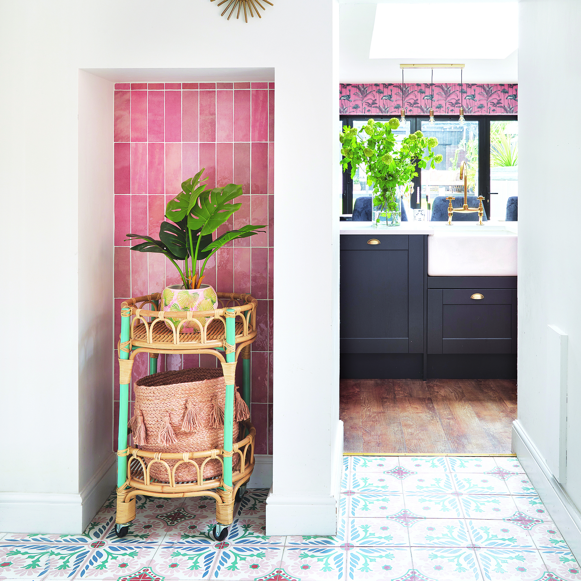
When you think of kitchen tiles, your might will probably jump straight to a splashback. And for good reason - it's easy to wipe down when sauce goes awry and protects walls from grease. However, incorporating tiles in different spots around your kitchen will tie the design of the room together with ease.
If you have any alcoves or shelving areas, then consider tiling around it to frame the look. Then, you can add decorative accessories such as indoor plants for a fun way of bringing your cooking space to life. Opting for a pop of colour in these spots will also mean that you can keep your paint ideas for cabinets low-key, and choose to make the tiles the personality.
7. Pick pink
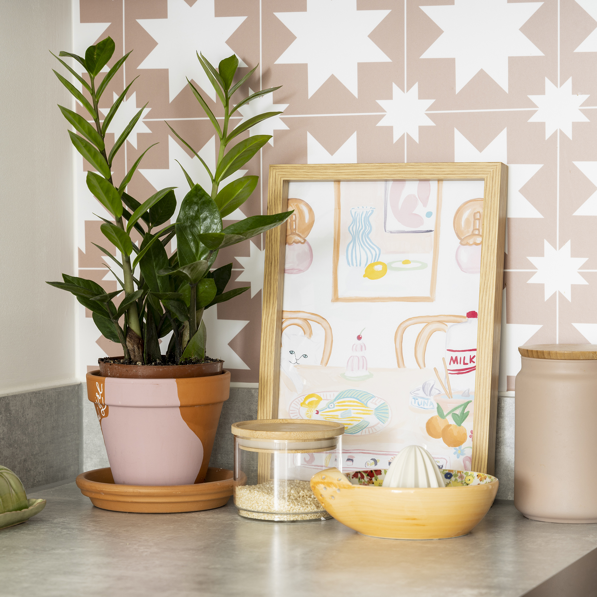
Pink kitchens have been having a serious moment in our interiors, with Barbiecore making us want to try out the trend ourselves. Tiles are an easy way to trial a look without committing to an entire kitchen scheme, or dabbling in a colour without it overwhelming the space.
Whether you want to colour block or add in a spot of white with some geometric pink tiles, it will add a touch of character to a cooking area. Plus, it's simple to style up with clusters of prints and plants for a cosy look that is personal to you.
8. Combine tonal shades
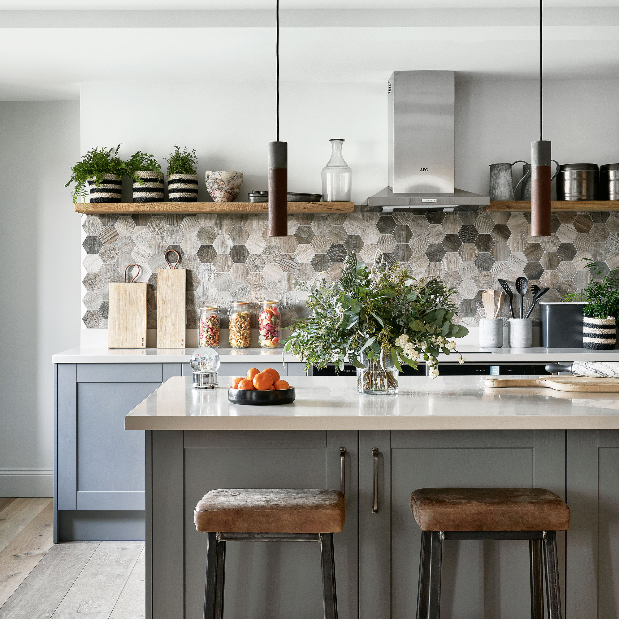
'Neutrals, greys and creamy whites are always popular for kitchen colour schemes on walls,' notes Damla from Otto Tiles. 'Lighter tones inherently look fresh and clean.' Instead of choosing just one of these warm neutrals, consider combining several tonal shades instead. By limiting yourself to a strict colour palette, the overall effect will feel cohesive and natural.
Opt for tiles with a naturalistic finish for a truly warm and relaxed effect.
9. Use vinyl tiles
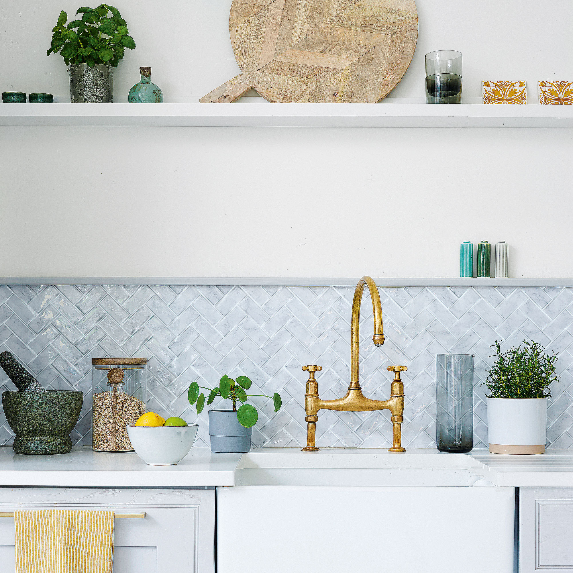
Tiled splashbacks are always effective but whether for time or money, it's not always possible. Instead, cheat your way into a new splashback with kitchen tile decals.
Instead of classic tiles, get the effect using a roll of tile-effect sticky-backed vinyl film. Edge the vinyl with a painted wooden batten for a neat finish.
10. Create pattern with colour blocking
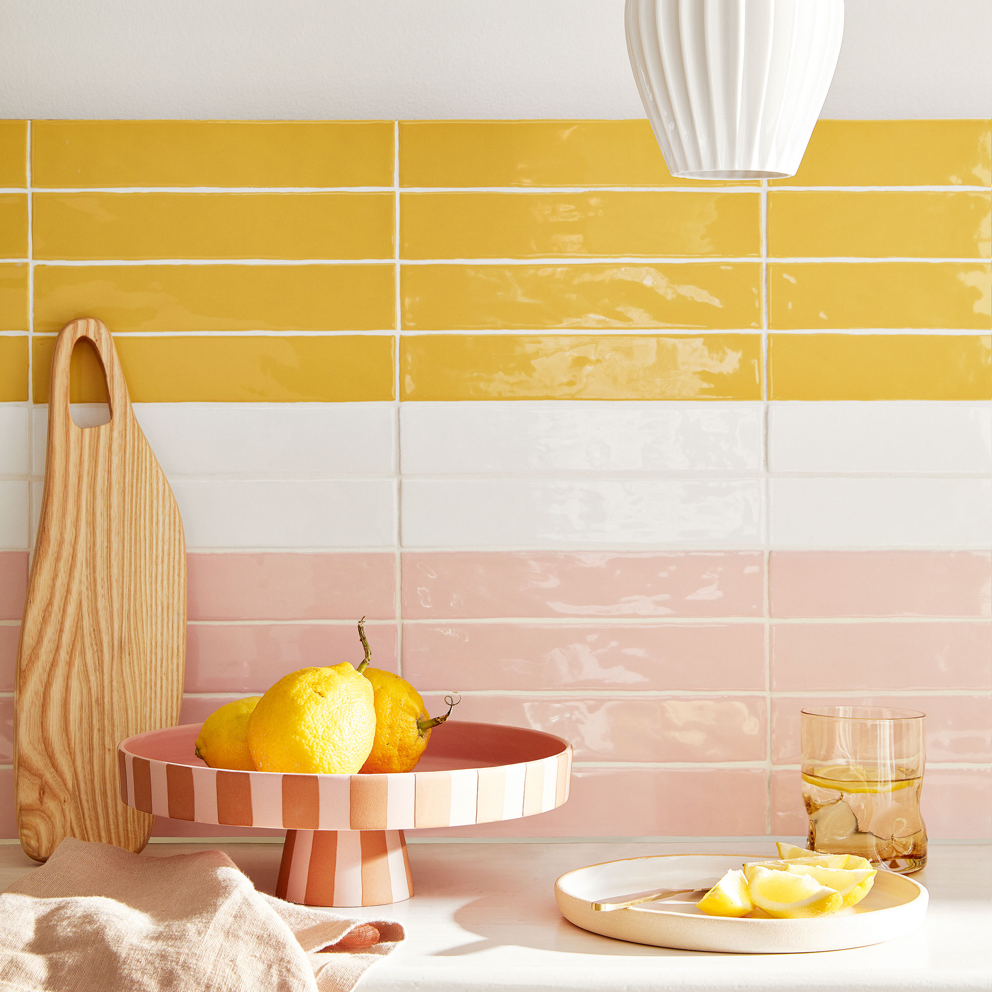
You don't have to use patterned tiles to achieve a patterned finish. Give brick tiles a twist by arranging them in horizontal stripes of colours for a fun kitchen splashback.
Play with widths of the coloured tiles on the floor to see what effect looks the best. If you're using more than one colour, break them up with white to give the shades room to breathe.
11. Introduce character with exposed brick
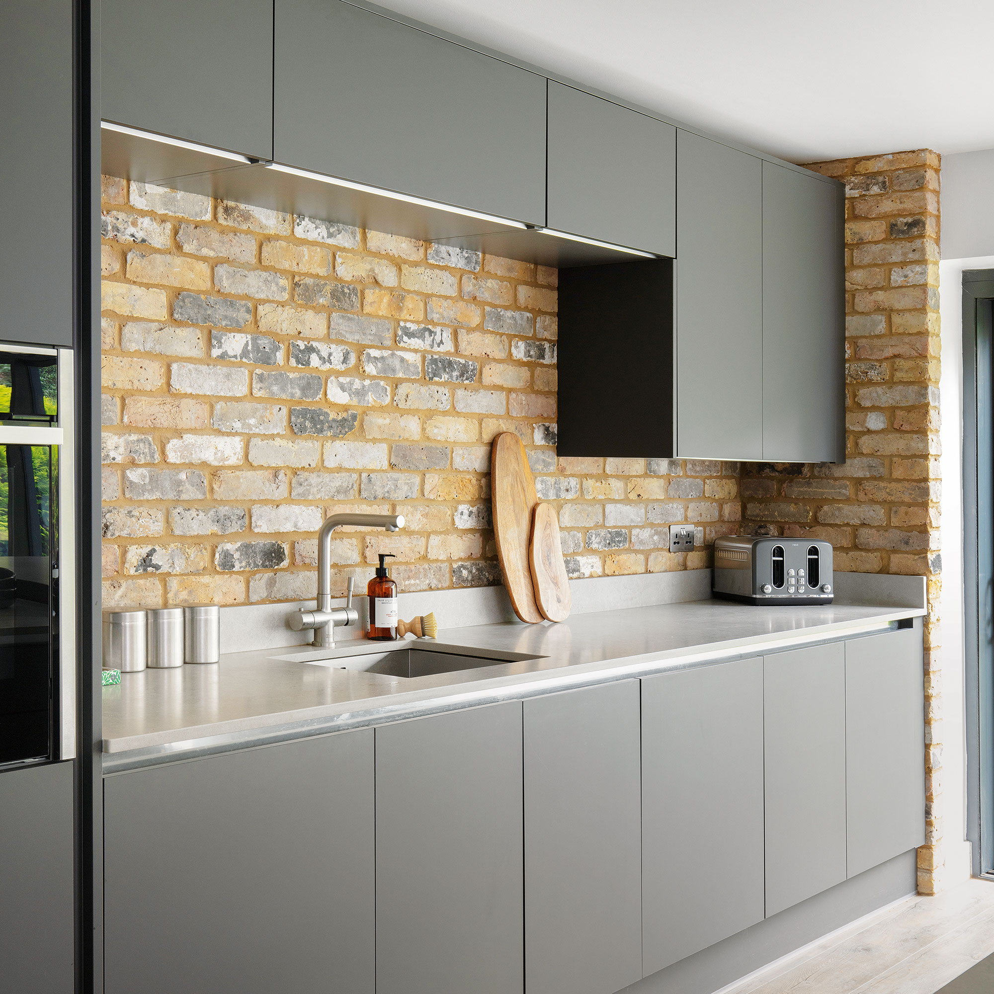
If you want enduring beauty and individual character, look no further than exposed brick. A classic option for feature walls, this material can work equally as well all over, including on splashbacks - although they will need to be protected with a sealant.
You don't even have to have original brick walls in place, or commit to building new walls. Brick slips - tiles manufactured to look like bricks - achieve the style with much less fuss and cost.
12. Tile your cupboards
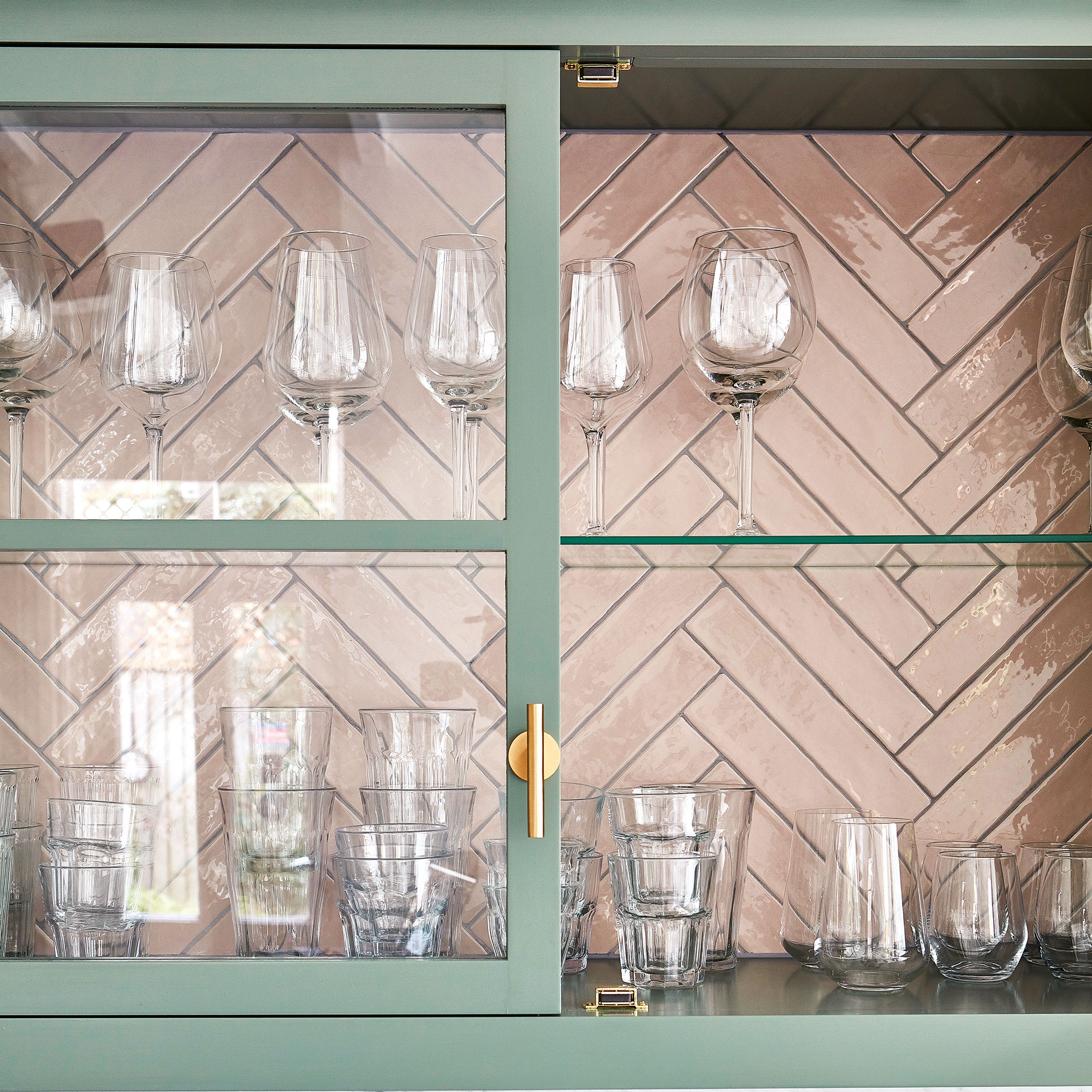
When considering kitchen tile ideas for your walls, think outside of the box. Or, well, inside. Elevate glazed kitchen cupboards by tiling the insides. This can be done in the same tile as the rest of the wall to create a seamless look.
Alternatively, only tile this area for a statement focal point.
13. Link with an unexpected surface
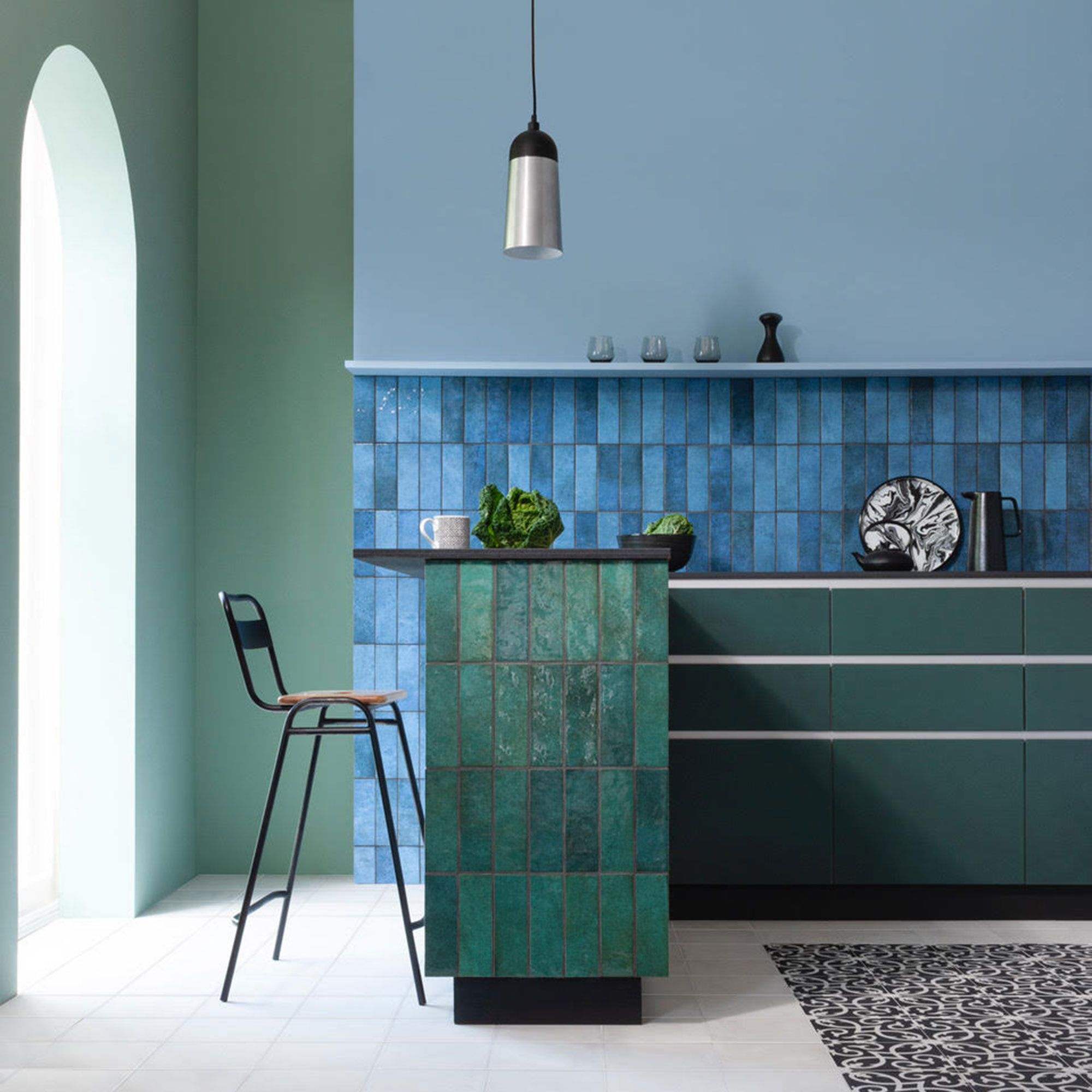
Create a cool and contemporary look with your kitchen tile ideas with some unexpected co-ordination. 'For those looking to create a designer look,' advises Amanda from CTD Tiles, 'consider positioning your tiles in a unique format for a striking focal point'
Tiling the sides of a breakfast bar or kitchen island ideas in the same laying pattern but different shade to your walls will result in a unique and stylish effect.
14. Get bold with colour
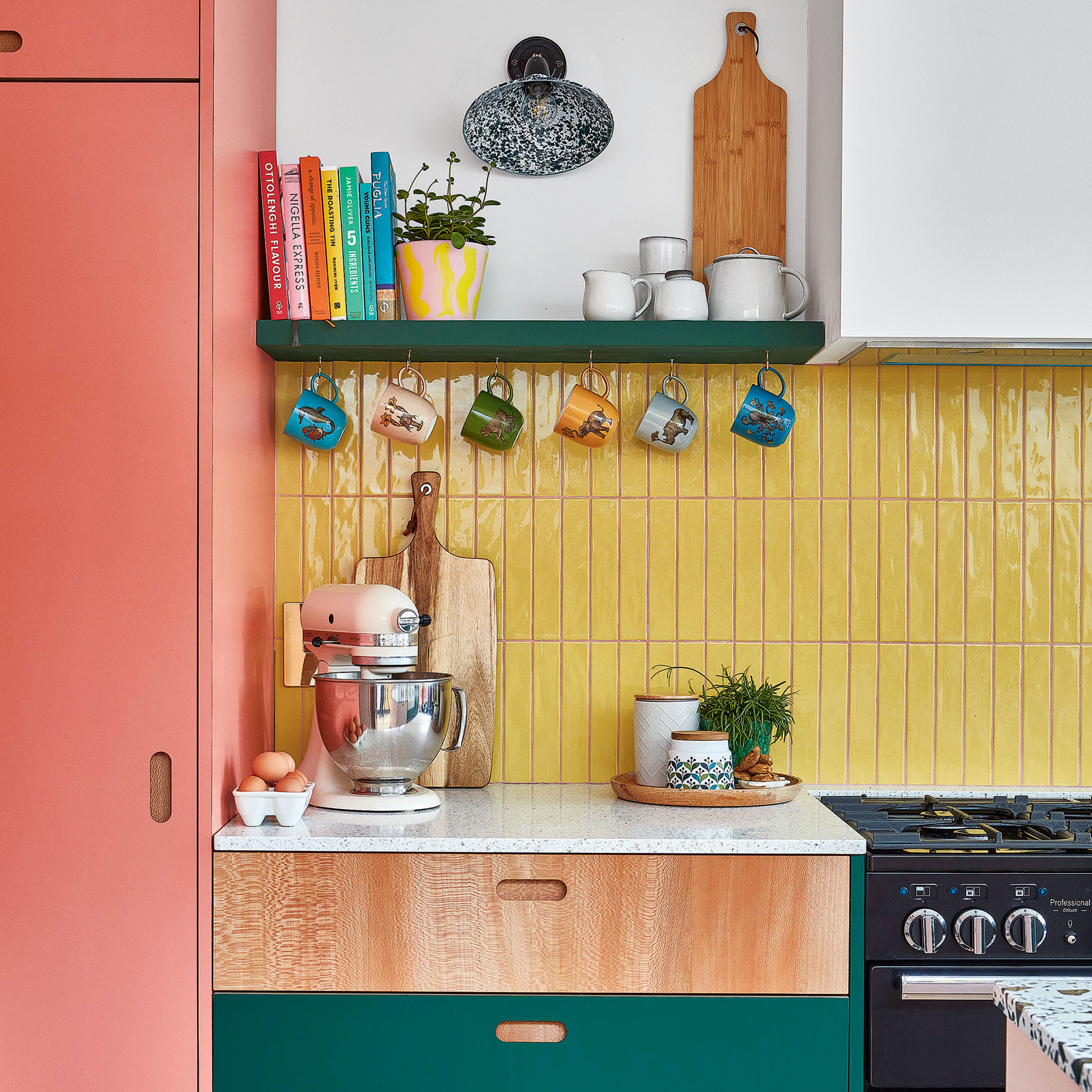
'In kitchens we’ve noticed recently that it’s all about statement colour and a lot of people are using their kitchen splashback ideas as focal points,' says Amanda from CTD Tiles.
'We’ve seen everything from bold and bright hues to more natural tones that deliver an earthy aesthetic. There really is no rulebook to what colour you should go for and there is no right or wrong answer, however we recommend opting for tiles in a striking colour such as blue, green or even vibrant red as its adds contrast to interiors.'
Choose a contrasting shades to your cabinetry for some serious colour-blocking cool points.
15. Play with colour, shape and pattern
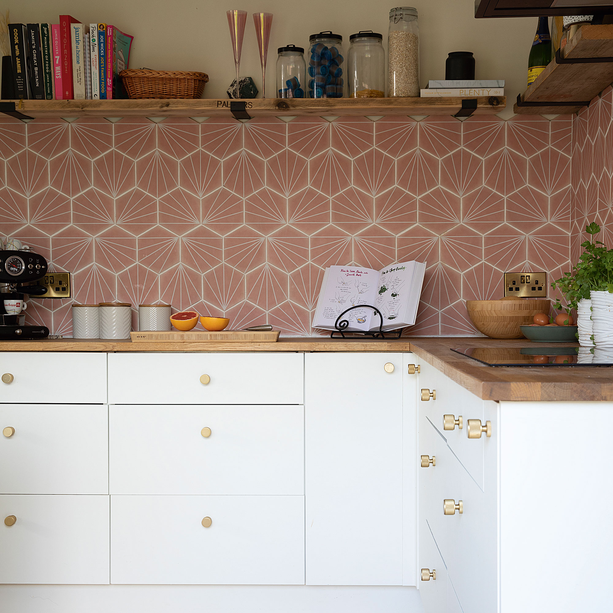
More sometimes really can be more. Instead of choosing shape, colour or pattern, why not have fun with all three? A shapely tile, in a bright colour, with a pattern.
To make the look seem cohesive, choose a pattern which links each tile together, rather than creating a patchwork effect.
16. Add interest to metro tiles
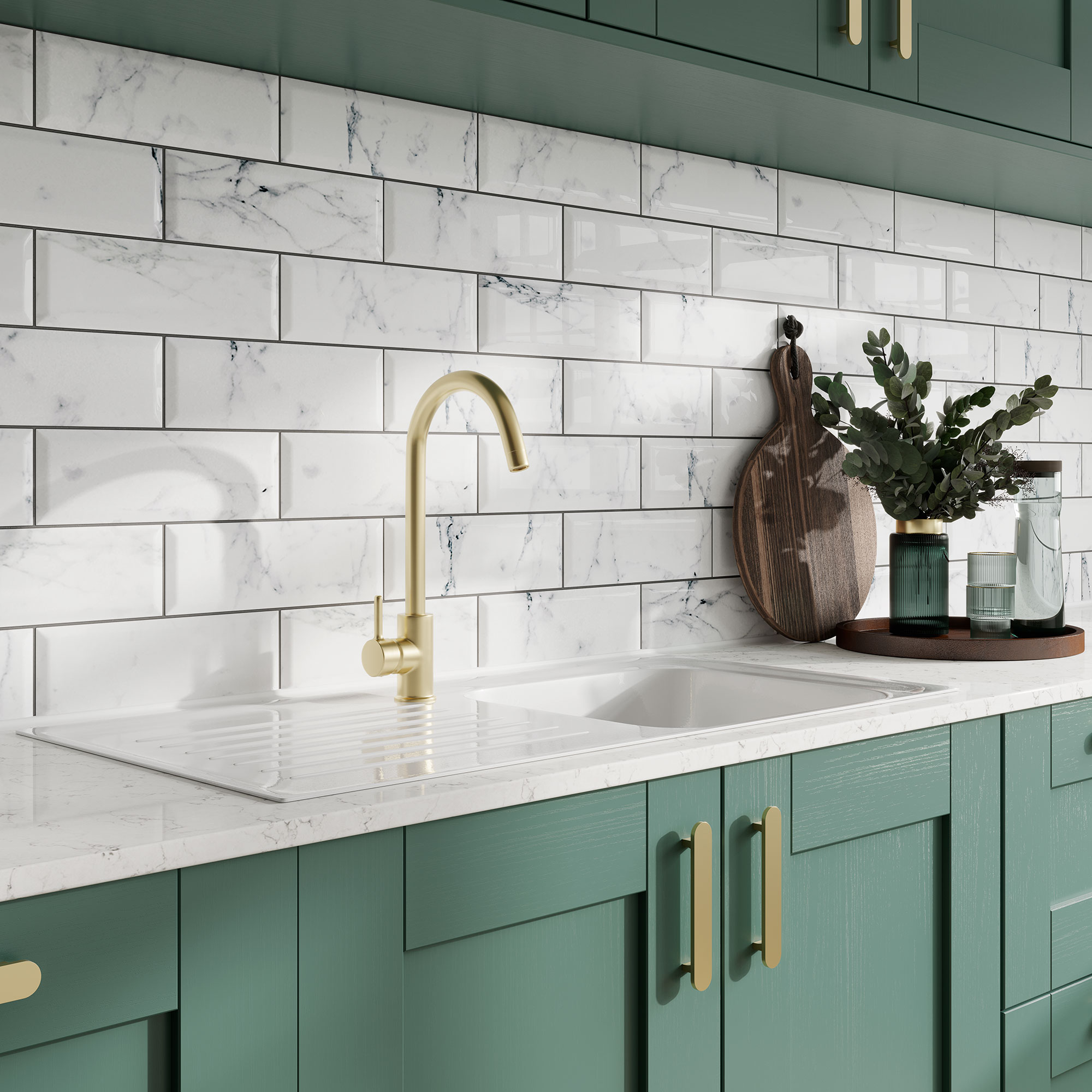
Metro kitchen tile ideas are a cool contemporary go-to. Add extra interest to yours by mixing up the material. Choose a marble, or marble effect, stone cute into metro tile rectangular shapes. You'll still achieve the chic, minimalist effect of classic metros, but will an added extra something.
17. Break up block colour with classic white tiles
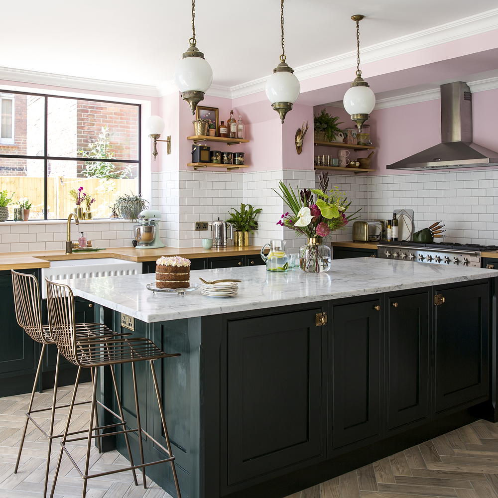
Add interest to a shaker kitchen by wrapping tiles around the room. Use classic white tiles to act as a neutral between two strong colour choices, one for the cabinetry and the other for the walls. As is the case in this statement kitchen the white tiles wrapped around the room breaks up the punchy green units and the delicious pink painted walls. A neutral coloured tile gives you the freedom to change the wall colour as the mood takes you.
Tiling half the wall this way is practical and will protect your walls from any kitchen splashes.
18. Add an extra dimension with hexagon tiles
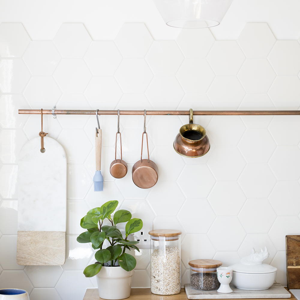
You don't need colour to make a statement. This effortless white kitchen idea shows how filling the space with different textures, materials and shapes will add interest – without the need for colour. Kitchen wall tiles are perfect for doing this. This honeycomb tile blends seamlessly into the white washed walls to create a sleek contemporary look.
19. Mismatch shapes and patterns
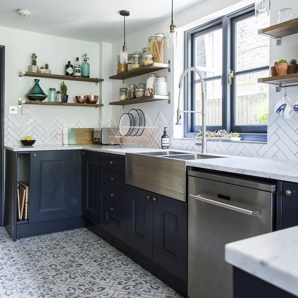
If you're looking at kitchen floor tile ideas along with the walls, don't be afraid to mismatch the shape, colour and even finish. On the floor it can be tempting to opt for a simple design, however you can use this space to make a statement with a patterned tile. Then keep the walls in a plain tile to invert the typical way to tiling the two surfaces.
20. Coordinate colour on different surfaces
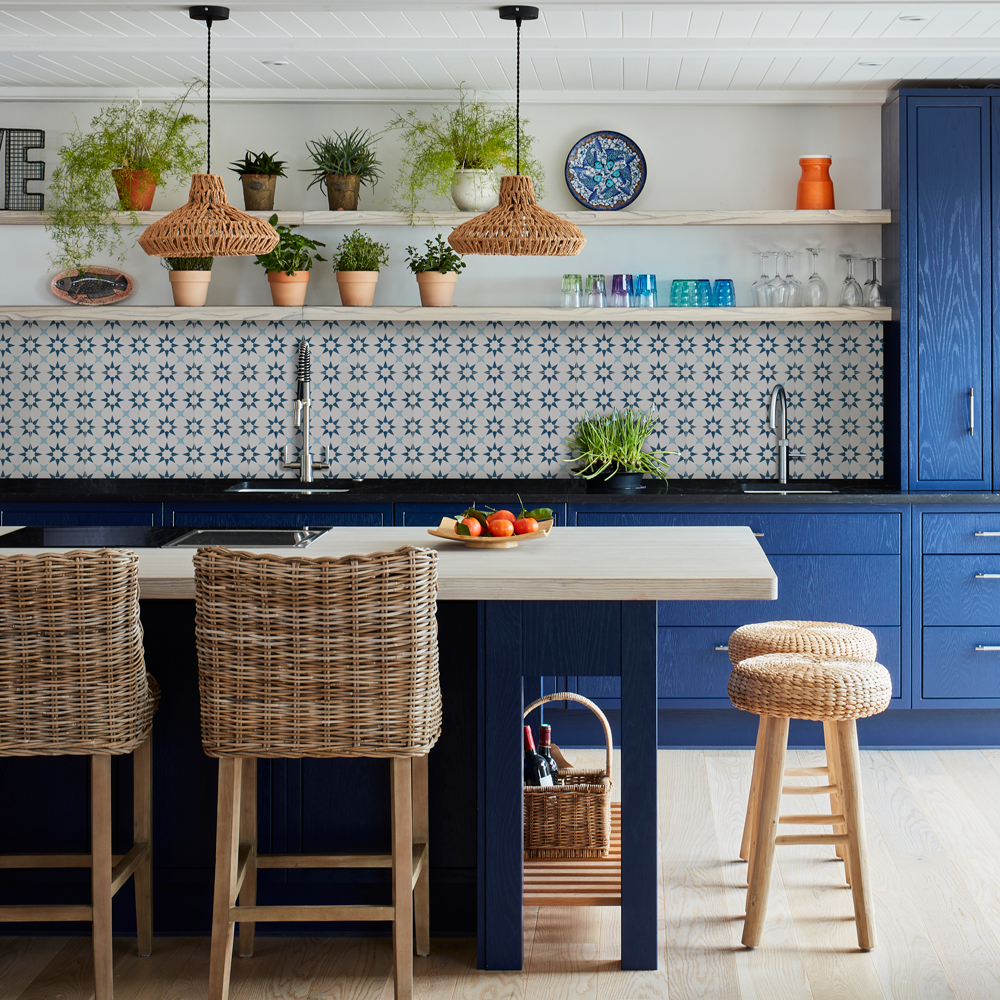
Use patterned tiles in a bold coloured kitchen to add further interest. Use your kitchen cabinetry as the starting point for your kitchen tile ideas. With a paint sample to hand, find a colour match to a patterned tile to use on the surrounding walls.
The effect will be bold but also feel cohesive, so won't overwhelm the eye.
21. Balance a busy pattern with a plain
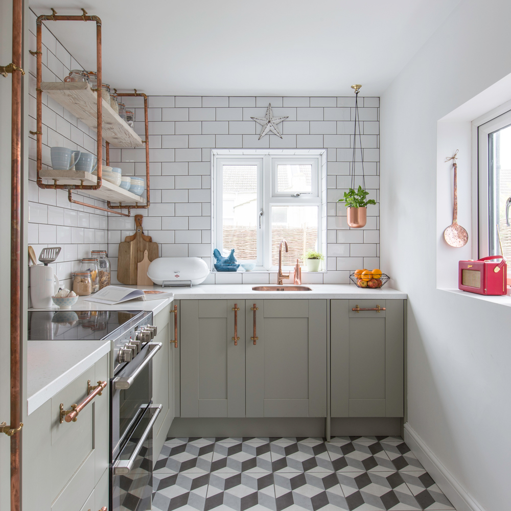
When tiling multiple surfaces it's tempting to mix things up, to add interest – using patterned tiles alongside plain designs. The rule of thumb is to choose one surface to use each style, to help balance the look. Using pattern on the floor in a kitchen will help to anchor the decorating scheme.
22. Use slate to create a splashback
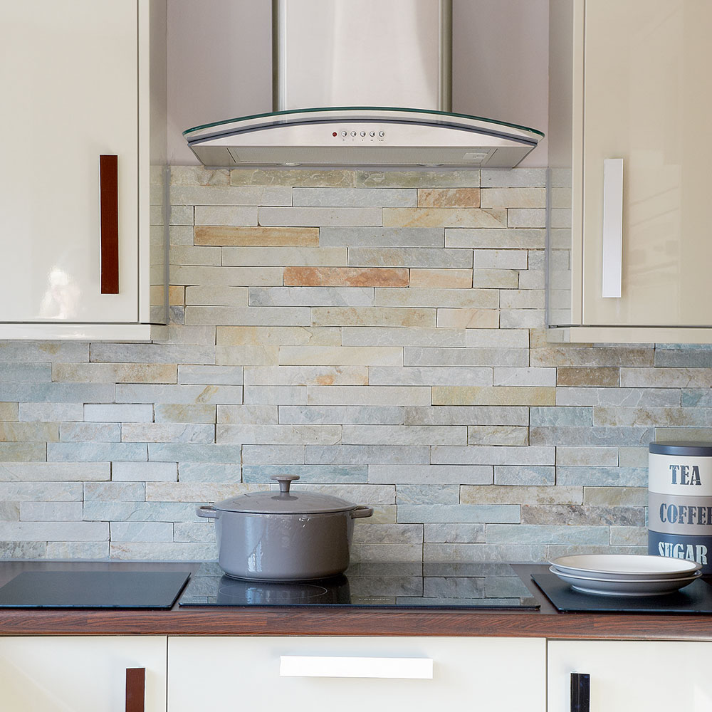
Mimic the exposed-brick look with a tiled slate wall. With its naturally smooth texture and varying shades, from pale grey to dark purple and rich rust, slate is a beautiful choice for walls and splashbacks. Leave your slate tiles ungrouted for added character.
23. Fake it with marble effect tiles
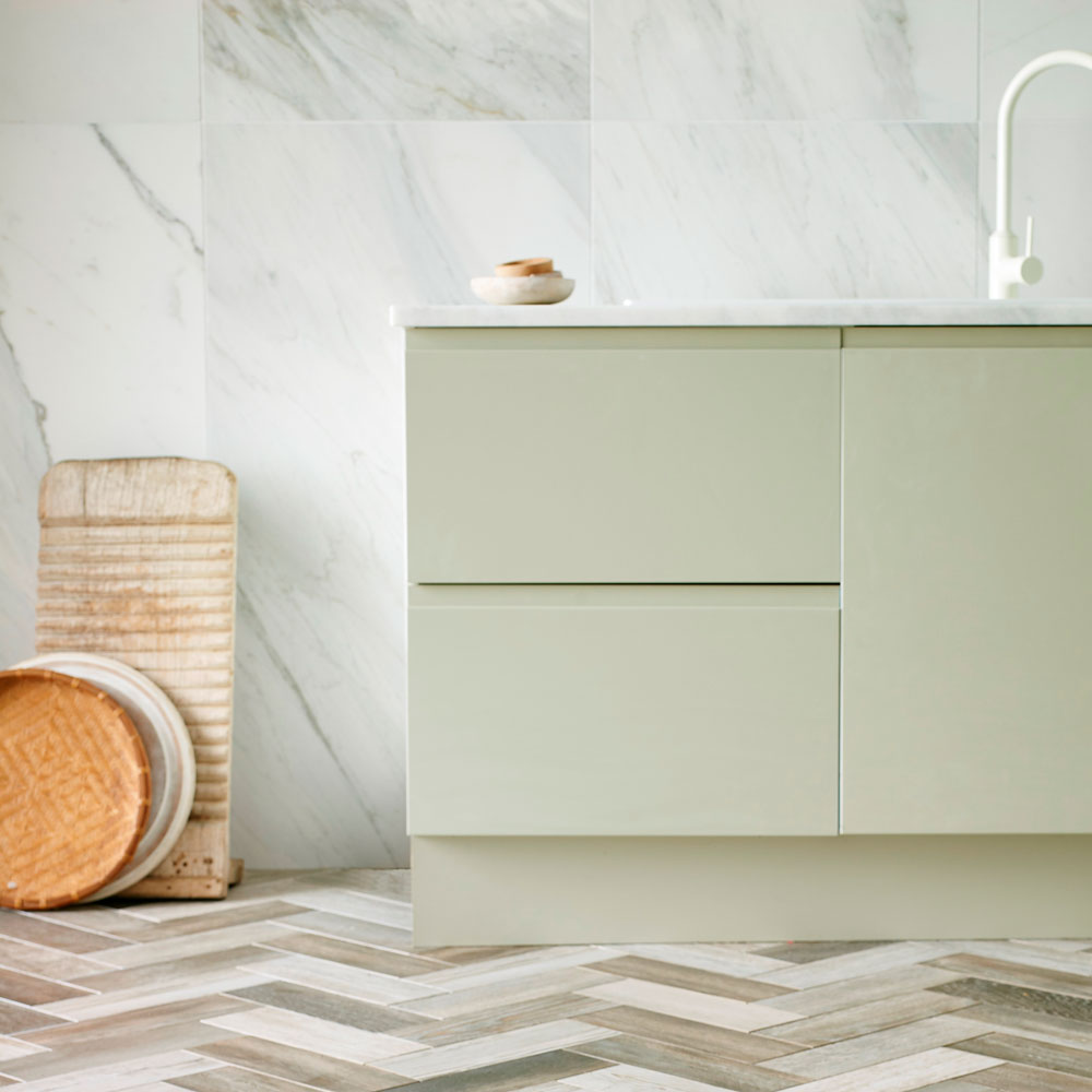
Marble is an intricately beautifully stone, but it can also be very costly, especially if you have a large area that needs tiling. Why not fake the look with a porcelain tile that looks almost identical to real marble? There are many good-quality marble effect tiles on the market, at a price to suit most budgets.
24. Choose a modern bistro-style vibe with metro tiles
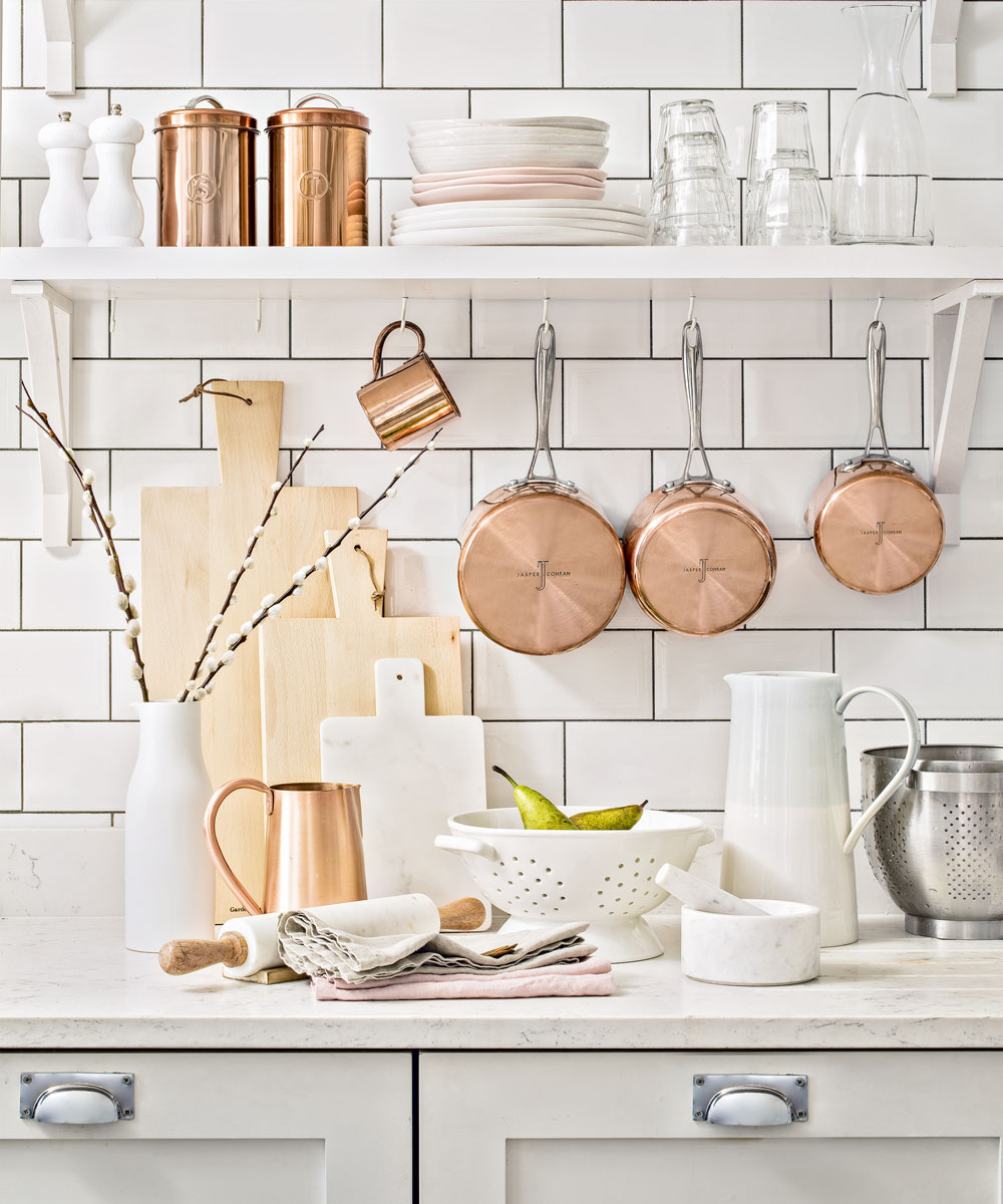
If you have a large wall to fill in the kitchen, consider creating an entire feature wall of metro tiles. Brick-shaped or Metro-style tiles with a distinctive bevel are a popular choice and provide a retro twist.
Choose matt flat or glass brick tiles to create a more contemporary feel. Be sure to choose the right grout. Not only is it practical bonding for durability but it’s key to determine whether your pattern stands out or blends in to the overall scheme. It comes in various colours and compounds so do your research.
How to choose kitchen tiles
Choosing the best kitchen tiles for your space is a tricky task, especially if you're easily overwhelmed by an abundance of options. There are so many materials, colours, shapes, and patterns to pick from that narrowing down what you're looking for can feel hard.
'First and foremost, start with function and safety, as they are the most important elements in a kitchen,' says Paul Cuschieri, Founding Partner and & Designer Architect at Rebirth Design Studio. 'Start by thinking about whether a tile is practical before you consider its beauty; and check how stain resistant it is too.'
Once you have established the type of tile you want, which should be based on how hardwearing and easy to clean it is for your needs, you can then move on to appearance.
Decide on a colour scheme based on your kitchen and living room, if the two are connected. Then comes the choice of creating a pared-back look with simple tiles or a statement scheme with pattern. The rest should come naturally, so go with your gut and your kitchen look will easily fall into place.
Budget, unfortunately, can't be ignored either. Home decor discount codes might help to keep the purchasing costs lower.
What type of tiles are best for a kitchen?
Tiles come in all sorts of materials, so it's all to easy to look for design over what they're made of. 'Both ceramic and porcelain tiles offer a wide range of stylish options, so there is bound to be something that meets your needs,' advises Jayne Adamson, marketing manager at Verona. 'In terms of the technicalities, ceramic and porcelain are very hardwearing and both options are sound for use on walls. As the kitchen is prone to mess and moisture, it’s best to opt for a tile which is easy to clean.'
Finish should be kept in mind, too. 'We recommend glazed tiles for kitchen walls and splashbacks,' says Lee Thornley, founder of Bert & May. 'As well as being practical, their glossy finish adds a reflective sheen to bring depth and drama to a space.'
What colour tiles are best for a kitchen?
While colours should always be down to a combination of personal preference and the lighting and style of your room, there are some colours which naturally work better across kitchen tile ideas than others.
'Neutral tiles continue to be a popular choice for kitchen walls because they’re timeless, classic, and easy to style,' says Lee from Bert & May. 'With neutral tiles you can easily to change up the décor in your kitchen as you please without any worry of clashing. Warmer neutral shades, will add the illusion of depth, airiness and light, no matter what size your kitchen is.'
'White and grey tiles continue to be popular as well as patterns,' adds Jayne from Verona. 'But there’s been a huge surge in demand for blue and green tiles, particularly small formats. From tropical turquoise to nautical navy, blues are dark and dramatic, while green shades are on the other end of the spectrum, with pale, sage tones being used to breathe new energy into the kitchen and recharge the space.'
And if you're not into neutrals? 'Pastels shades of mint, duck egg blue and dusty pink have been holding strong for a few years now,' notes Kamila from Tile Giant. 'These are a great starting point for homeowners who are new to colour, but if you're bold with your interiors, opt for rich, jewel tones such as emerald and dark blues which reflect natural light. We're even seeing black tiles become a more popular colour choice within modern kitchens.
Jennifer is the Deputy Editor (Digital) for Homes & Gardens online. Prior to her current position, she completed various short courses a KLC Design School, and wrote across sister brands Ideal Home, LivingEtc, 25 Beautiful Homes, Country Homes & Interiors, and Style at Home.
- Holly CockburnContent Editor