Before and after: lightening and brightening was the aim of this kitchen makeover
Knocking down a wall and choosing a different-shaped dining table enabled the owners of this kitchen to squeeze in a lot more storage
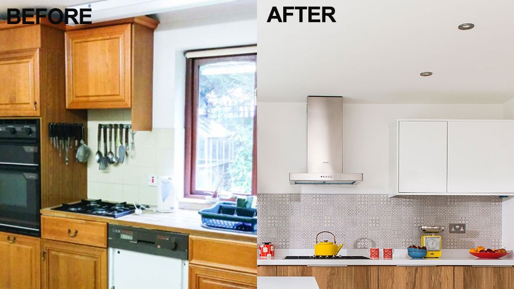
Living in Australia for eight years made the owners of this four-bedroom Seventies detached property in Middlesex look at houses very differently. 'Space and light are more important to us than period features now,' they say. 'When we came to see this house, we knew it was ideal for us, but the kitchen was cramped and its wooden units made the room seem really dark. It all needed sorting out and lightening up!'
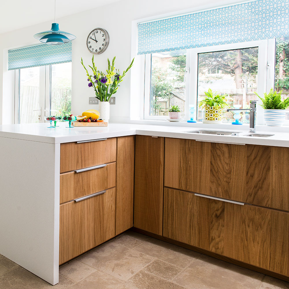
Taking down the wall that separated the kitchen and a dining room brought lots of light and the couple replaced dark wood frames with more practical white versions.
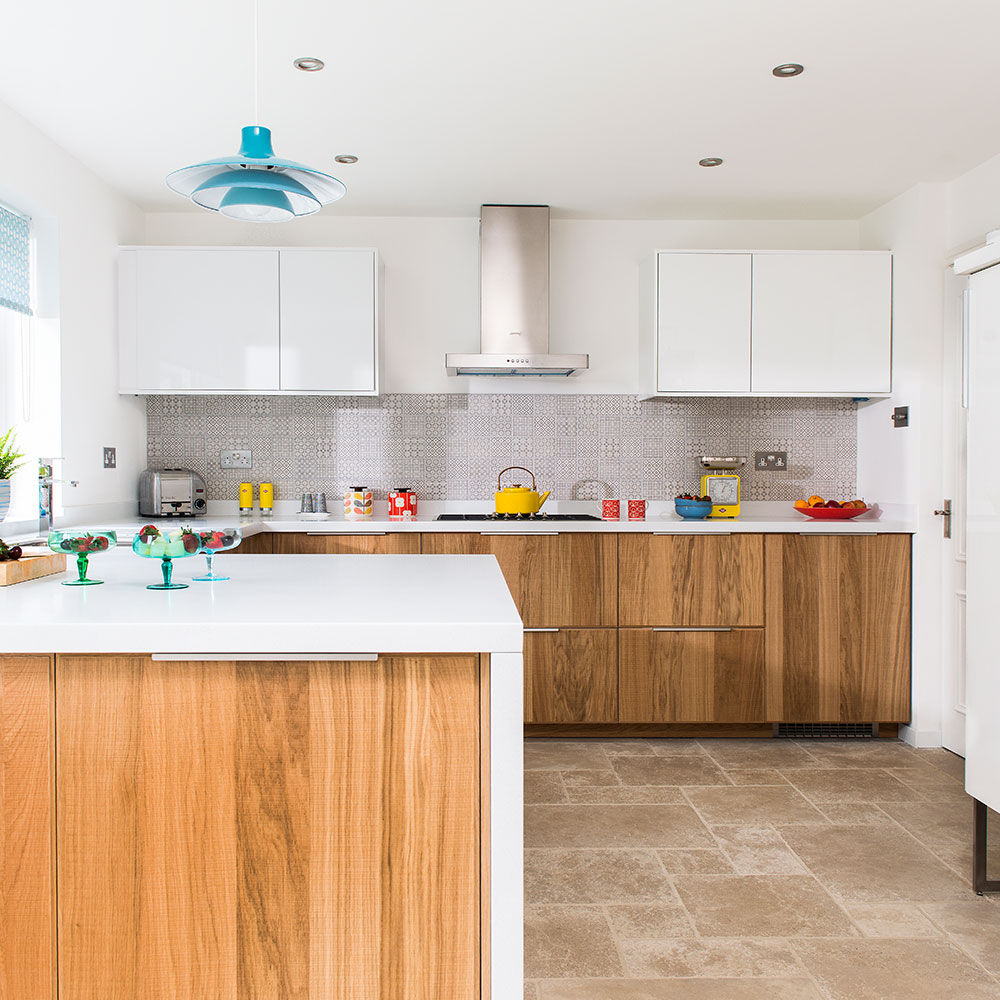
The units were arranged in a U shape, and one edge of this configuration acts as a peninsula, providing a natural separation between the kitchen and dining areas. In fact, this was where the original wall was between the two spaces. The old dining room was barely used so this new layout is a much more efficient use of space.
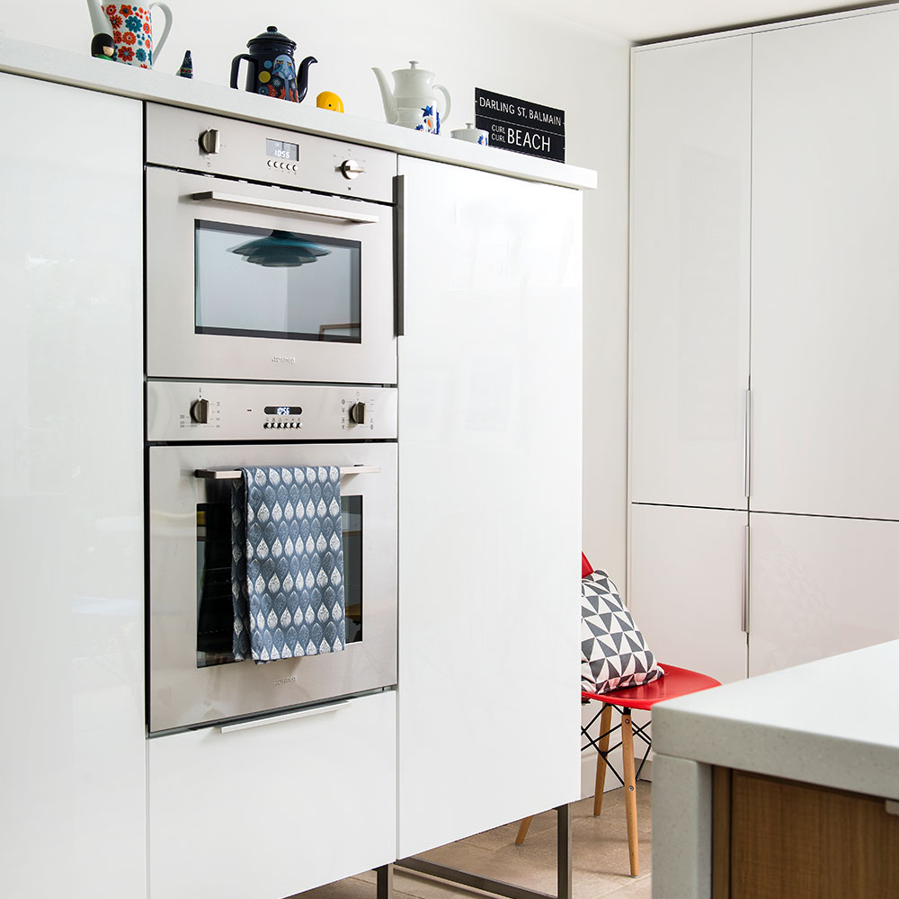
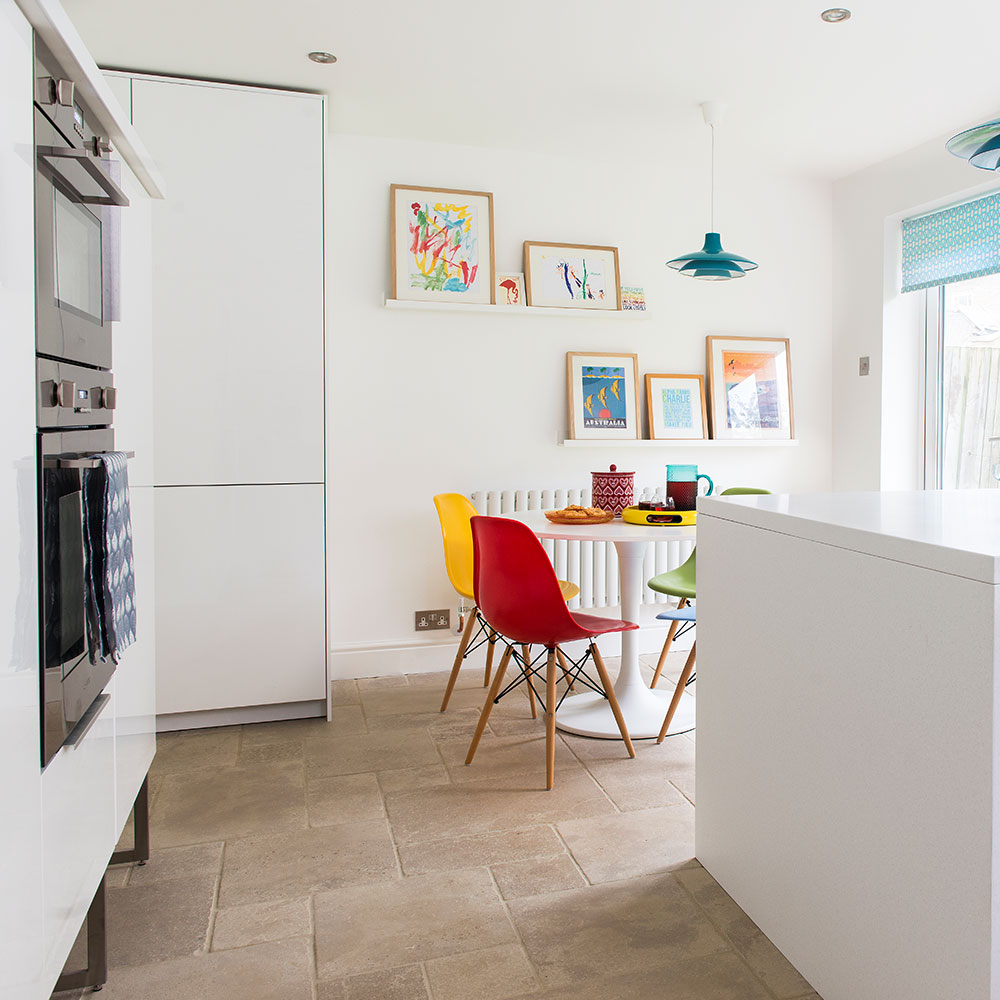
The U shape has also left room on the back wall for a freestanding unit that provides lots of storage. Metal legs raise the cabinet off the ground and add an industrial edge, while also making the kitchen feel larger than it is. Built-in ovens have been placed at a convenient height that requires no crouching to get things in and out.
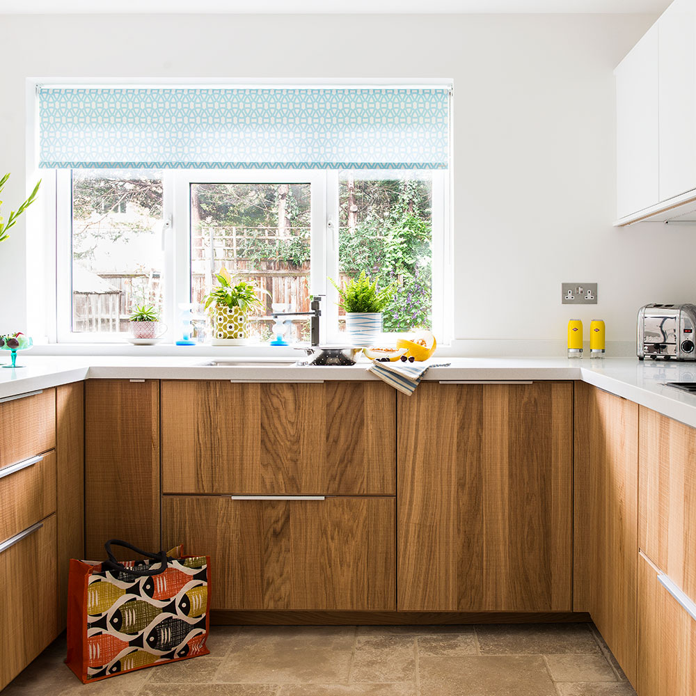
With its clean, streamlined look, the wraparound worktop offers a bright contrast to the wooden door fronts. 'The worktop cost more than the units,' say the owners, 'but any little scratch or stain can just be rubbed away - it's amazing.'
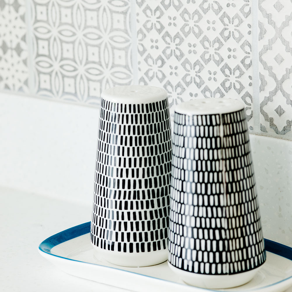
At the back of the room, the couple chose Sixties-style patchwork tiles in neutral grey to add subtle pattern to the splashback.
Get the Ideal Home Newsletter
Sign up to our newsletter for style and decor inspiration, house makeovers, project advice and more.
Swapping the big rectangular dining table for a round one has let the couple fit floor-to-ceiling units in one corner to hide their cleaning materials. A round table also offers a change from all the straight lines of modern kitchen units, creating a sociable spot where the family can gather. Irregular floor tiles in a mix of shapes and sizes make the room feel relaxed and their earthy colour is a practical choice with a young family.
Chairs in primary shades add a burst of vibrancy to the scheme. The dining area enjoys large French windows and views of the garden, which add to the light feel of the space.
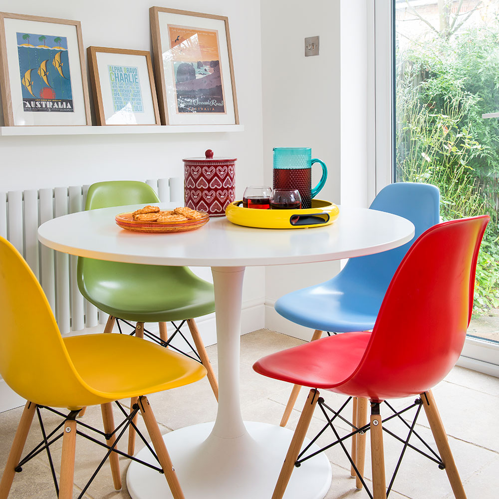
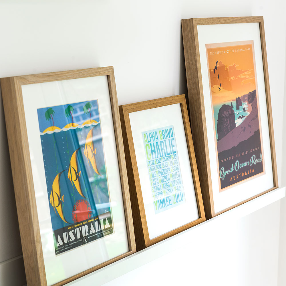
Above the radiator, the owners have mounted a picture ledge, which is ideal for putting colourful framed pictures on display without the need for wall hooks.
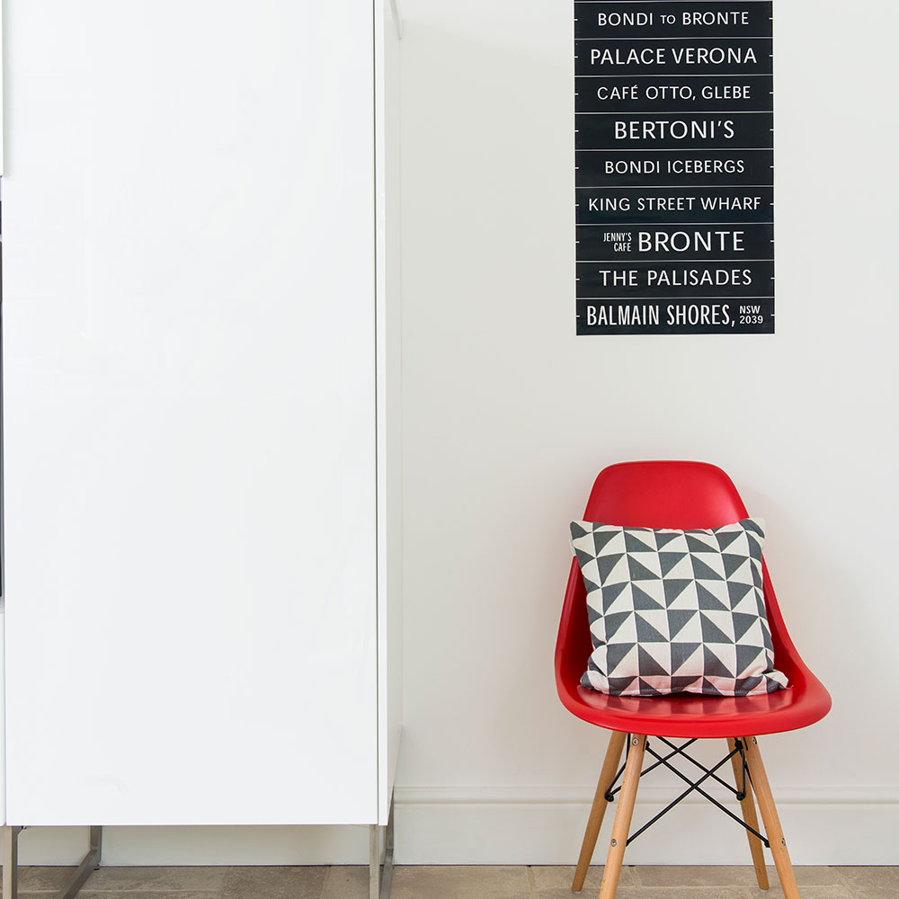
This little corner has been well thought out to tie the two spaces together. A geometric cushion picks out the colour of the splashback tiles, while an additional red dining chair links this little kitchen nook to the dining area.
In total, the build cost £6,000 and took eight weeks. 'The result is better than we'd ever hoped,' say the couple. 'It gives us a lift every morning.'
Get the look
Buy now: Metod/Hyttan Oak units, from £44 for a W40cm unit, Ringhult white gloss doors on freestanding unit, £40, and Docksta table, £130, all Ikea
Buy now: Amazone beige tumbled floor tiles, £66.99 per sq m, and Batik patchwork tiles in grey, £45 per sq m, both Topps Tiles
Buy now: Solid-surface worktops in Cristallo, from £150 per linear m, Maia Worksurfaces
Buy now: Lace Powder Blue blinds, from £140, Scion at Tuiss
Buy now: Spacy tray in yellow, £49.95, Wesco
Buy now: salt and pepper shaker set, £14.99, MissPrint at John Lewis
Buy now: similar chairs, The Conran Shop
This kitchen originally appeared in Ideal Home, April 2017
-
 A strict colour palette and vintage finds have turned this semi-detached Edwardian house into an elegant family home
Sticking to a three-colour palette of green, pink and yellow and mixing in plenty of vintage furniture and art has created an authentic period feel
By Stephanie Smith
-
 A top-to-bottom renovation has turned this Edwardian house into a lovely family home
With a few considered structural changes, this period house has been turned into a family home and has created a sanctuary for years to come
By Maxine Brady
-
 How to heat a conservatory
7 practical options to consider for year-round comfort
By Amy Reeves
-
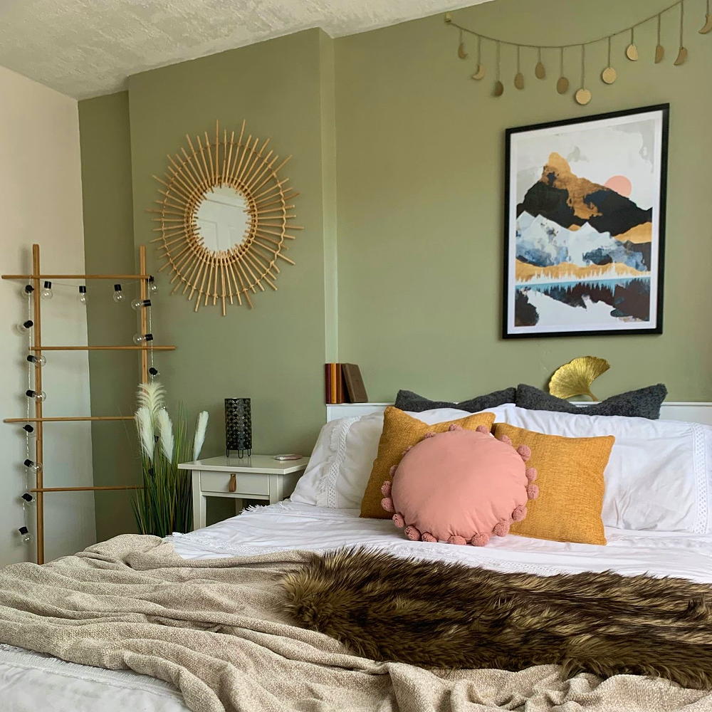 A £3 IKEA hack helped transform this bedroom into a scandi-inspired retreat
It's the ultimate thrifty makeover
By Laurie Davidson
-
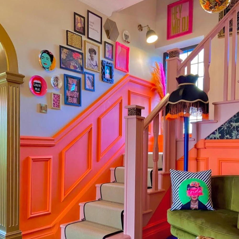 This colourful hallway makeover makes a bold first impression – it’s stunning!
It's a little bit extra and a whole lot of fun
By Laurie Davidson
-
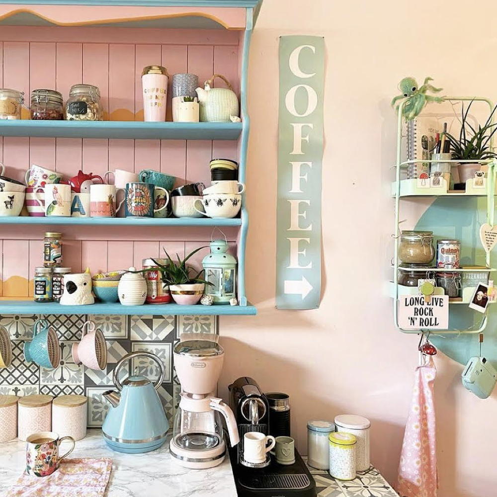 A dull kitchen was given an injection of colour and pattern for less than £250
Eye-popping pastels and gallery walls galore make this scheme pretty unique
By Laurie Davidson
-
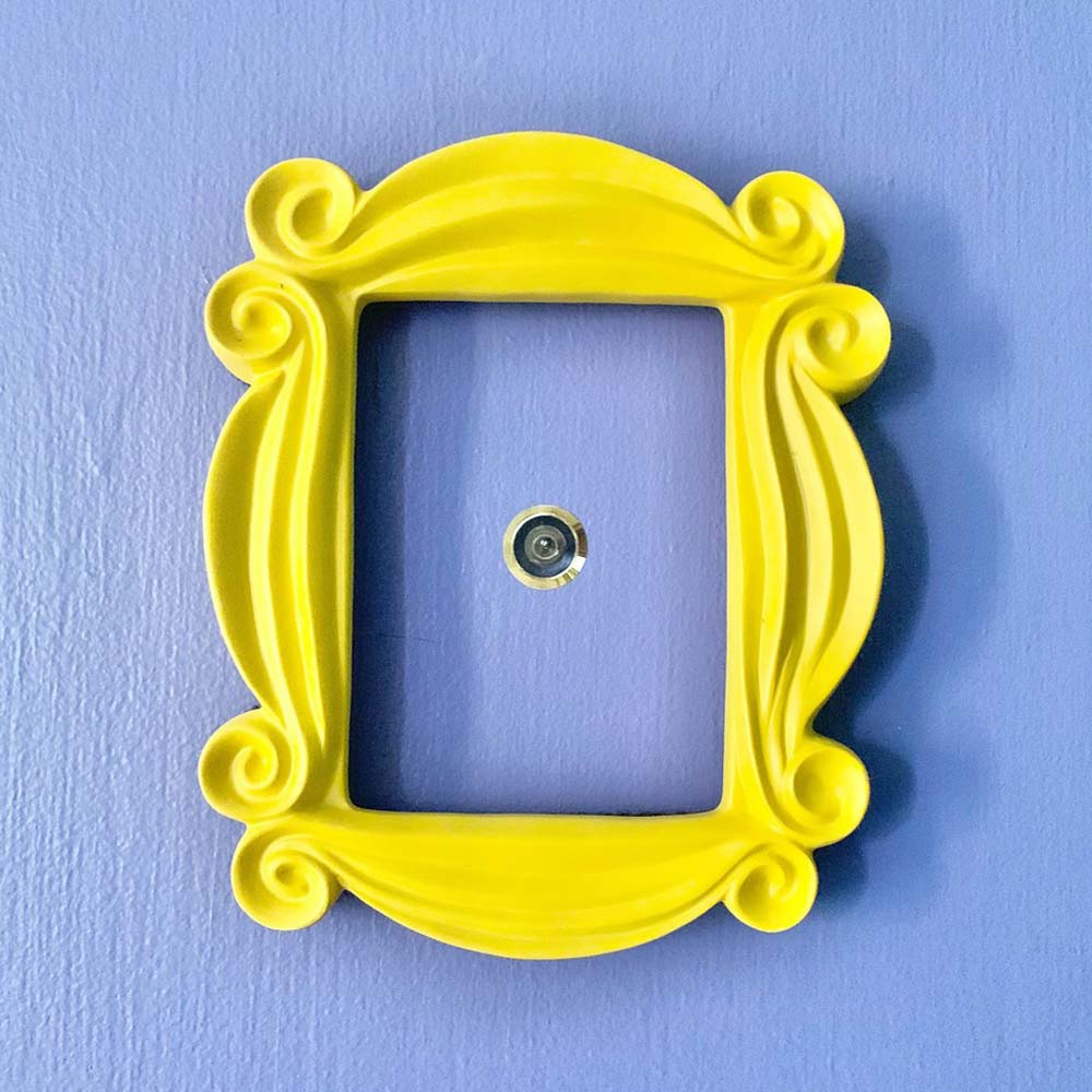 A DIY fan has recreated the Friends kitchen for less than £750
So no one told you renovating was gonna be this way...
By Millie Hurst
-
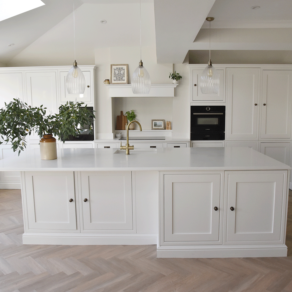 An interiors lover shares her stunning white kitchen makeover
It's now the kind of room you walk into and exhale
By Millie Hurst
-
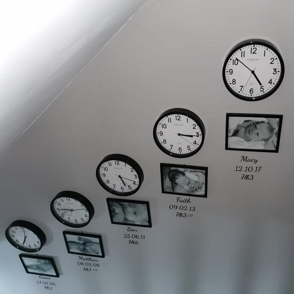 Mum created an adorable hallway tribute to her children for under £80
All it took was some wall clocks, frames and a bit of self-adhesive vinyl…
By Laurie Davidson
-
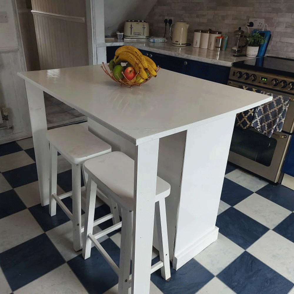 A thrifty DIY fan made a kitchen island for free out of an old set of drawers
'It took two days to complete and cost me nothing!'
By Millie Hurst
-
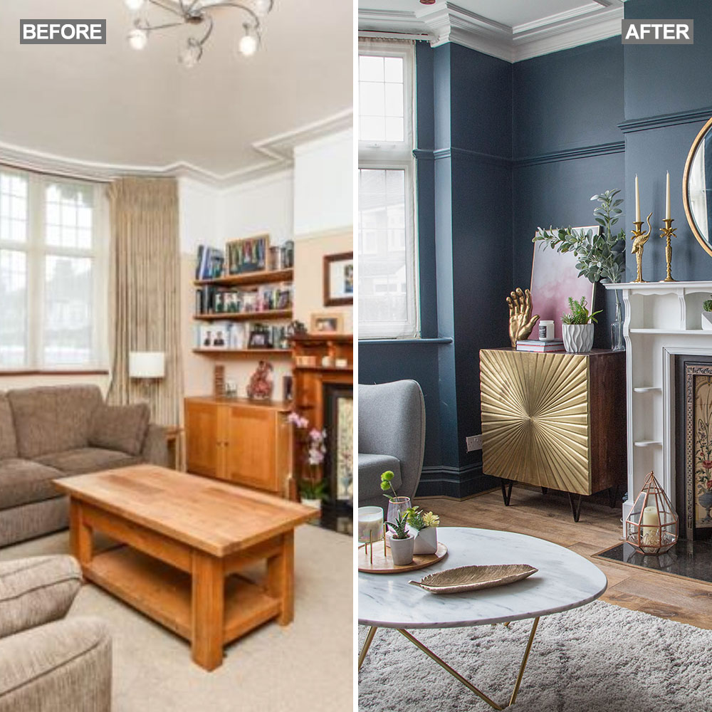 Before and after: A 'boring' neutral living room gets a glam and dramatic makeover
The owners took a risk and banished the beige...
By Amy Cutmore