Before and after: From dated separate rooms to an open-plan kitchen that’s party perfect
Knocking a kitchen and dining room into one has created a light, bright space that's ideal for entertaining
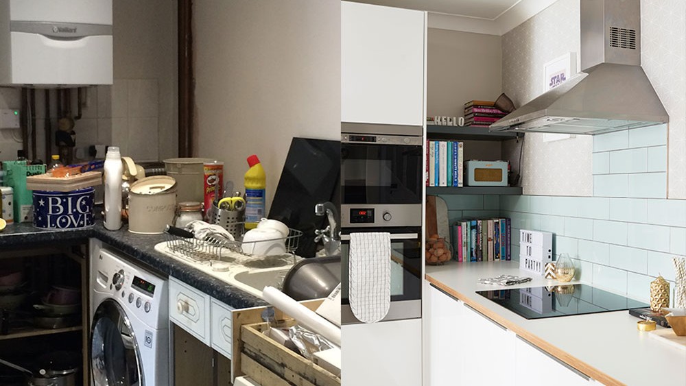

'Location was a big selling point when we bought this house,’ say the owners of this three-bedroom 1930s property in London. ‘Not only is it in a good area, but it offered us more space than the Edwardian terrace we had before.'
However, there was a big downside – the house had been decorated in the early 1990s by the previous owners and hadn’t been touched since. Every room was a different colour with radiators to match the walls. 'The kitchen and dining space were just awful – with all the stuff cleared out, we realised the full extent of the work that was needed,' the owners recall.
The kitchen had four usable cupboards and the preparation area was tiny. Plus the room was lit with blue lightbulbs and the boiler needed replacing, which was an unexpected cost. Two arches led from the kitchen into an old conservatory. The owners filled one of them, which helped to define the kitchen and family space, and they squared the other off, for a contemporary feel.
Renovating your kitchen? Read How to plan a kitchen – your step-by-step guide to the perfect space
They had never undertaken a renovation on this scale before. Everything had to be ripped out and replaced, the plumbing and electrics had to be updated and walls had to be plastered. 'The kitchen floor was a mix of blue carpets and blue vinyl, which was hideous – and the terracotta rag-roll effect wallpaper didn’t help! We had to live in the house while the work took place and we couldn’t afford to do it all in one go, so we had to do it bit by bit. It was a tough couple of years.'
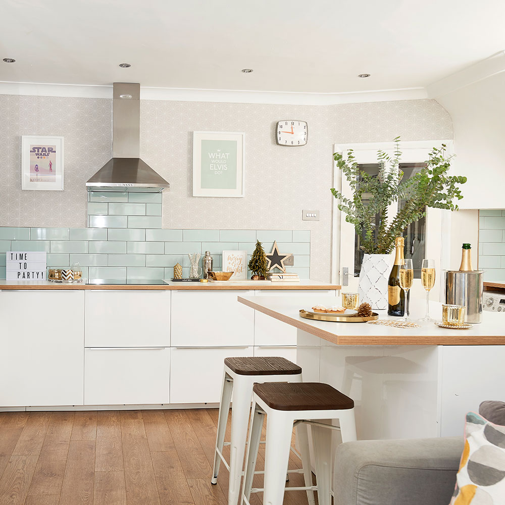
'Our first job was to was replace our boiler as it was deemed unsafe from the moment we moved in. We also plastered the walls – this step was transformative as it redefined the space to suit our life. We couldn’t afford to go bespoke, but the space is awkward and we needed something beyond standard units. In the end we worked with Ikea and an independent kitchen fitter to figure out a design that worked for us. We had to make compromises, but we got there.'
'We chose white glossy units from Ikea because we liked the simple design, they offer a 25-year guarantee and were much more affordable than other options we’d seen. They also came with clever storage options, such as small drawers within larger drawers, which meant we could customise the kitchen to our needs.'
Get the Ideal Home Newsletter
Sign up to our newsletter for style and decor inspiration, house makeovers, project advice and more.
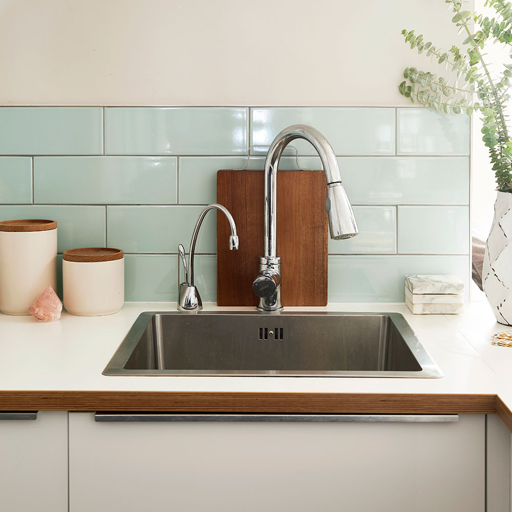
The couple gave up a double oven in order to squeeze in order to afford to fit in a boiling water tap, which they say seemed like a big deal at the time. 'We don't even think about that oven now, as we are still so thrilled with the tap.'
Get the look
Buy now: Langudden sink, £70, Ikea
Buy now: GN1100 steaming hot water tap, £579, In-Sink-Erator
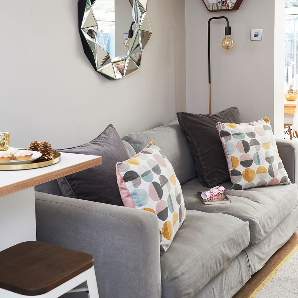
Having a sofa in the same space as the kitchen lets the kids watch TV while the owners cook.
Get the look
Buy now: Gallery Round Faceted Mirror, £119.99, Very
Buy now: French Connection Coast three-seater sofa, £998, DFS
See the transformation! Before and after: from poky kitchen to extraordinary extension
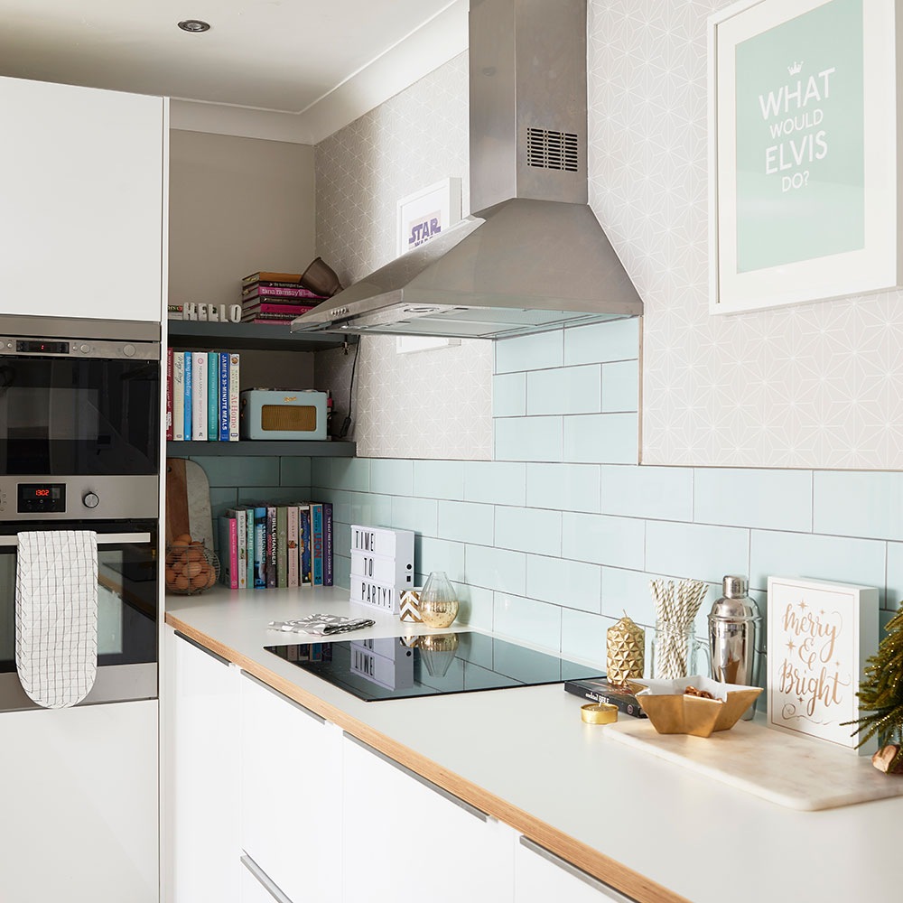
Bespoke shelving is great for making the most of an awkward corner and gives the owners somewhere to stash their cookery books.
Get the look
Buy now: What Would Elvis Do? print, £25, Notonthehighstreet.com
Buy now: Wellington Blue ceramic wall tiles, pack of 33, £19.80, B&Q
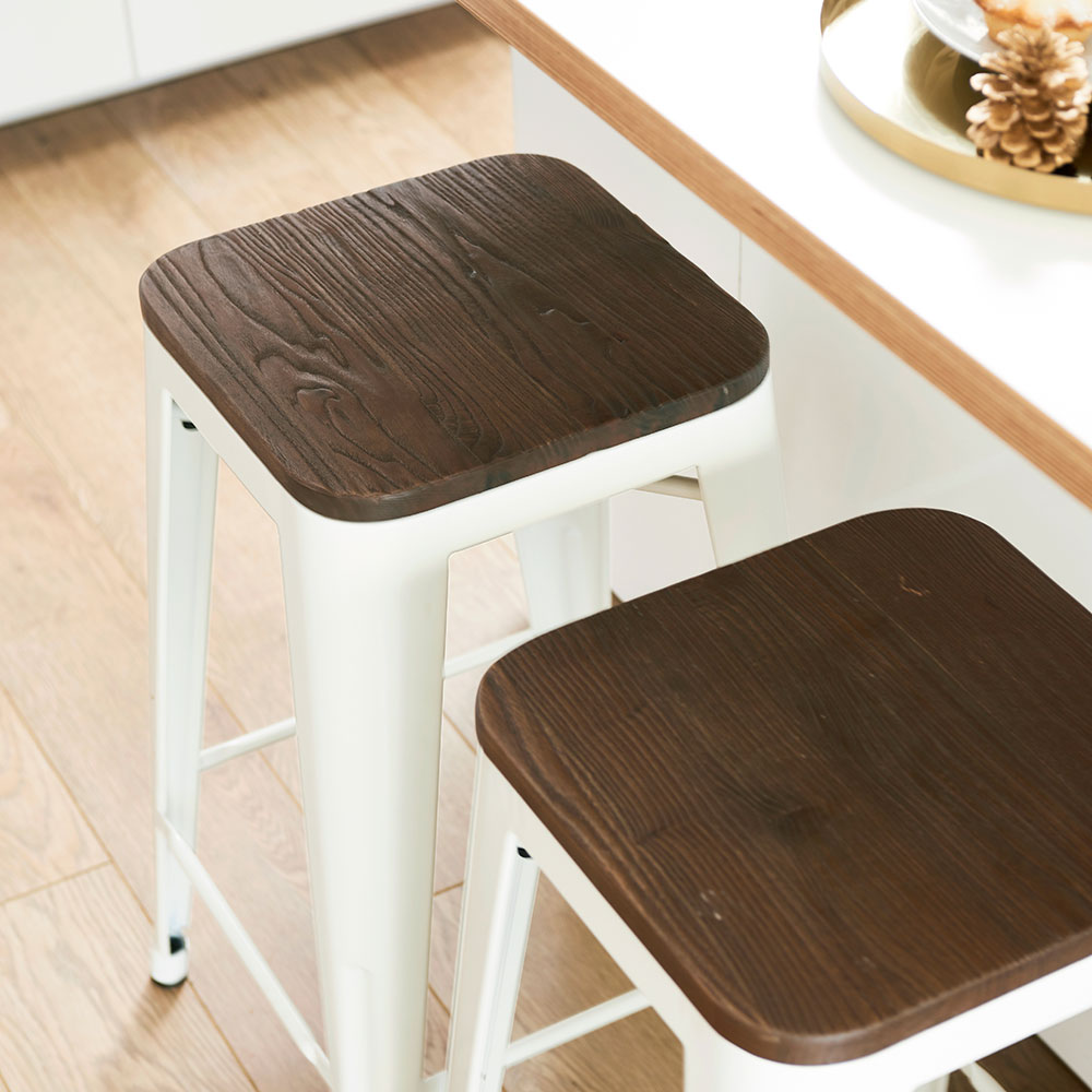
'We bought the bar stools from eBay. Our girls often sit here, doing their homework.'
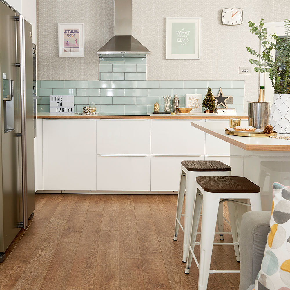
Want to see another kitchen makeover? Before and after: creating a kitchen-diner fit for a growing family
'The hob isn’t as close to the sink and dishwasher as I’d like, but despite that, I’m so happy with what we’ve achieved – the space has been completely transformed. After two years of living in a building site, we’re thrilled with the results. I love how light and modern it is now and it’s great for both family living and entertaining – especially at Christmas.’

Amy Cutmore is an experienced interiors editor and writer, who has worked on titles including Ideal Home, Homes & Gardens, LivingEtc, Real Homes, GardeningEtc, Top Ten Reviews and Country Life. And she's a winner of the PPA's Digital Content Leader of the Year. A homes journalist for two decades, she has a strong background in technology and appliances, and has a small portfolio of rental properties, so can offer advice to renters and rentees, alike.
-
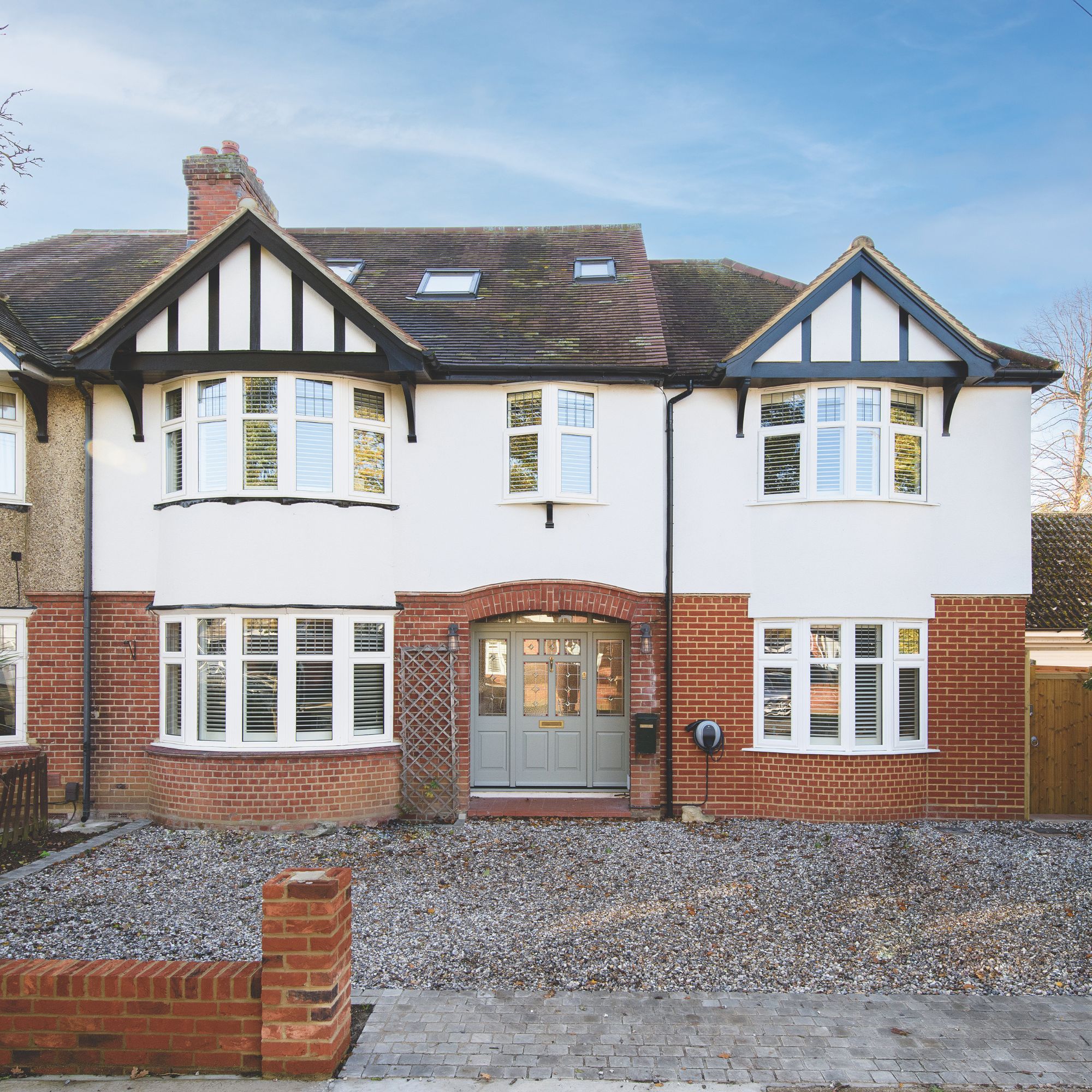 Who is responsible for repairing a party wall?
How to find out who should be organising and paying for the work
By Natasha Brinsmead
-
 Overcoming limited space and doing away with an awkward layout, this couple created a family kitchen filled with elegant touches
The symmetrical layout is full of luxurious details
By Holly Reaney
-
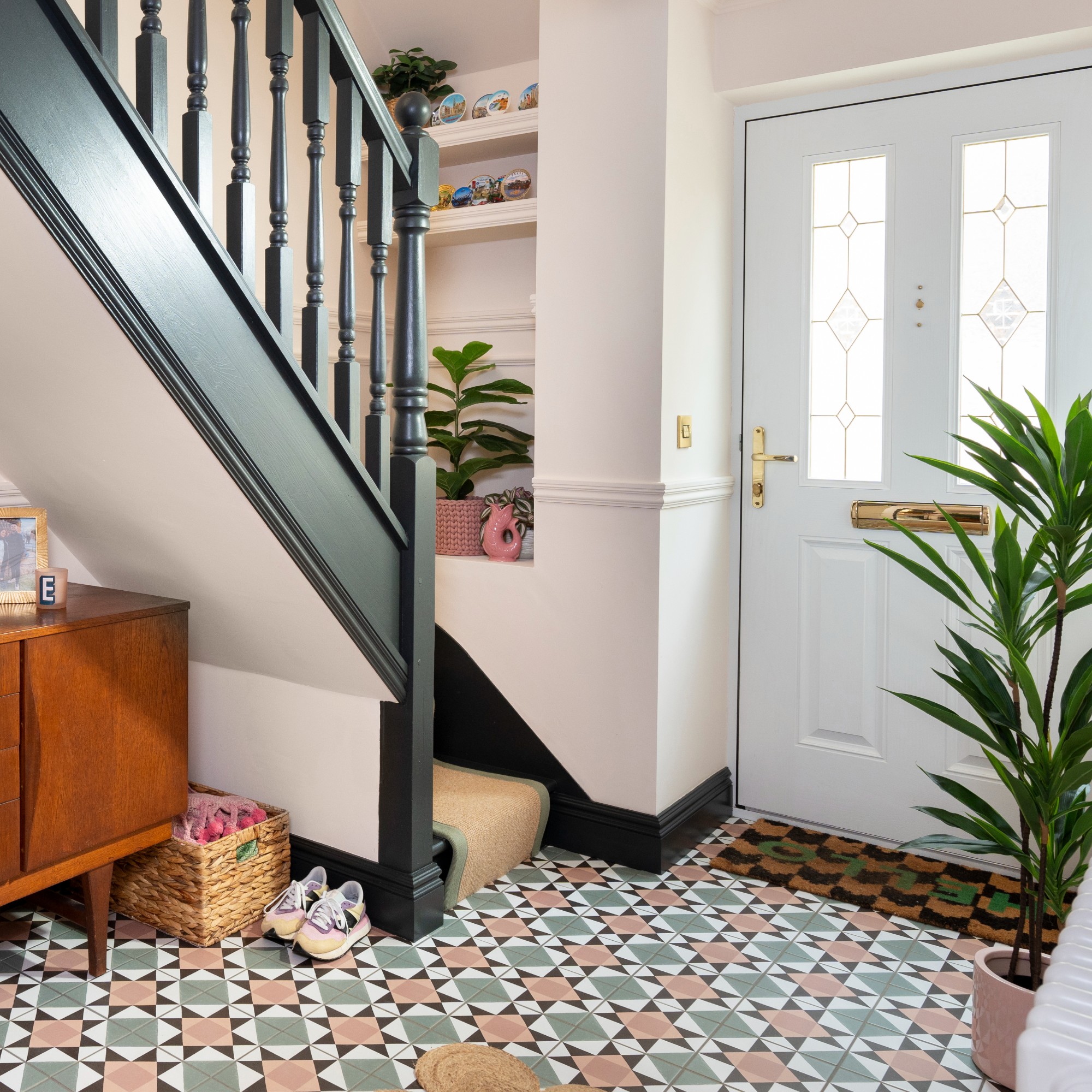 Should your doormat go inside or outside the front door? According to experts I've been getting it wrong for years
Experts reveal the best spot for a a doormat based on your preferences and where you live
By Sara Hesikova