Kitchen panelling is trending - here are 8 ways to achieve this affordable but luxury look
This small design detail will have a big impact on how stylish your kitchen looks


Kitchen panelling ideas are a simple way of adding flair to your cooking space in an affordable way. Whether it's on the side of an island, the full stretch of a wall or behind a sink, wall panelling adds a warm and trend-led look while also practically disguising electrical work and blank walls.
'Including wall panels in a kitchen design is a great way of creating visual interest and texture, so it’s no wonder that more homeowners are incorporating them in their kitchens,' recommends Ruth Lavender, design expert at Benchmarx Kitchens.
It comes in many different styles to suit the aesthetic of your kitchen ideas too. Narrow panelling in wood-tones will lean into a natural Scandi look while painted tongue and groove panelling is the perfect touch to a traditional space.
Wondering where to start? These panelled kitchen ideas will help you incorporate the look into your space regardless of how bold you want to go.
Kitchen panelling ideas
Kitchen wall panelling has solidified as a popular kitchen trend that instantly makes a space look 'in the know'. And the beauty of this stylish feature is that you can really choose how statement to go. If you're looking for a bold wood look, consider adding to cabinet fronts, but if you want to start small, showcase it behind stools underneath an island.
'You can use wood panelling in your kitchen, and across various areas, and either leave it natural or paint it – the choice is yours! What wood panelling does do, is add texture and definition to yours walls that paint alone won’t do', advises Richard Davonport, managing director at Davonport.

With a Distinction in Furniture Design and Cabinet Making, and knowledge from his father Aubrey Davonport, an honorary member of the British Woodcarvers Association, Richard went on to set up his own workshops and later, the Davonport brand, who specialise in creating bespoke kitchen furniture.
1. Go for a classic look
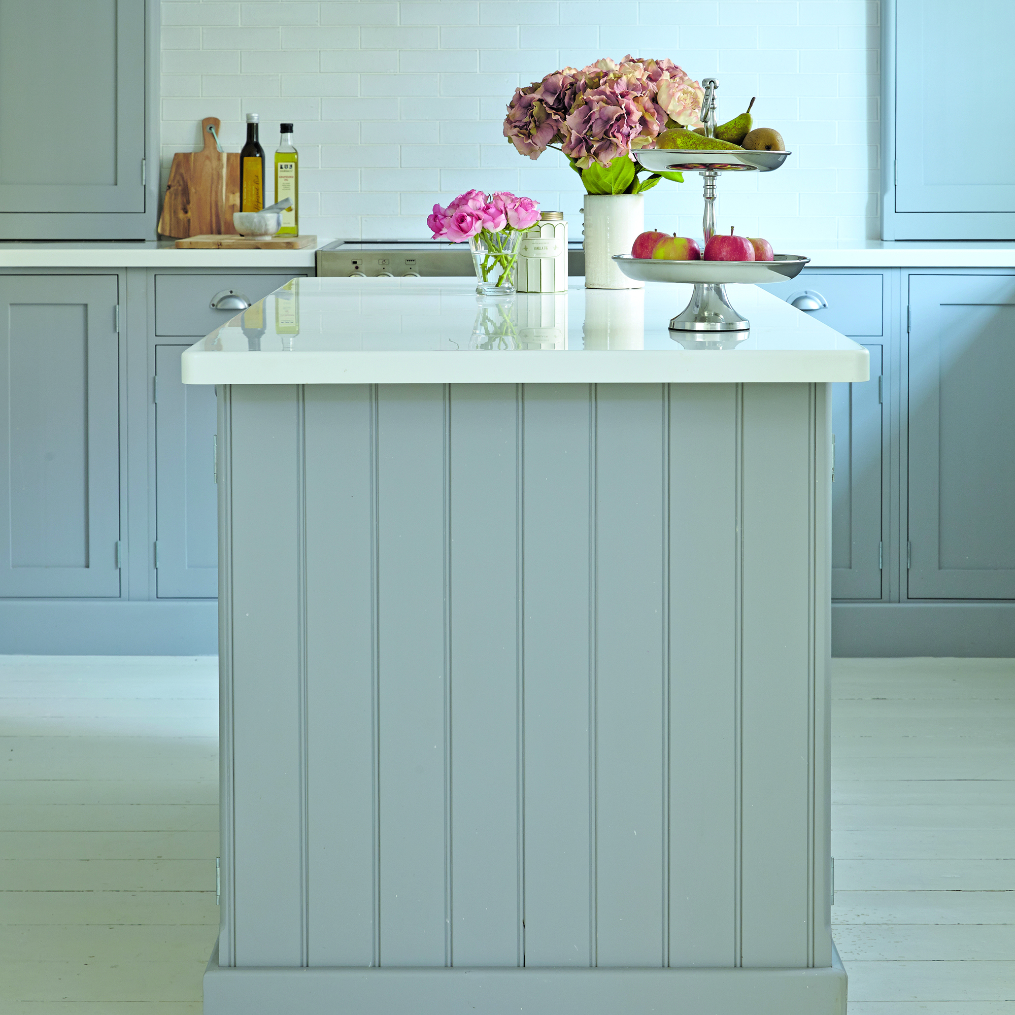
Classic wide tongue and groove panelling will instantly add to a traditional kitchen idea. If Shaker kitchen ideas are what you're leaning towards then adding a panelling effect to the edges of an island will take the classic aesthetic even further.
Colour will also have a big impact here. A kitchen island is the perfect place to experiment with a statement shade that differs from the rest of your cabinets, but equally matching the palette to the rest of the kitchen in a muted neutral tone will let the panelling stand out.
Get the Ideal Home Newsletter
Sign up to our newsletter for style and decor inspiration, house makeovers, project advice and more.
2. Add interest behind a sink
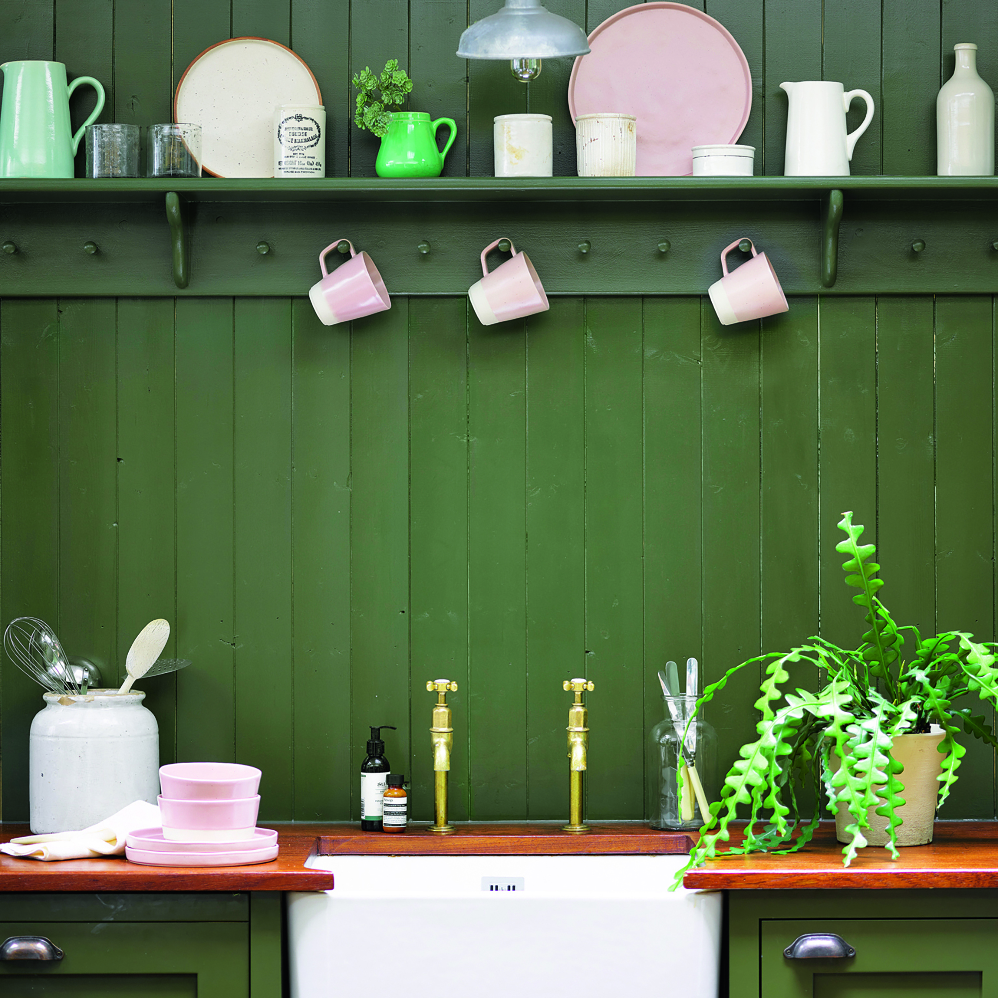
If your sink isn't positioned below a window then washing up can become a bit monotonous with no view to look out onto. Wall panelling is a clever fix for this as it adds interest to the area.
Panelling is also well suited to an eclectic farmhouse aesthetic so adding an open shelf and pegs for hanging kitchen utensils and cleaning supplies will not only make your space more practical, but it will also look perfectly undone.
3. Feature on the underside of an island
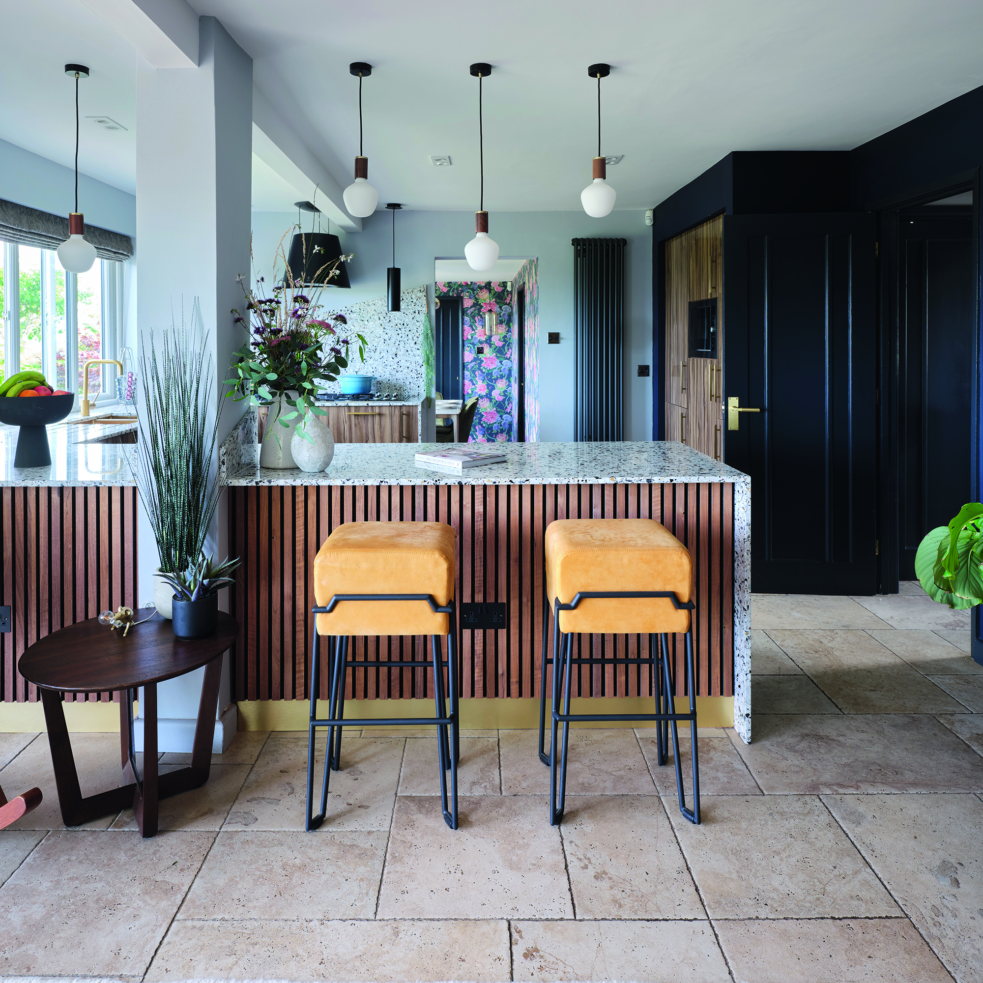
If you're wanting to zhuzh up your kitchen design but don't want something too 'in your face' then adding panelling to the underside of an island is the perfect antidote.
For those in certain areas of the kitchen, it will be visible, but it won't overwhelm the core design. It's also easy to DIY as you can purchase the panelling strips from retailers such as B&Q and adhere them yourself. It's an affordable solution to upgrading your kitchen design without refurbing the cabinets.
'Another popular choice is fluting on islands. Taking inspiration from Egyptian architecture, it’s a simple yet effective way to add detail – through both colour and material' Ruth adds. 'I’d recommend having the fluting on the side of the island facing away from your main kitchen cabinet wall – this means you won’t compromise on storage, as your cupboards and drawers will be hidden on the other side of the island.'
4. Zone a dining area

Use kitchen wall panelling to your advantage by placing it behind a seating area to help zone the space. Open-plan kitchen ideas will benefit from panelling in specific areas as it defines cooking and dining spaces so that they're visually separate but physically connected.
Building panelling into a bench will also create a bistro-inspired look that is ideal for enticing family and friends to sit and linger. Plus, painting in a statement shade, like red, will add flair to a kitchen without committing to brightly coloured cabinets.
5. Disguise storage with panels
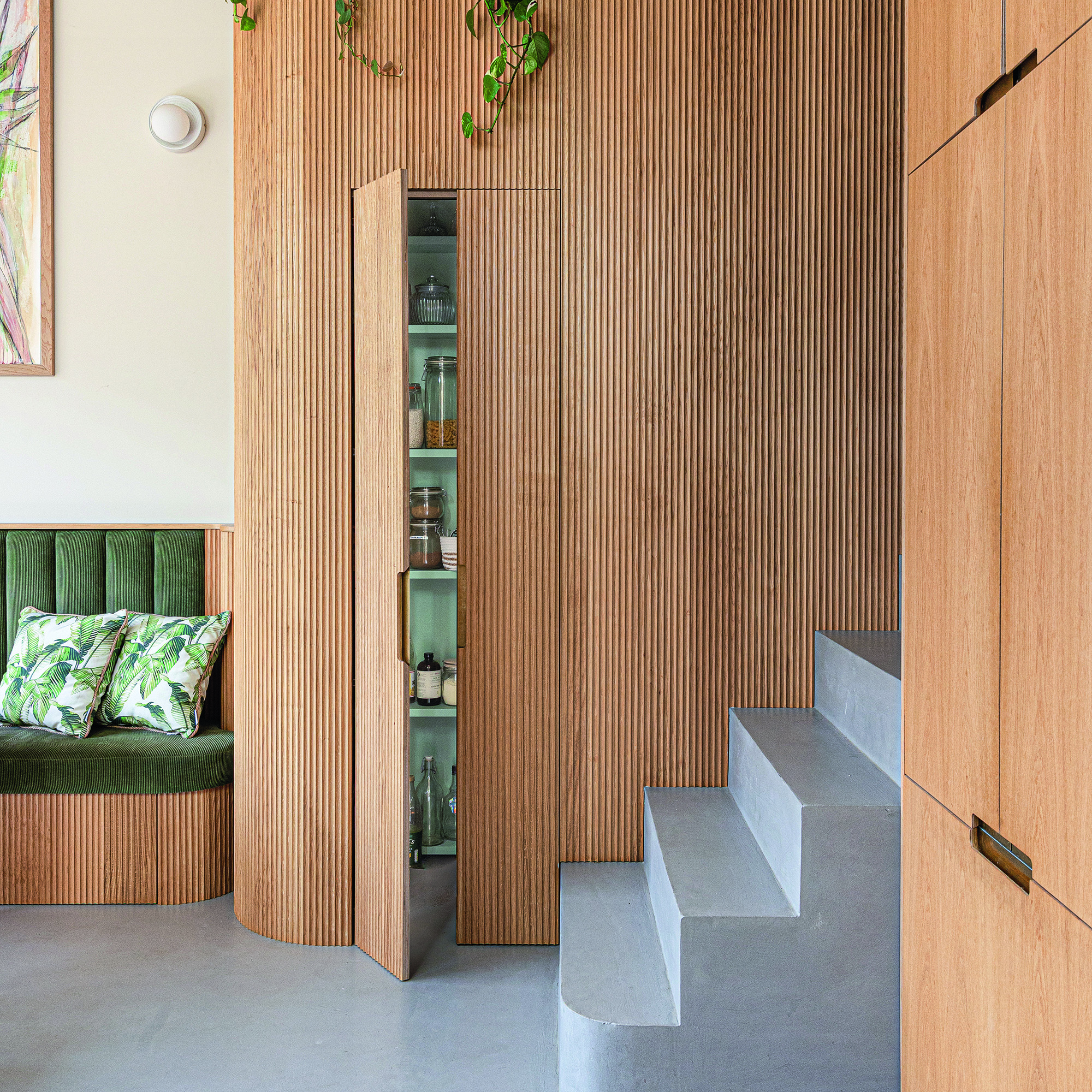
Long, thin panels are great for disguising joins and doors in a kitchen as the breaks look very similar to the gaps between the panels themselves. Therefore, they're effective for creating a more streamlined design.
If Scandinavian interiors are up your street then incorporating reeded cabinet fronts will make a kitchen feel flowing and sophisticated. Plus, if including as many kitchen storage ideas as possible is essential to your planning process, then panelling is a clever way to subtly hide an abundance of drawers and cupboards.
6. Create a feature wall
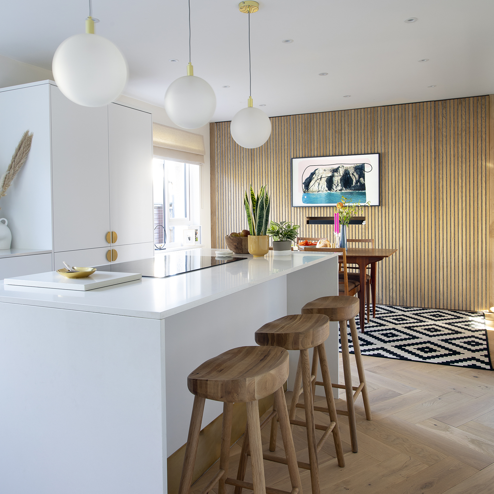
If you're looking for a budget kitchen idea to upgrade your space for less (or without undergoing an entire renovation) then committing to wall panelling across one blank wall will have a big impact.
Painted feature walls have had their moment and colour drenching has instead become the latest paint trend for kitchens, but if you're not ready to commit to overhauling each wall then a stretch of panelling is the next best thing.
'Installing panels across a full wall creates a feature, especially when paired with kitchen cabinetry of the same or a contrasting finish. For example, combining timber fluted and slatted panelling with nature-inspired tones, such as greens and blues, provides a feeling of earthy serenity,' adds Ruth.
It's also an update that you can DIY yourself as panelling can be purchased in long runs - so, minimal cutting required. Instead, you can pretty much just adhere onto your wall without worrying about matching up patterns as you would with wallpaper.
7. Add interest to empty spaces
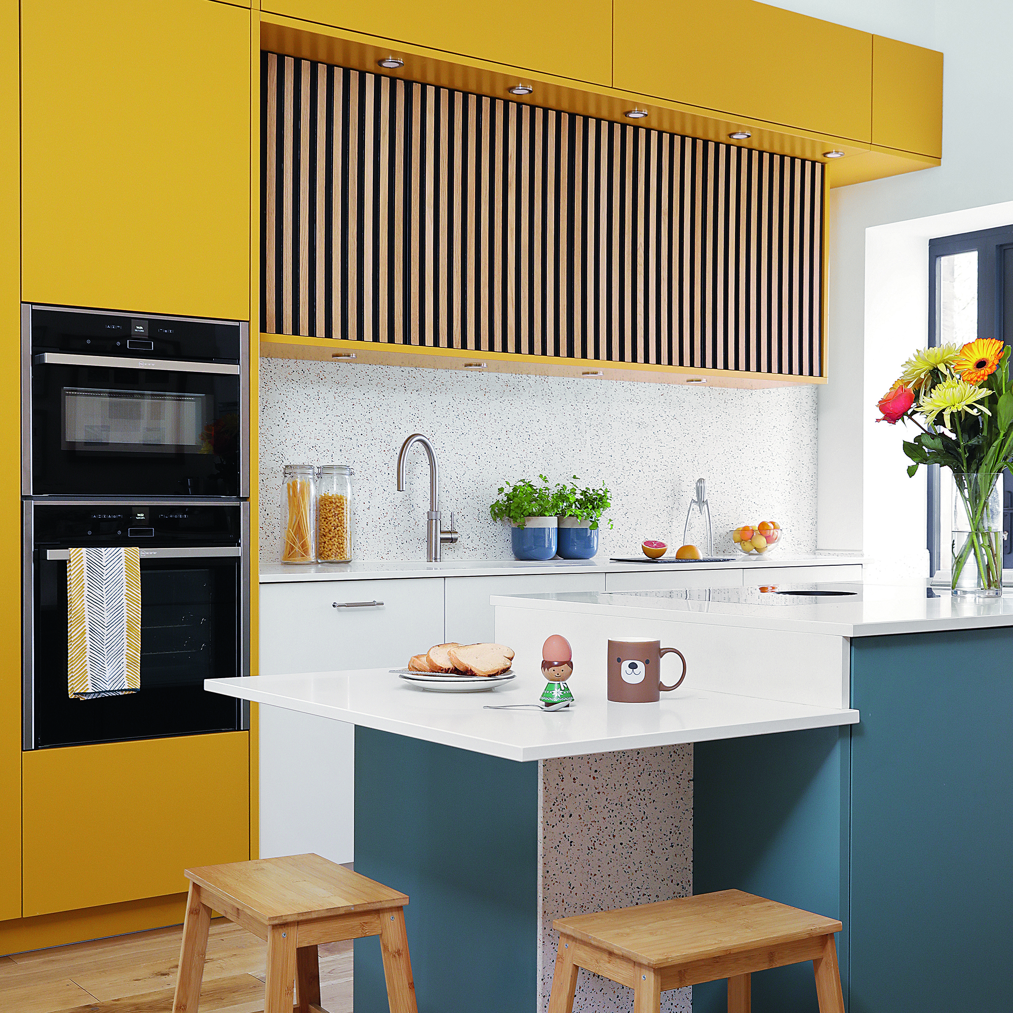
Often when considering how to plan a kitchen layout, you may find that there are areas of dead space where you can't utilise for storage, but need to add some kind of cabinet or plinth in. Instead of opting for a plain plank of wood to hide electrics or an extractor fan, for example, consider adding panelling to the area so it functions as a decorative feature.
It will add character to a layout and is low-cost, making it a great alternative to a longer stretch of backsplash that could set you back more money.
8. Max out with reeded cabinet doors
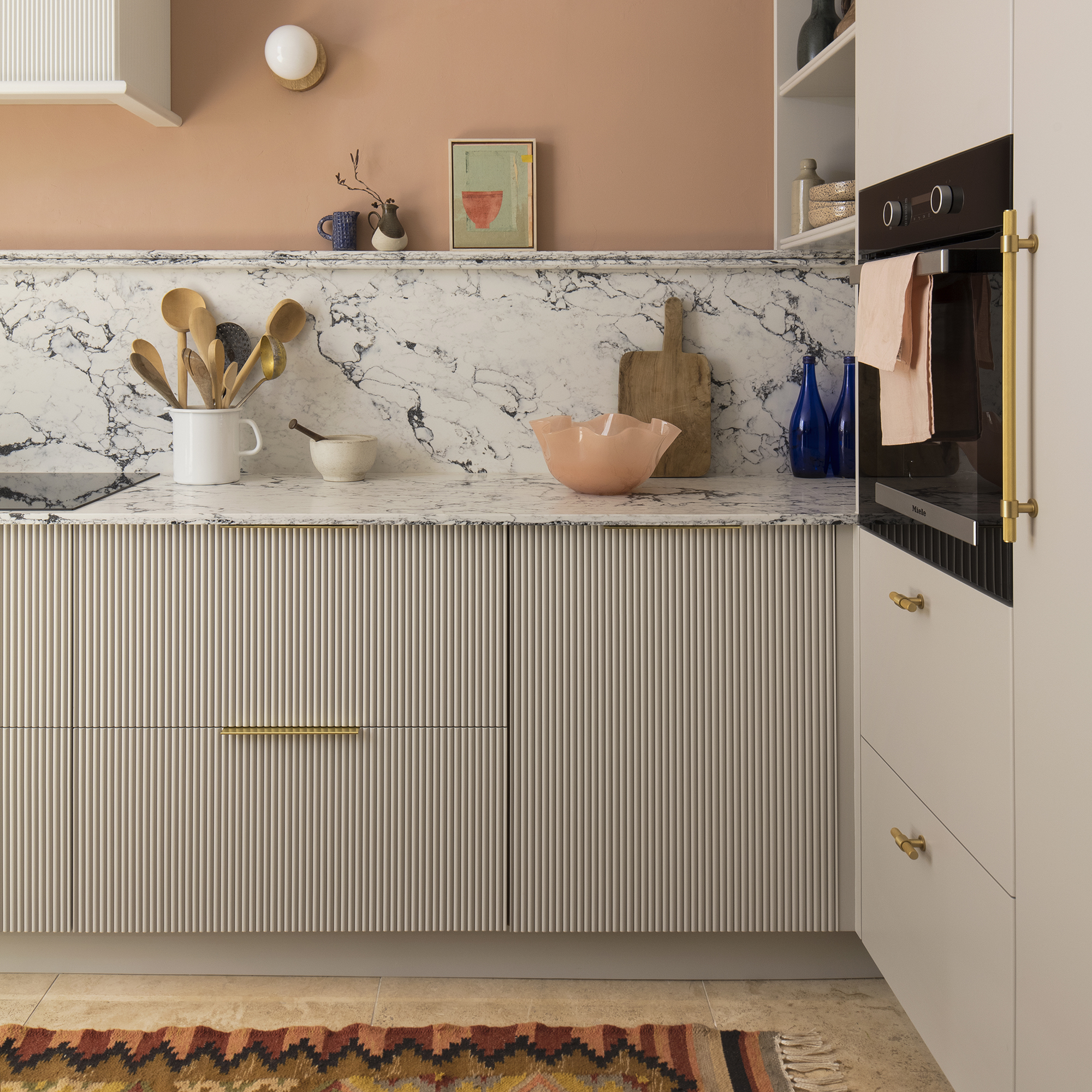
Already a fan of kitchen panelling and not afraid to take it one step further? Turn to reeded cabinets for a more tactile design.
'Reeded kitchen cabinets are a fun way to bring texture and the curve trend into your kitchen space,' says Melissa Klink, creative director at Harvey Jones.
'The reeded design creates a modern finish and helps bounce light and shadows across the room. They can be used as a statement piece highlighting a particular section of the kitchen or across all cabinets for an impactful design.'
FAQs
Is panelling cheaper than tiles?
Sticking to a budget in a kitchen renovation is essential, and there can be many unexpected costs that increase your end total. So knowing which options can save you a little bit of cash is always useful.
Panelling is often cheaper than tiles, especially when applied to an area where you can DIY it as opposed to paying for labour costs too. It can be bought off the shelf in high street DIY stores and requires minimal tools to apply it, making it generally more affordable than tiles which can add up cost wise. Plus, tiling tends to need a higher skill set so unless you're confident in your abilities, it's wise to pay for professional help.
Ready to look into how to add this update to your kitchen?

After starting out her journey at Future as a Features Editor on Top Ten Reviews, Holly is now a Content Editor at Ideal Home, writing about the very best kitchen and bathroom designs and buys. At Top Ten Reviews, she focussed on TikTok viral cleaning hacks as well as how to take care of investment purchases such as lawn mowers, washing machines and vacuum cleaners. Prior to this, Holly was apart of the editorial team at Howdens which sparked her interest in interior design, and more specifically, kitchens (Shaker is her favourite!).
-
 I spent the afternoon looking through Wayfair's garden sale – these are the 6 pieces I'm buying immediately for summer
These are my must-have garden buys from the sale
By Holly Reaney
-
 Stripes have got a bold new look – here’s how to make the trend work in your home, according to interior experts
Add a pop of personality to the classic pattern
By Maddie Balcombe
-
 What to do if you've sown the wrong grass seed – experts reveal exactly how to fix it and get your dream lawn back on track
Don't panic! Follow this easy guide to putting it right
By Natalie Osborn