Experts warn against falling for these 10 kitchen island design mistakes
The kitchen island design mistakes to avoid for a successful scheme
Sign up to our newsletter for style inspiration, real homes, project and garden advice and shopping know-how
You are now subscribed
Your newsletter sign-up was successful
A kitchen island can offer huge benefits, from extra storage and a central cooking zone to a sociable space for entertaining family and friends - providing you get it right. There are a number of kitchen island design mistakes to avoid, so we've spoken to experts who have highlighted the pitfalls and how to prevent them when considering your kitchen island ideas.
'When planning your kitchen island you need to consider it’s functionality,' says Lizzie Beesley, Head of Design at Magnet. 'Will there be integrated appliances, a breakfast bar area with chairs, and/or different levels of work area?
'The area around the kitchen island should be accessible and safe. Movement around the kitchen and units should be easy, so this will need to be factored in. This area is known as the clearance zone, and will take into consideration how much space you have to work with and how you use your kitchen.'
Article continues below10 Kitchen island design mistakes to avoid
If you're buying your kitchen from a kitchen company, its in-house designers should alert you to the errors to avoid. However, if you're designing your kitchen island yourself, here are the potential pitfalls.
1. Not enough space between the island and cabinets
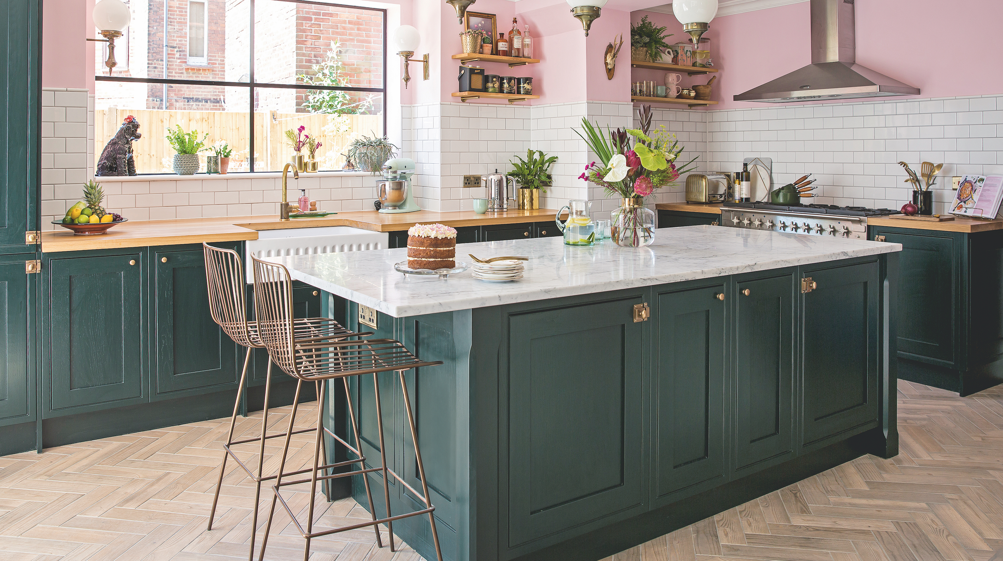
It's important to allow for enough space for more than one person to comfortably move between the kitchen island and the cabinets around the perimeter of your kitchen.
You'll also need to ensure you can open doors and drawers safely and without banging into each other. This is incredible important when planning any small kitchen island ideas.
'The best proportions for a kitchen island depend on how you intend to use it. If you are planning on using the space as just a surface to prepare food, then we would recommend keeping at least 1m between any surround walls or appliances,' says Brian McCoy, Category Head of Kitchens & Appliances at B&Q.
Sign up to our newsletter for style inspiration, real homes, project and garden advice and shopping know-how
'If you intend to use your island for dining purposes and would like to add in some stools, then it would be worth increasing this to at least 1.2m if possible.'
2. Too little overhang for a breakfast bar
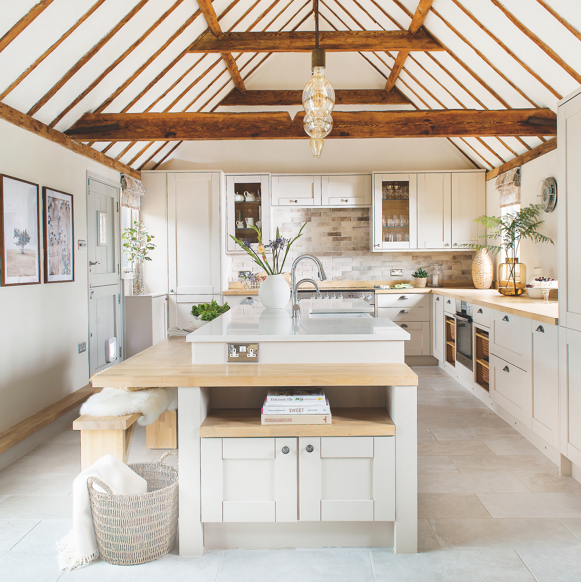
Having an extra casual dining space, such as a breakfast bar, is one of life's small luxuries. However, it has to be somewhere you actually want to sit and eat, so factor comfort - and style.
'A typical overhang for a comfortable seating area should be around 250-300mm, this should leave enough knee room and adequate space between the countertop edge and the person seated,' says Lizzie Beesley, Head of Design at Magnet.
'Therefore, as the depth of the overhang increases, so does the comfort and usability of the bar. For example, if a breakfast bar is likely to be a main dining space rather than an occasional seating area.'
3. An awkward seating area
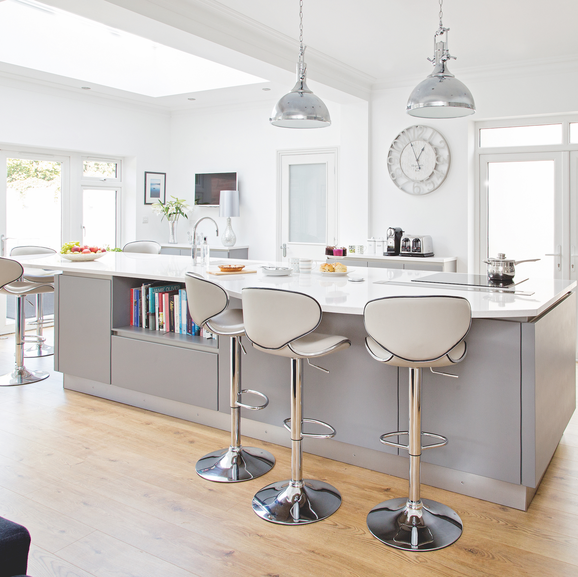
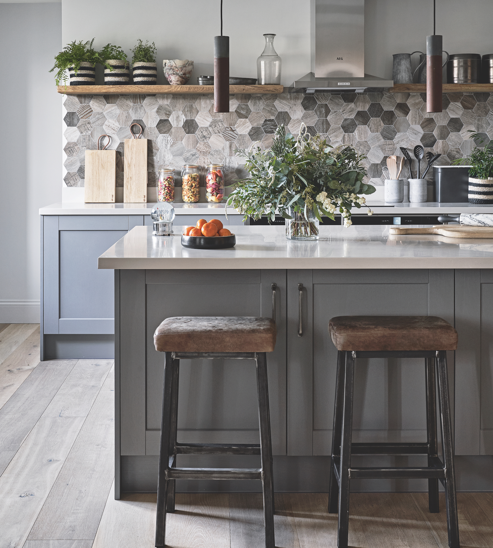
When deciding which side to place the overhang for the kitchen island seating ideas, consider what's behind the seating, where are the cupboard doors, what diners will be looking at and the amount of space between them. You don't want people blocking access to the oven, cupboards or fridge, squeezed in like sardines, or looking at a wall when there's a lovely view of the garden.
'Whichever side you decide to place the overhang, just make sure you are taking note of the flow of your kitchen,' says Brian McCoy from B&Q.
'Think about how you already use the space, doorways, cupboards and then make your decision based on these factors.'
4. An uncomfortable height
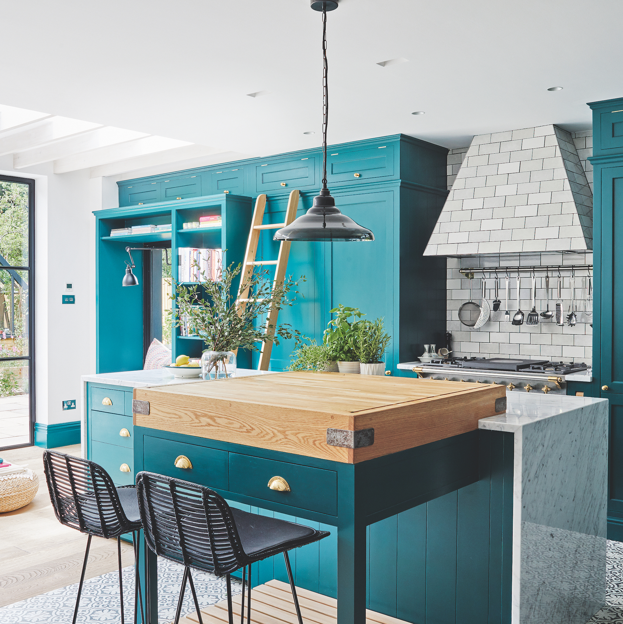
The kitchen island needs to be at a height that is comfortable for you to stand while you're cooking. As well as suitable for pulling up a seat if that's what you intend.
'Typically breakfast bar height is in line with the worktop counter, which in the UK usually varies between 850-900m with an average of 870mm from floor to the underside of the work surface,' says Lizzie Beesley at Magnet.
'Counter stools are most common in the home kitchen or breakfast area. They range between 58-72cm seat height. Bar height stools are used at taller breakfast bar areas. These areas are usually raised above the standard kitchen worktop height allowing for a feature seating area. These stools tend the range between 74-82cm'
5. Too big or too small for the space
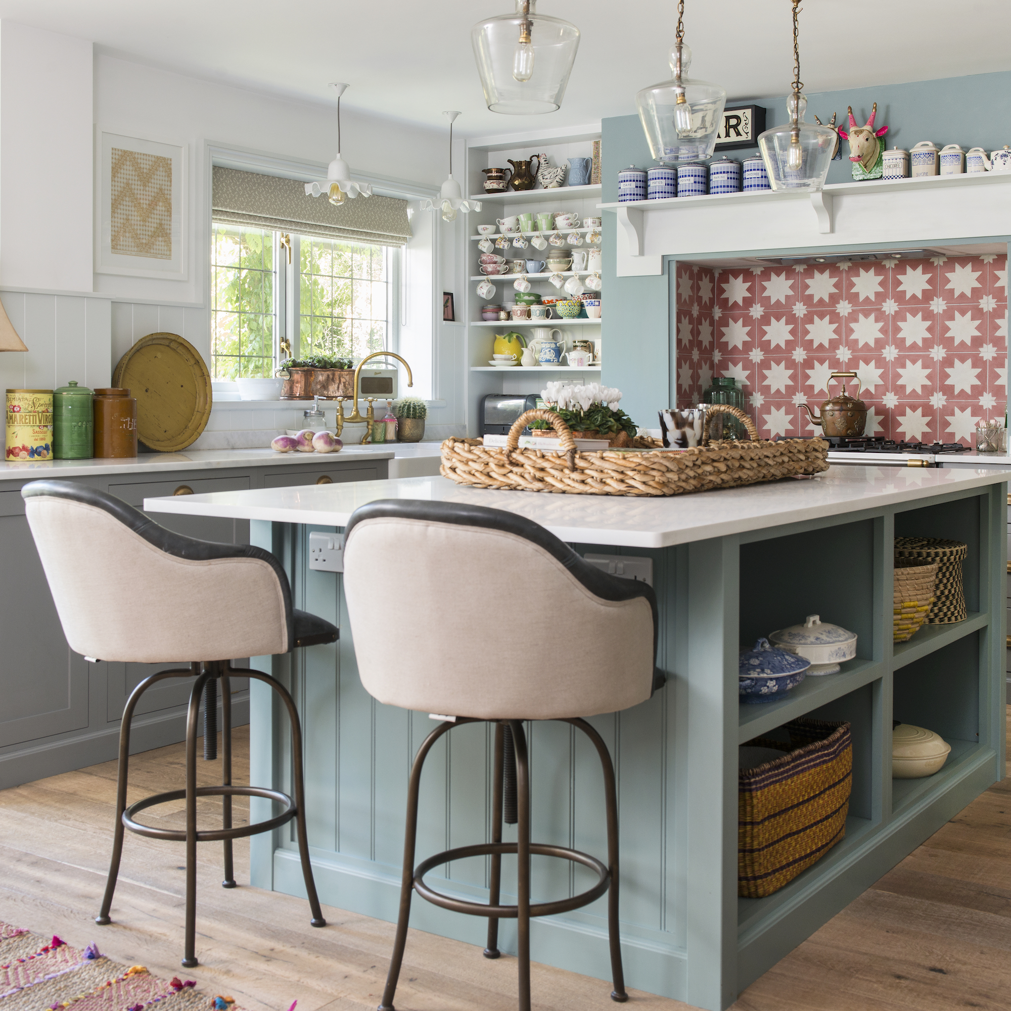
Size is important when it comes to kitchen island design, but so is the proportion in relation to the rest of your kitchen ideas.
'When starting out with designing your kitchen island, the key is to achieve a harmonious balance between functionality and aesthetic, says Scott Peterson, co-director, HKUK.co.uk
'The biggest mistake you can make is becoming too ambitious with plans and not thinking about the size of your kitchen. Always ensure your dream layout fits, otherwise you could hinder your use of the space rather than maximise it.'
6. Undefined areas
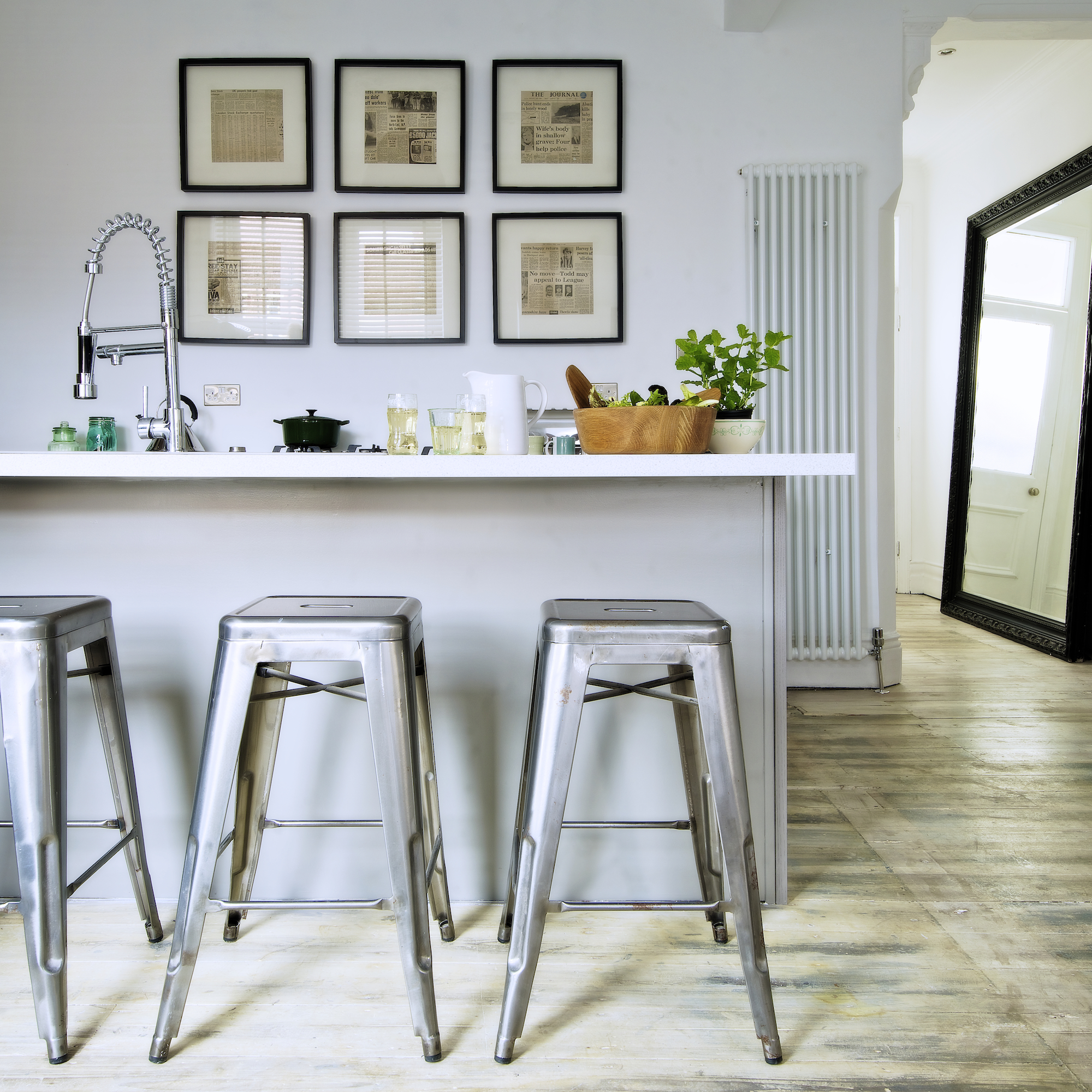
Work out which sections of your kitchen island are for preparation, cooking or socialising, and whether you want to include any kitchen island sink ideas. You don't want your guests sitting in front of the bin, or so close to the hob they're in danger of being splashed by a stir fry or sizzling steak.
'Those who love to entertain should consider adding an induction hob to their island so they can always face their guests and involve them in the culinary experience,' says Scott Peterson, co-director, HKUK.co.uk.
'Keep the hob and sink in separate spaces to better define the social area and ensure any dirty prep dishes or glasses are out of focus.'
7. Not enough plug sockets
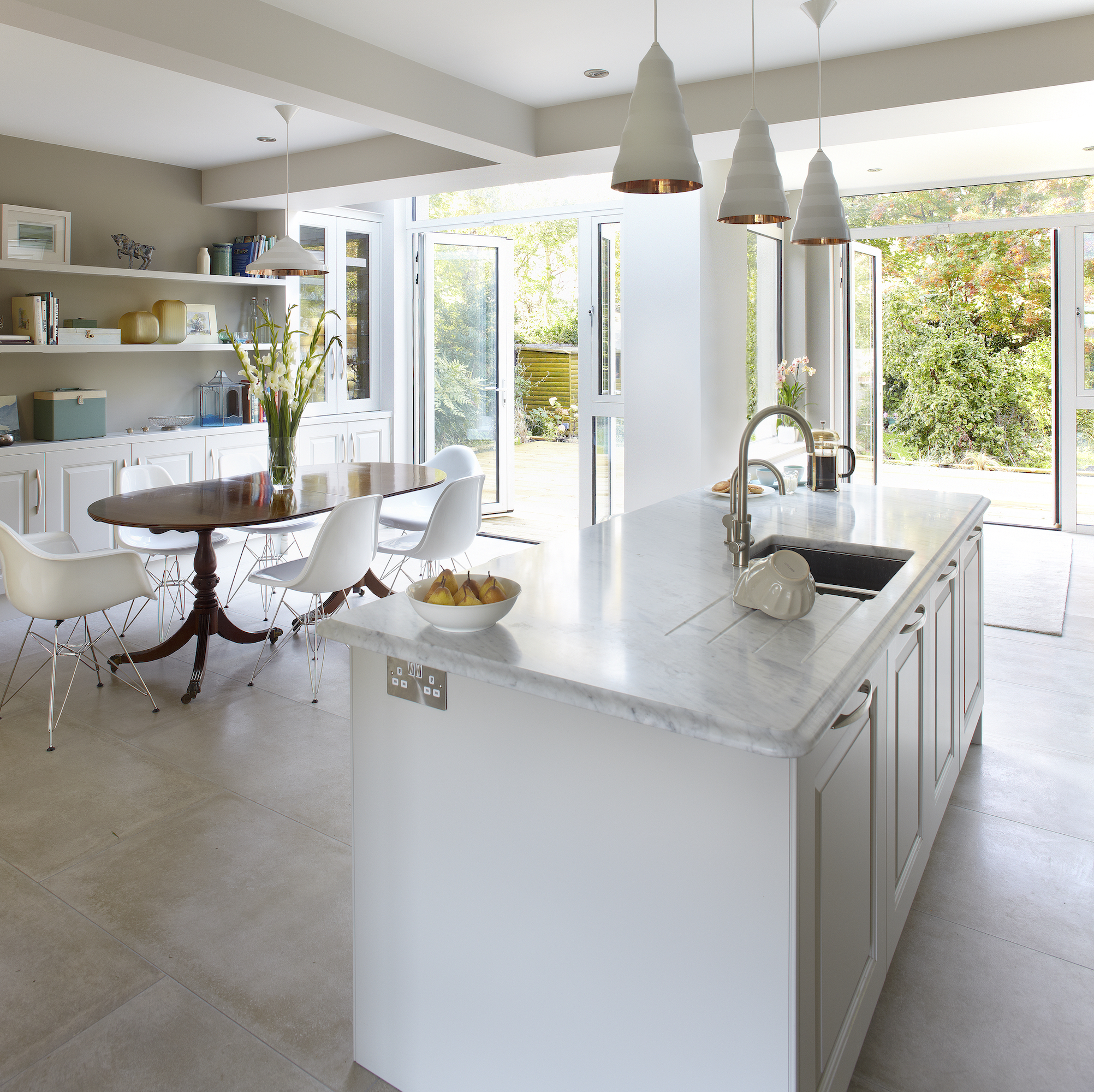
When choosing your island design, an easily overlooked part, is where to locate the plug sockets and how many to have.
Think about your lifestyle, what you like to cook and other tasks you do in the kitchen. Do you need to be able plug in a whisk or food mixer for whipping up favourite bakes?
Will the toaster and nutribullet be hidden behind closed doors? What about a charging drawer for phones and tablets, or a socket for vacuuming the kitchen floor?
8. Insufficient lighting
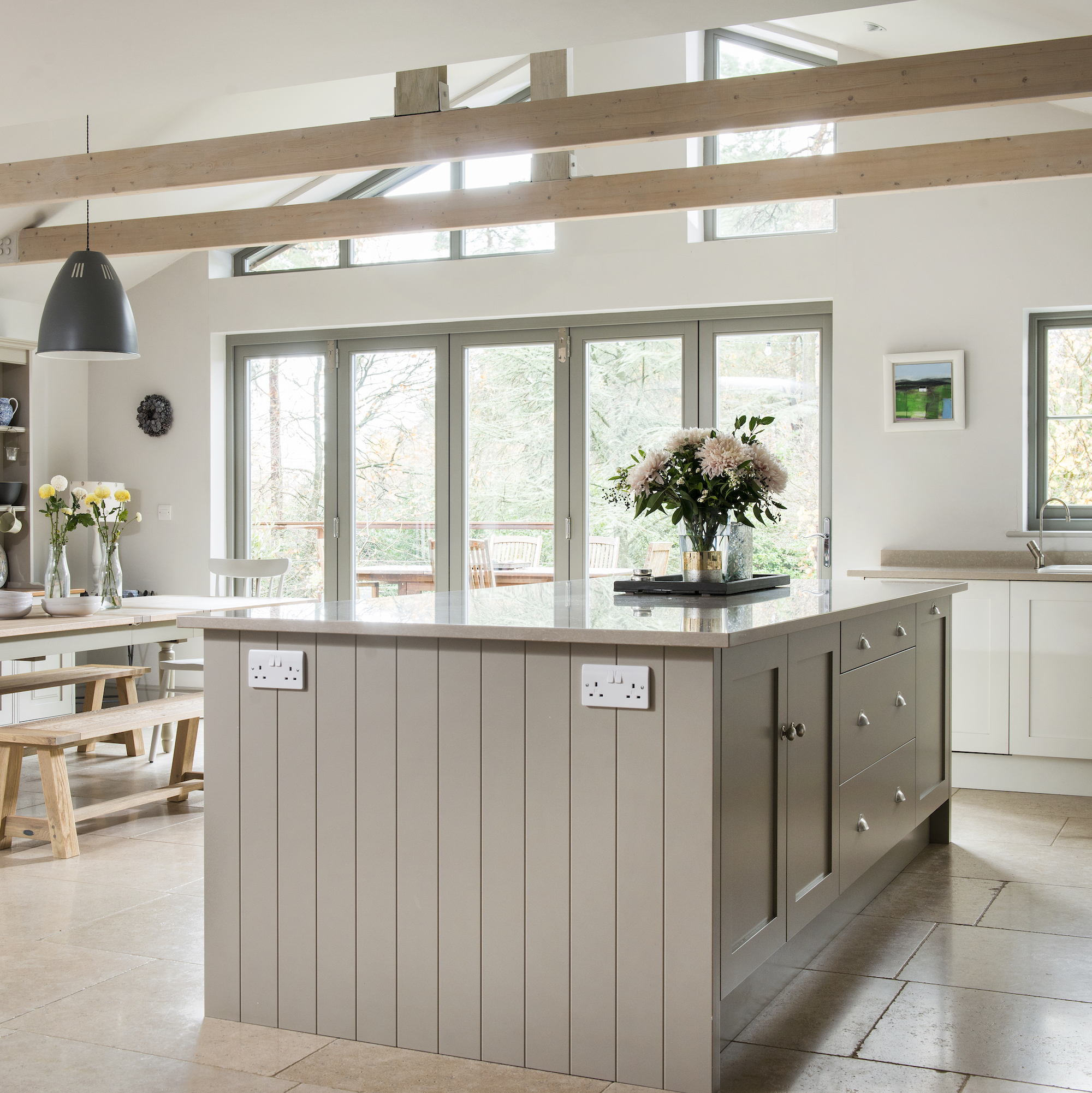
More often than not, a kitchen island provides extra work space, so it needs to be sufficiently illuminated, so you can chop, fry and boil safely. Ideally a choice of task and ambient lighting is best for kitchen island lighting ideas, so you can switch the mood in an open-plan kitchen-dining space.
‘The best lighting schemes involve light from a variety of sources, all of which should be controllable, allowing you to alter the mood at will,’ says Richard Moore, design director, Martin Moore.
‘A combination of ceiling spots, pendant lights and freestanding lights offers a multitude of potential effects, transforming the kitchen from practical work zone to relaxed entertainment area. Modern lighting controls can also allow you to program in a variety of pre-set levels.’
9. Too much focus on the floor
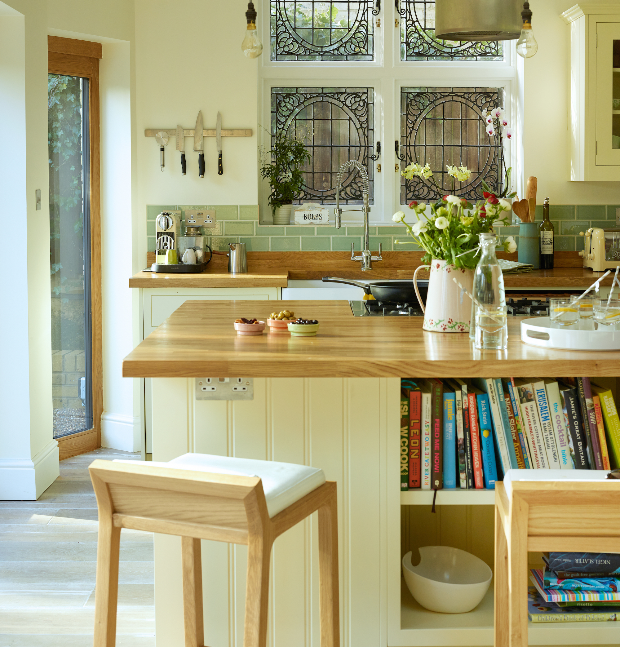
The options for lighting a kitchen island are vast, from overhead pendants and adjustable spotlights to plinth LEDS but be aware of exactly what it is you want to illuminate.
'Plinth Lighting is great for those that have a cleaner, great for ambience and a feeling of space,' says Emma Cowburn, senior kitchen designer, Harvey Jones. 'But be honest with yourself. If you have kids or pets, you might find the plinth lights highlight mess! A nice alternative is lighting under the breakfast bar.'
10. Forgetting to future-proof your island
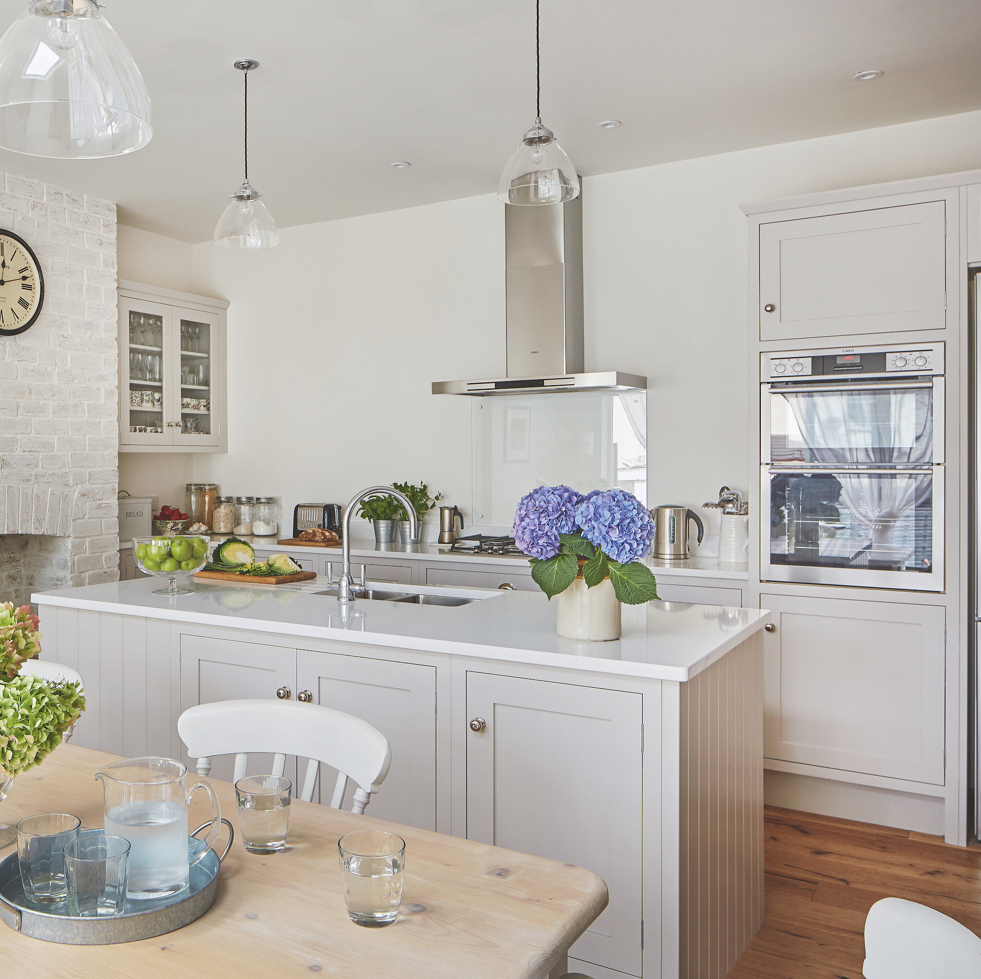
Kitchens don't come cheap, so if you're planning an island within a renovation, think about your future lifestyle as well as your current one. Are you planning a family or to have a gang of pets? If so, factor this into your plans, as you're likely to need low level storage for kids to access toys, or plentiful storage for bulky bags or packs of pet food.
'Whatever size kitchen you have, carefully planned storage is key to a successful design. Aside from everyday practical requirements, you should also draw up a list of elements that you may need in the future, ensuring your kitchen has longevity,' says Sophie Hartley, kitchen designer at Tom Howley.
'If you’re thinking of growing your family, you may need extra food storage, double ovens or a large breakfast pantry. Or with changing social behaviours, you may require a larger island or separate seating area.'
What should you not do with a kitchen island?
Ignore the flow of the space at your peril, you need to be able to circulate around the island without getting in the way of open doors, hot food being taken out of the oven or interrupting a kitchen thoroughfare to another room or outside.
‘Kitchen islands are an excellent way to seamlessly incorporate and configure the various kitchen appliances, as well as create additional storage,' says Caroline Milns, head of interior design at Zulufish.
'However, it's important to consider what you want to achieve, to ensure it is a support to daily life, without becoming a hindrance to the space. First of all, it's essential to consider the flow of the room, making sure there is ample space to easily circulate around the island easily and safely.
How do you layout a kitchen island?
'As a general (but loose) rule of thumb, when planning the kitchen island it’s best to map it out based on the idea of half width to length,' says Al Bruce, founder, Olive & Barr.
'Rather than restricting yourself to specific measurements, think about proportions rather than size. This rule prevents the kitchen from feeling too long and skinny or wide and square.
'A hob on the island is the most sociable setting and as you spend most of the time cooking in the kitchen, it’s nice to have the space to entertain while you’re rustling up dinner. However, some prefer a sink on the island and that’s perfectly fine too.
'One thing to remember is that the dishes will be on show, so if you’re someone that washes and puts the dishes back right away, that isn’t a problem. If however you’d rather not have dirty dishes out of sight, it’s best to keep it tucked away on the run of cabinets.'
When should you not have a kitchen island?
There needs to be sufficient space to accommodate an island, so don't force one into your small kitchen ideas. Kitchen designers recommend a minimum of 1-metre between the island and cabinets.
'Smaller kitchens can struggle, and it may be worth planning for a kitchen bar instead,' says Caroline Milns at Zulufish.
'This extends from the wall in place of a stand-alone island, or a movable island, one that can be relocated to the side of the room when more floor space is required.'
While an island is a great addition to some kitchen, think about whether it will actually benefit yours.
Jacky Parker is a freelance interiors & lifestyle journalist, specialising in modern interiors, design and eco living. She has written for Future’s interior magazines and websites including Livingetc, Homes & Gardens, Country Homes & Interiors and Ideal Home for over fifteen years, both as a freelance contributor and inhouse, with stints as Acting Digital Editor, Livingetc and Acting Style Content Editor, Country Homes & Interiors. Her work also features in national and international publications including Sunday Times Style, Telegraph Stella, The Guardian, Grand Designs, House Beautiful and more. With years of experience in the industry Jacky is privy to the insider view and the go-to places for interior inspiration and design-savvy décor.