The 20 best L-shaped kitchen ideas to make your space work harder
Stylish and effortless takes on the classic kitchen layout

Sign up to our newsletter for style inspiration, real homes, project and garden advice and shopping know-how
You are now subscribed
Your newsletter sign-up was successful
Planning a kitchen takes a lot of work - after all, you want somewhere which functions with ease while being aesthetically pleasing at the same time. L-shaped kitchen ideas are a classic choice for this exact reason. The shape offers plenty of flexibility and storage, without feeling too enclosed.
Carefully considered kitchen layouts also ensure that this working space is just that - a practical area to prep and cook in. After all, if a kitchen fails in terms of practicality, it's just annoying to work in and not an easily, or cheap, mistake to fix. This is why tried and tested layouts, like the L-shape are surviving the test of time
'L-shaped kitchen ideas have a number of great benefits,' agrees Alex Main, Director, The Main Company. 'Offering a versatile solution, L-shaped kitchens are a great way to help maximise space and can be adapted to large and small spaces. Not only does it create a more open-plan layout and feeling of space, but it cleverly uses corner storage, decreases traffic flow between each area and ensures an effective working triangle.'
Article continues belowL-shaped kitchen ideas
Once you've settled on how to plan a kitchen layout in your space, you can choose one of these L-shaped kitchen ideas to design a pretty and practical room. Whether the space is generous or small, an L-shaped layout works with both contemporary and traditional cabinetry. And the form is flexible enough to adapt to structural needs, such as sloping ceilings or large windows.
1. Create a sense of space
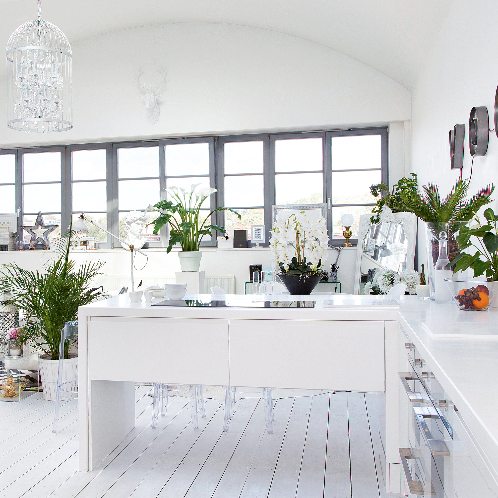
Although L-shaped kitchen ideas work with the style and size of most homes, they can be especially beneficial in those with open-plan kitchens.
'It's perfect if you want to separate the cooking and dining areas and works well as a guest friendly area, as the openness of the layout makes it easier to host and still be able to interact with guests,' explains Neil McDonald, Design Manager, Moores.
'You can make an L-shaped kitchen feel more open by choosing light cabinetry and worktops as well as strategically placed lighting to create the illusion of a larger, open space.'
Sign up to our newsletter for style inspiration, real homes, project and garden advice and shopping know-how
Alternatively, not taking the cabinetry all the way to the floor will allow light to pass through from one zone to another, boosting the impression of size even further.
2. Maximise storage
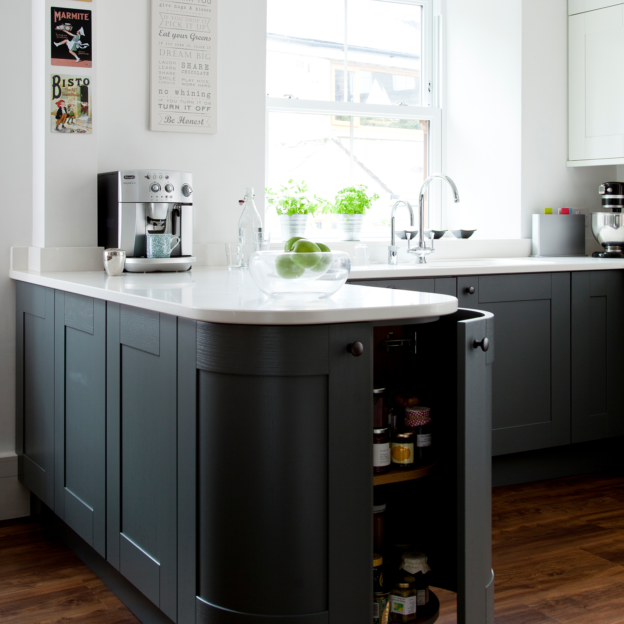
The most useful examples of kitchen storage are tailored to your needs, and nearly any layout can be adapted to to suit yours. If your L-shaped kitchen ideas include one arm acting as a peninsula, then consider adding in storage round both sides and the end.
Don't assume you have to have a flat end, either. A curved cupboard is a great choice for rounded pots, or pantry-style storage contained on kitchen turntables, from £9.99, Amazon, which means no more awkward reaching to the back for that spice you only use once in a blue moon.
3. Break things up with open shelving
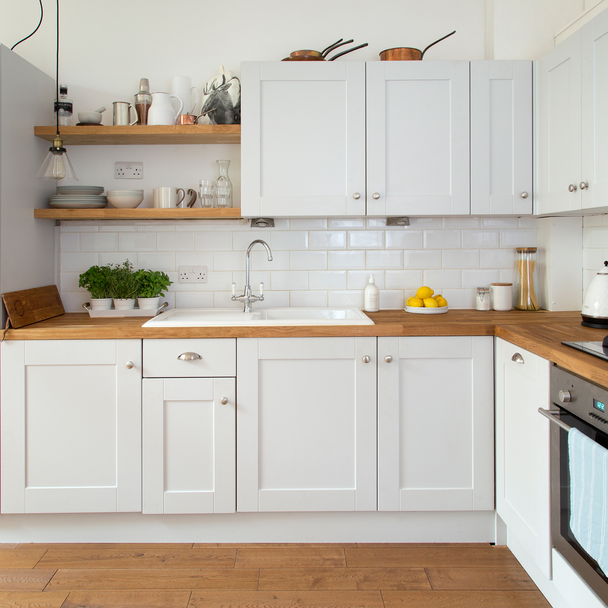
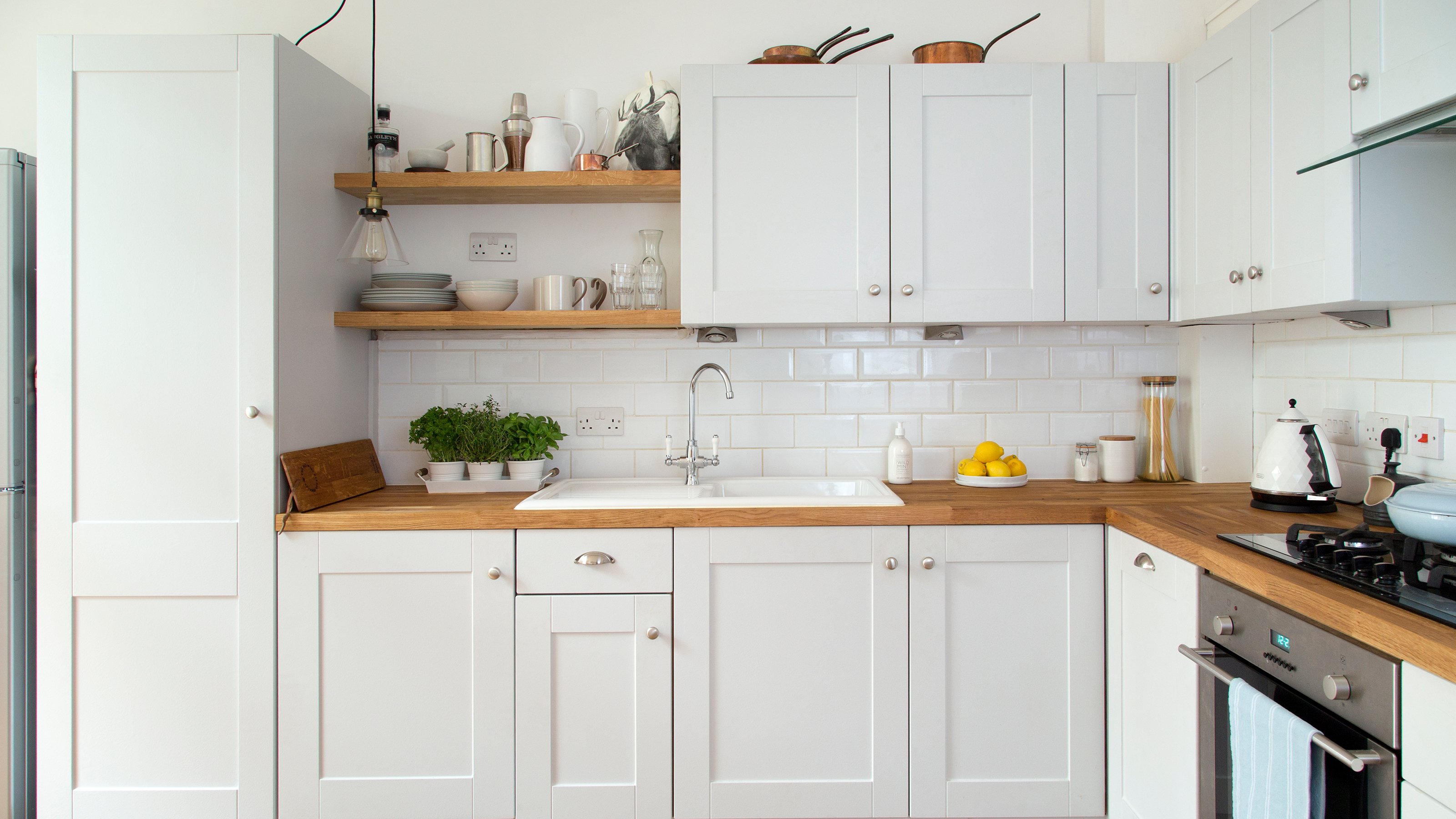
Even the best L-shaped kitchen ideas can sometimes feel a bit crowded. After all, most of the layouts rely on at least one wall on full height cabinetry. If this is the case for you, then replace some of the traditional cupboards with some open shelving ideas, instead.
You'll have a better feeling of space, and a new area to keep oft-used items, or display favourite pieces and seasonal touches.
4. Add a splash of colour
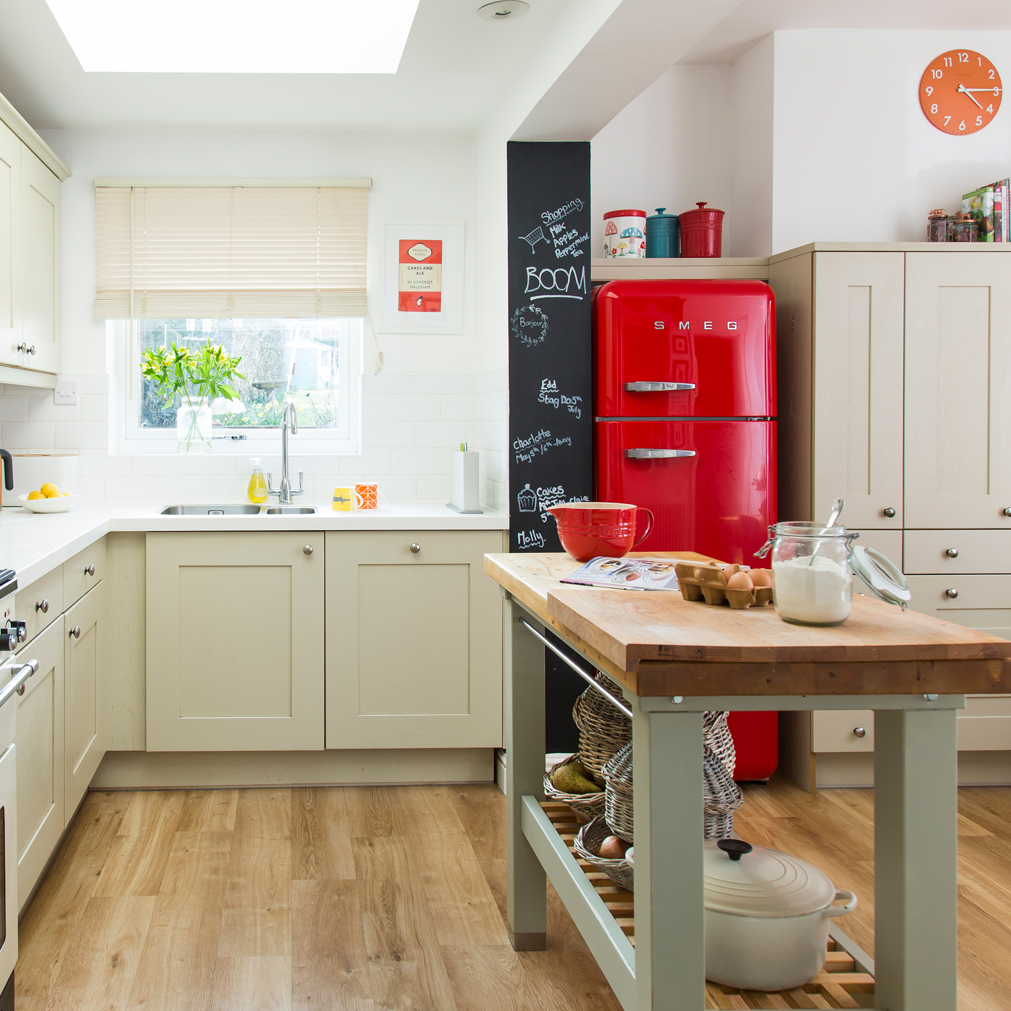
When it comes to kitchen colour schemes, it's often tempting to go neutral - and we don't blame you. When you use a space day in and day out you want to feel confident you're not going to tire of the overall effect. If you want to err on the side of caution with your cabinetry, then consider choosing a brightly coloured fridge instead.
In an L-shaped space this will also have the benefit of breaking up the look of two adjoining walls of cabinetry painted in the one shade. And who knows, maybe after a few years with the fridge you'll be inspired to go bolder with your decorating decisions.
5. Fake a U-shape
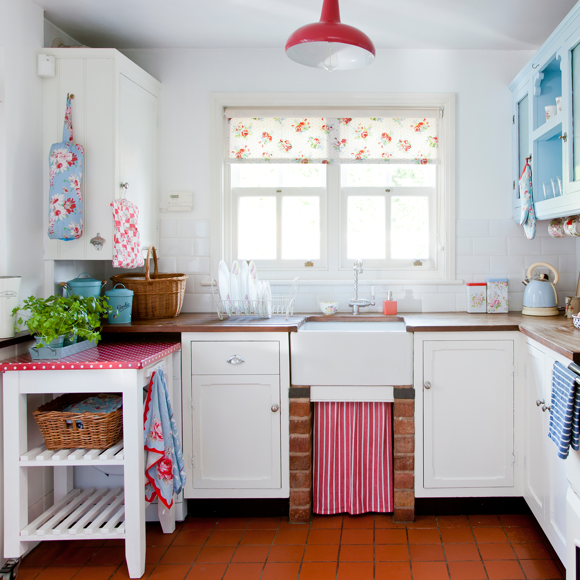
'An option is to extend one of the ‘legs’ of your L-shaped kitchen ideas with a peninsula to create a U-shaped design,' suggests Brani Hadzhi, Showroom Manager, Scavolini by Multiliving. 'This peninsula offers almost all the advantages of an island.'
You don't even have to have this built in. In fact, a kitchen cart will mimic this look but has the added benefit of being able to be moved. This way, you can have an island setup in moments when needed. Some, like the Forhoja, £129, Ikea, have wheels, making moving them around even easier.
6. Play with colour blocking
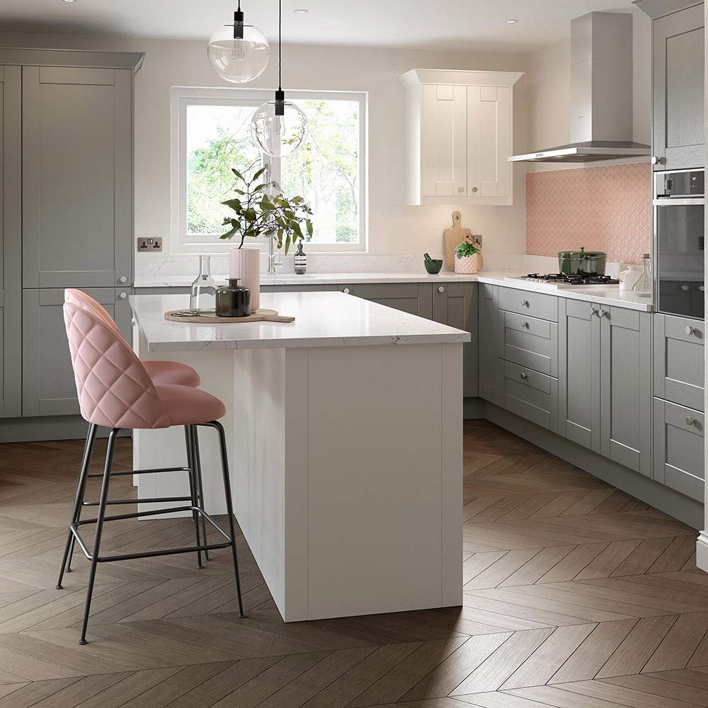
'An L-shaped solution will help you make good use of the space available and you’ll have plenty of room for cabinets on one side, as well as ample space for bar style meals on the other,' says Simon Bodsworth, MD, Daval Furniture. 'The cook has plenty of room to manoeuvre and can chat with guests at the same time, it’s a real win-win in a hardworking kitchen that likes to entertain guests.'
As well as being perfectly practical, an L-shaped kitchen with an island provides a wonderful base to start working with colours. Choose two complementary colours for the cabinetry and island, and use surfaces in one of these two shades. For an added pop of colour, select a third - more unexpected - tone, and use in accessories and detailing, like window dressings, upholstery and tiling.
7. Break up the layout
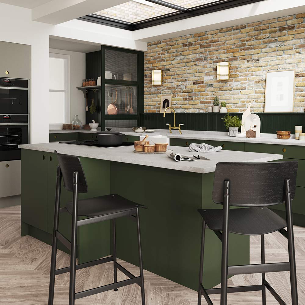
'Think about the size of the room you have and what you want to do in that room,' says Graeme Smith, head of design at Second Nature Kitchens. 'Is it purely cooking? Or do you want to use it for socialising, dining or working too?' If the latter, adapt your L-shaped kitchen ideas to suit your needs.
For a kitchen which will be multifunctional, tuck a second of the 'L' behind a panel of glazing to create some privacy. This is great for keeping mess hidden from guests, and for prepping food in if other family members are working elsewhere in the space.
8. Integrate a table
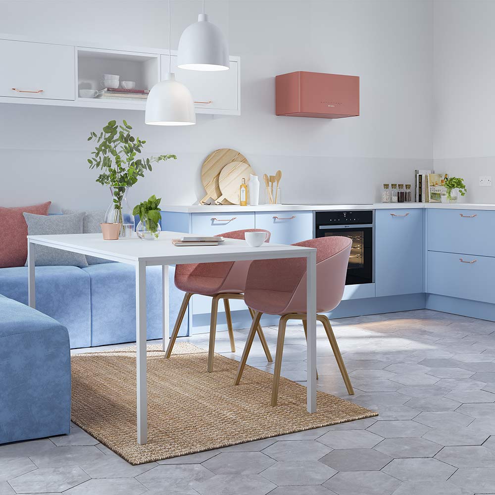
Since the U is the sister layout to L-shaped kitchen ideas, this is a look you can replicate in spirit using your dining table and chairs to suggest the appearance of a peninsula kitchen.
Choose two benches or an L-shaped sofa, and place directly next to the end of your cabinetry. For a seamless look that will trick the eye, match the upholstery to the colour of your cabinets.
9. Link with materials
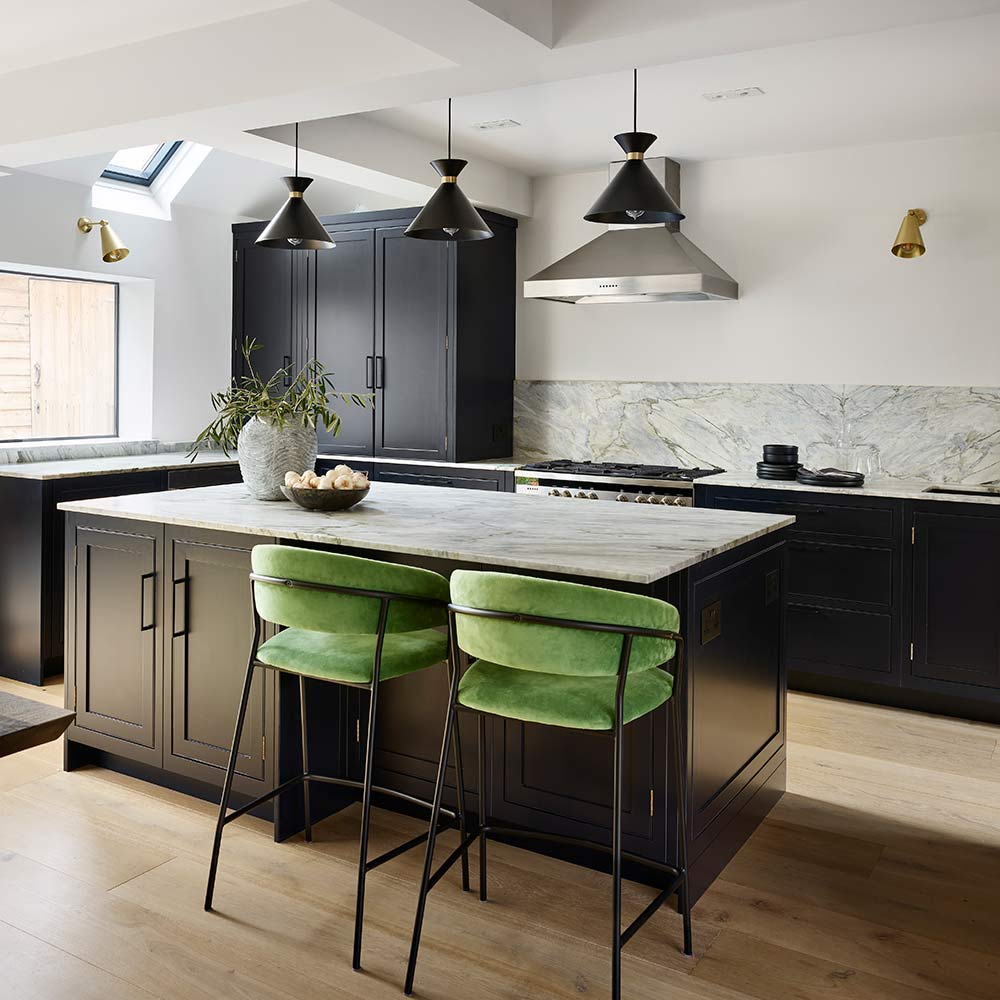
L-shaped kitchens ideas with islands are always a good look - so long as you know how much space is needed between a counter and an island. The downside is that the two work areas can seem rather disparate.
Link the sections together by matching your materials exactly. Think the same surface material, the same cabinetry paint and the same hardware. Not only will this create a cohesive look, but the space will look larger as your eye isn't drawn to something 'different' elsewhere in the room.
10. Balance your storage
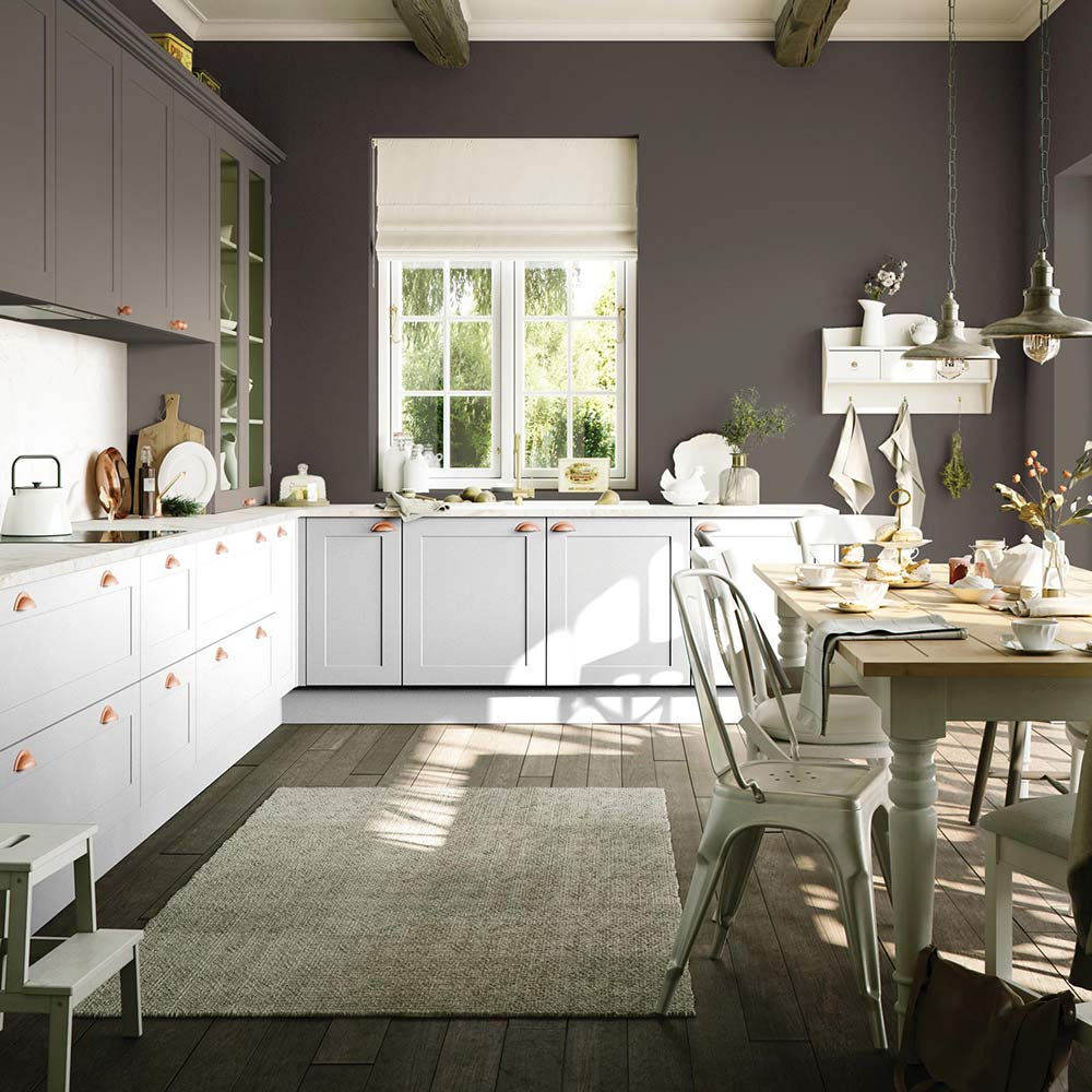
'Maximise the use of worktops and cabinets down the room – including storage low and high to make the most of storage space available,' says Andy Briggs, Interior Designer at Optiplan Kitchens. ' A large number of cupboards and some internal storage solutions can all push up the price of a new kitchen – so think about what kitchen layout will best suit your lifestyle and what you want to achieve in this space.'
Make the room feel larger without compromising on this key storage element by painting higher cabinets in the same colour as the walls, so they seem to disappear. Lower kitchen cabinet paint ideas should then involve lighter and brighter shades to draw the eye without weighing the room down.
11. Create a practical workspace
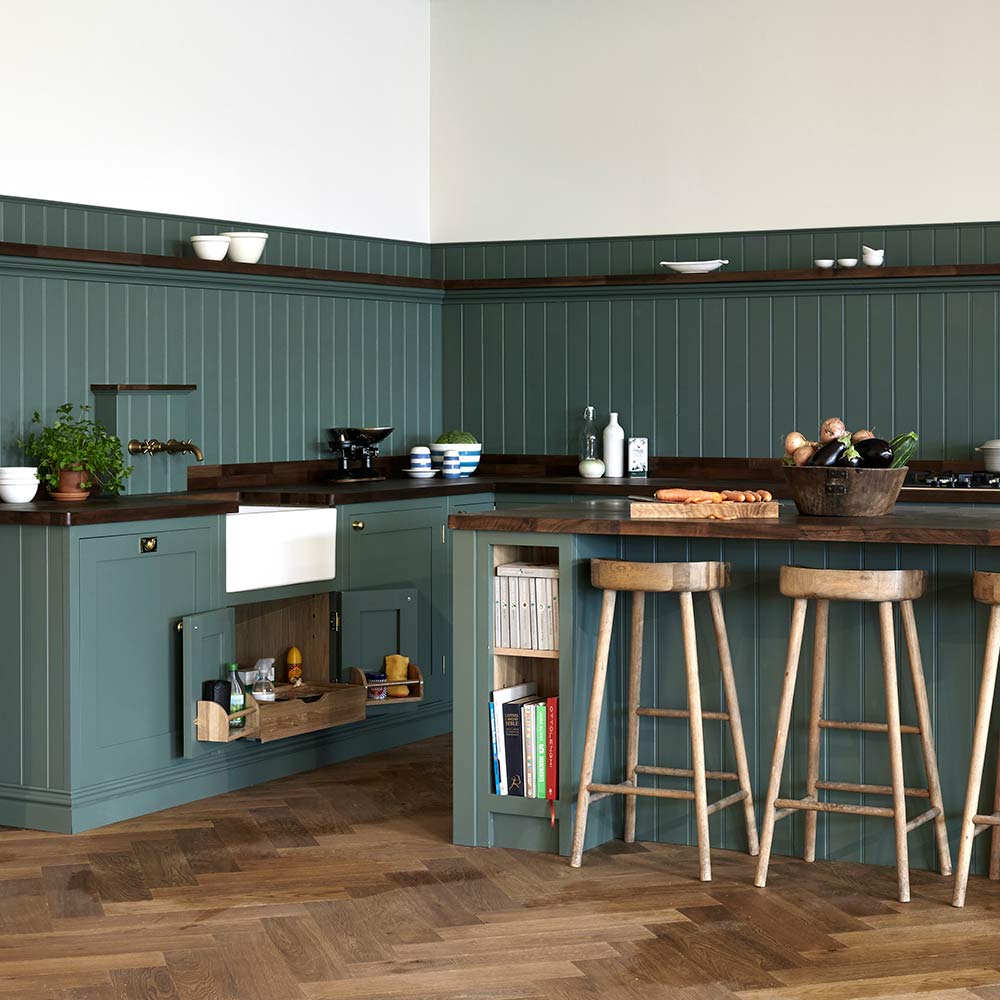
It's key to consider the working triangle, also known as the kitchen triangle. This is the space in which most of the practical work is being done - the chopping, cooking, cleaning and so on. The idea is that you want everything to hand so that work flows in an easy and unencumbered manner.
L-shaped kitchen ideas provide a great basis for creating a practical working triangle. A good idea is to start at the far end of the 'L' and work along the two arms in the order in which you will be accomplishing tasks. Perhaps starting with your sink for washing food, surfaces for prepping, and then onto the oven for cooking.
12. Store vertically
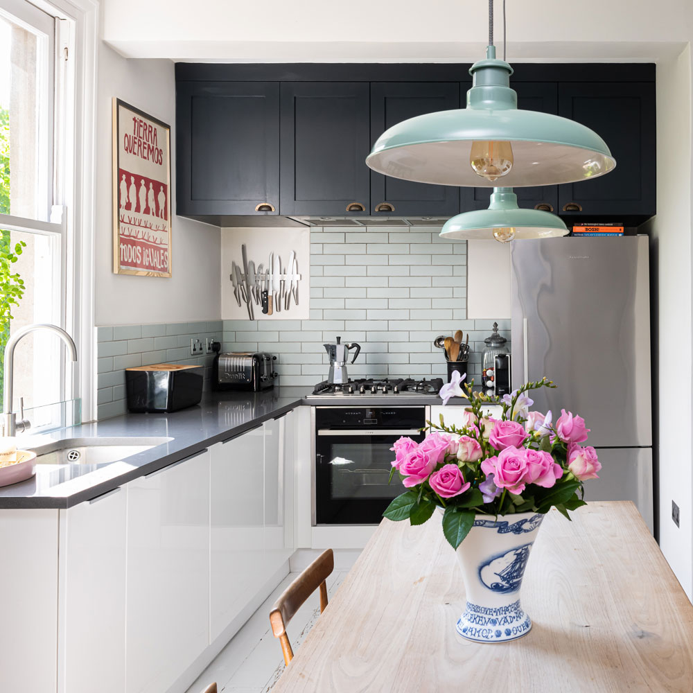
L-shaped kitchen ideas are efficient at making the best use of space. Take the design ethos one step further by using the entire wall to fashion clever storage solutions, from floor to ceiling.
Working with the dominant wall, the one without a window in this case, stylish kitchen cabinets are used above a tiled splashback.
The statement storage spans the entire width of the wall and reaches to the ceiling to ensure every inch of space is utilised. Making the most of storage space is an important thing to do in galley kitchens, too. To add another smart vertical storage element, the chefs knives are stored along a wall-mounted magnetic strip.
13. Balance the L-shape with a window
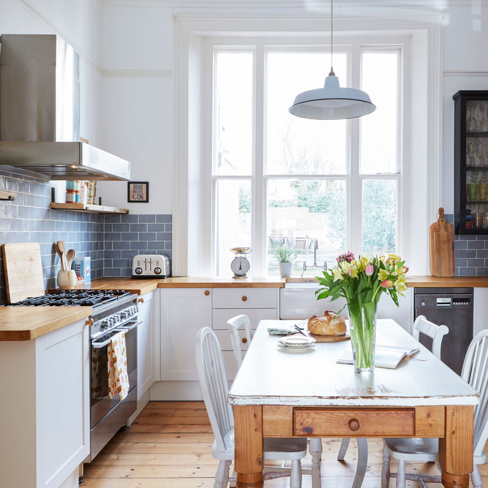
This is the most practical way to use L-shaped kitchen ideas, and the most popular. By running one side of the L under a window you help to balance the other side, which houses the cooker, cooker hood and cabinets.
By incorporating the window into the design you help to give equal purpose to the far wall, using the view beyond to make a statement. Windows also help to lighten U-shaped kitchens as well. Take the look further by adding a patterned blind to add interest. In this homely white kitchen the generous window needs little else to grab attention.
14. Double the L-shape potential
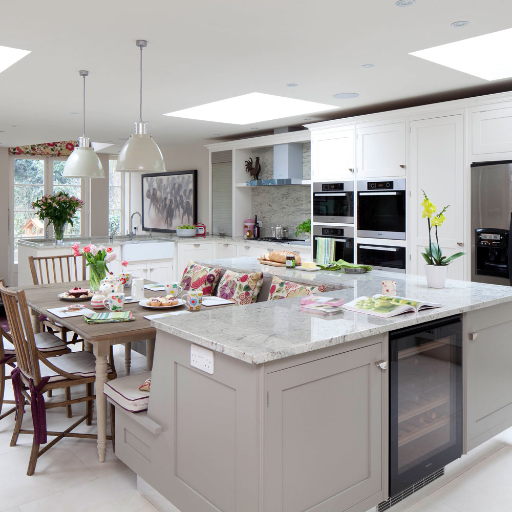
If space is no issue you could opt for a layout that cleverly incorporates two L shapes. A bit like the premise of a classic video game, use the kitchen units to fit together perfectly to make the best use of floor space.
The main L-shaped counter can be a base for the kitchen appliances and amenities, while a smaller L fits within the space to house a built-in dining bench area. Using the L shape to fashion a separate zone helps to create a sociable dining area that feels disconnected just enough from the main cooking space.
15. Keep your living room separate in an open-plan space
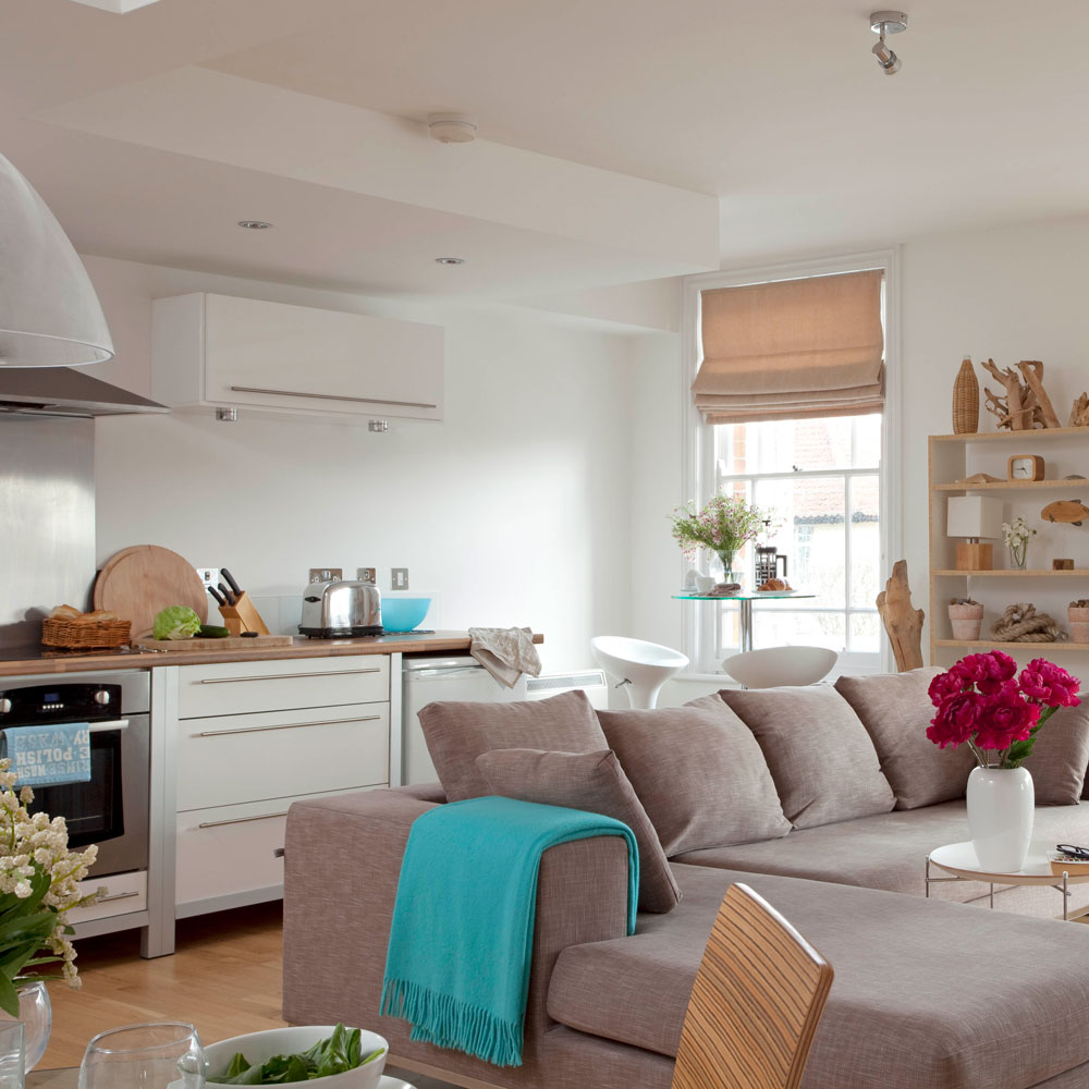
It goes without saying, if you have an open-plan kitchen and living area, you only really have two walls on which to consider for the kitchen. Capitalise on a far-side corner to keep the kitchen restricted, allowing the living area to benefit from the windows and other architectural details.
The kitchen takes up valuable wall space which means you therefore can't sacrifice any walls with design details already in place. When considering kitchen appliance layout ideas, keep sinks and appliances to one end to ensure they are at the furthest distance from the living area also.
16. Make the most of a small kitchen space
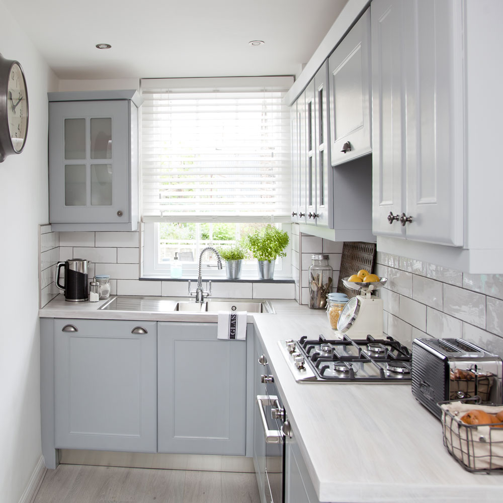
In a small kitchen an L shape is ideal as it concentrates all storage and appliances into two sides of the room, leaving the others free and open. This makes the overall space seem bigger.
Keep the colours on the lighter side so it doesn't appear too cramped. A mixture of cabinets and drawers makes housing pans, pots and general paraphernalia a breeze. While glass Kilner jars display pretty condiments and dried food to perfection.
17. Open up your scheme
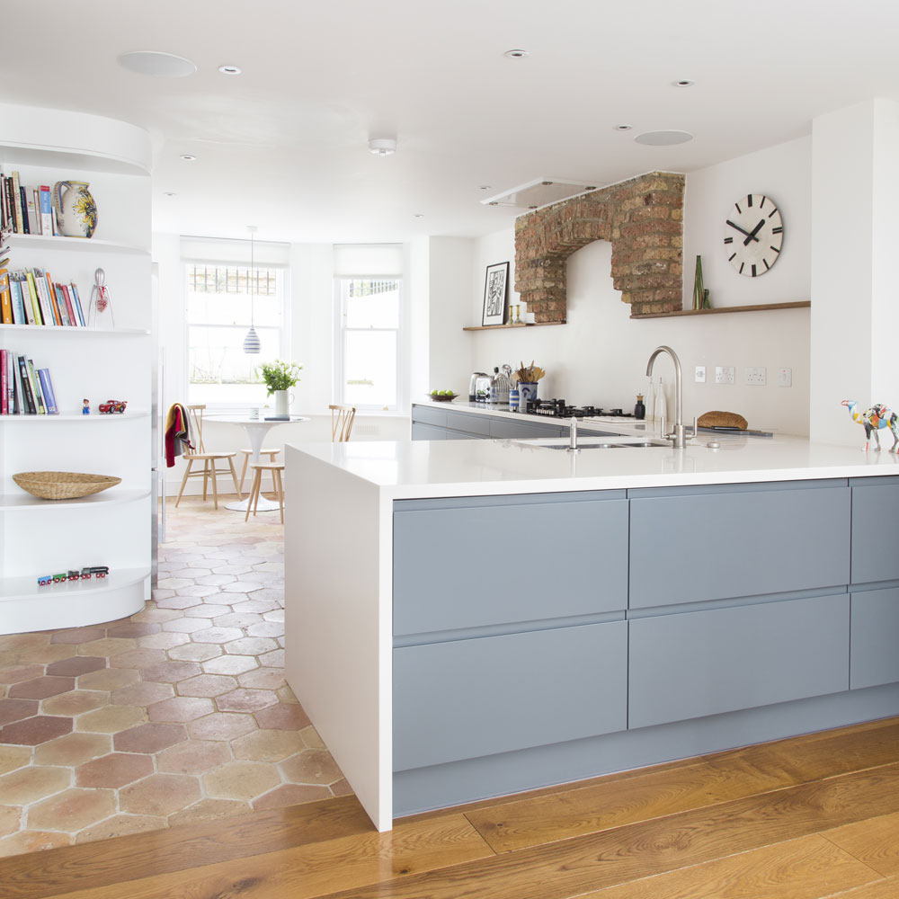
This L-shaped kitchen makes excellent use of space. It is easy to work in, as the work triangle can be easily established. Open shelving prevents a small kitchen from looking too busy, while banks of cabinets look stunning in a large kitchen as well as providing an abundance of storage.
A table and chairs fits neatly into the kitchen, while still zoning it off from the rest of the room. Whatever the size of your kitchen, the beauty of L-shaped kitchen ideas lies in the simplicity and flexibility. And the ease with which it can be adapted to suit practical requirements and different design tastes, too.
18. Utilise colour and pattern
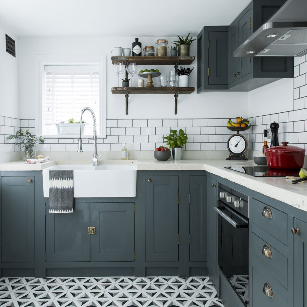
Don't be afraid to use darker colours and patterns in your kitchen. Deep colours are warming so often work well in larger kitchens. Inject refined rustic style with painted wooden cabinetry.
In a traditional space, use painted wood to co-ordinate kitchen cabinets with walls and architectural features; in a contemporary scheme, to soften the sharp edges of minimalist design. Go for a mid to deep shade, like the one in this grey kitchen, as it oozes easy elegance and sophistication.
19. Incorporate an island
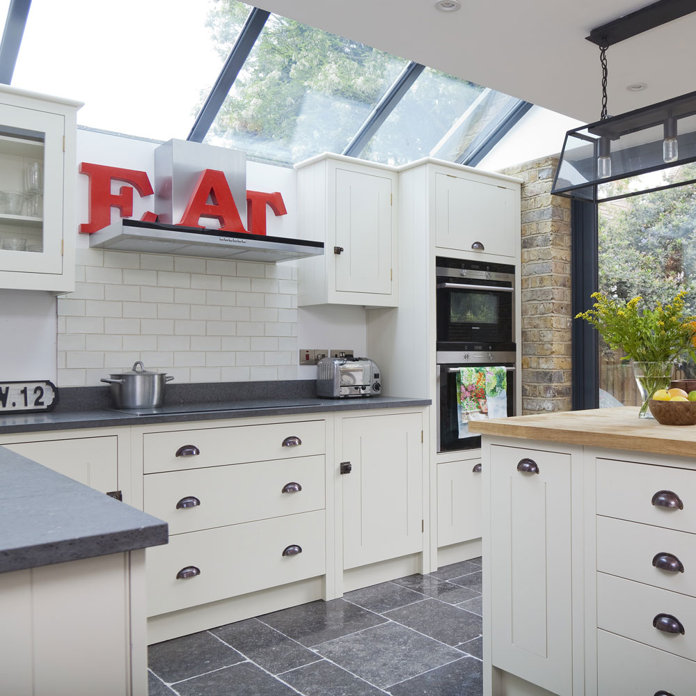
Where space isn’t an issue then L-shaped kitchen ideas with a central island unit provides informal dining space for the family or a place to chat with friends over coffee. Keep the cooking and kitchen chores tightly together in an L and let the rest of a large room be given over to family life.
Add personality and character with quirky signage and curios, which pop when set against cream kitchen ideas like in this scheme.
20. Work storage into a corner
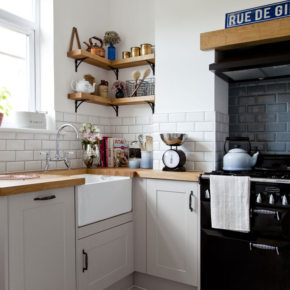
Give a wood-effect design an edge with statement accessories. This rustic country kitchen is brought to life with contemporary tiling. The choice of light and dark tiles, which work to separate the cooking and prep zones, provides a stark, modern contrast to the more traditional cabinet design.
If your kitchen is verging on the small side, consider installing wall-hung shelves into the corner of the room.
Open shelves are a practical and stylish solution in any kitchen. Display china and glassware, so that they are easily accessible. Try running a fixed rail below the bottom shelf to hold utensils with hooks for saucepans.
How do you arrange an L-shaped kitchen?
'As the name suggests, L-shaped kitchen ideas are laid out across two perpendicular walls of differing length,' explains Ben Burbidge, MD, Kitchen Makers. 'It will sit well in most corners of a room but it’s important to consider how you would like the space to function when you plan the layout.'
'Many designs incorporate a dining zone or island so think about the flow around the room and the relationship between the doors and windows to ensure that the space works functionally as well as aesthetically.'
What is an L-shaped kitchen with an island?
‘For those working with an open-plan space, this style of kitchen works exceptionally well,’ explains Paul Bangs, category director for kitchens at Wickes. ‘The addition of an island can provide an extra preparation and seating area, whilst becoming a focal point for the room. Likewise, this style of kitchen works well for those who entertain often or have families, as they offer plenty of space.’
'This is also great way to boost storage, prep space and achieve a more efficient layout,' agrees Brani from Scavolini by Multiliving. 'Consider placing a hob on your island so that you don’t have your back to guests while you’re cooking. You could even incorporate a breakfast bar into your island so that it becomes a social hub.'
Where should a fridge be in an L-shaped kitchen
With any kitchen design the placement of the fridge has to inline with the design triangle of use – the journey between fridge, sink and oven. But given the shape of an L this will mean the fridge is best placed at either end of the workstations, because it's the starting point of the journey.
'The L-shaped layout tends to naturally create a space for any tall cabinets (for example a fridge freezer), leaving a stretch of work surface for the return,' adds Elizabeth Sherwin, Creative Director, Naked Kitchens.

Thea Babington-Stitt is the Managing Editor for Ideal Home. Thea has been working across some of the UK’s leading interiors titles since 2016.
She started working on these magazines and websites after graduating from City University London with a Masters in Magazine Journalism. Before moving to Ideal Home, Thea was News and Features Editor at Homes & Gardens, LivingEtc and Country Homes & Interiors. In addition to her role at Ideal Home, Thea is studying for a diploma in interior design with The Interior Design Institute.