Before and after: walls came down to create this light-filled kitchen-diner
Previous experience gave this couple the confidence to reconfigure their impractical kitchen.
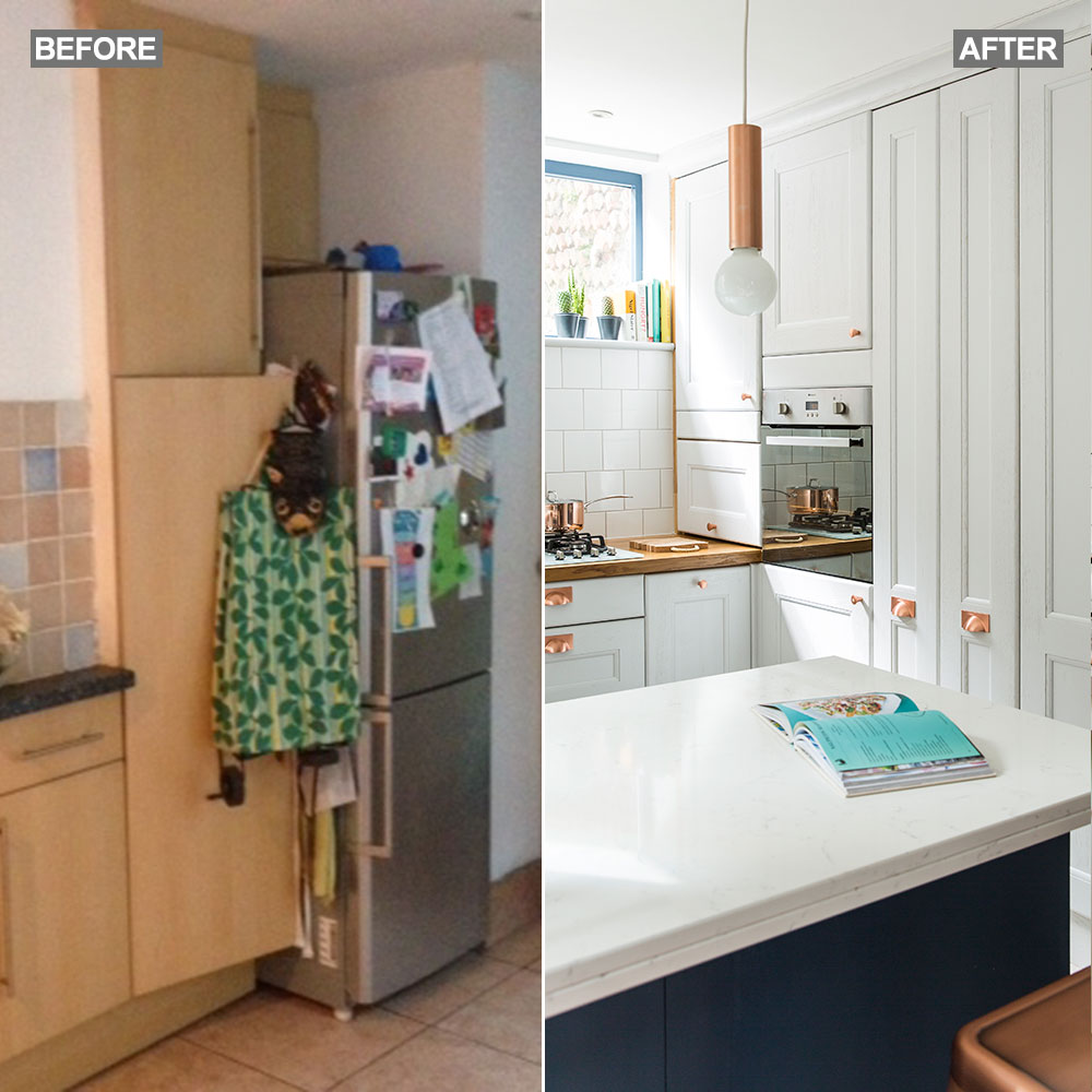

'Our last home in Bristol had a reception room knocked through to the kitchen to create an L-shaped open-plan space, so we knew it would work again in our next home,' say the owners. However, they were working to a tight budget, and had to price up the plans carefully to check they could afford to build and furnish the space in one go. 'We wanted to create that same feeling of light and space, as well as fit in a dining table,' they explain.
Their first step was to get quotes. 'We were horrified to find that the architect’s design and build quote was double our budget,' they recall. 'We discovered it would be cheaper to manage the build ourselves and employ our own builder, an engineer to advise the builder and an architectural technician to do the drawings.'
Love a transformation? Before and after: outdoor space is sacrificed for stylish kitchen extension
The kitchen used to be a separate room, accessed from the hall. By extending the second reception room three metres forward into the garden side return and knocking through, they could create an L-shaped kitchen-diner with French doors to the garden. Replacing the back door with a window allowed them to fit more units and closing off the old kitchen entrance created a corner for the dining table. It also freed up the second reception room to become a TV room and play area.
'We found a builder whose quote was within our budget, but so many things cropped up that we ended up borrowing money to buy the kitchen,' the owners continue. 'What was meant to be a three-month build starting in May 2015 wasn’t finished until well into 2016. The builder kept disappearing so we had a tarpaulin over the back door and a plank from the dining room to the kitchen. We wish we’d agreed a finish date from the start with penalties in the contract.
'The delays did mean we had plenty of time to think about the kitchen! We settled on a U-shape with a peninsular unit – I laid card on the floor to check the layout, then used an online design service to draw up the final plan,' the owner adds.
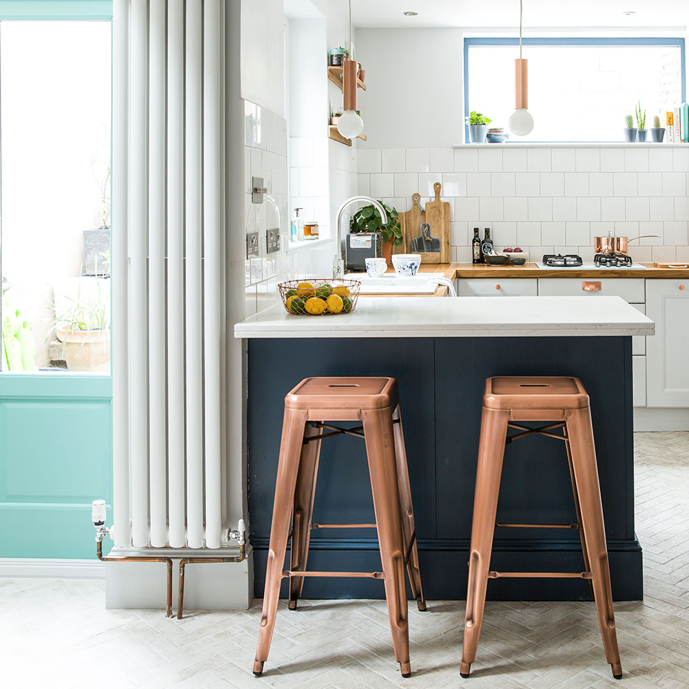
We chose solid wood cabinets, which were painted in Blackened by Farrow & Ball, and I personalised them with copper handles. We added colour to the front of the peninsular unit and the feature wall, and off-white textured brick floor tiles to give the room some pattern and texture.
Get the Ideal Home Newsletter
Sign up to our newsletter for style and decor inspiration, house makeovers, project advice and more.
Get the look
Buy now: Unit painted in Farrow & Ball Estate Eggshell Stiffkey Blue No. 281, £25 for 750ml, Homebase
Buy now: French doors in Paint & Paper Library Deep Water Green 599 - Architects' Eggshell, £26 for 750ml, Designer Paint Store
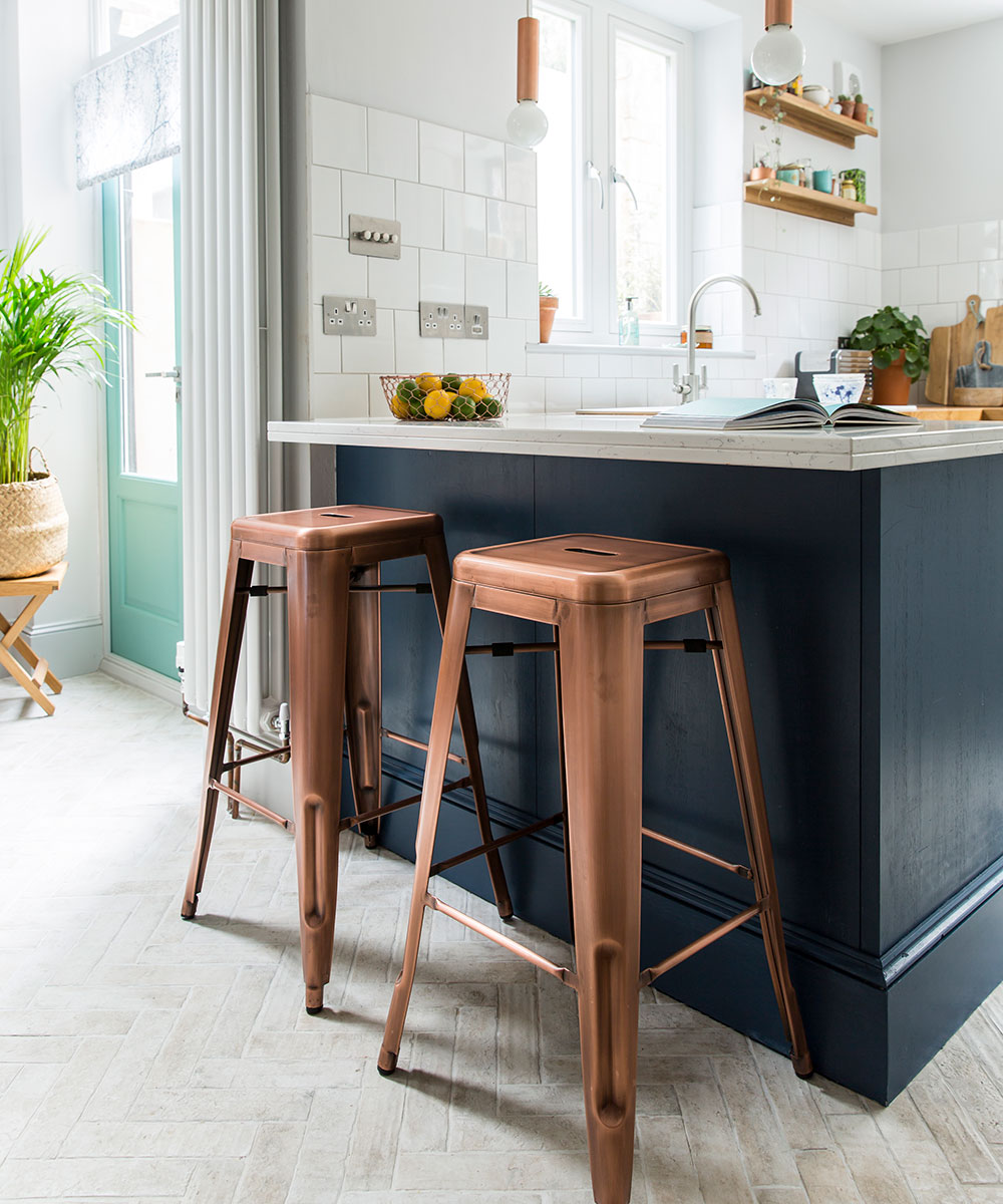
Buy now: Tolix style copper bar stools, £69 each, Cult Furniture
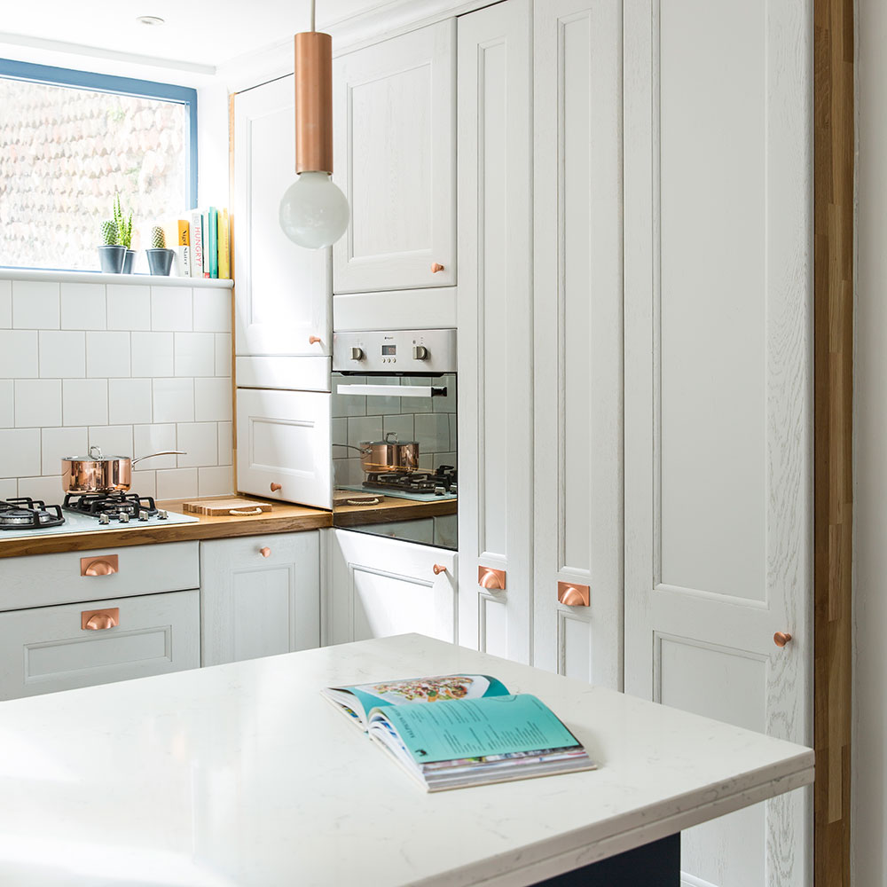
The couple employed a clever trick to make their marble-style worktops look more expensive. ‘We had 20mm thick composite worktop edged to make it look like a more luxurious 40mm thickness,’ they reveal.
Within the wall of units, there are two pull-out storage racks and a full-height cupboard. 'We decided to paint the walls and kitchen units the same colour so that they almost blend in. Losing the contrast between them makes the room feel bigger.’
Get the look
Buy now: Brushed copper-finish modern cabinet knobs, from £3.67 each, The Handle Studio
Buy now: 104mm In Length brushed copper square cup cabinet pull handles 104mm, £5.99 each, The Handle Studio
Buy now: Similar Industrial-style suspended lamp holder metal pendants in copper, £7 each, Value Lights
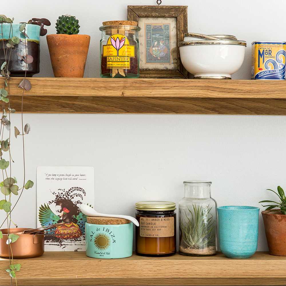
‘As well as providing a space for me to store things that require easy access, I treat my shelves as a place to display little decorative bits, too,’ says the owner.
Get the look
Buy now: Medium Oak Picture Rail shelves, £15 each, Futon Company
Instant refreshes: Easy kitchen updates – quick and simple ways to transform your room
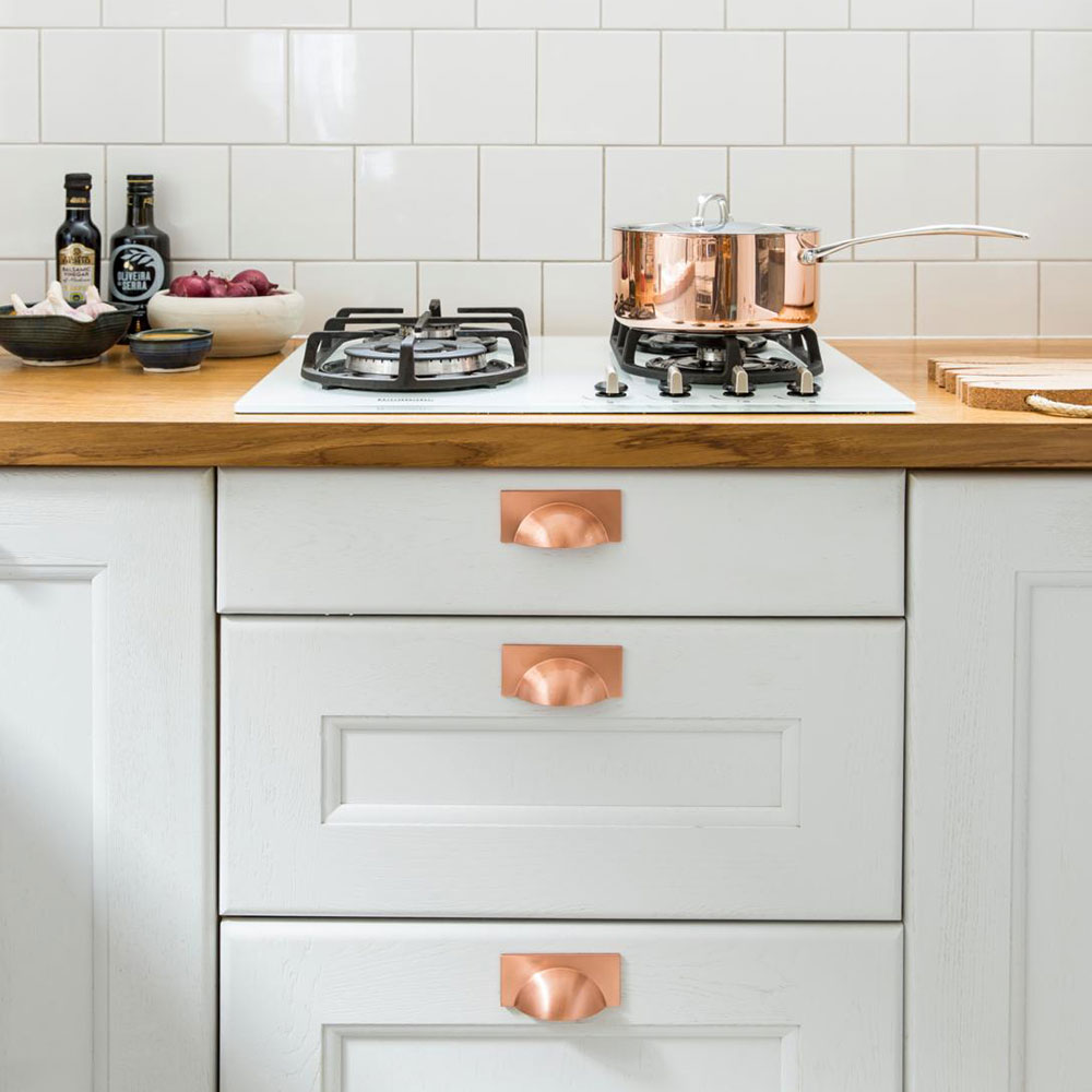
Having already added lots of copper through the handles and light fittings, the owners didn't want to mix in more metallics. So instead of a steel hob, they chose a white one with industrial-style black pots stands.
The couple spent just £50 on wall tiles. A brick formation with grey grout gives them a designer look.
Get the look
Buy now: Similar hob, Neff T26BR46W0 gas hob in White, £214, Currys
Buy now: Similar Matrix Diamond White Tile, £17.80 per sq m, Topps Tiles
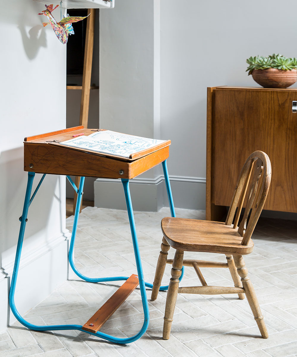
Used by the couple's young son, the little desk was free from Shabitat (a local furniture cooperative). The chair was the owner's when she was little
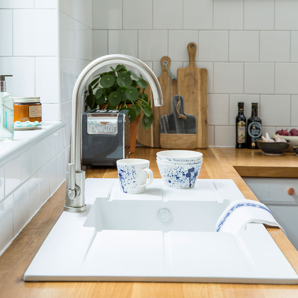
‘We chose a sink with a double drainer to avoid getting the wood worktop wet.’
Get the look
Buy now: Abode Zero single bowl sink with double drainer in White Granite, £286.70, QS Supplies
Buy now: Abode Atlas monobloc tap, £125.05, QS Supplies
Buy now: Full stave oak worktops, from £210, Worktop Express
Buy now: Dualit Architect two-slice toaster, £80, John Lewis
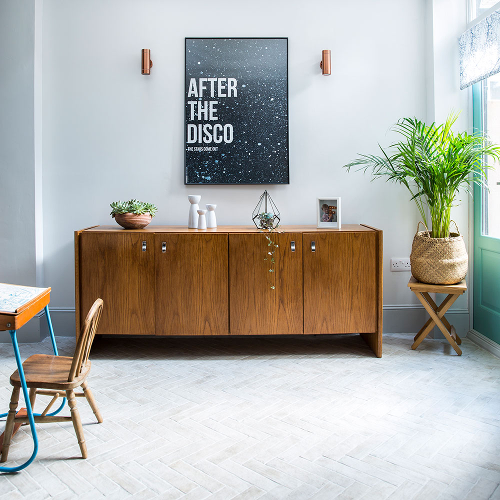
Though they loved the idea of parquet wood flooring, the couple couldn't stretch their budget. 'These light tiles were a great price and make the room look really spacious,’ they say.
Get the look
Buy now: ‘After the Disco’ print, from £125, Rockett St George
In store only: Equipe brick floor tiles in City Colourway, £48 per sq m, Master Tiles
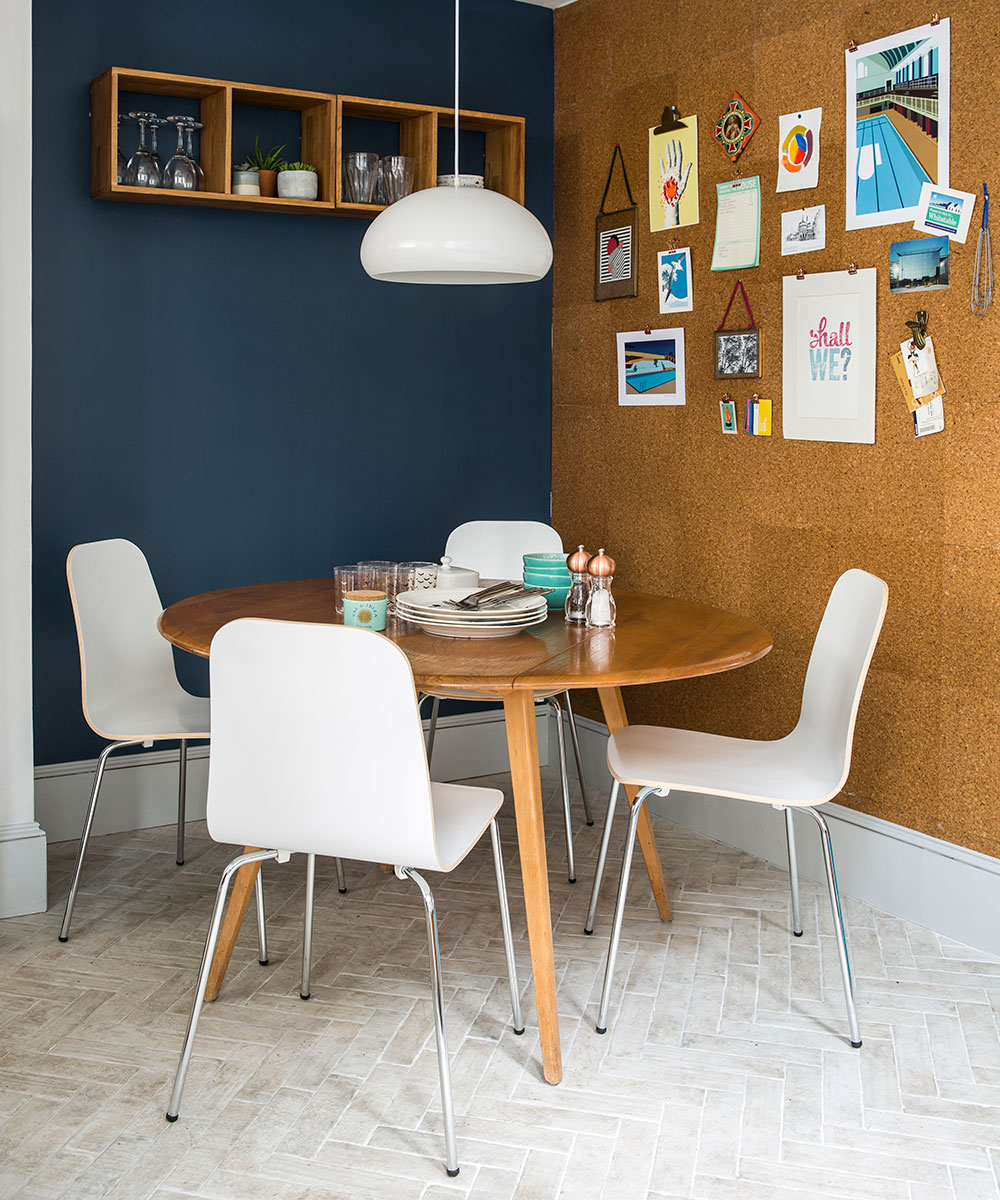
Rejigging the layout has given the family the dining area they craved. The cork wall is made from packs of Homebase tiles and cost them just £44.
Get the look
Buy now: Luca dining chairs, £55 each, Danetti
Buy now: Rock white metal ceiling light, £65, Habitat
Buy now: Value Cork Tile, £13.48 per sq m, Homebase
Be inspired... Before and after: from gloomy kitchen to open-plan entertaining space
Although it was a challenging project, when the kitchen was finally finished, the owners were thrilled with the results. 'The ground floor feels so much bigger,' they say. 'When you open the doors between the reception rooms, you can see all the way from the kitchen to the front of the house. And it’s lovely being able to chat to our young son while we cook.'

Amy Cutmore is an experienced interiors editor and writer, who has worked on titles including Ideal Home, Homes & Gardens, LivingEtc, Real Homes, GardeningEtc, Top Ten Reviews and Country Life. And she's a winner of the PPA's Digital Content Leader of the Year. A homes journalist for two decades, she has a strong background in technology and appliances, and has a small portfolio of rental properties, so can offer advice to renters and rentees, alike.
-
 Zoe Ball's colourful kitchen island shows how easy it is to create a characterful cooking space - here's how she did it
Being brave with colour will reap huge rewards
By Holly Cockburn
-
 7 plants that will make your patio smell gorgeous - the top fragrant picks experts recommend potting up
From aromatic flowers to fragrant herbs
By Kayleigh Dray
-
 I won't gatekeep - Magimix's new small kitchen-friendly mini chopper is my secret to delicious lazy dinners
My homemade pesto pasta has never been better
By Holly Cockburn