Modern glazed rear extension completely transforms dingy kitchen
A revamped glazed extension has changed the gloomy ground floor of this terraced property into a sun-drenched space

Glass filled extensions, especially one like this in North London, can make an enormous difference to a home. They can transform a space from light-starved to sun-drenched, and in turn, make a space all the more inviting.
It was exactly this quality that homeowners Steve and Graham lacked in their four-bedroomed Victorian terrace. The couple longed for more light in their dark and dingy kitchen and to make their house a lighter and brighter space.
They also were keen to connect the indoors with the outside space in a more fluid way. To help them achieve their dream, they enlisted the help of Amos Goldreich Architecture.
After: modern glazed rear extension
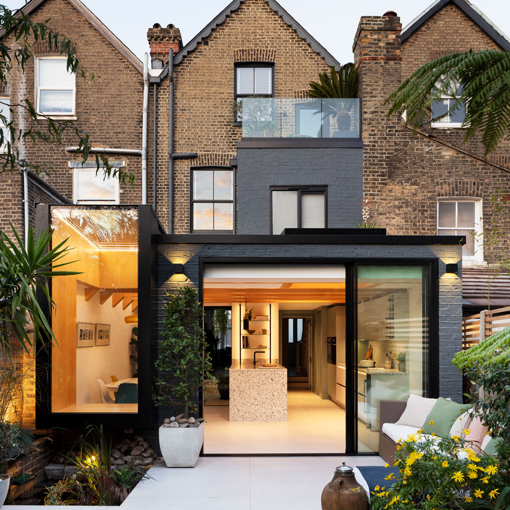
We spoke to Amos Goldreich to hear how the addition of a new glazed kitchen extension idea to the rear of the couple's home has transformed the gloomy ground floor. Transforming their Victorian terrace into a bright and sunny space.
'Our goal was to rejig the disjointed floorplan,' explains Amos. 'Which lacked light and was disconnected from the original galley kitchen. We introduced a side and rear extension, which allowed us to re-arrange the living spaces around the garden and an internal courtyard, which is now a wintergarden with automated roof-lights.'
The kitchen diner
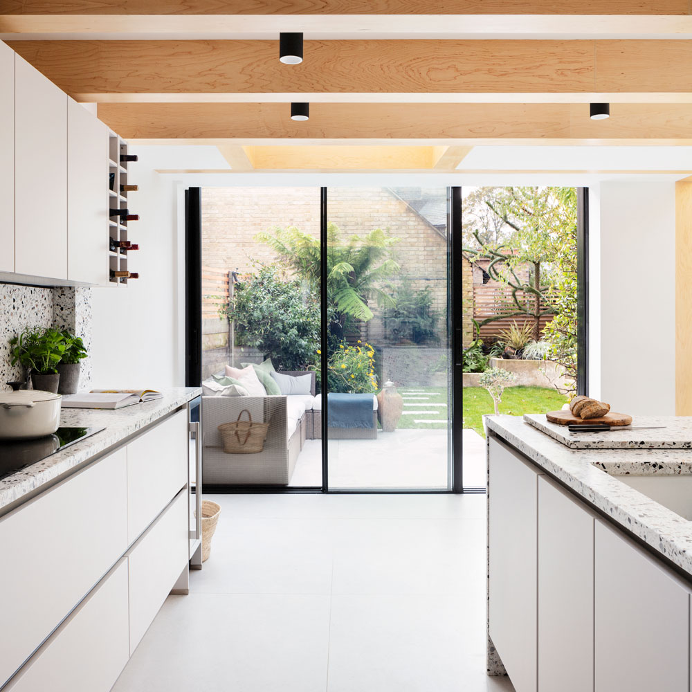
'At the back of the house, we altered the floorplan to turn the existing galley kitchen into a spacious open-plan kitchen-diner – which flows onto a new sun terrace. Connecting with the outdoors was an important goal, so we pushed the window seat right out into the garden, so it projects over a fish pond.'
'The seat combines with up and over glazing to create the feeling that you’re sitting outside in your own light-filled cocoon.'
Get the Ideal Home Newsletter
Sign up to our newsletter for style and decor inspiration, house makeovers, project advice and more.
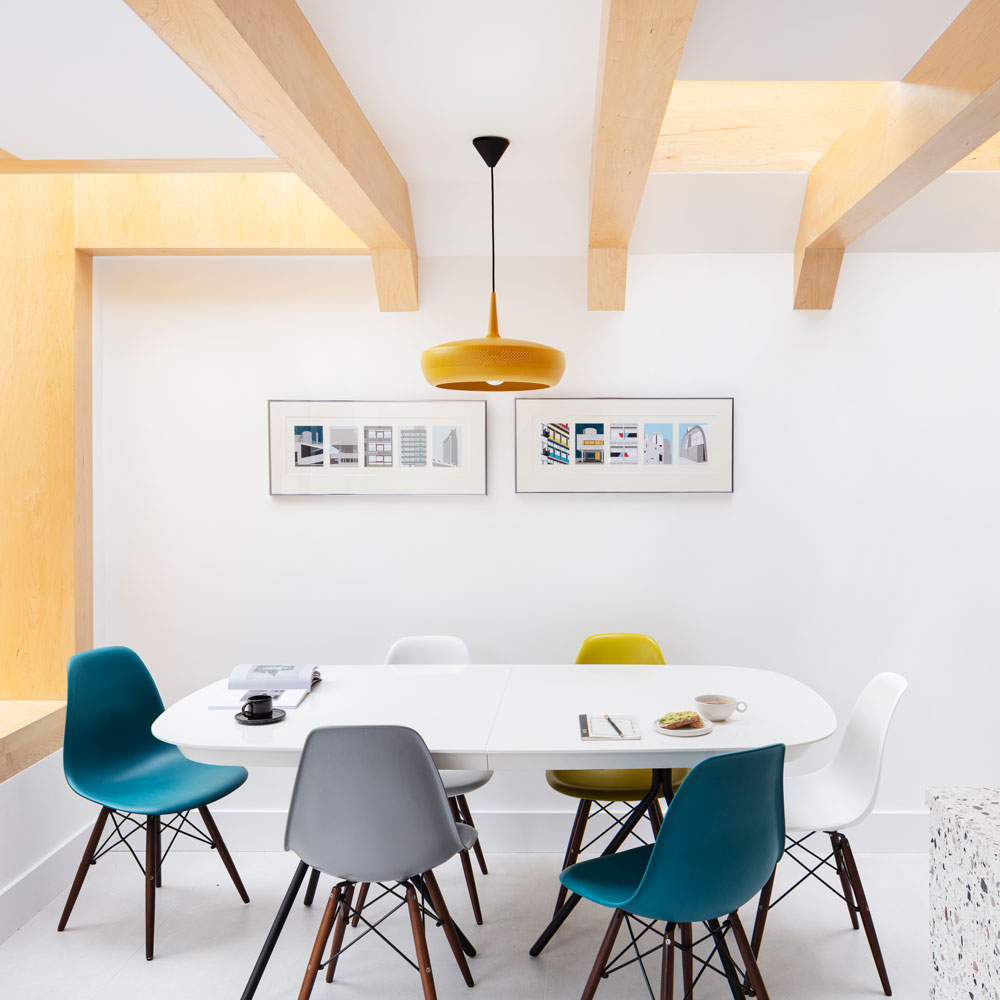
Instead of incorporating insulation between the exposed oak beams, it has been installed above. This has maximised floor to ceiling height and enhances the feeling of space.
The kitchen
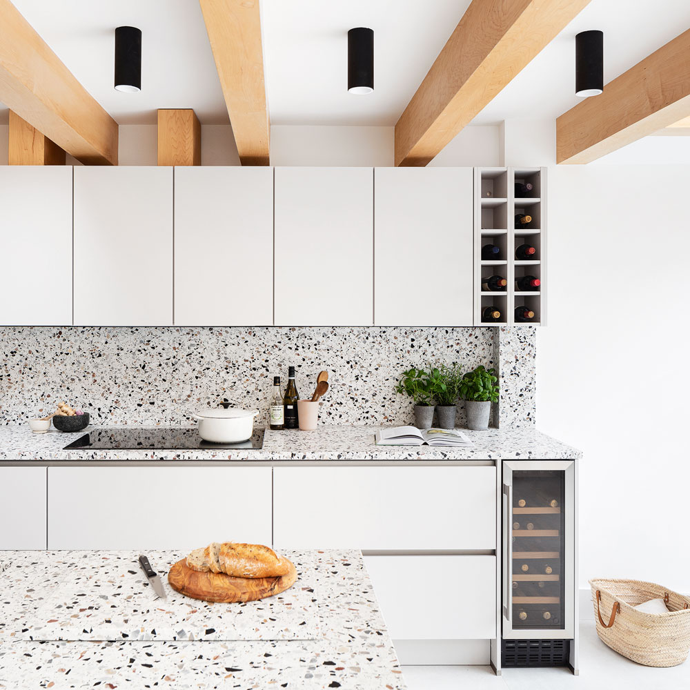
In the white kitchen idea, light colours were chosen for the floor tiles and cabinetry to help bounce light around the space.
A terrazzo style material was chosen to add interest to the bright space and this covers both the worktops and splashbacks, as well as the kitchen island idea.
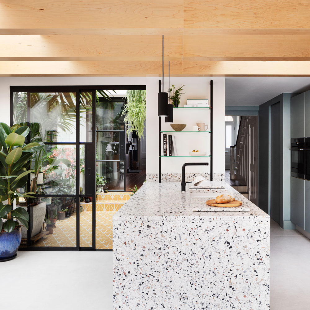
Crittall-style doors lead to the new wintergarden, which features a glass roof. Having a fully glazed room at the centre of the floorplan allows light to flood from front to back.
'Having this indoor-outdoor space at the centre of the floorplan channels light into the reception rooms at the front of the house,' explains Amos.
'The glazed wintergarden has also opened views through to the garden when you’re sitting in the living room at the front.'
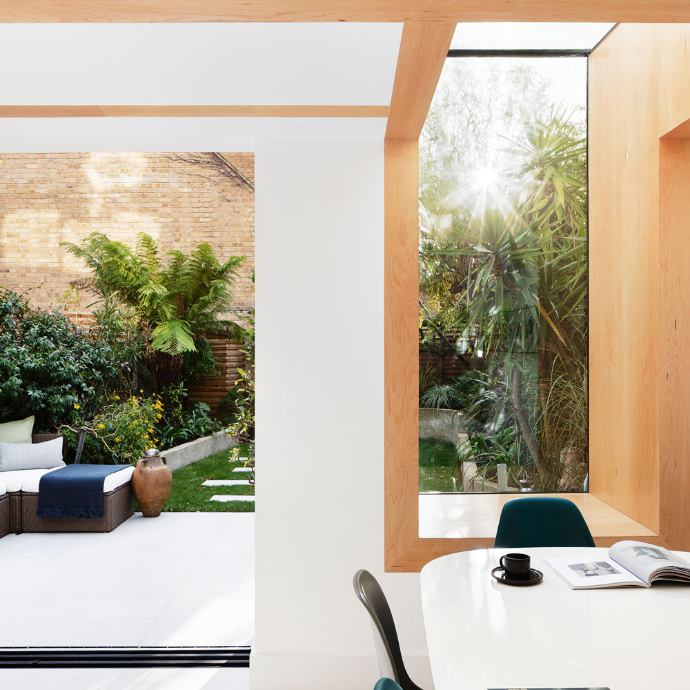
Conceived as a pair of intersecting box-like structures, the rear and side extension idea created space for a complete re-jig of the interior layout. Sliding glass doors were chosen for their minimal aluminium frames, maximising the area of glass and therefore garden views.
The same floor tiles flow from the kitchen-diner to the outdoor terrace, establishing a seamless effect. Though the tiles are all made from the same material, those laid on the terrace have a higher anti-slip grade.
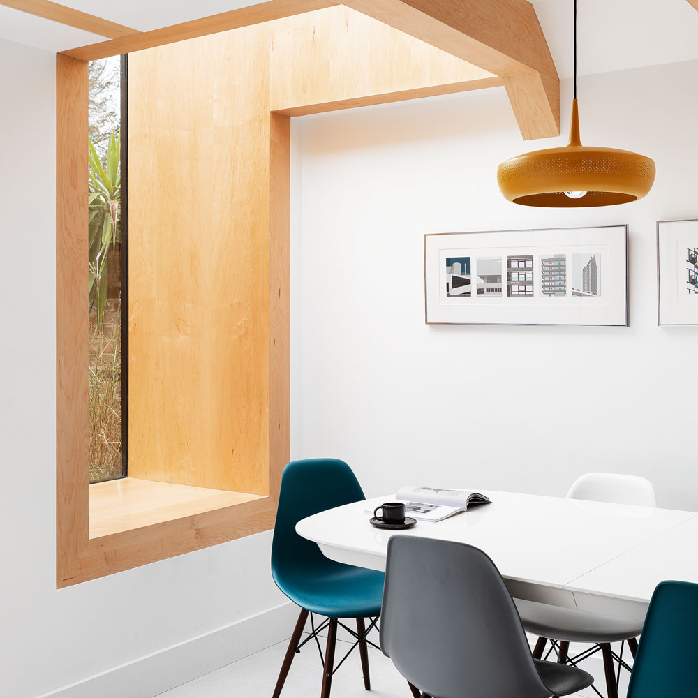
Positioned beneath the frameless up and over glazing, the oak-lined window seat idea benefits from an indoor-outdoor feel.
The glazing envelopes the window seat and extends over the dining area, drenching the space in sunshine. It's the perfect spot to sit and read.
The wintergarden
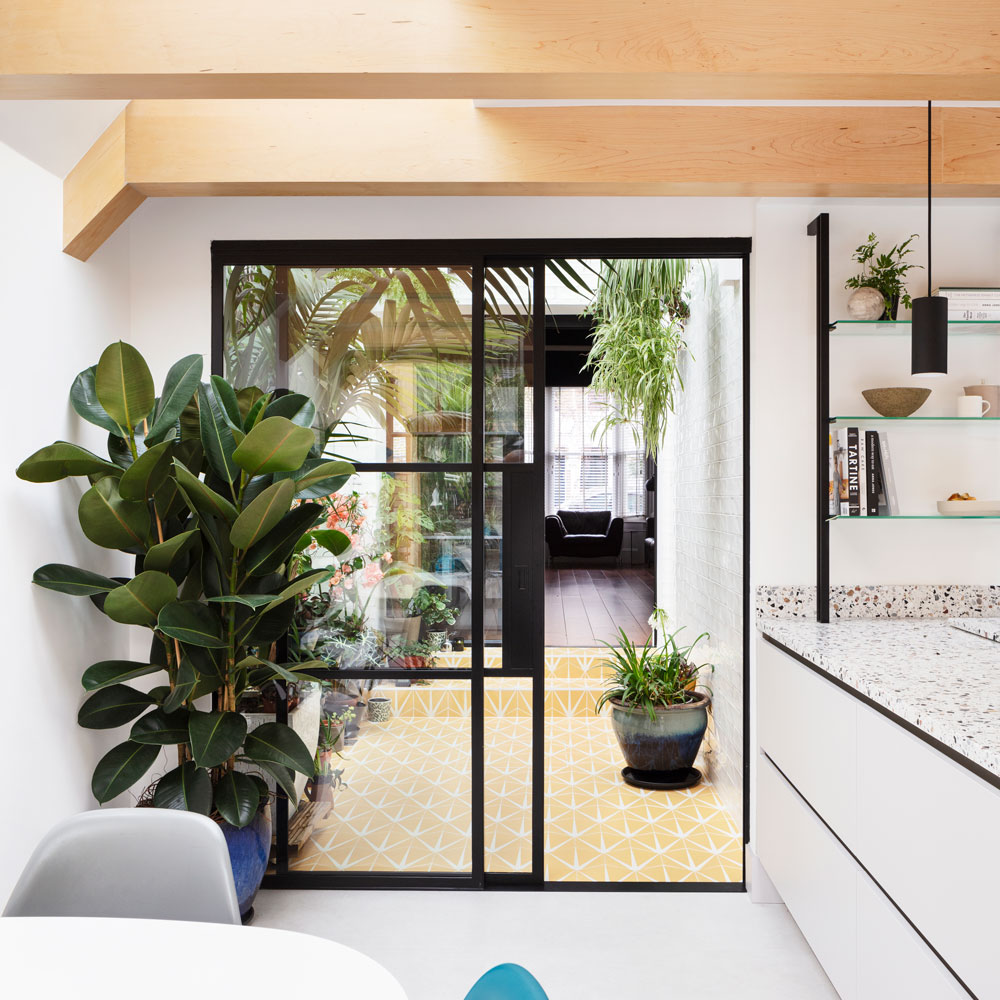
The wintergarden (or sun room) features colourful floor tiles to create a different focal point. Denoting a different space from the interconnected kitchen diner and living room.
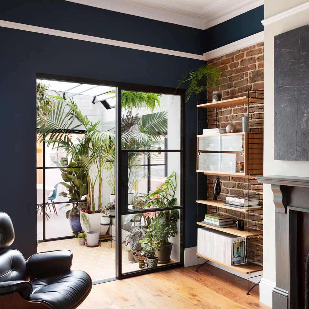
The positioning of the wintergarden between the living room and kitchen allows light to flood in from the space into the darker living area.
Before: dingy kitchen space
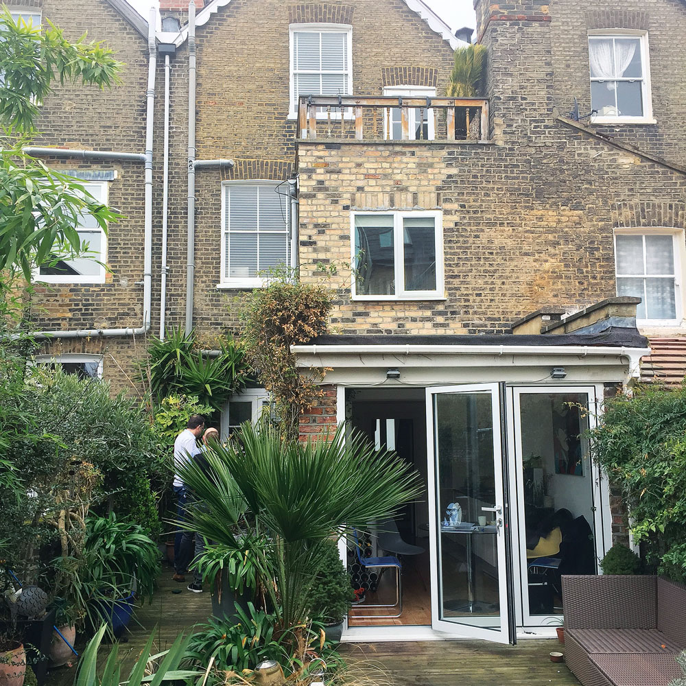
The layout of living spaces prior to the extension meant the centre of the floorplan was starved of natural light. The kitchen extension was dark and dingy and in need of some TLC.

Rebecca Foster started her journalism career in Bangkok in 2013, where she worked on the in-house editorial team at a luxury homes magazine. Since then, Rebecca has contributed to numerous property and interiors titles in the UK and Southeast Asia. She re-located to London in 2015 to work at one of the country’s leading self-build and home renovation magazines. In 2017, she left her job to split her time between freelance journalism and teaching yoga.
-
 Is M&S or John Lewis bedding better? I'm a Sleep Editor and this is my go-to brand
The battle of the bedding is on
By Amy Lockwood
-
 5 things you should never put in your garden waste bin – experts warn these items could land you with a £400 fine
You should avoid these waste items at all costs
By Kezia Reynolds
-
 Typhur Dome 2 air fryer review – a glimpse into the future of air frying
The Typhur Dome 2 cooks food brilliantly and has all sorts of benefits, but is it worth the £499 price tag?
By Ellen Manning