Kitchen designers warn against falling for these small kitchen layout mistakes - what to do instead
Avoid these common layout mistakes to unlock your small kitchen’s full potential
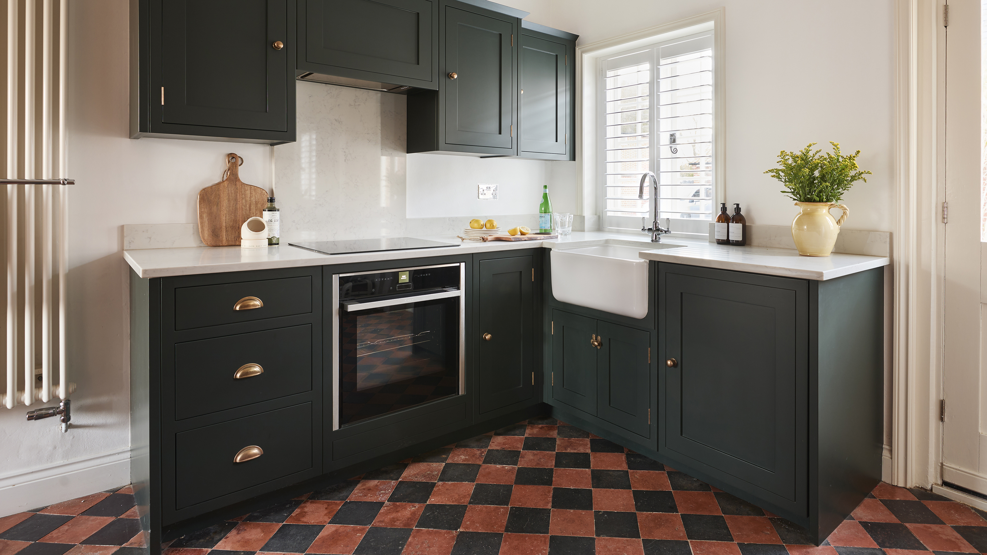
- 1. Not maximising ceiling height
- 2. Ignoring the working triangle
- 3. Overcrowding worktops
- 4. Including oversized appliances
- 5. Omitting clever storage solutions
- 6. Not considering all seating & dining options
- 7. Not using colour to make a space feel bigger
- 8. Not using available storage space effectively
- 9. Not considering lighting during the design process
- 10. Neglecting good air extraction
- FAQs

Space is highly sought after in a compact kitchen as you wrestle with balancing storage, function and stylistic touches. So, avoiding pesky small kitchen layout mistakes should be top of your list when planning to achieve a harmonious space that functions seamlessly for your household, making everyday life less stressful.
Creating a kitchen you love for years to come requires planning and the consideration of different layout options to get the best results from your investment. Just because you have limited space to work with, that doesn’t mean the kitchen doesn’t need to work just as hard!
If you can't increase the footprint of your small kitchen, there are so many clever tricks to make the most of, and avoid, so that every inch of space is optimised. We've asked the kitchen design experts which mistakes they've seen in practice so that you can plan the most practical kitchen possible.
Small kitchen layout mistakes
When figuring out how to design a kitchen, specifically a small one, you're unlikely to be faced with many configuration options. However, there are so many ways to cleverly plan storage, appliances and a limited floorplan so that a cooking, dining and socialising zone is as efficient as possible.
1. Not maximising ceiling height
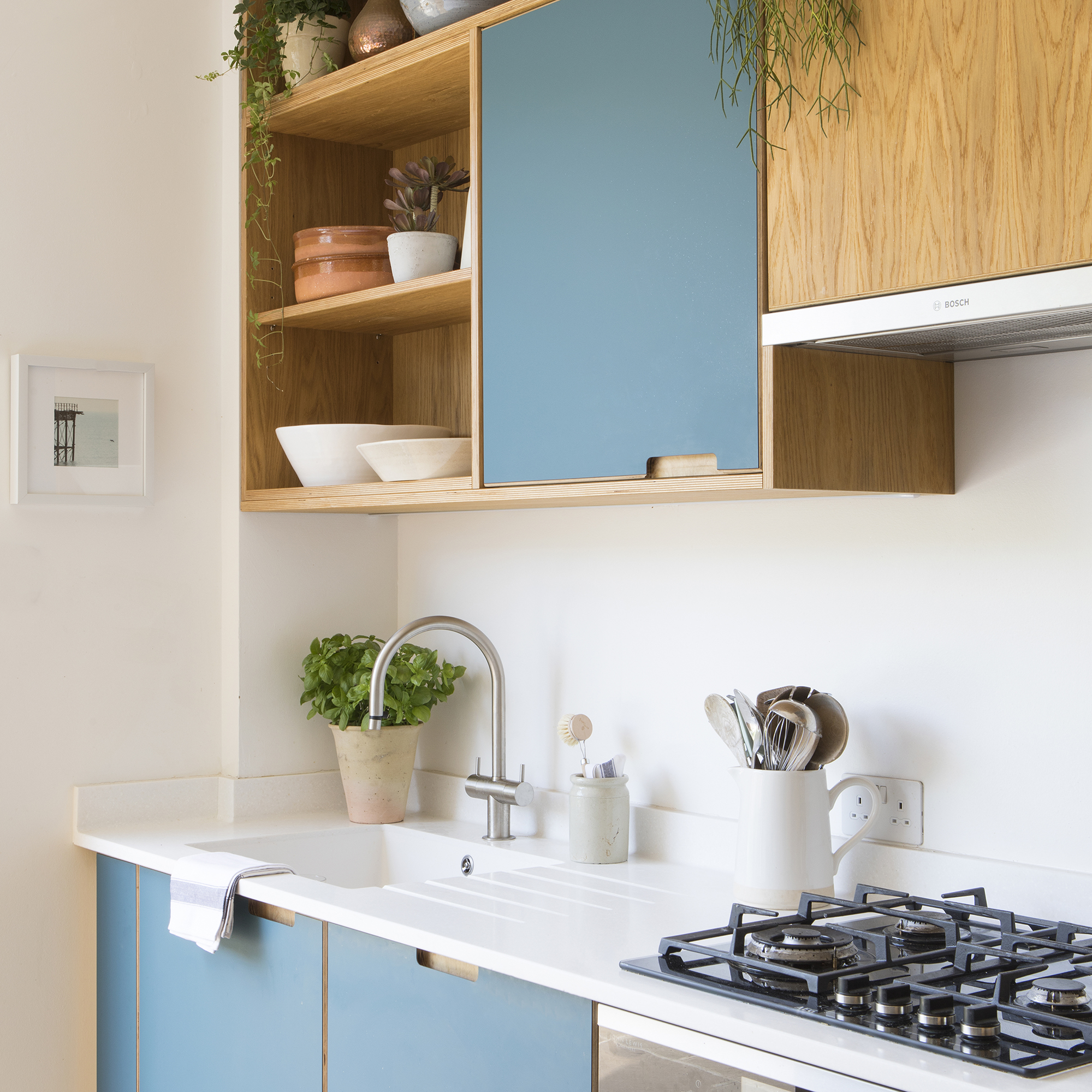
Many kitchen plans don’t make the most of available ceiling height which can offer a huge amount of extra storage capacity, freeing up valuable floor space for base cabinets which are often needed to house appliances. It's also a clever way of making a small kitchen appear larger.
Jen Nash, head of design for Magnet says, 'There is something so elegant about height and yet so often it isn't fully maximised, even if space is at a premium many of us forget to maximise the potential solutions we have and that normally involves using the full vertical of a room.' Incorporating cabinetry that utilises this vertical space will draw the eyes upwards, creating a sense of grandeur even in the smallest of spaces.
2. Ignoring the working triangle
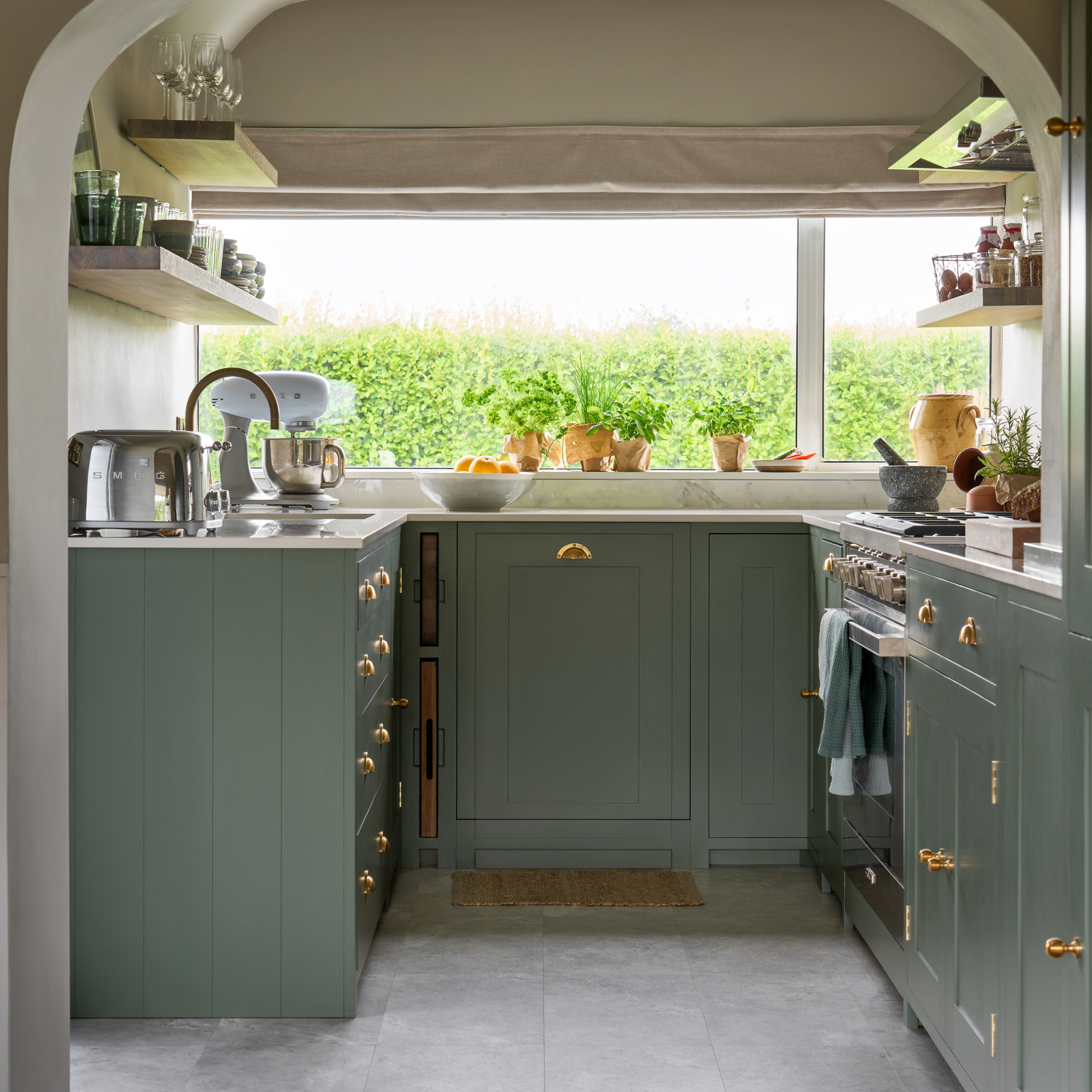
The ‘working triangle’ is a planning principle that many kitchen designers follow to create a practical flow around the kitchen.
Get the Ideal Home Newsletter
Sign up to our newsletter for style and decor inspiration, house makeovers, project advice and more.
'Whether you have a small or large kitchen, there are three key points of contact to consider when designing your space: the sink, fridge, and hob, referred to as the ‘working triangle’. Neglecting the working triangle can result in a shortage of worktop space between each main point, making daily tasks challenging. This is particularly critical in smaller kitchen layouts where space is at a premium', says Stacey Tompsett, lead designer at Turner & Foye.
3. Overcrowding worktops
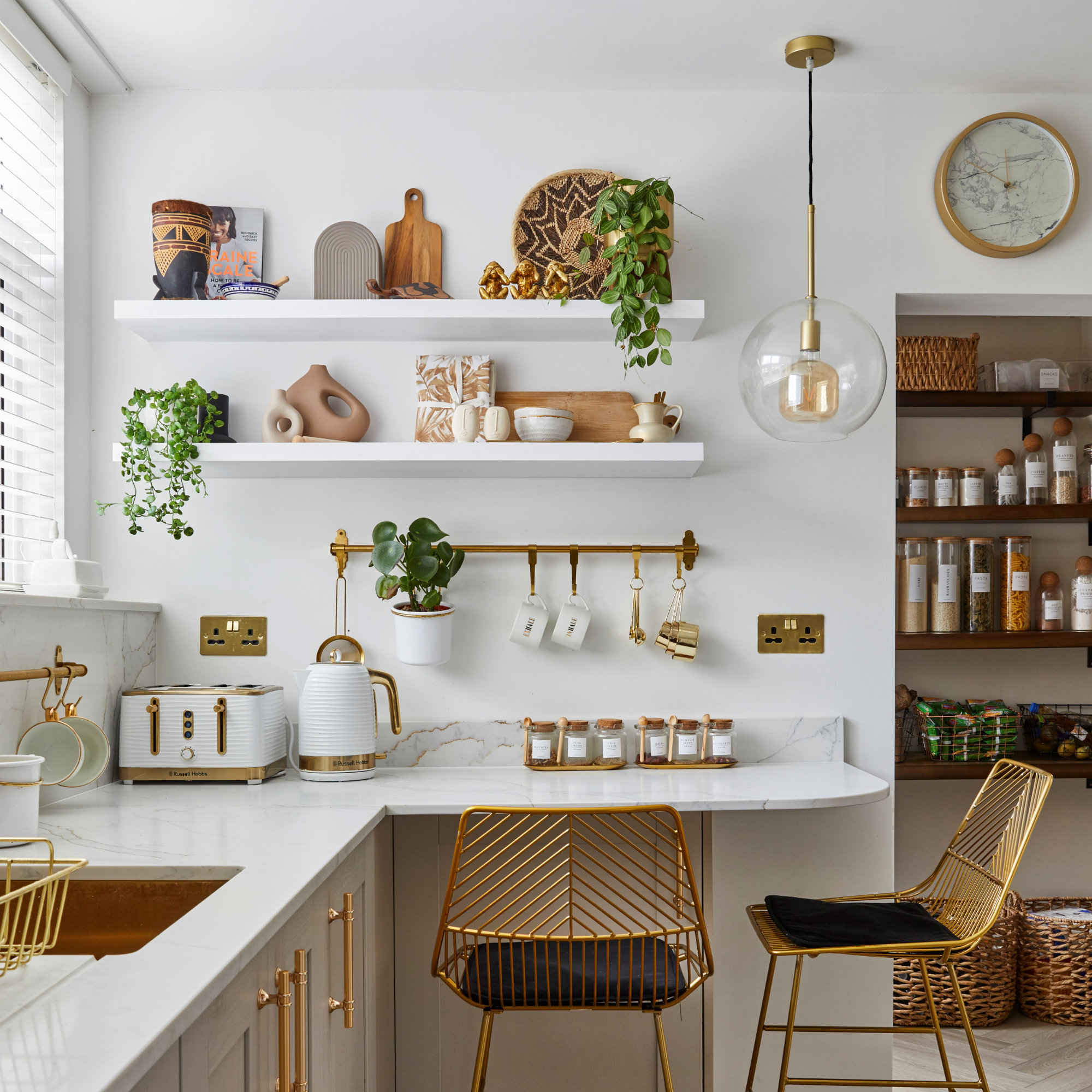
Stacey’s comment about worktop space is not to be overlooked and is often an area of frustration in the kitchen. We need to factor in a certain amount of flexible space to handle hot ovenware safely, prepare food and clean up afterwards. Thankfully, there are innovative ways to organise a small kitchen which can be incorporated into your design.
Helena Myers, director at The Myers Touch in Winchester suggests that 'clutter can be reduced by including a boiling water tap, so there is no need for a kettle on a worktop, as will the inclusion of a rail system to hold everyday cooking utensils'.
She also suggests considering the less exciting, but practical aspects of kitchen design. 'Mobile bins can be hidden behind cabinetry door fronts and sink drainers are also a good idea as they can be moved around and stored', Helena adds.
4. Including oversized appliances
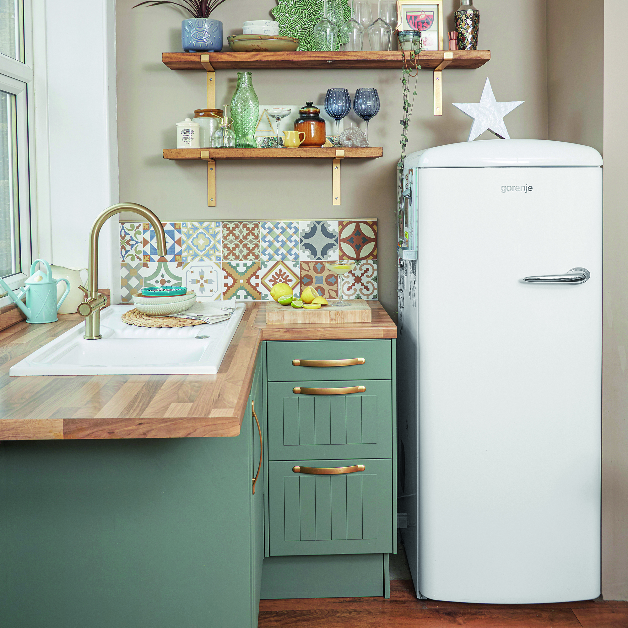
In smaller spaces, there’s usually a trade-off between cupboard space and appliances. Over the years, appliance brands have cleverly developed products that meet our needs in a more compact way.
You could opt for a slim 45cm dishwasher instead of a 60cm model or consider a single fridge. As Helena comments, 'We are increasingly including built-in steam combi ovens to increase worktop space as clients can then choose a smaller hob for frying and wok cooking.'
Lucy Corlett, country manager UK for RørosHetta says, 'The RørosHetta Elegant 60 combo hob is a compact, innovative solution for small kitchens. Occupying just 23cm of worktop space, it allows for functional drawers beneath, optimising cabinet space.'
5. Omitting clever storage solutions
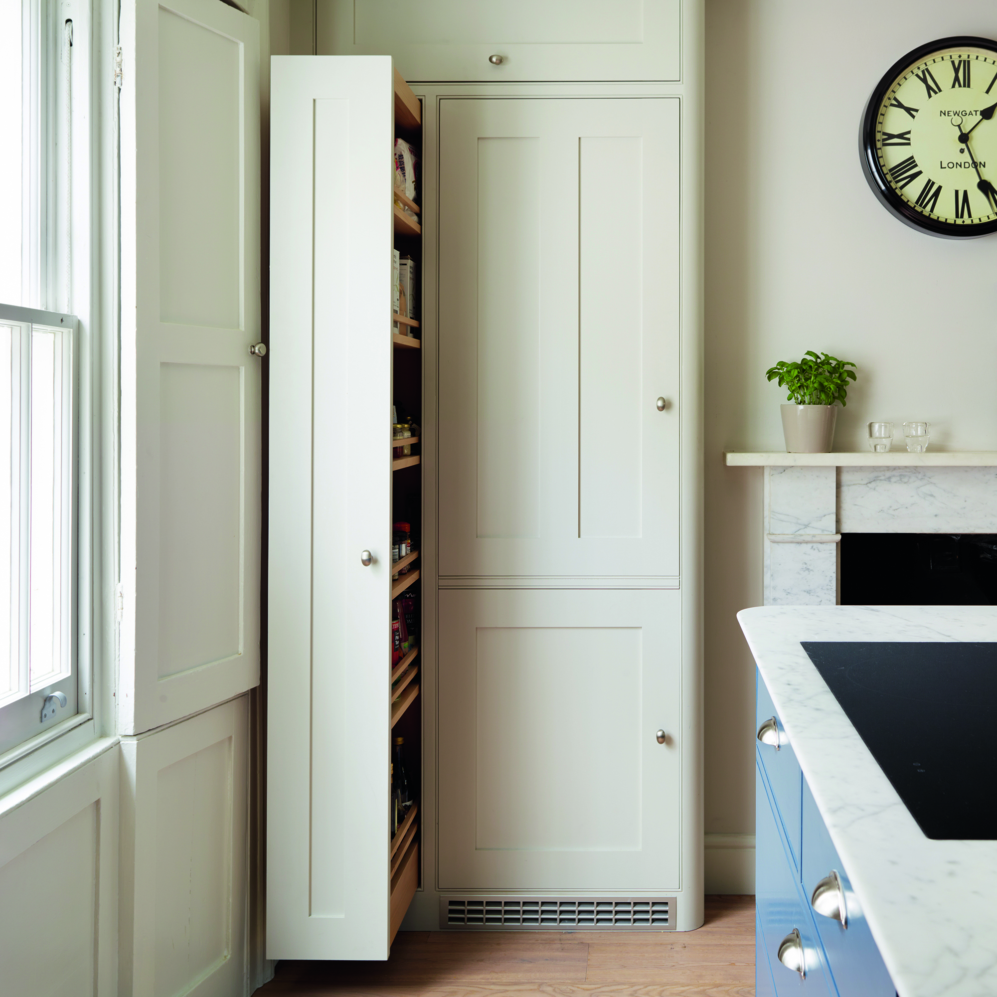
The challenges of small kitchen planning shouldn’t suppress creativity when it comes to the cabinet options on offer. There are plenty of small kitchen storage ideas that will make your space more organised without taking up too much space.
Jen highlights this common mistake. 'People can fall into the trap of ruling out certain storage options in a small space as they believe they don’t have the room.' She emphasises that this doesn’t need to be the case. She adds, 'The 300mm pull-out larder with easy-access wire baskets can be squeezed into narrower areas of the kitchen.'
6. Not considering all seating & dining options
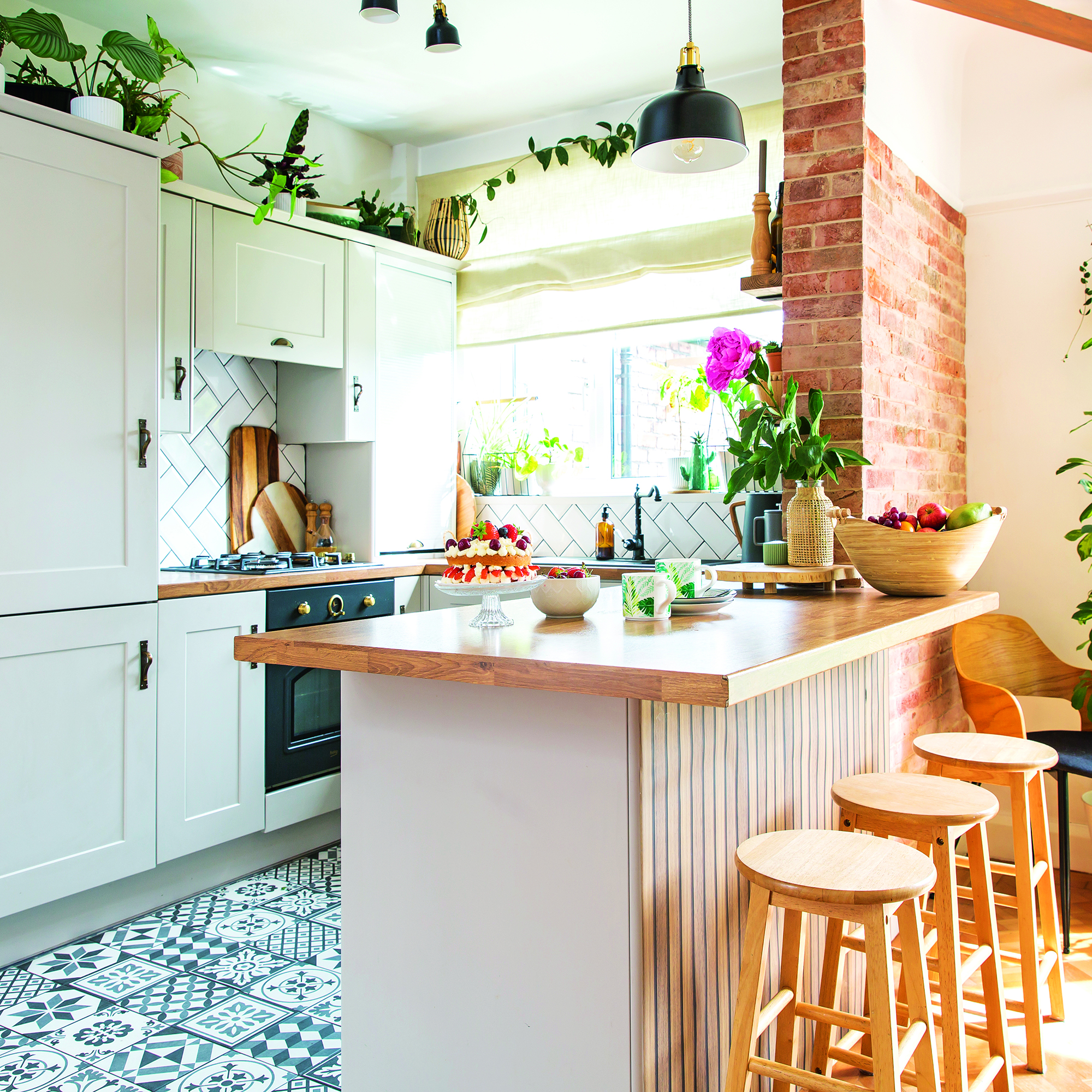
There are more options to consider, other than kitchen islands, when it comes to incorporating seating and dining areas. Even medium-sized kitchens may struggle to accommodate an island and squeezing one in can often be impractical when it comes to traffic flow.
Helena Myers has some alternative suggestions, 'Space-permitting, a slim drop-down table is also a great addition or the inclusion of a peninsula will effectively maximise a worktop area.'
A worktop peninsula can offer the social and practical benefits of an island but in a smaller footprint.
7. Not using colour to make a space feel bigger
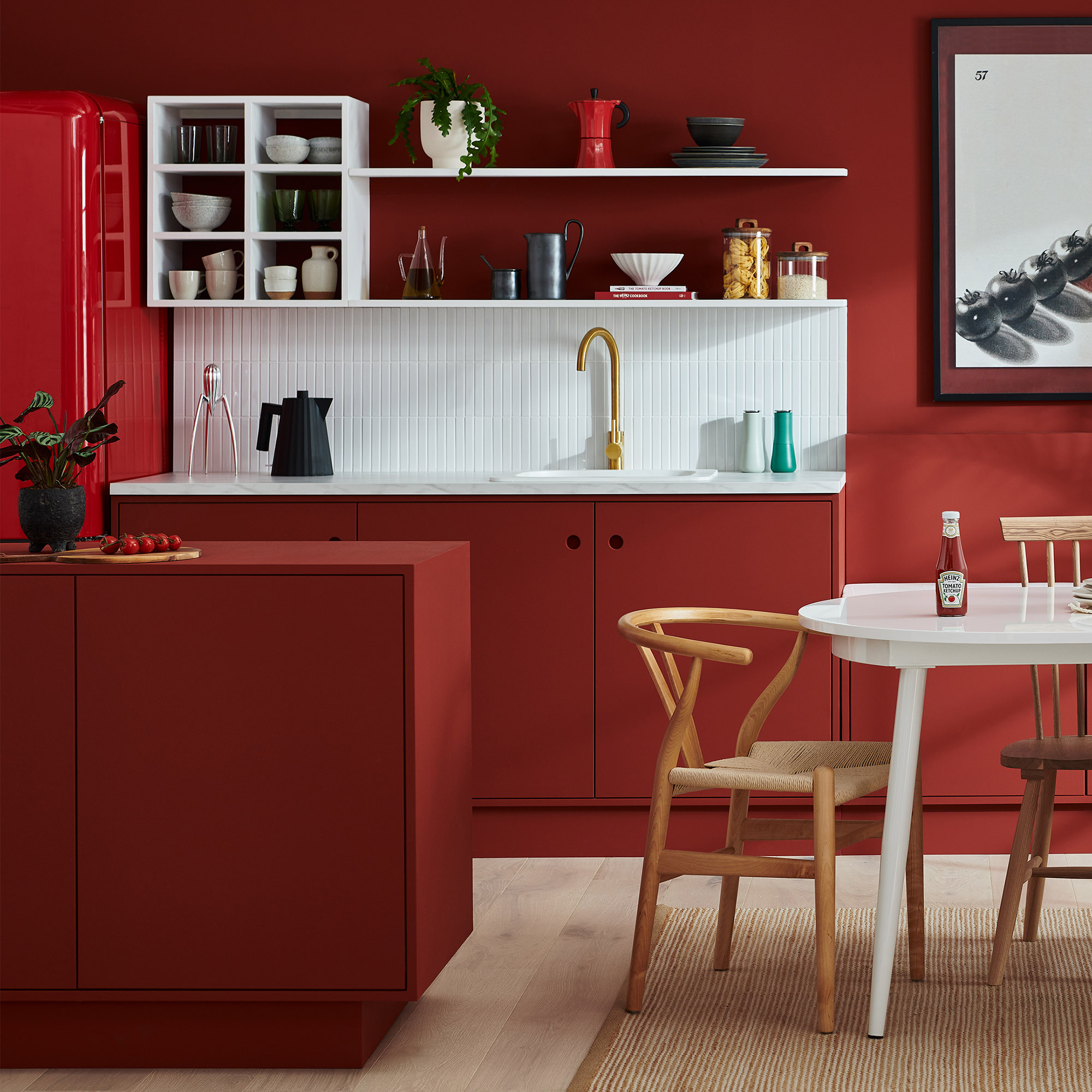
Without extensive building work, we’re often limited to an existing footprint but as Helena points out, 'Clients often say they 'want their kitchen to feel bigger', which, unlike any other room in the house, requires an abundance of different decisions from layout, style and colour.'
Alina Tacutanu, founder of Kitchen Reflection cautions against 'overcrowding' by using too many finishes. 'Limit the colour palette' she adds, 'every small kitchen can be transformed into a serene space that will give you a welcome feeling the second you enter the room.'
One way to do this is by painting the walls & woodwork the same colour as the cabinetry, to create continuity from floor to ceiling, creating the perception of a larger space.
8. Not using available storage space effectively
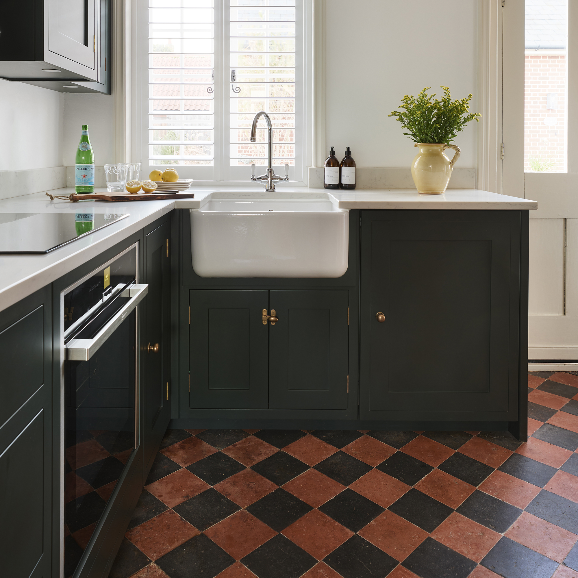
Our kitchens tend to accumulate items that we don’t often need close at hand, such as those small appliances we never use or the dinnerware that only makes an appearance at Christmas, limiting storage for those items that we need more frequently.
Stacey from Turner & Foye suggests using the design process as an opportunity to address this problem. 'Take stock of your inventory to determine which items should be stored in the kitchen, so you can allocate a designated area for each item during the design process.'
9. Not considering lighting during the design process
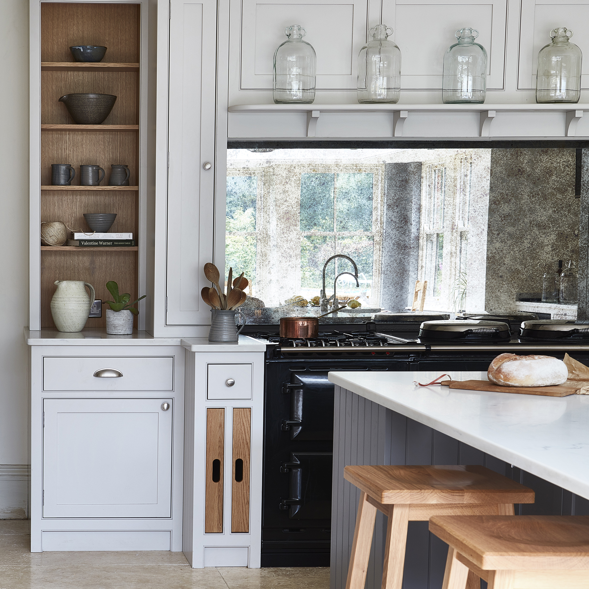
Lighting and our perception of space go hand in hand, so insufficient or poorly placed lighting can make a small kitchen feel even smaller. Incorporating a mix of ambient, task, and accent kitchen lighting to create a well-lit and inviting atmosphere is a key component of good kitchen design according to Jen, adding, 'It sets the mood and can make a dramatic impact on the ambience of your space as it illuminates both your cooking and entertainment areas, to give the illusion of more space.'
Maximising natural light is also important and mirrors are a cost-effective way to achieve this. Helena adds, 'the inclusion of a mid-height mirror will also cleverly make a kitchen feel bigger, adding interactivity and connectivity to the wider area.'
Mirrored splashbacks, instead of tiles, can be a great way to reflect light around a small kitchen. Antique mirrored finishes are a practical choice and more forgiving when it comes to keeping them clean.
10. Neglecting good air extraction
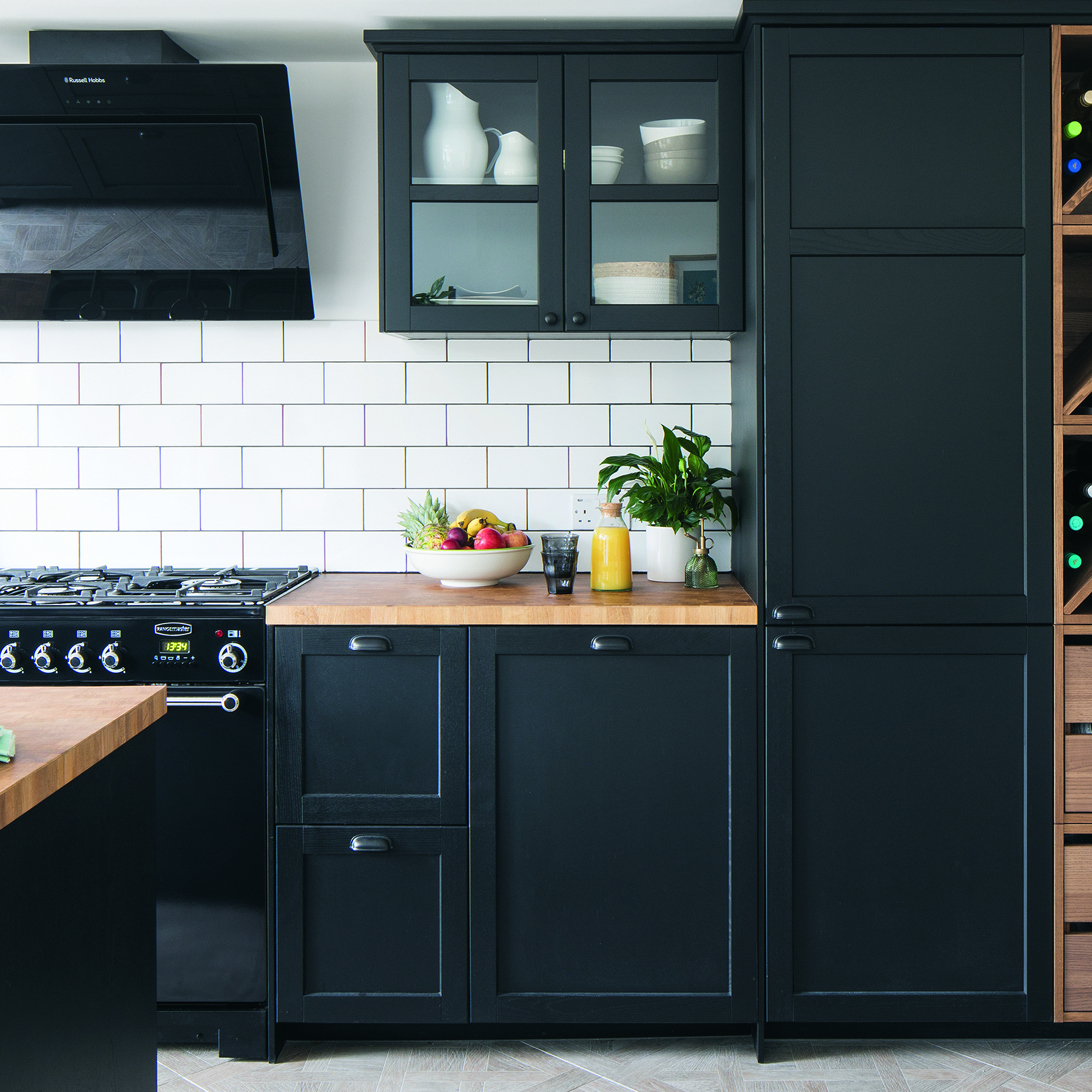
Good ventilation is important in a small space where steam, grease and cooking smells are more concentrated than in larger spaces.
Lucy Corlett, Country Manager UK for RørosHetta suggests their innovative SENSE range of cooker hoods. “The RørosHetta SENSE range is a perfect blend of quiet efficiency, safety, and style. Its advanced features, like air quality monitoring and fire safety alerts, tackle health risks and enhance safety. The hood's smart technology automatically adjusts ventilation, maintaining ideal air quality.”
FAQs
How to maximise storage in a small kitchen
One of the effective ways to maximise storage in a small kitchen is to use the vertical space. Jen Nash, Head of Design for Magnet, suggests wall cabinet ‘stacking’. “At Magnet our designers can help to create stacking configurations. These cabinets can be stacked to create an open shelving look without doors to display your kitchen treasures, or with doors to conceal your kitchen items”. This maximised storage without using the limited floor space.
What is the best layout for a small kitchen?
There are multiple different ways to design a kitchen layout in a small space. The most frequently used in small spaces are the ‘Galley’ shape and the ‘L Shape’, these are layouts that make the most of available wall space for cabinetry and don’t incorporate an island.
If extending the kitchen isn’t an option, Helena Myers, director at The Myers Touch, suggests considering opening up the space. “If the property allows, we might suggest reconfiguring their existing architecture to make a kitchen bigger, or if we undertake a design within an existing small kitchen space its essential to consider cabinetry styles, multi-purpose appliances, maximising worktop space and clever storage systems to make the most of every inch.”

Hayley Simmons is a freelance writer and strategy consultant for home interiors brands. With a passion for interiors and almost 15 years in product and marketing strategy roles for major retailers, Hayley took the leap and set up her own consultancy. In addition to working with retailers and brands as a consultant, Hayley is also a freelance content writer, regularly contributing to the leading kitchen and bathroom industry trade magazine and Ideal Home.
-
 Aldi is launching a £200 day bed with four different features - its sleek design is suited to the whole family
You don't want to miss out on this Specialbuy
By Kezia Reynolds
-
 How to set up a drip watering system that saves water and a lot of effort
Keep your plants hydrated (and your water bill down) with this clever garden watering solution
By Natalie Osborn
-
 I unboxed the Ninja Slushi – here's what happened
The Ninja Slushi is the stuff of dreams for summer entertaining
By Molly Cleary