'I was never going to stick to one colour' - Sophie Robinson's risky kitchen design is a masterclass in decorating your way
Yellow, pink and red is the unlikely colour trio we're now dreaming of
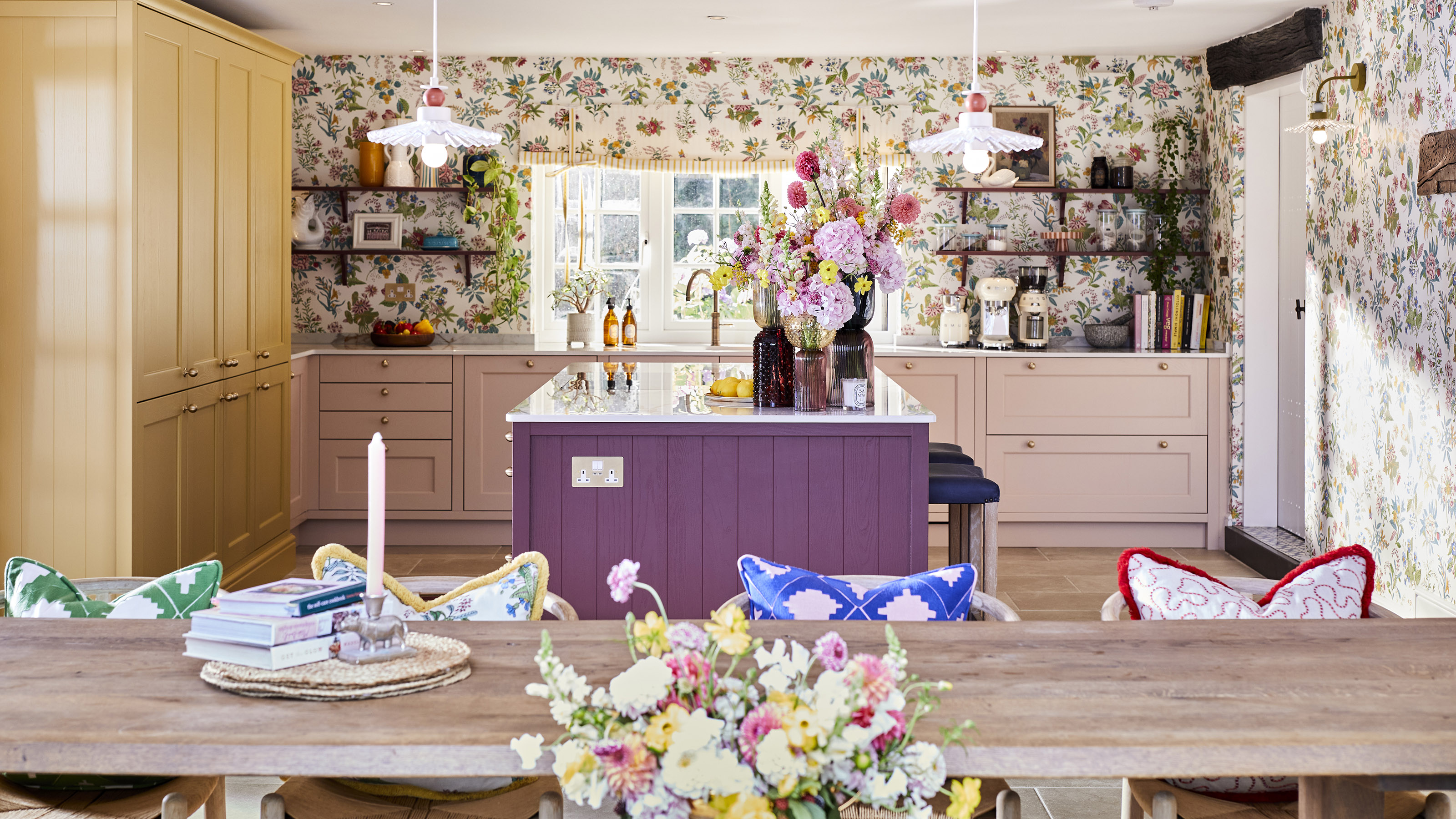

Whether you're already planning a stylish renovation or you're simply looking for some colour ideas to dream up your ultimate design, Sophie Robinson's kitchen supplies inspiration in spades. The presenter, interior stylist and colour expert isn't shy when it comes to choosing unlikely colour combinations for her beautifully bright home, so we expected nothing less when it came to her new kitchen renovation with Magnet.
When it comes to figuring out how to design a kitchen, there are many things to consider. From the cabinet type to packing in plenty of kitchen storage ideas, choosing the overall colour of the design should be the fun part. However, it can be hard to commit to a shade, especially when it's an investment purchase.
Luckily, Magnet's new hand-painted range includes 25 curated shades so there's something for everyone. Sophie's picks are a lesson in taking a risk with your choices to curate a kitchen that truly represents you.
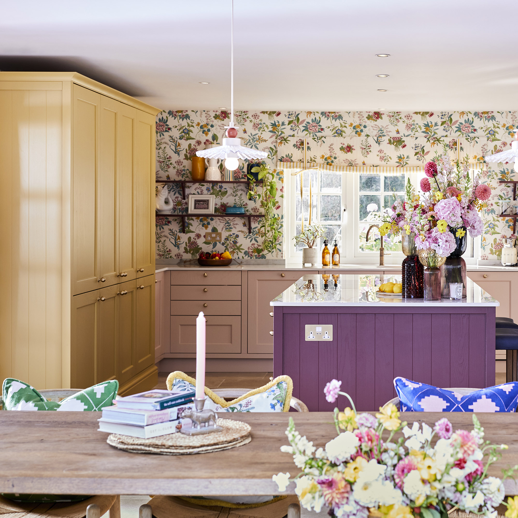
Take inspiration from Sophie Robinson's kitchen
Sophie Robinson is known for her love of colour, so when the opportunity came to collaborate with Magnet on her dream kitchen, it was a no-brainer that it would be packed full of vibrant hues.
'Sophie Robinson transformed her kitchen by blending practicality with her signature maximalist style and an explosion of colour. Working closely with Sophie, we embarked on a journey to craft a kitchen that radiates charm and charisma but suited her busy family life,' says Jen Nash, head of design at Magnet.
'We had so much fun playing with the various colour combinations in our Create Colours range and the final selection felt so unique, fresh and joyful but still retained a classic language which probably sums up Sophie’s distinctive style! Together, we created a breath-taking masterpiece that features not one, not two but three captivating kitchen colours.'
1. Make storage your kitchen hero
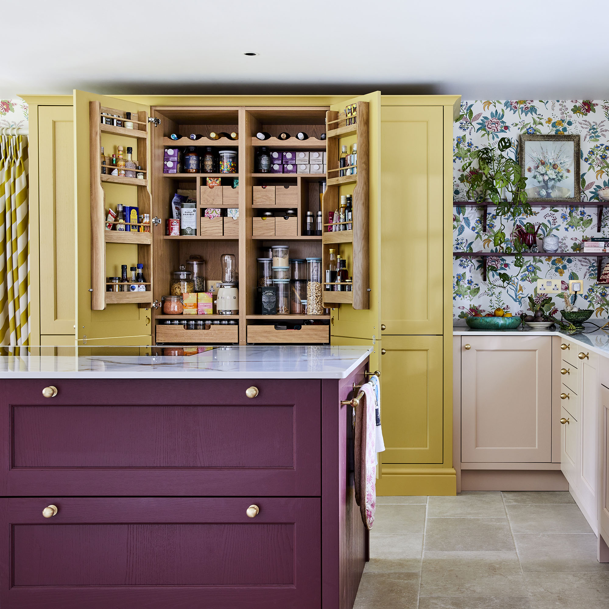
One of Sophie's main aims when designing her new kitchen with Jen was to include plenty of storage, and the pantry cupboard is certainly the standout feature.
Get the Ideal Home Newsletter
Sign up to our newsletter for style and decor inspiration, house makeovers, project advice and more.
'It works like a charm, functions brilliantly, storing all the family’s food in one place: from pantry staples through to frozen and refrigerated foods thanks to the integrated appliances,' Sophie writes on her blog. 'It made organising everything a delightful experience!'
'Appliance garages' are also one of the must-haves of new kitchen designs as they offers a go-to spot for keeping small appliances tucked out of sight, in an easy-to-access spot.
2. Pick patterned wallpaper

When designing a colourful kitchen, more is certainly more. So don't just stop at a playful colour combination, amp it up even further with a patterned wallpaper.
Sophie opted for her own Wildflower print from her collection with Harlequin which she says 'sets the tone for this joyful, uplifting and sociable space.' Situated along the length of the pale pink cabinets, it ties the entire colour palette together and even extends into her open-plan dining room for a cohesive look.
Opting for an open kitchen shelving idea also helps to break up the appearance of a busy pattern, so if you're worried about committing to a print then consider adding accessories to lessen the impact.
3. Don't just stick to a colour duo
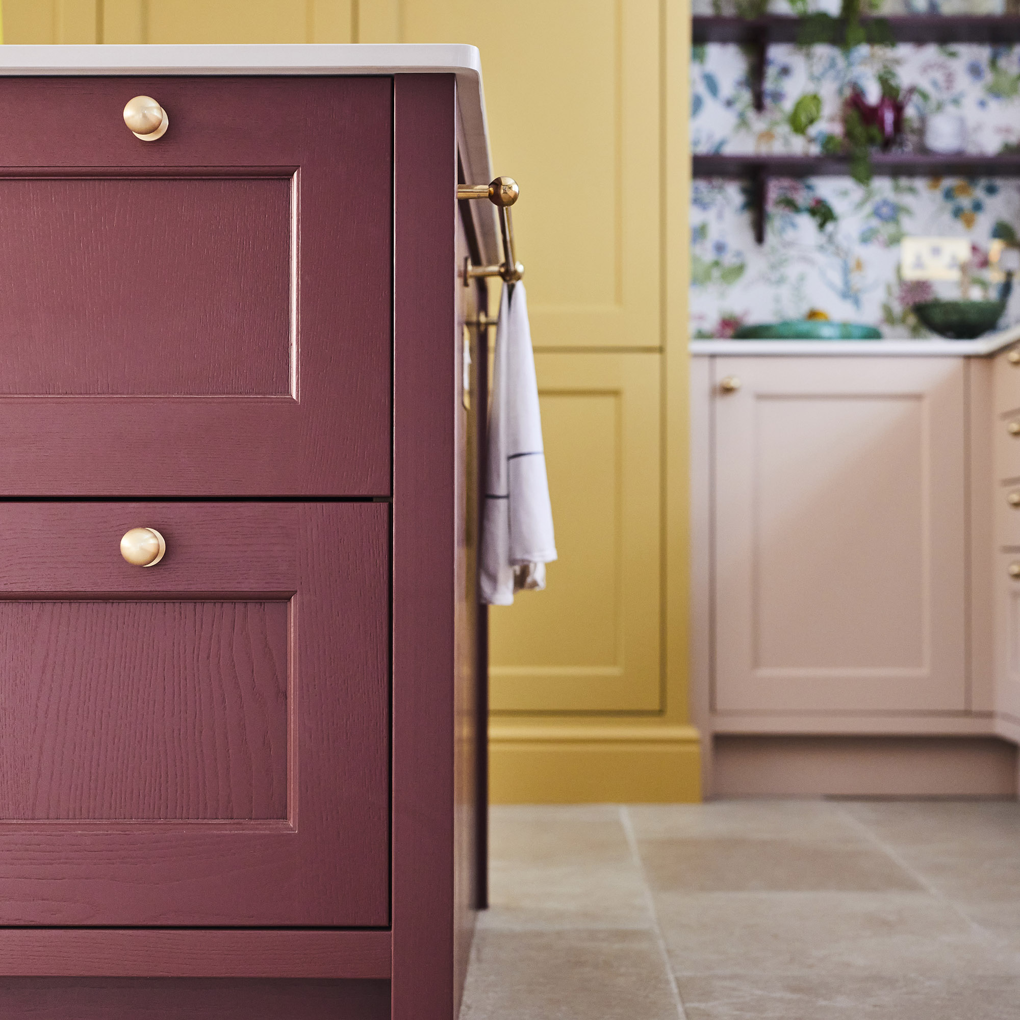
A lot of advice around choosing a kitchen colour scheme involves finding a pair of shades that compliment each other, and using this to form the basis of the design. However, going one step further and selecting a third colour will add plenty of dimension to a kitchen and make for a stylish yet unique effect.
Sophie opted for the Ludlow kitchen in Harvest, Chalk Blush and Burlington Red, creating a warm and homely atmosphere. The key to using three shades is to opt for two that are in the same tonal palette, as this add cohesion to the look.
'The colour palette, while it looked great on paper is just mouth-watering in real life,' writes Sophie. 'We chose three shades from Magnet’s hand-painted range and in real life they are perfection. This harmonious blend of Harvest Yellow and Chalk Blush pink and deep warm Burlington Red performs magically in this space, crafting the convivial, uplifting and joyful atmosphere that I envisioned for this family room.'
Sophie Robinson is definitely living in her villain era with her bold kitchen choices. Have you been tempted to take a colourful risk with your next kitchen makeover?

After starting out her journey at Future as a Features Editor on Top Ten Reviews, Holly is now a Content Editor at Ideal Home, writing about the very best kitchen and bathroom designs and buys. At Top Ten Reviews, she focussed on TikTok viral cleaning hacks as well as how to take care of investment purchases such as lawn mowers, washing machines and vacuum cleaners. Prior to this, Holly was apart of the editorial team at Howdens which sparked her interest in interior design, and more specifically, kitchens (Shaker is her favourite!).
-
 Wood drenching is the calming new twist on the colour drenching trend – here’s how to make the look work in your home
It’s easier than ever to embrace natural materials
By Maddie Balcombe
-
 Aldi is launching a £200 day bed with four different features - its sleek design is suited to the whole family
You don't want to miss out on this Specialbuy
By Kezia Reynolds
-
 How to set up a drip watering system that saves water and a lot of effort
Keep your plants hydrated (and your water bill down) with this clever garden watering solution
By Natalie Osborn