Kitchen colour experts are calling this the 'it' colour of 2024 that will go down as a future classic
The new neutral we'll all be lusting after
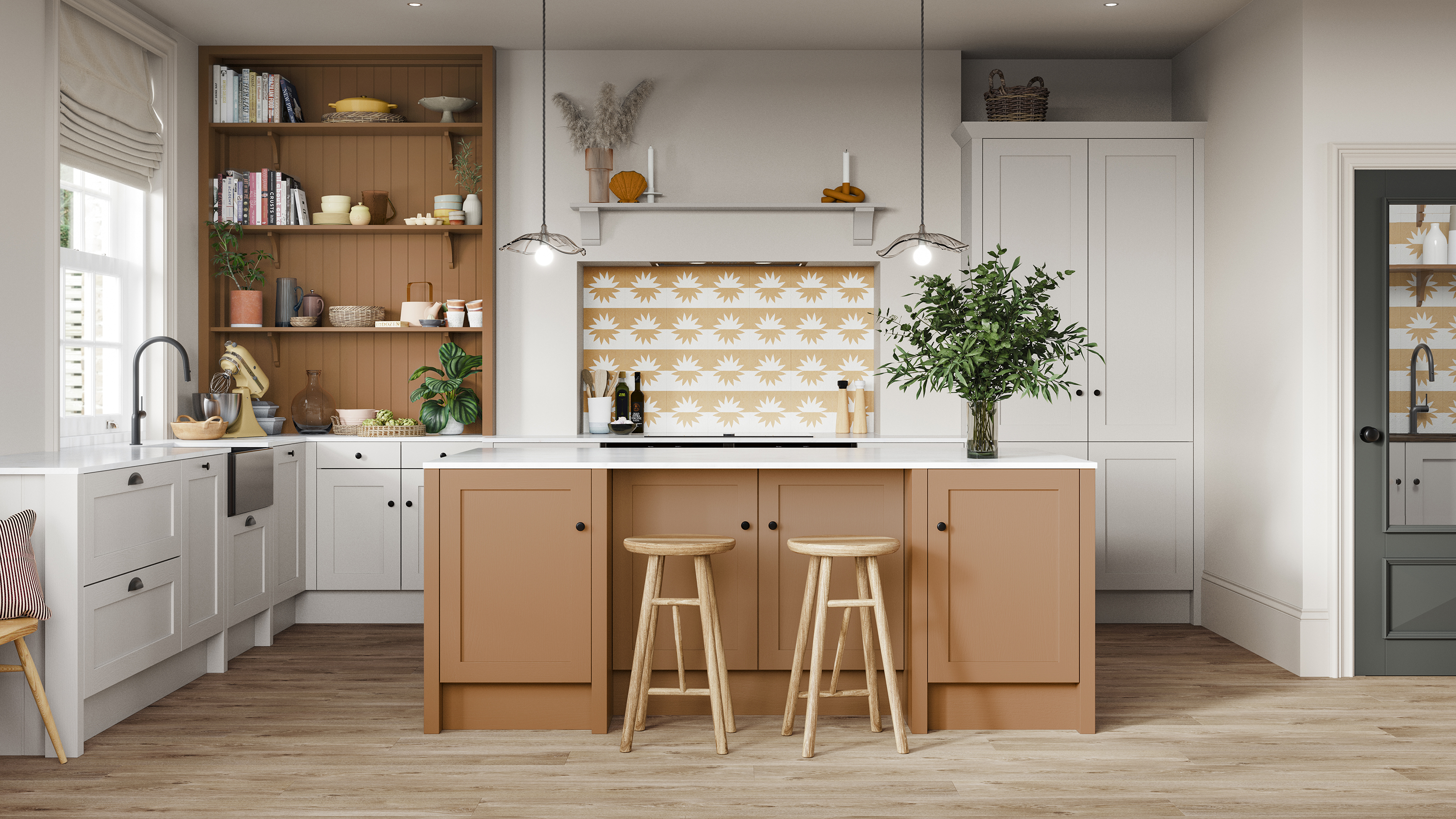

Embracing colour in a kitchen is the fastest way to make it feel warm, inviting and packed full of character, and the terracotta kitchen trend does exactly that.
We've seen navy kitchens become commonplace in many homes and while they've become a classic colour that will stick around for years, it's time for a fresh kitchen colour scheme. if you're on the hunt for a new palette that feels equal parts trendy and traditional, terracotta is going to be the tone to look out for in 2024.
It has a cosy feel that will look just as good warmed up with wood as it will next to crisp white surfaces, and offers plenty of personality that will transform for a timeless feel in your kitchen.
How to embrace terracotta in your kitchen
New neutrals are sweeping interiors and essentially consist of updated tonal shades, like terracotta, greige and even pinker shades. They're all just as easy to style in traditional kitchens and modern kitchens alike, all it takes are the right worktops, flooring and accessories to take terracotta into its own.
Magnet has just released its own take on the warm neutral with its brand new Nutmeg shade. 'In short, Nutmeg is that ideal shade that brings not just colour but warmth to the kitchen, adaptable to personal style and changing trends,' says Jen Nash, head of design at Magnet.
'This versatility makes it suitable as a backdrop to both classically elegant and playfully modern designs. Regardless of how the shade is adopted within the home, its warm and calming character will create a space that feels refreshing and balanced all year round.'
1. Go full traditional
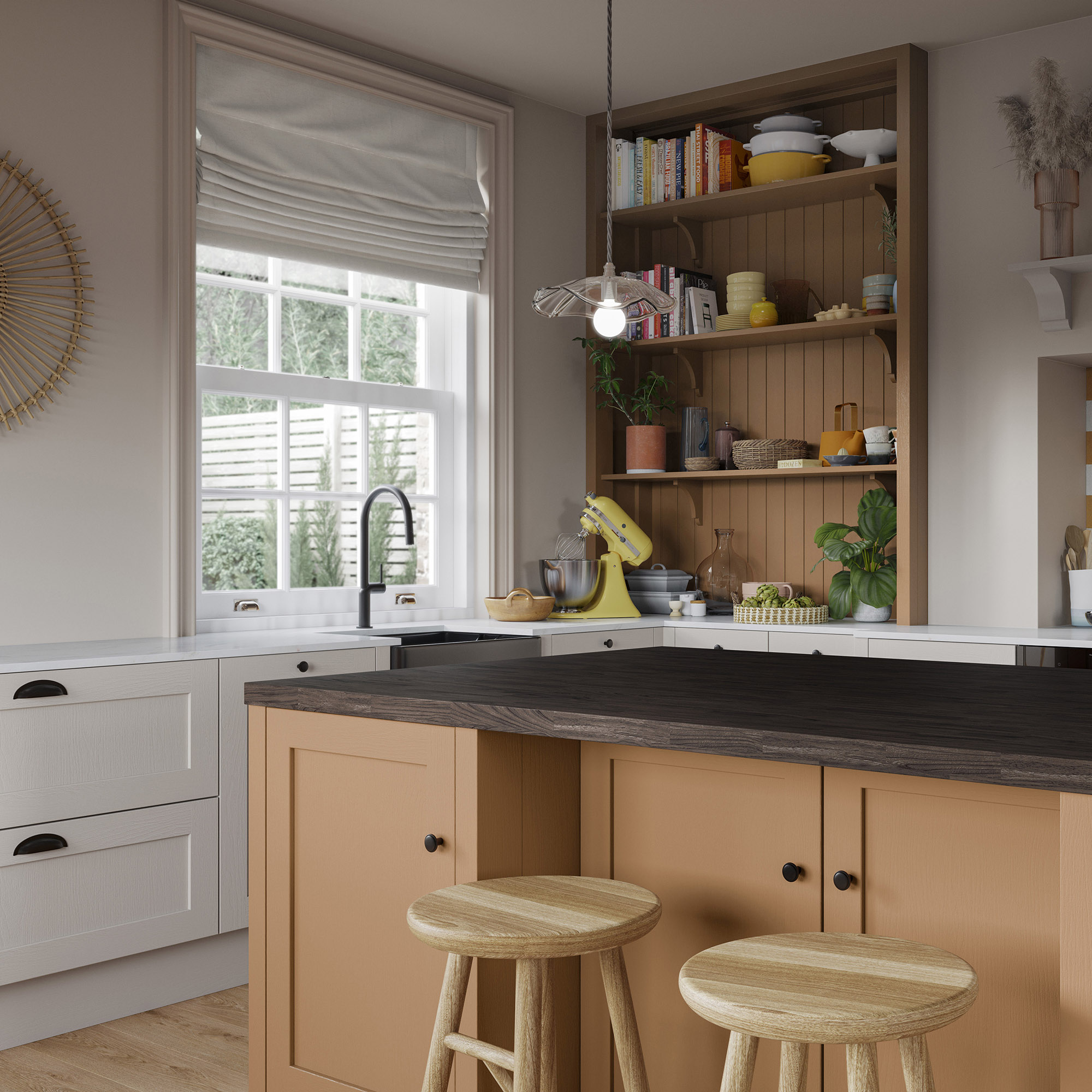
Terracotta works particularly well in Shaker kitchens for a warm and homely traditional look. It's a refresh of classic cream kitchens that are popular in country homes, so if you want to add either a pop of colour to an overall cream design, or go statement with all-over terracotta, it will fit right in.
Get the Ideal Home Newsletter
Sign up to our newsletter for style and decor inspiration, house makeovers, project advice and more.
Wall panelling looks even more premium when painted in muted colours, so consider adding terracotta to a specific section of open shelving to make it stand out. This is also a great compromise if you're wary of opting for all-over colour for your wall and base cabinets.
2. Embrace on an island
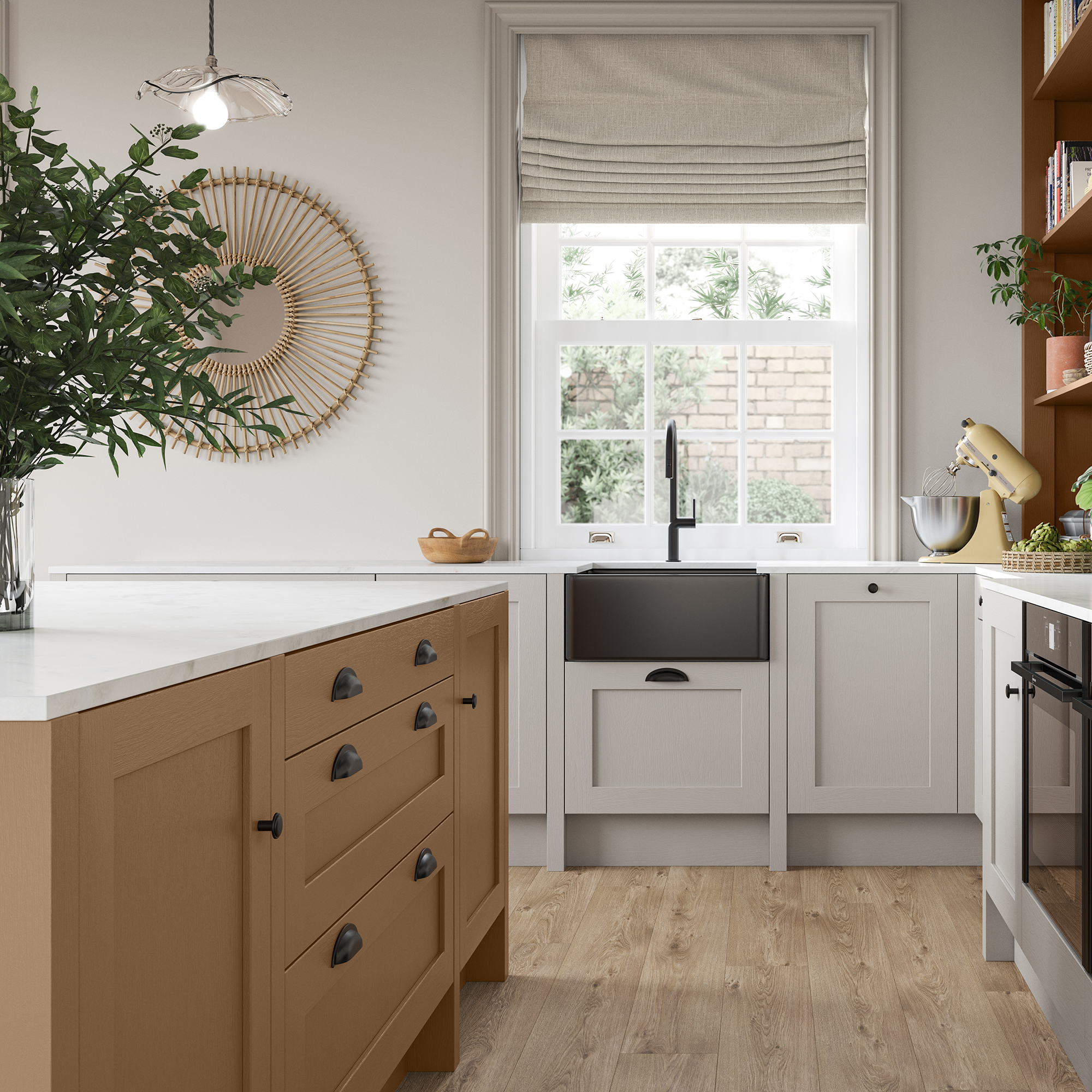
If you're hesitant about committing to a trendy colour palette, then incorporating it into an island is a handy way of getting the look on a smaller scale. A kitchen island is where friends and family gather to catch up about their days, eat, drink and cook, so designing it in an enveloping shade will only further this spirit.
'Terracotta is a lovely timeless, warm tone. Currently, following the years of the pandemic, there is a need for these enveloping and earthy shades as they give a sense of extreme cosiness and comfort, which creates an ever-welcoming and warm atmosphere in any space,' says William Durrant, owner of Herringbone.
'When using the various tones of terracotta it's good to keep other warm shades to a minimum and combine it with fresh, cooler colours - like white worktops and lighter cabinets from the rest of your interiors. This also goes for the flooring as the pattern works well with this tone and adds an interesting texture. Varied tones of the floor bring together the terracotta colour of the kitchen cabinets.'
3. Make it modern with copper
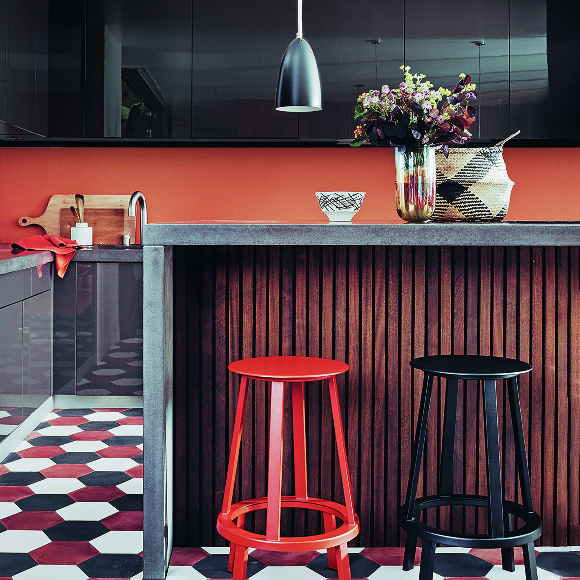
Terracotta doesn't just have to be reserved for a classic kitchen design. Its orange hue makes it perfectly placed next to copper and dark wood as it draws the richness out of the shade.
Modern, slab kitchens would work well in this shade, either with a run of cabinetry on the floor or wall that features the colour or as a pop of warmth on a backsplash.
'With its soft and earthy undertone, Nutmeg is a truly versatile shade to style. Opt for creams and browns to create a 70s inspired palette or for a more striking design pair with darker greens and charcoal shades - black accents will also add a modern and minimal feel,' says Jen.

After starting out her journey at Future as a Features Editor on Top Ten Reviews, Holly is now a Content Editor at Ideal Home, writing about the very best kitchen and bathroom designs and buys. At Top Ten Reviews, she focussed on TikTok viral cleaning hacks as well as how to take care of investment purchases such as lawn mowers, washing machines and vacuum cleaners. Prior to this, Holly was apart of the editorial team at Howdens which sparked her interest in interior design, and more specifically, kitchens (Shaker is her favourite!).
-
 How to set up a drip watering system that saves water and a lot of effort
Keep your plants hydrated (and your water bill down) with this clever garden watering solution
By Natalie Osborn
-
 I unboxed the Ninja Slushi – here's what happened
The Ninja Slushi is the stuff of dreams for summer entertaining
By Molly Cleary
-
 Should you invest in a pot filler or are they just a high-end kitchen fad? I asked kitchen experts whether they're set to be a trend beyond 2025
A high-low approach to kitchen design is the key to creating a stylish space in your budget
By Holly Cockburn