These are the colour mistakes to avoid in your living room, according to decorating experts
A guide to getting your colour scheme right
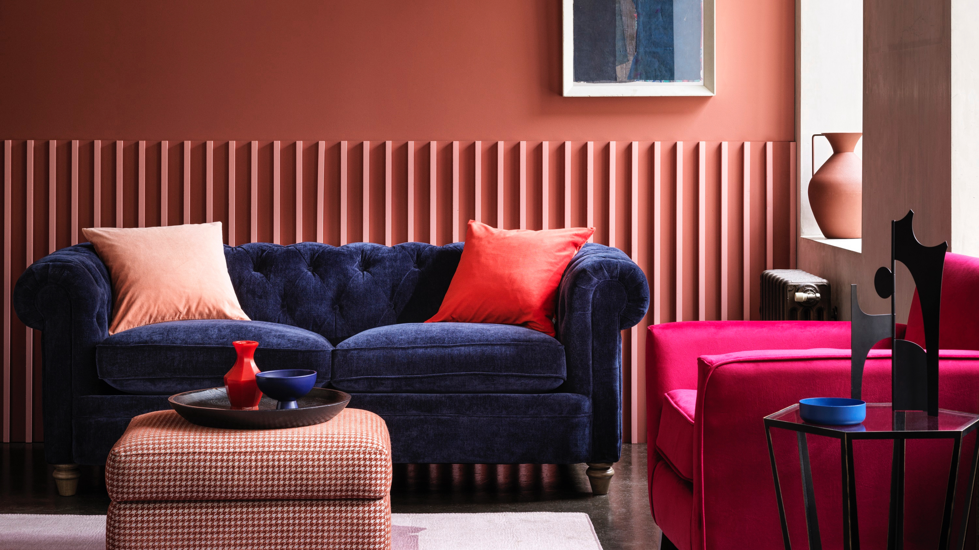

The right paint can transform a space instantly and turn it from tired and dull to harmonious and uber stylish, but how can we stop making living room colour mistakes from the get go? Let's face it, choosing the right colour for any space can be testing, and with our living rooms being such an important family space, it pays to get your choices right first time.
'When considering a colour scheme for your living room, think about the atmosphere you want to create,' suggests Shelley Cochrane, accessories buyer at Furniture Village. How you want the room to feel should always come high on your agenda when looking at choosing the perfect paint colour.
'Although the living room has always been a favourite space, it had in recent years become more of a showcase to impress friends and family than a place in which we could be our true selves,' says Marianne Shillingford, creative director at Dulux 'Over a tumultuous few years of change that has seen our homes working harder than ever, the living room is transforming into a place in which we can express who we really are and how we really want to feel. It will become a gallery of our lives filled with rich storytelling and comfortable, comforting furniture and accessories - that most importantly doesn’t look like anyone else’s living room.'
Living room colour mistakes to avoid
A good place to start is with the colour wheel, as it will help the process feel less daunting and allow you to choose colours that you may not have considered before. Then, start to collect paint charts and fabric swatches so you can get a feel for the living room colour scheme you want to create. Keeping it simple is always best and choose a scheme that feels you with joy.
We asked our colour experts to share their top ten living room colour mistakes to look out for when decorating a living room.
1. Being scared of dark colours
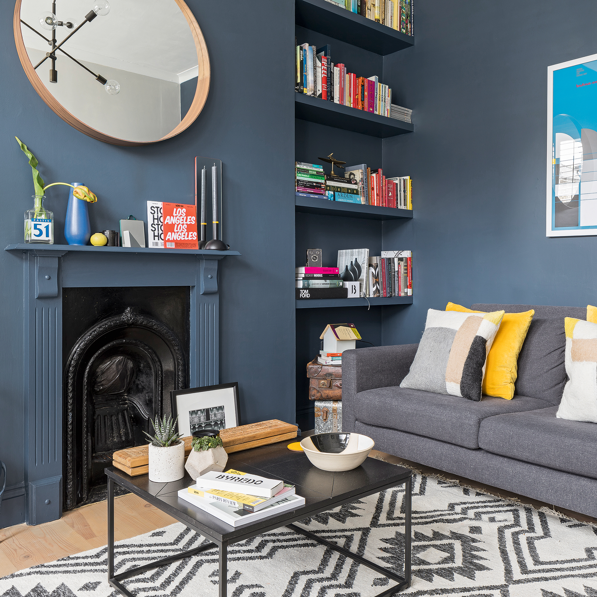
We've all seen beautiful living rooms with dark wall colours that look cosy and inviting, but the thought of implementing that kind of colour scheme yourself can be scary when considering ideas for living room paint.
'Be brave with your colour choices and dare to go dark in the living room, it creates a cocooning feeling that makes leaving the sofa nearly impossible,' suggests Joanna Baumard, co-founder, Purlfrost.
Get the Ideal Home Newsletter
Sign up to our newsletter for style and decor inspiration, house makeovers, project advice and more.
2. Not opting for bold, grounding shades
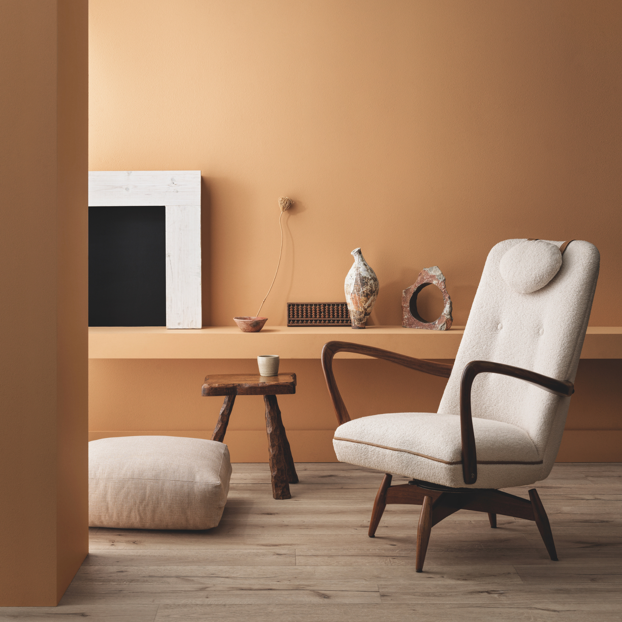
We can think that grounding colours like stone, taupe, russet, oatmeal and ochre are all pale. Of course some earthy colours are, but many have pigments that offer a depth that takes them from a basic neutral to something more exciting. Take grey for living rooms, for example – grey offers so much scope, from the palest, barely-there off-white to dark and dramatic almost-black.
'Far from being difficult to use as a backdrop to soft furnishings, artworks etc, a bold earthy colour, chosen with care, can actually harmonise different elements in a scheme, introducing warmth, character and a sense of calm,' says James Sirett, head of product at Fired Earth.
'Extending the colour to the floor (rather than breaking it up with a white skirting board) enhances the impression of warmth and also opens up the room, creating the illusion of more space.'

James Sirett is head of product at Fired Earth and has spent his entire career in the tile industry. He first worked at Fired Earth in the mid-90s and, having spent some time working for a tile distributor and running his own company, he rejoined Fired Earth in 2018. James is passionate about supporting artisan tile makers around the world and loves nothing more than spending time in their workshops watching designs come to life. He firmly believes in the transformative effect the right tiles (and colour) can have in a home.
3. Using the wrong paint finish
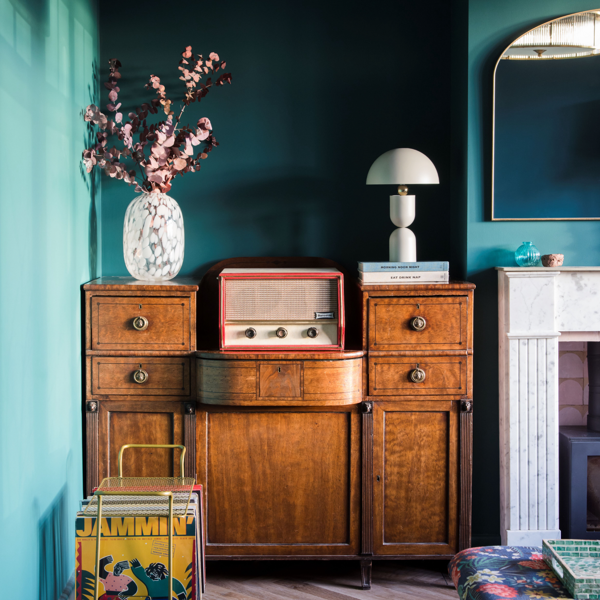
Not specifically about colour, but if you get your paint finish wrong when looking at how to paint a room, it will visually change the colours you do choose to use. Emma Bestley, co-founder & creative director, YesColours, explains: 'Choosing the right paint finish is more crucial than you think. It's like picking the perfect outfit for a job interview - if you don't get it right, you'll leave a bad impression. When thinking about the living room, it’s best to choose a matt emulsion for the walls and an eggshell for the woodwork.'
'Choose a paint with a matt finish that really allows the depth of the colour to be seen,' continues Emma. 'This is especially important when using a rich or punchy shade. It should be easy to use and dry to a lovely finish, essentially allowing you to give your living room a brand new look in just a couple of hours.'
4. Blindly following trends
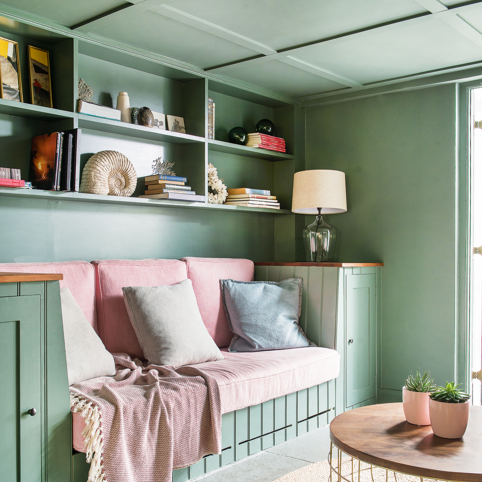
The key with trends is to follow them if you like them. If they don't resonate with you in anyway then leave them be. But if you do love one or two of the latest paint trends, then we say embrace them!
‘The past few years have dramatically changed people’s approach to their interiors and we are seeing consumers really finding their own sense of colour confidence in their homes,' says Ruth Mottershead, creative director, Little Greene. 'There is a move away from white woodwork and skirting in favour of contrasting or coordinating colours on woodwork, and the continuation of the colour drenching trend, which takes a single, or closely related colour across all aspects of a space, from skirting and walls to ceilings and doors.
This can be seen in the use of wallpaper in living rooms too, with tonal designs being paired with coordinating colours to create cohesive immersive interiors as well as adding paint to ceilings, which are often painted white, out of habit. Simply changing your ceiling colour and integrating it into your design scheme, will have a profound effect on the atmosphere within the space, as well as being the perfect opportunity to make a design statement.'

Ruth Mottershead, creative & marketing director of Little Greene, has been working in her family’s business for 12 years. She is responsible for creating concepts and ideas for upcoming paint and wallpaper collections, choosing colours for new cards and browsing archives at the National Trust for new wallpaper collections. She writes content for the company’s marketing material, manages photoshoots and communicates with Little Greene and Paint & Paper Library’s customers.
5. Believing you can't contrast light and dark shades
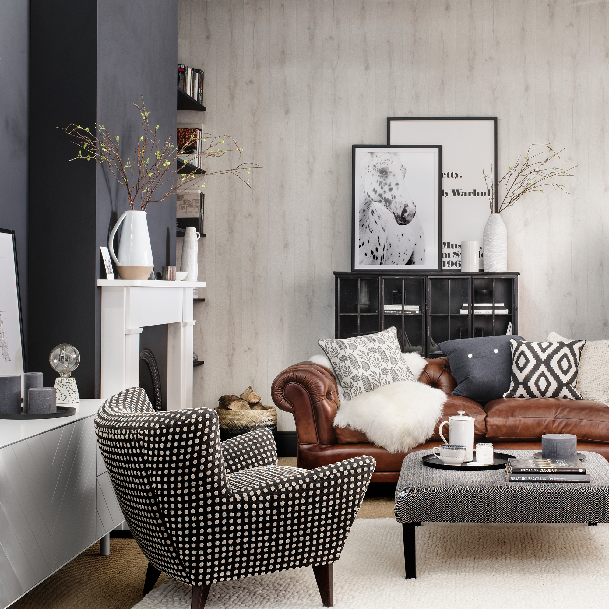
Generally, we're taught that one colour is enough in a space and that's what we tend to look for when we're in search of the ultimate shade, but experts say this is one living room colour mistake to avoid, because you can create a fabulous contrast between a light and dark shade.
'If you think you can’t contrast pale and dark colours in one room, think again,' says Francesca Hadland, interiors expert, Bridgman. 'Playing with light and shadow is a surprisingly easy way to create amazing atmosphere, ambience and depth in any space. Picking a softer, lighter shade for your walls and pairing it with a deep, painted ceiling will infuse your room with instant cosiness.'
Using a light and dark combination when picking living room paint colours will require a little balance, so keep your furniture lighter and use accents in a warmer colour to add an extra element.
6. Thinking neutrals are boring
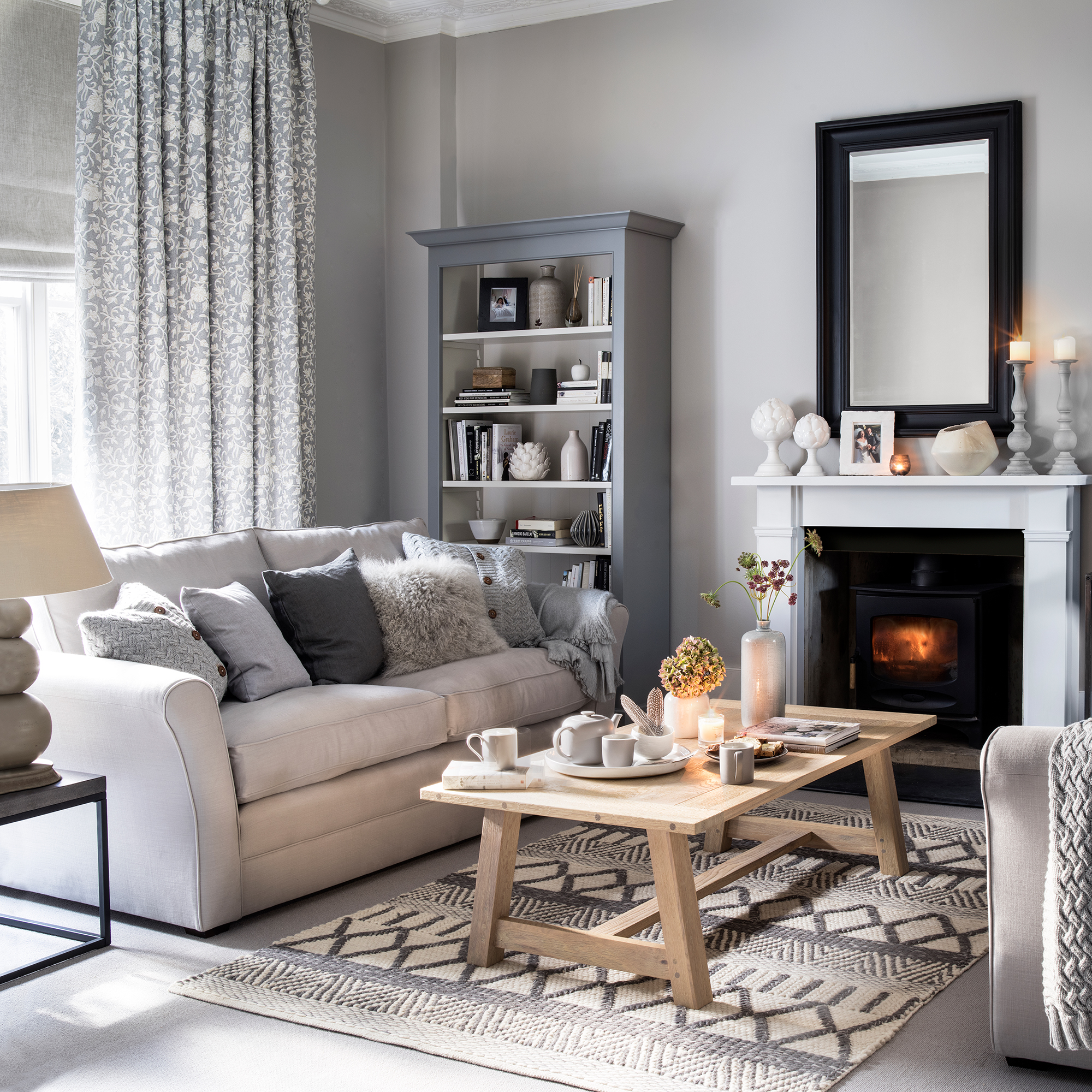
Neutral colour schemes get a bad press, though they're extremely versatile and can lift a dark space or one with interior design issues like low ceilings. There are plenty of beautiful neutrals to consider – gentle off-whites, beige, barely there blush, camel, tan and buff.
'It's all about personal taste and what style of space the homeowner is trying to create,' says Marie Goodwin, head designer, Prestigious Textiles. 'However I would suggest avoiding darker colours on the walls of a smaller living room, or a living room which doesn’t have much natural light.
Darker colours can be introduced in smaller accessories to add depth. Also we would suggest avoiding all white schemes, as this could create a cold space, but for a neutral scheme that embraces calming colours, introduce creams and warm neutral tones, along with lots of textures to soften the space.' The key is to add tactile elements like chairs upholstered in boucle, linen or velvet and to use textures like rattan.
7. Choosing colours that don't fit the space
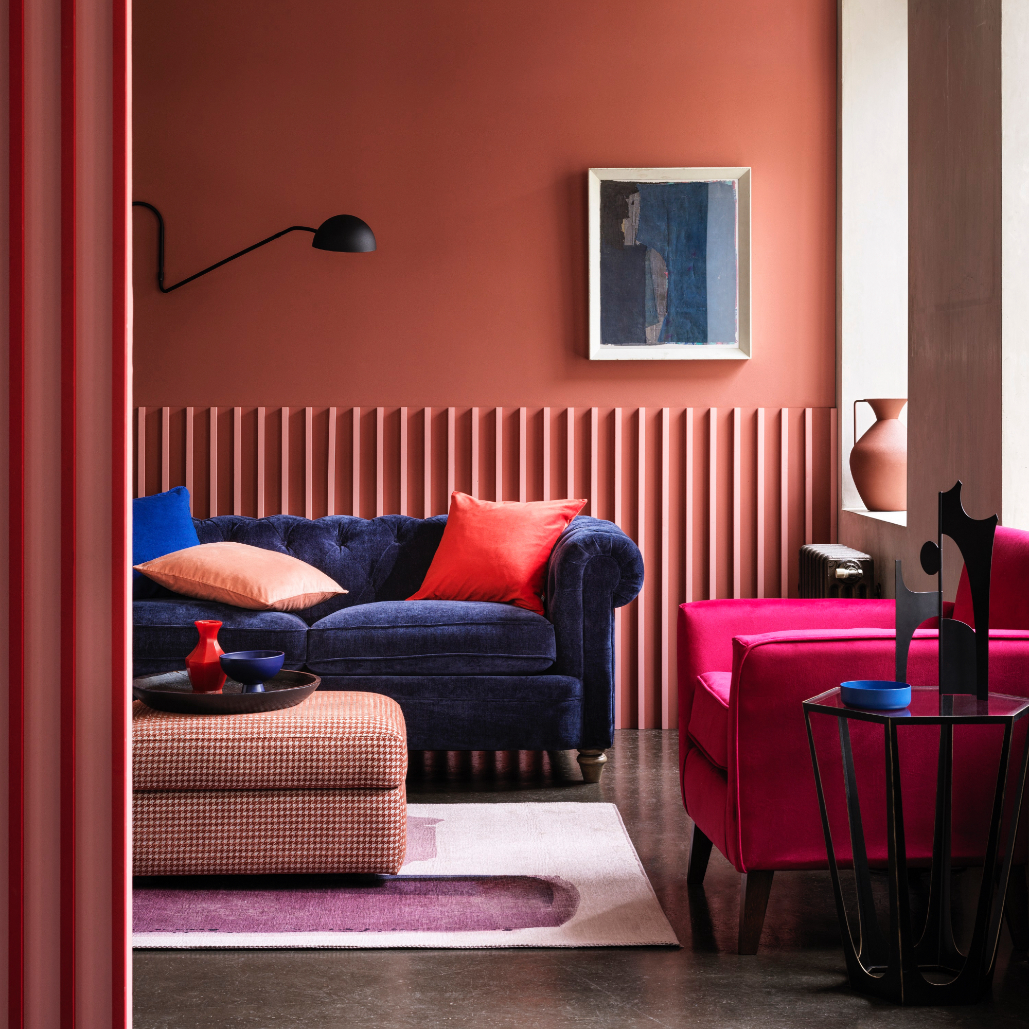
Before starting a room it pays to really look at the bare bones of the space first and ask yourself a few key questions. Is the ceiling low? Is the room north-facing or south? Another consideration is the size, as when looking at how to make a small living room look bigger, you can use certain colours to help.
'When considering a colour scheme for your living room, think about the atmosphere you want to create,' suggests Shelley Cochrane, accessories buyer at Furniture Village. Bright colours should be avoided – whilst they are great for bringing energy to a space, they don’t lend themselves well to creating a restful atmosphere that suits a living room come evening time. If you do want to bring in colour, choose more mellow tones like coral or sage green which will bring the same uplifting energy without the overwhelm that comes from bright and bold shades.'
8. Believing woodwork must be white
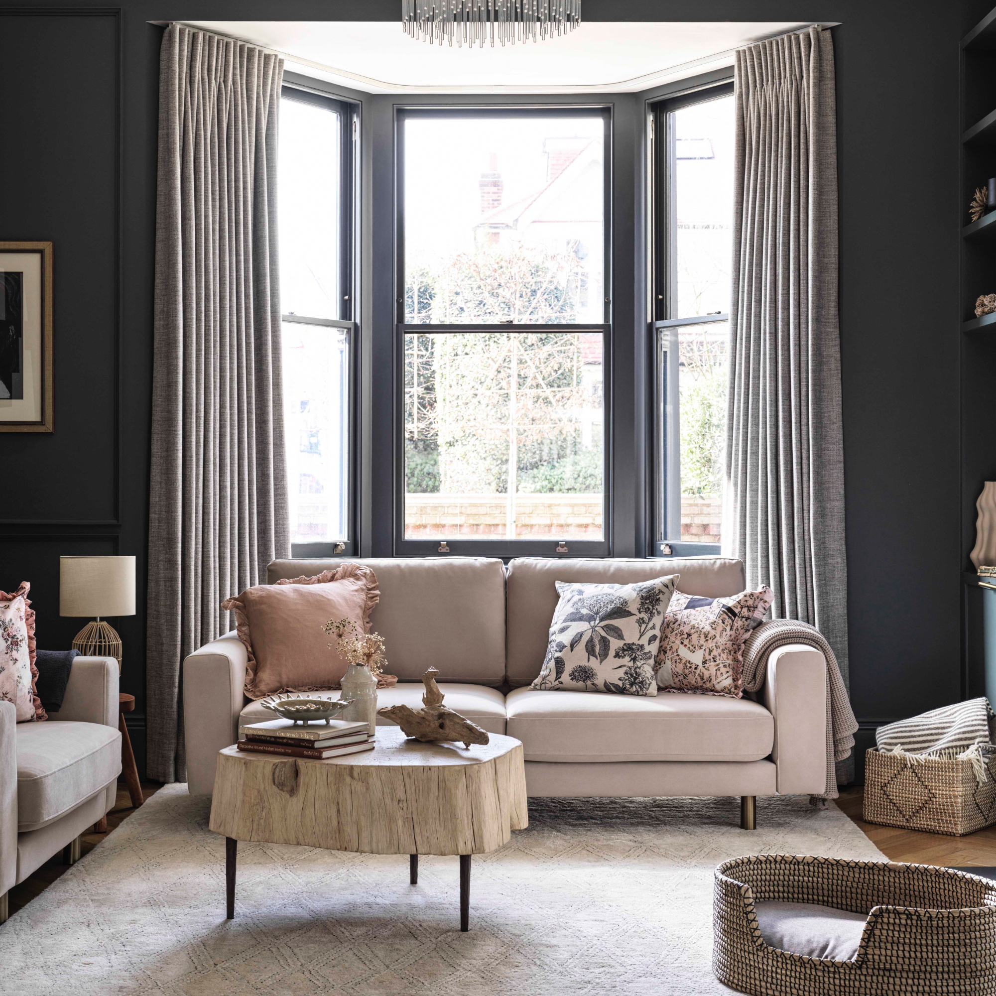
We've all had white woodwork, it's been standard practise for decades, but in the last couple of years the trend has been to paint your woodwork the same colour as the walls instead.
'It’s time to rethink how we work with colour in our living rooms, starting with paint - and if you ask me, the bolder the better,' says Dani Burroughs, head of product at Snug. 'It’s an important decision as the right colour creates the ideal backdrop for your sofa and furniture. Gone are the days of drab, mismatched woodwork. Embrace the power of colour and transform your home into a modern masterpiece by continuing the wall colour onto the woodwork. Trust me, you won't regret it.'
We agree with Dani; there's something rather revolutionary when it comes to painting your woodwork in a colour. You could even flip it and paint your walls white and have the rest in colour – the world is your oyster!
9. Forgetting the ceiling
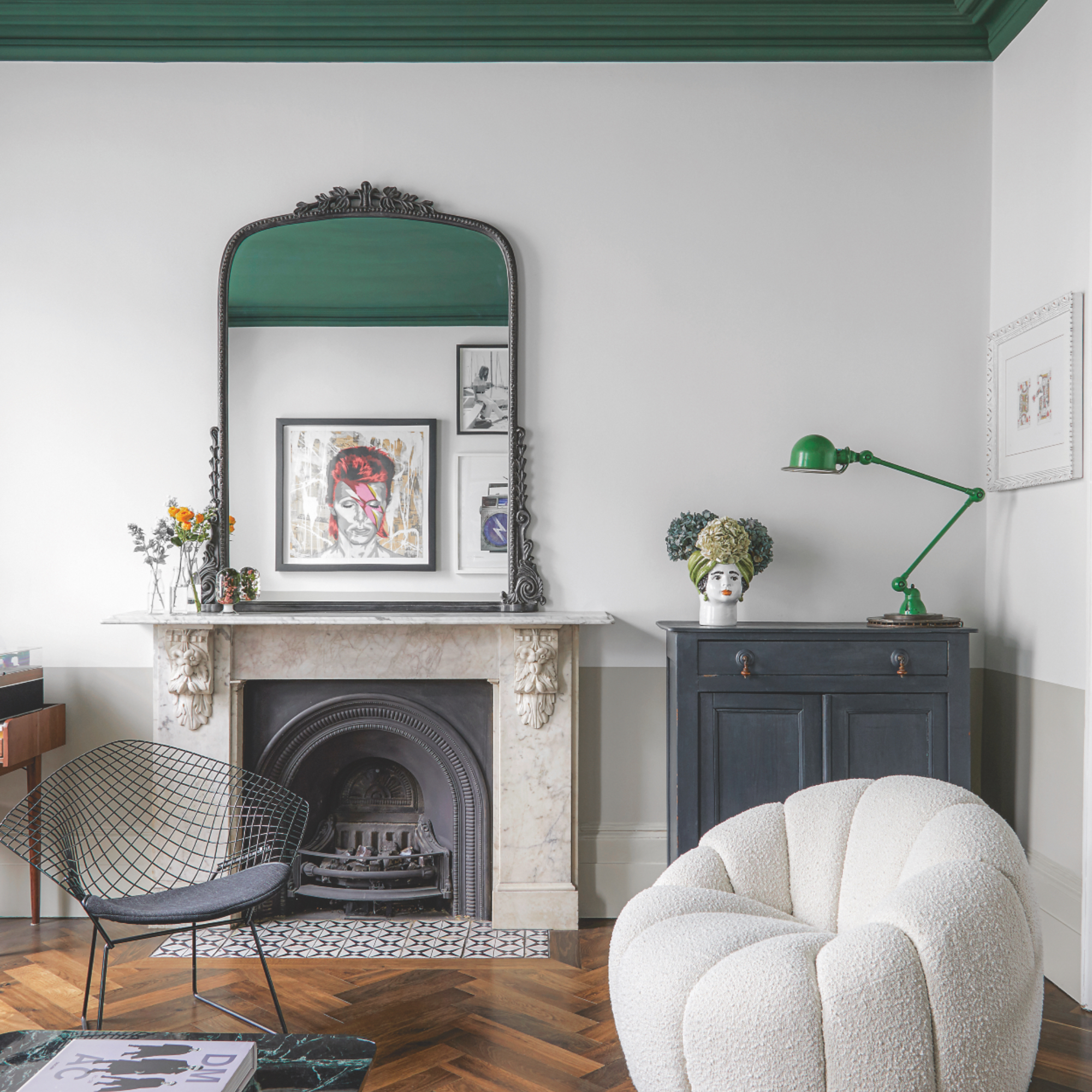
This colour phenomenon is another firm favourite amongst interior designers. Although no one wants the back breaking job of actually painting the ceiling, the results are worth it!
Ideal for high living room ceilings, adding a colour above will visually bring it down so the overall feel is cosier and more intimate. You can keep it simple with a bold shade and keep the walls white, or choose a colour that complements another that you've used.
10. You can't have fun with colour!
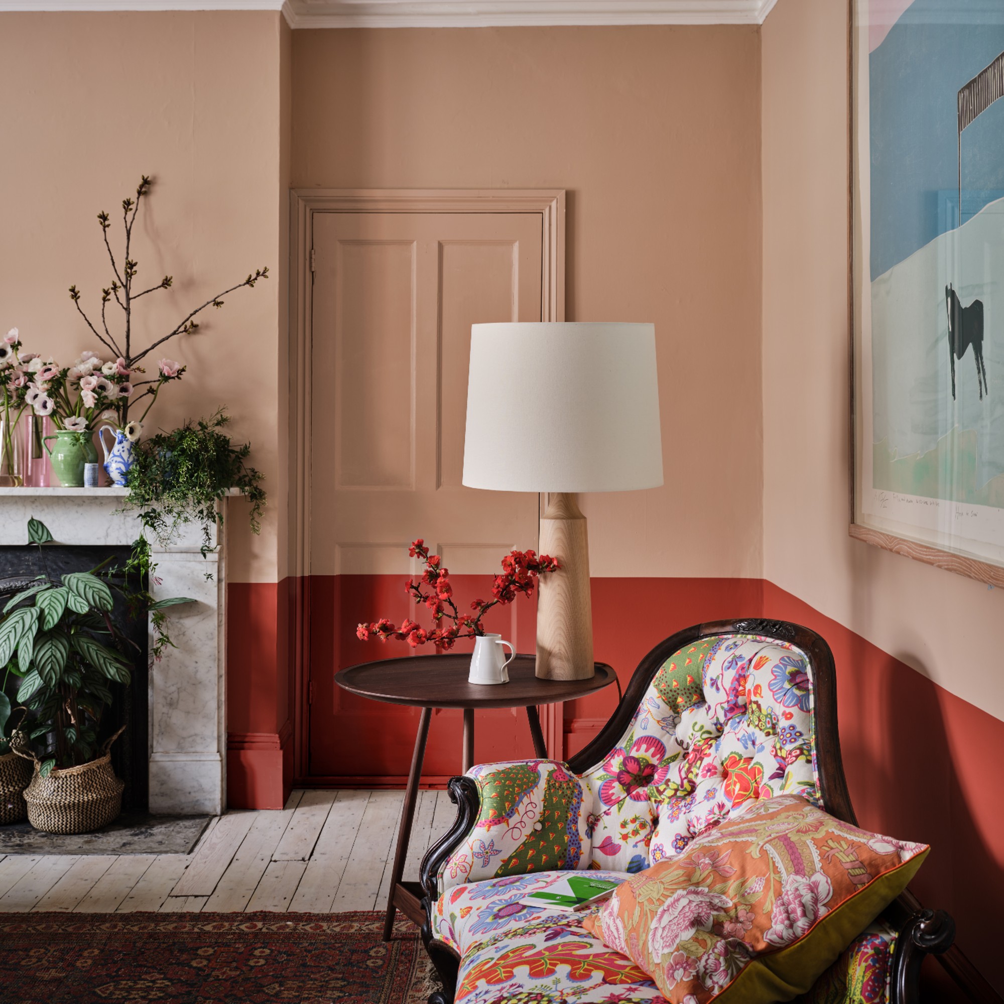
This last two years has seen so much experimentation when it comes to paint colours – so don't make not having fun one of your living room colour mistakes as really, anything goes!
'Using two bold shades together can feel like a brave choice, but it can create an immensely joyful impression with an unexpected twist!' shares Charlotte Cosby, creative director at Farrow & Ball.
'This look can be achieved in small or large doses, from using a brighter shade on your woodwork, to transforming your ceiling with a contrasting colour, or using two tones across the walls to add a touch of playful interest.'
What colours should I avoid in my living room?
This really is down to personal preference and what makes you happy. There are a couple of things to consider – if your living room is small then don't opt for colours that will make it feel smaller. Another key point to remember is where the sun comes in, a North-facing room benefits from warmer shades, whereas a South-facing room can cope with cooler more blue tones.
'There are very few colours that are off limits for a living room but the most important factor you have to consider is how its going to make you feel when you want to relax,' advises Marianne Shillingford, creative director at Dulux.
'Bright acidic yellows and fizzy saturated pinks, blues and greens may be ones to avoid unless your idea of chilling out is a bull racing festival in Spain or a carnival in Rio!'
What is the 3 colour rule in interior design?
There are a few 'rules' in interior design that can help with choosing colours for your home. You don't have to take them as read, but they can prevent you from making classic living room colour mistakes.
Marie Goodwin, head designer at Prestigious Textiles gives us the lowdown on how to use it:
'The 'three-color rule' is a guideline commonly used in design, particularly in interior design. It suggests that using a maximum of three colours in a design composition can help create a visually appealing and harmonious result. Here's a breakdown of how the rule is typically applied:
- Dominant colour: The dominant colour serves as the primary colour in the design and typically covers the largest areas or elements. It sets the overall tone and establishes the main visual focus.
- Secondary colour: The secondary colour supports the dominant colour and adds visual interest and variety. It should complement the dominant colour and be used in a lesser amount compared to the dominant colour.
- Accent colour: The accent colour is used sparingly to provide highlights, emphasis, or pops of colour in specific areas or elements of the design. It adds vibrancy and can draw attention to important details.'

Sophie has been an interior stylist and journalist for over 22 years and has worked for many of the main interior magazines during that time, both in-house and as a freelancer. On the side, as well as being the News Editor for indie magazine, 91, she trained to be a florist in 2019 and launched The Prettiest Posy where she curates beautiful flowers for modern weddings and events.
-
 The 6 outdoor lights from Habitat that I'm choosing between to make my outdoor space look more expensive this summer
I couldn’t believe some of the prices
By Ellis Cochrane
-
 Joseph Joseph 3-piece Saucepan review – seriously space-saving
Small kitchen? I tested this innovative Joseph Joseph space-savvy set which has foldable handles — and I loved it
By Annie Collyer
-
 Forget seating, this is how you should be making the most out of your kitchen island in 2025
Seating doesn't always have to be a necessity on an island when you can choose these ideas instead
By Holly Cockburn