10 common living room design disasters experts warn against falling for
Gearing up for a living makeover? Here are the top decorating mistakes to avoid, according to experts
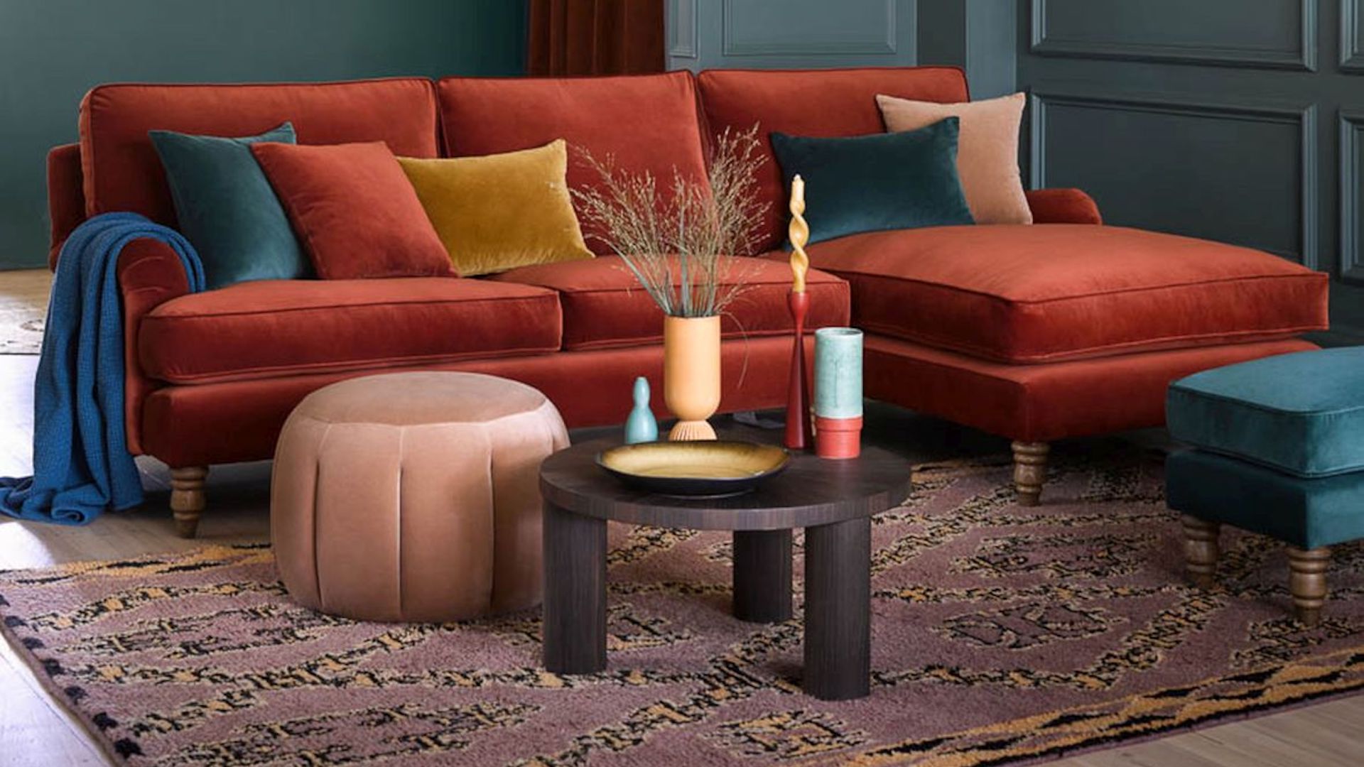

Understanding what living room decorating mistakes to avoid can be a vital tool in creating a stunning space that reflects your style and enhances your home.
When planning your living room ideas take heed of our experts’ key living room mistakes to avoid, and you’ll swerve all those decorating disasters that usually only come from experience.
One all-too-familiar living room decorating offence is the matchy-matchy look, which often occurs when sourcing furniture and upholstery from the same outlet. ‘A better approach is to embrace a mix of different styles, textures and colours to breathe life into your living room,’ says interior designer Keely Smith, from Home Stratosphere. ‘A blend of antique and modern pieces can create a dynamic yet cohesive look that’s far more compelling than all matching sets.’
The living room should be a space in which to relax, socialise and hunker down for chill-out time with your family, so it’s important to identify and avoid any decorating errors that might hamper success.
Living room mistakes to avoid
‘Start by thinking about who will use the living room, how it'll be used and what it'll be used for as this will have a huge impact on your overall design and help you make decisions on furniture, decor and layouts too,’ recommends Emma Deterding, Creative Director of Kelling Designs. Then simply side-step the following living room faux pas, sit back and relax.
1. Choosing the wrong size sofa
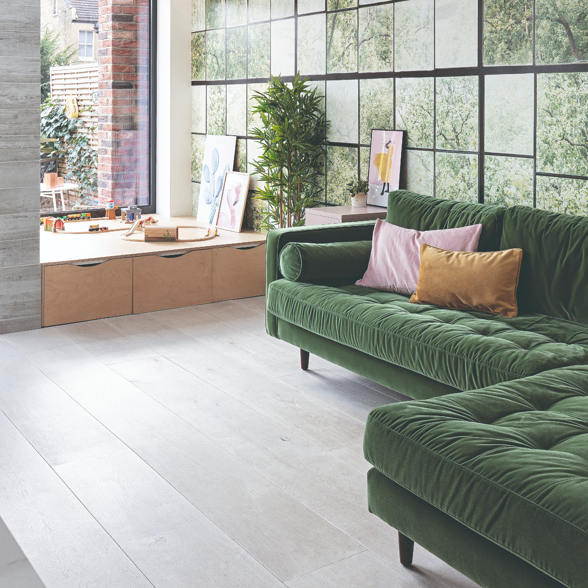
A key mistake often made when it comes to living rooms is selecting the wrong sofa. ‘Most people think that a large, chunky corner unit is the way to go as it'll provide enough seats for everyone, however, these often have a large footprint and will take up a lot of space,’ explains Emma Deterding, of Kelling Designs.
Instead, Emma recommends using multiple sofas as part of your living room sofa ideas, ideally with slimmer arms that won’t take up unnecessary space – a three-seater and two-seater combo, for example, are the best sofas to choose from. ‘Not only will these help to create a better layout and flow, they'll also provide enough seats where necessary and help make the room feel more spacious,’ she adds.
Get the Ideal Home Newsletter
Sign up to our newsletter for style and decor inspiration, house makeovers, project advice and more.
2. Not layering the lighting
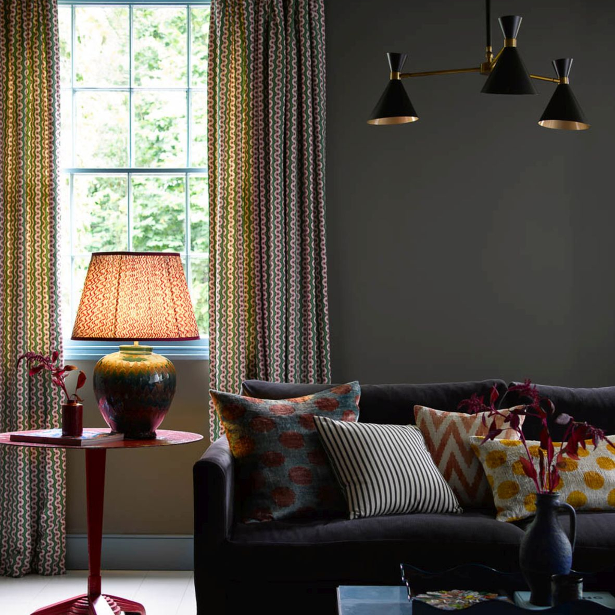
Lighting is another key element that people tend to get wrong – a lone ceiling pendant is a missed opportunity. ‘Where possible, try and use lighting that you can layer to allow you to have the right light sources, and enough light, for various tasks,’ suggests Emma Deterding from Kelling Designs. ‘We prefer lamps and subtle downlights that light something specific, your curtains for instance, or pinning the centre of an ottoman.’
A huge chandelier or dramatic pendant light can be overkill in living room lighting ideas– unless you have the ceiling height to ensure it won’t overpower the space.
Living room lighting is more about creating a cosy and relaxed atmosphere. Go for a mix of wall, floor and table lamps. ‘Not only will this allow you to change the mood and atmosphere with the flick of a few switches, but you'll also be able to put lighting where it's needed most. I always also recommend fitting everything to dimmer controls so you can change up the mood and try and wire lamps on a 5-amp circuit so all your lighting can be controlled from one main panel,’ says Emma.
3. Clinging everything to the walls
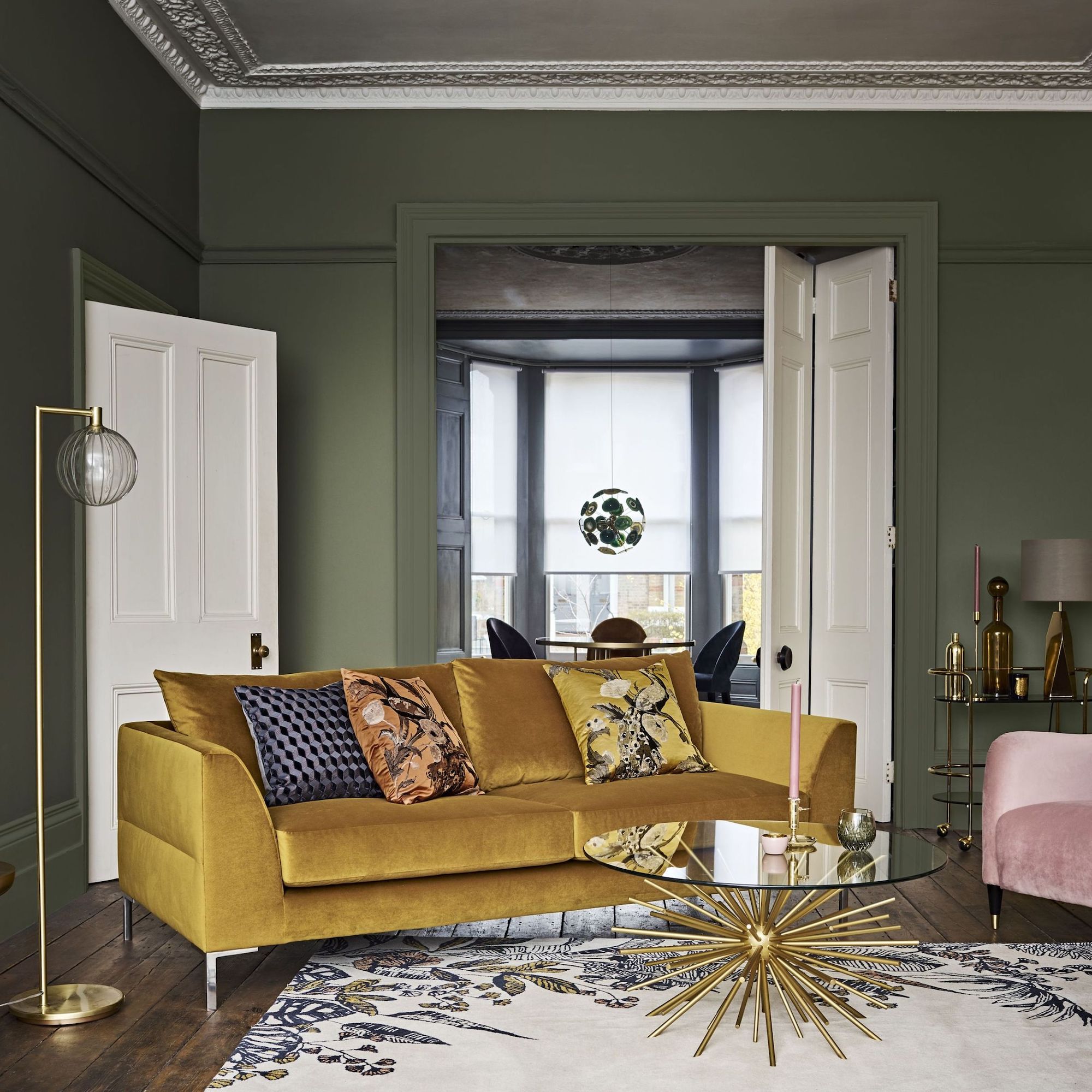
Pushing furniture tight to the walls may seem like the best way to make the room feel bigger but it can close the room in and rarely results in a very sociable or inviting living room furniture layout. ‘Placing everything around the perimeter often creates an awkward space in the middle, which can make you feel far away from guests when hosting, and highlights the room's cramped dimensions,’ agrees Laura Rich, interior design expert at Furniturebox.
‘Instead, pull furniture toward the centre, also known as ‘floating furniture’ to create a more open feeling and encourage warm interactions in the middle of the room. You’ll have the illusion of more space while creating an intimate setting for socialising or relaxing,’ suggests Laura. ‘Something as simple as pulling your sofa and armchairs forward and placing a rug in the middle of the floating furniture space can change the look and feel of your living room, while also creating more space for movement around the room.’
4. Using the wrong size rug
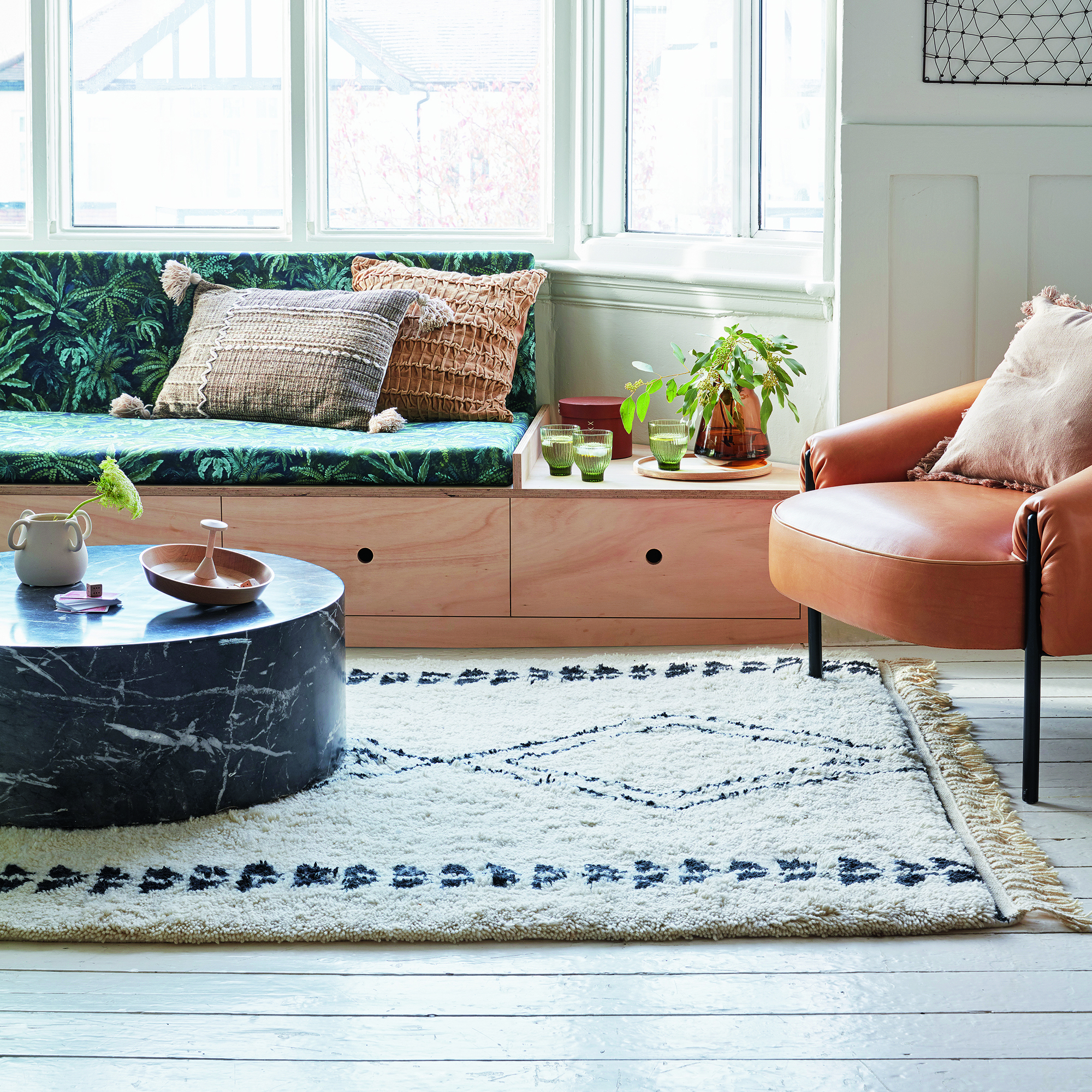
There’s no doubt a judiciously placed living room rug can amp up the colour, pattern and cosiness in a living room, but it has to be the right fit. No rug is better than a rug that’s too small, in the wrong place or a total design fail.
‘One of the most common design mistakes in a living room is choosing the wrong sized rug for the space. It's not a surprise that this happens so frequently – buying a rug for such a high-traffic room can be overwhelming. Not only do you need to think about colour and pattern, but size and positioning. Getting all of these elements spot on is where many people fall down,’ says Daniel Prendergast, design director from The Rug Seller.
The size of the rug you choose depends on your goals. ‘Small rugs are ideal for placing underneath a coffee table or footstool. This will create a centre point to the room and make it look more enlarged,’ explains Daniel.
A medium-sized rug is the ideal option if you want to make a bigger impact but not go too large. ‘It's important to make sure that your rug is large enough to place the front legs of your furniture on it. This will give you that designer finish and make the room look balanced,’ he adds.
For a large rug, aka area rug, you should look to cover almost the entire floor space of your living room. ‘Leave about 18 inches around the perimeter of the room and ensure your furniture comfortably fits on the rug and there is room behind the furniture, so it doesn't look perched,’ recommends Daniel.
5. Not working the windows
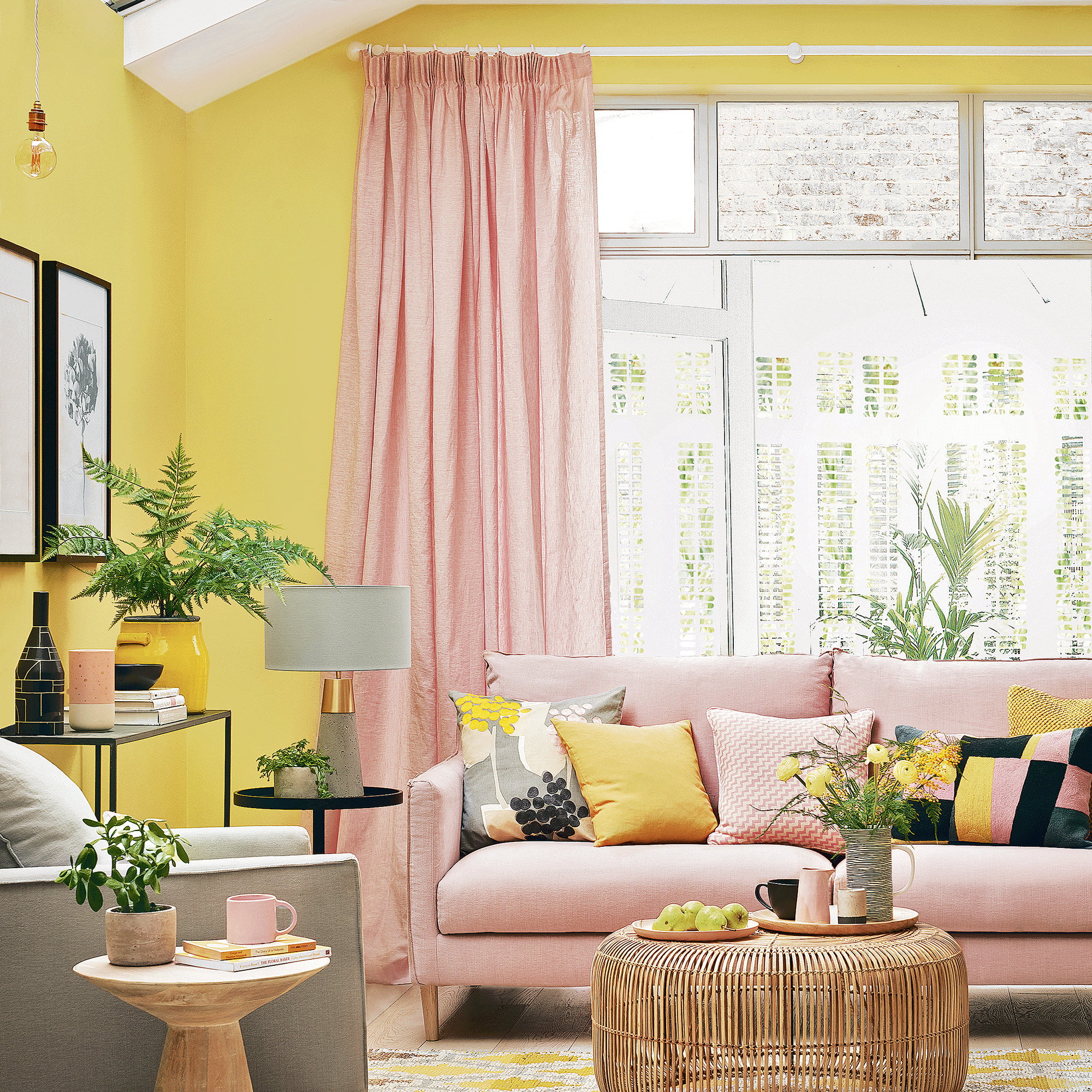
Failing to dress the windows to their best advantage can be disappointing, especially when the windows in question are not particularly pretty. Living room curtain ideas should frame the window and can add colour, texture and pattern. If your window frames are unattractive, use a curtain and Roman blind combo to hide most of the frame.
Hanging the curtain rail too low, or the bottoms of the curtains too short, are two of the most common mistakes that can ruin the proportions of a living room and make perfectly lovely curtains look a bit cheap. Yvonne Keal, Senior Product Manager at Hillarys, recommends fixing curtains several inches above the top of the window frame to enhance the sense of height in a living room. ‘You may also need to consider what surrounds your window, for instance, if there is a radiator near the window the curtain length may need to be altered,’ she adds.
If your radiator is directly below the window, consider floor-length curtains tied back and a thermal blind to help keep the heat in during the evenings, rather than hanging curtains the recommended 4cm above the radiator.
6. Over-loading with tat
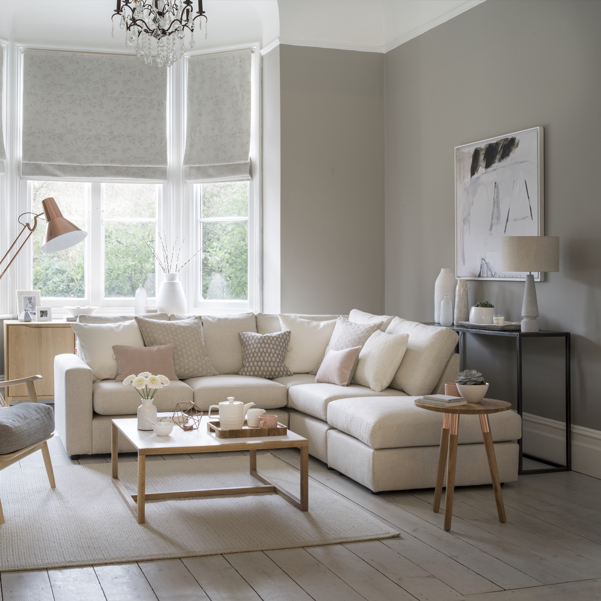
There’s a fine line between adding personality and becoming a prime candidate for the next series of ‘Secret Hoarders’. ‘It can often be far too tempting to fill your living room with bold pieces, accessories and prints. But, unless you’re totally maximalist, you risk straying into ‘over-cluttering’ territory,’ says Suzi Samaddar, Room Styling Expert at furn.com.
‘To keep clutter under control, embrace the art of editing. Avoid filling every surface, instead choose a couple of carefully selected accessories, then store the rest. Don’t cram your space with bulky, mismatched furniture either; choose a single statement piece and complement it with more plain accessories. It doesn’t have to be boring, just considered. For example, if you’re playing with pattern, ensure colour continuity for cohesion,’ Suzi adds.
7. Not creating a focal point
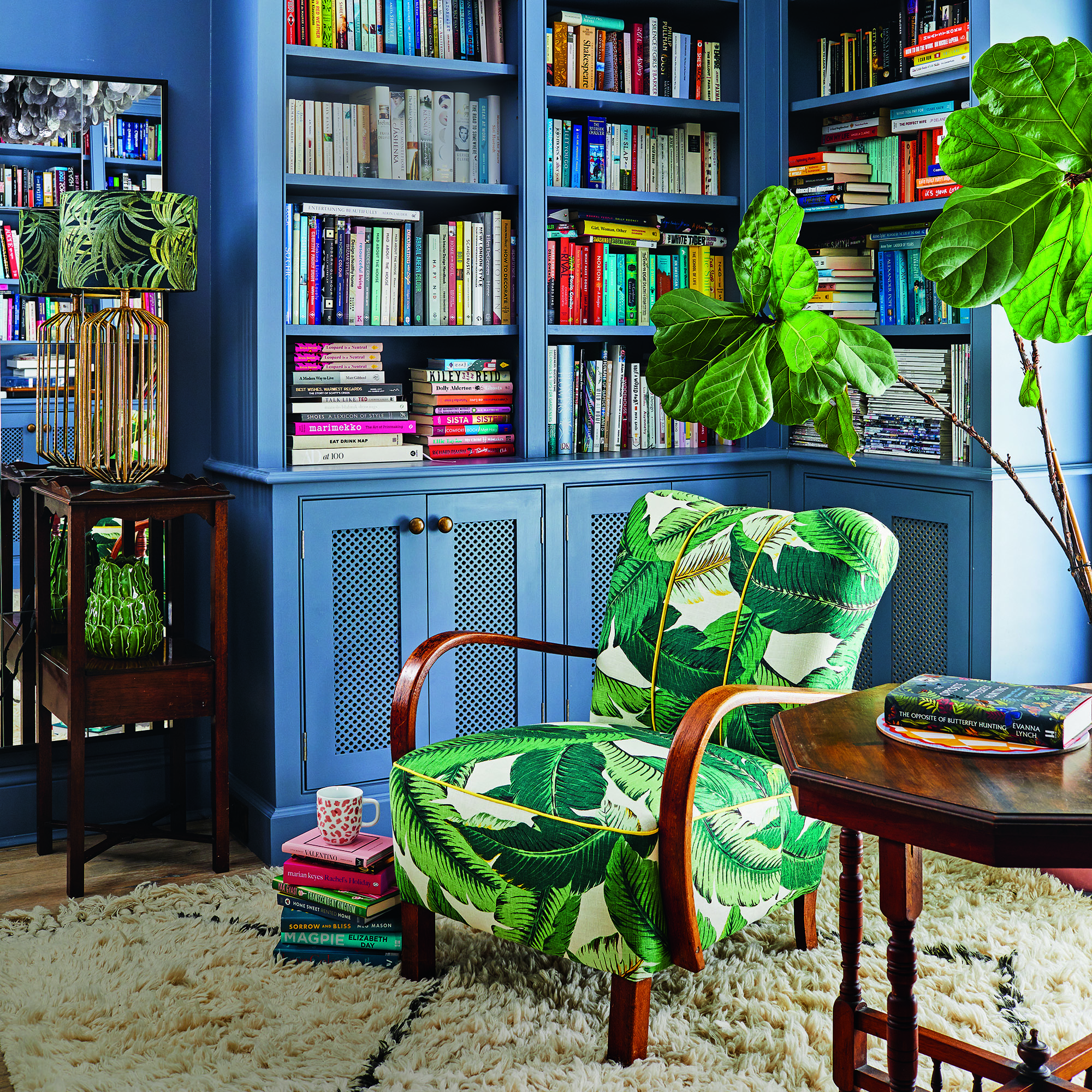
Failing to establish a core focal point in your living room is a big mistake that can result in a cluttered, overwhelming room or worse still, an underwhelming space that is simply lacking in focus and intention, so says interior designer Nicolene Mausenbaum of Dezyna.
Fortunately, an inviting and balanced living space is easy to achieve. ‘Firstly, select a visually interesting or functional item in your living room as your focal point – like an artwork, fireplace or window,’ says Nicolene. ‘Arrange complementary furniture items around the focal point, not forgetting to group these items with an area-defining rug. Adding or directing natural and artificial light will help to highlight it, and including decorative accessories and plants could further enhance its appeal.’
8. Focusing on the TV
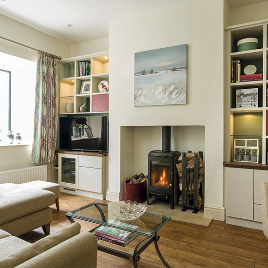
‘A common mistake that people seem to make when designing their living room is basing the design around where the TV is placed. Of course, a TV is often a key component within the living room, but it shouldn’t be the main one,’ says Kate Conrad, Lead Designer at Madison and Mayfair.
We’re not suggesting you should be embarrassed about owning a television – there’s nothing more relaxing than a cheeky little Netflix and chill time – so you don’t need to hide it completely. ‘Instead, build the living room around a more aesthetically pleasing feature as the first priority, then locate your television out of the way but still easily visible from the sofa,’ adds Kate.
If you’re struggling to find a good, accessible spot for the television that isn’t centre-stage, it’s worth taking the time to look into ways to disguise a TV or source a television with a discreet design, such as Samsung’s The Frame. A beautiful media cabinet can also distract attention from big screens – go for one with doors if you only use the television for occasional movie nights.
9. Badly hung art
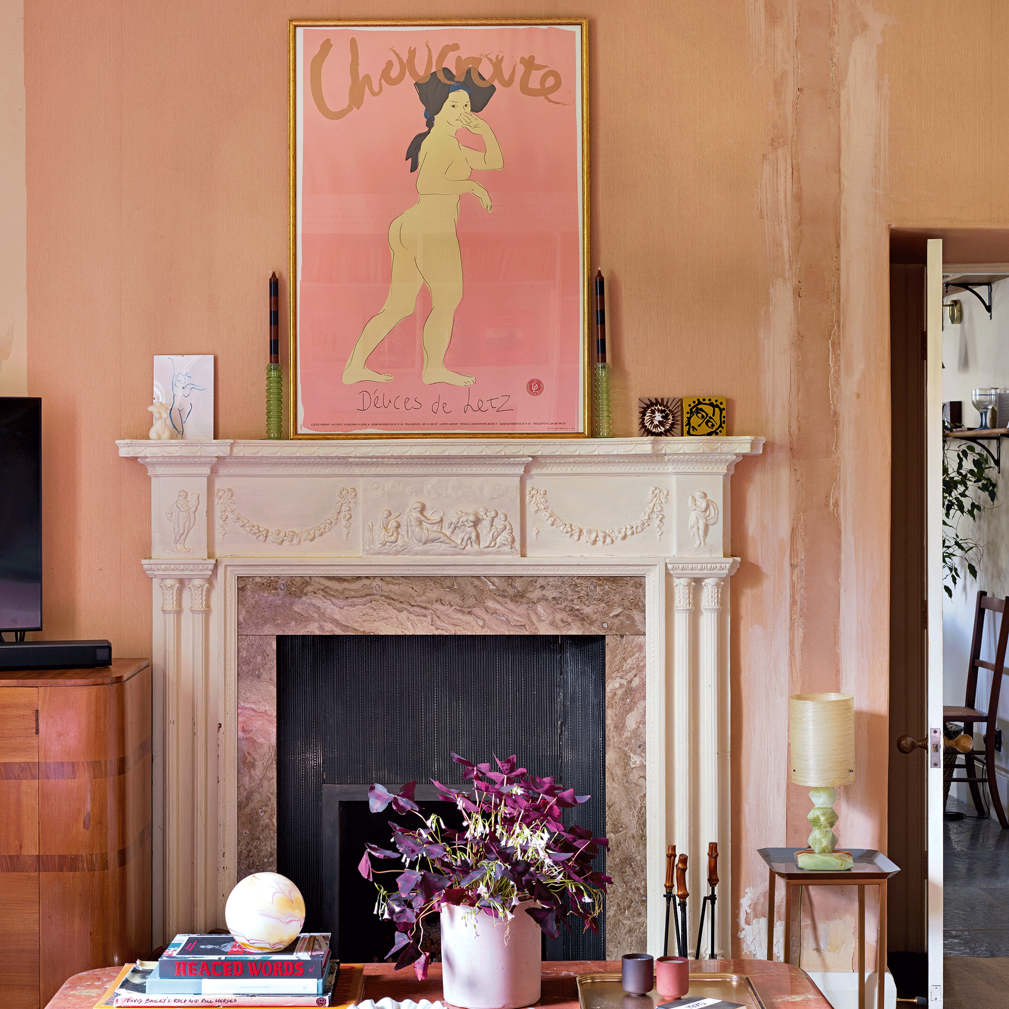
Living room walls are prime real estate for beautifully framed artwork, photos and prints. However, if you’ve ever entered a living room where the pictures are hung to low, too high, or (shudder) wonkily, you’ll appreciate just how disturbing it can be, especially if you suffer from mild OCD!
Learning how to style living room wall art ideas is a skill that can transform the look of your living room. Hanging artwork at the wrong height or in the wrong place is a common mistake but it can be easily rectified,’ says Madison and Mayfair’s Kate Winch, who recommends the spot between sofa and ceiling for an arty display. ‘Centre your hanging points on the width of the sofa to achieve a balanced look,’ she adds.
10. Insufficient storage
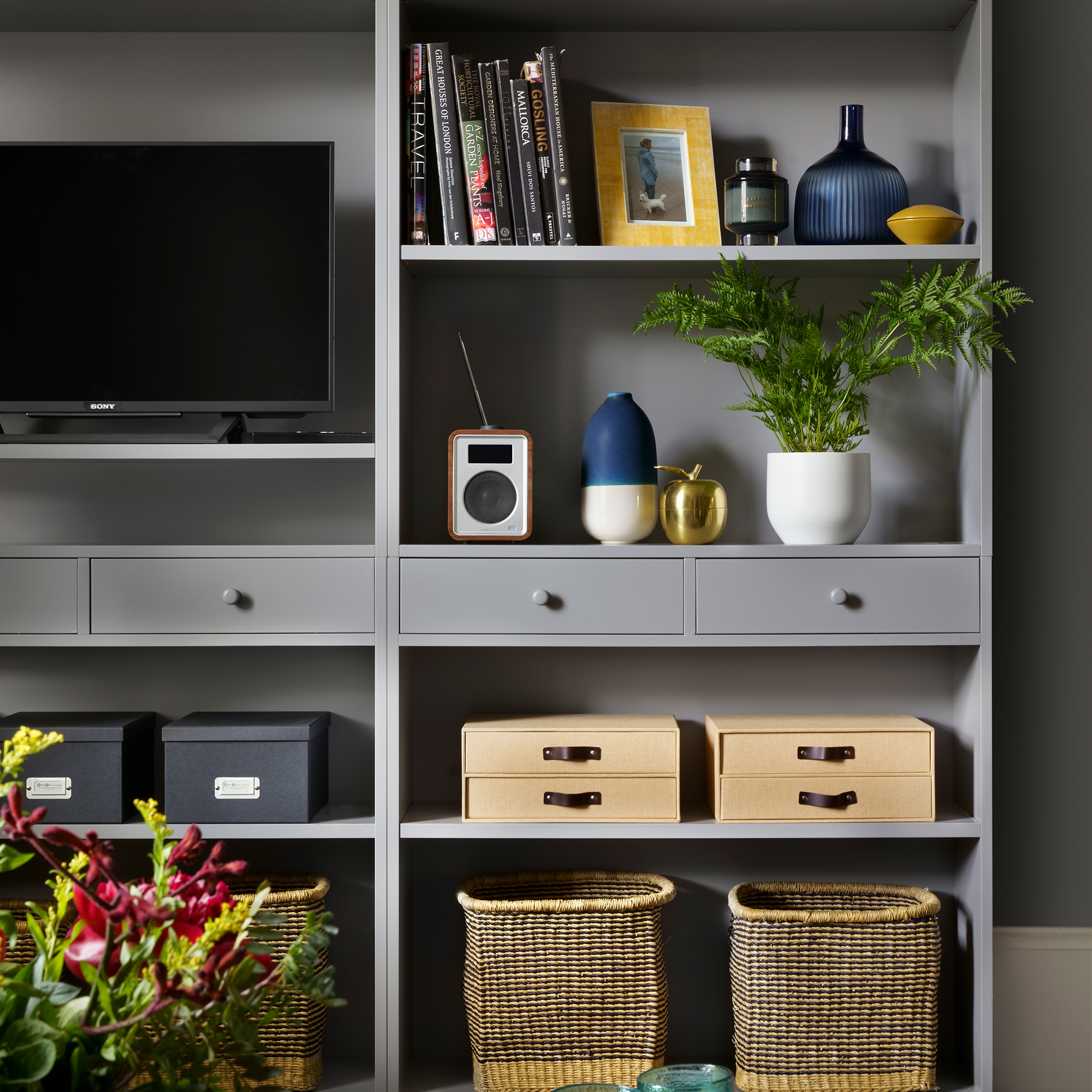
Living rooms should be a relaxing haven at the end of a busy day but a messy room can mess with your mind as well as your space. The best living room storage ideas can transform the busiest of lounges from cluttered to calm.
‘Keep storage stylish, compact, and multi-functional. You don’t need to use your living room as a store room but it’s handy to have items that serve a dual purpose such as side tables with storage for magazines and blankets etc,’ says Simon Glanville, Managing Director at A Place for Everything.
‘Avoid that frustrating sofa dive for the missing remote by re-purposing a wicker organiser or better still a stylish remote holder. And if you’re a household with kids, choose toy storage that blends into your décor rather than turns your stylish curated oasis into a fun fair of colour!’
FAQs
What to avoid when decorating a living room?
When decorating a living room to create a harmonious and aesthetically pleasing space, there are several common mistakes and pitfalls that you should avoid. ‘Firstly, choosing the wrong colour scheme can impact the atmosphere and functionality of the space. Colours have a powerful influence on mood and ambience. It’s important to choose a paint colour that considers the room's size, natural light and the mood you want to create,’ says Elaine Penhaul, founder of Lemon and Lime Interiors.
Overly bright or harsh colours can make a room feel chaotic or stressful while overly muted colours can make it feel dull and uninspiring. ‘Paint colours can often look very different from room to room so make sure to use test paint samples before committing,’ adds Elaine.
What's the difference between a living room and family room?
The terms ‘living room’ and ‘family room’ are often used interchangeably, but there are some differences between the two, although these differences can vary depending on regional and cultural norms.
‘Traditionally, the living room is located near the front entrance of the home. It is often the first room you see when you enter, and it's typically used for more formal gatherings and entertaining guests. The family room is usually situated in a more relaxed and informal area of the home, often closer to the kitchen or adjacent to other common areas. It's a space where family members gather for everyday activities and casual relaxation,’ explains Elaine.
‘Living rooms are usually less cluttered and are primarily used for quieter activities like reading, conversing, or enjoying a cup of tea or coffee. Family rooms are more likely to be filled with a variety of entertainment options, such as a large TV, video game consoles, and toys. They are the rooms for active and interactive family time.’
Many contemporary homes no longer have both a formal living room and a family room, especially in smaller or open-concept layouts. Instead, they may have a single multi-purpose space that serves as both a living and family room.
If you're aware of these pitfalls, you shouldn't have a problem pulling together a truly beautiful living room.

Linda Clayton is a professionally trained journalist, and has specialised in product design, interiors and fitness for more than two decades. Linda has written for a wide range of publications, from the Daily Telegraph and Guardian to Homes & Gardens and Livingetc. She has been freelancing for Ideal Home Magazine since 2008, covering design trends, home makeovers, product reviews and much more.
-
 Interior experts reveal the bedroom colours that are officially out of style in 2025 – and the shades replacing them
These are the new colourways you'll want on your radar
By Amy Lockwood
-
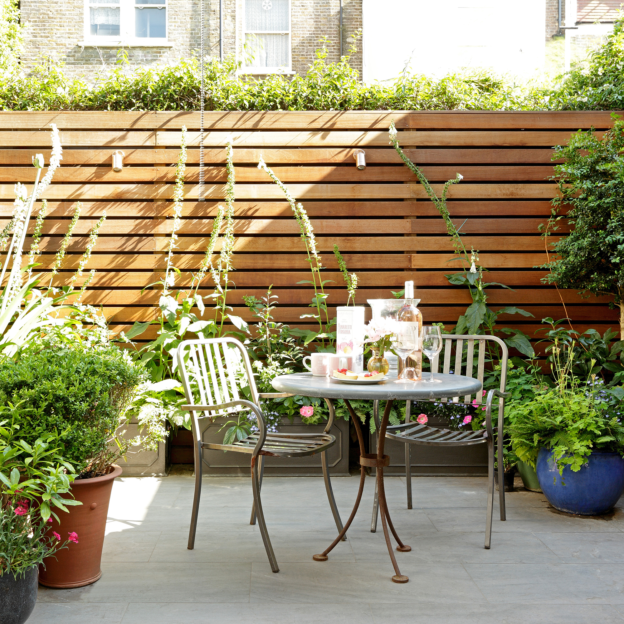 These are the 5 best climbing plants to transform an urban courtyard garden into a blooming oasis, according to garden experts
Fill your courtyard with beautiful flowers this summer
By Kezia Reynolds
-
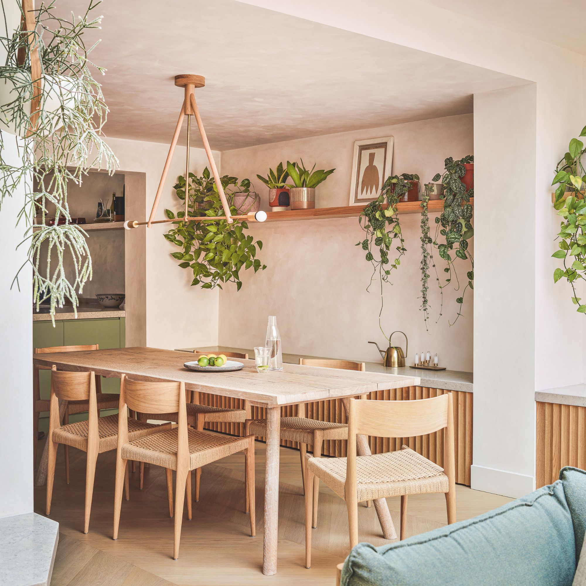 Experts warn these flooring choices will make it harder to sell your home — why it may pay off (quite literally) to replace them before you move
Certain flooring choices can increase the value of your home by up to 5%
By Lauren Bradbury