7 decorating mistakes you should never make
7 decorating mistakes you should never make
Sign up to our newsletter for style inspiration, real homes, project and garden advice and shopping know-how
You are now subscribed
Your newsletter sign-up was successful
From cushion overload to poor lighting there are several decorating fails that people make when renovating and furnishing their home. Here at Housetohome we share the 7 most common mistakes as well as tips on how to
avoid them.
1. Everything matches
Yes, it's good to have a strong colour scheme and stick to it, but this blue bathroom proves that sometimes less it more. Blue walls, blue mosaic tiles, towels, candles, accessories - the list goes on! At least the owners of this colour co-ordinating space opted for a white bathroom suite...
Article continues below 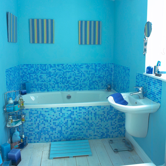
2. Furniture that doesn't fit
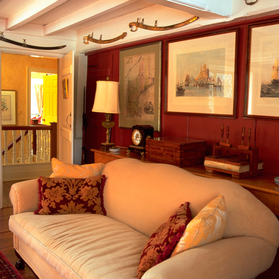
No matter what your home looks like, make sure you chose furniture that fits well in the space. A large sofa can dominate a cosy room… most people buy sofas that are too large, and rugs and other furnishings
that are too small for the rooms they’re in. Plan it carefully and always have a measuring tape to hand when you’re out shopping.
3. Out of control clutter
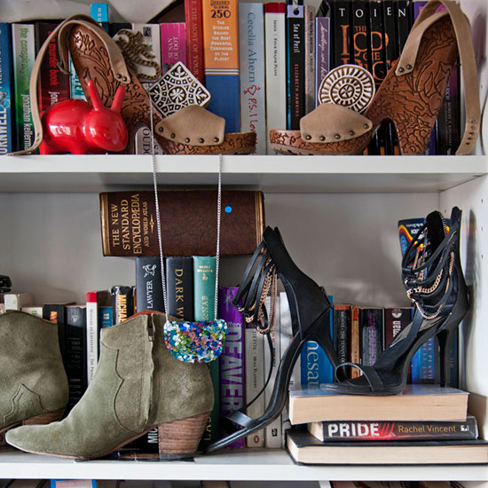
Remember to factor in storage when you're planning your next decorating project. However, before you embark on a big project, remember it is also an ideal time to have a sort out and get rid of any extra clutter or hoards (that you know you don't need)
Sign up to our newsletter for style inspiration, real homes, project and garden advice and shopping know-how
4. Poor lighting
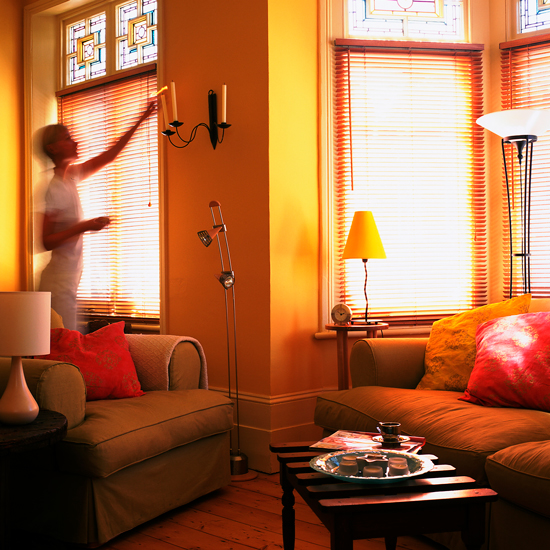
From dodgy uplighters to dingy overhead pendants remember to plan your lighting when starting a new decorating project. Again, think about scale (don't go for a small chandelier in a large living room) and the 'feel' of a room.
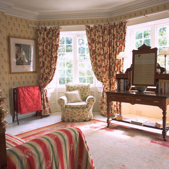
5. Too much pattern
Mixing different patterns is an art form.
Yes, small florals can mix well with large florals if chosen carefully.
And, yes often stripes and checks can actually work well together.
However, as this picture proves, any more than three patterns should be
avoided...
6. Awkward artwork
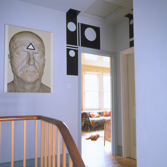
Choosing the right artwork for your home is no easy task. Where to hang it is equally as tough. Traditionally, the bottom of a wall hanging or picture should sit eight to 10 inches above a piece of furniture. Even if you don't want to stick to this rule, make sure you choose something that works well with the space (and with the other artwork surrounding it).
7. Cushion overload
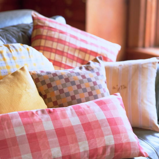
We all love cushions in an array of different colours and patterns. But if you've got so many cushions on your sofa that you can't actually sit down on it, then chances are you have gone overboard...
******