Bonkers or brilliant? IH's verdict on that divisive Changing Rooms splattered blue wall
The wig art will always take the crown

Last night's episode of Changing Rooms, saw 2LG Studio’s Russell and Jordan transform a neglected dining room into a modern cocktail bar.
As ever, there were some eyebrow-raising design features including a blue paint splattered wall which is dividing the internet. So, is it a brilliant or bonkers paint idea?
The interior designers called their design manifesto 'Back to the Futurism,' combining modern features with vintage elements, like the gramophone unit. Previously, the room was totally lacking in oomph - now, it's a multifunctional lounge bar that makes a statement.
Russell and Jordan used Brass Buckle Dulux paint on and wood panelling on the walls, with a bold splash of Honest Indigo to zone the seating area.
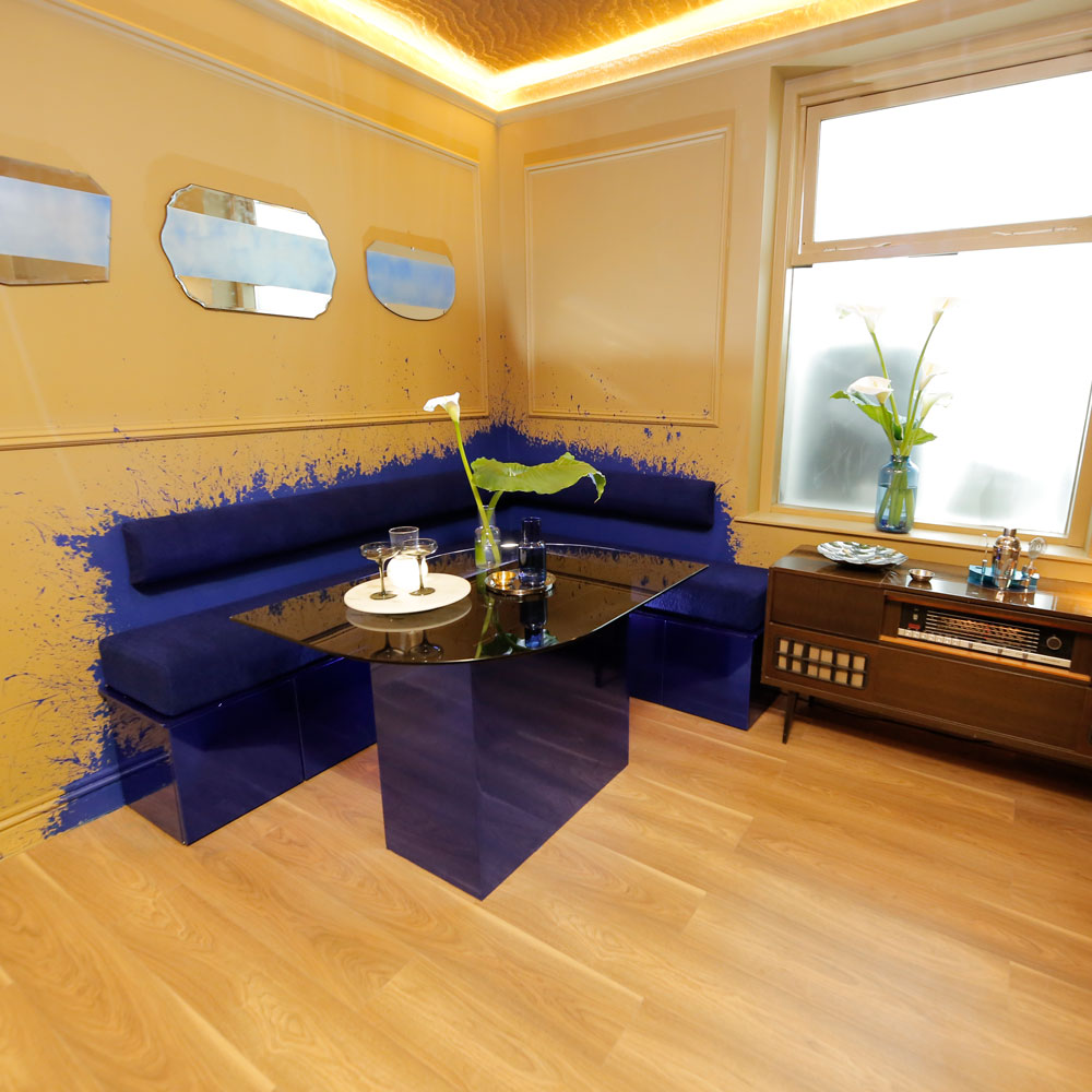
Dulux Creative Director Marianne says that Brass Buckle has a wonderful, heritage quality to it, making it perfect for this retro-inspired brief. It might not be to everyone's taste, but the clients loved the whole thing.
The big reveal had happy tears and homeowners Tom and Richard were astounded by the transformation, commenting that the splatter effect paint was their favourite thing.
However, the Ideal Home team were less convinced and had a lot to say about that paint-splattered blue wall...
Get the Ideal Home Newsletter
Sign up to our newsletter for style and decor inspiration, house makeovers, project advice and more.
Brilliant or bonkers?
'While I love a bit of colour-blocking, this just looks like I dropped a can of paint and tried to cover it up with some seating,' says Ideal Home Editor Heather Young.
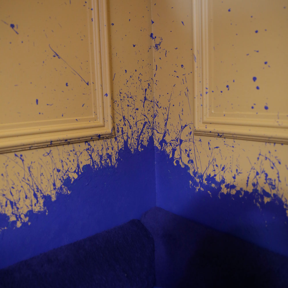
'Although it's totally bonkers, I think it's good that it distracts from the cube feeling of that room, with every surface being the same camel colour,' comments Digital Editor Tamara Kelly. 'I think the 'rum & coke' paint effect was worse!'
News Editor Rebecca Knight isn't sold on the paint splatter effect either. 'I like the colour combination and the idea of blocking out the seating in a colour,' she says.
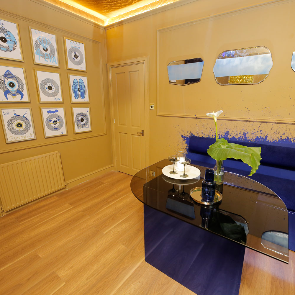
'But I think this is might have been better suited to a kids' bedroom idea,' Rebecca adds. 'It's got very early noughties CBBC/Dick and Dom in da Bungalow vibes.'
Senior Digital Editor Jenny McFarlane comments that it could look very Jackson Pollock in a more modern setting. Maybe the look would be more at home in a fancy hotel lobby or bar, rather than a standard dining room...
We're not convinced by this one, but can't wait to see what they come up with next.

Millie Hurst was Senior Content Editor at Ideal Home from 2020-2022, and is now Section Editor at Homes & Gardens. Before stepping into the world of interiors, she worked as a Senior SEO Editor for News UK in both London and New York. You can usually find her looking up trending terms and finding real-life budget makeovers our readers love. Millie came up with the website's daily dupes article which gives readers ways to curate a stylish home for less.
-
 Should an air fryer be on display in a kitchen or hidden away? This is why I always keep my small appliances on the worktop
Are you on team display or neatly hidden away? Share your opinion in the comments
By Rebecca Knight
-
 Experts warn that these 5 mopping mistakes are making your floors dirtier — and damaging your floors in the process
This is how to keep them clean and avoid costly damage
By Lauren Bradbury
-
 Move over, fences – dead hedges are the wild and wonderful alternative your garden will love and they're easier to build than you'd think
The perfect eco-friendly solution for small gardens
By Kayleigh Dray