
Redecorating this year? An interior designer has revealed the colours to avoid in January.
According to Tracy Hatch from Raspberry Interiors, we should be enveloping ourselves in warm and comforting tones to help us through this ghastly month. We asked a colour psychologist for his thoughts, and which of the paint trends for 2022 will be the most uplifting.

Colours to avoid in January
Speaking to Stelrad, Tracy Hatch said that we should be avoiding the following four colours: grey, lilac, pale blue and crimson. Instead, she recommends selecting a palette of warm greens and terracotta to make your home feel cosy.
Tracy says pale tones are colours to avoid in January, when the days are shorter. 'Earthy tones are a great way to bring the outdoor in, this can help people feel like they aren’t missing out on the dark days,' she says.
'Red is a great colour, but increased exposure to this shade might leave you feeling more agitated,' Tracy adds. Something to bear in mind for your 2022 living room paint ideas.

Colour psychologist Lee Chambers says, 'in the colder, darker months, with the positive anchors of Christmas and New Year's behind us, it's easy to literally feel blue with the short days and colder temperatures. But within our domestic environments, we have more than central heating and lighting that we can use to feel less blue in January.'
Lee agrees that warm and welcoming tones can gently stimulate us, elevating our mood without overwhelming us, giving us that little buzz of energy to push us out of our winter slumber. 'Gentle oranges and greens do this well, foster a feeling of spring returning, and create a feeling of space to grow into,' he says.
So, oranges, warm terracotta and green could be the way to go. Or you might be content with a warm white on the walls and accent colours brought in through furniture and rugs. We love a green rug as it gives the impression of grass underfoot.

It's safe to say we're all missing the sunshine, so a sunny yellow could also be a nice idea - be it on our walls, cushion covers or favourite coffee mug. Try something like Farrow & Ball's Babouche on the walls for your hallway ideas, as it isn't too overpowering.
When it comes to boosting our mood, we think a couple of warm hues in soft and 'liveable' shades are a winner.

-
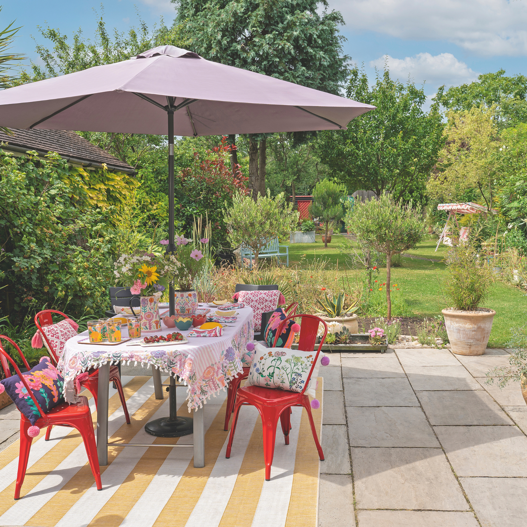 The one-year decluttering method is the key to clearing garden clutter this bank holiday – experts say it’s one of the simplest approaches
Banish garden clutter with this simple and effective method
-
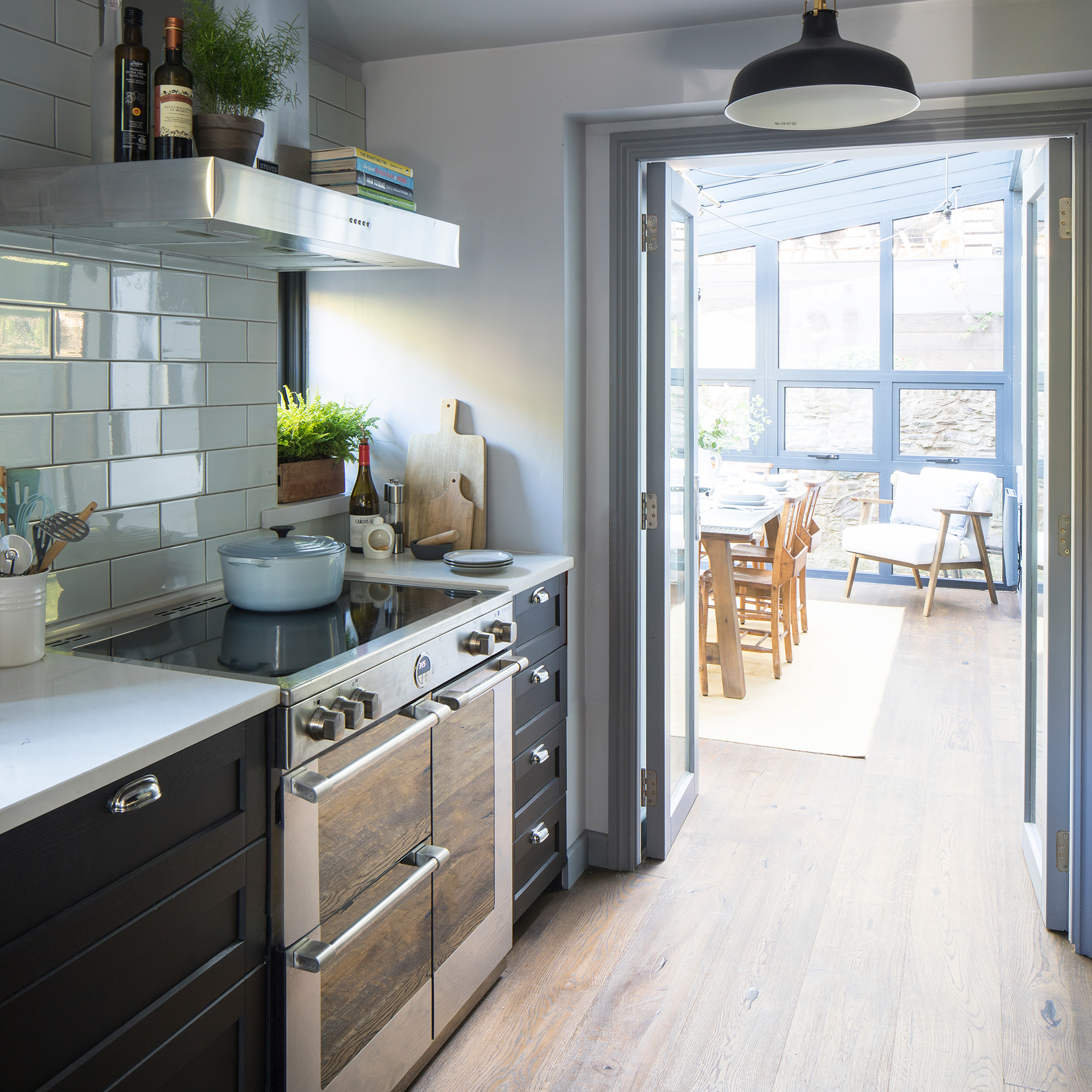 'We were keen to buy a small country retreat to escape to'
This Devon cottage has brought balance and calm to the owners' busy working lives
-
 Find out how much a party wall surveyor costs now to avoid any nasty surprises later
In some cases, hiring a party wall surveyor will be unavoidable – our guide explains how much to set aside for their services


