Extreme makeover: Cement factory turned into modern fairytale castle
Take a look at how this ugly duckling of an industrial building has become a surprisingly beautiful space

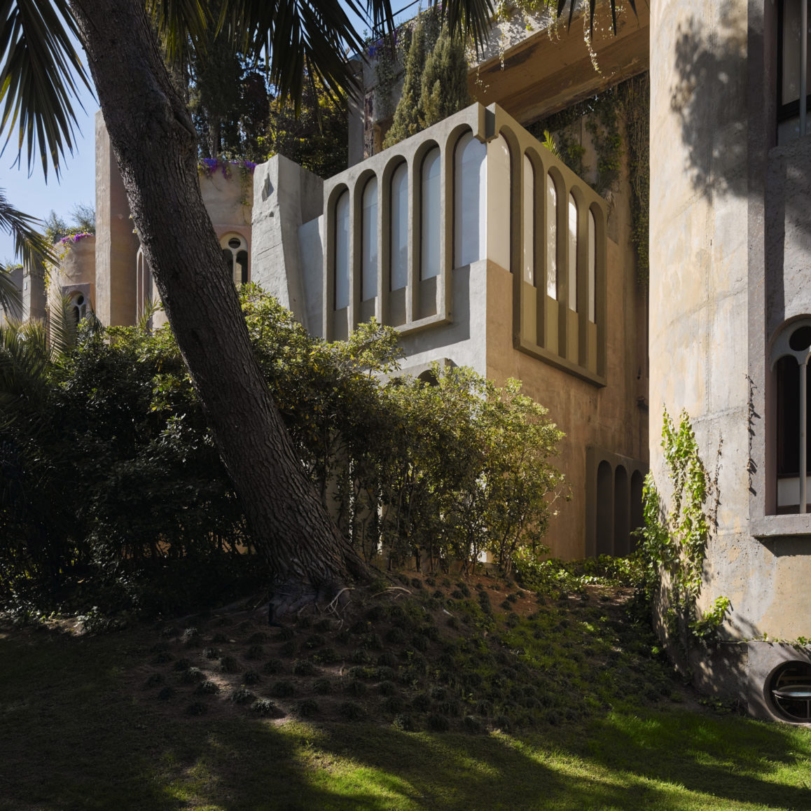
When it comes to home renovation projects, there are big ideas and then there are BIG ideas. And if you want an example of the latter, look no further than the unlikely fairytale castle that Spanish architect Ricardo Bofill created from an abandoned cement factory. We can feel your scepticism, but seriously, suspend your judgement and take a look… you might well end up hunting for your own disused utilities building/ factory/ warehouse to renovate.
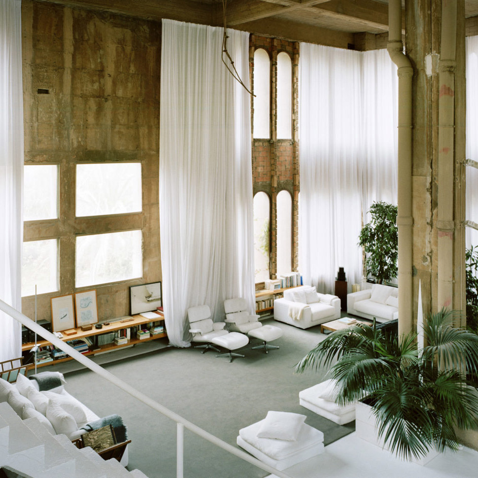
Bofill first found the space – which featured enormous silos, a smoke stack, miles of underground tunnels and machine rooms - in 1973, and realised there was incredible potential to redevelop the site. ‘We quickly decided to retain the factory, and modifying its original brutality, sculpt it like a work of art,’ he says. And the results show that he and his team have done just that.
The first year and a half of the project was spent deconstructing the space in order to reveal hidden forms and open up certain area to create a newly defined space. The next job - before any rebuilding took place - was to plant the exterior greenery: 'It was necessary to provide a green plinth to these volumes; plants would climb walls and hang from the roofs.'
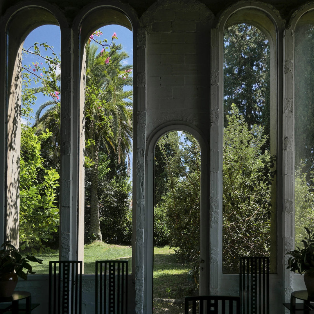
Now eucalyptus, palms, olive and prune tree, mimosas, and climbing plants wrap the exposed concrete walls, and with these plants comes some of the magic; the sense of a space that is living, breathing and changing day on day, month on month, year on year... inside, as well as out.
Scale is, obviously, one of the themes of this space - ranging from wide open spaces like the living room area and a deep, twisting Escher-esque stairwell that connects the floors of the architect's studio (also located on this vast site) to the more compact warmth of Moroccan-style rooms.
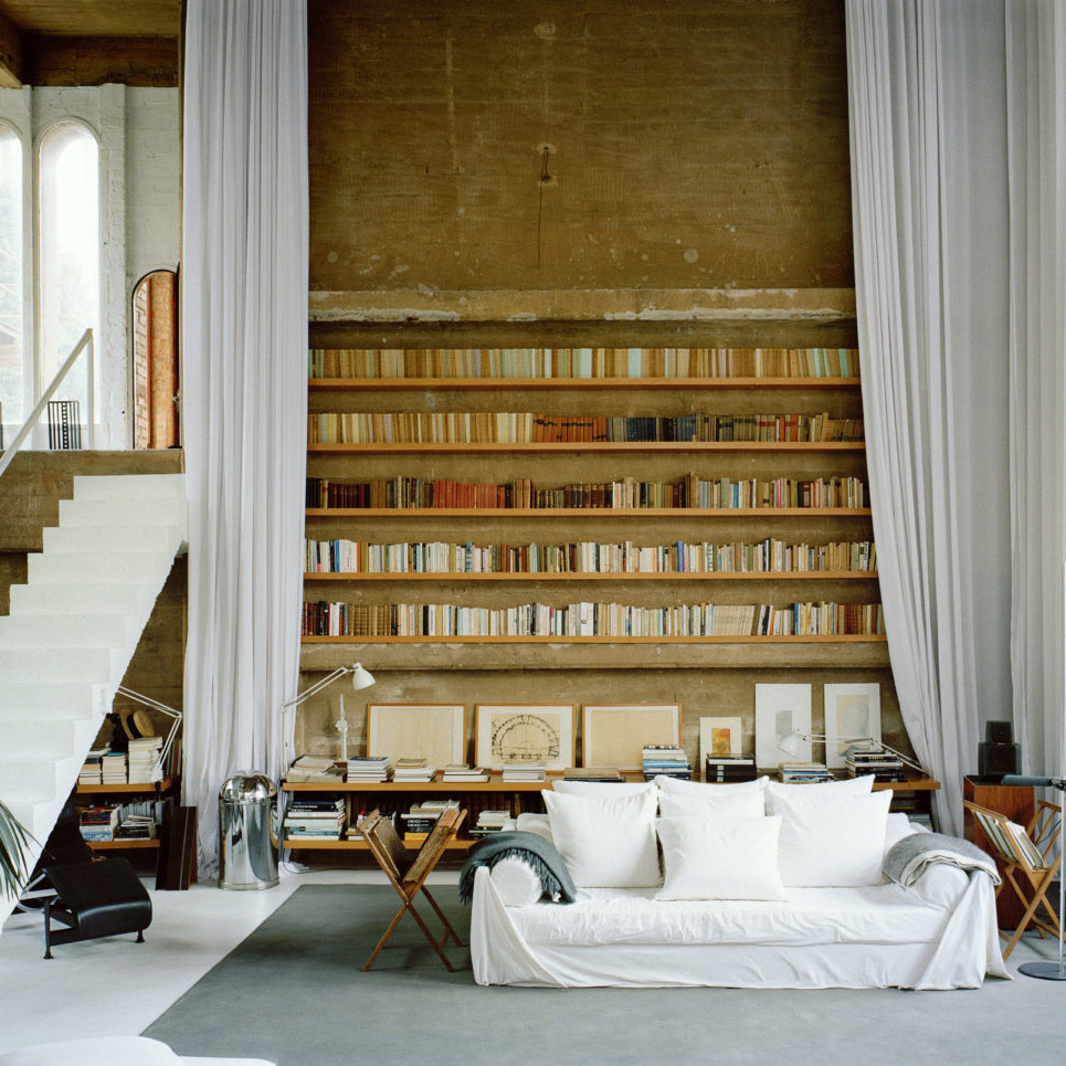
One of the greatest surprises is that, where you might think the
massive scale of the structure and the spaces within it will dwarf furniture, creating a strange echoey soulless chamber, the opposite is in fact true. The vast dimensions and rough textures blend spectacularly with the modern furniture, creating an elegant space with a calming atmosphere.
Get the Ideal Home Newsletter
Sign up to our newsletter for style and decor inspiration, house makeovers, project advice and more.
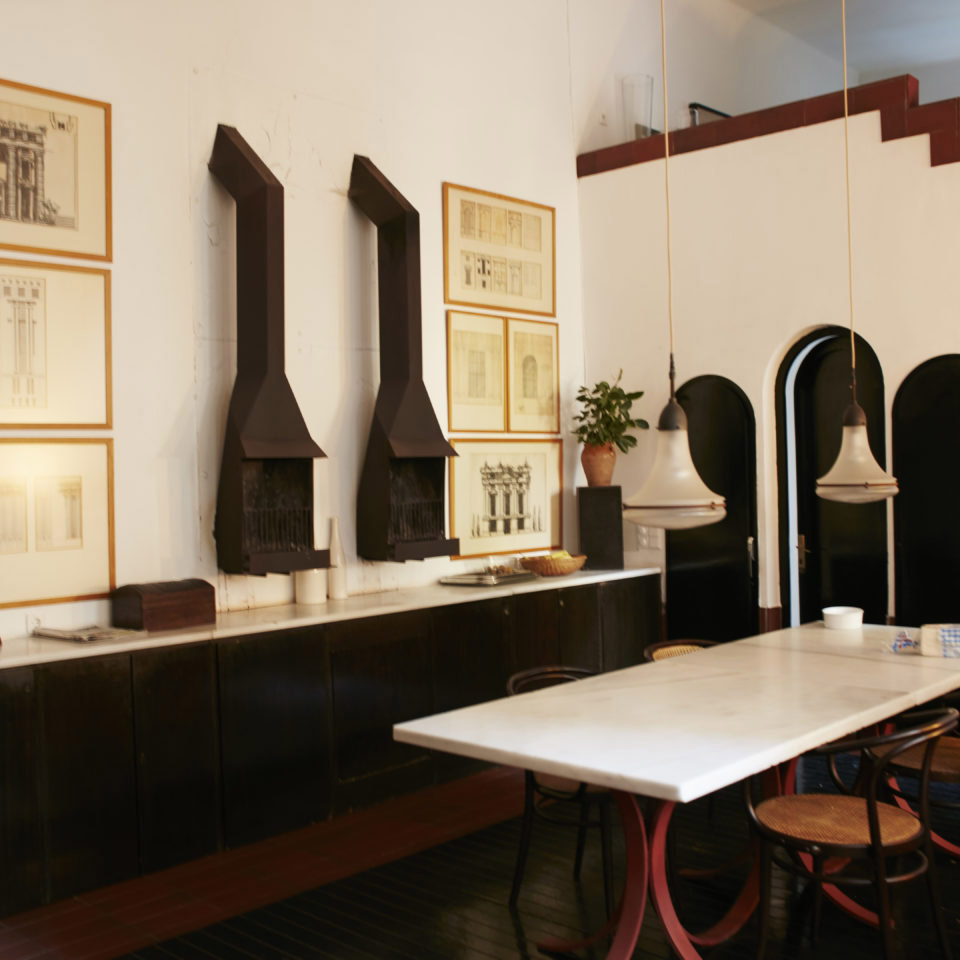
Each newly delineated room is a new jewel to be discovered and, like the greenery that clads the buildings, the interior is constantly evolving.
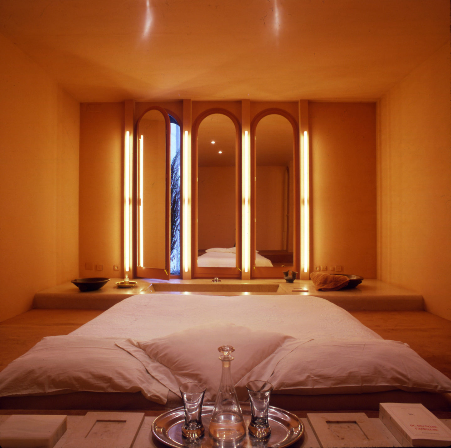
More than just a home, it's also the site of the architect's studio, a move that makes perfect sense because if you want to feel inspired we can't think of a better location. If only property in cities was as spacious, or interesting as this - we'd be taking a leaf out of Bofill's book. Wouldn't you?

Heather Young has been Ideal Home’s Editor since late 2020, and Editor-In-Chief since 2023. She is an interiors journalist and editor who’s been working for some of the UK’s leading interiors magazines for over 20 years, both in-house and as a freelancer.
-
 My go-to Ninja coffee machine is on sale for Easter weekend
It makes coffee shop quality achievable at home
By Molly Cleary
-
 When to plant out annual flowering plants for vibrant, colourful garden borders – and give them the best start, according to experts
Not sure when to plant out annual flowering plants? We've got you covered...
By Kayleigh Dray
-
 I'm a kitchen decor editor and didn't like this tableware trend - until I saw H&M Home's designer-look plates
They made it easy to justify a new crockery set
By Holly Cockburn