The kitchen design mistakes to avoid for a practical but beautiful space
Avoid these kitchen design mistakes for a cooking and entertainment space that will look good and be functional.
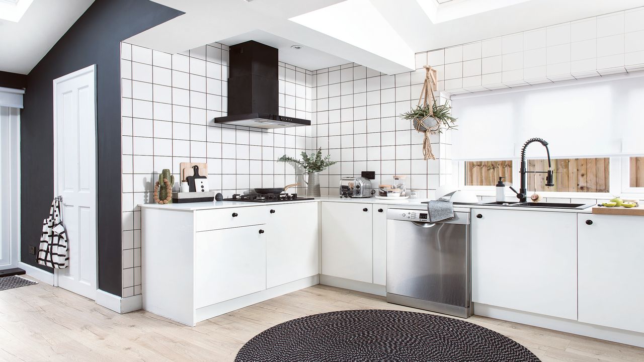
A kitchen is supposed to be the heart of the home, but a few kitchen design mistakes can quickly make it feel like the exact opposite - a space that doesn't quite work how you need it to.
However, when you get your kitchen ideas right not only can it create a space that flows, but it can also add value to your home - that's what we call a win-win. If you are learning how to plan a kitchen for the first time it can be tricky to know what is and isn't a kitchen design mistake, so we've spoken to the experts to draw on their years of experience for the mistakes to avoid and what to do instead.
Avoiding mistakes starts right at the beginning with the initial brainstorm for what you want from your kitchen. ‘You should always start your kitchen design process by understanding how you might use your space, the kitchen is nearly always the most hardworking room in the home, meaning it has to function effortlessly and withstand continuous use,' says Al Bruce, founder of Olive & Barr.
'It is also the little things that make a kitchen perfect, such as making the fridge easily accessible when cooking, having a special place for your chopping boards and knowing where to put your bin so the functionality of your kitchen is flawless. After all, one of the cornerstones of every kitchen is combining function and practicality with your wants, needs and personality.’
Kitchen design mistakes to avoid
It is also important to carefully consider your budget and think about how much does a new kitchen cost. Cost can impact the type of kitchen you can design, but being clear on the budget from the start should help you avoid making any form-over-function mistakes.
‘People often don’t have a clear vision about their budget so make sure you do your research to get a feel for the typical cost of refurbishing a kitchen. Make your available budget clear to your chosen designer from the outset and be aware that worktops, appliances and accessories vary greatly in price - your designer should be able to advise you about the best options within your target price range,’ says Melissa Kink creative director at Harvey Jones.
1. Inadequate ventilation
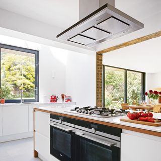
Many homes have adopted open-plan kitchen ideas that are linked to your dining and living rooms or sometimes both. While this can be a great way to create a space that flows from one task area to another, it can also lead to the smells of the kitchen flowing into spaces you'd rather they weren't.
Get the Ideal Home Newsletter
Sign up to our newsletter for style and decor inspiration, house makeovers, project advice and more.
Unless you have the right ventilation measures in place to eliminate kitchen smells and prevent them from spreading to the rest of your home. It's an easy design mistake to make.
‘In an open-plan kitchen it is important that smells from cooking aren’t left to linger long after the meal has been enjoyed unless the extraction system is sufficient,’ says Willi Bruckbauer, founder of Bora.
‘However, a head-height extractor hood can constrain the room’s design – depending on where it is sited it can create a visual obstacle and restrict the room’s layout, particularly when it needs to be sited above an island unit right in the centre of the kitchen.'
'The solution is the downdraft extraction hob, quite literally removing the steam and odours away from pots and pans exactly as they arise, drawing them downwards before they have the chance to permeate the air. A downward extractor will be significantly quieter than a head-height model too, dealing with the issue of acoustics in open-plan spaces.’
2. Not creating a multifunctional space
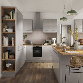
Kitchens are no longer simply a space just for preparing and cooking food, but now need to function as a social hub, office and dining room at the same time. This makes it essential to design a kitchen that can multitask and suit all family members at all times of the day. That can be as simple as installing a breakfast bar that can act as a place to eat, prepare food and for kids to do their homework.
‘I always encourage our customers to consider their lifestyle to help inform their kitchen design. Seating options, smart technology and integrated appliances are a few of a long list of factors that should be considered when designing a multi-functional space,’ says Ruth Lavender, design expert at Benchmarx Kitchens.
‘Even the smallest of details can make a real impact. Helpful features like accessible plug sockets by workspaces, wireless chargers and integrated bins can really facilitate a fluid lifestyle, ensuring that a kitchen design works in harmony with you. Not only do these details help a kitchen space to be used to its full potential but make it easy to enjoy too.’
3. Not planning a purpose for cabinets
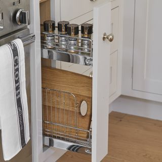
Kitchen cabinets are a big decision to make, but a critical error is forgetting to choose them with what you'll actually store in them in mind. Considering your lifestyle is important when making this decision.
‘Right at the start of your journey, it’s important to consider your specific storage needs to ensure the new kitchen can accommodate the household’s often-sizeable collection of crockery, tableware and cookware,’ suggests Richard Davonport, founder and managing director of Davonport Kitchen & Home.
‘For example, if you’re a budding mixologist and have a prolific collection of glassware, it’s important that shelves are designed at appropriate sizes. Similarly, if you are a great baker, you might want to plan extensive, easy-access storage for a mixer and similar kitchen equipment. For heavy enamel cookware and saucepans, you will need to have drawers or shelves which can bear their weight. Don’t just plan ‘cupboards’, plan ‘cupboards with a purpose.’
4. Neglecting the electrical outputs
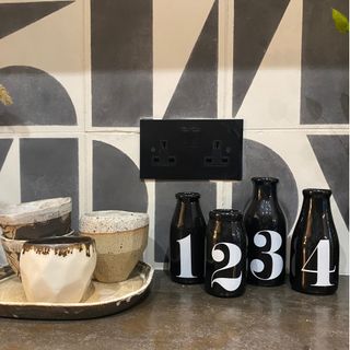
Forgetting about the position of your electric sockets is a big mistake familiar to anyone who has had to share one outlet between the toaster and kettle. As well as being irritating to not have enough sockets, the last thing you want is to find your kitchen countertop display is restricted by where you're able to plug in your coffee machine.
A well-considered appliance kitchen appliance layout idea will ensure a smoother-running kitchen. However, bear in mind that there are rules around safely installing sockets in a kitchen. Sockets are split into those above work surfaces, ideally 10-15 cm above the surface, and those used below work surfaces which are typically for free-standing large fixed appliances.
‘For kitchens that are 12-25 square metres, we recommend that you have at least eight twin sockets, and at least ten or more in a space larger than 25 square metres. It’s important to think about the appliances you want and those you use a lot – you need at least one twin socket per appliance,' recommends Howard Solomons, head of design at Wandsworth Electrical.
'Once you’ve thought about what appliances you’re installing, it’s time to think about what else you use in the kitchen – the best air fryers, blenders, toasters – and especially devices such as tablets and smart speakers. I recommend installing twin-switched sockets with integrated USB outlets in areas that are clogged with devices to minimise the effect on the look of your kitchen.’
5. Basing your design only on the 'kitchen triangle'
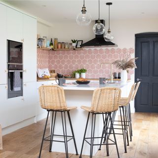
The flow of the kitchen layout is key to a successful and functional space. The working kitchen triangle is the classic rule of design - where the flow of the kitchen is based around the 'triangle' shaped made by the positioning of the sink, cooker and fridge. However, with modern kitchens working harder than ever it goes beyond the principle of the age-old triangle layout often needs adapting.
'The kitchen has now become a multipurpose room that continues to develop in style, function and layout,' says Simon Bodsworth, Managing Director, Daval. 'So you can no longer assume that it will only have three work areas as the traditional work triangle suggests.' It is essential to adapt the working principle to suit your needs, ensuring the flow is seamless throughout, whether you're working with large or small kitchen ideas.
'A good kitchen workflow is essential to avoiding kitchen design mistakes. If you don’t have one, your kitchen won’t work as well as you need it to. In the planning stages, people can focus on the aesthetics too early in the process' says Andy Briggs resident designer at Optiplan Kitchens. 'The number one priority should be functionality. If it looks nice but doesn’t work, then it will soon become a nuisance and only create stress instead of enjoyment.'
6. Mis-measuring worktops
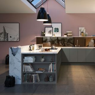
Securing worktops at the wrong height can jeopardise the entire functionality of a space, ending in expensive and irritating kitchen design mistakes. So is there a rule for determining the correct height for a worktop? 'On average, kitchen worktops are between 890 to 940mm high,' advises Andy Briggs from Optiplan Kitchens. 'This gives the most comfortable height for carrying out common kitchen tasks.'
'However, there is no perfect height for worktops as this is usually governed by worktop thicknesses and plinth heights. These two items can vary depending on either your supplier or your own personal preference.'
7. Laying inadequate flooring
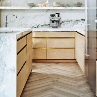
One of the most costly kitchen design mistakes to make might just be the wrong kitchen flooring ideas. 'In kitchens, there are three main things to consider: safety, durability and ease of cleaning' advises David Snazel, buyer of hard flooring at Carpetright. 'Kitchens usually see a lot of traffic, so it’s best to opt for high quality, durable flooring that is low maintenance and will stand the test of time.'
Hard flooring styles, such as vinyl and laminate are a durable and cost-effective solution for kitchens; each with their own specific features and benefits. Before selecting a type of kitchen flooring, first take the time to consider the space you are looking to update to avoid mistakes. This will help determine suitability and style.
'Before purchasing it’s important to look at the detail and whether it is replicating your desired flooring style’s elements. It’s worth visiting a store or ordering samples to ensure you can view each finish and ensure it is in keeping with the rest of your decor and the look you are trying to achieve.'
8. Working with the wrong paint
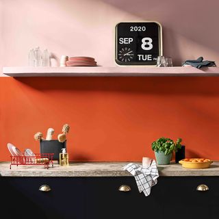
While colour is key when it comes to kitchen paint ideas it's just as much about the finish, because if you get that wrong the paint won't last – no matter how glorious the shade is, it will quickly be ruined by splashes and spills. Avoid kitchen design mistakes by choosing the right formula for the space. After all, kitchen paint needs to be more durable than your average matt emulsion finish.
'Kitchens are arguably the hardest working rooms in our homes and so you need a paint that has been designed to work just as hard,' says Marianne Shillingford, creative director at Dulux. 'Standard emulsion paints can begin to look tired very quickly on kitchen walls and so you need to look for something that has been specially formulated in a beautiful matt finish that is hard-wearing, grease resistant and washable just like Dulux EasyCare kitchen paint.'
9. Misjudging door clearance
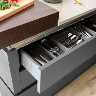
It feels simple enough to factor in but these type of kitchen design mistakes are easy to make. Think misplacing door layouts so they can't be opened fully, or opened at the same time is a kitchen nightmare. Ensure thoughtful planning when placing cupboards and doors.
'A lack of planning can lead to endless issues in fitting, as well as when you come to use it. This can impact the simplest of things like the ability to open cabinets and/or appliances,' says Andy Briggs from Optiplan Kitchens. 'This may seem nonsensical, but the opening ‘swing’ of a door is sometimes overlooked and can lead to endless headaches and alterations in the middle of the fit. Is there enough space to stand when you open your tall fridge/freezer, or will my wall unit open if I choose to have feature pendant lights?'.
'Failing to allow enough space to breathe can make any kitchen feel cramped and restricted – something which you need to avoid at all costs where possible. To provide the minimum circulation between cabinets, try to have at least 1.2m of space between kitchen units (i.e. between walls and island units). You should also try to allow a little more room if the kitchen is a thoroughfare, like a galley.'
10. Cutting corners
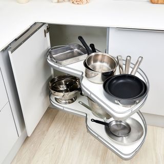
All good kitchen designs makes the most of corners, using every inch of space available makes even the smallest of spaces more functional. Choose a clever small kitchen storage idea such as a corner unit to maximise storage potential. A corner unit is deigned to pull-out and provide extra storage that reaches into the depths of wasted space which lies within corners.
11. Forgoing splashbacks or upstands
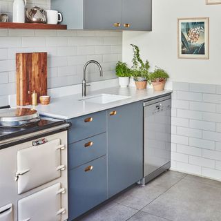
Common and easy kitchen design mistakes include leaving walls unprotected. Kitchen walls need all the help they can get to protect against everyday life. Areas behind the cooker and sink especially need a layer of protection to ensure watermarks and spills don't ruin the paintwork.
Whether a full splashback idea or a slight upstand choose a protective layer to suit your kitchen design. even when you have tiles it pays to add a dedicated protective layer – to save the grout from discolouring.
12. Only using cupboards for storage
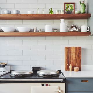
Kitchen cabinets are not the only solution for storage in modern kitchen ideas, especially if you're working on a budget.
'It’s true that when it comes to designing and planning your new kitchen, the cabinets can be a large chunk of the cost,' says Andy Briggs from Optiplan Kitchens. 'If you’re trying to stay within a strict budget, try opting for open shelving on higher levels, rather than wall cabinets.'
'This will allow you to store everything from mugs and glasses to cookbooks, and also enables you to display stylish accessories and family photos – creating that ‘heart of the home’ feeling in your kitchen space.'
13. Overlooking a heating element
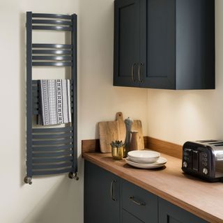
Who'd have thought heating features as a type of kitchen design mistakes to avoid. There's the danger of thinking because of the oven you already have a source of heat, so heating is not as important – but the oven is not on all the time right? Plus if your space is open-plan there's a lifestyle element to the space that needs to feel warm and inviting, not cold and uncomfortably chilly.
'Kitchens often have limited proportions but are some of the busiest places in our homes,' says Simon Morris, marketing manager at The Radiator Company. 'We need the space to look and feel comfortable, but also ask a lot from them. A bit of thoughtful planning can help the space feel more elegant from a decorating standpoint, but it’s also worth considering how we can also make our kitchens work harder from a practical perspective.'
'Whilst many homes opt for a towel rail to heat the kitchen from a multi-functional approach, but they can be more than just practical and design-led. Using classic or contemporary designs and custom finishes to key in with your décor can make your heating fit in seamlessly.'
14. Forgetting counter space
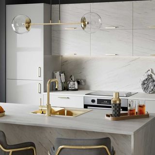
When it comes to planning a kitchen, making the most of every inch of useable space is a must. A very common example of kitchen design mistakes is not including enough counter space to work with.
'Remember to include enough space to prepare meals, display all your appliances, wash up, and potentially space to eat and socialise if that is how you plan on using the kitchen,' advises Hayley Simmons, head of merchandising for Magnet.
15. Underestimating your storage needs
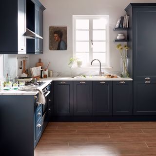
Plan accordingly and allocate a space for every single thing, from spice jars to cutlery-separating drawers. Although the temptation to keep adding to the list can be great, a clear initial index will keep you on track. By sticking to a clear plan you also avoid the temptation to overcrowd your brand new space and help you steer clear of kitchen design mistakes.
‘The key to getting the most storage out of your space is thinking of clever ways to integrate kitchen storage ideas and solutions into existing kitchen essentials,’ explains Iain McColgan at B&Q. ‘For example, magnetic panels help utilise unused wall space between wall and base cabinets.’
‘For bulkier items, you should also consider pull out corner storage. Designed to easily fit into the cabinets, pull out storage helps efficiently store away items and make them easy to access when needed.
‘Finally, don’t forget to utilise floor space by considering a trolley which creates extra space when you’re preparing food, or could even be used as a drinks trolley when entertaining.’ All worthwhile considerations when it comes to creating a kitchen that works its hardest to cater for all your needs.
16. Allowing rubbish to pile
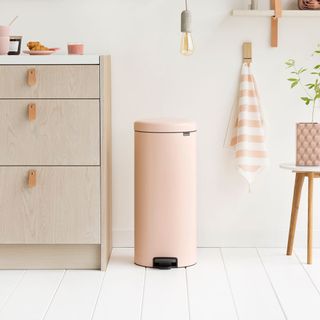
It sounds completely obvious, but when it comes to the rubbish, because it's the least glamorous part, bins are often overlooked. One of the most simple but easy kitchen design mistakes to make. Given waste is totally unavoidable it should be factored in as a priority. Even more so given we now require separate recycling, food and general waste disposal.
The best solution is integrated bins, or at least cupboards to conceal freestanding bins. Hiding not only the presence of waste, but also helping to contain odours. When the dedicated space isn't allocated at planning stage the only viable option is a free-standing bin on display.
Thankfully you can buy stylish solutions now. But if this wasn't part of the plan it won't please you when you realise waste disposal has been overlooked.
17. Skimping on lighting
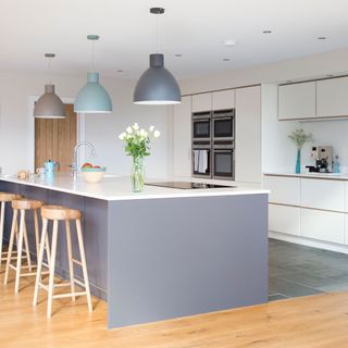
Like most rooms, it's important to get the lighting right for the functional use as well as the aesthetic look. Prepping food will require more direct, brighter lighting than that of a dining area within the kitchen.
'Installing multiple sources is one of the most effective ways to make sure there is ample light that is fit for purpose,' says Ruth Lavender from Benchmarx Kitchens. 'When thinking about a design, you should also consider placement of windows and how these will impact the natural light. Skylights and bifold doors are perfect for flooding a room with natural light. Having windows to the outside world will make your kitchen feel like it extends further than it does and will stop it from feeling enclosed.'
Smart kitchen lighting ideas such as spotlights concealed under wall cabinets and in the ceiling are still the most popular, practical choice to use throughout. They can be grouped according to tasks, and used with dimmer switches so you can change the atmosphere in an instant.
You might also want to consider plinth lighting. Strips that run along the base of your cabinet can provide a subtle light that will illuminate your kitchen after hours. Handy if you should sneak in for a midnight snack!
For areas of the kitchen where family and friends gather, consider living-room style lighting. Pendants add a more focal light source and create ambience, as do table lamps on a sideboard. Overhead spotlights can be switched off or dimmed low when you want those statement lights to take the focus.
18. Avoiding expert advice
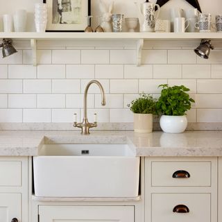
Often the temptation to DIY is so great that we forget the level of expertise involved in planning any major home project. Especially with a kitchen where complicated wiring, plumbing and ventilation systems all feature heavily. These are not to be messed with if you don't know what you're doing. Not seeking professional help can be one of the most costly kitchen design mistakes to make.
Seeking the help of registered tradespeople can lend a hand with planning and project managing, too. You need to know when to carry out each stage of the work. There's no point tiling until the electricians have been in for example.
'Looking at the bigger picture, a smart investment at the beginning of the project can prove to be more cost-effective in comparison to an amateur take on such a complex task,' explains Andy Briggs from Optiplan Kitchens. 'There’s no shame in getting some expert advice, especially when undertaking a massive project, such as a kitchen renovation.'
'Complicated wiring, plumbing or ventilation systems are not to be messed with unprofessionally. Plus, having a registered tradesperson to lend a helping hand can relieve the pressure of thinking about every single detail. Looking at the bigger picture, a smart investment at the beginning of the project can prove to be more cost-effective in comparison to an amateur take on such a complex task.'
19. Going over budget
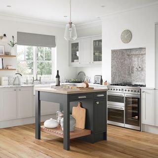
This may sound obvious, but when it comes to kitchen design mistakes, going over budget has to be one of the most common seen in home renovation. We've all seen enough Grand Designs episodes to know only too well that project spends can increase dramatically.
It's often the forgotten factor, such as above, that can add to the inflated costs. The easiest easy way to avoid over-spending is by creating an inventory list, ensuring it accounts for both furniture and contents.
‘Never start a kitchen renovation without a budget and plan in mind,’ says Hayley Simmons from Magnet. ‘Even if you have the money to splash out, having a set figure and keeping what you need from your renovation in mind can help avoid overspending.' Avoid temptation to keep adding to the list! A set, accurate budget from the beginning will keep you on track.
Hayley goes on to say, 'Don’t spend money on unnecessary or impractical items that will wear easily and need to be replaced. For example, if you want a solid wood worktop, but cook a lot and have small children that could damage and stain it, a laminate wood effect worktop may be more cost efficient and more durable for your needs.’
20. Not reworking the layout
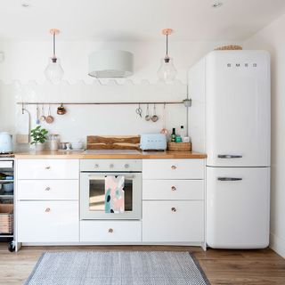
A new kitchen doesn't mean you have to change the existing layout, if it ain't broke don't fix it basically. You can replace like for like with new cabinets and accessories to refresh a space without having to completely rework the layout. Simply reconfiguring an existing space can go along way and just installing new appliances and sprucing up the space may be all that's needed to create a space that feels brand new.
21. Choosing a design that will date
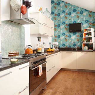
As tempting as it is to go for the latest kitchen trends, make your kitchen design a more considered choice, don't let it be more about style than practicality. Avoid choosing a design that is likely to date and be old news in only a few years. Kitchens are not cheap to replace, which is why kitchen design mistakes need to be carefully paid attention to. Keep this in mind when designing your dream kitchen. If you're watching the pennies but don't want to compromise on style, a great budget kitchen idea is to paint the cupboards yourself!
You can go as out there with the paint, wallpaper and accessories, but these can be easily and affordably alternated if desired. Brightly coloured gloss cabinet doors that you can't paint may seem like a great idea now, but will you love them a few years down the line? If you will, go for it! If you're at all unsure, stick to a timeless and classic choice.
A good kitchen should see you through at least 10 years, so it's important to get it right. It's worth thinking too about it's re-sale value, especially if you plan on moving within 10 years.
What should you not do when designing a kitchen?
When designing a kitchen you can incorporate your DIY kitchen ideas if you want to be more hands on with your kitchen transformation. However to avoid kitchen design mistakes it is important to plan the process in depth.
‘When planning your kitchen be careful not to be over ambitious with freestanding elements,’ says Ben Burbidge, managing director of Kitchen Makers. ‘You should ensure you precisely measure your floor so that an island or dresser will fit comfortably within your space. When you’re considering the size of your island, look to maximise the internal and worktop space but don’t be tempted to make the overall dimensions too big as it could dominate or restrict movement around the kitchen.
‘When placed in the centre of the kitchen, an island should leave enough floor space for you to manoeuvre around and access the rest of the kitchen. When planning a kitchen homeowners can often prioritise aesthetic over practicality, however innovative storage solutions mean it is no longer necessary to compromise space for style. Storage should be practical and functional but also a beautiful stand out feature of your kitchen that you take pride in.’
What is the common problem if kitchen design is not planned properly?
If a kitchen is not planned properly you can often be left with the feeling of nothing being easy to hand when you need it. ‘If the ergonomics and distances between key zones have not been considered, you can often feel as if you are crossing path or dashing across the kitchen to reach the essentials,' says Elizabeth Sherwin, creative director of Naked Kitchens.
‘There is nothing more irritating than finding out your favourite glasses don't fit in your dresser, or that the box for your favourite cereal doesn't fit in the pantry. Considering the important items that need to be stored in units will enable you to determine the shelf heights or drawer heights required. Tall units need additional height to be rotated/positioned upright in the room. We suggest leaving around 100mm between the tops of any tall units and the ceiling to ensure plenty of space for rotating.’
Tamara was Ideal Home's Digital Editor before joining the Woman & Home team in 2022. She has spent the last 15 years working with the style teams at Country Homes & Interiors and Ideal Home, both now at Future PLC. It’s with these award wining interiors teams that she's honed her skills and passion for shopping, styling and writing. Tamara is always ahead of the curve when it comes to interiors trends – and is great at seeking out designer dupes on the high street.
- Imani CottrellContent Editor
-
 What disinfectant can I use in a washing machine? Cleaning experts reveal the product you should avoid at all costs - and to use instead
Disinfecting is key... but only if you use the right product
By Lauren Bradbury
-
 How to fix creaking floorboards under carpet — banish that pesky squeaking without damaging your flooring
Expert advice on how to fix creaking and squeaking floorboards when they're hidden under carpet
By Marina Rabin
-
 I tried the ‘one in one out’ decluttering method – it’s overhauled my whole approach to shopping and getting rid of things
Shopping will never be the same again
By Ellis Cochrane