House of Hackney: Palm prints, pub decor and the pattern for success
Its fresh take on traditional prints has put House of Hackney at the top of the London design scene and now they've brought their unique style to the iconic nightclub Annabel's
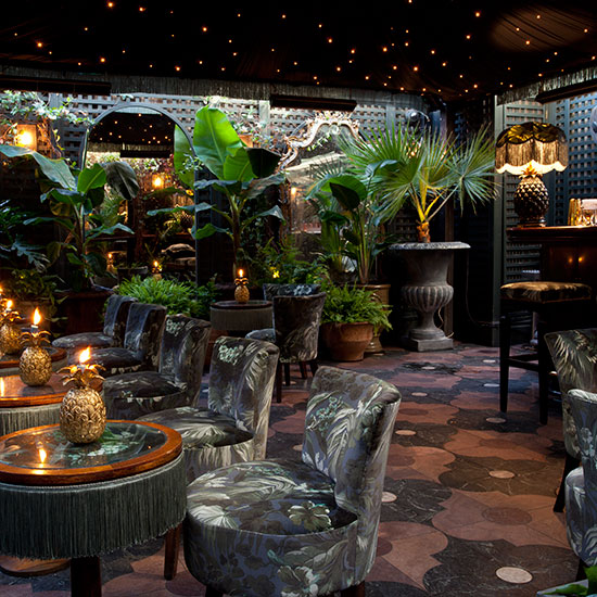
What do you get when the most glamorous nightclub in London invites a trailblazing design duo to makeover their legendary outdoor terrace? Well if House of Hackney's amazing makeover of Annabel's is anything to go by, you get a magical space decked out in glorious pattern and finished with reams of fringing.
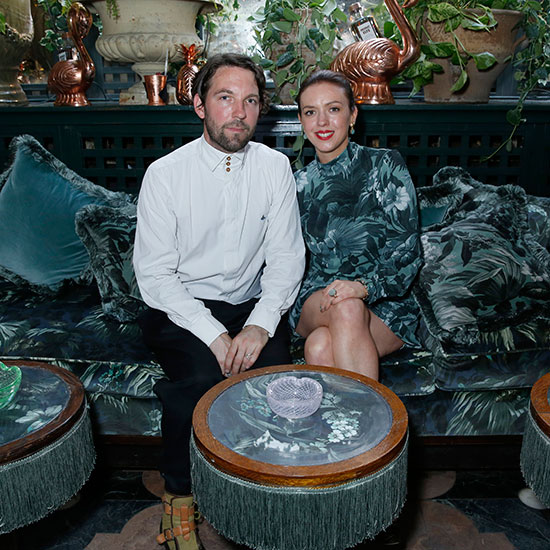
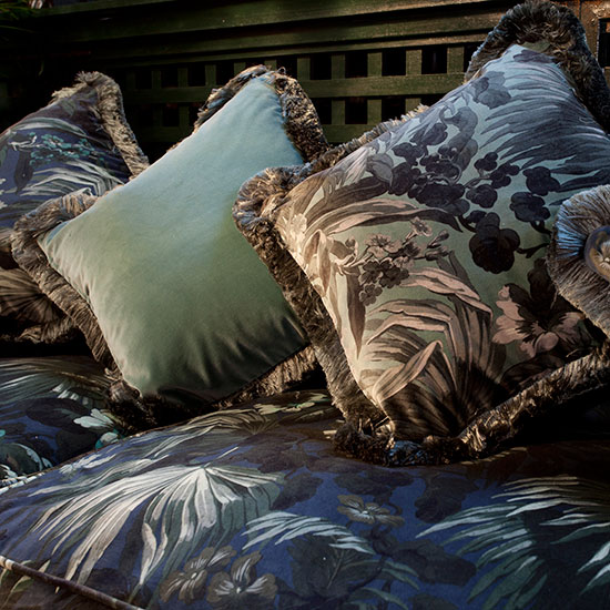
Frieda Gormley and Javvy M Royle, the clever couple behind the cool London interiors brand House of Hackney, used a new pattern inspired by flora and fauna to create a tropical den with bags of 1950s style. The tented ceiling is edged with lustrous green silk fringing, matching the tables and a new cushion created specifically for the terrace.
"It has been a dream interiors project for us," said Frieda. "It feels perfect for a cocktail club, really painterly, moody and quite glamorous and sexy at the same time," she adds, describing the new pattern called Limerence, which will form part of the AW16 collection.
The quirky collaboration came about when Frieda and Javvy attended a party for Iris Apfel at the members-only club on Sloane Square last year. A favourite of the royals (and still the only nightclub to have been visited by the Queen), it's the sort of space you could easily imagine Elizabeth Taylor sipping on a flute of champagne while Mick Jagger held court at the bar - both of whom have dropped into Bel's during it's glitzy 53 years.
Where Annabel's may have the star-studded legacy of a London icon, the House of Hackney label has quickly gained a huge following for their brilliant reimagining of traditional prints and eccentric 'more-is-more' approach to interior design. Housetohome spoke to Freida about the collaboration and the journey House of hackney has made from small indie start-up to a design power brand and her predictions for the next big interiors trend.
House of Hackney is celebrating its 5th anniversary. How has it been for you over the last five years and what are the lessons you've learnt along the way?
It's been a really interesting adventure. We started in 2011, just my husband Javvy and I, from sitting around our kitchen table in our house in Hackney. There really hadn't been very much going on in interiors for a long time so we conjured up the sort of brand that we could not find.
Get the Ideal Home Newsletter
Sign up to our newsletter for style and decor inspiration, house makeovers, project advice and more.
We were newcomers to the design industry and the brand was initially labelled as disruptive because we were about de-mystifying the interiors process and opening it up to people, challenging the traditional format of how people sold interiors. We're big visualisers and from the very start we had very strong ideas about what a world of Hackney would be about.
Your flagship store in East London has been voted one of the best shops in London. What inspired you to create the space?
I remember being given a book on Biba and really poring over those images and being struck by how magical it was. Everything on the high street has become very homogenised and we wanted to create something that was quite special, a treasure trove.
No one ever gave us a manual at House of Hackney so we've really written it ourselves and we've learnt a lot over those years. It was a challenging time economically when we launched in 2011 - during the depths of the depression - but I think after a decade of minimalism people were excited and charmed by what we were doing and I think it struck a chord across the generations.
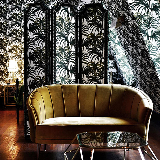
There have been a lot of imitators of House of Hackney - your tropical palm pattern Palmeral being a good example - so how do you continue to make your designs stand out?
We don't look at any trends. We trust our in own creative senses and we're inspired by our environ. Our inspiration comes from everywhere. It could be someone walking down the street of any age wearing a really interesting colour - for use colour is very important. We're known for drawing prints but for us the ambiance of colour is really key to what we are about and we almost have a bit of an anti palette. We usually drop a bit of grey into colours to actually sully them a little bit.
We're obviously hugely inspired by the natural world, cinema, music and its references; our love of the great days of rock and roll runs through the veins of our brand am I'm sure comes out in our work. There have been lots of imitators and, the way we look at it, we've lots more ideas so for us it's about staying in tune with what we're feeling and staying ahead of the game.
What's your prediction for the next big interiors pattern trend?
We are feeling a return to embossed wallpaper but with a bit of a modern update for these times. We all grew up with Anaglypta and it has this association with traditional pub décor but we're feeling embossed wallpaper is quite an interesting trend that's coming through - but mixed into a modern colour palette.
The Annabel's cushion in Limerence is available in limited numbers from House of Hackney
-
 My go-to Ninja coffee machine is on sale for Easter weekend
It makes coffee shop quality achievable at home
By Molly Cleary
-
 When to plant out annual flowering plants for vibrant, colourful garden borders – and give them the best start, according to experts
Not sure when to plant out annual flowering plants? We've got you covered...
By Kayleigh Dray
-
 I'm a kitchen decor editor and didn't like this tableware trend - until I saw H&M Home's designer-look plates
They made it easy to justify a new crockery set
By Holly Cockburn