We’ve just seen Little Greene’s new paint palette
...and it's absolutely stunning! Little Greene have put their elegant spin on all the major colour trends for 2017
One of our favourite paint brands, Little Greene have updated their much admired paint palette to include all the major new shades making waves in 2017. Along with several interpretations of the verdant green named as Pantone's colour of the year, the new collection offers a balance of modern colour trends with traditional schemes of greys, spring yellows and blues.
But it's not all sweetness and light, the new colour chart also has a gorgeous selection of dark and dramatic shades among the classic spring pastels. Their deep greens and heavily pigmented colours actually accentuate real-life greenery, perfect for this time of year when everything is coming into bloom.
Little Greene's updated palette now comprises 184 shades, and the new colour card is set on a darker background, making it easier to visualise and compare colours. New shades of grey have also been added to their collection, because, frankly we're all still using it by the bucket-load in our homes.
‘Grey is here to stay, due to its universal appeal and very useable shades,' says Ruth Mottershead, Marketing Director.
Here’s our first reaction to the new colours - are you as thirsty for a makeover now as we are?
Mid Azure Green
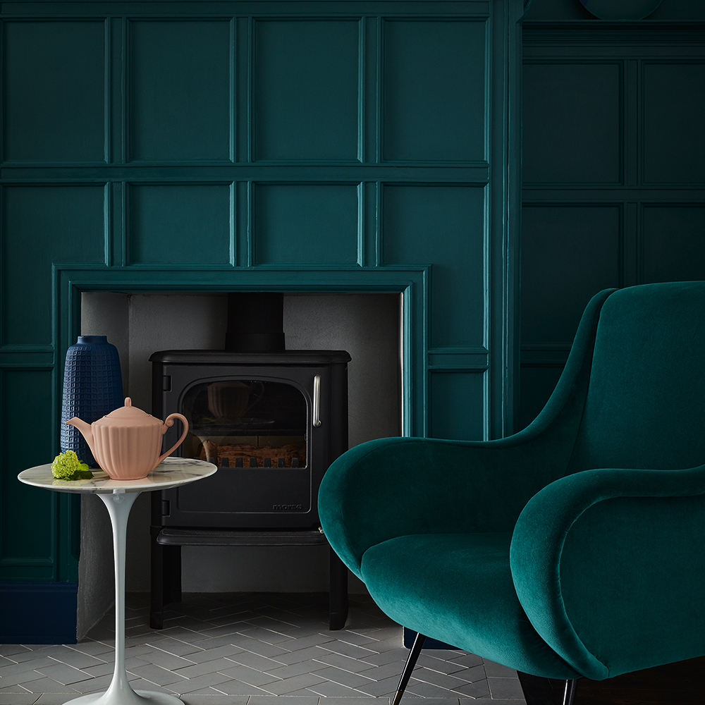
Little Greene says: A popular deep teal which has earned its place back on the card with some help from the trend of using dark colours to create moody, intriguing interiors.
Get the Ideal Home Newsletter
Sign up to our newsletter for style and decor inspiration, house makeovers, project advice and more.
Natalie Davies, our Digital Editor, says: Forget blue skies, this azure is the deep green of the jungle at midnight. Not for the faint-hearted, this pigment-rich shade will reward those that take the plunge. If you do, don’t hold back. Try a total colour block approach and use panelling or other textures to create pattern. Abigail Ahern would most certainly approve.
Grey Stone
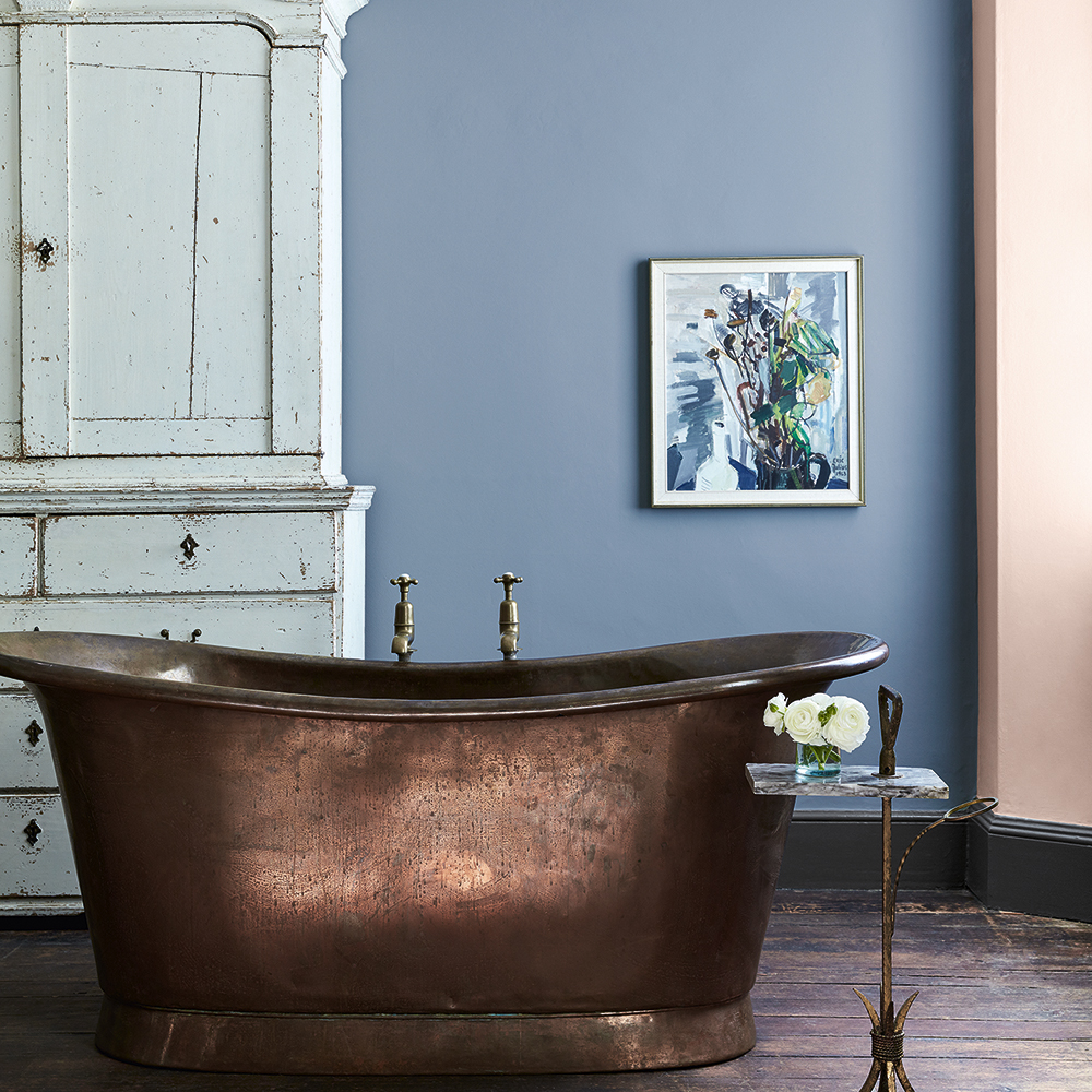
They say: Much more blue than its name suggests, it's a good colour for north facing rooms as it won't go lilac or green.
We say: Contrary to the name, this elegant shade is more reminiscent of the lavender fields of Provence than a cool neutral. And yet feel free to treat it like you would any mid grey tone. Gorgeous in a bathroom, it plays against rose gold accents beautifully. Use for a new way to do shabby chic.
Pale Lupin
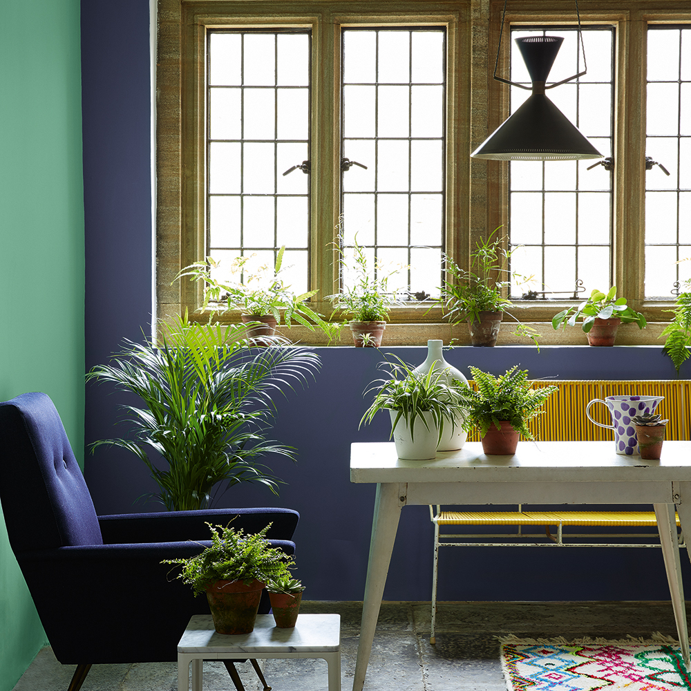
They say: With additional violet pigment, this is rather more feminine than any of the blues on our previous card.
We say: Dusky yet vibrant, this violet-hued blue works in a variety of styles. Gorgeous with traditional features and dark wood, it also sings with brilliant whites and is perfect for a relaxing bedroom scheme.
Pleat
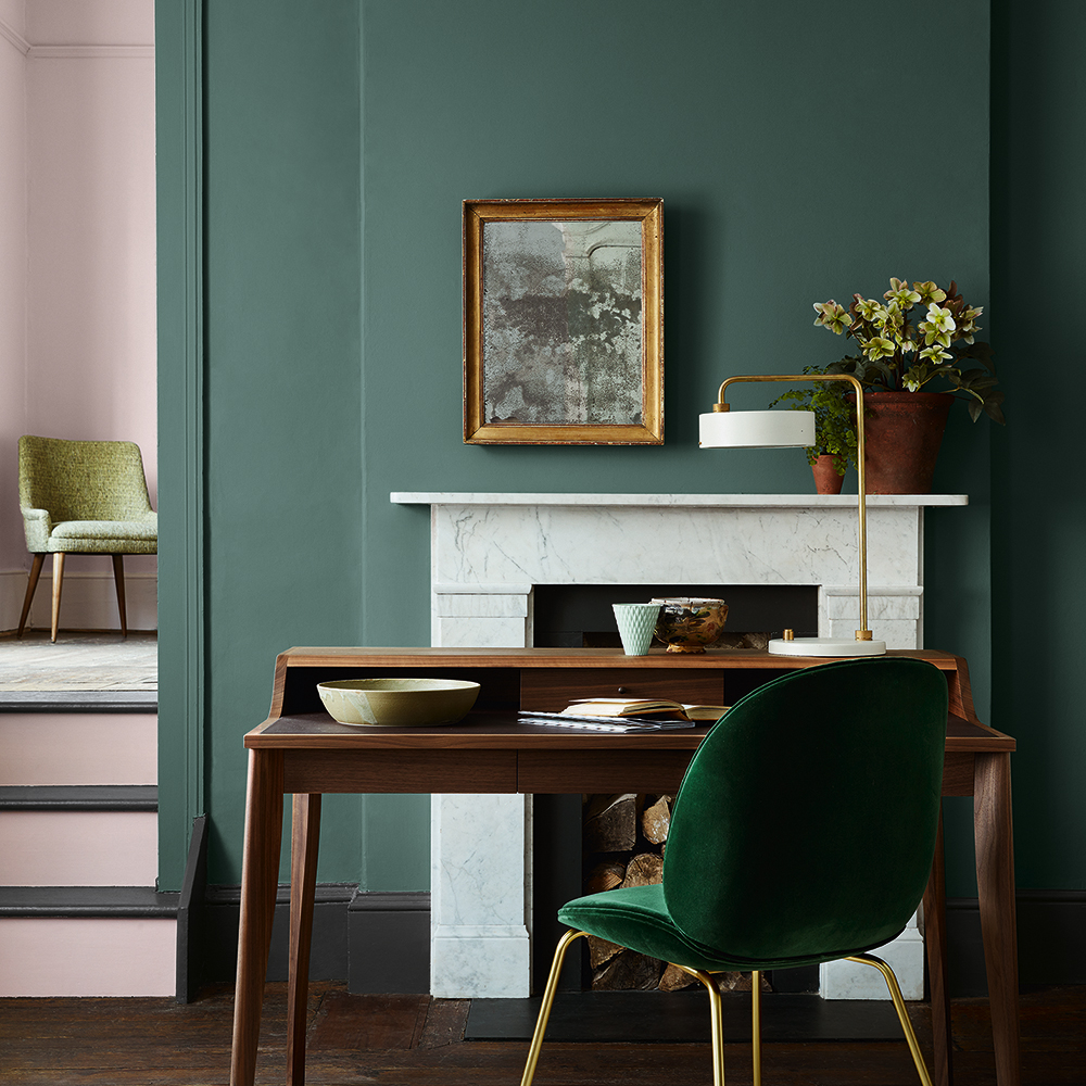
They say: A greener sister to Livid which featured on our Blue card, and worth consideration if you want a strong colour that can speak quietly instead of shouting.
We say: As the tongue-in-cheek name suggests this gorgeous take on racing green brings to mind the woody hues of a country manor - all Barbour jackets and leather bound books - but pair this with a pale pink and you’ve got a colour combo so modern it hurts.
Middle Buff
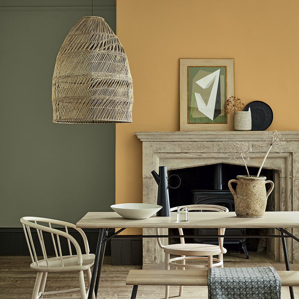
They say: One of those shades you might need to see to fall in love with, but it's a beautiful colour - a hidden gem.
We say: It’s more grown up than gold, more glamorous than mustard, and yet just as rich. This butterscotch shade gives a nod to retro without slipping into pastiche. Use on an accent wall or go to town in a small space (including the ceiling) for a dramatic look that’s surprisingly easy to live with.
So hats off to Little Greene for bringing these colours into our lives - they've put a lot of thought, research, and consideration into the creation of their products, which is exactly why we love them.
-
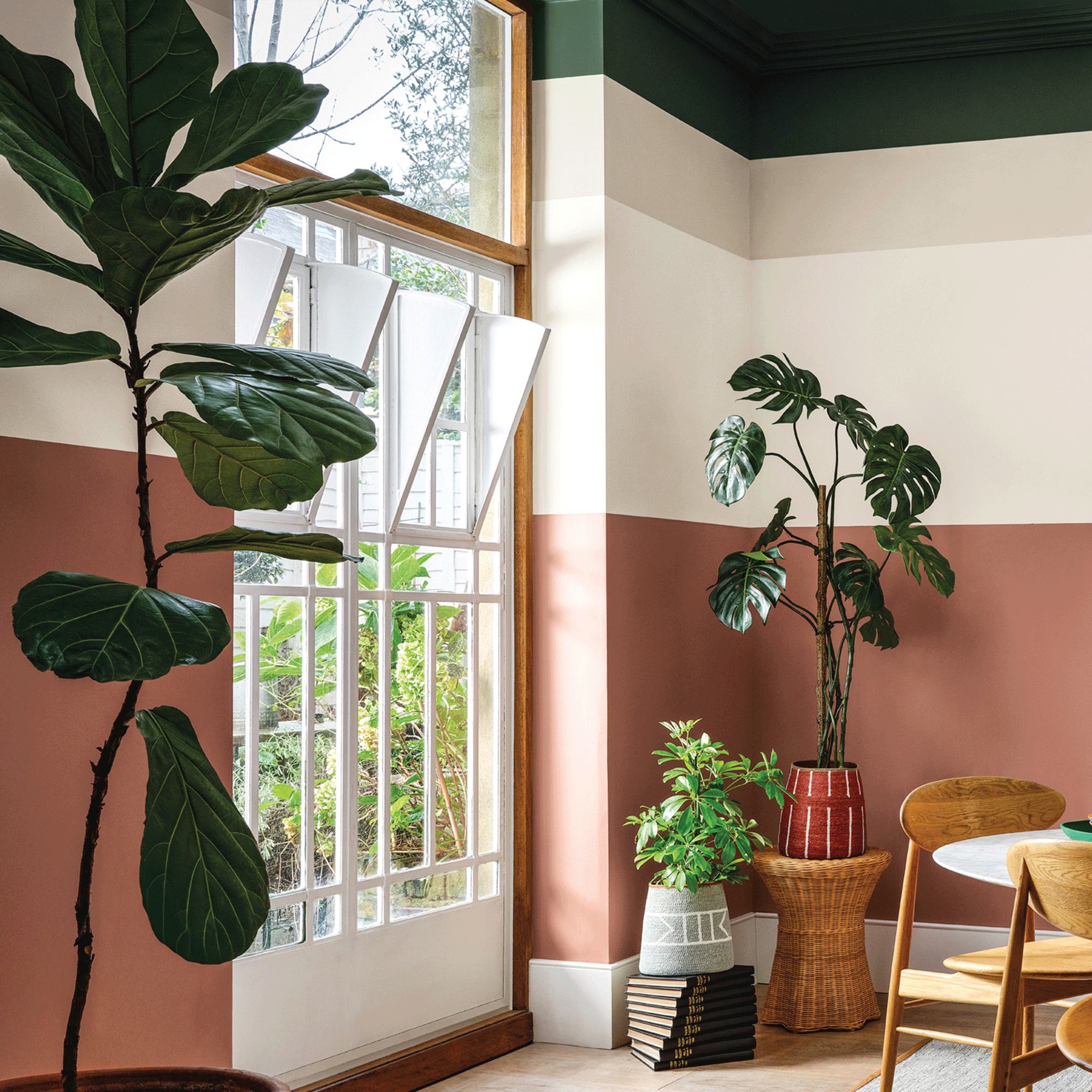 Crown Paint has launched new wall colours for the first time in three years, and changed how I think about neutral shades
Is terracotta the ultimate neutral?
By Rebecca Knight
-
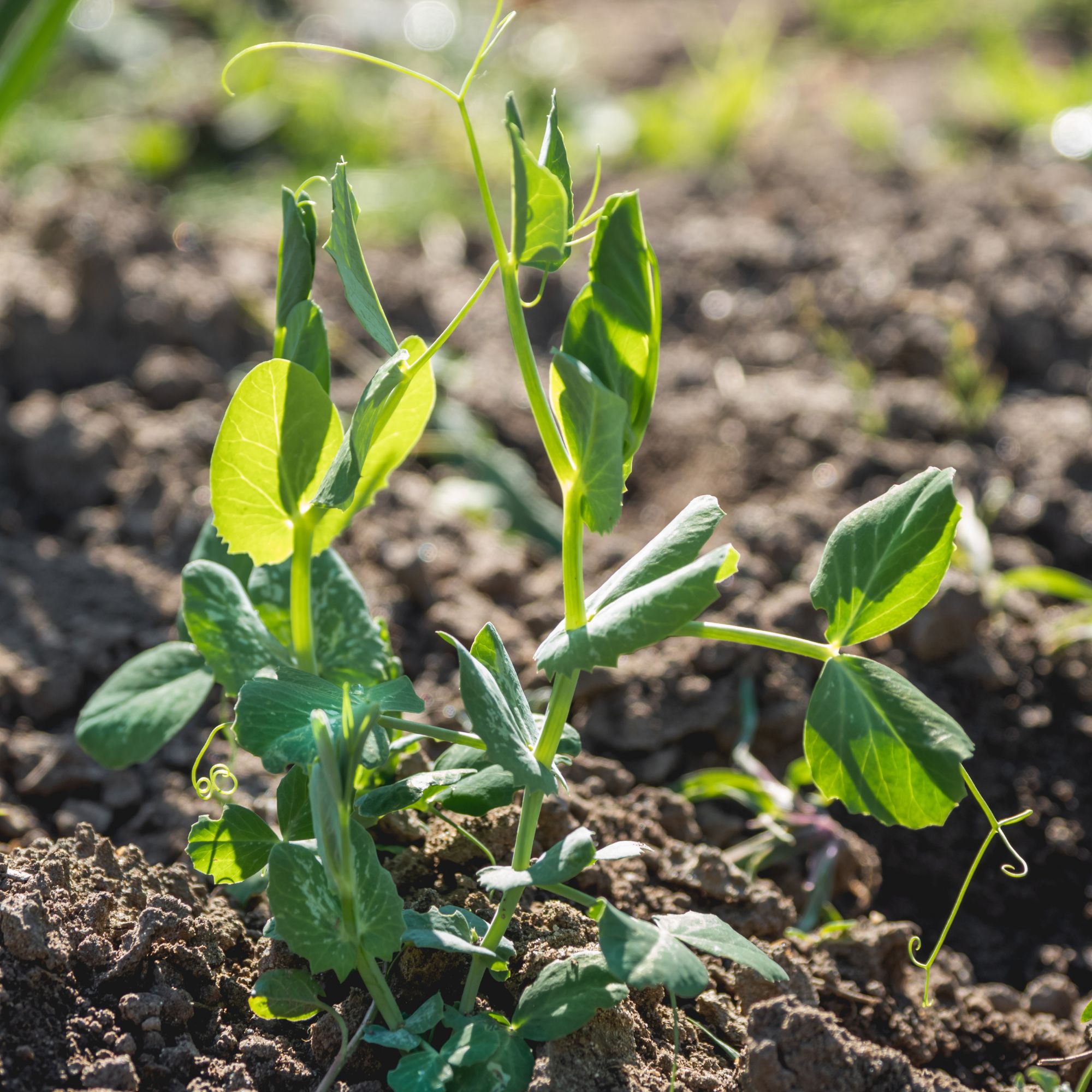 How to protect seedlings from birds – experts say there's a kind and clever way to stop them pecking
Yes, you can protect seedlings from birds without harming your feathered friends...
By Kayleigh Dray
-
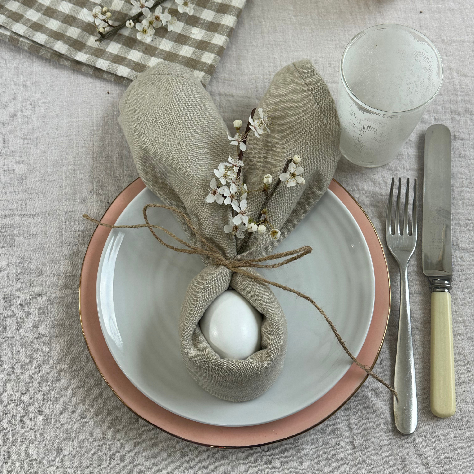 We tried the viral napkin bunny ears hack – it only takes five minutes and will take your Easter table to the next level
This Easter craft is not only beautiful, but really easy to do
By Kezia Reynolds