The Pantone Colour of the Year 2018 has been announced!
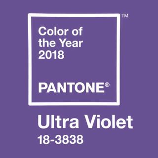
Drum roll please... the experts over at Pantone have chosen Ultra Violet as their colour for this coming spring. Ultra Violet is an enigmatic blue-based purple shade, which Pantone claims is set to take our imagination to new levels
Each year Pantone, the leaders in colour, predict a tone that will be the next BIG thing in the world of interiors. With such passion for colour, the chosen tone is so much more than just a shade to paint walls with. It's about how that colour makes you feel, and the atmosphere it creates when integrated into your home.
Need convincing about decorating with purple? Read Purple living room ideas that are easy to live with
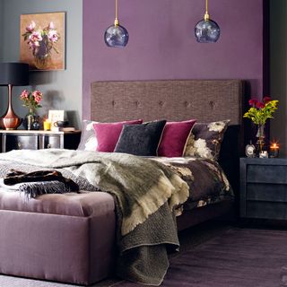
This rich purple shade of Ultra Violet is perhaps not what you might expect for a spring shade. But here's why it's set to be a key colour for next year...
'We are living in a time that requires inventiveness and imagination, says Leatrice Eisemen, Pantone's Executive Director. 'It is this kind of creative inspiration that is indigenous to Pantone 18-3838 Ultra Violet, a blue-based purple that takes our awareness and potential to a higher level'.
The expert colourists don't make this decision lightly – they take into account influences in the world of interiors, fashion, design, travel and current socio-economic conditions.
'The Pantone Color of the Year has come to mean so much more than "what’s trending" in the world of design,' explains Laurie Pressman, Vice President of the Pantone Color Institute. 'It’s truly a reflection of what’s needed in our world today.'
2017's Pantone colour was an optimistic green. 'Greenery' was chosen to represent the ongoing mindfulness trend of 2017, environmental issues and the threat of global warming, and the undeniable political turmoil of Brexit and Trump – what a year, eh?!
Get the Ideal Home Newsletter
Sign up to our newsletter for style and decor inspiration, house makeovers, project advice and more.
Related: How to decorate with Pantone's colour of the year 2017: Greenery
In 2016, Pantone broke with tradition and chose two key Colours of the Year. Serenity and Rose Quartz, a gentle blue and pink respectively, were picked to show the need for peace and harmony in a chaotic world.
Historically, the colour purple has been seen as having a spiritual or mystical quality to it. Are you feeling mystic? Can you see Ultra Voilet in your future?
Tamara was Ideal Home's Digital Editor before joining the Woman & Home team in 2022. She has spent the last 15 years working with the style teams at Country Homes & Interiors and Ideal Home, both now at Future PLC. It’s with these award wining interiors teams that she's honed her skills and passion for shopping, styling and writing. Tamara is always ahead of the curve when it comes to interiors trends – and is great at seeking out designer dupes on the high street.
-
 6 of the best bedding plants to add to your garden in April for vibrant flower beds this summer
Colourful displays are just months away...
By Sophie King
-
 Every homes editor I know owns this Joseph Joseph kitchen essential, and I've finally been persuaded to buy one too
I've never known a washing up bowl have such a cult following
By Rebecca Knight
-
 5 things you need to know before installing a porch to avoid an expensive mistake
Check these things off before diving in to avoid and expensive mistake when installing a porch
By Holly Reaney