

It may or may not have escaped your notice that there's a new paprika paint trend infusing our homes with a spicy flavour. We've spotted this rich, earthy hue – similar to rust and terracotta – popping up a lot lately.
We asked Little Greene for their advice on executing this hot new paint idea in our own homes.

Paprika paint trend
As Creative Director at Little Greene, Ruth Mottershead has the inside track on paint trends. She's able to see exactly where consumers are landing on the colour spectrum when decorating their homes.
'Over the past few years, we have seen a real move towards warm neutrals that create a sense of calm and comfort,' Ruth shares. 'This yearning for warm, nurturing colours has created interest in spicier, richer tones such as Heat, Drummond and Tuscan Red.'
Tuscan Red (pictured above and below) is a naturally occurring shade that reminds us of paprika. It also transports us to a sunny Florence portico, gelato in hand... Because this pigment has been used to colour paints for centuries, it's particularly grounding, great for bedroom paint ideas.

It's also more liveable and versatile than you might think. As the image above shows, it complements natural materials like the wood of the bench, the metal tap and terracotta pots. It also looks beautiful next to beiges and off whites and looks great on wood panelling.
Its deep terracotta red tone creates the perfect backdrop to garden greenery. It brings spicy heat to your terrace, patio or outdoor living room ideas. If you want to do some colour blocking, Ruth suggests pairing Drummond with the fresh Apple and deep Dock Blue (pictured below) for a vibrant open-plan kitchen colour scheme.

For a darker shade that works with paprika, Ruth suggests Pompeian Ash. You can break up the intense colour palette with a splash of Heat, a burnt orange with warmth, depth and optimism.
We're halfway through the year and we've seen colour drenching, Very Peri, we've wondered if green is the new grey. With summer's arrival, we're slowing down, taking pleasure in simple things, and looking after ourselves.
It's just a matter of time before warm and nurturing paprika shades are all over our front doors, bedrooms and outdoor spaces.

-
 Will a conservatory add value to your home and how can you maximise it?
This is what the pros say
-
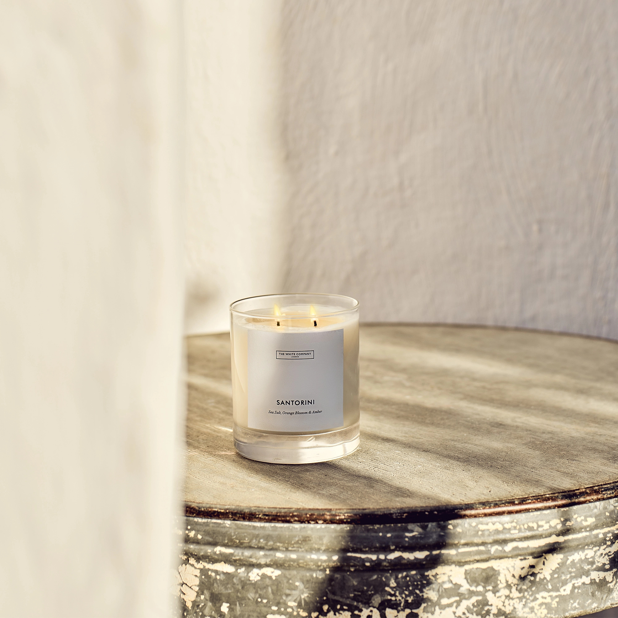 I’ve been looking for a new signature scent for my home and The White Company's new fragrance is the exact summer holiday smell I needed
Santorini smells fresh, summery and sophisticated
-
 How to remove algae from garden walls in five steps – and the cleaning product experts rave about for tackling it fast
Experts share their top tips for getting garden walls algae-free


-
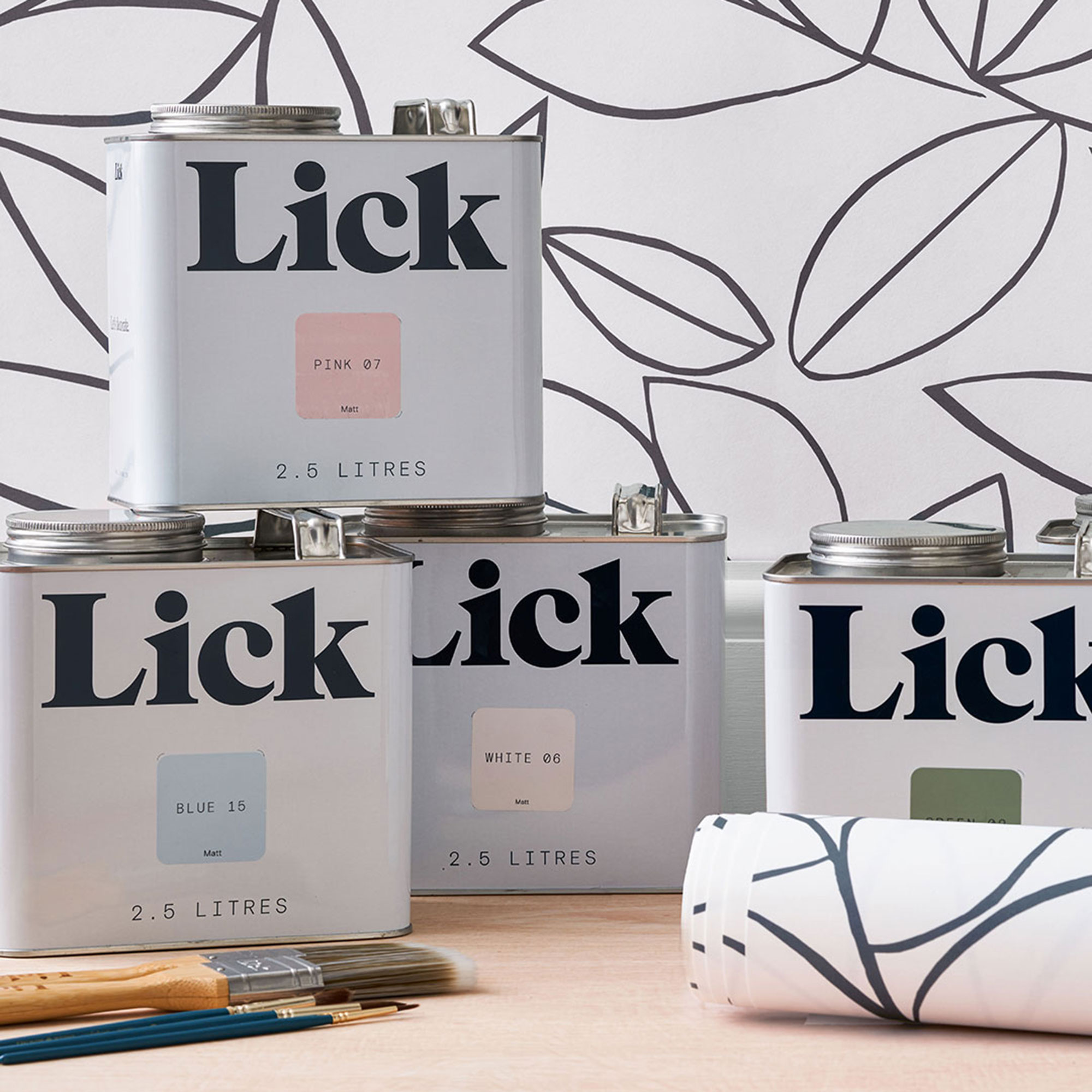 Lick paint has launched a first-of-its-kind wallpaper to help you relax and unwind
The paint and paper brand has collaborated with mental health charity CALM to produce a mindful wallpaper design
-
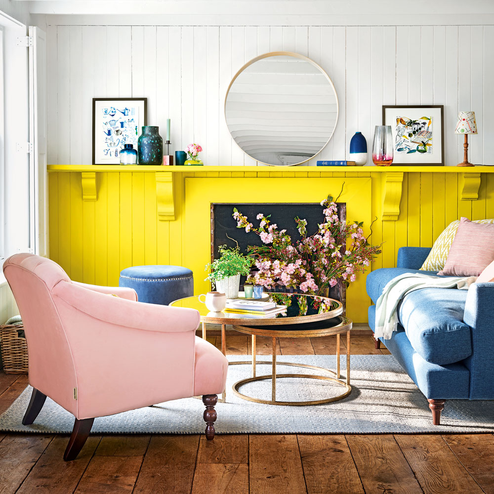 Yellow and grey living room ideas – from subtle hues to bold brights
Wake up your living space with this bright yet liveable colour combination

