11 house exterior colour ideas - boost your kerb appeal with paint, cladding and tiles
Reinvent your property with a new approach to your exterior colour scheme
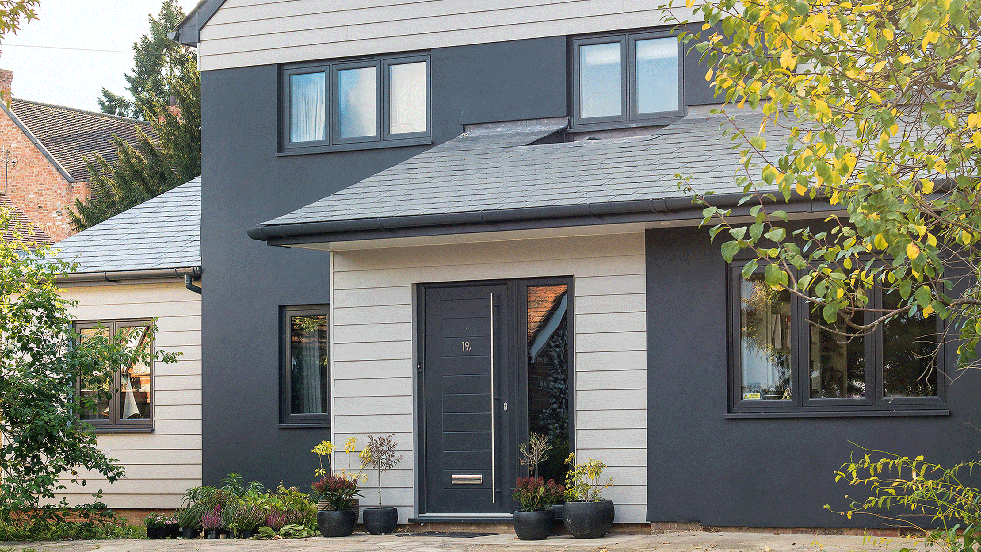
- 1. Go for a coastal classic combo
- 2. Transform an extension with tiles
- 3. Play with multiple colours
- 4. Clad with Cor-Ten steel
- 5. Highlight architectural features with contrasting borders
- 6. Unite the street with pastels
- 7. Focus on a colour pop
- 8. Exude opulence with golden zinc
- 9. Match aluminium windows with dark render
- 10. Modernise Victorian red brick
- 11. Lift tired brickwork with a paler paint
- FAQs

Your home's exterior might have been the feature that first encouraged you to book in a viewing, or even put in an offer. Yet so often, when it comes to decorating, it can be neglected in favour of the interiors. And that's a shame. Because good house exterior colour ideas can be totally transformational.
Just as you can transform a room with paint and panelling, furniture and fabrics, a property's facades will benefit hugely from a new colour scheme, characterful cladding or a rethink of details like guttering, window frames and front door ideas.
Granted, an exterior makeover can be expensive. Checkatrade estimates that the cost to paint a house lies anywhere between £3,000 and £6,000. Factor in cladding in tiles or a material like zinc, and you can expect to spend a lot more.
Yet creating an impressive exterior can pay dividends. Not just by wowing the neighbours, but by adding value and grabbing the attention of potential buyers. 'In today's digital age, where platforms like Rightmove dominate the housing market, it's essential for your property to stand out amidst the endless scroll,' says Ella Lewis, Client Executive at Chester-based estate agent Currans Homes.
'Due to the competitive market, it’s imperative for properties to make a lasting impression within seconds. And that's where the power of paint comes into play. We've seen first hand how, for example, creating an iconic door can transform a property from ordinary to extraordinary.'
House exterior colour ideas
With Ella's advice ringing in our ears, we've been determined in seeking out the best exterior colour transformations that will give your home kerb appeal and potentially a USP.
1. Go for a coastal classic combo
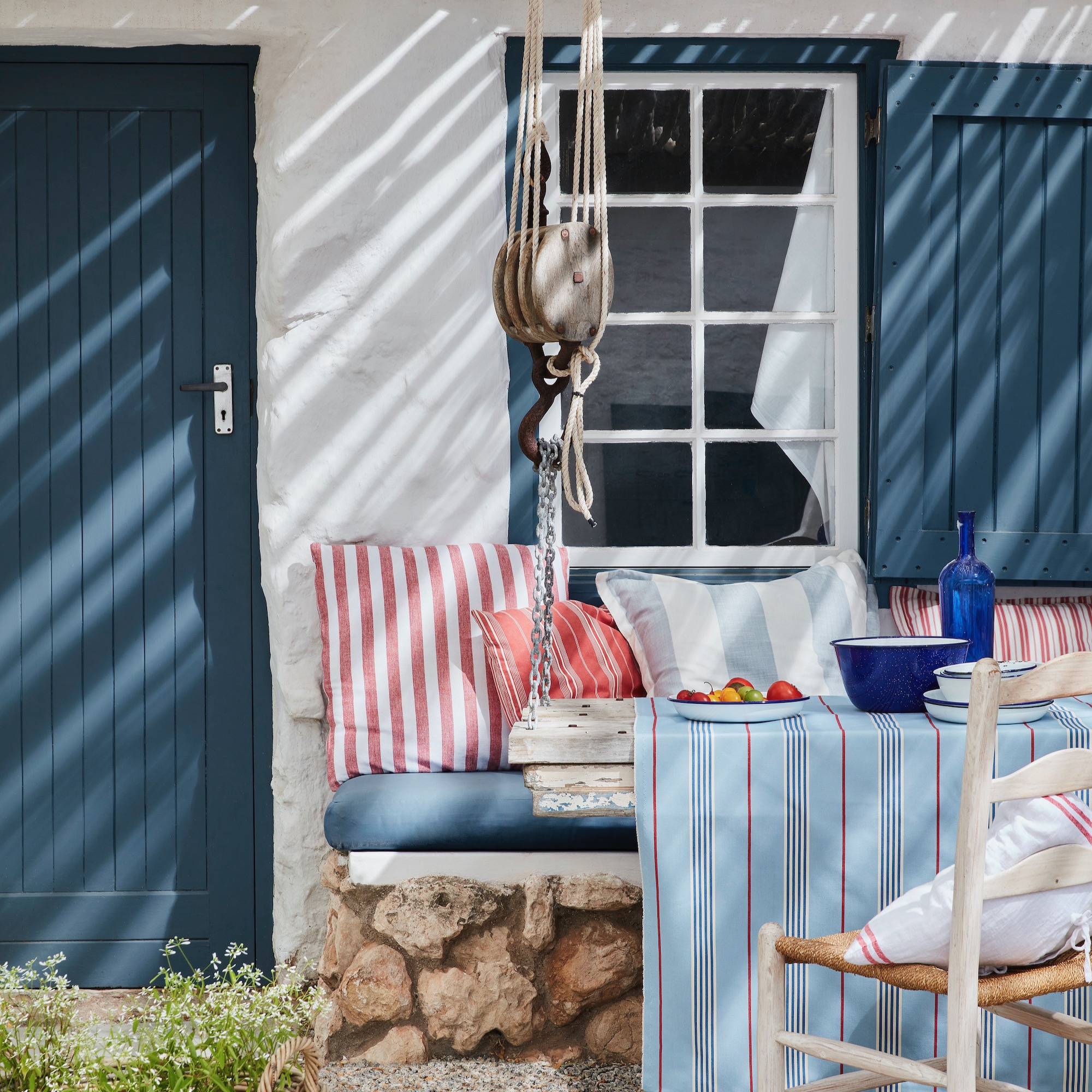
'Don’t let decorating the exterior be an afterthought, as well as weatherproofing and protecting your home, it’s a fantastic way to add design personality and curb appeal,' says Ruth Mottershead, creative director at Little Greene, who is responsible for this look in Hicks Blue and Loft White.
Painting your home can be a way to strengthen its identity and ties to a particular period or location. For example, blue and white instantly speaks of a Greek island – and is perfect for a coastal home.
Nervous about painting your window frames in a deep shade in contrast to your exterior walls? Andy Greenall, head of design at Paint & Paper Library has a great tip. 'When choosing colours for window frames, a good practical tip is to paint sections of timber that you can balance or place alongside the window and walls, rather than testing the colour on the actual frames or a flat wall,' he suggests. 'It really helps to see those colours on more than one plane.'
Get the Ideal Home Newsletter
Sign up to our newsletter for style and decor inspiration, house makeovers, project advice and more.
2. Transform an extension with tiles
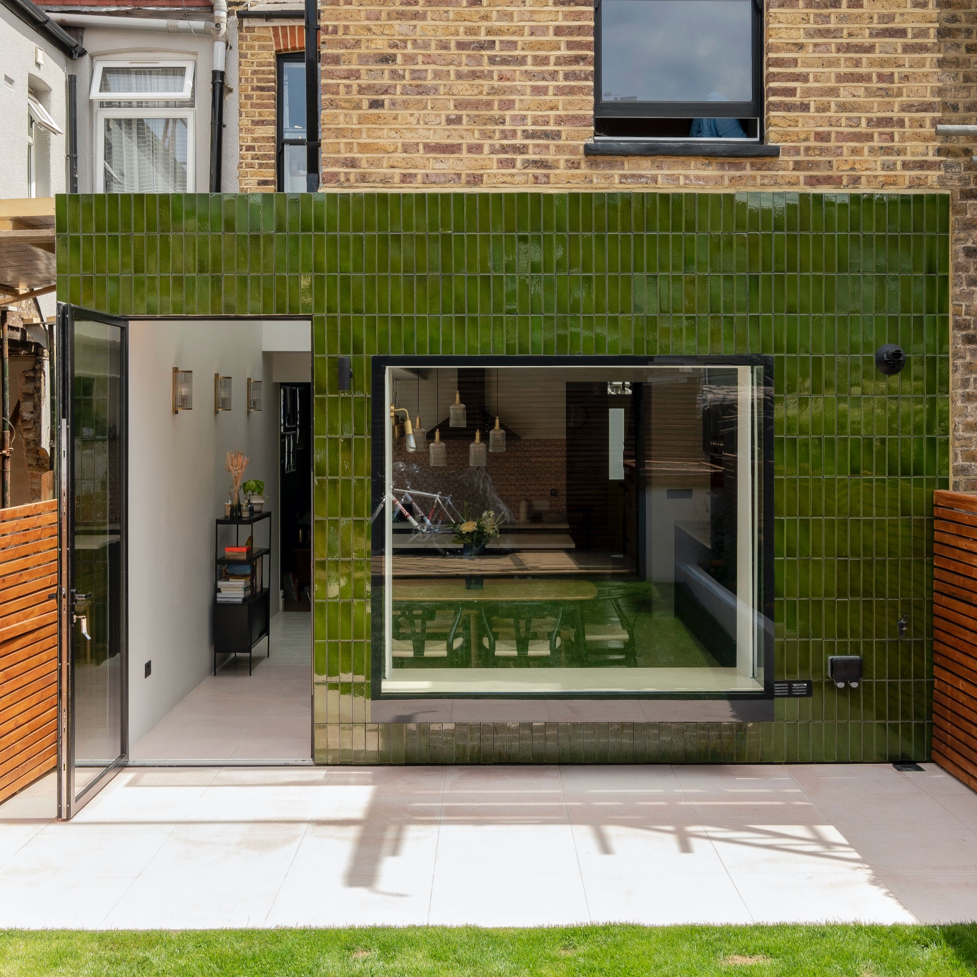
In this project by James Dale Architects, the rear of the house has been clad in striking, green tiles by H & E Smith, the tile company responsible for the iconic tiles used throughout the London underground. The vintage-style reference the age of the property, adding a rich complementary colour and texture to the exterior.
'It's all about trying to create something different, something that isn't a bog-standard brick extension,' says James. 'And the green works very nicely with the original buff London brick stock.'
'Tiles are practical, they're different, although slightly more expensive than other,' James continues. 'When you think about it, tiles are a similar material to brickwork – they're both made from clay. Also, they clean easier than timber cladding, and they last longer.'
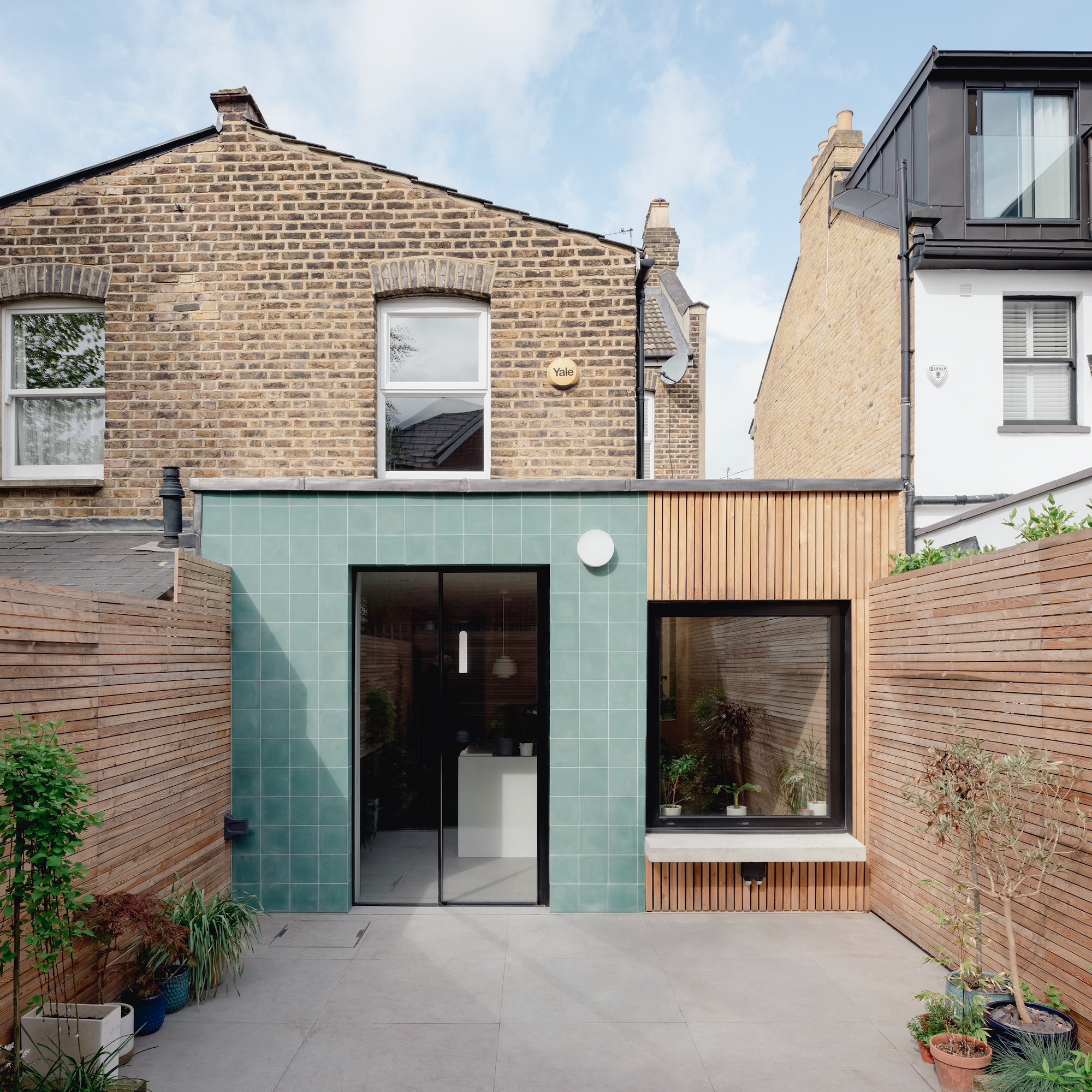
In another of James's projects, encaustic tiles have been used to add a contemporary powder blue finish to another rear extension idea. 'We actually clad using two contrasting materials, helping to break down its mass,' explains James. 'The main portion of the extension is clad in blue, terracotta tiles, selected to stand out from the original brickwork, and the smaller side infill section is clad in vertical larch timber.'
3. Play with multiple colours
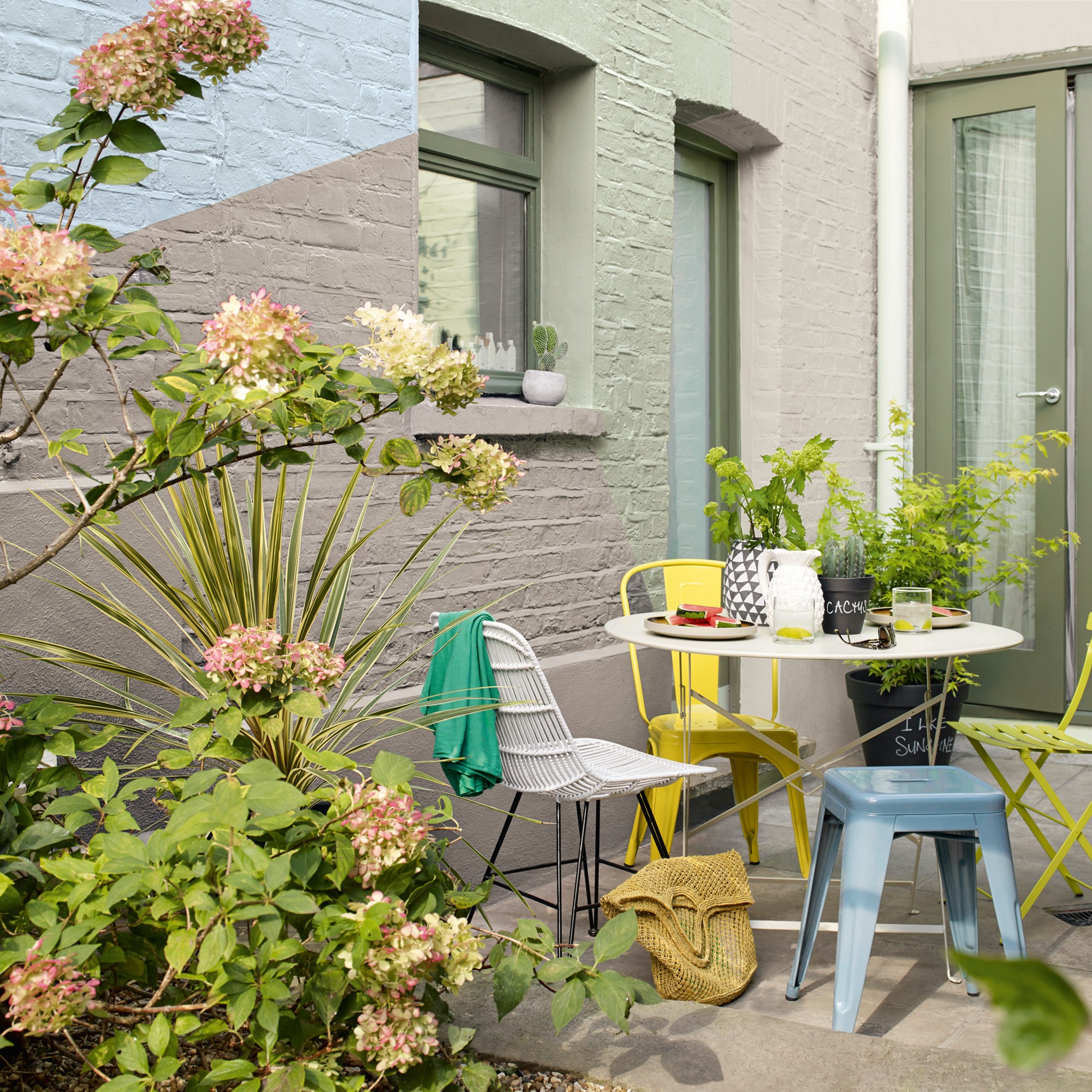
This approach proves that the mantra 'business up front, party at the back' doesn't just apply to mullet hairstyles.
While it's best to keep the public-facing elevations of your home conservative in one colour, a secluded rear elevation can present an opportunity to be creative. But first, check your title deeds and consult your local planning office to check there aren't any covenants restricting the colour you paint your house.
Then the fun can begin. Block out areas of wall with a series of straight lines running vertically, horizontally and diagonally – geometric patterns look playful and modern and will be easier to paint. Pick harmonious colours of the same tone (lightness or darkness) and saturation. For example, pastels, as seen here, or jewel colours.
There are a few things to be aware of when painting directly onto bricks. 'You must bear in mind their porous nature,' says Mandy Rippon, product manager at Frenchic Paint. 'It can result in the wet element of your paint being sucked into the surface on initial application, which can mean you use up more paint and often leads to an uneven finish.'
'There are some simple steps you can take to avoid this, such as sealing the surface and applying a mist coat,' she adds.
4. Clad with Cor-Ten steel
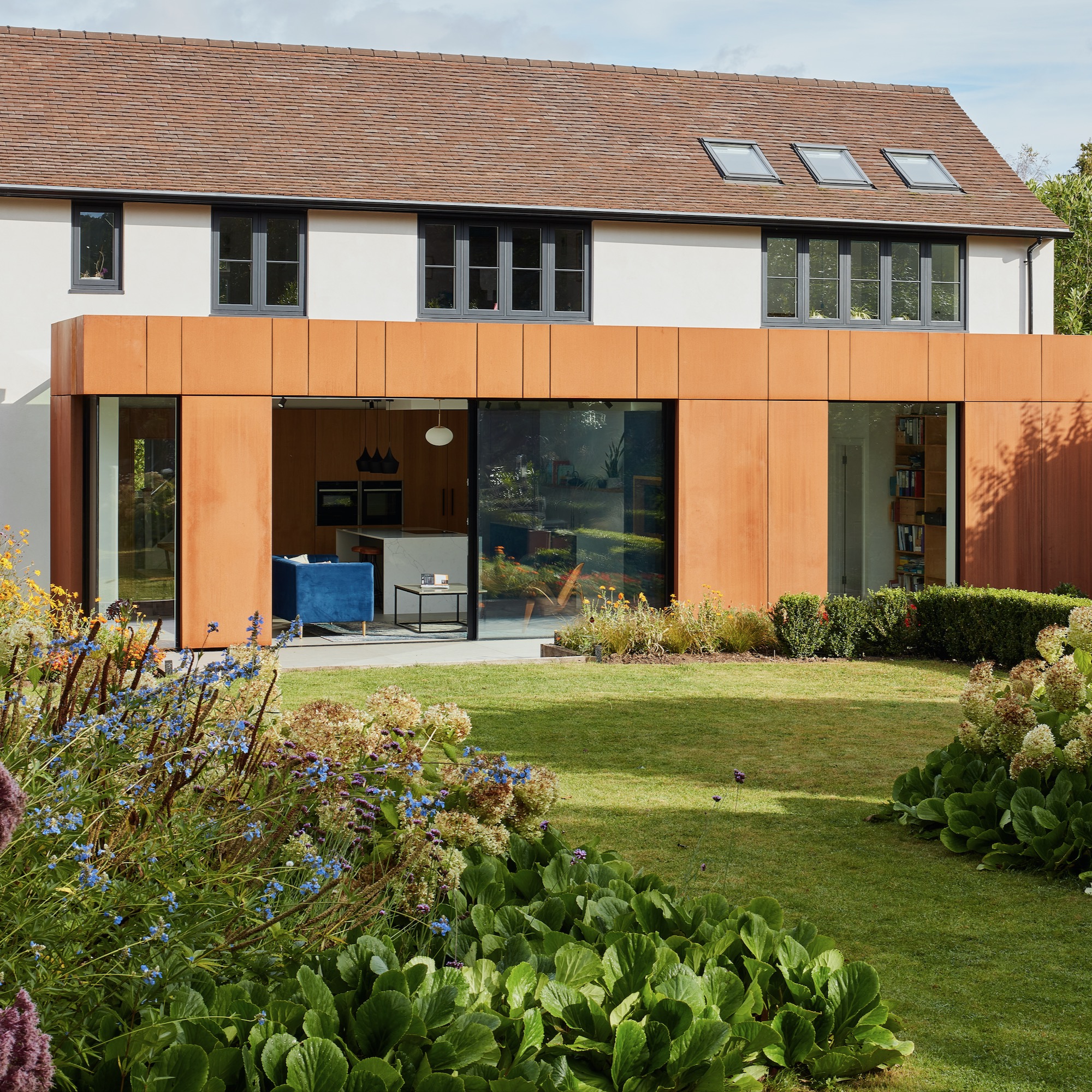
In this project – Autumn House by Matt Withers at Stylus Architects – Cor-Ten steel has been used as colourful cladding that highlights a new extension and helps to integrate the house with the garden ideas, which was quite a centrepiece of the existing building. 'There was a little bit of reusing of the material in the garden for things like lighting,' Matt says, 'but also a lot of the existing planting had red and orange tones, which is why the two now communicate with each other so well.'
Matt likes his projects to have an interesting element of colour. 'Anyone can add a brick extension, but what communicates your tastes as an individual?' he says. 'When you punch out something that's unique in terms of colour and material selection, people can take a little while to get used to it. But being bold is often a good choice, because you will get people that really fall in love it.'
'Cor-Ten is a unique material – it's not to everybody's taste but it's also not a one-block colour,' he explains. 'It has an almost organic quality to it as it oxidises over time.' The thickness of the panel itself will influence how the material weathers and the colour develops. 'On another project we're using a slightly higher gauge, thicker Cor-Ten, and that tends to turn more brown than orange. Whereas with Autumn House we wanted to go quite bold, and so this copper is more vibrant.'
Location, too, makes a difference. 'It will weather differently if you're located on the coast, and at a different timescale,' says Matt. 'However, after around two years it becomes more consistent.'
5. Highlight architectural features with contrasting borders
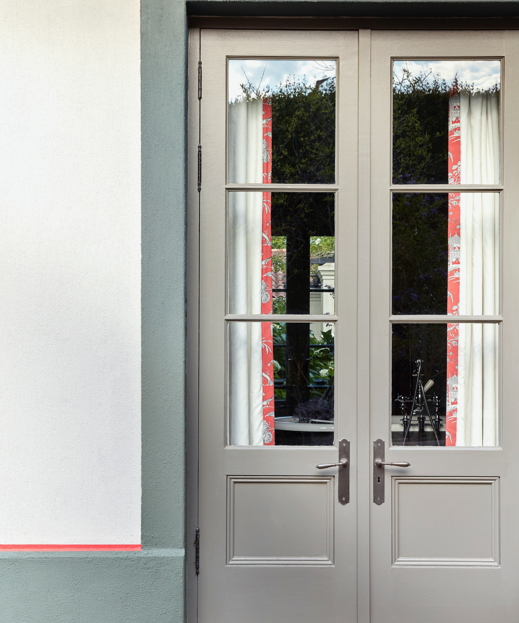
So you've decided to play it safe with your main render shade. But don't underestimate the impact a border or small painted detail can make to make your house exterior look more expensive. Here, an architrave and trim in Little Greene's Livid 263 and an unexpected stripe detail in Orange Aurora 21 is used to frame the doorway. The main wall is Ceviche 230 and the door is Serpentine 233.
'Gone are the days of only being able to find masonry paint in limited colours,' says Ruth. 'Our Intelligent Masonry Paint is available in the extensive Little Greene colour palette, so homeowners can really create a unique exterior design scheme.'
6. Unite the street with pastels
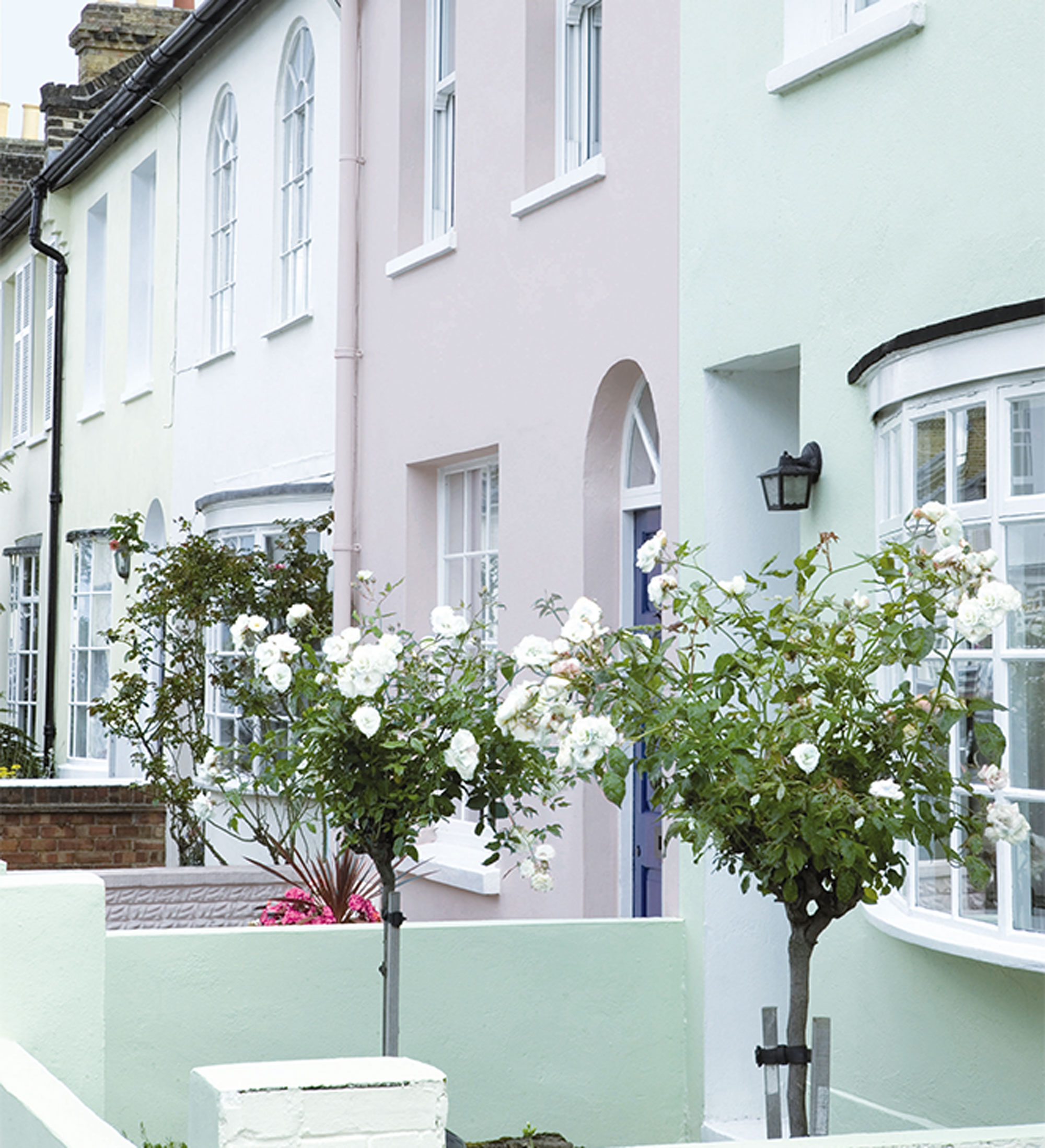
'In a street where houses are in closer proximity, don’t overlook the colours used on neighbouring houses,' advises Andy Greenall, head of design at Paint & Paper Library, 'as these can affect how your chosen scheme reads.'
In fact, in a row of terraced houses, it could be a good idea to collaborate with your neighbours and each paint your house in a different but complementary shade. Pastels can be particularly successful.
'Pinks and sage greens are the top trending exterior shades of the moment, so are a great choice if you want your home to be the talk of the street,' says Jemma Saunders, colour consultant at Sandtex.
7. Focus on a colour pop
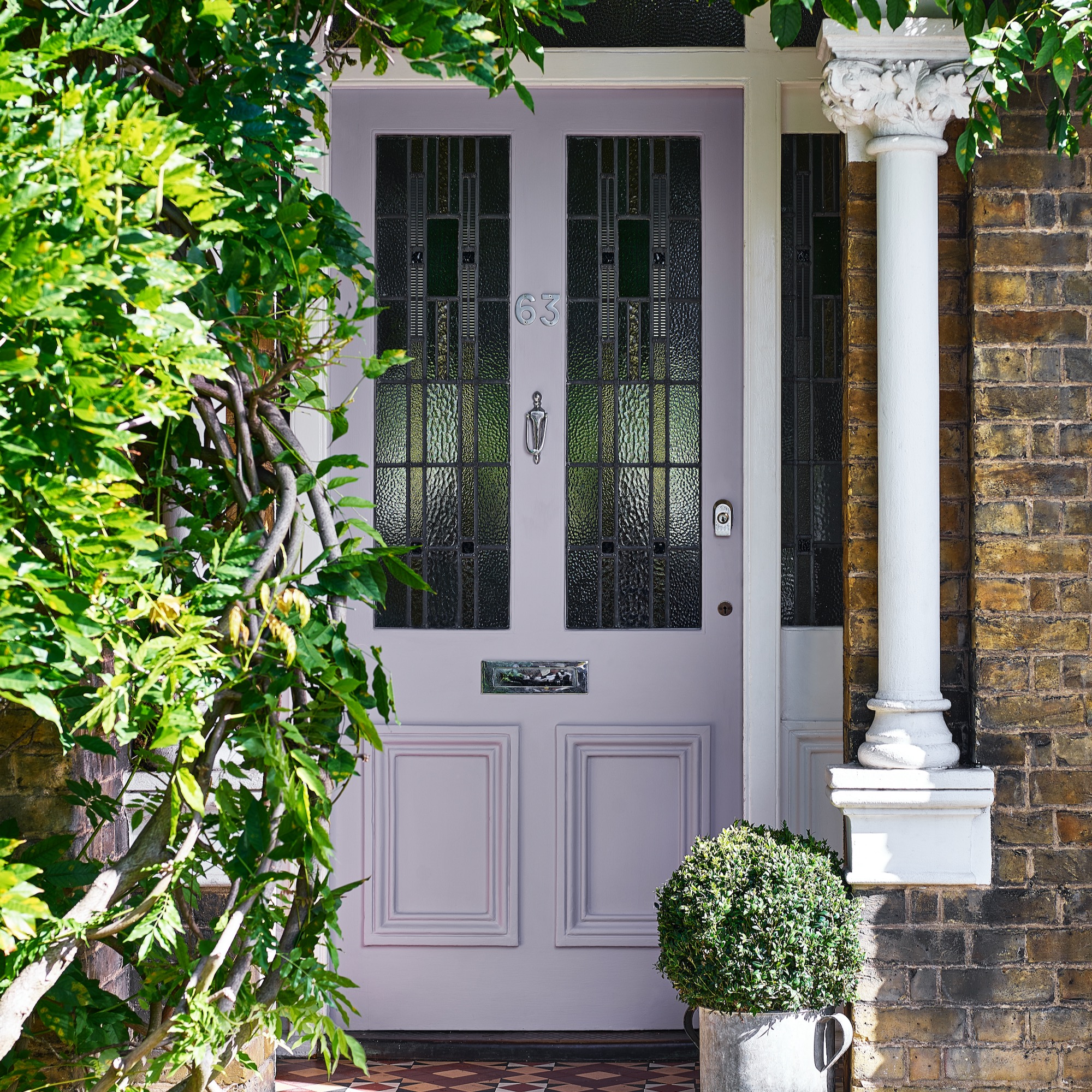
If you would rather give the main exterior of your property a neutral base, there is still plenty of fun to be had with the colour of your front door – and this can pay dividends.
'Working in Chester, we’ve marketed four luxury period properties on the illustrious King Street, each with a distinct colour for its front door,' says Beatrice Brown, property manager at Currans Homes. 'These homes were really sought after, and we saw that people were quick to recognise the likes of "the cool house with the blue door". It’s really proved how something simple can give a home originality and unique character. People want to be a part of that.'
We love this quirky Lavender Quartz by Dulux, which is both pretty and unusual. Michael Rolland, from The Paint Shed, is also a big fan of red for a front door. 'It’s great for enhancing both a home’s playfulness and elegance,' he says. 'That signature "pop of red", can be a great way to capture an onlooker’s attention, especially when it comes to period properties with dark brickwork or exterior tiling. We’d advise a richer, cherry shade like Zinsser Allcoat Water Based Exterior Satin Tinted Colours in 04-D-45, £20.35 for 1tr.'
If you are after an up-to-date look, Mandy Rippon, product manager at Frenchic, has another tip. 'Painting the frame the same colour as the door has a cool, contemporary look,' she says. 'This will also help make your door look bigger.'
8. Exude opulence with golden zinc
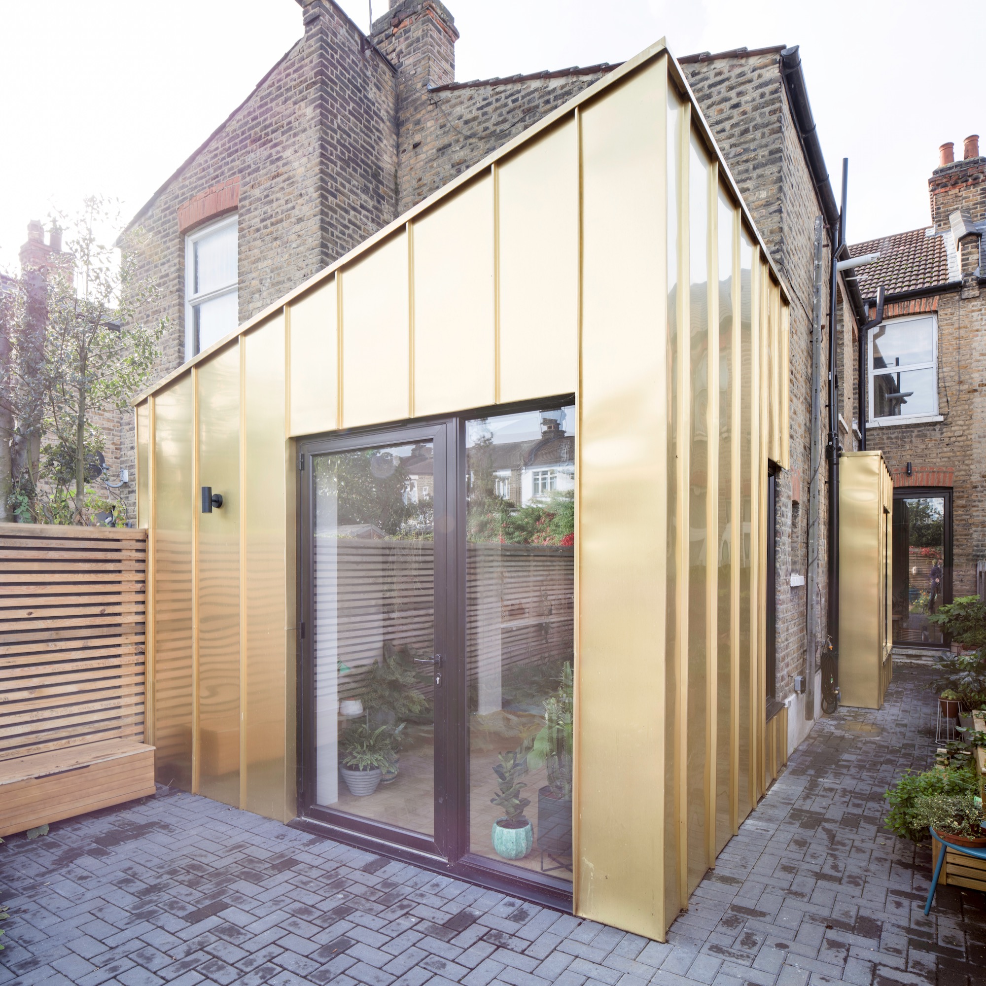
Cor-Ten is not your only colourful metal cladding option. James Dale decided to use a modern material 'to celebrate the contemporary addition, allowing the history of the home to be easily understood'. 'I find the London stock brick quite boring and drab,' says James. 'So when I'm working on an extension, I like to try to enliven the rear of a house, to create something more fun and playful.'
Here James used a zinc-copper alloy. 'It's a durable and high-quality finish, which is also aesthetically striking,' he says. And how does it age? 'A few years on, it appears less shiny and reflective – it's still very much gold, just a bit flatter,' says James. 'It nevertheless glows when caught by the sun.'
And what if you are nervous of using striking cladding or materials? 'I'd always advise working with an architect and asking them to produce CGI renders of what the finished building will look like,' he says. 'It's also important to source samples, so you know you'll really like what you're choosing. But be brave, and embrace the process.'
9. Match aluminium windows with dark render
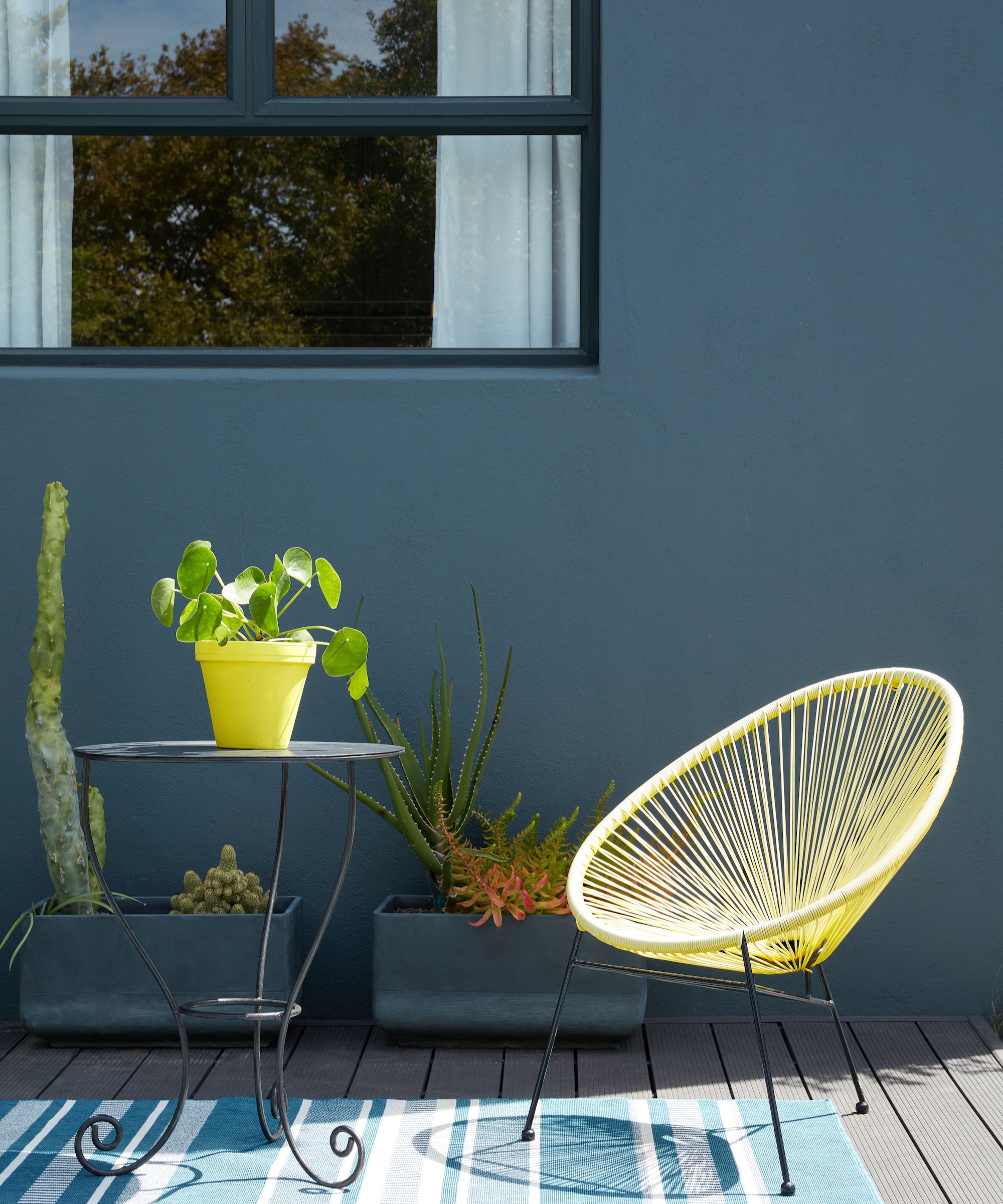
Aluminium and Crittall-style windows are hugely popular at the moment, and can really pop against a pale-coloured render. But if you want a more cohesive and sophisticated look, try painted render in a darker shade with grey tones, such as charcoal or petrol blue.
We asked Matt Withers about painted renders, and what colours he thinks work best. 'I don't think there's any hard and fast rule to be honest,' he told us.
'We've recently worked on a project with render in a sky blue colour, which I would call reasonably conservative. But I've seen examples from other architects and designers in colours such as bright yellow, which sounds hideous but which was actually very successful. In my view, using bold colours, particularly in a simple scheme, can make quite a difference in terms of how expensive and unique a property feels.'
10. Modernise Victorian red brick
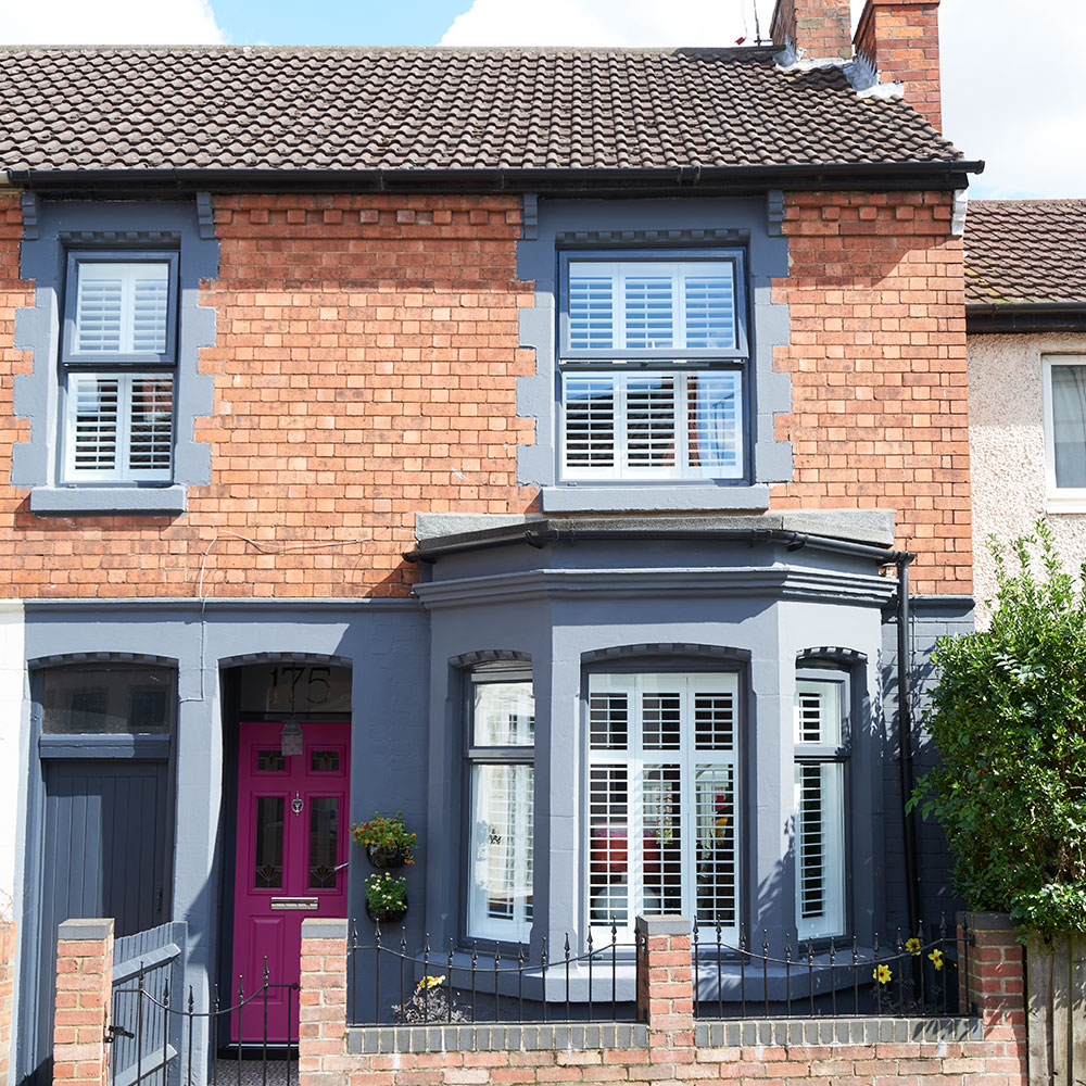
'When choosing colour for an exterior, consider the architecture, the colour of any other wall surfaces, such as brick or stone and the property’s period,' says Ruth. 'Often, an authentic colour from the era the property was designed will work well, or in the case of large masonry surfaces, a diluted version of a period colour can fit the bill.'
But certain materials can take a bolder colour companion. 'The finish on many British homes is red brick, which partners well with strongly contrasting shades,' says Andy. 'In particular green, which provide a natural balance. Deep teal and a rich, dark brown such as Copper Beech also both look really great alongside warm red brick.'
Juan Sanchez, RIBA chartered architect and spokesperson for HiiGuru, agrees. 'Red bricks or London stock yellow bricks works quite well with white render,' he says. 'However, they create a particularly interesting exterior when juxtaposed with dark and intense colours.'
'When it comes to Cotswold stone, limestone and Yorkstone buildings, you'll have more success by combining the stone with render in complementary pastel colours of a similar tone and intensity, and preserving the stone as the primary feature,' advises Juan.
11. Lift tired brickwork with a paler paint
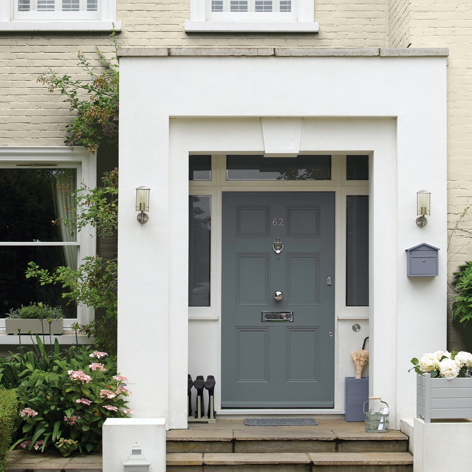
If your brickwork is looking tired, but you don't have the budget to get your house rendered, painting directly onto the surface is possible. Even just refreshing your front porch ideas will give you a new look.
'Lighter, neutral shades work brilliantly to brighten the exterior feel of older masonry, and colours with blue undertones help to freshen things up,' advises Jemma Saunders at Sandtex. 'These hues develop beautifully in different natural light levels, creating warmth and richness throughout the day.
'For more traditional homes, painting directly onto brick creates a really modern feel and a creamy white shade instantly lifts an older property,' Jemma adds. 'It’s also a great practical step to protecting your home, with exterior products such as Sandtex’s Microseal Masonry Paint (available at B&Q), giving up to 15 years of durable protection against the elements and helping your home to stay on trend for longer.'
FAQs
Which colour is best for the exterior of houses?
'Colours are a very subjective topic. What can stir a positive emotion in some can have the opposite effect on others, so there's no definitive "right" answer,' says Juan Sanchez. 'However, I would say that in the last few years, trends have steered towards pastel and soft colours rather than intense and strong shades.'
'There are many colour combinations that work well on the exterior of homes,' says Francesca's Paints founder, colourist Francesca Wezel. 'A classic white wall and black trim can look timeless and elegant. Neutral tones like beige, grey or taupe can be elevated with a vibrant pop of colour like red, green or navy on the front door or on shutters.'
'A monochromatic scheme is always stylish – for example, light grey walls with darker grey accents,' she adds. 'Earthy tones, like olive, brown and cream can be combined to create a balanced and harmonious look that blends well with natural surroundings.' However, Juan is quick to point out that certain circumstances might limit your freedom of choice.
'Sometimes, you may be restricted to a certain palette or even a specific colour under planning regulations,' he warns. 'This may be to maintain a specific atmosphere and appearance in conservation areas.'
How do I choose the right exterior colour for my house?
'When choosing colour for the inside of your home, you’re doing it for yourself – you are the person who lives in the space and it’s your own eyes that appreciate those choices,' says Andy Greenall. 'However, choosing colours for the outside of your house is inevitably a more public display; hence the first aim for most exterior redecoration is normally to smarten things up.'
'But there is then an (often unconscious) secondary offer of a subtle insight into your personality; whether it’s an extremely tasteful combination of colours, a cheerful yellow front door or a pristine gloss finish,' he adds.
'The colour choices you make for your exterior can have a transformative effect on the building, offering the chance to make a bold statement, be more discreet with a subtle and sophisticated design, or blend seamlessly with the original character of a period property; so be clear from the outset with what you want to achieve, before you start sampling colours,' Andy continues.
'In the same way you would look at paint colours alongside curtain fabrics and furnishings, consider the architectural elements of your exterior too,' adds Ruth. Do you have red or yellow tone bricks, limestone or granite walls, what colour are your roof tiles? Build these into your design scheme to ensure your paint choices are complementary.'
Should exterior paint be lighter or darker?
'Whether going light or dark is the right choice depends on multiple factors, including your property's location, orientation and position in relation to other houses,' says Juan Sanchez.
If your door and/or facade faces south and therefore gets warm quickly, paler colours may be a better choice as they reflect light and have less solar gain, so can help keep your home cooler in summer.
North-facing façades can be trickier. Because they never receive direct sunlight, you may find a lighter colour feels brighter and more appealing. But equally a dark colour can help trap heat and make the house warmer. 'This is why, generally speaking, Mediterranean homes tend to be painted in white or light colours, whereas northern European homes are darker and more intense,' says Juan. 'Think a white Greek island home versus a Nordic home with black cladding.'
There are other environmental circumstances to take into account, too. For example, if you live on a busy main road with a lot of traffic and therefore pollution, you may notice that a light exterior appears dirtier more quickly, and needs regular repainting.

Amy Cutmore is an experienced interiors editor and writer, who has worked on titles including Ideal Home, Homes & Gardens, LivingEtc, Real Homes, GardeningEtc, Top Ten Reviews and Country Life. And she's a winner of the PPA's Digital Content Leader of the Year. A homes journalist for two decades, she has a strong background in technology and appliances, and has a small portfolio of rental properties, so can offer advice to renters and rentees, alike.
-
 My go-to Ninja coffee machine is on sale for Easter weekend
It makes coffee shop quality achievable at home
By Molly Cleary
-
 When to plant out annual flowering plants for vibrant, colourful garden borders – and give them the best start, according to experts
Not sure when to plant out annual flowering plants? We've got you covered...
By Kayleigh Dray
-
 I'm a kitchen decor editor and didn't like this tableware trend - until I saw H&M Home's designer-look plates
They made it easy to justify a new crockery set
By Holly Cockburn